
Don't wanna be here? Send us removal request.
Statistics
We looked inside some of the posts by designstudio1 and here's what we found interesting.
Average Info
Notes Per Post
0
Likes Per Post
0
Reblog Per Post
0
Reply Per Post
0
Time Between Posts
5 days
Number of Posts By Type
Text
13
Last Seen Tumblr Blogs


Fun Fact
The most popular pages on Tumblr are about Minecraft, GIFs, and David J. Peterson.

Text
WORK IN PROGRESS I
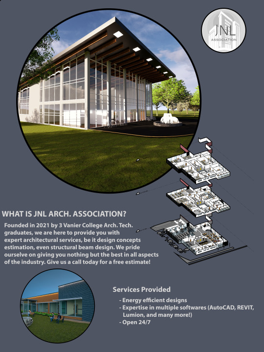
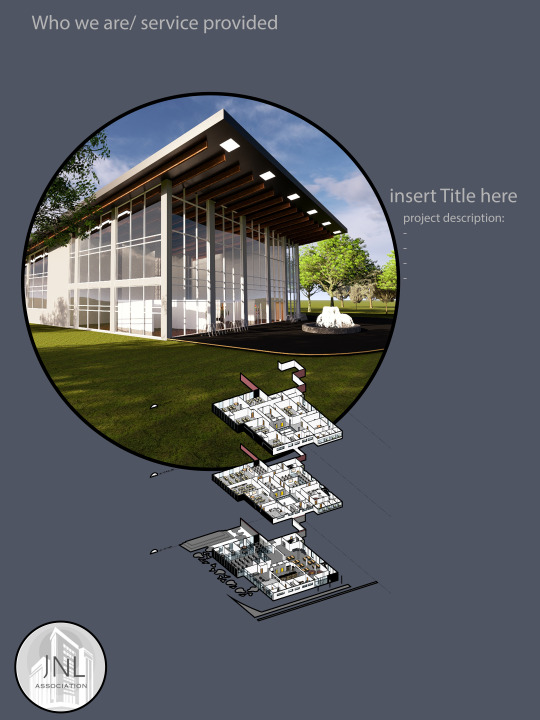
What is JNL Architecture, we offer top of the line architectural design services ranging from 3ds Max rendering to production of construction drawings all stamped and approved by our team of Architects and Architectural Technologists. We pride ourselves on giving you nothing but the best in energy efficient designs as most of our projects are LEED GOLD minimum.
List of our specialties:
Softwares: AutoCAD, Revit, Lumion, 3ds Max, Twinmotion, Photoshop, Illustrator, and many more!
What we can guarantee: Top Notch customer service, 24/7, open for emergency calls
Call now for a free estimate at 514-111-1111


0 notes
Text
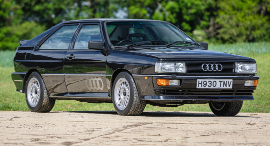
FINAL WORK
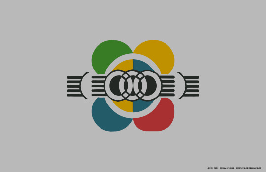
I was told to change logo and so I decided to use the Audi Logo.
I wanted to make the logo look like the front of a car with the "logo" still in the center though deconstructed. I then noticed it was lacking quite a bit of colour for it looked really plain, in my opinion. I added what i titled the "mid colours" those being blue and yellow and saw that it helped quite a bit. I then decided to add a dash of red and green for I thought the design wasn't popping for me. I chose simple colours for the inspiration photos i looked at all used relatively simple colours.
As for the design, I used my brother's newly bought drawing tablet and sketched most of this, using the eraser tool to make shapes I desired then copying and pasting, rotating them as necessary. The usage of hand drawing has given the drawing a more natural feel as my circles and shapes are imperfect. When filling out the colours with the paint bucket tool, I saw that at times it would leave imperfections or holes in the fill, to correct this I used the pencil tool as it didn't leave behind a gradient around the edges, to touch up everything and ensure a full fill. Furthermore, the design I made is quite simple and avoids details such as shading or blending of colours, this was taken from the inspiration photos yet again where all of them relied on solid colours and looked uncluttered.
As for the Audi logo, i took apart the first ring that makes up the middle sides and pressed together the other 3 overlapping the circles and giving me 3 square like shapes in the center of the drawing, I thought this was quite a nice pattern and decided to keep it.
INSPIRATION PHOTOS:
0 notes
Text
WORK IN PROGRESS I
The Olympic games is a gathering of 5 continents mentioned below where athletes from each, assemble and compete in sports. It is the world's leading international sports event and it the biggest international event
The Olympic rings are the symbol representing the Olympic games, 5 rings interlaced with each other, 3 on top and 2 on the bottom. They are a symbol that represents unity within 5 continents & athletes all around the world at the Olympic games (Asia, Africa, America, Europe and Oceana). Originating from the ancient Olympic games, in Greece, Pierre de Coubertin was inspired by them and decided to revive the games, holding the first modern games in Athens, in 1896.


0 notes


Text
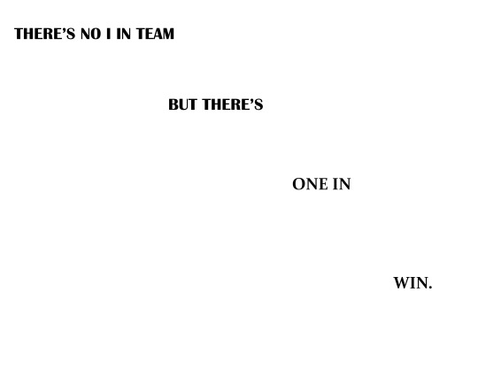
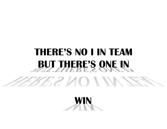
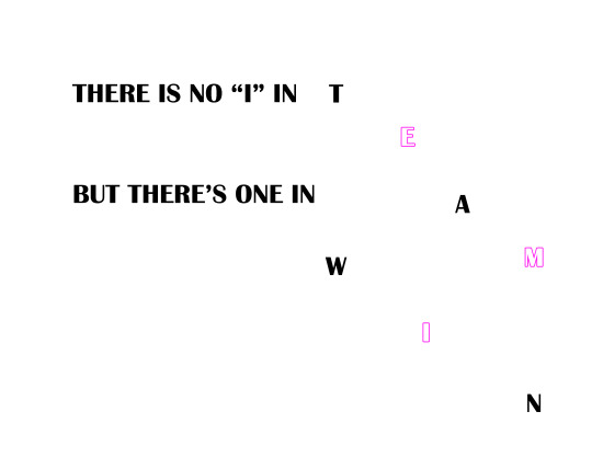
QUOTES
There's no "i" in team... but there's one in WIN
If you do not believe in yourself no one will do it for you.
0 notes

Text
MY THOUGHTS ON THE DESIGNS
For starters, I am quite bad with curves or playing with wavy letters and so for both my designs I tried to come up with something without changing too much of the letters. For the first design, I wanted to do something somewhat related to architecture technology. My idea for this design was to draw some kind of stairway or steps. I knew having 2 straight edges like the center of the letter “Z” next to each other could make an image that looked like a flat surface, like when drawing a prism. I then needed to incorporate the letter into a way to make a riser for the step and so at first, I tried to simply put a 90° rotated “Z” which to me felt way too simple and lost the steps effect. To solve the losing of the effect, I mirrored the rotated letter “Z” as I didn’t want to use another letter such as “N” and this solved my issue as now it looked like the cross section of 2x4 like in my architecture drawings missing one line as normally it’d be a rectangle with an X as the diagonal lines from their corners would cross. Finally, to get to the end product, I simply copy pasted a lot and made sure they aligned with snaps on and so they did and I got a nice stairway.
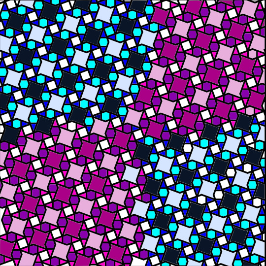
For the second design, I wanted something more creative and far away from architecture. I wanted to make a sort of star shape and so I believed using a letter such as “A” or “V” would be the best option. To make the star shape u pressed 4 “A”s together with their pointy end touching at the bar in the middle, one vertical, one horizontal and the 2 others mirrored. This gave me a ninja star like shape although it felt very incomplete. In my struggle to find out how to complete it, I copy pasted the same pattern on the entire page. The pattern spread past the borders of the document which I then masked. I drew a rectangle over the 20x20 surface and then selected all layers, went to the drop-down menu titled “object”, went to “clipping mask” and then “make” this clipped all the letters outside of my design surface.
Then came the issue of colour and what I wanted to do with the pattern in general. I noticed the stars across the sheet made different shapes when next to each other, a sort of square with pointy tips in the corners and a hexagon, so I got the idea of a checkerboard pattern due to the repetition of square, stars and the weird shape I just mentioned in the drawing. The problem now was that I have trouble seeing colours properly. Although undiagnosed, I’m sure I inherited some form of colour blindness from my father. And so, I picked what I believed was a dark colour of blue and then a lighter version of it. I then coloured the pointy squares with the paint bucket tool making one row of dark and the next light which gave me a checkerboard pattern with them. Then came the inside of the letter “A” I chose a lighter, more vibrant shade of blue as to make the square within the star stand out to make a second “checkerboard”. I then coloured the hexagone a lighter more teal colour making a third checkerboard with the triangles formed by the “A”s I then did the same with what I thought was purple but to change it up I made the hexagon the darker colour. I then made the blue pattern the top left & bottom right with the pink/purple pattern top right & bottom left giving me my final checkerboard. I then obviously showed it to friends and family to make sure the colours worked together and was pleasantly surprised when they said it was okay.
0 notes
Text

Work in progress (part II) My take on a checkerboard pattern
0 notes

