
Don't wanna be here? Send us removal request.
Statistics
We looked inside some of the posts by deskpubmoodboard and here's what we found interesting.
Average Info
Notes Per Post
0
Likes Per Post
0
Reblog Per Post
0
Reply Per Post
0
Time Between Posts
1 day
Number of Posts By Type
Photo
17
Last Seen Tumblr Blogs


Fun Fact
Average visit duration of Tumblr.com is 10 mins and 25 secs.
Photo


Final black and white versions. The palette with black paint splotches doesn’t really work for me so I came up with these alt options for the B&W design. For this I sort of prefer the brush underneath.
0 notes
Photo


I had to experiment a lot with placement. The text was originally above the palette. Also I really like both options of the brush laying under the text or extending from the “O”. These are the final 2 colour version.
0 notes
Photo


Drawing the paint palette was way more difficult than I thought. I am a terrible artist and don’t have a design background and drawing on illustrator was even more challenging. My goal is for the design to look more like a sketch. Less worked on looking, or overworked....a freehand drawing type of look to it.
0 notes
Photo


Final sketches before AI. Trying to work out the palette design.
0 notes
Photo


Want to do something with painting. Moving away from literary symbols as that only speaks to the calligraphy products. Client would like the logo to be appropriate for her future product offering as well, such as watercolor and charcoal prints that she will be including in her store eventually. I am the worlds worst illustrator.
0 notes


Photo


Some examples of my clients work and what she sells in her online store.
0 notes
Photo
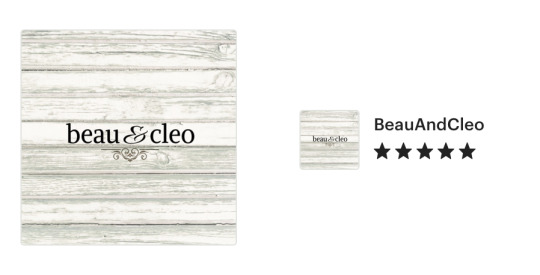
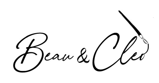
My Client is an artist and calligrapher. This is the logo she currently has for her online etsy store. While she primarily sells calligraphy prints hand painted with watercolours, as well as, pen/ink designs, she is expanding her offerings. “Beau and Cleo” is the name of her Store and she will be using the same name/new logo for a new website
0 notes
Photo


I cringe at my drawings. Unlike my client, I am not an illustrator. However, it helps to just toss out some ideas. Trying a lot of different ideas. Need to start narrowing down and begin designing in AI.
0 notes
Photo


There needs to be a balance of more classic design with more modern symbolism to cover the client’s current product offering and future designs. So could you take a classic feather pen and create it in a more modern design. Or include a more classic ampersand with a cleaner, more modern font.
0 notes
Photo


Looking at possible literary symbols, or classic writing symbols for the logo design. There are many classic literary quotes in her work so this is one possible way to go for symbols.
0 notes

Photo


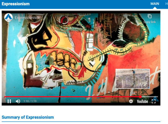
I’ve been researching various art movements for inspiration for my logo design project and learning a lot that is starting to influence my designs.
0 notes
Photo

As I am searching for fonts for my logo project, this grabbed my attention. Adjust altering the font slightly in just a way made both of these hit their mark perfectly.
0 notes
Photo


Also love this simple design and reading about how this business began and grew adds to why this logo is just perfect. I also really think it works in practice and sometimes you have to see it on packaging or on a sign to see just how right it is.
from logodesignlove.com
0 notes
Photo


Logo design research and inspiration. The left is the original, the right is the new and improved. I thought this was a cleaner, more modernised version of the original that really hit its mark.
from logodesignlove.com
0 notes
Photo

On the logomotivations’ instragram page, they do a great series called “how it started, how its going!” Interesting to see how logos have evolved for Ikea. H&M and Google!
0 notes