
Don't wanna be here? Send us removal request.
Statistics
We looked inside some of the posts by digicharillustration and here's what we found interesting.
Average Info
Notes Per Post
0
Likes Per Post
0
Reblog Per Post
0
Reply Per Post
0
Time Between Posts
1 day
Number of Posts By Type
Text
17
Last Seen Tumblr Blogs


Fun Fact
The Tumblr office adopted Tommy, an 11-year-old Pomeranian.
Text
Final Reflection:
This has been a really interesting class and I have learned a lot. The lessons are well structured and Toby has obviously put a lot of work into making them as insightful as possible. Values and how they relate to colour is one of the most valuable learning I have taken from the course. Learning how to use tools like smoothing to their best effect were also great. There are 2 main advantages to digital art for me personally, and they are basic photoshop features: zoom & layers.
Designing a character based on someone else's brief was also an interesting exercise, though I am not interested in pursuing this as a career, only because I would rather work on my own stuff. For the most part I enjoyed the group exercises though.
It would have been good to be able to start the final project on the friday of week 3 rather than the monday of week, besides that I can't really knock anything.
Thanks again, Toby.
0 notes


Text
Scarf Face: An Urban Legend
[A sample of what a Scarf Face film would look like]
ACT 1: PAST - 1969, Scarfieville, Dunedin.
There was a young man - still a boy really - who moved to Scarfieville from his home in rural Otago to fulfill his bucolic folks’ dreams of tertiary education in the family. The contrast between the 2 locales was such that the young man felt like a pioneer colonist on an alien planet and he struggled to acclimatise.
He found a flat with a couple of other students. They were unaware of his alien nature at the time; it would be kind to say they grew to tolerate his… idiosyncrasies (This is important later).
Making friends didn’t happen. Did he really try? Even the flatties figured everything would’ve been a little bit better if he’d just sucked it up and disappointed his parents.
Mid-winter approached. Everything got colder. The chimney needed cleaning. Landlord said he was on it.
Co-ed flatting was the topic in those days. Baxter’s poem rang fresh in his mind, as it did on the lips of his classmates.
When that one hot girl, - you know the one; the hottest of hot girls, - said she was going to come over for the solstice. He had questions, doubts, even suspicions. Each stayed silent though.
Home he went, like HG had had already arrived and there was a whole flat that need a slight yet deliberate rejigging. Hasty tidy. Quick reflection on HG’s intentions. Off with the clothes. Sexy pose on bed in tighty whiteys.
The old clock ticks away. It gets progressively colder.
Eventually, the need for warmth and maintained sexiness overrides wanting to keep the landlord happy. A fire is kindled. A heart is reinvigorated. The wait is eclipsed by the compulsion too comfortable. Here comes the nod. The nod takes hold, or maybe its a leak.
Still no sign of HG. The warmth takes hold. Even in his undies, old mate has gotten Same result, our loveable protagonist succumbs to slumber and never wakes back up
Anyway, he died. No one was present, and he never got that one present he was hoping for.
0 notes
Text
SCARF FACE

The intent of SF was to lean into the mysterious horror villain trope where the majority of the backstory, motives, etc. are fleshed out by the audience’s overactive imagination (and later butchered by writers of the 10th sequel). The example of Wolverine from Marvel comics springs to mind here. So much of his charm is caught up in his past being unknown and full of red herrings, and the character lost a lot of the mystique that made him so alluring by creators who wanted to etch their version of his history to the canon (google Romulus and Wolverine to learn more).
When I first conceived of Scarf Face I was curious whether people would get the reference just from the name. Most Dunedinites got it. My 2 favourite incorrect responses were “I’m pretty sure Scarface is already a thing” (which made me wonder how far of the pop-culture pulse my tastes had slipped) and another person’s idea of Scarf Face as an anonymous collection of students engaged in a mafia-like enterprise where they all use the scarf to obscure their identities and create a brand (which I think is a cool idea).
Art, like life, is subjective. The future of story-telling is collaborative (think MMOs, and the resurgence of traditional TTRPGs like Dungeons and Dragons). These are the 2 overriding storytelling concepts that interest me currently, and studying this degree has only made me more curious about exploring the potentials of these with my art. More than anything else, these were the impetus for creating a character like Scarf Face and allowing his story to unfold organically through the input of the audience.
Combined with the mysterious slasher villain trope/archetype, these ideas made me try and keep his back story as vague and open to interpretation as the course requirements would allow. When pressed for a beginning, middle, and end to Scarf Face’s story I was able to work one up quickly because of a character creation device that I stumbled on a few years ago. Purakau is a te Ao Maori Model of Human Development that centres on storytelling. It is quite vague and malleable in its structure, but the basics of each stage are probably the best shortcut I have come across for character creation. Basically, there are several distinct ages and stages of development described by Purakau, each centred on the stories we know, who told them to us/who we tell them to, and who edits, or co-authors them with us.
For the first 15 years stories are told to him, almost exclusively by his parents (farmers from rural otago with traditional ‘salt of the earth’ values). As his brain is still developing at this stage, he takes these stories at face value, lacking the skills of critical analysis that will come with age. Scarf Face was 18 when he died. That means he is 3 years into the 2nd stage, called Taraia. This is the experiential stage, where people start to rely less on their traditional storytellers (parents) and start to take other narratives into account (here it is teachers and peers who have the most dramatic impact) and question the accuracy of the stories told to us previously. As an undead character, Scarf Face also falls into the last stage of development. This is where we feel our own story has been written, we edit it, and then we share it with younger generations/those at earlier stages.
How does this apply to Scarf Face? His parents are simple country folk. They work hard and they only want the best for their children. Their overwhelming desire is to see their offspring do better than they themselves have, and the surefire way to do that is tertiary education. For ost of his life Scarf Face has no reason to question this, and dutifully goes along with it, because another important story that kids are told is deference to their elders/ honour thy father and thy mother. At school, Scarf Face is an outsider, even in his rural farming community. Where the other boys pursue the typically boyish activities of rough and tumble, Scarf Face would rather sit in the library with a good book. Kids can be cruel and the stories they told young Scarf Face about what a freak he was left a lasting impression, making him more socially awkward than his nature had already done. Teachers reinforced the book learning as a smart and mature approach to life, so there is this internal contradiction between, what is sensible and what is cool.
This continues when he moves to Dunedin to attend university (it is irrelevant what he studied, but if pressed I’d say something to do with agriculture). Being a nerd is now a lot less maligned by his peers, but his country bumpkin roots replace this, and he still struggles to connect with other people, further driving his isolation. What stories would have been topical amongst his peers at the time, led me to the co-ed flatting debate that was so hot at Otago Uni during the late 1960s and I couldn’t have asked for a more perfect set up. The hot girl in class shows him some attention and he doesn’t want to entertain any of the logical red flags that pop up on his radar. He is just desperate for connection. Turns out he should’ve listened to that little voice in his head and all their alarm bells. That the hot girl was into him turns out to have been little more than a cruel prank designed to humiliate him for the shits and giggles of the hot girl and her friend group. Nobody could have predicted that the uncleaned chimney of his flat, the biting cold of the winter, and his stubborn persistence in trying to look sexy, all splayed out on the couch in his tighty whiteys would merge into a perfect storm and result in his tragic death.
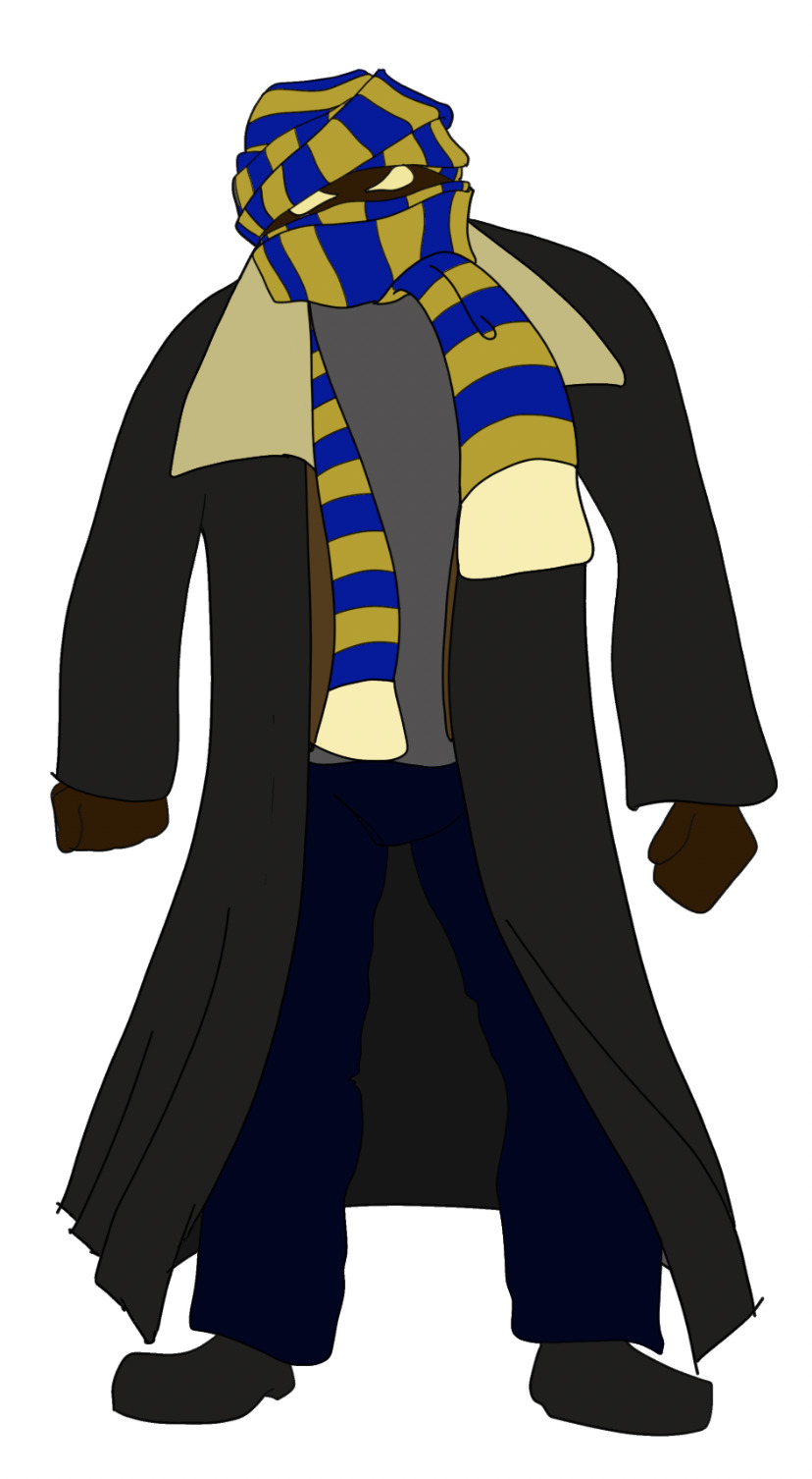
When he comes back in 2019, I stuck to the idea that he was at an age where his story was already written and he was ready to share it with others. Unfortunately, the bulk of the chapters of hia life were spent in the cold, hard ground so basically all he had to share was the hate and thirst for revenge that had occupied his mind in the last moments before the fire took him all those years ago. Self consciousness was a large part of his caracter in life, so it seemed only natural that the first glimpse of his undead visage would make him want to hide it. What could be more emblematic as a mask than the ubiquitous blue and gold Otago scarf, snagged and forgotten in a nearby bush? What better way to fix it in place than with the staple gun carelessly left out by some workman in a rush to get home for the evening. Adding the graduation gown as an overcoat seemed like a natural progression of noticing that his clothes were not quite as slick as they once were and was a nice nod to dreams unfulfilled.
Scarf Face means something to me, but I know that other people will read him with their own experiences as contextual reference, and he will likely mean something different to them. After the group crit thumbnail exercise I saw that people were positioning him very clearly within the genre, not just as a concept, but as an art style too. This was reinforced by Toby’s enthusiasm for leaning into the Video Nasties aesthetic.
I liked the idea of trying to establish facial expression when the face itself is covered and this became a big driver of my decision to use Scarf Face as the character for the final project. I think the end result has achieved the right mix of malevolence, mischievousness, and misogyny given the context of the scene. The layering of his costume was likewise an interesting experiment in silhouettes, as I had originally envisaged Scarf Face as that creepy formless shape you catch out the corner of your eye (and the imagination tries to make sense of it by filling in the blanks). The wide collar of the sheepskin jacket is something of a stylised version of the ritualistic viking sacrifice called the Blood Eagle (splitting the ribcage down either side of the spine and splaying it out like an eagle’s wings).

I started with the line of action. To achieve the basic posture I had envisaged for Scarf Face, I drew inspiration from classic slasher villains. The premise that he is returned from the dead indicated a rigidity or stiffness to his movements, as though unfamiliar, or out of practice with how the body moved. I liked the head tilt that Michael Myers from Halloween often has, giving a quizzical impression, again, as though he is unfamiliar with what he sees, like observing an alien world and its inhabitants for the first time.
From that foundation I laid out the basic skeleton, drawing on several reference pics to get perspective and proportion. With the basic structure down, I moved onto some shapes to give him some substance. Reference was important here too for the reason mentioned above. I knew that his legs would be mostly obscured by the woman’s face and hair so that part of the character did not progress much beyond this step.

From the shapes I was ready to move onto some rough clothing outlines, and this is where layers really started to prove their worth. This is still part of the discovery phase of my drawing process, so building up the layers of his attire was streamlined by putting overlapping/intersecting lines on separate layers. This gave me the option to come back and rework them if subsequent lines indicated that they would need to be revised to achieve the appropriate angle/fold etc. Reference played a big roll here too, particularly with the graduation gown’s folds. The research phase taught me that there are different gowns for different levels of academic qualification, and I settled on the short sleeved style associated with Master’s level qualifications (because it allowed for more of the sleeves of the sheepskin jacket to show, and I liked the way it hung on the shoulders.
The brush I had chosen to get that rougher, less vectored look to the linework proved to be very versatile once I’d played around with the brush settings a little. The scatter/ noise from the brush produced quite different results depending on brush size, so I tweaked those for smaller and larger brush sizes (tighter scatter/noise for the larger brush and looser for the smaller brushes). Pen pressure also had a dramatic effect on the lines and a bit of trial and error revealed that applying a very light amount of pressure with the smaller brush sizes and looser noise produced mostly just the noise and very little of the actual line. This became a useful tool for adding the appearance of detail to Scarf Face’s skin. I leaned into this a bit hard during this stage of the illustration and it caused some issues when it came to laying in the values. In future, I would add this detail after the colouring process but before highlights and shadows.

The scarf became a good opportunity to test how my ability to draw curves had progressed since the start of the course and I was very pleased with the results. Smoothing was a feature of photoshop that I didn’t really understand how to use before the course and became a revelation once I played around with it a bit.

I treated the woman’s face and hand as separate illustrations and relied heavily on reference images to get the creases and angles as accurately as I could. During the search for reference images, I learned that google images is overwhelmingly dominated by AI art. The face was drawn the traditional way, with pencil and paper (because I did it outside of class), but followed the same process outlined for Scarf Face. The hair was another experiment in making nice flowing curves and because I wanted the woman to appear as though she was in motion, I didn’t have to worry too much about pinpoint accuracy with the lines. I used a reference pic to get the basic structure down, but then just let the lines flow. Using a couple of layers enabled me to be even looser with this, as I could simply erase overlapping lines were required. Once the hair started taking shape I could see that there was an impression of flames in it and I thought that added a nice layer of subtle symbolism to the image given Scarf Face’s history with and phobia of fire. I got a bit enthusiastic with the hair and ended up reworking the portion in front of his torso as the hair started to obscure too much of him.

Once the 3 main elements (Scarf Face, Woman’s Face, & Woman’s hand) were reasonably complete I added the border and tweaked the positioning of each element to eliminate any unintentionally intersecting lines and shapes. Then I reworked a few bits to make them fit together (one of the fingers on the woman’s hand clipped into the border without breaking it so I made it a few pixels longer, for example). When I was satisfied with the overall composition, I merged the line work of each element, but kept the 3 elements on separate layers for the time being.

With the 3 main elements arranged, I laid out a guide for the doorway with the pen tool and then drew the lines in freehand with the brush. Because there is a lot going on with the characters, I wanted the background to be as minimal as possible. In the end it became even more so than I had thought I could achieve. The intent of the light shade is to evoke the impression of a halo. I think this adds to the symbolism of the sweeping scarf lines and gives them a hint of wings. These 2 aspects in concert give a shade of some demented avenging angel, which was not my initial intent for Scarf Face, but is certainly adjacent to the same ballpark as the mysterious supernatural force that has reanimated him.


Now I moved on to adding values to the image. This was new territory for me in a digital sense, and I really like how easy it is to adjust colours once the values are laid out. I found Toby’s advice and guidance here to be invaluable as I still did not fully grasp the subtleties of this part of the process. Lightening the wall values to make Scarf Face’s arms stand out against them worked in a way that was counter to how I thought for example, but the result was proof of the rule. I’m sure that the glaring value sin of the wool part of Scarf Face’s jacket will immediately jump out to people, and anyone with a discerning understanding of values will be able to see that the value is vastly different to the rest of the values I applied to him. I tried Toby’s advice of bringing this value closer to the rest of his ensemble but could not achieve the coloration that I desired no matter which hue I used with which level of saturation, so I stuck with an outlying value (though not the one I had initially assigned).

Personally, I think the brightness of the collar in combination with the vari-coloured jersey draws the eye to the centre of the image, which is a useful trick seeing as he is the main character of the image but is positioned behind his would-be victim. The brown layer mask over top of the jersey was a great suggestion from Toby, and tweaking the opacity produced a nice, worn look that muted the colours and gives an impression that it has been underground for a long time.
Highlights and shadows were also unfamiliar territory for me digitally. With pencil and paper I rely heavily on hatching and blocking out chunks of an image with black. For highlight, the area of the picture just remains white, with the shadow and hatching doing the heavy lifting of adding depth.
I decided to experiment with 2 different types of highlighting for the final image. For Scarf Face I used the same brush I'd used for the lines as I liked the scatter effect and though it would translate to the rougher nature of his clothing. For the woman, I fell back on the penguin exercise from 1st year fundies, and used shapes with a fairly neutral off-white colour. Once I'd manipulated them into the shapes I was looking for, I merged them all into one shape, rasterized, and then dialled the opacity down to around 35-40%, depending on the colour underneath (this process took some trial and error to figure out which order I need to do the steps in). I would have liked to add an extra layer of highlights, maybe even 2 to the woman, but I was running out of time and ultimately I wasn't confident that it would really add much more to the pic. For the hair, I just ran short on time, there are some subtle highlights but I would have liked to add more. Most of the variation was achieved by reducing the opacity of the hair colour to 70%.
Shadows were a combination of the brush and some gradients with layer masks. I was very tempted to go a lot heavier on the shadows, but tried to stick to the less is more mantra. Since there is a lot already going on in the image with the linework, this seemed to be the smarter approach.
In the final analysis, I am pleased with how the poster turned out (though an extra 48 hours wouldn't have gone amiss).
0 notes
Text
Planning the Poster (pt. 2):
Iterating thumbnails:

Original & Feedback:
This one is super cool & evocative of old school horror posters. We think this would be even better with texture and printing marks for retro style.
The title font is really nice, sketch [style] gives relief to detailed work in poster.
Love the angle and the 3D aspect of the border.
High detail rendering of the facial wrinkles really pushes the emotion of the monster’s victim.
Genre very clearly conveyed and great hierarchy.
Watch out for scarf clipping off frame.

Revisions based upon feedback:

Original & Feedback:
Background could use a little simplification as to not distract from the character, though also very effective to illustrate the time/setting of the story.
A little less visually busy (maybe not less elements, but be mindful of values, saturation, etc.
I do think the stages in each triangle could be foggy or clearer for each place. Not sure the middle image’s point to be there. The line of action is good.
Maybe where the text is on this could be portrayed on each gravestone.
Love the street /gravestone lines splitting the backgrounds.
The background will get very busy when colour is added
The character is really nicely done, but it feels quite busy to look at. Could use some more contrast to see all the cool elements better.

Revision based upon feedback:

Original & Feedback:
I think the title could be moved either to the bottom or sideways on the wall [along the doorframe].
Effective composition, could use a little more visual interest in the background.
Exploration of background elements and values.
Would like to see the eyes.
Love the coffin shape up from the person like a doorway.

Revisions based upon feedback:
0 notes
Text
Planning the Poster:
Colour Swatch:

Silhouettes:

Thumbnails:


Thumbnails:

0 notes


Text
SCARF FACE
Initial idea and notes on Scarf Face and its suitibility for the final project. This is generally how I come up with characters, then stacks of notes follow which serve the purpose of the setting/goal/challenges/talents Character Backstory.
My first attempt at usin the Character Backstory/Arc template for Scarf Face. Feedback on honing the Goals and challenges helped me to work out what was important to for people to know and what was not necessarily relevant at this point. I found this way of fleshing out a character to a little counter-intuitive to my regular way of doing it, as I would not usually answer some of these questions (at least not in so much depth) at this point of the creation process.As a reality of convincing other people to buy into my ideas though, it was a welcome challenge to try and explain step by step what my vision of Scarf Face was. Not having complete answers to some aspects, and seeing in real time that the Lecturer was not totally grasping what I was talking about was a good wake up call, and made me try and explain things more clearly and concisely.
With feedback on board I revised the template. The goal became straight up revenge. I tried to flesh out the external and internal challenges to make them clearer and more concrete.
SCARF FACE IN 100 WORDS OR LESS (98): Scarf Face is rooted in Dunedin; Castle Street, the University, and cemetery. Student in late-70s. Humiliated by the hot girl. Dies in flat fire trying to keep warm. 150th anniversary of Uni merges with revenge and raises him from the grave. Finds costume heading to Castle Street, staples scarf to face and dons a graduation gown. Modern Dunedin disorients him both literally and figuratively. Slow realisation it's not 1969. Those he hates are long gone. Urge for revenge is overwhelming, concludes present students will suffice. Students’ only hope is discovering his innate phobias of fire and beautiful women.
Basic character idea Mood Board
Scarf Face is an homage to classic B-grade slasher flicks with a local twist. Originally, I had the idea to make the character Candyman/Bloody Mary esque (say hisname 3 times in the bathroom mirror. Hence the inclusion of the mirror pics. The Jason and Michael Myers pics represent the classic supernatural fuelled slasher villains that have inspired Scarf Face.
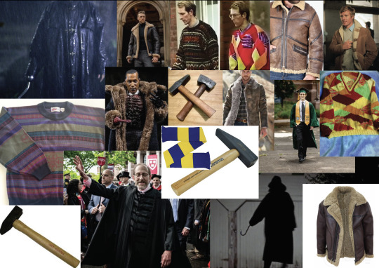
Costume ideas Mood Board
I envisage the costume as drawing from elements of slasher film villains combined with some kiwi influences. The non-descript silhouette of killers like the guy from I Know What You Did Last Summer are appealing because that shapelessness puts the imagination filling the blanks of what exactly might lurk beneath. Given the University/student aspect of the narrative, I thought that a graduation gown would serve a similar purpose. As a corpse, he was at one time buried at his funeral, his final attire lovingly and thoughtfully chosen by is grieving mother. Wide collared sheepskin jacket is a nod to his farming roots, also popular during the 60s. Beyond that it adds some interesting shapes to the basic value/colour palette of the outfit. The David Bain-inspired jersey is a nod to the character's formerly dorkish nature, hand-knitted by a relative and quintessentially Dunedin. The layering effect of these 3 items of clothing is deliberate, as the bulk of his attire is earthy/neutral in tone. OThe overall intention of this is to draw the eye to his face, which is basically the only bright colouration to the design. I am toying with the idea of flared/bell-bottom pants to help orient the character in time, however I'm not sure whether this would be too cool for a country bumpkin.
The Mason's Hammer is subject to change (if I stumble across a more interesting one before this project is too far advanced) as his weapon of choice/opportunity. There is a lot of structural work/strengthening going on around the country, and Dunedin is no exception. It is within the realms of possibility that some mason inadvertently left their hammer out when they went home for the weekend.
Initial colour test
0 notes
Text

Poses using lines of Action, Skeleton, and Shapes to build up a dynamic character. This was an enjoyable exercise. I try to draw this way in general, though am guilty of skipping steps occasionally if I have a well-formed idea that I just want to get down on paper. I tried to pick references that had some dynamism to them to challenge myself. Some were pictures that I have accumulated over time, while the sports ones are from the news site i had open with my morning coffee. The 4 armed monkey stemmed from old mate's question in class about how to use the skeleton to form a character with 4 arms. Further discussions over the weekend with a friend well-versed in anatomy and medicine helped me to understand what would be required, i.e. the sculpture used in the ref image would not actually work in real life because there is no clavicle etc to hold the second set of shoulders in place.
The Pose I decided to turn into a full character:

Pencils (line of action, skeleton, shapes)
I liked the way this one turned out and it immediately made me think that instead of pulling, the paramedic might be dragging something (a body). I contemplated changing the pose so that it was the figure's left hand doing the dragging and the torso was twisted so that it is mostly the figures back showing... because I thought there was enough ambiguity in the basic shapes to suggest such a pose. In the end, it seemed more in keeping with the exercise to remain faithful to the reference pose, so I went with that.

Roughs over the top of above. Constructing these lines on several layers so that none of those that intersect touch has been a very useful process in streamlining my workflow. I have more confidence in just laying a line down and not being too concerned with its length as I can select the relevant layer and erase back to the required intersecting line (similar to my pencil/paper drawing style except I don't even need to sketch back in the portions of other lines removed by the chunkiness of the eraser head).

Brush lines over top of Roughs.

Just the Brush Lines.

With some colours (His dress sense is supposed to be super garish so I drained a lot of the saturation out of each colour)
0 notes
Text


Rodney Popcorn-Buchette: First designs and Feedback from the briefers.
Overall there was good cohesion in the team for the first final iterations of each media type. The general vibe of the brief is present in each one, with each having the bespoke spin of the platform it is intended for. I knew going into the it that the pose I had settled on for the mobile game version would probably not fly as it covered too much of the face, however I felt it was the most faithful representation of the timid-but-curious expression described in the brief and decided to submit it knowing that there was a round if revision coming up. If they didn't like it, I would change it. If that hadn't been the intention of their description then it offered a pose that was in sync with the theme, combined with the well-known expression movie goers tended to adopt when curious but scared, and I wanted to present them with with an option they perhaps hadn't considered.
The feedback highlighted something that I hadn't really taken into account, that this was for a brand, albeit fictional, and its mascot. That being the case, it is obvious that they should lean towards the design that most closely resembled the traditional Rubber Hose style of animation and the most ubiquitous iteration of that pose in the modern day (the arm -swinging power walk stance in the middle version). I was pleased that the brief providers where receptive to our additions to the character (usher uniform, singe mark to rep the lightning strike.
Reworking the designs based upon their feedback was relatively straightforward, particularly since I had no personal investment in the character/design (I wonder how it would be different if I did have a stake in the character).
For the 2nd iteration I leaned more heavily into the pen and shape tools and recreated the design using these almost exclusively (I had tried this during the 1st iteration, but used them sparingly as it soon became apparent that it was more efficient in photoshop to just draw some lines and colour fill them with the OPTION + DELETE and EXPAND SELECTION functions we had learned in class).

The Revised Designs: The consistency between the 3 media types is near total. I tried to mimic the desired pose while stripping the 3rd dimension out of it, and also removed the underside of the she (the only 3-dimensional aspect of my 1st attempt. I also put the hat on to better mirror the other 2 designs & adjusted the facial features to reflect the other 2).
The designs turned out well and I think that clients were happy with the results. One criticism that I would make, is that they don't exactly scream 'timid-but-curious', however perhaps I made too much of this element of the brief when it seems the other aspects were weighted with more importance by the briefers in effectively communicating their concept through an illustrated design.
0 notes
Text


The initial brief for Rodney Popcorn-Buchette, Initial ideas and notes from brainstorming with the team, as well as the final values study illustration. I was curious about this exercise as I have never drawn characters based on someone else's brief before and wondered about the process. The specific character of Rodney was a good challenge as I don't really draw cartoony brand mascots. I ended up with the mobile game iteration of the character. Again, this is not really in my wheelhouse, so that provided an added quirk to the brief. The group had originally discussed some Frankenstein elements like bolts and stitches (in keeping with the struck by lightning aspect of the brief). These elements made it into some the initial concept sketches, but were ultimately dropped as they didn't really add anything to the design, and possibly actually detracted from the overall intent of the character (by implying more of the Frankenstein story than the being animated by a lightning strike). The hardest part of the initial brief to interpret was the timid but curious expression. Belatedly, I settled on the peeking through the fingers look in the value iteration. I thought this was what they were going for, given the movie theatre theme, though I felt it covered too much of the character's face. The additions of the bowtie, hat, and uniform of a 50s usher helped to focus the idea that the popcorn bucket was a movie theatre popcorn bucket, and gave a certain flavor to the character that was in keeping with the retro vibe of the brief.
0 notes
Text

Value Iterations for character (Wk1): Adjusting values with photoshop was a really interesting exercise. I had in mind already the colour scheme I wanted to use for this character, but applying the values of each to the colour template were not something that I knew much about. It makes a lot of sense to do this, and it is an area I would like to explore more. There were some parts of each value iteration that I found I had attributed the wrong values to when it came time to colour (i.e. too dark/light even at max saturation). This is an area I would like to focus on for my final illustration. In the end I settled for the right-most of the 3 iterations, though the left iteration was also a contender (and could be their away game colours).

Colour Iterations for Character: I had the blue and gold colour scheme in mind from the get go (Otago), but found the process of using values to set the colours fascinating. I threw the green colour scheme in there as something different, and to get a better understanding of how thew values applied to different colours. The green was quite obnoxious so I leaned heavily into de-saturating most of the colours for this iteration. As a first real attempt as using the value system for colouring I felt the end result was relatively successful, however I would be interested in having another pass at this because when it came to colouring, I found the values I had attributed to certain areas did not reflect what I had in mind, and I ended up adjusting some the values of some areas drastically to achieve what I had intended.
0 notes
Text

Rough Sketches for Kip Killigan (Wk 1 exercise). I used the pencils as practice for quickly drawing lines with the brush tool.

The original pencil sketches. The lines came out very pale when I scanned them so I used it as an opportunity to practice the brush tool and quickly traced back over them so they were more readable on screen. The notes say: 'Rugby collars' - in reference to a subtle change to the silhouette, & 'stick a mic in front of him for context - in relation to the 2 more sombre stance leaning on the sword (the idea being a generic sports post match sports interview, giving the nod to the opponents being the better team on the day, while eulogising a teammate who was brutally slain during the match).
There are also a some other notes (not visible on scan) related to silhouette. 'Spikes on the shoulderpads?', 'gauntlet for defense arm?', 'boots should be socks', 'cape or no cape?'

The silhouettes: This helped me to understand what effect the different accessories I considered had on the overall shape of the character. All of them are fairly readable as far as the character being some kind of long-haired beefcake with a big sword. The 2 sombre stances are more vague because there is less dynamism to them, and ultimately I decided they were too bland for a one-off illustration. The spikes added some interesting shapes to the shoulder area, and without knowing the character's personality, still indicate a sense of danger (along with the sword). I felt the cape obsured too much of the character's form when viewed in silhouette (though I'd already decided to drop it for logistically reasons during an organised team deathmatch, i.e. someone would just grab it as you ran past and then you'd be dead). The guantlet takes shape in the top right image, looking at the silhouette, I decided to make it bulkier/squarer to break up the symmetry of his limbs. The rugby collar idea came about when looking at this silhouette and thinking his neck looked too exposed.
0 notes
Text

The final sketch from Wk1 (screengrab to replace poor quality photo from phone).

Final Lines: By the end of this pic I felt much more confident with the brush tool, and using it in combination with rotating the canvas. I would like to focus more on which angles allow me to draw lines in a certain direction most fluently, as a lot of time could have been saved by putting in those lines with one canvas rotation (rather than turning it a dozen times, because I was focused on one part of the drawing).
The various elements of the sketches and silhouettes came together well in the final picture. In hindsight I would either simplify the torn material around the shoulder spikes or lose them entirely, as they caused delays during the value iterations and final colouring due to their tips often not being an entire pixel wide. The gauntlet was inspired y ice hockey goalie pads, and I like the overall shape, a few random lines and curves to denote use/wear would have helped to define the material it is constructed from. I like the rugby collar, but think there is scope for increasing its size even further.
0 notes
Text
Group Character Brief Exercise (Pt. 1): Rodney Popcorn-Buchette
This was an interesting exercise, as it leaned into one of the takeaways I would like to achieve from the elective - designing characters for other people. Coupled with the challenges of working in a team, I found it to be a useful lesson. The team worked well together and I think everyone contributed to designing our 'Sir Garish' brief well, bouncing ideas and building upon the concepts the other members shared. The same can be said for working on 'Rodney Popcorn-Buchette'. The commissioning team provided a tight brief which was easy to follow and interpret. The biggest challenges of the exercise were the tight time-frame and not sitting down with the commissioning team to further nail down what they were looking for.
0 notes
Text
What I want to get from Digital Character Illustration (Wk 2 update):
Having worked through the sketch iterations, I stumbled across something else I hope to get out of the course. How & when to use digital, and when to stick with pencil and paper in order to maximise my productivity and minimise replication of images. I.e. I think my sketch iterations could have been done a lot quicker if I had done the subsequent iterations digitally. There are elements of the character that are basically the same in multiple iterations or could be for this early stage of the design process, e.g. the cape flapping in the wind could just be a copy paste job between iterations rather than redrawing it each time. The folds and flaps are not set in stone at this point, so there is little need for them to be different between iterations. LIkewise, the face would be much the same between several of the images (with the exception of shading/highlights), so that is another area I would look to copy paste the sketch image, fine tuning it in the final design to get the expression right).
0 notes
Text

Final Sketch and Silhouette:
5. (impossible to see in this shonky pic from my phone) Dynamic charge, captures movement, limb positions & sword make for an interesting silhouette. The body is too hunched over though and obscures a lot of the torso. Sword is at too low of an angle.
Final: Modifications to #5 and I am happy with the pose/silhouette. Torso more upright, Off-arm pulled out from body. Angle to bent leg creates negative space between the 2 limbs. Sword higher than head, Flows toward same vanishing point as hair.
Once I had a better concept of what the body was doing in the illustration it became easier to add the detail to his uniform as the correct perspective to the shapes became more apparent - Guard/shield for off-arm, Spikes on shoulder pads. Number on jersey, team logo. Ditched the cape from the initial character sketches. Added the up-turned collar, because that's just what sports people do.
0 notes