
Statistics
We looked inside some of the posts by digital-diary-hope and here's what we found interesting.
Average Info
Notes Per Post
0
Likes Per Post
0
Reblog Per Post
0
Reply Per Post
0
Time Between Posts
2 days
Number of Posts By Type
Text
16
Last Seen Tumblr Blogs


Fun Fact
China blocked Tumblr because of pornography and censorship problems in 2013.
Text
My evaluation of my own project
I honestly found this project really difficult.
More and more I’m discovering that I’m not fit to be a designer or at least the education side of what it takes to get a design degree. I’m a very ‘flat’ thinker as one might say, which is why assessment work is really difficult for me, because I don’t plan, I don’t normally research unless there’s a variable I don’t know and i don’t sketch before hand. I kind of just start, that’s my general process, and I change things later if they don’t look right but I can never really sketch because i need to see the full picture before I can recognise errors. So naturally with the time constraints we were given because of the term adjustments due to the pandemic, this was very difficult for me. (among other reasons)
I like how my project turned out, but because I’m so nitpicky I know theres a lot more I could’ve done, but it would honestly take me too long to complete and with a deadline, it’s just not going to happen so despite liking what I’m presenting, I’m also disappointed that I ran out of time to actually put my full 100% into the project.
I also found work-booking really hard, naturally, because none of the processes we really learnt were very helpful to how i design (because we all have different paths in design and I guess I wasn’t really suited for this one, if I’m suited for any)
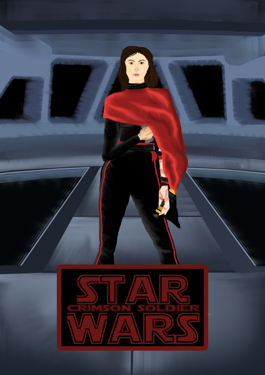
This is how my final design turned out and I like it. I used the proper star wars font in the title and utilised that star wars colours, as well as drawing inspiration from an actual star wars set for the background. But like I said, there’s obviously more I could’ve done had this been less about the workbook and more about the final drawing and had we had more time to actually develop our own style, but unfortunately we didn’t. Good news is that now I have a drawing I can practice on in my own time.
I also don’t think it helped that my photoshop somehow broke and wouldn’t let me have a pointed ended brush, just round, no matter what settings I changed.
below is my feedback on online learning (I’ve used a similar one on the other projects we did over this time because I feel it’s important to voice my opinion on the subject)
Overall I felt that online learning had a massive affect on my motivation to complete this project. Being in my room in front of my computer all day everyday was really negative and had a huge impact on my general mental health (something I feel wasn’t taken into consideration when it came to structuring the day/week) my advice for if this situation happens again would to be to drastically relax both the class times and the marking schedule to allow for time for students to leave their room and go on a walk outside, as well as being able to get actual exercise during the day. While the argument is there that ‘we finish at 5 thats enough time to go on a walk’ it would’ve been had this situation happened in summer, but unfortunately it happened while we were transitioning into winter where it gets dark at 5:30
(this is by no means directed as an insult to your teaching as I understand you tried your best with the circumstances, it’s just something to consider incase there’s a staff meeting about how online learning went because we haven’t been asked to submit any feedback about this situation so I have nowhere else to put it)
0 notes
Text
Checking the value of my drawing
It was either the first or second week of our study that we looked into the value of an image. So, I wanted to check how mine looked in black and white before I submitted it.

Off the top of my head I remembered that it was important that the foreground was darker than the rest, which i think is visible in my drawing, aside from the face which is obviously going to be light because she’s pale. I don’t think that it loses its impact when put into black and white either.
0 notes
Text
Full backstory
It is the middle of the war between the resistance and the First order and Snoke has decided to despence his most recent force trainee Cora Warrshri to lead the first order alongside general Hux and Kylo Ren. Cora Warrshri was a young childhood friend of Kylo Ren, but was taken from her home as a young child when Snoke discovered she was Force sensitive and since then had been meticulously trained under his guidance to become a powerful and stone cold killer, able to execute his orders within the first order swiftly.
Cora has basically taken over control of the finalizer from Kylo as he starts to neglect his duty more and more as he begins to search for Rey in order to execute her. Cora trains her skills daily and constantly strives to improve her craft as a sith.
Cora has a long burn up her left arm, her dominant arm. This is due to they Khyber crystal she built into her saber. Many new Sith elected for artificial Khyber crystals in their lightsabers due to the rarity of Khyber crystals. But as part of her training Snoke had sent her with no resources to Tatooine to search for her own Khyber crystal and turn it to the dark side. The process of crushing and bleeding her Khyber crystal caused sparks and flames to engulf her arm as the crystal fought against being turned to the dark side. Cora like to believe that the harsh burn connects her closer to the crystal and uses the memory of the pain to enhance her fighting style and draws on the memory for adrenaline in a fight.
0 notes
Text
The decision on title positioning
I was really struggling to finish my drawing, i needed to add a title into my piece so I made the decision to put the title over the top of where the feet would be, because I just couldn’t make the feet look right and I’d been trying for an hour to do it, but it just wasn't working.
It worked out well because when I added the star wars font ontop of where the feet would be, I’d already made some really struggled attempts to complete the face, another aspect of the drawing I was struggling with and it boiled down to it being one or the other.
The font on its own, without a solid background was actually really difficult to read, so putting a clone wars style rectangle behind it looked really good.


0 notes
Text
Changing the positions of parts
Mid way through drawing my character I realised I needed to make her a bit more unique when it came to weapon choice. The main characters of star wars have different weapons that are unique to their character. For example, Kylo ren has a crossguard on his lightsaber, which make it unique to him.

It becomes a weapon that is unique to his character and recognisable without being attached to the character, and i needed something like that. Especially when even the sub characters have different lightsabers. Like darth maul with a duel bladed lightsaber, which then is further adapted by the inquisators and unique to both characters.
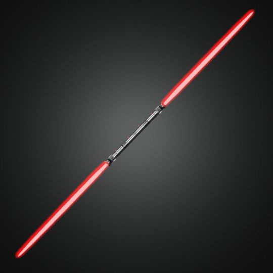

So I decided to give my character a unique side weapon, as well as the classic lightsaber that most force sensitive users will have.
I tried to come up with something that wasn’t already in the star wars universe as a lightsaber. and in my research I came upon the decision to give her a light-dagger (a smaller dagger sized lightsaber) which would be her side weapon and also utilised in combat.
I wanted to add a bit of attention to this specialised weapon that she’ll carry, so I decided to change the position of her arm. I decided to move her arm so that the dagger will be in front of her chest, drawing in the eye as it will be central in the poster and therefore hopefully become connected with her character as it’s special to her.

You can see where I’d originally drawn the arm to be, and then where I’ve changed it to.
0 notes
Text
Drawing figures
I’m not very good at drawing figures, so when we did this in class I was really slow as it was hard not to try and be a perfectionist. I tried my best to go over a few images of myself that I had previously used in a photography project ( i don’t feel comfortable sharing them here as they aren’t super appropriate)

I only managed to do 2 during the time we were given, but I tried to make them look really good (i added a bit of focus into the arms, and showing where muscles would be as I think it makes the character more realistic.
The first figure was a bit easier, as it was kind of basic and I used to draw similar figures when I did sculpture in high school so it was something I was familiar with. However the second image was really tough, definitely a position that would be easy to mess up when drawing.
0 notes
Text
An example of my painting style
How I draw my images to me seems quite simple. It’s an easy quick way of blending things together that gives all the natural colours I need in an image.
For instance, here is an image of the burn on her arm before I’ve blended it.
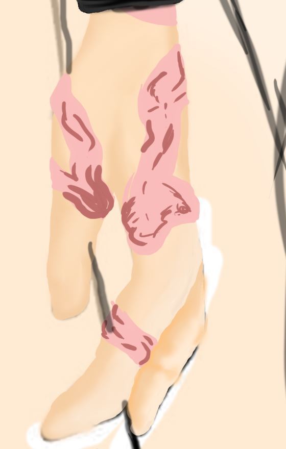
As you can see, the burn consists of a highlight colour and a shadow colour. This is before I blended the burn together and you can see it’s rough, with hard lines and hardly any mixing together.
In order to move on with my image I use the mixer brush (possibly one of my favourite tools. I use the eye dropper to pick the darker colour (and then lighten it a bit in the colour wheel so that its a mid colour between the light and dark .

This is how it looks once its blended, I like it, I think it looks much more natural and realistic as well as shows that it has depth and isn't all flat.
0 notes
Text
Background inspiration

For the background of my drawing I wanted it to be an area that would be familier to my character. Which would be the cockpit of one of the first order ships (specifically the finaliser which is the lead ship within the first order) This designhas been around since the original star wars trilogy, and hardly changed throughout all the the sequals so it made sense for me to use it as the background of my image. I chose to make the windows a bit rounder and I also chose to give it a slight (very slight) blue tint to the grey.

As you can see, I gave a blueish tint to the grey areas, It’s roughly done, as it’s not the main focus of the image, I tried to make the metal look metal-like if that makes sense.
I personally like how this background turned out, even though it’s not the cleanest image in the world.
I tried to round off some of the window in the background, the images I used as a reference already had swooping curves to them as well as some harsh lines. This works really well for my character as if read into it shows off my characters hard exterior, by having sharp lines and corners close to the front and then rounder more swooping curves closer to the back of the image, which references how she is good deep down but tries to keep it hidden.
I used the same painting style I do with most of my images, but used the lasso tool when I needed straight lines for different shapes. I started by using solid colours and then adding in a darker solid colour where I need it. Before going over the whole thing with the mixer brush, in order to get it looking more natural.
0 notes
Text
Character mood board/inspo

I definitely want to focus on those contrasting colours of red and black and blue (as she has a pull to the light)
I think the red and back are very dynamic colours together and are super recognisable within the star was universe, so they’ll be a very important part of the character as they’ll tie her into the universe and show where her allegiance lies within the story.
0 notes
Text
Character Questions
These are pretty basic and rough, I’m trying to not go into too much depth cause I’ll get carried away and the main info will be lost.


0 notes
Text
Week 4: Bad cause I’ve been unwell
Coming up with a character brief for my final character:
Refining my brief down to around 100 words is really difficult for me, as I’m a writer and i like to flesh things out and fully go for it.
I knew that I would really only be able to refine it down once so thats what I aimed to do and this is what I came up with.
To preface this.. I’m a massive star wars nerd and this is an OC set during the most recent sequels to the original star wars movies.
Cora Warrshri is a prodigy, extremely gifted in the ways of the force, taken to the dark side at a young age after her capabilities were seen by Snoke. He trained her mercilessly for 18 years, perfecting her combat skills to make her the ultimate killing machine. She’s dispensed to the finalizer to lead alongside kylo ren. Trained to be stone cold she keeps up an emotionless facade as she rules, but behind closed doors she battles with her emotions and the guilt she feels after she carries out kill order after kill order under Snokes dictatorship.
Cora wants more than anything to escape the first order and find a way home to her parents, if they’re still alive, but desertion means death and that’s not a risk she’s willing to take.
I understand that this is a super basic and I hope that coming up with an OC, within a pre-created world is okay. I’m just obsessed with this universe and can come up with a lot of stuff for my character in the short time frame we have.
I’m going to complete the character brief by answering those character questions we were given and creating her list of attributes.
I’ve already started working on her character design so I’m going to start documenting the process.
0 notes
Text
Focus points
Silhouette / Shapes and Proportions
Shading / brushwork / texture
Backstory
Posture / Gesture / Pose
Value and Colour
Composition
Expression
Line
Simplification
Perspective
This is in order of what I feel I want to work on most, to least, based on the direction I want to take my illustration, as it is a hobby. The three main points are bold
0 notes
Text
Week 3: Character studies
This week on Tuesday we started a character study in groups. My group was given the character ‘Amethyst’ who we knew absolutely nothing about. It was quite a difficult task for us to be honest, not only were we not able to research things effectively as a team, but it was super hard cause it seems that the character we were given has a lot of niche aspects to them and it really felt like we needed to know a lot about the character in order to complete it.
We ended up trying to just get the very basic aspects of the character and not go into too much depth. We then split off for a bit to go and do our singular tasks, before coming back together to finalise everything. This is what we ended up doing as a team.


0 notes
Text
Week 2: Design from a brief
This week we split off into smaller groups to create a brief for a character. Once this was completed we handed it in and received a brief from another group for us to complete.
My group got a brief for a character called Elpy. This character was a bubbly cacti/succulent that had a consciousness and lived in a greenhouse with other conscious plants.
This task was quite tough at first, because the brief was really broad and didn’t really give us too much to go off of and left us with a lot of questions. But as a team we decided on a general direction and went on from there.
Of the three illustration types we were given, I chose to draw the mobile gaming type to draw, because it’s a style I’ve never looked into before and I want to learn more about other styles outside of my own style.

This is what I managed to draw in the alloted time. I ried to make it simple so that it could be recognised even when shrunk down. I drew it on a square because it could then be used as the app icon as well. I think it turned out pretty well. I’m not very good at drawing hard lines on my drawings so that was quite tough for me and although the lines aren’t perfect, I think they turned out pretty well.
I chose a softer colour scheme because I wanted the character to appear soft, like the brief described. I felt if I went much darker with the colours it might come off too hard and rough and a bit more threatening.

This was the final designs of our group, the two on the end were added in later as they didn’t make the meeting where we were given a brief. Hanna, who created the middle drawing, couldn’t make it to the afternoon meeting where we went over colour schemes and stuff. And I really think you can tell that James and I had that extra bit of communication, because out drawings are quite similar when it comes to style and colour.
I found working in a group over Microsoft teams really difficult, quite awkward, and felt like i didn’t get everything I wanted to get done completed. It’s quite hard to communicate effectively in a group over the web when you haven’t had that in person chat, because you can’t bounce ideas off each other effectively. I think the others in my team agreed with this because we all really struggled with that aspect.
It’s also tough because it means I have to be depleting my wifi all day in order to keep that line of communication open, which isn’t always possible because I’m not the only person who needs to be using my network.
0 notes
Text
Week 1 - Reflection
My thoughts on this week:
I think this week went very well for me, although I may not have enjoyed the first task we did, I quite liked doing the task we did this thursday on values.

I chose not to blend mine, but even on its own it’s quite a cool art technique that looks quite effective to the eye. It was a good task for me in terms of learning to simplify my digital drawings, a little goes a long way? in a sense. I honestly really like how mine turned out, and even though it’s not something I’ll use in my final copy, It’s something quite interesting that I could look into doing in my spare time.
Surprisingly I felt like I learnt a lot from it, even though the idea and process of making it itself is quite simple, it showed me how effective it is to make changes between light and dark, and how you should build things up from a simple base.
0 notes
Text
Week 1 - 28/04/2020
Introductory business, we met Toby and also created our blogs (which is what you’re seeing here now.) We also started doing some work on our own character design/rough character design.
We also did a small focus on solid line drawing (this is something I’m not super interested in, and find really difficult cause of my art style. I decided to do something very easy to just get the task completed for the workbook.
I present to you
Jason the Jack-o-Lantern

The above png shows the process of making the pumpkin (which I liked until I destroyed it by adding eyes, but oh well. He is complete, and unique in appearance.
I really wanted to dive right into the design aspect and start coming up with an OC and creating a back story to go around that.
I’ve done a bit of digital illustration and character design before so I wanted to get a start straight away because generally my style of art takes a bit longer as I try to make things that look a bit realistic if possible.
0 notes