
Don't wanna be here? Send us removal request.
Statistics
We looked inside some of the posts by digitalcreativitydanihaynes and here's what we found interesting.
Average Info
Notes Per Post
0
Likes Per Post
0
Reblog Per Post
0
Reply Per Post
0
Time Between Posts
6 days
Number of Posts By Type
Text
1
Photo
13
Video
3
Last Seen Tumblr Blogs


Fun Fact
In 2020, 44% of users from Denmark used Tumblr daily.
Text
Space Evaluation
Danielle Haynes
629316
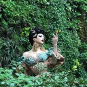
For this brief we had to create an interactive piece that would be displayed at the end of the year show. The theme we was given was Space. When I first got given this brief I had no idea what I was going to create. The first things that popped in my head was planets, stars, galaxy. However, when doing my research I started to find things that I would have never thought of, such as, negative space, space organisation, space themed baking and more. Once I created a mood board of all the things I took an interest in, I then looked into everything I placed on the board and picked two things I took the most interest in. I have always found Zodiac Signs interesting and I decided to chose Stars as well because I find them pretty and had a few visions on how I can use their brightness and twinkling in some of ideas.
*picture of stars and zodiac signs*
Once I figured out the two space themed categories I wanted to look further into. I then started to sketch and come up with some concepts. I created a couple of ideas as I did have some in mind but as I got sketching more ideas came to me. I originally had my mind on making an app but as time went on I realised I could do some more out of my comfort zone.
*picture of my sketches*
The first sketch, I was inspired by the large interactive board at We the Curious, which was inspired by all the famous things and sayings that forms Bristol.
*picture from We the Curious*
So, I thought about having a large Arduino board that is placed in a dark room to give more of the space effect. On the board would be tons of twinkling stars and people can go up to it and press on the stars to reveal the zodiac signs that will be within all over the board. I would have placed sound like a twinkle sound just to make it more interesting just like the one from We the Curious. I thought this would be a really nice and calming piece. I would want that area to be quiet because I feel like it would add to the space atmosphere. Even though, I love this idea and think if I could create it how I wanted it to look, it would work really well. However, I do not have much experience with Arduino and felt that it looked very complicated for me to learn. If I had more time I could have learned the function and really got the grips of it but because we only had a few weeks I did not want to take the risk. For my second design, I had a similar concept as the first but I will create it in Animate CC and it will be displayed on a screen, which you can click on the buttons that will be labelled with each star sign and it will reveal the zodiac signs on the screen instead of touching the screen to reveal the signs. My third idea was to create a calming zodiac sign app. The reason why I say ‘calming’ is because I had the idea of using muted colours for the colour scheme as I feel like they are very calming and subtle. The app will give information on each zodiac sign and will help you gain knowledge. You could also compare with friends and family. I also had the idea of creating a mini game/ quiz, where you will be asked multiple questions, it will be multiple choice answers and due to the answers you picked it will reveal the star sign you should be and see if your actual star sign and what the app gave you matches. I just thought it would be an extra fun feature to the app. My final idea was having a display where people can experience by walking through. So I thought again this display can be in a dark or dimmed room with fairy lights dangling from the ceiling and continue to just above the floor. The fair lights will resemble the small stars that twinkle because there is a setting on fair lights where they can slowly fade in and out of light and I thought that would be perfect and then I would create various sized stars out of paper in the sense of origami and have them within the fairy lights so that the light shines through. I thought this idea people can interact by walking through, taking pictures and videos. Out of all my ideas I went with design two because I felt that it was the most manageable for me and I had a clear idea how I was going to create it.
So when I made my decision with that, I then looked into different types on star designs. I really liked the look of these stars…
*picture of stars*
… but with that being said I also really like this print I found…
*picture of the multicoloured star print*
… what I like about this is how it still has a black background with the tiny white stars but also has pop of colour from the coloured stars. I feel this design makes it look more interesting because it is different to a normal star background but it does not look too strange, it still has normal features within the background. Once I was set with my decision, I then went ahead and created a twinkling black background for the base of my display. I formed the background using Photoshop. I was very pleased with the final outcome when I completed it because I was not expecting it to turn out the way it did. To create the background I followed a YouTube video. After that I moved on to creating the individual coloured stars. I decided to keep the colours somewhere in between bright but muted because I felt like if they were too bright they would have clashed with the other features that was going to be added to the display. I decided to add different styles of stars instead of sticking to one style because I took inspiration from the print I found while doing my research and even though I liked a certain style that gave a retro feel, by adding all the different ones and using that colour scheme made it look more interesting and experimental.
*picture of my background with the buttons*
When I had completed the background I moved on to creating the buttons. For the buttons I decided to keep them circular to look like planets. I used different colours because I felt that it brought character to the video and helped tie in the multicoloured stars as well. When I was happy with the colours and positioning, I then moved onto making the buttons interactive. So I first made the buttons ‘highlight’, so what I mean b y that is, when you hover your mouse on the circle it changes shade so that you as a viewer know it does something. I done that to all of them using a tween. From there I started to add my star signs and getting the buttons to function properly. I did have a few struggles with this, I originally had it so that when you click on a button it reveals the sign and then when you click on it again it hides it but I included a reset button so I could not have that anymore because when I clicked the reset button and clicked on a star sign button it would not reveal again due to the code I chosen. So I went through and changed all the code and it now works perfectly.
*picture of my display with type on the buttons*
For the type I wanted it to look modern but still slightly retro because the background I created looked more retro but did want to make sure that it still looked modern. I am really pleased with this font as I feel that it delivers both, retro and modern.
*pictures of my final outcome*
Overall, I am very pleased with how my final piece turned out. I feel that it looks how I envisioned it to look and I am glad that all the code works as it did take me some time to understand it and get the right one that works best for my piece. However, if I was to work on it more, I would defiantly experiment with making the star signs the same colour as the buttons so that people know exactly what sign goes with what button. This will make it more consistent and clear to the viewer but I don’t know if that would be too much colour and make it look messy and too busy. I wouldn’t know until I tried it. This project was very challenging for me, especially the coding side of this project but I feel like all the time and effort I put into this piece really payed off and I am really delighted with how this final piece formed.
0 notes
Photo


This was my favourite piece there. It was an interactive wall that had things on it that replicates Bristol. I loved the bright coloured houses that Bristol is known for. It also had sound that says Bristolian words.
I just found it very interesting and it gave me an inspiration for my Space Idea.
0 notes
Video
tumblr
This is just a clip of when we went to We The Curious for a trip.
0 notes
Photo

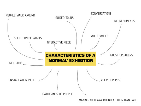
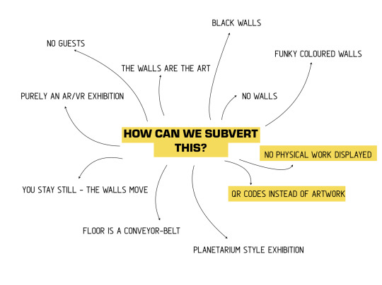


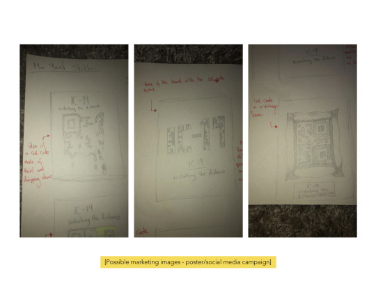
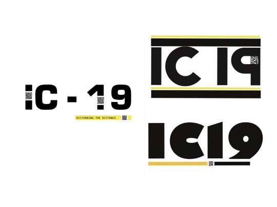
*MINI BRIEF FINAL OUTCOME*
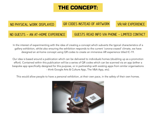
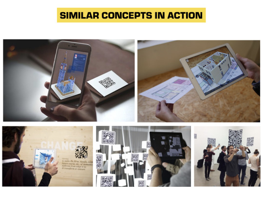
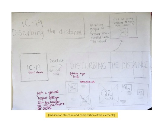
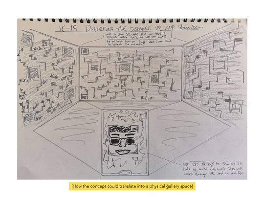
So me, Jess, Gareth and Samira came up with the idea of having a gallery that has no artwork in and you would have to use a QR Code to access the piece and information about it.
The logo we all wanted to keep it simple but wanted it to stand out. So we used the yellow against the black to really make it stand out and also include a QR Code within the type and I feel like this really shows what our idea is about and it gives it interest as well.
0 notes
Photo

*MINI BRIEF*
These are some sketches I created for the Mini Brief that was set.
0 notes
Video
tumblr
*The Final Outcome*
This is the final piece, I am very pleased with how it turned out. I did have a few struggles with this but finally got there.
This is a screen recording of it because I cannot upload the file on Tumblr.
0 notes
Photo


While creating my code for the buttons, I had a few issue but I managed to solve the problems and now it works fine.
0 notes
Photo
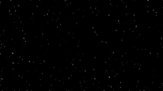
To start my design I wanted to create a background that twinkles all the time as I thought it would be a nice touch and will make the display more interesting. Rather than having nothing moving at all. I created this background in Photoshop. This image does twinkle on a loop in the video but this is just a screenshot as I did not have an animated version.
This background was simple but so effective and I am really happy with how it turned out.
0 notes
Photo

For my design I wanted to go with the stars that looked more retro but I really liked the black background with white and different coloured stars.
0 notes
Photo

I decided to go with the second idea which was the interactive display created in Animate CC because I was not too confident with using Arduino and understood Animate CC more.
Once, I made my decision, I then started to sketch some variations of how I wanted my display to look like and where I wanted my buttons to be.
Layout 1 - I felt that it looked unbalanced. The buttons was all on one side and it looked heavy.
Layout 2 - I did not like the gap that was created and felt that the buttons positioning looked awkward in a way.
Layout 3 - I felt that is one looked the best and all the buttons looked well balanced and equal.
Layout 4 - I liked this layout, however I felt it looked boring and simple.
Layout 5 - I really don't like this layout. Again the buttons look awkward and unbalanced.
0 notes
Photo


When I realised what I took an interest in, I then moved on to creating some designs.
The first one I came up with this big Arduino board full of stars which will be placed in a dark room to allow set the aesthetic of space. This display would allow people to come up and press buttons to reveal Star Signs.
The second idea is similar to the first but it would not be functioned by Arduino, I would create an interactive piece with Animate CC. It will have buttons labelled with each zodiac sign and people and play around with it and interact with the piece that way.
The third idea was that in a dark or timed room there will be loads of dangling fairy lights with big glowing stars and people can walk through and take pictures or videos.
My final idea was to create a calming zodiac sign app, where people can go to their zodiac sign and see what their sign is about or their friends and they can compare.
0 notes
Photo

I realised I had a main focus on Stars and Star Signs. I felt that I could find some fun and interesting facts about all the different star signs and for Stars I felt that they look pretty against a black background and though of for a display it would be a nice interactive piece that people can take pictures with.
0 notes
Photo

When we first got given the I had no idea what I was going to do because Space could literally mean anything. However, I decided to create a mood board of all the things I thought I could do or what I took an interest in.
I have things like space make-up, space buns (hairstyle), planets, stars, star signs, baking that include space theme into it, the galaxy (I really liked the texture and colours), negative space and lastly space in terms of organising your space.
0 notes
Video
tumblr


*The Final Outcome*
The top video is a screen recording of my final outcome. I decided to screen record it because when I finally managed to export it, the video at the start was not long enough. So when you pressed play the robot would explode immediately and you would not have seen the face.
The second two images is evidence that I tried to add an interactive click to my robot. I wanted there to be a click so that when you click on the robot, it would explode. However, the code just was not working for me. I could not find a code that would achieve the results I wanted as I was following a YouTube tutorial and what the person what telling me to do, I would not have got the effect I needed.
0 notes
Photo


After making my mood board, I picked out some of the colour schemed I liked. I like the traditional look of a robot, which is just different shades of greys but I also really liked the muted colours like the sage green, dusky pinks and the muted mustard. I felt that this colour scheme gives the robot a more modern look but also makes it look old.
I still decided to add both colour schemes to my robot but I defiantly preferred the muted green over the grey.
0 notes
Photo

I created a mood board to help me design my robot sketches and also to give me inspiration for colour schemes.
0 notes
Photo
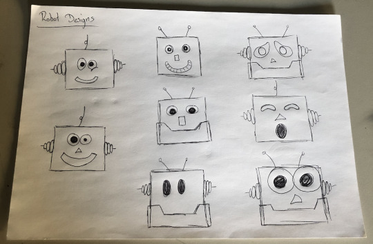
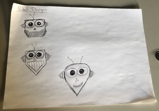
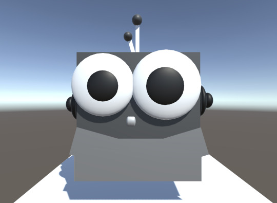
I then moved onto looking into how I wanted my little robot to look like. I knew that I wanted it to look cute so that when the viewer first sees the robot they go ‘Awww’ or ‘Cute’ so that when it does exploded it will be more shocking?
So when I first stared designing it (first image) I was kind of playing around with the eyes and mouth, trying to create a cute look but I felt that it wasn't working so I tried making the eyes bigger to make it look ‘cute’ and I felt that doing that helped a lot.
0 notes