
Don't wanna be here? Send us removal request.
Statistics
We looked inside some of the posts by digitalmediayear2-2 and here's what we found interesting.
Average Info
Notes Per Post
6
Likes Per Post
0
Reblog Per Post
6
Reply Per Post
0
Time Between Posts
5 hours
Number of Posts By Type
Text
17
Last Seen Tumblr Blogs


Fun Fact
28.6 is the average number of monthly visits per US mobile user.
Text
Evaluation
For the team project, we created an app, animation and social media campaign to promote BBC Radio 4’s Podcasts. We wanted to improve the way people got to their podcasts by creating an app where they could easily access them. We found out that Radio 4’s problem isn’t their podcasts, it was just how people actually got to them. Their podcasts are popular on other podcast sites but not on the BBC’s own site. Because of this, we decided to create an app with an animation that would be posted on social media. We also wanted to target our demographic of 16-34-year olds better by improving BBC Radio 4’s social media. To do this we wanted to create better content for their twitter as well as creating Instagram and Snapchat accounts for them where they would post regular content and stories.
To start the project, I created the app using the colours and fonts decided by the team. I think the final outcome for the app is really good as it flows really nicely and has everything you expect to be in a podcast app. I think the gradient background works really well too. After feedback from the presentation, I changed the background for the app as it wasn’t complaint with the contrast checker. I changed the colour to a different darker blue which would be better for accessibility. Overall, I really enjoyed making the app and making sure it suited our 16-34-year-old demographic. If I were to create the app again, I would make more pages so that when we created the Adobe XD part you could fully use every part of the app.
The animation was created by Josh which I think is really good. It started off in black and white which represents the old BBC when it was first created. It then changed to full colour when the app is introduced. I think if we were to create the animation again, we could change the voiceover so that the narrative is different. Other than that, I think the animation targets our demographic really well and it could be something that you would see on social media.
The last thing that was created was the social media adverts which were created by Holly. I think the outcome of this was good as you could clearly see how the ads would be portrayed on Snapchat and Instagram stories. If we were to create the social media adverts again, I would create an Instagram post advert that people could see whilst scrolling through their feed. I think it would be good if we created a few different types too so that they could be posted multiple times. To improve the Snapchat advert, I think we could create a few different ones with various celebrities so that we could show how we would appeal to lots of our demographic.
Overall, I enjoyed doing this project as I think our team worked really well with each other and we understood what we wanted to create and how we wanted it to look. Everyone remembered about the stylesheet which meant that everything could look the same and people would know whose ad it was before they saw the name. I think our outcomes were really good as they looked professional and all along the same theme.
0 notes
Text
Presentation Improvements
From our feedback, our group decided to change a few things on our presentation to improve it.
The first thing we did was take our the storyboard as it didn't fit in with the theme or look of our presentation - it was also not needed.
We then changed our personas so that we could make it look like the theme we had.

We then put the answers to our survey into a graph which meant it would be easier for people to take in the data.

1 note
·
View note
Text
App Improvements
After doing our presentation, we decided to improve some things that people said we could do to make our outcomes better.
Below are some screenshots where I colour checked our background -
To do this I found an app called ‘No Coffee simulator’. This app let me change how someone would view our app depending on different things. I decided to change the colour deficiency option so I could see what our app looked like in different ways.

This is the no colour version called Achromatopsia -

This is the Deuteranopia version -

I then colour checked our background font colour. It didn't pass the colour check so I changed the colour of our blue to a darker one which passed -

I then changed the colour of our background on the app -

1 note
·
View note
Text
Feedback
Below is the feedback for the other group’s presentations -
Lucas, Tara, Miles - BBC One
- Running order super useful
- Need an edge to your presentation as things are too far at the bottom/top
- Looked at competitors
- There's a lot of text
- Good use of stats
- Text on some pages is too small to read
- Surveys - in-depth to see where the BBC goes wrong
- In-depth use of Adobe XD - understand what they are doing clearly
- Think about text size, make sure everyone can read it as some text used is too small
- The image within the image is really good
- The moving image part is good
Ewan, Justin, Jack - BBC Radio 4
- Talked and understood the BBC/ what their values are
- Good use and understanding of stats
- Understood where the problem is - the age of the hot compared to the audience
- Looked into the people behind the BBC and how they affect the age of audience
- I like the use of social media and how they have a use of video to thoroughly show you what the social media would be like
- Good use of marvel
- Use of comments - Sense of community
- Like the conclusion - wrapped up nicely
Bonnie, Izzy, Sophie - BBC One
- Understood the brief
- Running order
- Research the dents before making your own
- Good use of videos to show research
- Sitemaps to fully understand where each option goes
- Fully showed what you wanted each part of the website to do in the video
- Used stats to back up what you’re saying
- Talked about what they would do next and what went well
Jordan, Finn, James - BBC One
- Like the introduction
- Looked at what went wrong in last presentation - changed to make it better
- Like the timeline of what each person did throughout the project
- Looked into other brands / social media
- Digestible social media / content
- Looked into social media’s target audience and the audience they actually have
- Like the logo design development
- In-depth research
- Like the video - selection page
0 notes
Text
Presentation
For our final presentation, we created it in Indesign. Below are some screenshots from the presentation -


I think our presentation went well as we said everything we wanted to say about everything we created. I also think people liked our outcomes as they look similar to each other which means that you know who the ad is from before you see the logo.
The feedback we got -
I like how the slides have the same colour scheme throughout
Like the research journey
The animation was colourful, exciting, good length of time
Good soundtrack
A strong social media campaign
I felt like I was following a narrative with the research - well structured
Colour check the blue background as some people may not be able to see them
Change the persona images to match the style of everything else within the presentation
1 note
·
View note
Text
Social Media Campaign
This is the Snapchat social media advert that Holly created -
youtube
Holly also created this Instagram advert -
youtube
0 notes
Text
Final Animation
Below is the video for the final animation advert that Josh created using the app and the drawn assets
youtube
1 note
·
View note
Text
Final App
Below are screenshots of the final app. I’m really happy with the outcome of this as I think it looks really easy to use and something that the BBC could produce.
This is the Homepage -

This is the live page -

As you can see on this page, the live button at the bottom is darker than the rest so that you know which page you are on.
This is the library page -

This is the Browse page -

This is the Search page -

This is the Podcast page -

1 note
·
View note
Text
Presentation Tips
12 Tips for a powerful presentation
1. Your presentation is part of your brand
2. Know your subject
3. Tell a story
4. Say what you’re going to say before you say it
5. Include full-screen imagery
6. Be bold - give stats meanings
7. Give your presentation a meaningful title
8. End the presentation with “thank you any questions?”
9. Your audience wants you to do well
10. If someone is yawning, it doesn't necessarily mean they are bored
11. Show enthusiasm and passion
12. Plan, prepare and practice

0 notes
Text
Colour Checking
Following the accessibility keynote, we decided to check our colours on the colour contrast checker.
Below is the blue background colour with the white text, as you can see it says no in all of the boxes.

We then tried to change the blue background colour and got most boxes to say yes.

We then tried our grey bar colour and white text and it also said mostly yes.

Lastly, we tried to change the colour of our text rather than the blue background colour and got nearly all yes.

1 note
·
View note
Text
Accessibility and Inclusive Design
Accessibility - The qualities that jake an experience open to all
Inclusive design - The design of an environment so that it can be accessed and used by as many people as possible, regardless of age, gender and disability.
When it comes to people, there no such thing as ‘normal’ - Microsoft design inclusive toolkit.

Unconscious biases are social stereotypes about certain groups of people that individuals form outside their own conscious awareness.
Everyone holds unconscious beliefs about various social and identity groups, and these biases stem from one's tendency to organise social worlds by categorising.
youtube
Principles of inclusive web/app design
1. Prioritise Content - Hierarchy of content on a page. The search bar is at the top of the page
2. Consider the situation - Colours of the app in different environments
3. Be consistent - Stick to the brand guidelines so everything has the same look
4. Give control - Resize websites or zoom in on an app
5. Offer Choice - Give options on how someone can see the information you're giving them eg in a list or a grid
6. Comparable experience - Enable subtitles or captions
7. Add value - Hide or show passwords whilst typing which can be helpful

How can I make my designs more inclusive?
1. Experiment with screenreaders - Everything is read to you
2. Accessibility Guidelines - WCAG https://www.w3.org/WAI/standards-guidelines/wcag/
3. Include users with disabilities in your design process - #a11y on twitter
4. Ensure to use colours with sufficient contrast - colour contrast check
https://snook.ca/technical/colour_contrast/colour.html#fg=33FF33,bg=333333
5. Ensure that language is simple and easy to read - Hemmingway app
6. Make sure that type sizes are too small or too big
7. Mobile touch targets should be 44px by 44px as a minimum
Barclays inclusive design cheatsheet

0 notes
Text
Starting the animation
Josh started to create the animation, below are screenshots -
This is the people and the bus for the animation

Screenshots of after effects -


0 notes
Text
Storyboards
Josh created storyboards for our animation advert.
Josh created these storyboards below but after discussing it, we decided that it would be better to create an animation rather than filming and editing an advert.

Below is the final storyboard for our animation advert -
0 notes
Text
Starting the App
Below is a screenshot of the home page of our app -

After creating this, we realised that the font sizes should be bigger and we needed to add a settings icon to the front page.

This page is the live page which shows a live now podcast and a live later podcast. We decided we shoud have an edge to the images so we created a light blue one. We also think that the fonts should be bigger and that we need to put what times the podcasts are live from and to.
0 notes
Text
Sitemap
Below is the sitemap for the Radio 4 app. As you can see it’s very busy and there’s a lot of information that is not needed.

This is the sitemap for the Radio 4 website which has a lot of menus and options which makes it very complicated.
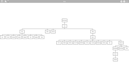
After creating these sitemaps, we created a sitemap for our app. Below is the final sitemap which is easy to use.

0 notes
Text
Wireframes
Holly created wireframes for what we wanted our app to look like. To do this, Holly looked into Spotify and Apple podcasts to see what worked well and what buttons and options we wanted on our app.
Below are the wireframes of what we want it to look like :


0 notes
Text
Backwards Engineering
To understand the Radio 4 app and website better, I drew out a rough idea of what the layout looked like.

We did this so we could see what information and images we actually needed on our app.
Doing this has enabled us to know that we don’t want it as complicated as it is now. We want to take away the menu part and have it all at the bottom so that users can easily get places they need.
0 notes