
PLEASE TAG EACH POST YOU MAKE WITH YOUR FIRST NAME AND LAST INITIAL. AND TAG IT AS #HW OR #INSPIRATION (#HW FOR ASSIGNMENTS/WORK YOU CREATE AND #INSPIRATION FOR OTHER PEOPLE'S WORK YOU FIND INSPIRATIONAL)
Don't wanna be here? Send us removal request.
Statistics
We looked inside some of the posts by digitaltoolbox1 and here's what we found interesting.
Average Info
Notes Per Post
5
Likes Per Post
2
Reblog Per Post
3
Reply Per Post
0
Time Between Posts
16 hours
Number of Posts By Type
Photo
17
Last Seen Tumblr Blogs


Fun Fact
Women make up for the other 50% of Tumblr’s audience.
Photo

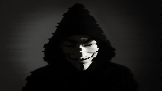
By Jose D. Munoz Vega Haiku: Cold and heavy breeze, faceless humans staring down, go by in a blink.
0 notes
Photo

by Jose Otero Haiku: The path to success Will overcome the darkness So follow the light...
1 note
·
View note
Photo

By Devan n the cold morning
we rush to make it on time
to watch the clock tick
My haiku is about how everyone is in a rush to make it to school/work, and by the time we get there, we can't wait to go back home again. I saw a music video by Coheed and Cambria called "Eraser, " in the video it had a clock and got the idea to recreate what I saw for my image. I wanted the image to feel hypnotic because it's how I see the clock everyday.
0 notes
Photo

Ariana Bodden
hw 2 collage
1: What story or message are you trying to tell through your visual elements/Why did you choose your specific design elements?
I chose these elements for my design because I feel like people have different personalities. This is my favorite idol and her album Sweet , Sexy , Savage basically says how a female or anyone in general can feel sweet and sexy and be a true savage.
2:What is the visual focal point of your composition? How do the elements of your composition draw you into the painting?
The focal point of my design will have you look at it as three people yet they’re the same with split personalities.
3:What competing focal points are there?
I want my viewers to be drawn to the calm colors of the photo, multiple of the same person. I want them to question those three words like . Am I sweet? Am I sexy? Am I about that Savage life?
4:What is in the background and foreground?
I didn’t change the background of my design because i felt like no other background or color would suite the picture.
5:How will the eye travel through this image?
I feel like the eye will be more focused on the person’s tattoos then everything else in the design.
6: What are the possible contexts for your composition?
This design can be a poster design because it was just for fun. If i knew more of how to use this software then I could've really got into depth with this project. But I had struggled on this a lot and as well as tried my best. I feel like this is decent enough for a poster.
0 notes


Photo
By Devanie Rosario

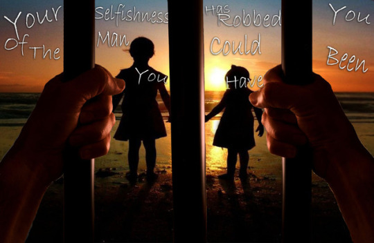
DROSA Feb.13, 2017
1. What story or message are you trying to tell through your visual elements/Why did you choose your specific design elements?
I wanted to show two different versions of the same words. I want the viewer to understand what’s going on without saying anything.
2. What is the visual focal point of your composition? How do the elements of your composition draw you into the painting?
The visual focal point are the children, and how he won’t see their future because he did something selfish and got himself arrested. The prison bars make a path way to the children.
3. What competing focal points are there?
The other focal point are the man’s hands. The pain and struggle are clearly there in his hands.
4. What is in the background and foreground?
In the background is the sunset, as is everything is coming to an end.
5. How will the eye travel through this image?
In this image, your eyes will most likely read the text first and then look at the image. I chose that font because i wanted to look as if it was someone’s handwriting.
6. What are the possible contexts for your composition?
It context could be for new fathers’, or prisoners i suppose.
1 note
·
View note
Photo
By Devanie Rosario

DROSA Feb.13, 2017
1. What story or message are you trying to tell through your visual elements/Why did you choose your specific design elements?
I wanted to show two different versions of the same words. I want the viewer to understand what’s going on without saying anything.
2. What is the visual focal point of your composition? How do the elements of your composition draw you into the painting?
The visual focal point is the woman looking at her husband, who is an astronaut, and she sees his rocket explode right in front of her eyes.
3. What competing focal points are there?
The other focal point is the woman and binocular’s lens with the explosion.
4. What is in the background and foreground?
In the background is a very mellow sky, not too dark or too bright from the sun.
5. How will the eye travel through this image?
In this image, your eyes will most likely read the text first and then look at the image. I chose that font because I wanted everyone to clearly read it
6. What are the possible contexts for your composition?
It context could be for a movie, it could be artwork in the subway, or it could be a poster in a room.
1 note
·
View note


Photo

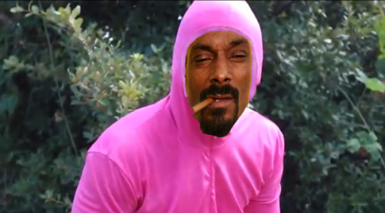
By Arian Rivera, The picture of daft punk created by an artist to look like Samuel L. Jackson and John Travolta in "Pulp Fiction" was then photoshopped by me to show the talented DJs aiming at each other in a mirror effect. The reason for me doing a mirror image as when dissecting the original picture in multiples cubicles/square frames is the fact that majority of the picture its blank like the background so I wanted to give a focus on the DJs (Daft Punk). For HW DD101, the picture I photoshopped is a famous Youtuber named TVFilthyFrank as he is known for wearing his pink suit, rapping, breakdancing, and doing funny/random acts. What I did with this photo is take professional and longtime rapper Snoop Dogg and put his face in place of FilthyFrank making it seem as if he is the one wearing the pink suit. The colorful background is where TVFilthyFrank wore his pink suit in public while preforming his outrageous acts.
0 notes
Photo


by Erik Martinez I chose to work with Charlie Chaplin as my subject because all of his work within the film industry was black and white. So, I decided to use the main colors that we are familiar with; blue, green, red, and yellow. The reason for this is because I wanted to see how Charlie Chaplin would look in different colors being that back then everything was black and white in the 1900’s but then later on around the mid 1900’s people started experimenting with colors.
0 notes
Photo


By Brian Abreu Garves,
1. What story or message are you trying to tell through your visual elements/Why did you choose your specific design elements?
There isn't much of a story I'm attempting to tell. But I am describing the character himself and his power. I used a sloppy font to show that this character is "cool"
2. What is the visual focal point of your composition? How do the elements of your composition draw you into the painting?
The giant character in the small ring demonstrate his strength and perseverance is what I think draws one into the painting.
3. What competing focal points are there?
I want the eyes to jump everywhere on the messages as there isn't much to the background.
4. What is in the background and foreground?
The background is a boxing ring, since the character IS a boxer
The foreground is the boxer himself, Little Mac. Also, the words.
5. How will the eye travel through this image?
It is green everywhere, the eye will bounce on everything there is to read and try to find all of it; or atleast that's what it's supposed to do.
6. What are the possible contexts for your composition?
It could be used for a tee shirt, sweater, or jacket!
0 notes
Photo

by Chanse Smith 1: In this image I just decided to make it look like the character (Goku) is wearing a brand of men's cologne and the aura around him kind of makes it seem that way so I made it look like a men's cologne ad. 2: I think the aura around the character would be the focal point just because of how the color is it has a nice bright blue color. 3: The competing focal point in this image is the clipping mask I have in the text where it says God I have an image of another character from an anime (Vegito) that I made as a clipping mask it may be hard to see I tried to make it as noticeable as I could. 4: There is just a white background in this image I couldn't really get any clear images I wanted to have a picture of a cologne bottle in the background but I think it looks pretty good without it 5: I think viewers would look at the text and the character the way his stance is that makes him look manly and the clothing as well as the color of his hair. 6: The possible context for this composition would be for men's cologne.
1 note
·
View note
Photo

by Gerllin Ball
Text Collage (Homework).
1. What story or message are you trying to tell through your visual elements/Why did you choose your specific design elements?
The message I want to give to people who see the image is how important it is to think about health by showing a test that says that you exercise three times a week.
To use colors that attract attention is the goal of my image, I want the message to reach as many people as possible. The health issue seems to me a good one, so I took this image of a thin woman with a sewing tape tied around her waist.
2. What is the visual focal point of your composition? How do the elements of your composition draw you into the painting?
The colorless body of the woman, but showing a healthy figure to those who look at it. I wanted to take away the natural from the image using paint and muddling absurd colors all over the woman's body to make people look and wonder: what is going on here?
3. What competing focal points are there?
There is no order in this composition. Everything is very simple in the sense. But my intention is to take advantage of the image of a female body adding unnatural features to captivate the eyes of many people to read the message I want them to know. The woman body is the focal point. The secondary focal point is the words in the text and other the colors.
4. What is in the background and foreground?
I put only color in the background of the image. The image is separated in half by the body of a woman and I put a different color for each end. Use one side of the color pink and the other the color green and thus captivate the attention of the eye. I want that people read the message
5. How will the eye travel through this image?
In my composition the eye travels first through the woman's body and then through the background and then read the text. There are to many colors for focus the text. The eye should be directed vertically. The idea is to keep the body healthy and vertical is what is most close to a body in health.
6. What are the possible contexts for your composition?
It could be used for health bulletins in a magazine, as an image to complete a health text, informational scroll. Cover of a book that talks about health.
0 notes


Photo

By Jose Otero 1. What story or message are you trying to tell through your visual elements/Why did youchoose your specific design elements?a. Living in a City induces stress due to our consistent movement due to work,school. We move metaphorically at the speed of light and don’t stop to relax andlook at the world for what it is truly worth. I chose this picture because it displaysthe stress through the viewer’s eyes as she is sitting with a cup of coffee and acigarette trying to reduce the stress. I placed it as the Center Piece with multi-colors to show the apparent levels of stress one can undergo.
2. What is the visual focal point of your composition? How do the elements of yourcomposition draw you into the painting? a. I believe the focal Point will be the ladies posture and eye positioning. Theyappeared to be distraught as if something was bothering her while she was tryingto relax.
3. What competing focal points are there?a. The competing points is what is doing versus what she appears to be thinking. Iwant viewer to see that although she is mechanically smoking and drinking torelax, her thoughts don’t allow her.
4. What is in the background and foreground?a. The background is a coffee shop set in the 1950’to 1960’sb. The foreground is two replicated copies of the lady in various colors.c. There is also the Message Banner which is slightly sarcastic stating “Relax andhave a cup”.
5. How will the eye travel through this image?a. I think this is a direct visual which in which the viewer’s attention will directly befocused on the lady and then look at the message.6. What are the possible contexts for your composition?a. I believe this work can be portrayed as a Health/Work PSA. Not necessarily andAD but more of a reality check type of message.
0 notes