
Don't wanna be here? Send us removal request.
Statistics
We looked inside some of the posts by discowitches and here's what we found interesting.
Average Info
Notes Per Post
13
Likes Per Post
12
Reblog Per Post
1
Reply Per Post
0
Time Between Posts
12 days
Number of Posts By Type
Text
16
Last Seen Tumblr Blogs


Fun Fact
Tumblr Inc. is using 66 technologies for its website.
Text
True feminists hate Helvetica.

“Tune out, dive deep, read on”, such is the title of the article written by Meg Carter published in Eye no. 92, in which she interviews Danielle Pender and Shaz Madani on their magazine Riposte.
Riposte - meaning a quick, clever reply - is an independent English magazine that was launched in 2013 by Danielle Pender and Shaz Madani. Their goal was to create “an antidote to mass-market women’s magazines” with a magazine that would “shine a light on women’s creative and intellectual merits”.
The article opens with the statement that print readership has plummeted over the past decades, which calls for a new generation of print publishing – embodied, in part by Riposte – which views “printed magazine as an object of desire”. Indeed, Riposte is not your typical women’s magazine. What sets it apart is its editorial direction : for Pender and Madani, a printed magazine is more timeless and collectable and forces you to be more mindful about the content that you are putting out into the world. Riposte features longer articles on a broad range of topics – art, design, business, politics – which offer in-depth exploration of the subject. Moreover, bespoke visuals bring each article to life. Each page feels precious, well thought-out and carefully curated.
The editorial goal of Riposte is brought to life through graphic design and its most distinctive feature is probably the text-only cover. Where mass-market magazine covers usually show unrealistically edited pictures of celebrities, Pender and Madani opted for a “typographic cover that simply headlines the names of the women featured inside, while an image of the cover star sits happily on the back cover.” The cover being the first thing you see, this is a powerful signal of intent. Pender and Madani explain that they made this bold decision of using pared-back design in order to encourage the reader to focus on the content. They add: “Good design should be invisible rather than overpowering … but always confident and bold with a clear view and a strong voice. ”
I thought this article was interesting because I learned more about Riposte – which I have always found very aesthetically pleasing and have admired from afar – but did not know much about until then. Yet, I have to say that I was also a bit disappointed. Although I have heard that Eye was the cream of the crop of graphic design magazines, I found this article a bit underwhelming. Despite the title, the author does not really dive deep into graphic design issues. They skim on the surface, merely mentioning the typographic cover, without explaining what typefaces are used and why they were chosen. The inside design is not analyzed either. As readers we are only told that this is what good graphic design should look like, but we don’t learn anything about said design.
And that is where my second problem comes from. I love Riposte’s design, I do. I am not saying it is not good design. I do think it was a bold and refreshing choice to have a typographic cover for a women’s magazine. But unlike Madani, I don’t think this design is neutral or invisible. I think it is a statement and a proof of patriarchal oppression. I think it is interesting to see that in order to be deemed a good and smart women’s magazine, you need to cater to an international style aesthetic by having a text-only cover set in a nondescript Helvetica look-alike. I think it stems from the fact that women need to act like men to be taken seriously, the article actually puts down other women’s magazines to prove their point, calling them “embarrassing and lame”. Don’t be emotional, don’t be crazy, be a man. And what is more manly than Swiss graphic design: it is cold and unemotional and rational and it was invented by old straight white men. Men like Adolf Loos who wrote in Ornament and Crime that ornament was a sign of bad and taste and lack of culture. Fortunately, today, people like Yinka Shonibare are reclaiming ornamental design for themselves. In her project Criminal Ornamentation, she defines ornament as “a pattern of voices and ideas - a decentralizing of aesthetics. There is a rich area connected to pattern and ornament which takes in aesthetics, culture, politics, class, taste snobbery, gender, postcolonialism - things we deal with on a daily basis”.
In conclusion, I would like to say : true feminists hate Helvetica. Fuck international style. Throw away the grids and Helvetica and the crystal gobelet. Be bold, be ornamental, be colorful, be emotional, be fucking crazy.
4 notes
·
View notes
Text
De la difficulté de faire un choix
Laisser moi vous conter, chers lecteurs, l’histoire d’une jeune graphiste un peu trop curieuse pour son propre bien.
Un jour, la jeune graphiste dut repenser la maquette d’un manuel de français. Elle travailla à son ouvrage avec acharnement, assemblant sur des pages des lettres, des couleurs, des formes et des idées. Après plusieurs mois, son ouvrage fut enfin achevé. La beauté du texte littéraire était sublimé dans un caractère à empattements : le GT Super. L’aspect pédagogique du manuel, lui, était composé en Akzidenz Grotesk dans des encadrés colorés. Le manuel était maintenant clair et organisé. Il alliait la poésie du texte littéraire à la nature plus matérielle du cours et des exercices. Il ne restait plus qu’une étape cruciale : celle de la couverture. Celle-ci devrait être la plus belle et la plus enviée du royaume, pour que les gens désirent l’acheter.
La jeune graphiste ne se posa guère de questions: l’extérieur serait semblable à l’intérieur. Toutes les informations techniques furent placées dans des encadrés et composées en Akzidenz Grotesk Medium. La graphiste décida d’évoquer la littérature par une peinture, tout de même plus attrayante qu’un pavé de texte. La graphiste choisit donc un tableau du XVIe siècle, le Portrait de Lucrezia Panciatichi peint par Bronzino. Dans le tableau, elle préleva un détail : la main qui repose gracieusement sur un livre ouvert, une invitation à la lecture, un contraste bienvenu face à la rigidité mécanique des encadrés. C’était simple, c’était logique, cela plairait à aux éditeurs.
Mais, comme un de ses maîtres aimait le répéter : avoir une seule idée, c’était se mettre en danger. Elle continua donc ses explorations et alla demander conseil à ses instructeurs. Le premier était un homme qui n’aimait rien de plus que la précision d’une composition typographique et, malgré ses lunettes, collait toujours son œil le plus près possible des caractères qu’il observait. Il lui suggéra de reprendre des principes de sa maquette interne mais de les appliquer différemment. La graphiste, décida d’utiliser le texte pour créer un cadre. Elle le composa en Akzidenz Grotesk, tout en bas de casse, en référence aux jeux typographiques inspirés de Josef Muller-Brockman auxquels elle s’était livrée sur les pages d’ouverture de chapitre. Le texte formait un cadre, détournant ainsi le principe des encadrés, tout en revisitant de façon moderne les cadres qui ornent les tableaux classiques. Cela plairait aux artistes.
Le second maitre était bien différent du premier. S’il était aussi rigoureux dans son travail, ses méthodes d’enseignement était des plus originales. Il n’était pas du même avis : « Au diable la cohérence avec l’intérieur ! Ce n’est pas le plus important ! Qu’est-ce que l’acheteur verra en premier ? La couverture ou l’intérieur ? Ce qu’il faut c’est susciter le désir ! Prenez parti de la sensualité de ce tableau voyons ! » La designer graphique se remit donc à l’ouvrage et dessina une troisième couverture. Sur celle-ci, l’image était reine, le texte un simple ruban de dentelle vertical, a peine visible, une suggestion. La main posée sur le livre ouvert, sensuelle, était une invitation à la lecture, au plaisir. Cela plairait aux rebelles.
Mais la graphiste ayant trop expérimenté, se trouva fort dépourvue quand le moment du choix fut venu. Elle avait devant elle trois chemins qui la mèneraient à un acheteur différent, et ne savait pas lequel emprunter. Fallait-il choisir la première couverture, celle qui plairait aux éditeurs, aux parents, aux professeurs ? C’était le choix facile, ce n’était point celui de son cœur. Fallait-il alors choisir celle qui séduirait les artistes sans un sou, ou encore celle qui séduirait la jeunesse fougueuse ? Cette solution remplirait son cœur d’allégresse mais point son porte monnaie de richesses.
De cette fable, cher lecteurs, on peut tirer nombre de morales. Il faut toujours se fier à son premier instinct. Le mieux est l’ennemi du bien. Avoir du choix c’est beau, mais quand il y en a trop, on se retrouve vite submergé par les flots. Gare à celui qui cherche à se plier au désirs de tous, car à force de vouloir plaire à tous, on ne convient finalement à personne. Je vous laisse choisir la vôtre.


0 notes
Text
Dream House as Review

Dream House as Introduction In the Dream House is a memoir written by Carmen Maria Machado. But In the Dream House breaks away from the predictable structure of a memoir: it focuses on the arc of the abusive relationship between the writer and her ex-girlfriend in a non linear way, it shape-shifts like a dream, like a memory.
Dream House as Archival Silence The story begins on the outskirts of the archive, from the ancient Greek arkheion, “house of the ruler”: a place where stories are kept in an official record. Machado writes about the concept of archival silence – the idea that certain stories never enter the cultural record. In the Dream House is written into the silence surrounding violence in queer relationships. She writes : “I speak into the silence. I toss the stone of my story into a vast crevice; measure the emptiness by its small sound.”
Dream House as Fairytale It first sounds like a fairytale. Machado meets a beautiful woman – referred to only as “the woman in the Dream House”, they fall in love, they move in together in their Dream House in Bloomington, Indiana. And then, the abuse starts. Over the course of the book, Machado uses footnotes to track traditional folk tale motifs – magic, taboo, odd coincidences – as they occur in her own story. Fairy tales often rely on taboos and arbitrary rules, which makes them a perfect metaphor for navigating an abusive relationship.
Dream House as Gothic Romance However, the fairy tale quickly turns into a horror story. After all, “a narrative only needs two things to be a gothic romance”: “woman plus habitation”, a woman finding fear where she expected safety. Behind closed doors, the girlfriend starts revealing her true nature: she will accuse Machado of cheating, throw things at her, lie to her, manipulate her, scream at her, and reduce her, again and again, to tears. The house and the woman merge into one another, both becoming haunted, until Machado realizes she has become the Dream House’s ghost. But what makes Machado’s relationship with the woman in the Dream House so horrifying and poisonous is that they are both women. She never thought that abuse could occur in queer relationships.
Dream House as Queer Dilemma Her journey is full of ups and downs. Machado wrestles with the idea that her book might participate in perpetuating a tradition of demonizing gay characters. However, she chooses to keep on writing because, she affirms: queer people “deserve to have our wrongdoing represented as much as our heroism, because when we refuse wrongdoing as a possibility for a group of people, we refuse their humanity”.
Dream House as Tapestry of Narratives In the Dream House is a memoir told in fragments. It has to be told this way because the story is about trauma, and trauma and memories are fragmented. “I broke the stories down because I was breaking down and didn’t know what else to do.” Since there are so few references of abusive same-sex relationships, Machado crafts her own new way of telling her story that borrows from many of genres. Each chapter examines their relationship through a different lens summarized by a title: “Dream House as Romance Novel”, “Dream House as Erotica”, “Dream House as Blue Beard”. All this feels deliberate in showing the cycle of abuse. For instance “Dream House as Choose Your Own Adventure” invites the reader to make a series of pointless choices that will inevitably lead to abuse, giving them the illusion of control. Each chapter is a key that Machado uses to try to unlock her story, a thread in a tapestry forming a clearer picture.
Dream House as Two Sides of the Same Coin The narration switches back and forth between an “I” – Machado today, the confident and eloquent author – and a “You” – a younger version of herself, the victim. The use of “you” also includes the reader in the story. It might be Machado’s story of suffering, but you are also there, that makes the girlfriend your girlfriend, the house your house, her pain your pain.
Dream House as Queer Archive And so, the story ends in the archive. Her intent is finally clear. By writing this book, by weaving together her own experiences, fairy tales about silenced women, historical and cultural examples of queer abuse, Machado speaks into the silence and enters her story into the archive: it becomes impossible to erase. She also uses her memoir as a tool to gather and help all the future readers who might find themselves in the Dream House as she did; so that they don’t have to make up their own language to make sense of what is happening to them, because she already did.
0 notes
Text
Révolution conventionnelle

« La religion graphique est restée entre des mains solides, légitimes, les mains de passation de pouvoir ». Ainsi, s’ouvre le premier numéro de LSD – une revue annuelle s’adossant à la programmation du Signe de Chaumont – dont le but est de nourrir la réflexion critique sur les enjeux du design graphique contemporain. Ce premier numéro intitulé a feminist issue est composé de plusieurs essais autour du graphisme et du féminisme, et s’appuie sur l’exposition d’Anja Kaiser « Undisciplined Toolkit ». Undisciplined comme « l’enfant indocile [qui] s’oppose aux traditions et au canon préexistants. » Dès le début le ton est donné : voilà une réflexion polyphonique qui s’intéressera à la création graphique de la marge, de la lisière même si cela revient à « prendre le risque d’une possible délégitimisation ». Une intention qui sonne comme une promesse de révolution. Enfin, j’allais pouvoir lire un ouvrage théorique et apprendre de nouvelles choses sur une thématique qui m’anime: les liens entre design graphique et féminisme intersectionnel ! Mais le propre des promesses, c’est qu’elles ne sont pas toujours tenues.
La réflexion s’ouvre sur un premier faux espoir. Dans Critical Boldness, Anna Jehle et Juliane Schickendanz décrivent le travail d’Anja Kaiser un moyen d’empowerment visuel. Ce court article me met l’eau à la bouche. Mais dans l’essai qui suit, À qui dois-je mon corps ?, Anja Kaiser ne nous parle pas de son travail de graphiste. Elle démontre que la technologie, la culture populaire et le marché du travail sont des lieux d’émancipation autant que des champs de domination et d’instrumentalisation. Certes, c’est une réflexion sociologique intéressante, mais elle ne me dit rien que je ne sais pas déjà ; et surtout, elle ne fait pas de lien avec le design graphique. Essaie encore Anja !
Autre raté, l’écrit de Fabrice Bourlez, Pragmatique des Lettres. Sur une dizaine de pages, ce dernier se livre à une gymnastique poétique sur les rapprochements que l’on peut faire entre graphisme, militantisme et psychanalyse ; pour conclure qu’à l’image du sigle LGBTQIA+ en constante expansion, le graphisme devrait s’étendre pour inclure toutes les identités. Si j’admire sa plume, je trouve que l’auteur parle beaucoup pour simplement me dire que les normes graphiques et typographiques sont souvent excluantes, message dont j’ai déjà bien conscience en tant que féministe – d’autant plus qu’on le martèle depuis le début de l’ouvrage. Merci Fabrice pour cette analyse très perspicace !
Une faible lumière dans l’obscurité : Graphisme x Intersections, Voix intersectionnelles, féministes et décoloniales dans le champ du design graphique écrit par Loraine Furter. C’est le titre qui m’a le plus attiré, enfin, on allait passer au concret et parler de graphisme ! Dans cet article polyphonique, Loraine Furter orchestre différentes voix qui ont nourri sa pratique et sa réflexion sur le design graphique – une forme pertinente puisque, par définition, l’intersectionnalité se pense à plusieurs. Au fur et à mesure de son essai, Loraine Furter cite de nombreux designers qui rejettent l’idée d’un design neutre et apolitique, remettent en question la notion de bon et mauvais goût, et prônent la réappropriation de symboles autrefois discriminatoires ; mais elle n’apporte aucune analyse. Au début, je trouve cet écrit pertinent et réconfortant parce que j’y retrouve des termes, des concepts, des personnes que je connais et avec lesquels je suis d’accord. Puis en y repensant, je me rend compte que je ne suis pas satisfaite : en tant qu’initiée sur le sujet, j’ai certes été confortée dans mes opinions mais je n’ai ni appris, ni retenu grand chose. Je me dis que cet article ne s’adresse pas à moi, mais plutôt au débutants. Pas grave, après tout, il en faut pour tout le monde. Mais je réalise aussi que si le vocabulaire spécifique au féminisme m’est familier, ce n’est pas le cas pour tout le monde, or il n’est à aucun moment défini dans l’article. Pas cool Loraine !
Graphisme x Intersection est symptomatique du problème de LSD n°1: a feminist issue : un ouvrage qui propose un vague entre-deux consensuel qui semble dire beaucoup mais finalement dit très peu, et où personne – ni débutant, ni initié – ne trouve vraiment son compte. LSD semble être un énième club de graphistes où l’on aime se dire intellectuel de gauche, un énième club de graphiste justement trop intellectuel et pas assez ancré dans la réalité. Un club où l’on reste dans sa bulle ; où l’on aime se rassurer, se dire qu’on est informé et ouvert d’esprit ; où l’on se félicite de ressortir des discours « engagés » déjà entendus milles fois ; où l’on prône une révolution conventionnelle.
3 notes
·
View notes
Text
Ways of seing: found in translation
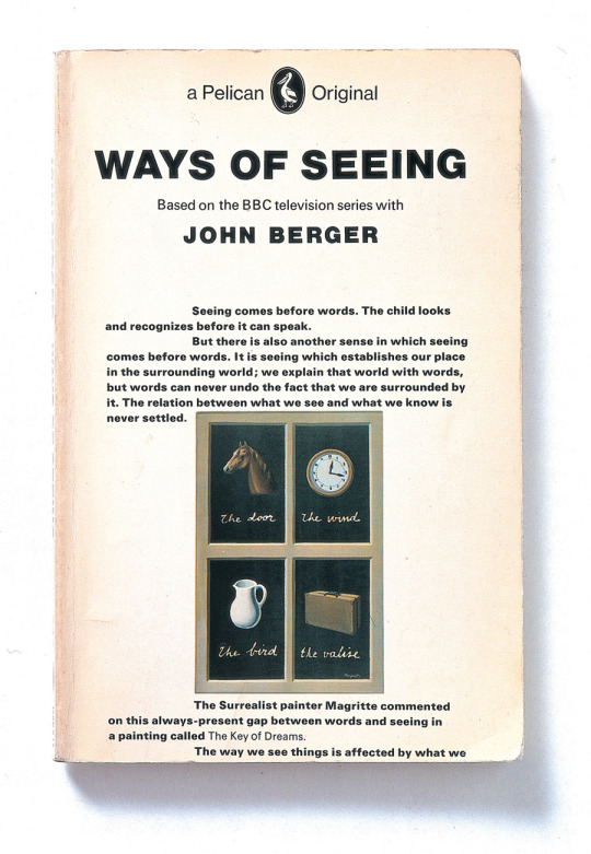
In 1972, the BBC broadcasted a four part documentary series called Ways of Seeing. In the show, John Berger, long-haired, wearing wild 70s shirts, portrays a charismatic host. Alternating between shots of Berger talking straight to the camera, close ups of paintings and advertising images that he analyzes and other sequences where he does not even speak, the series questions art and our relationship to it. Berger has a rather unusual approach to art history, instead of using convoluted sentences, he opts for a more conversational tone. Moreover, he draws parallels between high (Renaissance paintings) and low (advertising) - blurring boundaries and demystifying art in the process – in order to urge the audience to question the images that surround them on a daily basis.
In the same year, Pelican Books (an imprint of Penguin Books), released a book version of Ways of Seeing containing 7 essays, three of which use only images. The book was a collaboration between John Berger (writer and art critic), Sven Blomberg (painter and sculptor), Chris Fox (art critic), Michael Dibb (BBC producer) and Richard Hollis (graphic designer), and eventually became a classic amongst artists and graphic designers. Today, we mostly talk about how digital media is threatening print, so it is interesting to see something that started as digital find its real audience in print. It is a truth universally acknowledged that adapting a project to a different medium is not an easy task, but rather one that ends up losing the original substance in translation. Honestly, what can pages and typefaces and paper add to an on-screen experience during which everything is already said and seen? Ways of Seeing’s screen to page adaptation is unusual in that it maintains the essence and clarity of the original essays.
Above anything else, Berger criticizes artistic elitism. It make sense, then, that he did not want to follow art history’s elitist norms and watch his show get turned into an imposing coffee table book – affordable and understandable by only a lucky few. In regard to this, Hollis went on to design a revolutionary art book. Ways of Seeing is a slim and small paperback – 127 × 203mm – of only 166 pages. Famous artworks are printed in black and white, stripped of their daunting greatness. The first essay starts on the cover: “Seeing comes before words. The child looks and recognizes before it can speak.” It gives the book a sense of modesty and of urgency which also suggest a digital quality: the content is broadcast to the reader even as they pass the book on a shelf, just like a viewer would see part of a show while flipping through TV channels.
The inside of the book is as striking as the outside. Gone is the nod to classicism, the book screams modernity. Hollis sets the entire book in a bold sans serif font – Univers 65 – in order to match the visual weight of the illustrations. The text is broken down into short bursts, usually no more than a paragraph, and the images are inserted into the running text column, so they become part of the story, and do not break the flow of reading.
The text and the pictures work simultaneously, like a continuous stream of images on a TV screen. When adapting Ways of Seeing into book format, the designer cleverly uses the limitations and conventions of print. In the show Berger uses silence as an active agent of change in how we see things, in the book, turning a page serves the same purpose. For instance, he places place a Van Gogh painting at the bottom of one page with the caption “Look at it for a moment. Then turn the page”. When the reader does so, he finds the same picture at the top of next page, accompanied by another caption: “This is the last picture that Van Gogh painted before he killed himself”. This simple trick illustrates Berger’s point of the impact words can have on an image.
Finally, as Berger himself states in the series “seeing comes before words”, so he sometimes stops talking, and lets the juxtaposed pictures on screen speak for themselves. Hollis manages to recreate that in entirely visual essays where he stops using type to pass on messages and lets the visuals do the talking. He puts starkly contrasting images – such as advertisements promising a life of luxury and pictures of war refugees – side by side to denounce social inequalities. And so, the meaning is not lost in translation from screen to page, because just by flipping through the pages, seeing the interactions between type and pictures, the reader can already start to find some meaning.
0 notes
Text
Reid Miles, le seul graphiste 100% jazz !

J’ai grandi dans le jazz. C’était la musique que mes grands-parents écoutaient, c’est celle que mes parents écoutent toujours aujourd’hui. Quand je repense aux longs trajets en voiture de mon enfance j’entends encore ce slogan résonner dans mon esprit : « TSF Jazz, la seule radio 100% jazz ! » Pour moi, c’est une musique qui sonne comme une maison. Alors quand je pense aux pochettes des albums de jazz, j’imagine aussi quelque chose d’humain, un graphisme chaleureux, empreint d’âme. En revanche, les mots « style international » m’évoquent design graphique suisse avec toutes ses grilles remplies de caractères froids et sans empattements. J’imagine deux univers diamétralement opposés, et pourtant, l’œuvre de Reid Miles prouve le contraire.
Reid Miles est un graphiste américain qui a travaillé pour le label de jazz Blue Note Records entre 1956 et 1967. Au cours de cette décennie, il réalise environ 500 pochettes de disques, objets à la fois culturels et commerciaux qui reflètent l’esprit de l’époque. L’approche de Reid Miles, qui combine la radicalité formelle et conceptuelle du style internationale est devenue l’incarnation esthétique du jazz.
En 1966, il conçoit la pochette pour l’album Dippin’ du saxophoniste Hank Mobley. On y retrouve sa patte emblématique, fortement inspirée par le modernisme. Le texte occupe une place prépondérante. Le titre – en bas de casse, évidemment ! – repose sur un vaste aplat orange qui occupe l’ensemble de l’espace. Le reste des informations textuelles est traité très sobrement dans un caractère sans empattements – le News Gothic – dont il fait varier le corps et la couleur pour hiérarchiser les informations. Reid Miles adopte une démarche radicale, traitant la typographie comme un composant plastique à part entière qui peut être décomposé ; il abandonne la dimension très illustrative qui reliait auparavant l’aspect des pochettes à leur contenu. Le dessin est remplacé par la photo qui est elle même remaniée de façon à mettre en avant ses qualités plastiques, plutôt que sa capacité à représenter le réel. L’image – en surimpression sur le fond coloré – est brutalement recadrée, confinée dans l’espace d’un parallélogramme. Dans cette composition asymétrique, tout est régi par une rigueur formelle, presque mathématique : les coupes dans les caractères du titre, la descendante du p et la photographie sont parallèles et inclinées à un angle de 15° ; tout est liée d’une manière presque gravitationnelle. Rien n’est lassé au hasard, il y a un équilibre maîtrisé entre l’emploi du texte, de la couleur et de l’image ; comme si le fait de modifier un tant soit peu la disposition revenait à se tromper.
Derrière l’esthétique moderniste, il y a toujours une dimension morale et politique : le langage moderniste est synonyme de progrès technologique et social, il représente un idéal démocratique universaliste face aux régimes totalitaires. Toutes ces notions sont rassemblées dans le « rêve américain », il n’est donc pas étonnant que le style international ait eu du succès aux États-Unis. Or, on est souvent tenté de critiquer cette standardisation qui entraine une uniformisation au détriment de la diversité culturelle, et permet à la civilisation occidentale d’imposer ses codes au reste du monde. On peut alors se poser la question de la pertinence éthique de ce langage graphique dans le contexte de ces pochettes de jazz dessinées par un graphiste blanc pour des artistes noirs. D’autant plus que Blue Note Records est connu le hard bop, un style de jazz qui est un moyen pour les noirs américains de renouer avec leurs origines africaines, une réponse agressive - musicalement parlant - au cool jazz, surtout dominé par des musiciens blancs.
Néanmoins, il faut tout de même noter que Reid Miles s’octroie une certaine liberté par rapport au style international, respectant ainsi l’esprit du jazz, qui repose grandement sur l’émotion et l’improvisation. Il réinterprète le modernisme de manière ludique et séduisante. Il s’autorise, par exemple, à utiliser pour le titre le caractère Ultra Bodoni en italique, une fat face imposante et expressive, qui devient un motif envahissant l’espace. Les caractères coupés en leur centre se balancent, glissent comme s’ils avaient envie de sauter hors de la pochette et de danser sur la musique qu’ils annoncent. Quand on regarde le travail de Miles, on ne peut s’empêcher d’avoir l’impression de regarder le jazz concrétisé. La couleur, la photographie, les caractères typographiques se mettent en place comme s’il glissaient le long de la corde pincée d’une basse, attendant juste leur moment pour retentir dans une explosion d’émotions.
Qui de l’œuf ou de la poule est né en premier ? Les pochettes de Reid Miles ressemblent-elles au jazz où sommes nous venus à penser que le jazz ressemble aux pochettes de Miles ? En tout cas, il réussit l’exploit d’affirmer que jazz peut rimer avec style international.
youtube
0 notes
Text
Mother tongue

On Earth We’re Briefly Gorgeous is a letter, a letter written by the narrator – Little Dog, a letter to his mother who cannot read, a letter which opens like this: “I am writing to reach you – even if each word I put down is one word further from where you are”, a letter that is not meant to be read.
Ocean Vuong gives us a mess. Coming-of-age novel, letter, auto-fiction, essay, poetry, he crafts his own genre as fluid as gender. Intergenerational trauma, identity, race, sexuality. Past and present intertwined. Reflections, vignettes, flashes, a patchwork of memories, pieces of a puzzle falling into place. Little Dog’s family ran away from the Vietnam War to America. His abusive father is gone. His grandmother, Lan, has schizophrenia and is dying of cancer. His first love story is with an American boy lost to drugs. His mother, Rose, has PTSD from the war and loves him and hits him. Like the narrative, her English is broken, but his is not, and he becomes a writer. The story is triangle-shaped: mother, son, tongue. Language – words and the space between them – is a tool to explore the relationship between a mother and her child, a mother tongue and its child.
For Little Dog, using English is an act of love, the words a love letter to the women who raised him. Little Dog’s relationship with his mother structures his life, she is in everything: work, love, violence. She works at a nail salon for him, “a place where dreams become calcified knowledge of what it means to be awake in American bones — with or without citizenship — aching, toxic, and underpaid”, to ensure that he will have a better life than hers. She a mother and a monster. She abusive but she loves him, he is abused but loves her. He owes it to her to be her interpreter, to use his “bellyful of English” to give her a face, a voice. He makes it a promise to himself and to her: “That night I promised myself I’d never be wordless when you needed me to speak for you”.
Little Dog then faces one of the most important paradox for a child of immigrant, because mastering the English language, speaking for his family, writing about his family, is both betraying them and preserving them. Language becomes two-faced – at once a bridge and a gap. Because each English word, each beautiful turn of phrase laid down on paper is a step taken away from his mother. His mother cannot speak or read English. His Vietnamese is broken. “The Vietnamese I own,” he says to his mother, “is the one you gave me, the one whose diction and syntax reach only the second-grade level.” “Our mother tongue, then, is no mother at all—but an orphan”, he adds. Their relationship is defined by the absence of language, the inability to express, the impossibility of mutual understanding.
But Little Dog’s letter gives voice to what previously could not be put into words. The impossibility of his mother reading it is what makes Little Dog’s telling it possible. The letter is not so much about direct communication, but about a desperate need of self expression for the narrator. Processing and articulating different memories, is trying to break free of the limits of language by writing. At one point, he quotes Barthes: “Two languages cancel each other out, suggests Barthes, beckoning a third. Sometimes our words are few and far between, or simply ghosted. In which case the hand, although limited by the borders of skin and cartilage, can be that third language that animates where the tongue falters.” And perhaps Vuong found that third language in his fingertips, holding the pen, writing this book. Ocean Vuong gives us a mess, he is not telling “a story so much as a shipwreck—the pieces floating, finally legible”, beautiful. He crafts some of the best sentences ever created, ones that carve a space for himself – as gay Vietnamese man in America – and a space for his illiterate mother in a work of literature.
I am telling you all this, praising this book with my whole heart, but you could have guessed it from the title, because it says it all: gorgeous.
0 notes
Text
Peluches et cannibalisme

C’est l’été, vous cherchez une lecture de plage. Le livre, posé sur la table des nouveautés, a l’air mignon, enfantin, inoffensif, peut-être même un peu niais. Sur la couverture, une peluche hérisson dans l’immensité de l’espace, le titre et le nom de l’autrice : Les Terriens de Sayaka Murata. Au dos, un résumé qui laisse supposer un roman d’apprentissage. Mais ne vous laissez pas tromper par la couverture, Les Terriens n’est pas aussi mignon qu’il n’y paraît.
Le livre s’ouvre d’une manière charmante. On rencontre Natsuki alors qu’elle s’apprête à célébrer le festival de l’O-Bon — une fête traditionnelle honorant l’esprit des ancêtres — avec sa famille. Dans une prose enfantine, Murata raconte les longues journées d’été passées en famille, le chant des cigales, la célébration des ancêtres, la relation touchante de Natsuki et de son cousin Yû. Le roman aborde notamment la difficulté à trouver sa place dans la société. L’héroïne paraît en désaccord avec sa famille, éloignée de tous, anormale, elle se prend pour une extraterrestre, son seul ami est son hérisson en peluche Pyutô, et elle tombe amoureuse de son cousin Yû. Cependant, alors qu’on s’attend de formation, qui montrerait l’évolution de la jeune fille, l’autrice part dans une direction inattendue : viol, inceste, meurtre et cannibalisme sont au programme.
Cette histoire qui commence comme une fantaisie enfantine attachante devient une sombre critique sociale. Natsuki se fait agresser sexuellement par un de ses professeurs. Le ton demeure enfantin et détaché même dans les scènes les plus violentes, la narratrice garde une distance presque scientifique avec son sujet, l’héroïne dissocie son corps de son esprit, se détache du monde qui l’entoure.
Adulte, Natsuki, est mariée à un homme simplement pour échapper aux injonctions de ses proches et de la société. Ensemble, ils deviennent convaincus qu’ils sont tous deux des extraterrestres et considèrent tous les humains comme de simples ouvriers ayant subi un lavage de cerveau dans une usine de fabrication de bébés. Après avoir tenté de rentrer dans les moules créés par la société, ils veulent se détacher de toutes ces normes. Ils s’exilent avec Yû, mais leur tentative de créer leur propre société devient très bizarre, très vite.
Au début, la rébellion des personnages est risible, ils volent de la nourriture et renoncent à l’électricité, comme s’il découvraient la tendance hippie avec 50 ans de retard. Mais très vite leur expérience sociale innocente s’aventure dans le territoire du film d’horreur lorsqu’ils décident de tuer un homme et de le manger, puis de se manger les uns les autres pour survivre. Dans une prose toujours aussi naïve et détachée — « Nous nous grignotons avec ardeur tout en commentant les saveurs que nous percevons » — l’autrice nous mène vers une conclusion horrifiante où elle célèbre une nature humaine totalement décomplexée. Ce n’est que dans cette scène finale, après avoir commis l’inimaginable que la protagoniste affirme enfin « Aujourd’hui, mon corps est tout entier à moi ».
Alors que Les Terriens s’aventure dans des territoires violents, transgressifs et fantastiques, Murata désoriente et intrigue le lecteur par sa narration terre-à-terre d’événements sauvages. Il n’y a ni bon ni normal. Encore et encore, l’autrice contrarie notre désir de porter des jugements ou de trouver un sens en se basant sur des normes acceptées. Est-ce que j’ai aimé les Terriens ? Je ne sais pas, mais ce qui est sûr, c’est qu’il m’a marqué, et que je n’aurais pas dû le choisir comme lecture de plage.
0 notes
Text
The French Dispatch, now a major print-motion picture

A few weeks ago, I finally saw Wes Anderson’s new movie: The French Dispatch. The film centers around the French bureau of the Liberty Kansas Evening Sun — a fictional magazine which was inspired by The New Yorker — as they create their final issue, following the sudden death of the editor Arthur Howitzer Junior. It sounded like just the kind of movie that would please me — a half French, half American, Wes Anderson fan with an interest in print. However, as I was walking out of the movie theater with my friends, I felt sort of confused: I was amazed by the visuals and the aesthetic of the movie, but I was also very confused by the storytelling, which did not follow any linear plot, nor linger on any story long enough for me to really connect to the characters. While I felt like I had experienced a whole new level of movie-making, I also felt like I had mindlessly flipped through the pages of a magazine while waiting for a doctor’s appointment.
The French Dispatch is Wes Anderson working at the height of his powers as a filmmaker. It opens with a sequence of a close-up on the hands of a waiter preparing coffee for the magazine’s staff on a silver platter, then a wide shot of him carrying the platter up an intricate set of staircases and doorways to deliver the drinks. In less than a few minutes, there is already a narrating voice-over, fixed shots, perfect symmetry, horizontal and vertical travellings with the camera, yellow and other pastel colors, and a retro feel: everything feels entirely Andersonesque. With The French Dispatch, Wes Anderson goes all in - maybe even overboard - exalting his aesthetic and his fantasies in a way that forces admiration. The movie contains an overwhelming amount of details in its sets, costumes and storytelling techniques . Anderson makes bold and ambitious choices by using many different narrative forms - live action, black and white film, animation, theatre. I was deeply engrossed in this visual spectacle which was in equal parts fascinating, surprising and confusing. But while Anderson’s favorites motifs — stories within stories, family, friendship, art — are still there, the movie feels like it is lacking in warmth and soul, and I think a big part of it is probably because it devotes very little time to his various characters to make them interesting or to feel real empathy toward them.
Therefore, I was a bit disappointed at first, but after a while, I realized that there was a reason behind that cold messiness. In truth, the different narrative forms feel like different writing styles, as if the director was alternating between different movie and literature genres. It is not actually that surprising because Wes Anderson’s very recognizable visual aesthetic is actually not so far from a writer’s very distinct writing style, his pictures are evidence of his bookishness. He has a very literary approach to cinema: there are always lots of books, newspapers, letters and interesting type design in his work. In The French Dispatch, he draws inspiration from existing writers, for instance, Roebuck Wright is clearly based on James Baldwin. However, the story is not divided in the same way as novels, but rather like a newspaper. It doesn’t delve into the characters’ lives because it is structured exactly like an issue of a magazine, in which you flip through the pages/scenes and read/watch different sections : travel (a tour of Ennui-sur-Blasé), art (the portrait of a psychopathic prisoner turned genius painter), politics (a reimagined version on May 68), gastronomy (a diner party turned into a wild car chase), and obituaries. In that regard, Wes Anderson has achieved an impressing tour de force: making a film laid out like a magazine, an ode to cinema and to printed press, a print-motion picture.
1 note
·
View note
Text
En 2021, l’amour sera gris

Les Olympiades (2021), un film de Jacques Audiard.
Jacques Audiard, je connais son nom mais pas son œuvre, je n’ai vu aucun de ses films. Je ne sais pas non plus à quoi il ressemble, je l’imagine comme un vieil homme aux cheveux blancs, vêtu de noir. La bande annonce me présente un film en noir et blanc, un film sur le sexe, un film qui ressemble à un vieil homme pervers aux cheveux blancs, un film qui n’est pas fait pour moi. Pourtant, dans cet océan de noir et de blanc se glissent quelques notes discordantes, fausse notes frappées sur les touches d’un piano. Les personnages : un visage familier, celui de Noémie Merlant, celui d’une femme blanche certes, mais aussi deux visages inconnus, une femme asiatique et un homme noir. Et puis le titre, Les Olympiades, le 13e arrondissement de Paris, loin des lumières touristiques et des immeubles haussmanniens. Ces fausses notes m’intriguent, alors je décide d’aller les observer dans les salles noires.
Les lumières s’éteignent, l’écran s’allume. Dans chacun des quatre coins s’affichent tour à tour des noms — Jacques Audiard, Céline Sciama, Lucie Zhang, Makita Samba, Noémie Merlant, Jenny Beth — dans un caractère typographique gras et condensé, imposant et dense, comme les tours dans lesquelles l’action va se dérouler. Dès les premiers plan, la caméra radiographie en noir et blanc l’architecture du quartier cosmopolite où les toits des pagodes côtoient les HLM. Elle se concentre sur la façade d’un immeuble, passe d’une fenêtre à l’autre laissant entrevoir des fragments de vie, avant de s’arrêter sur un appartement, sur une petite histoire dans une grande ville. Cette histoire, c’est celle de quatre personnages très différents : Émilie, jeune chinoise sortie de Science Po qui travaille dans un centre d’appels; Camille, jeune professeur noir s’apprêtant à passer l’agrégation; Nora, provinciale trentenaire qui arrive à Paris pour reprendre ses études; Amber Sweet, une cam-girl. C’est l’histoire de leurs relations qui se font et se défont au fil du temps, des « je t’aime moi non plus », des « fuis-moi je te suis », des banalités qui deviennent des ouragans à l’échelle d’une vie.
Audiard dépasse l’aspect austère du noir et blanc pour nous livrer une comédie romantique moderne et intemporelle, parfois légère, parfois profonde. Le film est en noir et blanc mais il est surtout en gris, en nuances de gris, toutes ces petites nuances qui montrent avec justesse la multiplicité des identités et des relations contemporaines. Emilie, Camille, Nora et Amber Sweet sont très différents, mais ont au moins un point commun : ils sont des trentenaires en errance amoureuse et identitaire dans le monde d’aujourd’hui. Les Olympiades raconte Paris et l’amour en 2021. Une ville multiculturelle. Un monde où l’on peut, dans un même film, voir naître une histoire d’amour entre deux femmes et une romance entre une femme chinoise et un homme noir. Un monde connecté, avec tous les nouveaux moyens de communication, avec les réseaux sociaux, avec le porno sur internet, un monde où — paradoxalement — on ne sait plus communiquer ses sentiments directement, un monde où ce dernier « je t’aime » prend une dimension extraordinaire et me laisse un sourire aux lèvres.

0 notes
Text
concrete design: stop interpreting and start appreciating

Negerkunst, Prähistorische Felsbilder Sudafrikas (1931) by Max Bill
Max Bill – born in 1908 in Winterthur, Switzerland – has had many personalities, he was at once architect, painter, sculptor, industrial designer and graphic designer. He studied at the Bauhaus in Dessau form 1927 to 1929. He is mostly known for popularizing concrete art, a concept first introduced by Theo van Doesburg in his 1930 Manifesto of Concrete Art. The manifesto states that art must be simple, visually controllable and aim towards absolute clarity. Art must be entirely free of any reference to reality and must be entirely built up with purely plastic elements, namely lines, colors and planes. Therefore in concrete art, a pictorial element does not have any meaning beyond itself, as a consequence, a painting does not have any meaning other than itself.Max Bill later on became the flag bearer for concrete art by organizing its first international exhibition in Basle in 1944. This week, I was given the task to write about one of Bill’s projects, in other words to find some kind of tension in his work, find an angle through which I could analyze it. It might have seemed like a rather straightforward exercise, however – as I learnt more about concrete art – I could not help but wonder: how can one analyze something that is not meant to be interpreted beyond itself?
I chose to talk about a poster that Max Bill designed for an exhibition called Negerkunst, Prähistorische Felsbilder Sudafrikas (Black Art, Prehistoric Rock Art of Southern Africa) in 1931. The poster made by linocut and letterpress appears simple, industrial, hard, lifeless, utilitarian, devoid of any emotion. It only uses three colors – beige, black and white – and is only comprised of geometric shapes: a circle inside a white oval and a square at the bottom right corner. As a human being – and moreover as a design student – I was immediately tempted to try interpreting the very little visual information that was given to me. My mind could not help but wander and try to find a meaning hidden behind those shapes, something that would anchor them to reality, something that I could understand, that I could relate to, that I could make sense of. What was this oval? Was it an eye? An African mask? An egg, a primitive symbol that would make sense in the context of prehistoric art?
But then I remembered: “a work of concrete art does not have any meaning other than itself”. So I decided to stop interpreting and to start appreciating the concreteness of the poster. Max Bill formulated the principle of concrete design in the catalogue of 1936 exhibition Zeitprobleme in der Schweizer Malerei und Plastik (Problems of Time in Swiss Painting and Sculpture): “Concrete design is design that emerge from its own resources and rules, without having to derive or borrow these from external natural phenomena. Visual design is thus based on color, form, spaces, light and movement. Although all creative design is stimulated by inspiration, it cannot be perfected without clear and precise formulation […] Just as clear, clean musical forms are pleasant to the listener, and give joy to the knowledgeable in their structure, so clear pure form and color should give visual pleasure to the viewer.” For him, the simplest solution is the most beautiful. He often used mathematics in the construction of his posters. He also considered that blank space is as important as the printed parts, concluding that the relationship between space and typeface, which is the essence of the work, may not be perceived by many viewers, but it is precisely this relationship that – when properly used – can elevate typography to the level of a work of art.
Two words could be used to describe this poster: economy and clarity. The poster is comprised only of geometric shapes: one oval, one circle, one square. It is entirely structured on a geometrical basis, laid out in a systematic, proportional, orthogonal grid: the square hits the middle of the oval, the placement of the different elements creates a visual tension. The square is divided in a grid meant to differentiate the informations, which are also distinguished by Max Bill’s use of typography and blank space. In a very modernist fashion, the text is in all lowercase. It is an utilitarian poster, it is only meant to communicate a message, and it delivers that message in its cleanest, purest form. It tells us the only thing we need to know: the name, place and date of the exhibition. Negerkunst, Prähistorische Felsbilder Sudafrikas is a concrete art poster and can only be interpreted and appreciated as such, for its effectiveness and its aesthetic qualities.

Concrete Art Manifesto (1930) by Theo Van Doesburg
0 notes
Text
Il était une fois la sorcière et le graphiste...
Cet article est un extrait retravaillé de mon mémoire de DNMADE.

Malleus Maleficarum, Heinrich Kramer et Jacob Sprenger, 1487
Il était une fois, la sorcière et le graphiste (1). La sorcière est à la fois une figure de l’imaginaire et une figure politique, une personne à la marge, qui ne correspond pas aux normes sociales. Ainsi, les sorcières de notre société sont les femmes, les personnes racisées et les personnes queer. La sorcière a des pouvoirs magiques, et se sert de forces existant dans la nature pour produire des effets, grâce à des formules et des rituels. C’est « l’unique médecin du peuple » (2), qui utilise ses pouvoirs pour soigner, faire le bien des marginaux. Le graphiste est une personne réelle qui fait partie du système capitaliste dominant, et peut lui servir d’arme, notamment dans le domaine de la publicité. Il « traite visuellement les informations, les savoirs et les fictions: il est l’un des instruments de l’organisation des conditions du lisible et du visible », c’est « un médiateur qui agit sur les conditions de réception et d’appropriation des informations et des savoirs qu’il met en forme » (3). J’ai grandi avec les sorcières, celles des histoires, qui m’effrayaient et me fascinaient, celles dont je voulais posséder les pouvois magiques. Aujourd’hui je suis presque graphiste. Cependant, étant une femme, racisée et bisexuelle je ne suis pas dans la norme du designer graphique, je suis donc un peu sorcière. Alors je me demande souvent, peut-on être graphiste et sorcière à la fois ?
Notre histoire suit donc deux personnages apparement opposés, mais dont les destins s’entremêlent. En 1454, Gutenberg invente l’imprimerie, qui permet en 1487 de diffuser à grande échelle le Malleus Maleficarum (4), manuel d’Inquisition qui féminise et encourage la chasse aux sorcières. On en a recensé au moins 34 rééditions entre 1487 et 1669. Il ne semble alors plus si illogique de rapprocher le graphiste e la sorcière. Alan Moore pousse l’analogie en affirmant : « Je crois que la magie est de l’art, et que l’art est littéralement de la magie. L’art, comme la magie, consiste à manipuler les symboles, les mots ou les images pour produire des changements dans la conscience.» (5) Il révèle ainsi les rôles fondamentaux de nos personnages qui manient tous deux des signes afin d’opérer des transformations.
Pour ses sortilèges, la sorcière utilise des mots, sa voix (son incantation varie selon l’effet qu’elle recherche), des objets (baguette magique, pierres, bougies, herbes) qui canalisent les énergies, et des symboles (les sigils) qui représentent une intention magique. Le graphiste lui, manie des mots auxquels il donne une « inflexion visuelle » (6) par la typographie. Il leur donne un sens, c’est son incantation. Il utilise des objets-outils (stylo, ordinateur, imprimante, appareil photo) pour canaliser son énergie créative et donner corps à ses idées. Enfin, il manie des signes. Parmi eux, les couleurs « véhiculent des codes, des tabous, des préjugés auxquels nous obéissons sans le savoir » (7) : ainsi si le vert exprime la possibilité, le rouge exprime l’interdiction. L’image pourrait être le langage commun de l’humanité car elle ne nécessite pas de savoir lire, sert de vérité et fait appel aux émotions. Mais en réalité, elle est ambiguë car fabriquée par l’homme, c’est un acte qui manifeste une intention. En fabriquant une image, selon le choix du sujet, du cadrage, des retouches, on construit une idée, on agit sur la réalité. L’image est polysémique, elle implique « une chaîne flottante de signifiés, dont le lecteur peut choisir certains et ignorer les autres. » (8) Ce n’est pas la vérité mais une vérité. Tous les signes que manie le graphiste naissent de l’action humaine et donc, témoignent d’une intention. Ce sont des vecteurs émotionnels et c’est là que réside leur pouvoir. Pour son projet Sigillum Magicae, Charles Bedel crée un grimoire contemporain qui détourne le pouvoir d’évocation des logos de notre quotidien. Dans ce cahier à spirales régi par une grille de construction plutôt Suisse, on trouve des inscriptions indéchiffrables mais aussi des logos et des pictogrammes détournés sur des autels graphiques afin de les utiliser de manière bénéfique et invoquer l'amour, la chance, la fortune ou encore la réussite. « La magie a ses symboles et ses mantras; les marques ont leurs logos et leurs slogans.» (9)
Ainsi, dans un sens, être graphiste c’est être sorcière. C’est manifester son pouvoir à l’aide des signes, c’est manipuler ces signes pour provoquer des changements dans la conscience, des changements qui peuvent être à la fois magiques et politiques.

Sigillum Magicae, Charles Bedel, 2019
(1) L’un des personnage est féminin, l’autre masculin, car si les sorcières ont une place plus importante dans l’Histoire que leur équivalent masculin, les graphistEs au contraire, sont presque invisibles.
(2) Jules Michelet, La sorcière, Paris, Gallimard coll. Folio, 2016
(3) Annick Lantenois, Le vertige du funambule, Paris, B42, 2013
(4)Le marteau des sorcières est un manuel d’Inquisition publié en 1487 par Heinrich Kramer et Jacob Sprenger qui féminisa la chasse aux sorcières. L’acte de sorcellerie était alors considéré comme féminin car les femmes seraient plus faibles moralement, et donc céderaient plus facilement à la tentation du Diable.
(5)The Mindscape of Alan Moore, documentaire réalisé par DeZ Vylenz, 2003
(6) « So when something is typed in a typeface, what is said is influenced by how it is said. I call this a kind of visual inflexion, just like when we speak of voice our tone of voice gives meaning to the word, so does a typeface. » - Mia Cinelli, The power of typography, TED Talk, avril 2016 [en ligne], https://www.youtube.com/watch?v=C_RzDqgGcao
(7) Michel Pastoureau et Dominique Simonet, Le petit livre des couleurs, Paris, Editions Points, 2014
(8) Roland Barthes, « Rhétorique de l’image », Communications n°4, 1964
(9) Mona Chollet, Sorcières, la puissance invaincue des femmes, Paris, La Découverte coll. Zones, 2018
2 notes
·
View notes
Text
UFO - Unidentified Film Object
When I went to see Dune last week with a friend, I didn’t really expect anything. I had not read the books nor seen the trailer. I knew it was a sci-fi movie, a genre I don’t really enjoy. I knew it was directed by Denis Villeneuve and that the casting was really good. I knew it was a big movie because everyone was talking about it. But this was about it. In my mind, Dune was supposed to be just another sci-fi blockbuster. But once I was in the movie theater, in front of the big silver screen, surrounded by darkness, light and sound, I changed my mind. What was this strange movie ? Was I seeing a blockbuster or an arthouse movie ?
Dune is the story of Paul Atreides, a young man whose family is sent to Arrakis, a planet whose people - the Fremen - are colonized and exploited by outsiders to harvest their precious Spice, a psychoactive substance supposed to be a source of energy. Dune does have all the ingredients of a sci-fi blockbuster with its spaceships and battle scenes and sand monsters. The themes themselves are Manichean, there are the good guys - the Atreides - and the bad guys - the Harknonnen. Paul is the archetype of the chosen one/white savior whose destiny is to lead humanity towards a better future. And of course - like any good sci-fi movie - all of this is a metaphor for the real world, a pretext to explore themes such as ecology, exploitation and equality. Another characteristic of sci-fi blockbusters is that they are made to be visual spectacles, they need to suck the audience into their world, make them forget the real one, and Villeneuve undoubtedly understood that. His adaptation is gigantic and all-encompassing, a true sensory experience that needs to be seen on the big screen. The care taken with the visuals, the sets and the costumes is such that we literally dive into the world of Dune. I did not see the two hours and a half go by. The attention to detail is present in every shot. The vastness of the visuals is matched by Hans Zimmer’s soundtrack, sometimes dreamlike, sometimes thunderous, filled with drums, tribal chants and even intergalactic bagpipes. Everything is done to grab our attention and captivate us, the immersion is total.
However, Dune is not your typical blockbuster, it is actually a sort of an anti-Marvel movie. It is huge and loud and impressive and spectacular but it can also be slow and bleak. Like a painter, Villeneuve takes his time to lay the foundations of his dense and sprawling universe. He does not hesitate to take up half of the movie to introduce the viewer to each of the main places and characters and the nature of their relationships. He lets his images do as much of the narrative heavy-lifting as the dialogue. It sometimes feels like he aims to impress rather than entertain, creating a dark slow-paced mood piece, against the never-ending explosions that the sci-fi genre has been offering for so long. Denis Villeneuve does not try to bait the viewer with an accumulation of special effects or a funny tone. Entertainment does not neglect reflections on the world around us. Underneath this spectacular surface, Dune tells the story of a self-doubting young man carrying the burden of a poisoned destiny. In one scene, Paul's tormented silhouette cut against the cliffs of Caladan connects Dune to the great Shakespearean tragedies or Friedrich’s Wanderer Above the Sea Fog. Villeneuve cultivates an aura of mystery and leaves many questions unanswered which can be off-putting for some people. His films are imposing and cold, but never lacking in theoretical material and striking images. Rare are the blockbusters who hold the same power - both visual and political - by introducing reflections on imperialism, colonialism, the exploitation of foreign resources and the ecological disasters caused by such actions.
Dune is entertaining and serious, epic and slow, oversized and intimate. It is as much a blockbuster as it an arthouse movie. Dune is an UFO - Unidentified Film Object - that will captivate sci-fi lovers, casual watchers and cinephiles alike.


Dune (2021) by Denis Villeneuve
2 notes
·
View notes
Text
Dédale d’art

Passage (2021) Anne Imhof Verre, acier, bois, acrylique
Anne Imhof investit les 15 000 m2 du Palais de Tokyo de ses Natures Mortes. L’artiste plasticienne allemande crée une œuvre totale qui occupe tout l’espace du bâtiment en alliant performance, installation, peinture, musique, vidéo… Elle fait dialoguer ses œuvres et celles d’une trentaine d’autres artistes qu’elle a invités à participer. Dans l’ossature décharnée du Palais de Tokyo mis à nu, elle compose un labyrinthe perturbant, dont les multiples méandres nous baladent dans les interstices entre le mouvement et l’inertie, l’ombre et la lumière, la vie et la mort. Mais comment s’orienter dans ce labyrinthe d’art contemporain ?
Natures Mortes est pensée comme un labyrinthe. On y entre par une spirale de verre lumineuse qui entame la descente dans un dédale de murs en verre taggués. Le visiteur peut se déplacer, errer comme il le souhaite, les seules indications de cheminement des structures en verre et en métal qui le guident par moments. J’aperçois en transparence des œuvres et des visiteurs, un effet de palimpseste voyeuriste parfois oppressant. La taille du lieu accentue l’aspect solennel et déroutant de l’exposition, la pluie qui tombe dehors le jour où j’y suis donne une ambiance apocalyptique. Au bruit de la pluie se mêle le déconcertant concerto des Sound Rails d’Anne Imhof et Eliza Douglas. Deux enceintes se déplacent sur une structure en acier. Elles interagissent l’une avec l’autre, semblant parfois se poursuivre, se séparer puis se réunir dans un ballet mécanique. La piste sonore mêle voix, musique, le bruit des vagues, des cris. Les œuvres des différents artistes se suivent et ne se ressemblent pas : la vidéo se mêle à la peinture et la sculpture, les sujets me semblent flous. Ambiance sonore sinistre, cris, chemins de verre, vidéos stroboscopiques, curieuse symphonie qui me suit tout au long de mon parcours. Le dédale finit par me mener - tel une descente aux Enfers - aux bas-fonds, les sous-sols du musée qui achèvent ce voyage cauchemardesque et accablant. Arrivée à la fin de l’exposition, je ne trouve ni la sortie du musée, ni celle de ce labyrinthe de l’art contemporain.
En sortant, je me dis que j’ai préféré la mise en scène aux œuvres elles-mêmes. Je n’ai pas éprouvé grand. chose, à part un sentiment de confusion. Quel était le message ? Quels étaient les liens qui unissaient les œuvres ? Comme souvent face à l’art contemporain, j’ai beaucoup de questions sans réponses. Ces réponses, je les cherche d’abord dans les œuvres, puis dans leurs cartels. J’en trouve quelques unes, comme dans Untitled (Wave) (2021), vidéo où Anne Imhof filme Eliza Douglas. Celle-ci est sur une plage, en jogging, sein nus. Sous ses pieds le sable, dans son dos la mer. La mer s’agite, on entend et on observe le ressac incessant des vagues. Armée d’un fouet, elle frappe inlassablement, un va-et-vient comme les vagues qui érodent les falaises. Elle projette toute sa force et sa violence. J’admire ce mouvement immobile car répété sans cesse, cette violence qui se fond dans les vagues, primitive, naturelle, illimitée, cet acharnement inutilement humain. Je retiens également Phat Free (1995) de David Hammons, performance filmée dans laquelle il se promène de nuit dans les rues de New-York en donnant des coups de pieds dans un seau métallique. Il met ainsi littéralement en scène l’expression « to kick the bucket », mourir. Memento mori, le bruit du seau métallique qui roule sur le sol dégage une musique angoissante qui semble évoquer la nature fugace de la vie, prédire la mort. À part ces quelques exceptions, je n’apprécie pas l’art qui se trouve devant moi, du moins je n’apprécie pas l’esthétique ou la forme, même quand je trouve l’idée intéressante.
De ce dédale, je sors confuse et assommée. L’art contemporain est un labyrinthe et je suis Thésée. Il y a autant de méandres que de médiums utilisés et les murs qui l’entourent semblent hermétiques. Pas de lien apparent entre les œuvres, sauf la notion prévalente de concept, comme un mur qu’on longe à l’aveugle, souvent sans trouver la sortie. Je pense avoir davantage apprécié le concept des œuvres de l’exposition plutôt que leur forme, et n’est-ce pas là tout le paradoxe de l’art contemporain? Peut-être bien qu’il est là le fil d’Ariane.
3547 caractères

Untitled (Wave) (2021) Anne imhof et Eliza Douglas Vidéo, 30'19''

Phat Free (1995) David Hammons Vidéo, 5'20''
0 notes
Text
“A girl comes of age against the knife.”

The real Betty, Tiffany McDaniel’s mother.
Betty is the story of a girl and her family and how she “comes of age against the knife”. Betty Carpenter is born in 1954 in Breathed, Ohio in a family of eight children1. Her father, Landon, is Cherokee and her mother, Alka, is white. In 1950s America, the Carpenters don’t really fit in anywhere. Growing up in the foothills of the Appalachian mountains, surrounded by the love of her father, Betty witnesses acts of cruelty and oppression. Needing and escape she recounts her family’s stories - both past and present - and invents her own, in an act that is both hurting and healing at the same time.
Betty is, first of all, a story about family. All throughout the book, Betty’s first person narrative tells the complex lives of the Carpenters in a deeply honest way. They are a poor family, one that doesn’t fit in, one that experiences racism and sexism, a family with many horrible secrets and traumas. They also are a family of storytellers. Betty’s mother, who has had a very tormented past and struggles with mental health often tells her daughters dark stories filled with scary warnings about what life is like for women. Betty inherits her parents’ gift for storytelling and starts writing down her mother’s and sister’s stories before burying them deep in the ground, as if to exorcise their traumas. However, despite all the hurt and grief and losses, the Carpenters have each other’s backs and Landon, is always there to help his children navigate the world.
Betty is also a love letter to the healing power of fiction. She finds comfort in her family and the Cherokee legends her father tells her in order to teach her to love the land and to never forget where she comes from. With the help of their father, Betty and her sisters build a stage called “A Faraway Place” in their backyard, which becomes their refuge. As women of color in 1960s America, they are constantly reminded that they are nothing, that they are not important, that they have no power. But Fraya writes songs, Flossie dreams herself as an actress and Betty writes and tells stories. On stage, the sisters express themselves through art and escape the poverty of their daily lives. It is on that very stage of A Faraway Place - their “hopes and desires manifested in four corners of wood” - that the Carpenter sisters are at their freest and most powerful. At one point Betty says about her sisters that “They had never seemed so tall to me as they each planted their feet at a distance that felt powerful to them”. As much as they fight in real life, they unite on stage. When they are told they are worthless, they reveal their power on stage. Each in their own way, they share a great power, the power of imagination. As with many people from minorities, fiction then becomes an escape door. It becomes an armor against reality, a way to create a new world of possibilities, a world where they would have importance and power, a world where they could choose their fate. Throughout the story, we become aware that the stories Landon Carpenter tells his children are not just myths, but also cures. “I realized then that not only did Dad need us to believe his stories, we need to believe them as well. To believe in unripe stars and eagles able to do extraordinary things. What it boiled down to was the frenzied hope that there was more to life than the reality around us. Only then could we claim a destiny that we dit not feel cursed to.”
Betty is a blazing sunset, bringing tears to your eyes while warming you up. Betty is a novel about family, race, womanhood, coming of age and the power of fiction. It is sad and hopeful and beautiful and heartbreaking and from it “I remember the fierce love and devotion as much as I remember the violence.” Betty is a deeply American story. America land of the slaves, land of the free, land of dreams and of walls. A country and a story both rooted in as much hope and beauty as they are in violence.
1 Betty is based on Tiffany MacDaniels own mother.
0 notes
Text
Éloge de la stupidité humaine

Devanture de la librairie Shakespeare&Company le 08/09/21
8 septembre 2021. La pandémie continue, les Talibans ont repris contrôle de l’Afghanistan, les catastrophes naturelles se déchaînent. La vitrine de Shakespeare&Company est envahie par les couvertures bleues du nouveau roman de Sally Rooney, le même message apocalyptique est répété : Beautiful world, where are you. C’est l’histoire d’Alice une autrice qui rencontre Felix qui travaille dans une usine, c’est aussi l’histoire de sa meilleure amie, Eileen, et de son ami/amant Simon. C’est un roman centré sur des jeunes Dublinois marxistes et cultivés, leurs amitiés, leurs relations - des sujets qui paraissent frivoles et privilégiés. Et pourtant, je préfère lire cela plutôt que de regarder les informations.
Comme les autres livres de Sally Rooney1, l’histoire est guidée par des personnages. C’est la vie quotidienne, il n’y a pas événements extraordinaires ni de suspense insoutenable, l'histoire suit les va-et-vient de leurs conversations et de leurs relations. D’une part, on suit les quatre protagonistes dans une narration à la troisième personne. La plume de l’autrice est simple, précise, froide : elle introduit ses personnages comme « une femme » ou « un homme », n’emploie pas de guillemets pour les dialogues, traduit des émotions par de minuscules gestes des personnages. D’autre part, on a également accès aux pensées peu réjouissantes d’Alice et d’Eileen dans les soliloques philosophiques qu’elles s’échangent par emails interposés. Elles se désolent du climat socio-politique, du réchauffement climatique, de la pauvreté extrême, avant de s’enquérir de leurs dernières conquêtes amoureuses. L'humanité est en voie d’extinction et les voilà en train d'écrire encore un autre mail sur le sexe et l’amitié. C’est une contradiction qui leur semble immorale, Eileen dit à un moment : « Je conviens qu'il semble vulgaire, voire épistémiquement violent, d'investir de l'énergie dans les trivialités du sexe et de l'amitié alors que la civilisation humaine est menacée d’effondrement. Mais en même temps, c'est ce que je fais tous les jours. »2
C’est ce paradoxe intrinsèquement humain qui fait la force du roman. Davantage que dans ses romans précédents, les protagonistes qui peuvent paraître hautains au premier abord sont finalement très lucides sur leur position privilégiée. « Je suis consciente de l'extraordinaire privilège de pouvoir vivre de quelque chose d'aussi définitionnellement inutile que l’art »3 affirme Alice, à travers laquelle Rooney discute de sa propre place dans le paysage du roman contemporain. « Le problème du roman euro-américain contemporain est que son intégrité structurelle repose sur la suppression des réalités vécues par la plupart des êtres humains sur terre », proclame Alice dans un mail adressé à Eileen. « Les protagonistes se séparent-ils ou restent-ils ensemble ? Dans ce monde, qu'est-ce que cela peut bien faire ? Le roman fonctionne donc en supprimant la vérité du monde - en la cachant soigneusement sous la surface scintillante du texte. »4 Pour une fois, Rooney ne semble pas seulement critiquer la société et la nature humaine, mais tente de formuler des solutions. Les romans sur les relations et le sexe sont-ils forcément un privilège sans importance ? N’est-ce pas un trait fondamentalement humain que de penser aux personnes qu’on aime ? Les derniers mois de pandémie marqués par l'isolement, ne nous ont-ils pas fait prendre conscience que la communication avec les personnes aimées fait partie intégrante de notre vie quotidienne et mérite d'être explorée en littérature ? Ce livre semble plutôt partisan de la dernière hypothèse puisqu’il se lit comme un éloge du roman et de l’imperfection de l’être humain. Tout semble résumé dans cette pensée d’Eileen : « Peut-être sommes-nous nés pour aimer et nous soucier des gens que nous connaissons, et pour continuer à aimer et à nous soucier même quand il y a des choses plus importantes à faire. Et si cela signifie que l'espèce humaine va s'éteindre, n'est-ce pas, d'une certaine manière, une bonne raison de s'éteindre, la plus belle raison que l'on puisse imaginer ? Parce que, alors que nous aurions dû réorganiser la distribution des ressources mondiales et effectuer une transition collective vers un modèle économique durable, nous nous sommes plutôt préoccupés de sexe et d'amitié. Parce que nous nous aimions trop et que nous nous trouvions trop intéressants. C'est ce que j'aime dans l'humanité, et c'est même la raison pour laquelle je souhaite que nous survivions - parce que nous sommes trop stupides les uns à propos des autres. »5
1 Conversations with friends et Normal People
2 “I agree it seems vulgar, even epistemically violent, to invest energy in the trivialities of sex and friendship when human civilisation is facing collapse. But at the same time, that is what I do every day.”
3 “I’m conscious of the extraordinary privilege of being able to make a living from something as definitionally useless as art.”
4 “The problem with the contemporary Euro-American novel is that it relies for its structural integrity on suppressing the lived realities of most human beings on earth,” Alice proclaims in one email to Eileen. “Do the protagonists break up or stay together? In this world, what does it matter? So the novel works by suppressing the truth of the world — packing it down tightly underneath the glittering surface of the text.”
5 “Maybe we're just born to love and worry about the people we know, and to go on loving and worrying even when there are more important things we should be doing. And if that means the human species is going to die out, isn’t it in a way a nice reason to die out, the nicest reason you can imagine? Because when we should have been reorganising the distribution of the world’s resources and transitioning collectively to a sustainable economic model, we were worrying about sex and friendship instead. Because we loved each other too much and found each other too interesting. And I love that about humanity, and in fact it's the very reason I root for us to survive - because we are too stupid about each other.”
1 note
·
View note