
University of Huddersfield Graphic Design Blog, Second Year
Don't wanna be here? Send us removal request.
Statistics
We looked inside some of the posts by dkbdesign and here's what we found interesting.
Average Info
Notes Per Post
1
Likes Per Post
1
Reblog Per Post
0
Reply Per Post
0
Time Between Posts
4 days
Number of Posts By Type
Video
6
Text
9
Last Seen Tumblr Blogs


Fun Fact
In Q3 of 2020, 31% of US users access the Tumblr app daily.
Text
Jay Payne
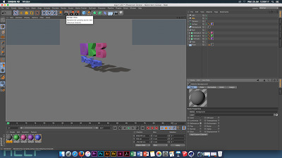
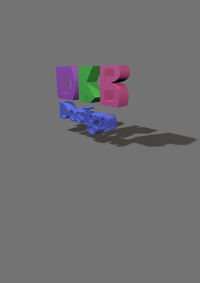
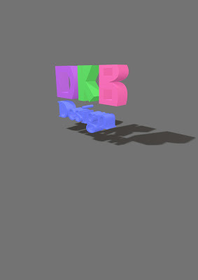
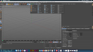
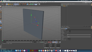
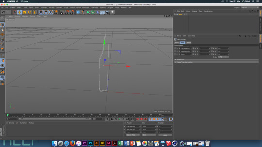
Illustrator and Cinema 4D - lesson 1
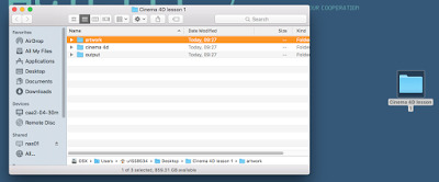
To start, first create a folder on your desktop called Lesson 1. Inside this folder create three more folders , called Artwork, Output, Cinema 4D.
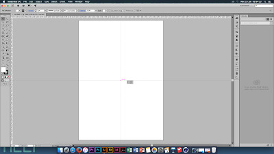
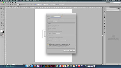
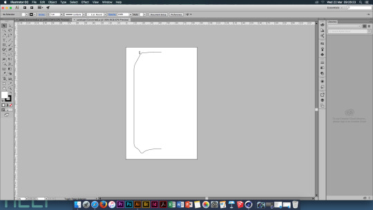
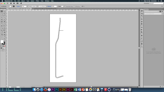
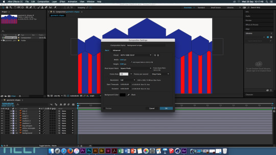
In Illustrator, create a new page, through File, New - make this page a standard A4 portrait page. Use the ruler guides to find the centre of the page and have it marked. This will be helpful when creating your logo.
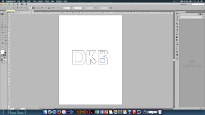
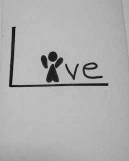
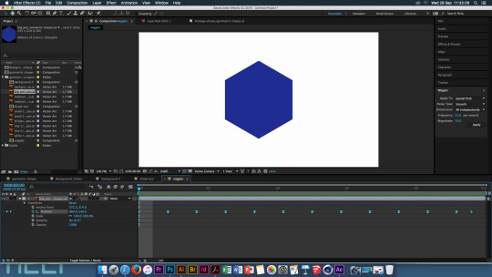
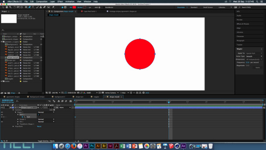
Create the logo using simple lines and shapes. for mine i stuck with my initials keeping the shapes of the letters simple and easy read.
Save the the design into your Artwork folder, before fully saving the design change the illustrator file to Illustrator 8, this may come up with a warning but ignore it as this form of illustrator works better with Cinema 4D.
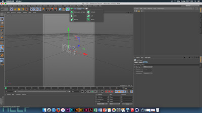
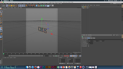
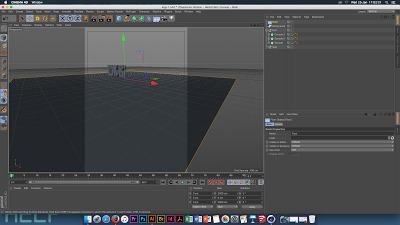
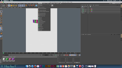
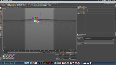
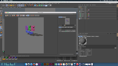
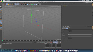
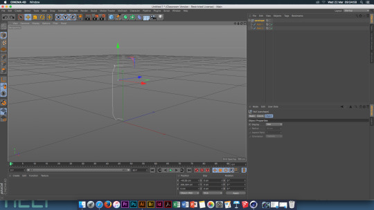
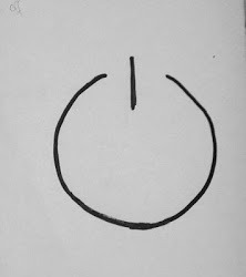
Now open Cinema 4D, this is the little circle logo.
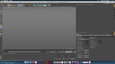
In Cinema 4D you will find the tools are on the top of the screen - Rotate, Scale, Render The top right has the list box which shows everything you create Bottom right has the project attributes Bottom has the timeline and the materail bar
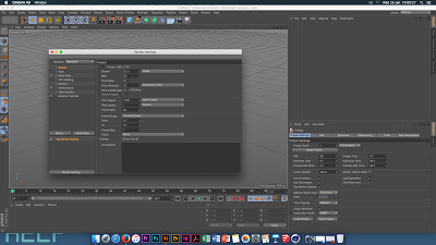
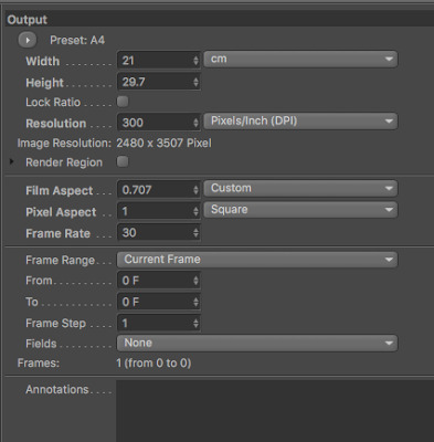
Right orange button - render settings - open Output - print portrait, A4 Frame range - current frame
Save Change tiff to jpeg Name the file Save this file into the output folder in your lesson folder
File , save as , lesson 1, cinema 4d, call it template Save it again to the same folder this time calling it logo 1


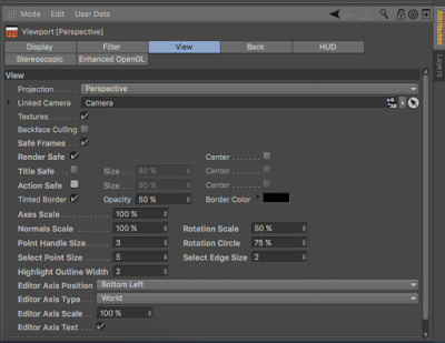
Right hand bottom , mode and view settings Enhanced OpenGL and tick the Shadows button View - tinted border, change the opacity to 50% Turn on the Action Safe button and change it to 95%
Go back to edit render settings , go to anti-aliasing and change from geometry to best
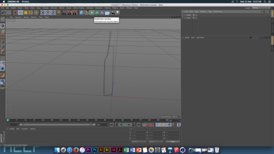
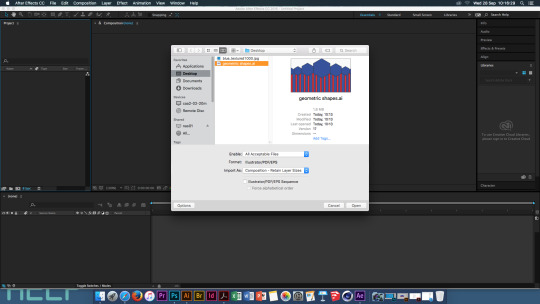
File, merge and go to artwork folder and open up the logo image - OK your artwork should appear in the centre of the image
In the right hand corner there are little black tools that help you to navigate your page, the last button of these 4 shows different view points

The list column should now show the logo and all the paths of each part of the logo
When moving the image, use the select tool and 3 coloured arrow heads will appear on the image use the arrow heads to move the object (when selected the arrow head will turn white)

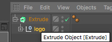
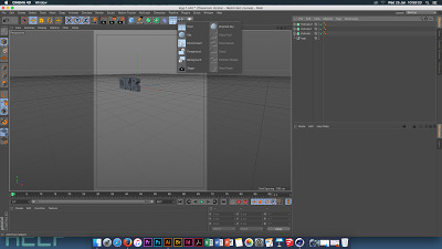
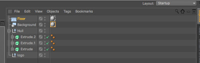
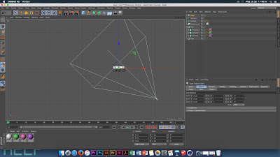
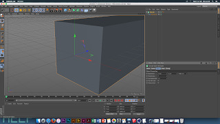
Click and hold on the green box button and select extrude, then move the logo file in the layers tool into the extrude file, to make this work click the 'hierarchical' button
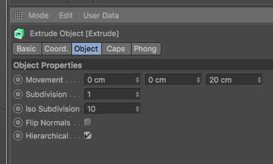
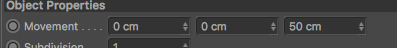
Bottom right box change the movement size to 50cm, this makes the object thicker
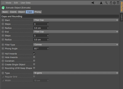
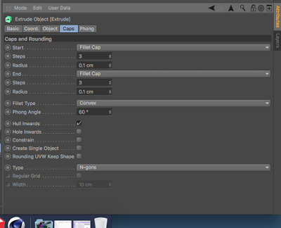
The image now looks really sharp, looking too unrealistic, this can be changed. go to the caps tab and turn off caps. now change the tabs to 'fillet cap' . now change the steps to 3 and 0.1 radius
Put each logo layer into there own extrude file. copy and paste the first extrude and it will have all the edits you made into thee new extrude files.
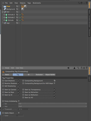
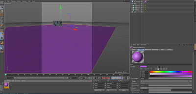
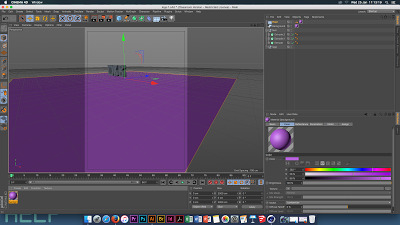
Click and hold on the floor button and select background. then click the floor button and this will create a floor. move the logo above the floor

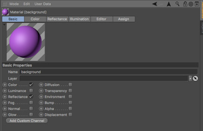
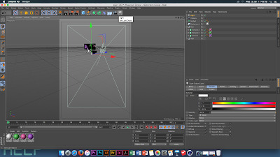
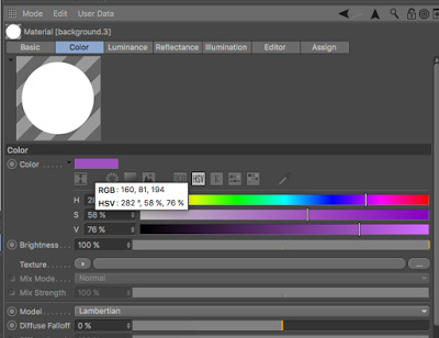
Double click in the bottom section and this will create a material, this material is for the background and floor. drag the material into the floor and background folders on the top right hand side In the list window select the floor layer then select tags, cinema 4d tags, compositing and turn on compositing background. Double click on the name of the material in the bottom layer to background, you can now change the colour of the material to anything you want by changing the Hue and Saturation select the material and go to the basics tab and this shows the basics of this material.
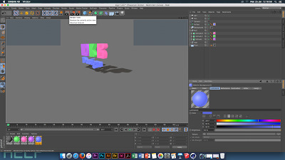
Create 3 more materials and add one to each layer of your logo, this gives each part its own colour.
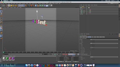
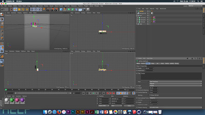
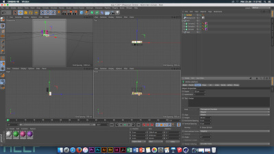
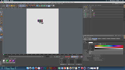
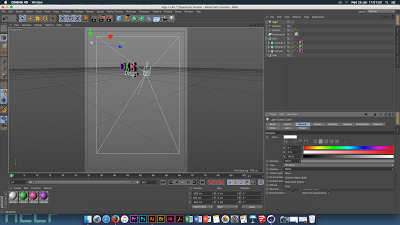
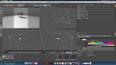
To add text: top selection bar select MoGraph, MoText MoText layer, object tab- change the depth to 50cm , change the text to what you want it to say. then change the alignment to the centre. change the height (which is the font size) change this to fit with your work. you can also change the font to what ever you want it to look like. on the text change the caps to fillet caps and 3 steps and 0.1 cm radius.
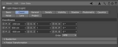
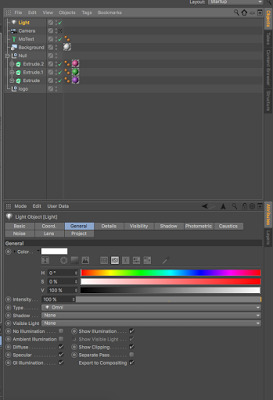
Lights and Camera: there is a camera symbol on the top bar . Adding lights: click on the light button, this will make everything dark. go to the view tab so you are looking at the image from the top then select the Coord. tab Change Y: 500 X: - 250 Z:-500 Now select the general tab, and change the shadow tab from NONE to SHADOW MAPS (soft) this will show you where your shadows are and this will help you to work out where your light needs to move to to get the best shadow. Now create a second light, name it FILL, this needs to go on the opposite side to the first light, the shadow then needs to be turned off this light and the intensity needs to be at 50% Key Light: shadows tab, shadow map, this will change the resolution of the shadow key light, general, colour, change the hue to 200, saturation 5% Fill Light , Hue 45 and saturation to 5% To notice this change the white background to a dark grey, this will help the coloured light to show up better .

Then render the image
To change the colours to luminous - select the colours in the material tab - not the background- go to basic and turn on the luminescence button. Now select each material individually and go to the colour tab select the original colour and drag it into the luminescence colour tab. If this looks too bright just select all the colours in the materials tab and change the brightness on the luminescence tab to the right setting for you.
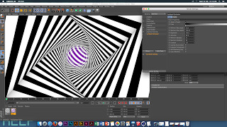
Cinema 4D- Lesson 2
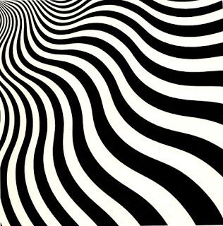
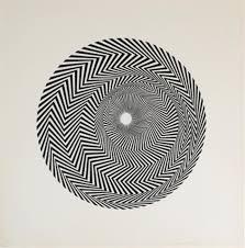
Bridget Riley - Optical Art
GMUNK -
Before starting create a folder onto the computer desktop (session 2) with three folders inside of it ; Artwork, Outcome, Cinema 4D
Open Cinema 4D
Select and hover over the pen tool, select the rectangle button
Select the Extrude button - in the objects section drag the rectangle tab into the extrude tab
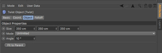
Select the Extrude tab, go to the object tab, and change the Z access to 5000 cm. Then go to the Caps tab, change the Start and End tabs to None.
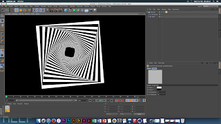
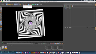
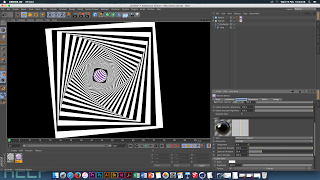
Select the Bend button and chose Twist
In the objects tabs the Twist tab needs to be below the Rectangle tab
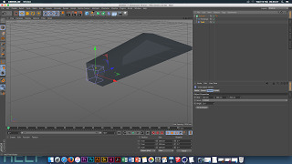
Change the angle of the Twist to 20 degrees
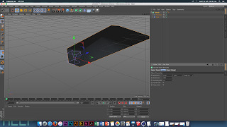
Display - Gouraud shading (lines)
Extrude - object list - Subdivision = 500
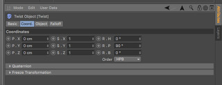
Twist list - Coord button - Rotation P =90 Degrees - Object button - Angle = 10 Degrees - Mode = Unlimited
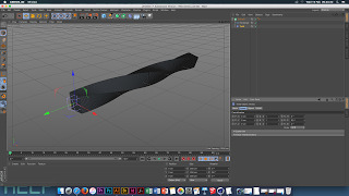
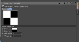
Create a material - Double click in the bottom view box -Basic tab - unclick Colour and Reflectance - only have Luminance ticked -Luminance tab - texture - surfaces - checker board - Select the checker board change - U Frequency - 0 - V Frequency - 10 -Apply the material to the extrude object - once this is done change the V Frequency to 40
Edit the Render settings - Anti - Aliasing - change to Best - this stops the objects from breaking down too much
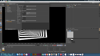
If straight lines in your pattern have kinks in them, go to the rectangle object - object tab - intermediate points and change that to Subdivided
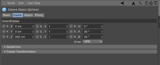
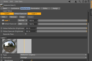
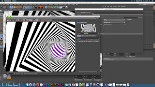
Go to the blue cube button - select Sphere -Change the Radius to 40cm -Coord - position Z = 500cm -R.P = 30 degrees -R.P = 40 degrees
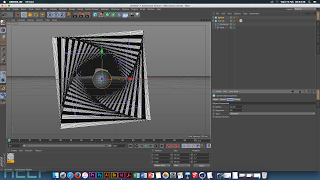
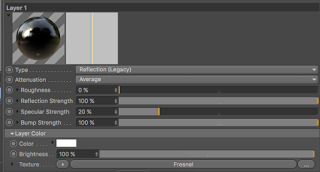
Create a new material -copy the first material, as you want the same pattern and this saves you time so you are not having to recreate it. Change colour 2 to a brighter colour so that it stand out over the first material. Change the V frequency to 10 for this material. Drag the material onto the Sphere object tab -Select the material tab - basic tab - tick reflectance -Reflectance tab - add - reflection legacy - texture - fresnel
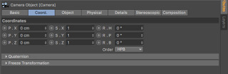
Camera - Coord tab - all coords changed to 0
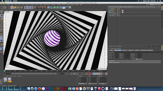
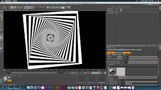
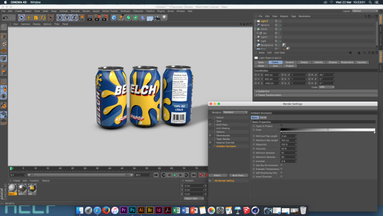
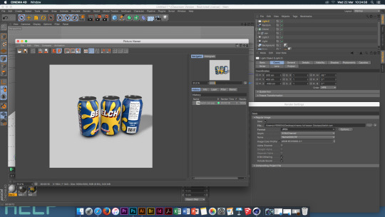
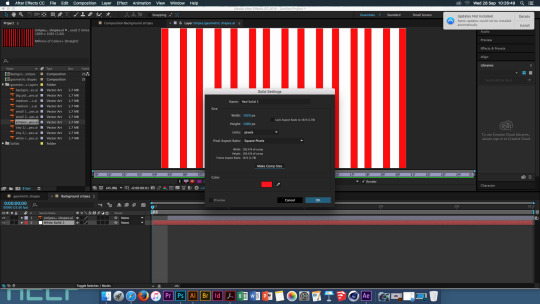
Render Settings -Output -Save - Name the document - Destination- save it into the Output Folder on your desktop - Format - JPEG - High Quality - Effect - Ambient Occlusion - this adds shadows to the object giving it more depth
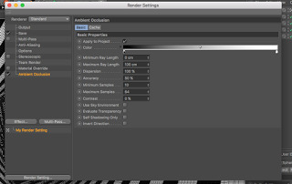
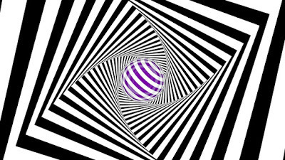
(without shadow)
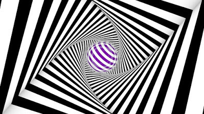
(with shadow)
Cinema 4D - Lesson 3
Prototyping
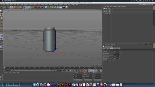
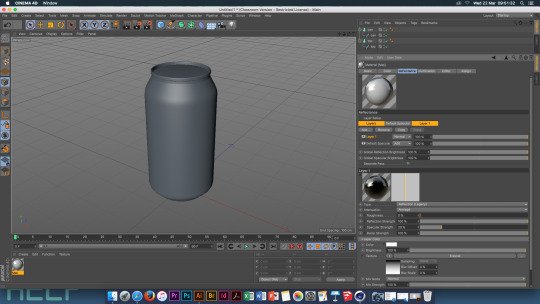
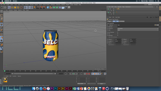
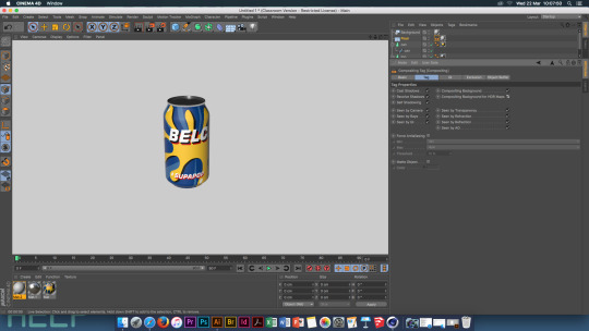
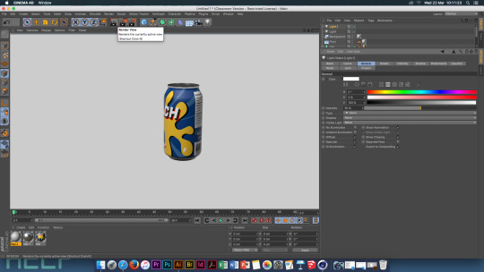
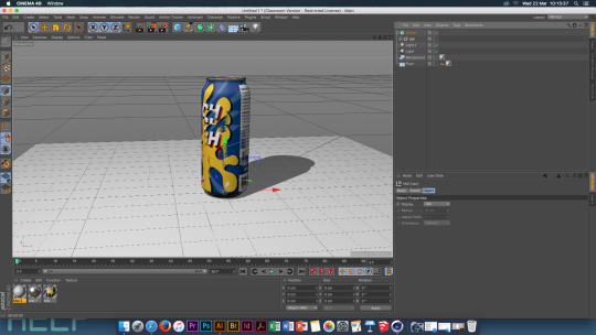
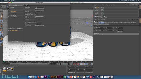
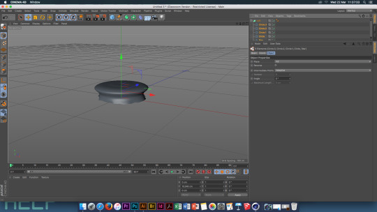
- Open the pre made Bottle and Can Illustrator files - Save these as Illustrator 8 files so that they will open in Cinema 4D
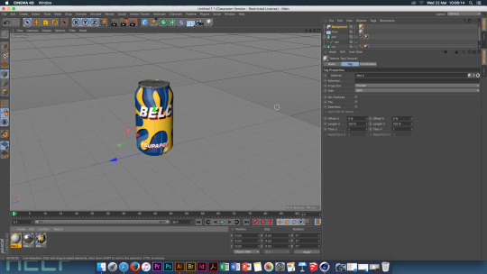
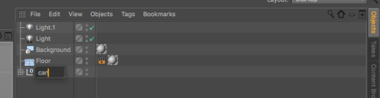
- Open Cinema 4D, File, Merge, Can - This object is made up of two shapes which can be seen in the list folder, they need to be renamed to ‘can’ and ‘top’.
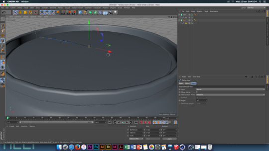
- Next create two Lathe objects. Drop each part of the can into its own Lathe object.
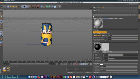
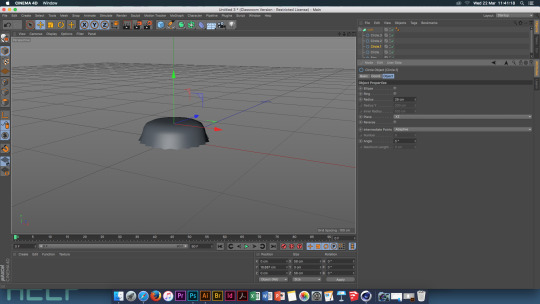
- Create a material, in this then go to the Reflectance tab - Add - Reflection Legacy - Layer Colour - Texture - Fresnel - Layer Fresnel - Fresnel - Dielectric - Preset - PET Global Reflection Brightness - 55% Global Specular Brightness - 55%
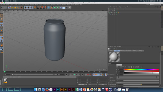
Colour Tab - Texture - Big Button - Maps - Folder - Can Label Drag this material onto the can
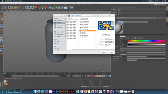
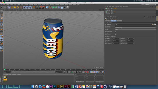
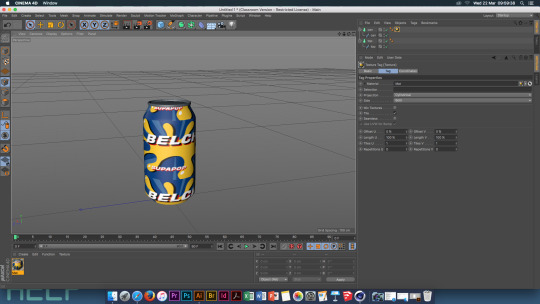
Once the label is attached you will notice that it is reversed, this can be fixed. Projection - Cylindrical , Untick Tile Right Click on the material - fit to object.
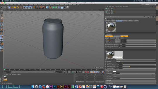
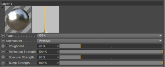
Create a new material and go to the Reflectance Tab Add - GGX Roughness - 20% Globals - 55% Colour - Value - 35% Add this material to the Top tab
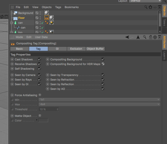
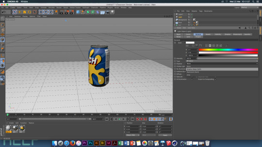
Create another new material and just leave this one white. Create a floor and background and add the new material to both of these.
Select the floor -Tags - Cinema 4D tags - Compositing - Tick the two compositing boxes
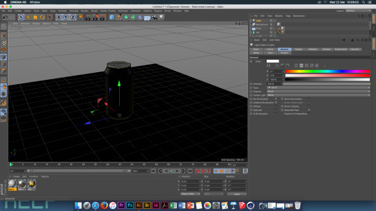
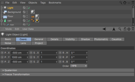
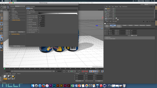
Next you need to create a light using the light button. Positions - X: -500cm Y: 1000cm Z: -500cm
Create another light
Positions - X: 500cm Y: 100cm Z: -500cm Intencity - 50%

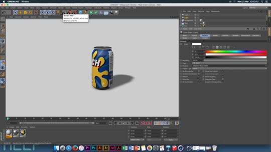
Select the first light you created - General - Shadows - Shadow Maps Soft Mode - View Settings - Tick Shadows Box
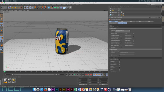
Select ‘Can’ and ‘Top’ lathes and group thee objects.
MoGraph - Cloner- Drag the ‘Can’ object into the cloner
Cloner- Mode - Grid Array
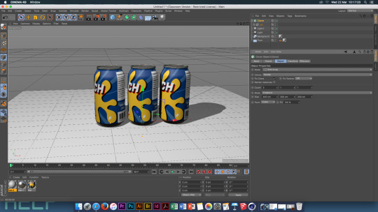
Count - 3,1,1 Size - 400, 200, 200 MoGraph - Effector - Random - Turn on Roatation, Turn off Position Add an area light
Coord - Position - X = 500 Y = 400 Z = -400 R.H = 45 degrees Render settings - Anti Alysing - Best Effect - Ambient Occlusion Output - Resolution = 300 Size: W = 1000 H = 1000
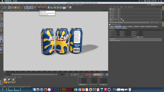
Save!
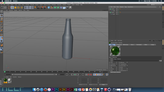
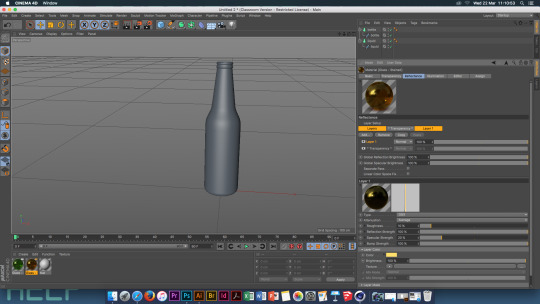
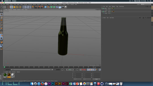
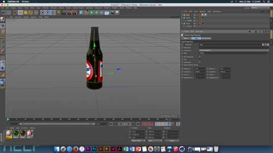
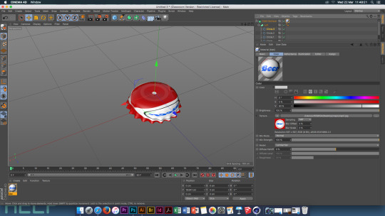
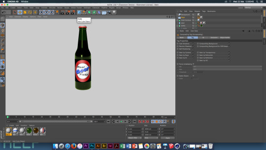
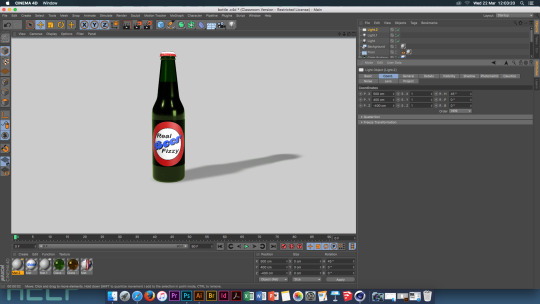
Open Cinema 4D, File, Merge, Bottle This object is made up of two shapes which can be seen in the list folder, they need to be renamed to ‘Bottle’ and ‘Liquid’
. Create two Lathe objects. Drop each part of the bottle into a lathe object.

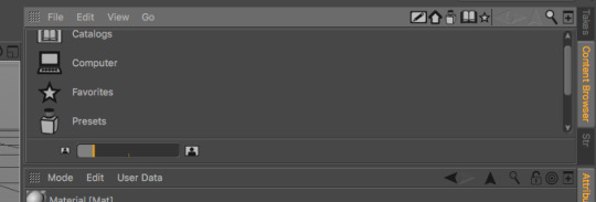
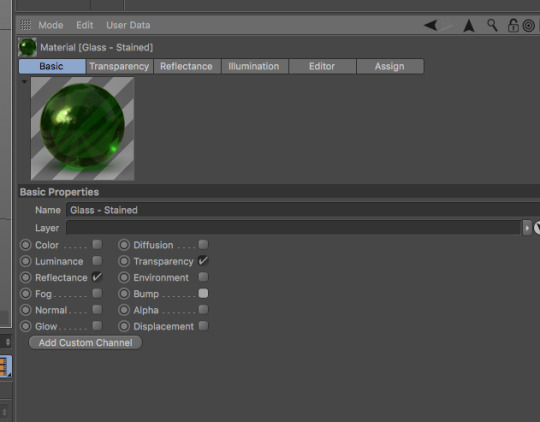
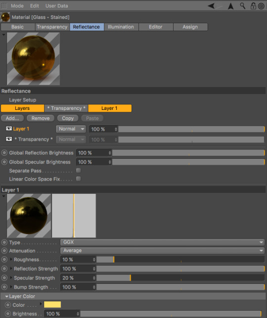
Create a new material. With the new material selected open the Content Browser. Go to Presets, Broadcast, Materials, Glass. Glass - Stained - this is all set up already.
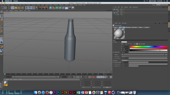
Select the Basic Material tab. Turn off ‘Bump’, then go to the Transparency tab, change the Absorption colour to white. Set the Refraction to 1.2.
Copy the glass material, change the colour and transparency colour to an orange/gold. Change the colour of the reflectence tab aswell.
Drag the materials onto the objects, green onto the bottle and gold onto the liquid.
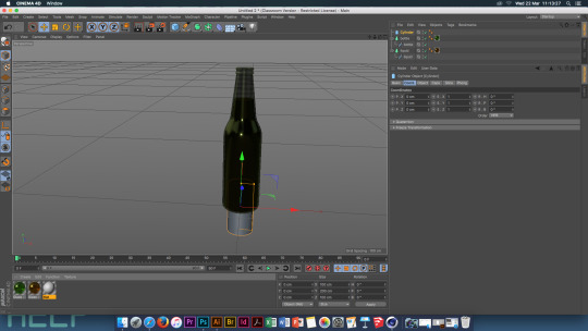
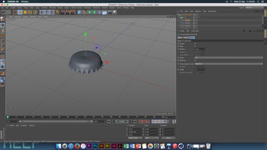
Create a Cylinder, go to the objects tab and change the radius to 73. Using the green arrow, move the cylinder up until it fits perfectly around the centre of the bottle. Change the ‘Bottle’ and ‘Liquid’ subdivisions to 36.
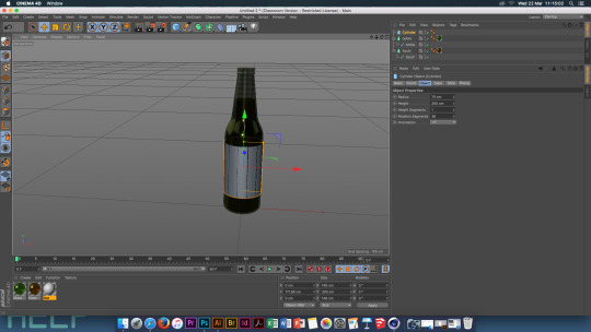
Select the cylinder layer, go to the caps bar and untick ‘Caps’. Create a new material, go to the Basics tab and tick Alpha. Then go to the Alpha tab, texture, maps , select the ‘Beer Mask’. Add the material to the cylinder. Go to the alpha tab, material, tick ‘Invert’. Colour tab - texture- beer label - open.
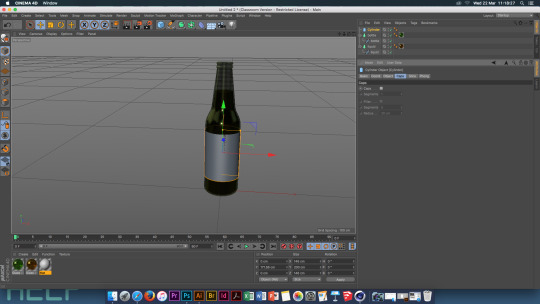
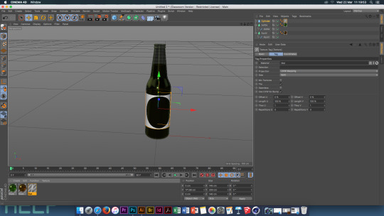
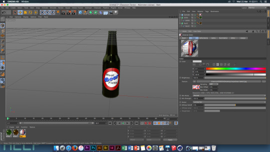
Create a new material and add this to the cylinder. Select the material, select the Tags tab and change the ‘Side’ to ‘Front’. Go to the label material, reflectence tab, ass, reflection legacy. Go to layer colour, Fresenel, then go to the Fresenel layer, pieletic , preset, Jade. Save!
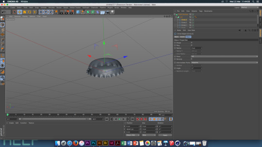
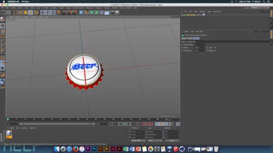
Bottle top
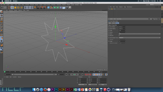
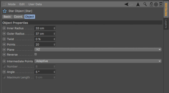
Create a new page. Using the pen tool and the shapes within this, create a star object. After creating the shape, go to the object tab, plane and change it to XY. Change the Inner radius to 33, the outer radius to 37, and the amount of points to 20.
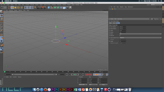
Select the pen tool and create a circle, change the radius of this to 33, the plane to XY. Copy this 3 times. Each of the circles needs a different radius. Circle 1: 39 Circle 2: 17 Circle 3: 0

Select all the circle, move one up 7cm, the next 9cm and the last 3cm. Unselect the circles, select circle 1. Create a lost object. Move all the objects into the loft object. The settings for the loft: Go to the object tab, subdivisions, U=41, V=2. Iso Sub, U=3 Caps, Start = None, End = None Simulate, Cloth, Cloth Surface. Drag loft into cloth surface.
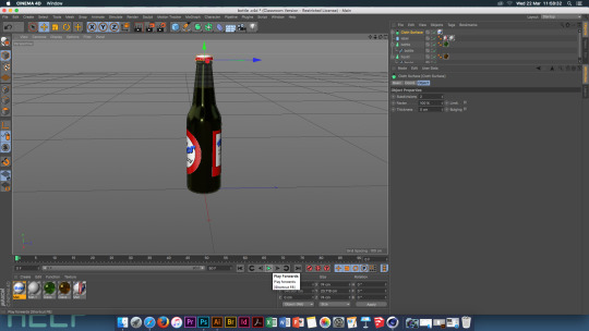
Create a new material . Create a floor and background, add the new material to to these objects. Select the floor, tags, cinema 4D tags, compositing, tick the two compositing boxes.

Create a light. Positions: X = -500 cm Y = 1000 cm Z = -500 cm Create a second light Positions: X = -500 cm Y = -100 cm Z = -500 cm Change the intensity to 50%
Select the first light, go to general, shadows, shadow maps, soft. Mode , view settings, tick shadow box.
Render settings, anti- alysing, best. Effect, ambient occlusion Output, resultution - 300 Size : W = 1000 H = 1000
Save!
0 notes
Text
Theory Essay Question and Research/ and feedback
How did the Industrial Revolution help to progress the development of British Graphic Design?
Research Subject
I’m interested in researching the history of British graphic design and how it has evolved over the years
Research : History and evolution of graphic design – 15000BC – 2014 timeline
• 15000BC – 2000BC – The invention of writing
• 2000BC-1000BC - Alphabets
• 1000BC – The Asian contribution
• 1399 – 1799 – Illuminated manuscripts
• 1400 – Printing come to Europe
• 1400 – 1600 - Renaissance graphic design
• 1500 – The German illustrated book
• 1600 – 1700 – An epoch of typographic genius
• 1700 – 1850 – Graphic design and the Industrial Revolution
• 1800 – 1950 – The arts and crafts movement and its heritage
• 1880-1901 – Art Nouveau
• 1896-1972 – The genesis of 20th century design
• 1900 – 1925 – Pictorial modernism
• 1900 – 1930 – The influence of modern art
• 1910 – 1930 – A new language of form
• 1920 – 1935 – The Bauhaus and the new typography
• 1935-1950 – The modern movement in America
• 1936 – 1955 – The international typographic style
• 1945 – 1970 – The New York school
• 1950 – 1960 – Corporate identity and visual system
• 1960 – 1970 – The conceptual image
• 1975- 1985 – Post modernism design
• 1985 – 2014 – National visions within global dialogue
• 1990 – 2014 – The digital revolution
Research Title
British graphic design and the Industrial Revolution 1700-1850
England 1769 – 1840
• Extreme social/ economical/ technological/cultural change
• Steam engine perfected = greater productivity – manual labour replaced by machinery
•Technological improvement – mass production – increased availability & lower costs
• Graphic communications – more important & accessible
• Fast expansion of font jobbing printers, advertising & posters
• Advancements in font types and sizes
Background Review
Mechanization of Typography
• Mid 19th century – presses could mass produce up to 25000 copies per hour – but each letter had to be set by hand, which lead to limited newspapers.
Chromolithography
•Lithography – a method of printing using an etching stone on a completely smooth surface.
• Chromolithography - a method of making colour prints.
By 1860 the popularity of this grew. Without traditions & constraints of the letter press, designers could invent any letter form and utilize an unlimited palette of vibrant colours. Circuses and carnivals where the first to use these new methods for their posters. Chromolithography was then moved onto labels and packages.
Two typographical innovations during the Industrial Revolution were, the creation of the ‘Fat Face’ and Sans- Serif. ‘Fat face’ was introduced by Robert Throne and Thomas Cotterell – the innovation was in the contrast in the weight, it was changed in the thickness of each stroke. Sans-serif was the second innovation and went onto become important within graphic design in the 20th century.
Research Question
Essay Introduction
How did the Industrial Revolution help to progress the development of British Graphic Design?
The industrial revolution was the major technological, social and cultural change in the late 18th century, that began in Britain. The revolution meant that manual labour was replaced by industry and the manufacture of machinery. This meant that graphic communications became more important and accessible which lead to fast expansion of advertising and posters.
Feedback -
The main piece of feedback I was given is that i need to find a title for this piece as my question is not the title. The title I could chose could be ' Industrial Revolution & British Graphic Design.'
I need to think and talk about what the Industrial Revolution was.
On the power point it is quite difficult to read the time line, to make it easier to read it could be split across 2/3 pages so that it is easier to read. I also need to remove irrelevant times, times from 15000 BC to the 1600's need to be removed as they are to early and irrelevant to my research.
On my power point there needs to be more images and less text, the images need to show what the revolution brought to graphic design, the images need to be more prominent. Sub divide the text make it clearer and not crowded on the page.
0 notes
Text
Studio and Process & Production Feedback
Studio -
With my prints I was first told to scale up the prints, my original prints where an A4 size and I was told straight away that the out come would look better on a larger scale, possibly A2.
My printed put come had a white border, I was then told to edit the image so that the coloured background would fill the paper and there would no longer be a white border to the image, which when printed on a bigger scale would look a lot better.
Another part of my feedback was to move the image to the side of the paper having the main focus off to the side and an open space for the rest of the image.
Have a play around with the paper - it was suggested that I try printing onto different types of paper to see what type would make the outcome look more professional and to see what paper would look better when printing onto a bigger scale .
I need to play around with Illustrator more and become more confident in using it and by becoming more confident I can add more detail to my images, I can then become more confident in using more layers to create a more detailed piece. This is to help me move away from simple pieces and create more detailed pieces when i use Illustrator.
I could also look at other ways to create the outcome, I need to play around with different media, I could try hand drawing my outcome and even try using photography combined with illustrator .
Blog -
On my blog i need to remove a fair amount of the research images that i have included as there is just too many on there and i have another blog dedicated to just the images research that i found so my main blog doesn't need to include all of them.
0 notes
Text
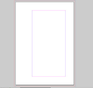
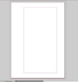
Workshop - How to print from InDesign
Bleed & Slug -Bleed - removes borders when printing - Between 3-5 mmSlug - Page info - Top-7mm - Bottom-20mm - Inside - - Bottom - 7mmTo change margins- Layout- Margin collums - (20mm, 50mm, 20mm)Red Line - Bleed LineBlue Line - Slug LineTo print Saddle Stitch the pages must be in multiples of 4
There is a maximum number of pages that can be printed and folded in this way.
Paper size must be set to A4 - portrait ad be printed on A3 for a saddle stitch print out.
Give yourself a generous inside margin.
Top Margin - 3cm
Bottom Margin - 3cm
Inside Margin - 6cm
Outside Margin - 3cm
Bleed & Slug -
Bleed - removes borders when printing - Between 3-5 mm
Slug - Page info - Top-7mm
- Bottom-20mm
- Inside -
- Bottom - 7mm
To change margins- Layout- Margin collums - (20mm, 50mm, 20mm)
Red Line - Bleed Line
Blue Line - Slug Line
You can add as many page masters as you want
True Black - In InDesign never use Registration black
To get a pure black, in the colour pallet change the colours to:
C - 0%
M - 0%
Y - 0%
K -100%
InDesign preferences - appearance of black - display all black.
0 notes
Text
Nick Deakin - Studio
Self Publishing - The Zine
What’s a zine?
Definitions of a “zine” - Self-published (the publisher doesn’t answer to anyone!). Small self-distributed print run. Motivated by expressing oneself rather than making money. Outside the mainstream. Low budget. Also — No need for any special equipment or knowledge. Portable. An expression of DIY culture. Foster a community among their creators and readers. Allow the creator to publish nearly immediately. Can be interactive, allowing comments from readers. Tactile in this digital age.
The Zine Creation Process;
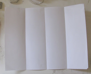
Step 1: You will need one sheet of A3 paper, scissors, and anything else you will need to create the content of your zine. *Note: You can never go wrong with a pencil
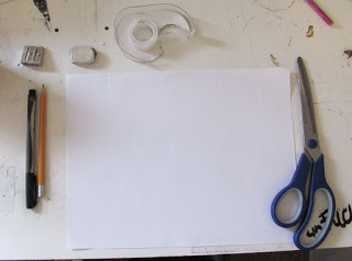
Step 2: Fold your sheet of paper in half, portrait.
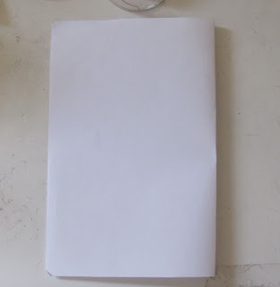
Step 3: Unfold the paper. The sheet is now split into halves. Fold one side of your paper into the middle to meet the crease.
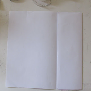
Step 4: Repeat step 3 for the other side of the paper.
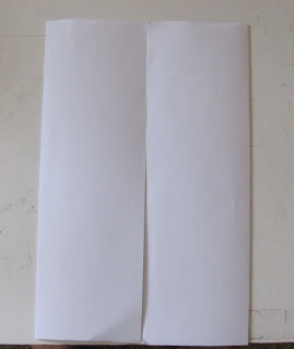
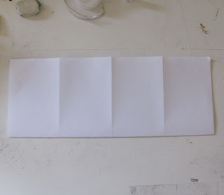
Step 5: If you unfold your paper you should have four equal sized vertical columns.
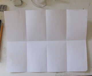
Step 6: Fold your paper in half again but this time vertically.
Step 7: Unfold your paper you should now have 8 equally sized rectangles.
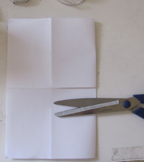
Step 8: This is a very important step as cutting your zine correctly will ensure it folding properly. Fold your paper back in half . Now cut halfway in at your crease, this cut will create a opening in the middle of your paper.
Step 9: Open up your paper, fold in half . Then simply push the ends of the paper in and fold like a small book or pamphlet.
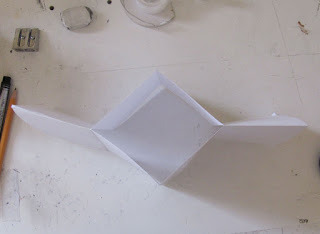
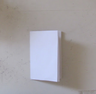
Step 10: This is what your small one page zine should look like when you are done.
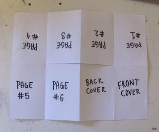
Step 11: This is how the pages and covers should be laid out. Remember that you are folding the paper in half so the pages have a top and bottom, so one half is not upside down.
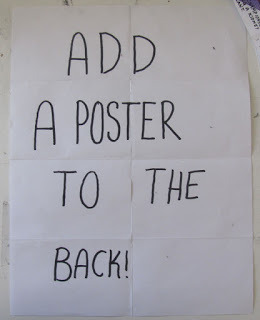
Step 12: Add a poster to the back side of your zine so your reader can fold it out and enjoy!
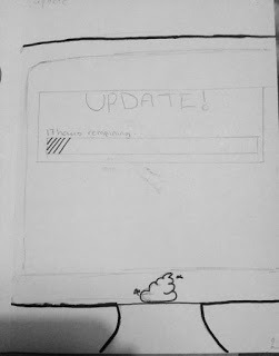
Content — Words to depict in any order.
Minimize
Like
Share
Update
Off
Dream
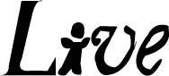
Live
*Emoticon*
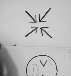
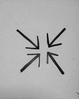
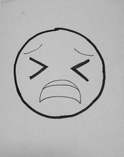
Edited Drawings - Illustrator
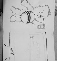
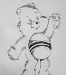
The Self Portrait Zine
Using the steps above create a zine. This zine is focusing on me.
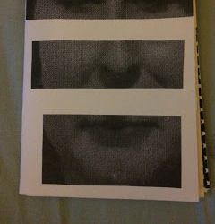
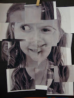
The front page was created with an image of myself that has been cut up so that my main features; eyes, nose and mouth are the main parts of the front page.
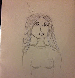
The back page was for a self portrait - the way you see yourself or want to draw yourself . I drew myself in a cartoon kind of style - quick and simple.
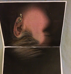
The first inner page has a photocopy of the side of my face.
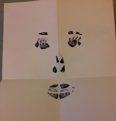
The next page after that is a face created out of emojis.
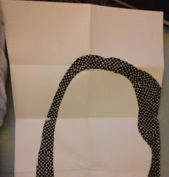
The full poster is a mono tone creation of my self portrait using different thicknesses of black and white spots. this is still unfinished.
The Poster
Screen Printing
The Stencil
Information — The volatile period of civil unrest in France during May 1968 was punctuated by demonstrations and massive general strikes as well as the occupation of universities and factories across France. At the height of its fervor, it brought the entire economy of France to a virtual halt. The protests reached such a point that political leaders feared civil war or revolution; the national government itself momentarily ceased to function after President Charles de Gaulle secretly left France for a few hours. The protests spurred an artistic movement, with songs, imaginative graffiti, posters, and slogans but also intense violence. “May 68” had a resounding impact on French society that would be felt for decades to come. It is considered to this day as a cultural, social and moral turning point in the history of the country. As Alain Geismar—one of the leaders of the time—later pointed out, the movement succeeded “as a social revolution, not as a political one”. In Paris, on the 16 May, students and faculty staff took over the Ecole des Beaux Arts to establish the Atelier Populaire (the Popular Workshop). The organisation went on to produce hundreds of silkscreen posters in an unprecedented outpouring of political graphic art. In a statement, the Atelier Populaire declared the posters “weapons in the service of the struggle… an inseparable part of it. Their rightful place is in the centres of conflict, that is to say, in the streets and on the walls of the factories.”
Combine some of the imagery of those posters and graphic art, with the lyrics of The Stone Roses ‘Bye Bye Badman’, a song referencing the uprising, using the lyrics as typographic content for the stencilled prints creating new content, language and meaning though an abritrary process.
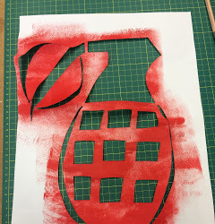
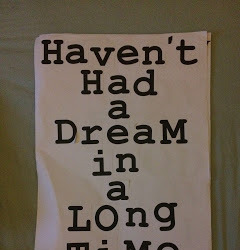
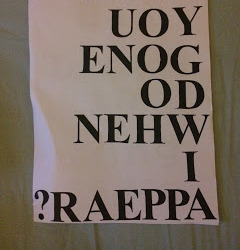
The image that I picked out was the word Grenade. I chose a simple drawing of a grenade so that it was easier to cut out when creating the stencil, and this meant that it is still recognisable when cut out.
I chose the colour red for the grenade as it represents danger, war which a grenade is used for and in.
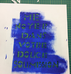
The lyrics I got from The Stone Roses song where " Drown me in your sweet submission". I decided to translate this into French to stick to the theme of the information we where given. I chose blue paint as this stood out over the red paint better.
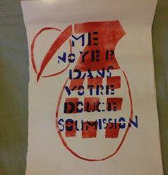
This is the final outcome of both the stencils put together.
1 note
·
View note
Text
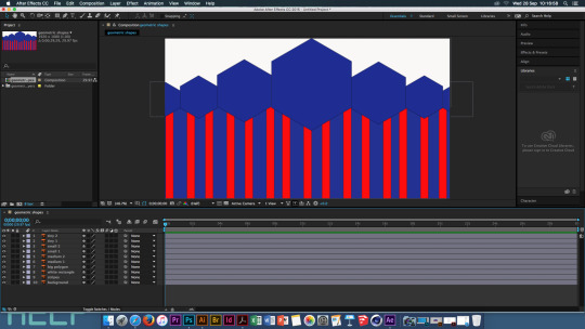
Loops and Living Holds Geometry - Sara Nesteruk
Prep Info:
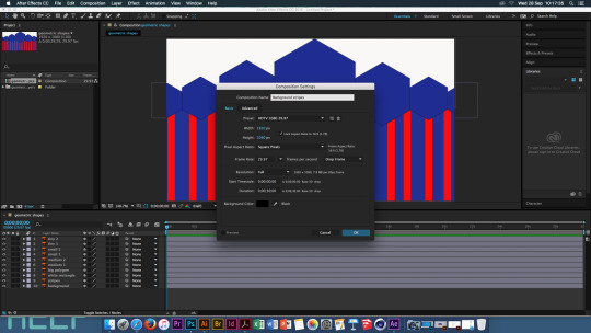
Save as HD - 1920 pixels wide x 1080 pixels high
30 Motion Tests in 30 Seconds - Steffen K
New Comp - Background, W=1920pix H=1080pix
25 frame rate - 1 second
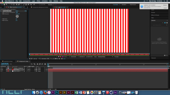
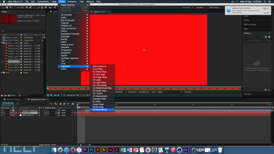
Effects - Transition, Venetian Blinds
Transition Position 0% frame - 100% frame - This makes the effect of stripes on the page
New Comp - The Wiggler - same comp
Windows - check the 'Wiggler' button
Frequency 12.0 per second
2 key frames
none movement at first and last frame
Magnitude 10.0
New comp: shape morph - 2 seconds
copy shape from illustrator - pen tool
move play back to 1 second
use pen tool to add points

Rotoscoping
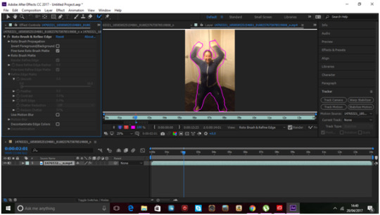
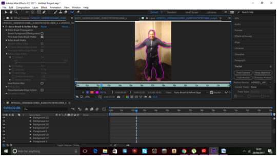
File, Import, Movie file ( this being a video of anything you have taken that is 10 seconds long.) Move the movie file from the left hand bar into the bottom bar To rotoscope you can outline the section of the video that you require to be rotoscoped by using the pen tool and manually outlining the section. OR It can be done by using the Roto Brush tool which selects the area in a faster manner than the pen tool. After outlining the section of the video change the smoothness to 0. If there are any areas that do not need to be selected when using the Roto Brush tool, hold Alt and this turns the brush red and this will help to deselect the unwanted areas. After the area of this part of the video is selected move a bit further on in the video and continue this method to select the wanted areas of the video. Do this to the whole video.
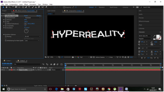
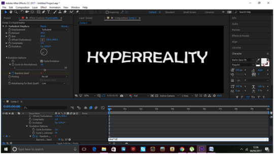
Hand Drawn
Create a new composition, Set it to 1920 width, 1080 height. Change the frame rate to 23.976 From here you can include an image or a piece of text. Once this has been added in and the image or text is still selected, go to Effect, Distort, Turbulent Displace. This makes the image/text look ‘wobbly’ change the Amount to 24. The Size to 35. Go to the Evolution options, cycle 18, hold Alt and click on Random Speed. In the Expression Speed box type in “time*10″ After this change the composition settings, change the frame rate to 8. Then select the pen tool, outline the image or text using the pen tool making sure you have selected the whole image/text. Once the whole thing has been outlined with the pen tool, go to Effects , Generate, Stroke. After this increase the brush size so that it covers the whole image/text. Change the Paint Style to Reveal Original Image.
3D
Start with opening an image into Photoshop. Change the page type to Transparent. Remove the background of the chosen image. Save this file as a PNG.
Open Illustrator, and open the image. Go to the View tab and Show Transparency Grid. After this go to Image Trace, change it from black and white to colour and change the amount of colours to the amount of colours in the image. If you chose a simple image with no more then 4 colours it will be easier to trace. After image tracing click Expand. Create a new layer and move each section of the different colours into its own new layer. Save this document as an AI file.
Open After Effects. New Composition. Width 1920. Height 1080. Import the AI file, change it to composition Move the layers of the illustrator file into the bottom bar. Turn on the 3D layer. In the top right of the main display box is a Renderer box this should say Ray-traced 3D. Right click on the layers in the bottom bar and select ‘Create Shapes from Vector Layer’
0 notes
Video
vimeo
30 motion tests in 30 seconds from Steffen K on Vimeo.
0 notes
Text
First Brief- Cybernetic Self
Project synopsis:
This module enables you to develop the integrated design methodologies required to work in a dynamic, professional, creative and commercial environment.
This project demands that you channel your intellectual and creative skills, through exploration and self-directed progression that demonstrates your ability and independence, as well as in-depth knowledge and understanding of aesthetic, environmental, marketing and technical requirements of design for
the creative industries.
Cybernetic Self
Briefing — 27/09/16
Formative assessment — 31/10/17
Consider, explore and synthesize these three themes —
⎯ Autopoiesis The self-maintenance of an organized entity through its own internal processes. Consider your Autopoiesis your ‘self making’ — ‘self poetry’, your identity and its subsequent interactions with others. What defines you? And how does interaction with others affect that? Redefine the self portrait, the selfie.
⎯ Sociomaterial Technologies are sociomaterial assemblages, an ensemble of people, materials, equipment, components, and institutions. The idea being that the technical is not reducible to the social, nor is the sociable reducible to the technical. How does the self — yourself — circulate in the sociomaterial world? Is it circulatory, or rhizomic?
⎯ Network Ego Your ego, disseminated through a network – virtual and real. What is being said and what is being hidden as we endlessly curate and control the media perimeters of our lives. How has the acceleration and integration of social media affected the perception of ourselves and our egos?
You are required to appropriate and converge a variety of mediums for your final outcomes —
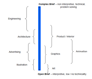
Graphic Design
A printed document, considered possibly as a supplement for a magazine such as Vice, ID, Kinfolk, Creative Review, Emigre, Eye, Monocle etc – this could also be a stand alone publication. Also consider — Posters, Fanzines, Book, Magazine, E-zine, Manifesto, Marketing Strategy, Direct Mail, Advertising Campaign, Advertisements, Copy, Photography.
Animation
A digital short, moving image, or animation, considered possibly as an output for Nowness, Vice, or Dazed etc. This could be an eye catching short for social media, you tube, twitter, facebook, instagram, snapchat, vine etc. Also consider — Web application, Film, Animation, Video, Information Graphics, Motion Graphics, Generative Design and Strategies, Game, TV short, Animatics, Scripts and Storyboards, Fictional or Factual Documentary.
*It is key here to consider that current commercial and personal outputs invariably involve both still and moving image. Individuals post both photos and videos of their lives (marketing themselves?), and businesses use both still and moving image in their commercial marketing. You should consider both, rather than one or the other.
Aims —
Undertake creative and ambitious research beyond the parameters of each theme
Develop a brief that transcends commerce and commodity acquisition
Examine the conceptual and aesthetic potential of digital convergence.
Innovate, explore and expand technical and personal parameters.
Create a contemporary portfolio piece for personal promotion and a curated exhibition.
Show your ingenuity – be unique - make it memorable
Area to consider :
Network Self ; Consider self presentation and social connection in a digital age .
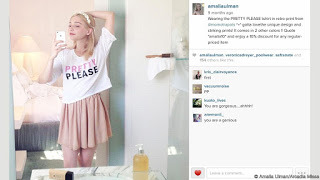
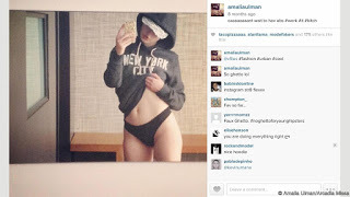
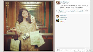
Amalia Ulman - Excellence & Perfections
Sociomatiral - an ensemble of people, materials, equipment, components.
What keeps us human? - Emotions.
What defines you? - Redefine the self portrait - selfie
A printed document- supplement for a magazine
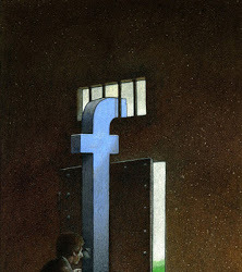
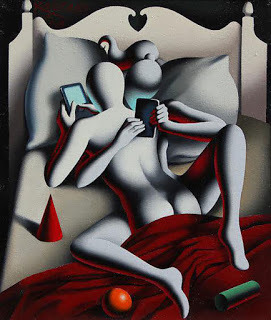
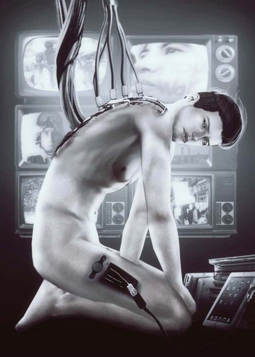
Research -65 Satirical Illustrations Show Our Addiction To Technology
Art is often a mirror, reflecting the social issues and problems of the day. With the rise of ubiquitous Internet, smart phones, and other Internet enabled devices, being online all the time is not only possible, it’s the de facto state for many.
http://www.architecturendesign.net/satirical-illustrations-show-our-addiction-to-technology/
https://uk.pinterest.com/pin/426082814731140520/
The Age of the Selfie
Idea 1: Creating a 'selfie' out of all your previous selfies- deconstruct previous images to create a new one.
What defines you? - using the idea of creating a selfie from previous images of yourself and taking it further to create an image of you out of the things that you feel define you, i.e. your hobbies and your likes and interests. The things that make you happy.
Idea 2: Recreating selfies by drawing them - the self portrait.
Recreating your photographed images into painted and sketched drawings, making them look like self portraits from years before the camera was invented pushing social media back into a creative form.
A self portrait - is a representation of an artist, drawn, painted, photographed, or sculptured by the artist.
A selfie - is a self-portrait photograph, typically taken with a hand held digital camera or camera phone
Idea 2, part 2: create the same image in the different ways a typical self portrait would be created and have them show the evolution of a self portrait to a selfie. Begin with a sketch of a chosen image, then have a painted version, then a sculpted or illustrated version, and finally end with the original selfie.

Original Image
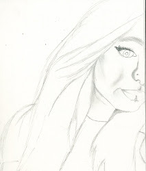
Drawn Selfie
Art is often a mirror, reflecting the social issues and problems of the day. With the rise of ubiquitous Internet, smart phones, and other Internet enabled devices, being online all the time is not only possible, it’s the de facto state for many.
This list of satirical illustrations highlight some of the biggest problems with technology addiction.
how likes and comments boost our ego and what images we post that help us increase our likes and egos.
- How a simple selfie can gain a few likes
but
- How a more revealing selfie gets more likes and comments and gets the attention of people who wouldn't normally look at your images.
Idea 3: "Take a Selfie. Fake a Life" -
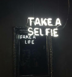
This idea was inspired by this image, how when we take a 'selfie' we are faking who we really are.
My idea for this is to have someone looking into a mirror, the person would have their back to the viewer but from what we see the person looks very ordinary, possibly plain, has made no effort with their appearance, however in their reflection this person all dolled up, nice clothes , for a female her make up and hair is all done, and the image is all posed to look great. This shows how we reflect ourselves on social media, by not showing who we really are but who we want everyone to see us as, this 'perfect' illusion of us constantly looking as good as we do on social media. #fakealife
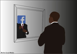
Idea 4: We are social media - Using the same idea as the previous idea oh having someone looking into a mirror, however this time the reflection we see isn't the fake persona we portray on social media, but the social media its self looking back at us. This reflecting how much time we all spend on social media and how it is is starting to take us over, making us slowly become social media.
Idea 5: Wearing the social media we use -
If every piece of social media we used started printing on our bodies, every post we shared was tattooed to us... showing how everyone sees your social media account - Social media becomes a tattoo.
Expanded Ideas
Idea 4: We are social media - Using the same idea as the previous idea oh having someone looking into a mirror, however this time the reflection we see isn't the fake persona we portray on social media, but the social media its self looking back at us. This reflecting how much time we all spend on social media and how it is is starting to take us over, making us slowly become social media.
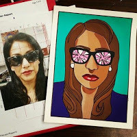
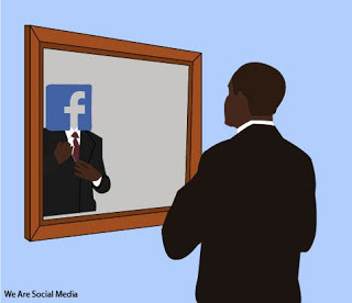
This is a first design of this idea, it reflects the person getting ready in the mirror but what they really see back at them is what social media they use and what they post looking back at them. It also shows how other people might see us as many people only know us from the things we post on social media so when they see us all they see is what they have liked on our pages.
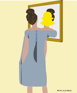
This is an improved version of the first design, for this one i added in a colour for the mirror to give the image more detail, and i removed the gradient colour and went for a light blue background. I chose blue as it fits with the colour of the selected social media design, and this just helps to like the image together.
This is my second design connected to a different social media. Again sticking with the design of having someone looking at themselves in a mirror with their 'most used' social media logo reflecting back on them, showing what people really see when they see them (they only see what they see you post on a particular social media site). Again i wanted the image linked to the logo of the media and so i went for a pale yellow as the Snapchat logo is yellow.
Presentation: For this design i want a series of these images that will be distributed and displayed in a physical form rather than digital, to remove people from the internet, by telling them they are becoming the internet through physical form. I want these designs to be displayed as posters, flyers an postcards, ways people can physically hold and look at the poster rather than scroll past it.
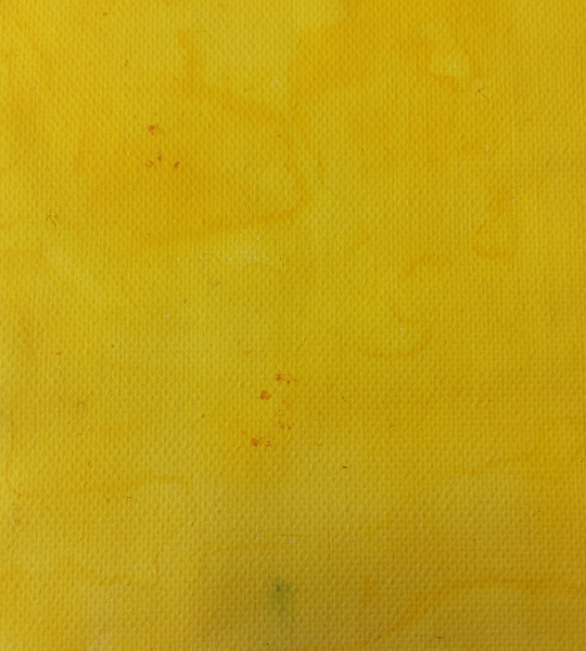
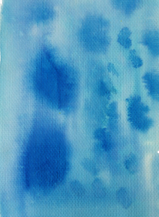
To move away from having a fully digital outcome. I looked at different ways of creating textured backgrounds for the image to be put onto. I worked with inks and water to create these coloured backgrounds. Their colours are uneven making it more ‘human’ than computerised because it isn't perfect like the previous backgrounds where, moving the design away from the computer.
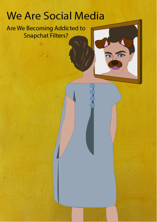
This became the extended version of the ‘Snapchat’ poster. I stuck with the original design from the previous outcome. For this design i used the background i created using ink and water, for the more imperfect, away from the computer, look, with the digital design top. I changed the design for the reflection. I did this to remove the typical ‘Snapchat’ logo so that it wasn’t obvious. I changed the design so that it was a real reflection of the person on the design, however so that you could still tell it was supposed to be linked to ‘Snapchat’ i included the ‘Filters’ that are commonly used on the 'Snapchat’ app. After creating the new design for the poster i thought about the filters that people use on Snapchat and how they are very commonly used in peoples everyday lives now and i thought of ways that this could be showed, as this is a display of how social media has taken over our lives as people always try to include these filters in the photos they take.
0 notes
Text
Pete Norris
Welcome back, second year
What industry wants...
Independence
Self thinking
Analysis ability
Regret is always more painful than failure (Film 'The Dish' )
With failure - you can learn
With regret - you'll never know ... but you'll always wonder.
Design
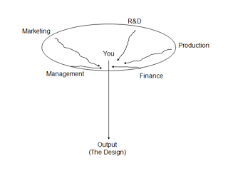
Production Orientation:
- I make this product
- Where is my market?
Market Orientation:
- I have these assets
- What do you want me to do with them?
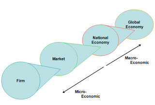
Firms:
Manufacturing
Management
Sales
Finance
Marketing
etc.
Markets:
Competitors
Suppliers
Customers
Clients
National Economy:
Geographic Entity - A Country
Private Sector - Firms, Companies, etc.
Public Sector - Financed by tax revenue, schools, government, police, armed service, hospital, etc.
Government/ Law
Global Economy:
World Trade
Economic Blocks
Basic Marketing.
The 4 P's :
Price
Product
Promotion
Place
Price:
Cost + cost to: -Manufacture -Deliver -Package -Admin & Management
Profit Element -Mark-up can be very high 100%+ in some instances
Loss Leaders
Product:
Core Product -What it must do
Secondary Product -Why the consumer buys it
Promotion:
Where is it being made available?
Shop/ Internet?
Place of consumption -Home? -Office? -etc.
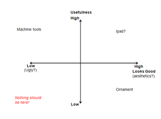
What is design?
Problem solving - creativity
Two types of mental processing
Convergent Thought
Divergent Thought
Attitudes - Management vs Designers
Characteristics Manager Designer
- Aims Long Term Short Term
Profit/ Returns Product Quality
Survival Reform/ Change
Growth Prestige
Company Durability Career Building
- Focus People Things
Systems Environment
Attitudes - Management vs Designers 2
Characteristics Manager Designer
- Education Accountancy Crafts
Engineering Arts
Verbal Visual
Numerical Geometric
-Thinking Style Serialise Holistic
Linear Lateral
Analytical Synthesis
Problem Orientated Solution Led
Attitudes - Management vs Designers 3
Characteristics Manager Designer
- Behaviour Pessimistic Optimistic
Adaptive Innovative
- Culture Conformity Diversity
Cautious Experimental
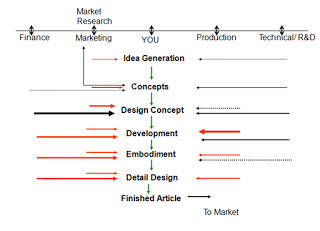
Design Process:
Trigger - Idea Generation, Concepts, Design Concepts, Development, Embodiment, Detail Design, Finished Article.
Design Process:
Trigger - Idea Generation, Concepts, Design Concepts, Development, Embodiment, Detail Design, Finished Article.
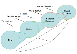
Understanding what is happening ...
The World
The Economy
The Client
The Firm
The Market
You therefore need to keep up with the news.
A need to assess the situation you are in.
Need to ask questions before undertaking a design.
The client is the boss - or at least let him think that.
To meet the clients demands, you must, understand that he may not be giving you all the information you need.
PEST Analysis
Political
Economic
Social
Technological
SWOT Analysis
Strengths - Internal
Weakness - Internal
Opportunities - External
Threats - External
Design Audits
These are more difficult to assess, often occurring after an event.
Right Talents
Right team structure - or recognise where problems may be,
Involve all parties
Ensure management of information
Resolve problems quick;y
Ensure effective communication
Market Data/ Market Research
Market Research - Primary Data
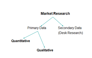
Quantitative :
3 types: Geographic - where you live tells you a lot about how you live
Psychographic - How you think determines what you buy
Socio-economic - your class and financial ability indicate what you will buy
Pro's - Detail/ Clarity
Statistical information
Objective
Con's - Costly - £150,000+
Complex and difficult to do
Needs careful control
Qualitative:
The interview and focus group. Here you discuss with 'those in the know' about a a market or issue that you need to understand.
Pro's - Cheap - cost of a train ticket and lunch
Easily done
Offers a holistic view
Con's - No statistical validation
Subjective
Success depends on control of discussions
Secondary Data/ Desk Research
Covers data that has already been published, there is loads of this stuff, just look in the right places and you'll find them.
Care needed...
Huge amount of data. Need to focus on the needs of a particular market.
Market segment
Breaking a market into distinct blocks.
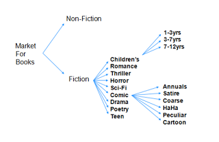
Successful Segmentation
Measurable/Identifiable
Accessible
Substantial
Meaningful
Segmentation ensures successful targeting
Important:
Define the product offering clearly
Don't try and analyse different objects/ products
Only compare like with like, this is more difficult then it might seem at first.
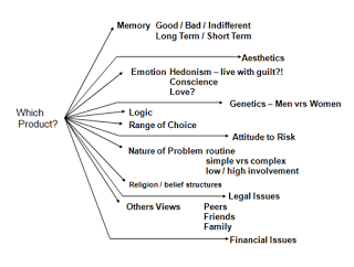
Buyer Behaviour
History Timeline - helps give context of what happened at certain times, should help when aiming work at people of different ages.
Buyer Behaviour Process
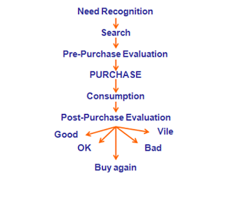

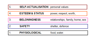
Maslow's Hierarchy of Needs
0 notes