
Statistics
We looked inside some of the posts by dlbanalysis and here's what we found interesting.
Average Info
Notes Per Post
1
Likes Per Post
1
Reblog Per Post
0
Reply Per Post
0
Time Between Posts
1 month
Number of Posts By Type
Text
7
Last Seen Tumblr Blogs


Fun Fact
The Tumblr app for Google Glass was released on May 16, 2013.
Text
PowerBI Job Simulation - Histogram
So a while ago I completed the PwC Switzerland Job Simulation. I thought it was great actually, good to get really stuck in and start playing around with the data and making charts! In this post I wanted to talk about how I created a histogram to display the amount of calls answered within a certain duration, like this:

So, as none of the call centre staff have been selected this is displaying all calls by all people. But if we wanted to know specifically all calls answered by say, Greg, then we click on his name at the top:

We can clearly see that the histogram has changed and the Total Calls Answered amount at the bottom has now changed to reflect that of being filtered by Greg. So this is how I did it. Here is the DAX for the bins:
Bins = IF(CallCentreData[AvgTalkDuration] <= TIME(0,1,0), "00:01:00",
IF(AND(CallCentreData[AvgTalkDuration] > TIME(0,1,0), CallCentreData[AvgTalkDuration] <= TIME(0,2,0)), "00:02:00",
IF(AND(CallCentreData[AvgTalkDuration] > TIME(0,2,0), CallCentreData[AvgTalkDuration] <= TIME(0,3,0)), "00:03:00",
IF(AND(CallCentreData[AvgTalkDuration] > TIME(0,3,0), CallCentreData[AvgTalkDuration] <= TIME(0,4,0)), "00:04:00",
IF(AND(CallCentreData[AvgTalkDuration] > TIME(0,4,0), CallCentreData[AvgTalkDuration] <= TIME(0,5,0)), "00:05:00",
IF(AND(CallCentreData[AvgTalkDuration] > TIME(0,5,0), CallCentreData[AvgTalkDuration] <= TIME(0,6,0)), "00:06:00",
IF(AND(CallCentreData[AvgTalkDuration] > TIME(0,6,0), CallCentreData[AvgTalkDuration] <= TIME(0,7,0)), "00:07:00",
IF(AND(CallCentreData[AvgTalkDuration] > TIME(0,7,0), CallCentreData[AvgTalkDuration] <= TIME(0,8,0)), "00:08:00")
))))))) The DAX TIME function takes three arguments and the syntax is TIME(hour, minute, second)
So basically what this is saying (using the first IF statement as an example), is that IF the average call duration is less than or equal to 1 minute, then put that entry into “00:01:00” in the Bins column. Everything else is where this test fails. The next conditions are strictly greater than the condition before it (i.e strictly greater than 1 minute but less than or equal to 2 and so on). This gives us the Histogram! So all these values would be plotted along the x-axis in 1 minute increments. The y-axis is calculated by this DAX measure: CallsAnswered = CALCULATE(COUNTA(CallCentreData[Answered (Y/N)]),CallCentreData[Answered (Y/N)] = "Y")
It was important to specify that the call had been answered because in the average call duration column – if the call wasn’t answered (i.e “N”) this would have no value in the average call duration – but because of how the above column had been calculated it would put in “00:01:00” ! (because it is technically less than or equal to 1?).
0 notes
Text
Correlation Coefficient
In this post I would like to talk about the correlation coefficient.
Correlation coefficients are used to measure how strong a relationship is between two variables. There are several types of correlation coefficient, but the most popular is Pearson’s.
So, this is the formula for the Pearson correlation coefficient:

It looks a little bit scary, but let’s take it apart bit by bit. So,
𝑟 = The Correlation Coefficient
𝑥𝑖 = Values of the x-variable in a sample (variable 1)
𝑥̅ = Mean of the x-values in dataset (variable 1)
𝑦𝑖 = Values of the y-variable in a sample (variable 2)
𝑦̅ = Mean of the y-values in dataset (variable 2)
Once we have plugged all of our numbers in, the end result should be a value between the range -1 and 1. If we have
𝑟 = 1 then this indicates a strong positive relationship,
𝑟 = -1 indicates a strong negative relationship and
𝑟 = 0 indicates no relationship at all.
What this means in real terms is that a correlation coefficient of 1 means that for every positive increase in one variable, there is a positive increase of a fixed proportion in the other. For example, shoe sizes go up in (almost) perfect correlation with foot length.
A correlation coefficient of -1 means that for every positive increase in one variable, there is a negative decrease of a fixed proportion in the other. For example, the amount of petrol in a tank decreases in (almost) perfect correlation with speed.
Zero means that for every increase, there isn’t a positive or negative increase. The two just aren’t related.
This is probably best shown with a few pictures:

This has a Correlation Coefficient of 1 (and confirmed by excel using the =CORREL() function).

Correlation Coefficient of -1 (and also checked in Excel)

So according to the =CORREL function, this technically has a correlation coefficient of 0.0192. But i think we can safely assume it's close enough to zero!
0 notes
Text
Standard Deviation
In this post I would like to talk about Standard Deviation. I will be using the following data:
What is Standard Deviation?
So first of all, Standard Deviation is a measure of how much variance is in our dataset. Variance is key for Standard Deviation, as Standard Deviation is just the square root of the variance! It is denoted by lower case sigma (σ).
Population or Sample?
Most of the time, we will be dealing with 'Sample' data. In our example, we don't have heights and weights for all males and females. Also, it is easier to work with heights because they follow a normal distribution. So this means we will need the Sample Standard Deviation Formula which is:

So the first thing we need to do is work out the mean of our data. This is 175.3cm.
Now that we have this we can plug in all of our values. This results in a Standard Deviation of 7.8cm.
This is what the histogram looks like:

What does it tell us?
There is a well known rule called the 68-95-99.7 rule that gives us information about a normally distributed dataset.
It states that:
68% of values lie within 1 standard deviation of the mean
95% of values lie within 2 standard deviations of the mean
99.7% of values lie within 3 standard deviations of the mean
Adding the standard deviations onto our histogram will give us this:

So what this does is give us some sort of benchmark for 'normality'. It tells us that:
68% of men are 175.3cm (±7.8cm)
95% of men are 175.3cm(±2*7.8cm [or 15.6cm])
99.7% of men are 175.3cm (±3*7.8cm [or 23.4cm])
0 notes
Text
Index
Power BI: - Histogram (CallCentreData) Statistics: - Correlation Coefficient - Linear Regression - Linear Regression 2.0 (Dummy Variables) - Standard Deviation
0 notes
Text
Linear Regression 2.0 (Dummy Variables)
This is another Linear Regression post (using statsmodels) - but this time I wanted to talk about 'dummy variables'.
The overarching idea:
In the previous blog post at some point I mention about having multiple variables in our linear regression model that may (or may not) give us more explanatory power.
In this example we'll look at using a dummy variable (attendance) along with SAT score to give us a more precise GPA output.
The code:
Apologies in advance, I know this is incredibly messy - but I feel like the concept behind what's happening is more important than how it looks at the moment!
------------------------------------------------------------------------------ import numpy as np import pandas as pd import statsmodels.api as sm import matplotlib.pyplot as plt import seaborn as sns sns.set() raw_data = pd.read_csv('1.03.+Dummies.csv') data = raw_data.copy() data['Attendance'] = data['Attdance'].map({'Yes': 1, 'No': 0}) print(data.describe())
#REGRESSION # Following the regression equation, our dependent variable (y) is the GPA y = data ['GPA'] # Our independent variable (x) is the SAT score x1 = data [['SAT', 'Attendance']] # Add a constant. Esentially, we are adding a new column (equal in lenght to x), which consists only of 1s x = sm.add_constant(x1) # Fit the model, according to the OLS (ordinary least squares) method with a dependent variable y and an idependent x results = sm.OLS(y,x).fit() # Print a nice summary of the regression. results.summary()
plt.scatter(data['SAT'],y) yhat_no = 0.6439 + 0.0014*data['SAT'] yhat_yes = 0.8665 + 0.0014*data['SAT'] fig = plt.plot(data['SAT'],yhat_no, lw=2, c='#a50026') fig = plt.plot(data['SAT'],yhat_yes, lw=2, c='#006837') plt.xlabel('SAT', fontsize = 20) plt.ylabel('GPA', fontsize = 20) plt.scatter(data['SAT'],data['GPA'], c=data['Attendance'],cmap='RdYlGn')
# Define the two regression equations (one with a dummy = 1 [i.e 'Yes'], the other with dummy = 0 [i.e 'no']) yhat_no = 0.6439 + 0.0014*data['SAT'] yhat_yes = 0.8665 + 0.0014*data['SAT']
# Original regression line yhat = 0.0017*data['SAT'] + 0.275
#Plot the two regression lines fig = plt.plot(data['SAT'],yhat_yes, lw=2, c='#006837', label ='Attendance > 75%') fig = plt.plot(data['SAT'],yhat_no, lw=2, c='#a50026', label ='Attendance < 75%') # Plot the original regression line fig = plt.plot(data['SAT'],yhat, lw=3, c='#4C72B0', label ='original regression line') plt.legend(loc='lower right')
plt.xlabel('SAT', fontsize = 20) plt.ylabel('GPA', fontsize = 20) plt.show()
------------------------------------------------------------------------------
When you run the code, this is the graph you will get!

What am I looking at?
This graph is showing us students' SAT scores against their GPA. It is also showing us regression lines of attendance. In green, we have those students who attended more than 75% and in red, those students who had less than 75% attendance. We can clearly see that the students who had an attendance rate of over 75% are expected to achieve a higher GPA.
How was it done?
Obviously you could find that out by looking at the code - but I want to break it down into steps (for my own benefit in the future if nothing else!)
The first noticeable thing that is different from the previous blog post is we have loaded in the dataset into a variable called 'raw_data' (as opposed to 'data). This is because we have some extra work to do before we get started! *Just an aside here that in the 'Attendance' column we have 'Yes' or 'No' entries depending on whether or not the student has attendance rate of more than 75%.
The next two lines of code:
data = raw_data.copy()
data['Attendance'] = data['Attendance'].map({'Yes': 1, 'No': 0})
The first line will make a copy of our 'raw data' variable and call it 'data'. The next line maps all 'Yes' entries in the 'Attendance' column to 1 and all 'No' entries to 0. As below
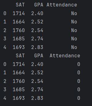
(we only see 5 entries here because both instances [i.e first section is the original and the second one is after the mapping] were printed with the 'data.head()' method).
3. The next thing we need to do is declare our dependent (y) and indedpendent (x1) variables, which are:
y = data ['GPA'] x1 = data [['SAT', 'Attendance']]
4. Once we have this it is the same as before, use statsmodels to create a constant and print some useful statistics!
x = sm.add_constant(x1) results = sm.OLS(y,x).fit() print(results.summary())

A couple of things to note here, the adjusted R-squared value (0.555) is a great improvement from the linear regression we peformed without attendance (0.399) [a note here to say that R-Squared and Adjusted R-Squared will get their own post one day!].
5. So, we can start constructing the equations now. So, our original one was: GPA = 0.275 + 0.0017*SAT
The model including the dummy variable is: GPA = 0.6429 + 0.0014*SAT + 0.2226*Dummy So now, we can split out this dummy variable into two equations (one that has a dummy value of '1' for the attendance greater than 75% and one that has a dummy value of '0' for the attendance less than 75%).
Attended (dummy = 1)
GPA = 0.8665 + 0.0014 * SAT
Did not attend (dummy = 0)
GPA = 0.6439 + 0.0014 * SAT
6. The next line of code is plotting the points in a scatter chart
7. After the points have been plotted we then define our regression lines (as mentioned above):
yhat_no = 0.6439 + 0.0014*data['SAT'] yhat_yes = 0.8665 + 0.0014*data['SAT']
8. Something that I wasn't sure about was one of the arguments in the plt.scatter function. This was the 'cmap='RdYlGn'' parameter. Obviously it is some sort of mapping (Red, Yellow, Green?) but the interesting thing about it was that originally it was 'cmap='RdYlGn_r'' - but I think this reversed the colours or something. Anyway, after I removed the '_r' I was able to display the <75% attendance data points in red which I thought was more intuitive.
9. For reference, perhaps it is a good idea to include our original regression line, this is:
yhat = 0.0017*data['SAT'] + 0.275 10. In the last few lines of code we are plotting the regression lines and giving them titles!
fig = plt.plot(data['SAT'],yhat_yes, lw=2, c='#006837', label ='Attendance > 75%') fig = plt.plot(data['SAT'],yhat_no, lw=2, c='#a50026', label ='Attendance < 75%') # Plot the original regression line fig = plt.plot(data['SAT'],yhat, lw=3, c='#4C72B0', label ='original regression line') plt.legend(loc='lower right')
plt.xlabel('SAT', fontsize = 20) plt.ylabel('GPA', fontsize = 20) plt.show()
So there you have it, that is our linear regression with a dummy variable. I thought that was really interesting. Quite a clever trick to convert categorical data into something numeric like that (but i suppose a binary outcome like 'yes' or 'no' is kind of easy enough I suppose - next time it'd be interesting to see how its done with something like eye colour [blue, green, brown, hazel etc].
0 notes
Text
Linear Regression
So in my first proper post i'd like to talk a bit about Linear Regression.
In the Data Science course I am studying, we are given an example dataset (real_estate_price_size.csv) to play that contains one column with house price and another with house size. In one exercise, we were asked to create a simple linear regression using this dataset. Here is the code for it:
------------------------------------------------------------------------------
import numpy as np import pandas as pd import matplotlib.pyplot as plt import statsmodels.api as sm import seaborn seaborn.set() import unicodeit
data = pd.read_csv('real_estate_price_size.csv') #using the data.describe() method gives us nice descriptive statistics! print(data.describe())
#y is the dependent variable y = data['price'] #x is the independent variable x1 = data['size']
#add a constant x = sm.add_constant(x1) #fit the model, according to the OLS (ordinary least squares) method with a dependent variable y and independent x results = sm.OLS(y, x).fit() print(results.summary())
plt.scatter(x1,y) #coefficients obtained from the OLS summary. In this case, the property size has the multiplier of 223.1787 and the intercept of 101900 (the constant) yhat = 223.1787*x1 + 101900 fig = plt.plot(x1, yhat, lw=2, color='red', linestyle='dotted', label='Regression line') plt.xlabel(unicodeit.replace('Size (m^2)'),fontsize = 15) plt.ylabel('Price',fontsize = 15) plt.title('House size and price',fontsize =20,loc='center') plt.savefig('LinearRegression_PropertyPriceSize.png')
plt.show()
------------------------------------------------------------------------------
And here is the scatter graph of the data with a regression line!
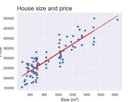
So overall I'm very happy with this. After a bit more playing around i'd like to be able to sort out the y-axis so that the title isn't cut off!
But what does that code actually do?
A couple of things in the code that I'd like to explain:
The first 7 lines (i.e the import numpy etc) are for importing the relevant libraries. By stating something like 'import matplotlib.pyplot as plt' means that each time you want to call on matplotlib.pyplot, you only have to write 'plt'!
The next line of code, "data = pd.read_csv('real_estate_price_size.csv')" is using the pandas library and syntax to load in the real estate data (in comma seperated value [.csv] format).
By using "print(data.describe())" we can see a variety of statistics as shown below:

4. After this, the next lines of code are declaring the dependent variable (y) and the independent variable (x1). With regards to the '1' after the 'x' - it's a good habit to get into labelling them in this way (we will see later that we can make our regression more sophisticated [or in some cases not!] by using more than one x term [i.e x1, x2, x3,...,xk]).
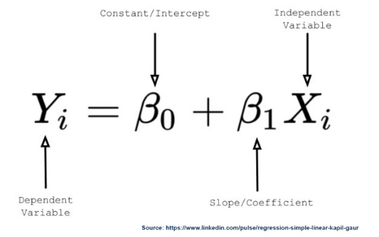
5. The next bit is slightly more complicated - so it's probably worth taking a step back. Remember that a straight line has the equation: y = mx + c, where y = dependent variable, x = independent variable, m = slope and c = intercept (where the line cuts the y-axis). So now imagine that we're trying to fit this line to some data points - we want a constant term c that is non-zero.
A bit of a digression here - but hopefully this will make sense. Imagine that we are trying to predict someones salary based on their years of experience. We collect data on both and we want to fit a line to this data to understand how salary changes with experience.
Even if someone has zero years of experience, they still might have a base salary.
So in regresison analysis, we often include a constant term (or intercept) to account for this baseline value. When you add this constant term to your data, it ensures that the regression model considers this starting salary even if someone has zero years of experience.
This constant term is like the starting point on the salary scale, just like the y-intercept is the starting point on the graph of a straight line.
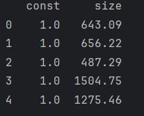
x = sm.add_constant(x1) will add constants (of 1) as a column next to our 'x1' which in this example is 'size'
So this column of ones corresponds to x0 in the equation
y_hat = b0 * x0 + b1 * x1.
So this means that x0 is always going to be 1, which in turn yields
y_hat = b0 + b1*x1
So now that we've got that cleared up, it's on to the next bit. This is the following section of code:
results = sm.OLS(y, x).fit() print(results.summary())
sm.OLS (Odinary Least Squares) is a method for estimating the parameters in a linear regression model
(y,x) represent the dependent variable we're trying to predict and the indepenedent variable we believe are influencing y.
.fit() this is a function that fits the linear regression model to your data, estimating the coefficients that best describe the relationship between the variables.
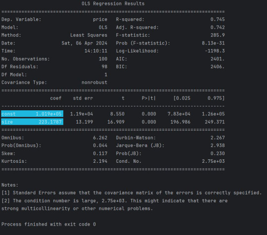
results.summary() returns this:
6. The next section is relatively straightforward! This is the bit where we actually plot the data on the graph!
So first of all we have plt.scatter(x1, y) - which is fairly self explanatory!
Next, we declare a new variable yhat. The highlighted sections in the previous image give us the values we need for the equation. So we have 223.1787 (this is our Beta1 that is multiplying x1) and we have 1.019e+05 (which is 101,900) which is our Beta0. I suppose we could have arranged it (so that it is in the same format as the diagram) as yhat = 101900 + 223.1787*x1
So the next bit - I have to be honest - I'm not entirely sure of the arguments and their order, but essentially it looks as if
fig = plt.plot(x1, yhat, lw=2, color='red', linestyle='dotted', label='Regression line')
is determining the attributes of the graph (i.e the variables for the x and y axes, the line width (lw), colour, the style of the line etc).
The next 3 to 4 lines are quite straightforward. Essentially just giving the axes a title, specifying the font size, giving the chart a title and using the plt.savefig() method to save the image!
0 notes
Text
My first blog post
This is my first blog post! The purpose of this blog is to keep me on track with learning about Python, statistics, and various other things that are involved in Data Science, Data Visualisation and Analysis.
1 note
·
View note