doctorriri
rhodes island reporting
riris arknights side......
37 posts
Don't wanna be here? Send us removal request.
Last Seen Blogs

topodcpower
Untitled
goreinkz
goreinkz
Rotty🐾

fireessie
Buttermilk Bend, my beloved

yuribrut
yuri brut
dreaming-lunar-snow-king
Dreaming Lunar Snow King☆

Text
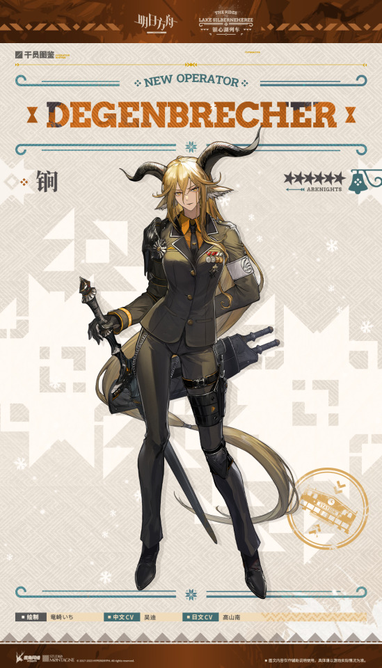
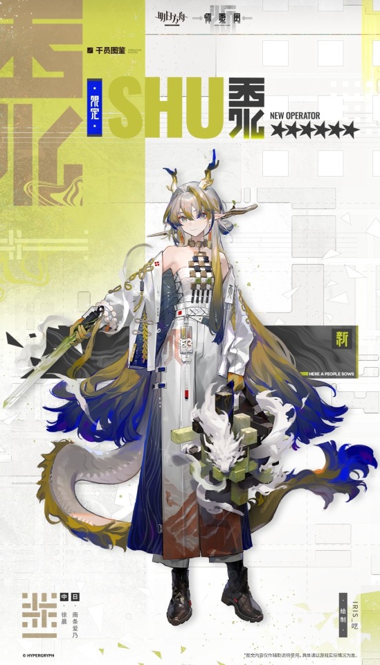
something arknights CN does that other servers sadly dont do is design the character introduction sheets with thematic typography. just look at these lovely examples!
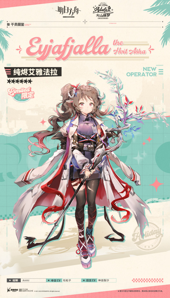

eyja's name font matches the event logo! consistent colour palette too. meanwhile, vivi's is a serif font with a musical bar on its right (and also behind her chinese name).
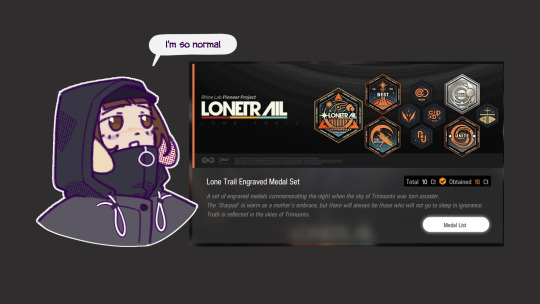
cant forget lone trail's charming futura-like font. lone trail is probably the most notable recent event to catch everyone's attention on thematic typography in arknights.

non-limited events also get similar treatment. enter degenbrecher. the train station stamp makes it look like a train ticket.
last but not least, here a people sows. thick and bold latin font, retaining the letter's curves. meanwhile, the hanzi are stylised such that there are no curves! looks more geometric. this follows the event title font, too, just like previous examples.
#oh#i usually don't pay a lot of attention to these sheets#but it's such an interesting and cool detail#love it#thanks for pointing it out
599 notes
·
View notes
Text
leonhardt and kroos are twins (source; dude trust me)
186 notes
·
View notes
Text
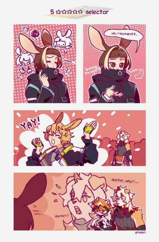
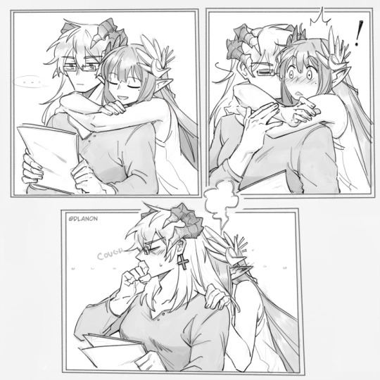
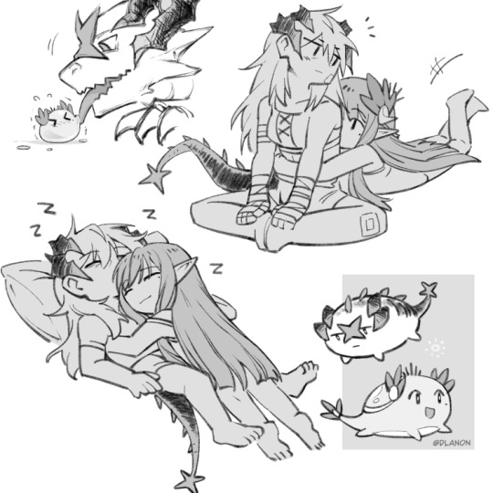
#it took me like 2 weeks to decide fr#sorry hung sorry waai fu i'll get you later тот#bunnyknights almost done... furryknights next#arknights#arknights fanart#leonhardt arknights#hung arknights#waai fu arknights#doctor oc#mine
22 notes
·
View notes
Text
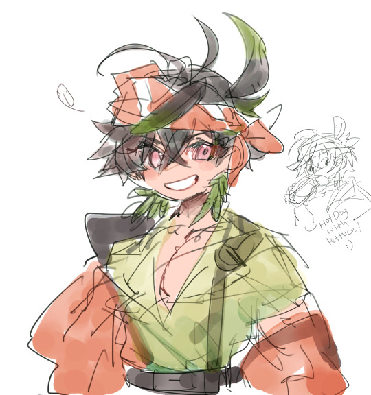
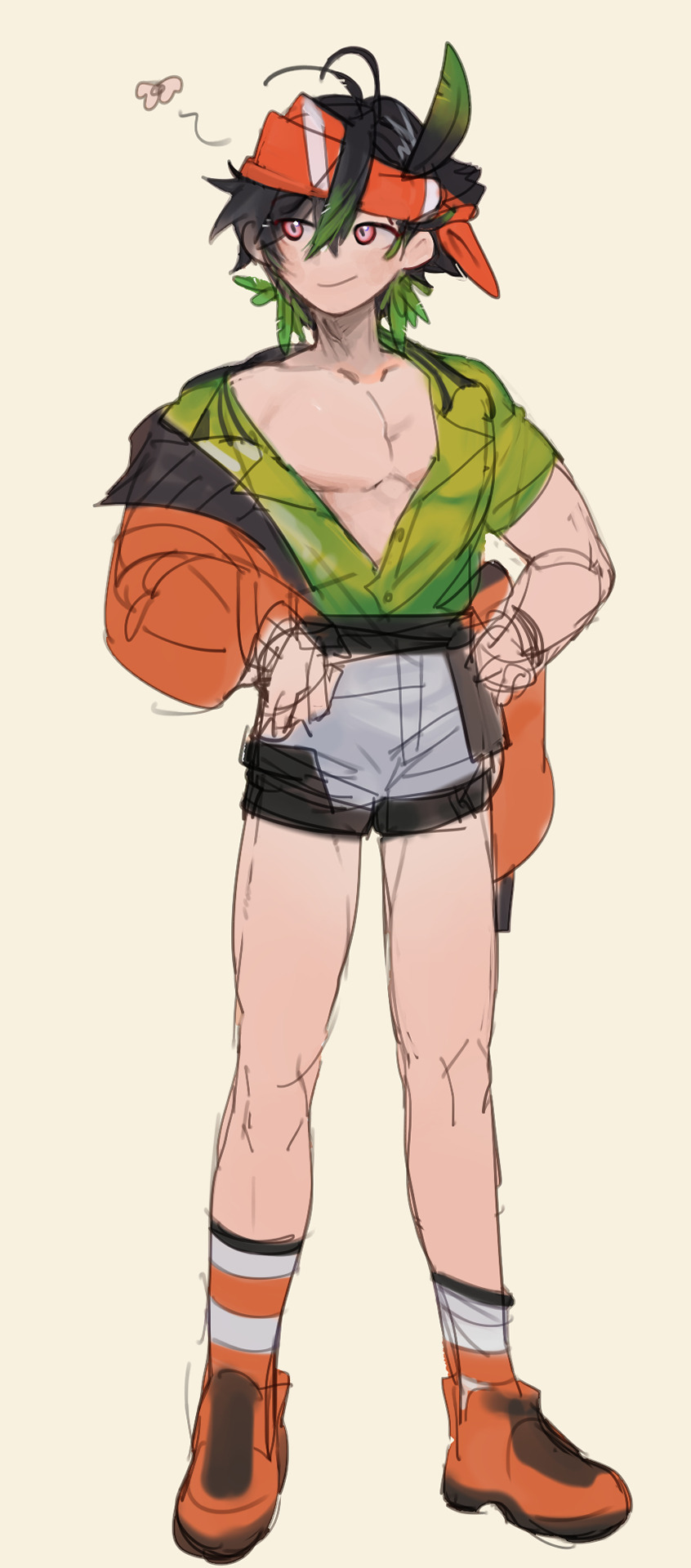
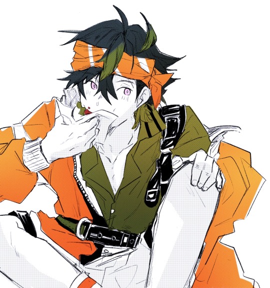
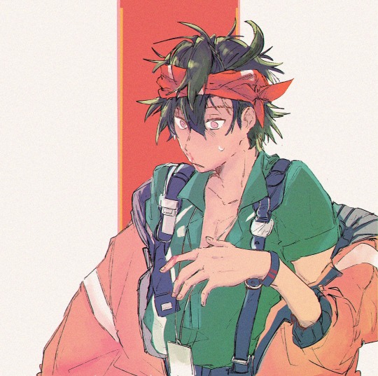
doing the thing where i go nuts and draw characters that arent even out yet (tired and unskilled edition)
50 notes
·
View notes
Text
154 notes
·
View notes
Text
first of all its not silver liquid its like some other shit
760 notes
·
View notes

Text

the love made you seem more present, like the world mattered a little more to you when we were together
could it have ever been enough to convince you to stay?
291 notes
·
View notes


Text
6 notes
·
View notes
Text
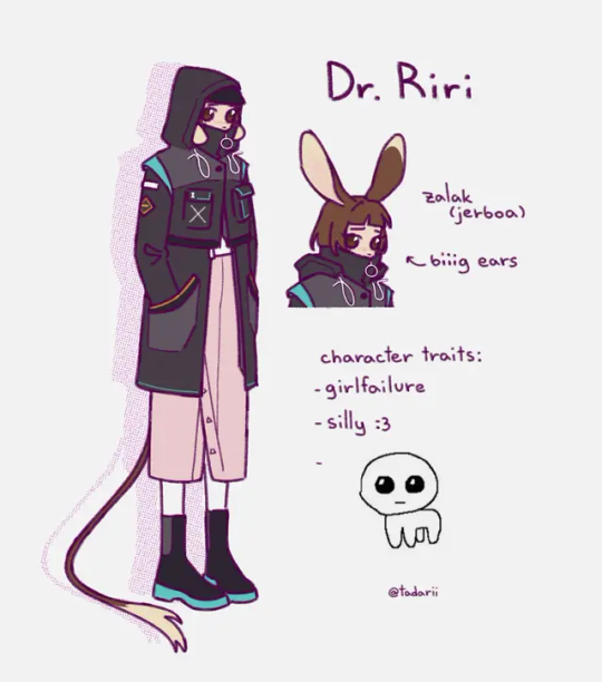
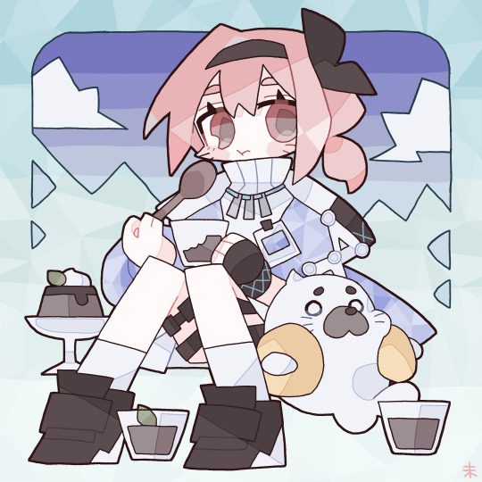
yippee ^_^
#finally little ref sheet for my doctor sona :3#wanted to make her a little pathetic because for some reason my sonas r ususally bright and cute#but she's not like that#don't talk to her or she will cry#maybe later I will make version with normal sized eyes#I just like to draw them this big. makes her sillier#not much info except this tho#I did not think up any lore#arknights#arknights oc#arknights doctor#doctor oc#mine
16 notes
·
View notes