
Don't wanna be here? Send us removal request.
Statistics
We looked inside some of the posts by dorcas5191143 and here's what we found interesting.
Average Info
Notes Per Post
49
Likes Per Post
14
Reblog Per Post
0
Reply Per Post
35
Time Between Posts
5 days
Number of Posts By Type
Text
15
Last Seen Tumblr Blogs


Fun Fact
Tumblr posted its first advertisements in May 2012 and subsequently earned $13M in revenue.
Text
IDES1261 Overall Reflection
Taking the communications course this term has been an enjoyable experience. Even though there was a considerable amount of content which I was already quite familiar with prior to taking the course, including doing engineering drawings and using Rhino, I found consolidating those skills and building on new ones, such as rendering with Photoshop and photographing products, more helpful than I expected.
Photography nightmare...
The tutorial that I had most difficulty with was the first photography one where we had to take photos around the campus. I found this quite challenging not only because of my poor quality phone camera, but mainly due to my lack of skills in photography. All the photos I took seemed boring and they lack a new perspective or a sense of excitement in them. Hence it was great to be able to read some of my classmate’s blogs and learn from the way they composed and edited their photos.
I love rendering!
The task I enjoyed the most had been our assessment 2 on product rendering. I started the task early and had plenty of time to keep on editing and building more shading and highlight layers on top of what I already had. As I’ve mentioned in previous posts, shading is not my strength, but starting off with a photograph of the product really helped to inform me of how light reflects (or does not reflect) off surfaces with different curvatures and materials. Spending time on this task was an absolute joy. It has taught me lots about rendering and also problem solving when it comes to using an unfamiliar software.
Key Insights
#1
I see this course as a skillset building and expanding course, and as with any other skills, to master them take lots and lots of practise. So the key to improving would be to PRACTISE all the skills I’ve learnt continually throughout this degree and beyond.
#2
Reflecting on my experience in this course, I realised the importance of taking my time with tasks, especially when starting out. Whether it is with technical drawing, digital rendering or photo taking, it is so important to be PATIENT and plan ahead before rushing into completing the task. Thinking through the next step before doing it results in more precision; stepping back and considering different ways of doing something encourages creativity; and redoing something when it goes wrong rather than letting it be lead to a better understanding of the skill and a more developed and mature end product.
#3
Finally, I hope to expand my knowledge in using a range of industry standard software, not only the ones I’m most comfortable in (or even the ones I learnt in this course). In this digital age, it is almost essential to be able to communicate through CAD and CAM, so building on these skills would be profitable.
Resources Review
I really appreciate all the resources given to us throughout this course. I found following the instagram accounts of professional photographers and industrial designers/ artists posted on Tumblr especially helpful because looking at industry standard work motivates me to improve and gives me something to aspire to. I especially liked Adityaraj Dev's sketching style and Steve McCurry's photography.
Lastly, thank you Rob, Max and Will for being excellent tutors (and lecturer)! Your guidance throughout the term has been invaluable. I'm very much looking forward to Communications 2 next term.
1 note
·
View note
Text
Week 11 - Product Photography
Interior studio setup with 2 lights
Out of all the photos taking this week, I liked the 2 lights set up the best. Perhaps it is because we get to have more control over where to put the lights and that a professional camera is used to capture these photos as supposed to a phone camera.
Before and After Post Production Comparisons


Interior studio setup with 1 light

Exterior - Open shade

Exterior - Direct light with diffusion
Unfortunately there wasn’t much sunlight by the time we took our products outside to be photographed. However, there is still a noticeable difference in the lighting of these photos compared to the ones in the shade or lit up with LED panels.

3 notes
·
View notes
Text
Week 10 - Photographic Essay
Photography is one of the things I’ve barely touched on so learning about it in the lecture was fascinating. I learnt that a photograph is capable of not only communicating the appearance of an object of focus, but also more importantly, evoking an emotion and telling a story. Good photos are provocative and they challenge the viewer to see the world from a different perspective. Framing, composition, lighting and post editing are all elements of photography that could determine the impact an image has on the viewer.
Adobe Bridge
Checking out the Lynda videos helped me navigate through Adobe Bridge - an excellent software for effectively organising large amounts of images.
After uploading the photos onto Adobe Bridge, we graded each photo from 0 to 3 stars. This is done by selecting an image and typing in “Ctrl + number″.
Once a 3 star photo has been post edited on Adobe Camera RAW, it is upgraded to a 4 star. This way, the photos can be effectively categorised and it becomes clear which ones have been selected for the post.
This task made me realise how time consuming photography is because behind every good photo is a large amount of crappy photos.

Pebbles
The harsh sunlight created very prominent shadows on the pebbles and gave the image an overall warm tone. I had to tone down both the saturation and exposure to give the image more depth.

Built Environment
UNSW has some pretty cool buildings! Increasing the saturation of the photo makes the glass panels appear more vibrant. The white balance and contrast of the photo are also adjusted to give the building a more dynamic look.

Shrub
The interesting part about this photo is the lens flare created by the sunlight shining directly onto the lens. As a result, the original photo was very hazy, so I used the “dehaze” tool on Adobe Camera RAW to remove the haze. I also increased the saturation to bring more life to the leaves and branches.

Parked Bikes
The row of bikes create an interesting effect as you see them reducing in size the further away it is from the camera. The geometric shapes of triangles and circles overlapping against one another also adds depth to the image. However, I don't quite like the background. If I was to do this again, I would choose a different angle and make the lines in the background parallel to the edge of the frame.

Concrete
I particularly like the texture of the concrete sphere. Its weathered and aged appearance is enhanced by increasing the contrast and adjusting the white and black balance. However, I also noticed that the vertical panels in the background are drawing attention away from what's in the foreground.

Sandy
I like the look of portraits that are taken outdoor in natural light. I dessaturated this photo and gave the background a bit of blur. I experimented with increasing the blur but it seemed too unrealistic and edited. Perhaps if I used a better camera, it'll be easier to create a natural blurring of the background.

Reflection
This task was fun but frustrating at the same time. I didn't like any of the photos I took. I think the post production process helped a bit, but I still have a long way to go to improve my photography skills.
It would also have been better if I used an actual camera rather than my bad quality phone camera. It is not a good sign when I couldn't even see my screen while taking some of the photos because of the bright sunlight outside.
This exercise got me researching into different types of cameras and the difference between DSLR, mirrorless, and point-and-shoot cameras. Hopefully I could start investing into a better camera in the near future!
3 notes
·
View notes
Text
Project 2 - Drone Rendering
Rendering

Mood Boards


5 notes
·
View notes
Text
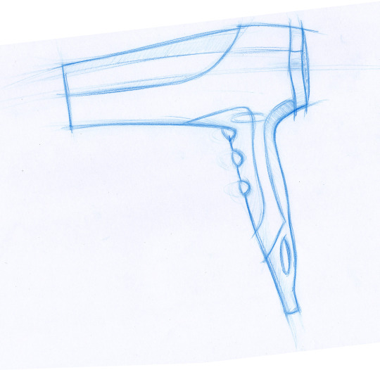
Week 8 - Photoshop Rendering
I found this week’s task to be the most intriguing by far. We used Adobe Photoshop to create a digital rendering of a hair dryer.
Having used Adobe Illustrator for a few years now made switching to Photoshop a bit easier than starting off as a total beginner to Adobe products. The walkthrough we are provided with is also very helpful in guiding us through the entire process.
Starting with a sketch...
We started with an already made handsketch, which we had to change the levels and saturation of in order to use it as an underlay for the digital sketch.
Levels
We used “Levels” to adjust the brightness, contrast, and tonal range of the image so that the background is white and the outline is clean and crisp.

Creating Paths
The “Pen” tool is used to create a path that outlines the hairdryer. As an Adobe Illustrator user, I am very familiar with using the pen tool. It is important to use as little control points as possible to create a smooth curve that is not jagged. The curve can be adjusted using the “convert point” tool by pulling the handles of control points.

Select Inverse
As I filled my clipping masked groups using “Edit > Fill”, I realised that selections of the background were made instead of the actual object. Hence, I had to redo the clipping masks, making sure I clicked on “Select inverse” every time.

Subtract Mask from Selection
Similar the Rhino, trimming is available on Photoshop. The only difference is instead of trimming a path, a selection needs to be trimmed.


Blending Mode
Blending mode changes the way a layer reacts with the layer underneath it. Creating 2 layers, one with the “Multiply” mode, the other with the “Overlay” mode allows shading and highlights to be added to the render respectively.

Rendering - Lighting, Shading & Highlights
The Brush tool (shortcut: B) is used to add shading to the hairdryer to make it more photorealistic. Using the brush tool with a mouse is quite tricky as I have to be very steady with the way I handle the mouse. I might look into other methods of rendering such as using a tablet which could makes drawing freehand curves easier.

Gaussian Blur
The glow around the LED lights are made using the effect “Gaussian Blur” found in Filter > Blur.

Texture
This feature is great for making surfaces appear more matted.

Opacity & Colour
Opacity is another word for transparency. Adjusting the opacity of different brush strokes creates the effect in the shaded box.

Reflection
This exercise was quite a relaxing and enjoyable one. It was great working in a group because when one of us got stuck, the others could help and in doing so we all learnt more than we would have if we did the task individually.
I’m quite satisfied with the final rendering of the hairdryer. The only thing I didn’t like was the air inlet texture. The array of small circles are too uniformed and even though you cannot tell from afar, it actually looke quite odd when you zoom in. It would look more realistic if the circles were arranged in a radial manner and varied in size.
6 notes
·
View notes
Text
Week 7 – Sketching Drills
This week’s task involved a series of exercises that could be practised regularly to improve our sketching skills. They help to develop good hand-eye coordination, muscle memory for drawing straighter lines and better ellipses and circles, as well as a better perception of 3 dimensional shapes.
Straight Lines
Drawing a series of straight lines was more challenging than it seemed. The key to obtaining straigher lines is to move the entire arm across the page while locking the wrist. This minimises the rotation of the wrist which results in curved strokes.
The smaller the sheet of paper, the easier this exercise would be; so drawing on an A4 and then transitioning to an A3 piece of paper helped to really develop the skill.

Join the dots
One trick that Rob suggested is to fix the eyes on the point where you want the line to end. This somehow guides the arm to draw a straighter line and arrive more precisely at the end point.

Cubes in Perspective
Even though I have done a similar exercise before and am fairly familiar with drawing basic shapes in two point perspective, doing more practise helped me improve and draw better cubes. I also enjoyed putting circles inside each face of the cube as it shows how a circle would look in 2 point perspective - it becomes an ellipse that is not only squashed, but also slightly tilted.

Circles and Ellipses
We had to draw 40mm diameter circles all through the page. I drew my first circles slightly too big, measuring 45mm, so I had to redo them. This week’s task provided us with exercises to not only improve our sketching, but also more accurately guestimating metric measurements - which is a crucial skill for industrial designers.
Contour Lines
Contour lines help to transform a 2D shape into 3D. Not many objects in the world are made up of completely flat surfaces, rather, organic shapes and curved surfaces. Adding contour lines help to represent this effectively. It is fascinating to see how adding different contour lines to the same 2D outline could create vastly different shapes and forms.
Ellipses in Perspective
I found drawing ellipses more challenging than circles. Most of my ellipses also tend to have a little tail where the starting and end point connect. This could be eliminated if I paid more attention to where I ended my stroke and really took the time to visualise it before drawing it out.

Shading & Tone - Flat surfaces
Shading is one skill that I struggle with when trying to make my sketches look more realistic. Hence it was nice to start off with shading something simple like a cube. I was also introduced to different styles of shading, including a solid fill, hatching, squiggly lines, etc.

Shading & Tone - 3 dimensional form
We had to create our own water bottle and draw it using the skills we learnt in the sketching drills. I chose to draw a bottle where I can implement more shading because I needed more practise on it.
The shaded box in the background is often incorporated in industrial design sketches to help the object stand out, although I would make it a bit lighter if I did again, since right now it is drawing too much attention to itself rather than the bottle.

1 note
·
View note
Text
Week 6 - Sketching with Perspective Grids
This week, we learnt about 2 point perspective drawings. The task was to draw a Wassily Chair (designed by Marcel Brueuer) using perspective grids, starting with a simple box. I found this to be the most confusing task yet.

Wassily Chair

We had to convert all the measurements of the chair from imperial to metric. I simply typed it into Google, but I also saw some classmates who used the engineer’s scale for conversion.

Page Set Up
I found the setting up of the page the most confusing part of this task. Firstly, it’s working out the right scale for the drawing. The chair has to be small enough to have all referencing lines fit on the A2 page, but big enough to be seen. We changed the scale 3 or 4 times before arriving at a suitable one, i.e. 1:10.

Vanishing Points
Then, it was drawing the vanishing points. At first, we thought they could be drawn anywhere on the page, then Max showed us that they have to be drawn in a particular way:
Step 1. Draw 2 lines parallel to the top view from SP to PP
Step 2. Rule a vertical line down the page from the intersection point
The intersections between the vertical line and the HL are the positions of the vanishing points.

Drawing the Box
Once the page is set up, drawing the box was simple and fun. It was just a matter of connecting the right intersecting points to the vanishing points.


Drawing the Chair
I started out with ruling lines from the vanishing points that indicate the height of the chair and the arm rest. I also ruled lines for the frame of the chair, starting with the front view, but eventually it took too long and so soon enough I started to sketch freehand. Drawing the chair inside a box allowed me to place elements on each view independently, which really helped me visualise how the 3D chair should look like. It also helped to ensure better proportions, as supposed to a freehand sketch.

Shading
As I thought I was finished with the drawing, I saw the finished drawings of people nearby and they all shaded the chair. I am terrible at shading so shout out to Sandy for teaching me how to shade! There is certainly still so much room for improvement but even just a bit of touch made the chair look a lot more realistic and “readable”.

Reflection
I played around a bit with shading and ended up with this (see image below). Although it was a lot of work, probably too much work, put into constructing a box, this exercise helped me to understand 2 point perspectives better and has given me more confidence in sketching 3 dimensional shapes.

5 notes
·
View notes
Text
Project 1 - F Clamp
Engineering Drawing by Hand

Engineering Drawing on Rhino

1 note
·
View note
Text
Week 5 - Drawing with CAD (Rhino) II
In this week’s exercise, we were given an isometric view of a pivot bearing of which we have to draw 3 corresponding orthogonal views. After 4 weeks of practising engineering drawing, it became a lot easier to visualise how each of the front, top and side views should look like.

Learnt from Last Week
This week, I used incremental saving right from the start to ensure that no work is lost. I also created layers right at the start to make the drawing process more systematic.

Wrong Dimensions?
Half way through drawing up the front view, a few of us realised that the dimensions in the isometric view drawing do not add up. Also, since the bearing is not symmetrical, the radii of fillets may not be the same on both sides, but there are no additional information that shows it. Hence, after consulting the tutor, we were told to treat the drawing as symmetrical.

Hatching
There are many different hatching styles to choose from, but “Hatch 1″ on Rhino is used as it is the only one that adheres to the AS1100 standard.

Dimensioning
Dimensioning the drawing is relatively easy because the software automatically displays the correct dimensions. The only challenges are 1) the counterbore symbol is not available on Rhino, so I had to copy and paste the symbol from the internet; 2) to draw an arrow to indicate a section, the tool “Leader” needs to be used.


Title Block
Drawing up the title block required me to look back at the Engineering Drawing textbook to ensure that all measurements are exactly as required by the AS1100 standards. The tool “array” is used to distribute the zone boxes evenly across and down the page.

Reflection
Doing an engineering drawing on Rhino is so much more effective than drawing it by hand! “Ctrl + z” is such a lifesaver! Osnap and SmartTrack are also really useful for aligning views without using construction lines. Overall, I found this exercise a great practice for our first assignment.

3 notes
·
View notes
Text
Week 4 – Drawing with CAD (Rhino)
This week, we started doing engineering drawing using the computer aided design software, Rhino. I’ve had previous experiences with Rhino which made this week’s task less daunting than it would otherwise be. I found it helpful to revisit useful tools such as rotate, array, offset and fillet.
Planning...
Working in a group was great because we could discuss how to approach the task before we began. We all had different ideas but ended up deciding to start with the large circle in the middle because we realised that all other elements of the gasket are dimensioned in reference to it.

Layers
From there, we located the other circle cut-outs using reference circles on which they lie. Even though I knew which lines were for construction and which ones were needed to be kept for the final drawing, I could’ve made it easier for myself by putting construction lines on a different layer, changing its colour and line width. Using layers would be especially useful for more complicated drawings, hence it would be helpful to adopt the habit early on.

Since I did not bring an extra device, I found it helpful to divide up the screen into two to eliminate the constant need to switch between windows.

Tangent to Curves
In this exercise, I learnt to use the “arc: tangent to curves” tool. It creates an arc of a specific radii that is at tangents to two other curves, creating smooth transitions between curves. A similar tool is available in the line flyout, called “line: tangent to 2 curves”, which draws a line, instead of an arc, of the same nature.

Trim & Join
The next step is trimming all the unnecessary lines with the trim tool. This was quite satisfying to do. Then, I took an extra step to join all the curve segments together to ensure that they are indeed touching, i.e. there are no gaps or overlaps between them. Gaps and overlaps commonly results from not using osnap, incorrect snapping, or over trimming/ trimming the wrong lines. If everything do touch, the command line should say “x curves joined into one closed curve”.


Centre Lines
The last step was to add in centre lines on a different layer. I realised that it would be helpful not to use the colour yellow for a layer, as it could be confused with a selected curve (which is indicated also with the colour yellow).

Saving...
Similar to drawing by hand, using CAD could take longer than anticipated because of the many possibilities of making errors. One way to speed up the process is by using incremental save, which allows you to recover an earlier version of the file. However, in this exercise I completely forgot about saving my work until the very end, let alone using incremental save. Fortunately, there were no crashes, otherwise all my work would have been lost.
7 notes
·
View notes
Text
Week 3 – Section and Auxiliary Views
This week’s exercise is built on the skills we learnt in the last two weeks. In addition to a third angle orthogonal projection drawing, we are required to draw a section and an auxiliary view. A section view reveals interior details of an object by slicing it while an auxiliary view shows the real dimensions of a surface that lies on an ulterior plane to the standard x, y, z planes.
Draft
After last week’s mistakes, I made a rough but accurate draft sketch of the drawing on an A3 sized paper. I soon realised that since the scale has to be 1:1, the drawing cannot fit on an A3 without the views overlapping. This meant that I have to work on an A2 sized paper for my actual drawing.

The draft also made me realise that the tapered block is in fact much more complicated that it looks. It took me a few go’s to work out how the front view should look like.

Drawing on A2
After I finished the front view, all I had to do was to project the edges to the top and right/ section view. This made the process so much more efficient than if I had to measure everything again.
It took me a while to figure out how to draw the auxiliary view since it is not 30, 45 or 60 degrees to the horizontal. I remember using a trick with the set squares to draw parallel lines in high school, which is by lining one set square against the other, and then sliding it forward and backwards while the other one remains stationary (see image below). This helped me create a much more accurate auxiliary view that is perpendicular to the surface it represents on the section view.

Hatching
When hatching the surface, I lined the 30/60 set square to the T square and drew lines that are 10mm apart. This created very even and neat lines. However, when I referred back to the book later on, it said hatching lines should be 45 degrees to the horizontal unless in special circumstances.

I also made the mistake of hatching the entire lower part of the block, when in fact, the bottom rectangle represents on of the legs of the block that has not been cut through by the sectioning.

In the final drawing, I am not sure whether to label the auxiliary view as it has not been clearly stated in the book. I also did not dimension the auxiliary view because they would become auxiliary dimensions, i.e. redundant.

Reflection
This week, I feel a lot more comfortable with using the eraser shield and it has made my life so much easier! There is a huge sense of satisfaction that comes from rubbing out a wrong line and leaving the correct line (drawn directly next to it) completely untouched.
I enjoyed this exericise because of the new skills I learnt and the already learnt ones from last week that I am able to consolidate on.
3 notes
·
View notes
Text
Project 1 - Workshop Tool
I chose a clamp for my engineering drawing project. It will be challenging as there are many different parts to draw, but it shouldn't be too sophisticated since each part is made up of pretty standard shapes.

1 note
·
View note
Text
Week 2 – Orthogonal Projection & AS1100 Standards
Engineering Drawing
Doing engineering drawing by hand is hard work! I have done similar engineering drawings previously, but only after this lesson did I realise how precise everything needs to be. Not only do the measurements of the object itself have to be accurate, even the centre lines, dimension lines and arrows have specific parameters in order for it to adhere to the AS1100 standards.

Draft Sketch
At first, I did not believe a draft sketch was necessary and therefore made a very rough outline which did not help when it comes to deciding where to position my drawing on the A3 page. As a result, I drew the front view in the middle of the page, leaving me insufficient space for the top view. I also had to spend a lot of time thinking through how to put in all the dimensions without having one view overlap with the other since the views were so cluttered. Furthermore, it meant that my title block needed to be shorter than what is required in the standards. It was after encountering all these issues that I understood the purpose of drawing a more accurate draft. Although it may seem tedious at the start, it would save a lot of time in long run.

Reflection
I am glad that I drew everything in pencil before going over it in pen, simply because so many changes had to be made. Through this exercise, I have understood the importance of planning ahead and developed sharper instincts as to where to position orthogonal views on an engineering drawing. This exercise took me at least 5 hours to complete, and I’ve got to say I look forward to the day when we could use CAD and knock it out in half an hour.

3 notes
·
View notes
Text
Week 1 - Drawing Instrument Exercises
This session has taught me how to use basic technical drawing tools which I had little to no prior experience with, including the T-square, stanley knife and circle template. I enjoyed the whole process because drawing neat and accurate lines and cutting them out gave me a sense of satisfaction. However, this does not mean I did not make any mistakes.

Part 1, Figure 1
The first mistake I made was instead of measuring a 8mm gap between two parallel lines as instructed, I measured 8mm between the vertices of the two lines which meant the actual gap became much shorter than 8mm (see image below).
While rubbing out the wrong lines, I accidentally rubbed out other constructing lines. If a similar situation arises next time, utilising an eraser shield would be a better option. I also learnt to use a plastic ruler to construct straight lines rather than a metal ruler, as it is not the appropriate tool - it made my lines look a bit squiggly.
When I began to outline the sketches with a felt tip pen, I realised that the ink was flowing under the ruler, causing smudges and uneven thickness of lines. Rob explained this as a result of surface tension and capillary action and suggested using the other side of the set square which has a raised edge to prevent the ink from bleeding.

Part 1, Figure 2
In the cutting exercise, I learnt to devise a plan of completing the task more efficiently by drawing a whole array of the pattern instead of four individual and separate templates. With the first few cuts, I repeated the action a couple of times, but I later on found out that one cut is usually sufficient for something with the thickness of a piece of paper.


Part 2 - Tessellating Pattern
Most of the pieces fitted nicely together. However, the pattern would have looked more interesting if coloured paper were used. Right now, all the elements are blending into each other as they are all white.
Reflection
Overall, this exercise has taught me valuable skills that are basic but foundational to build upon as we advance through to more complex and sophisticated sketches in the course.
3 notes
·
View notes
Text
Hi
Hey guys, this is Dorcas. I’m studying industrial design because I am intrigued by the creativity and resourcefulness that designers exhibit in their work. I hope to do the same by coming up with innovative designs that could make a difference in people’s everyday life. As an ex-mechanical engineering student, I think I will enjoy the more creative and hands-on nature of this course.
4 notes
·
View notes