Text
Cat Sculpture - Final
For my Final Portfolio piece I decided to recreate my cat, Django, as a 3d clay sculpture.

Unfortunately due to Covid last year we only had a few lessons on clay and working with it, so I spent a chunk of time doing some research on methods and how to approach it. I found Susie Benes online.
https://www.susiebenes.com/blogs/airdryclayart/88058691-sculpture-foundations-i-constructing-a-solid-armature
She is a artist that sculpts using various methods, although she creates armatures that are designed for movement it still seemed like a solid approach for a multiple limb animal. I started by buying some wire and a wooden block for a base.

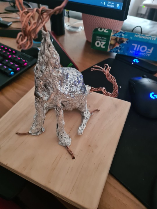
I threaded the wire though the base and created the form of the sculpture.

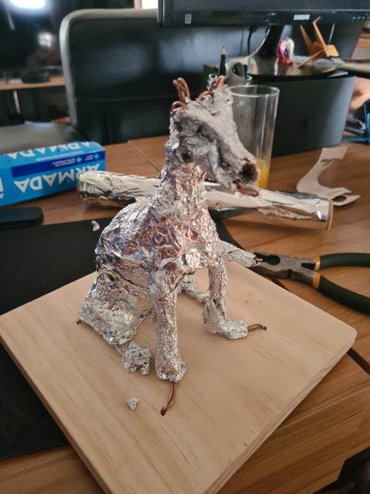
The next step I decided to use tinfoil to create a larger block form (a method we are learning in life drawing). Doing this would mean the core would be light and strong and require need less clay.


Once I was happy with the overall form, I started to layer on clay. Unfortunately I only had access to some cheaper air dry clay, where id much rather use a higher grade.

I was quite happy with the first pass with the clay, I knew I needed to go back in to create more detail later at some point but was overall pleased.

I went in one more time to smooth some surfaces with sand paper and add detailing with small pieces of wet clay. at this point I noticed the proportions weren't exactly how I wanted them, unlike digital I couldn't go back to easily correct this, also the way I had built the model meant that bending and moving limbs would be almost impossible. Next time I would spend more time with the tinfoil to nail down the muscle structure with more detail, I assumed that I could go in with clay to do this after the fact but this proved more difficult than expected.
As the final part I decided to add a coat of black pain, this helped create a stronger silhouette.


Looking back over the process I would defiantly spend more time building the muscle structures during the wire/tinfoil part. I’d also seek out an higher quality clay I found this one to be crumbly and dry unevenly.
0 notes
Photo

For the creative piece I wanted to use what I learnt from the other paintings and incorporate it into one piece. I went for a stylised poster like design with striking colours and interesting texture. Using the sky blending method I learnt, I used brighter colours for the sky. I also used the greyscale method to create the landscape and details on the character.
The outline around the character came out more exaggerated then I intended but I decided to stick with it as it really made the character pop. The muted cool tones of the ground detail contrasting with the bold and bright sky is exactly what I wanted to capture in the creative piece.
0 notes
Photo


For the colour study I picked a landscape. I really wanted to do a photo I took on the way to uni one day. The colours are bright and moody and the dark grey urban setting sits really well in contrast to the sky. I did a test painting first to understand how to approach this type of sky, using a cool dark blue colour I blended it on the canvas with the vivid orange. From this test I learnt that using a dark colour overpowers the image and looking at my image reference I decided to use a brighter cool colour instead. When it came to painting the piece, I used lots of layers of colour for the sky, I really wanted this to be the focus of the piece. I kept the buildings and roads dark, so they did not take attention away from the sky.
0 notes
Photo


I Started by practicing my greyscale tones with a few faces. I am fairly new to using paints, especially acrylics, I tend to come at painting with a more of an oil like approach with bigger strokes of paint and lots of paint layering. I decided I wanted to do a coastal landscape for the greyscale but after a few tests I felt it was hard to read and came out looking bland. I decided to go for a more texture heavy painting by using a photo I took at the beach a few years ago. The rocky hard shapes really drew my attention in. I started by painting out a large portion of the canvas with a dark shape using the photo as a rough guideline, then I slowly worked the rock highlights with a slightly dry brush. I kept the background more of a rough suggestion to make the center rocks stand out more.
1 note
·
View note