Don't wanna be here? Send us removal request.
Text
Blog #4
Chapter 10 in the book focuses on visuals and graphics for emphasis on the designer's message. Artists highlight their creativity in adapting to match their client's intended message. Mirko Ilic states "...the better known you are as an illustrator with a certain style, the harder it is to change directions. Big ships require much more time and energy to turn around." This represents the overall message of graphic design as there is no one single solution to good cover art or strong marketing tips. Having that clear idea in your head and interpreting it into something that stands out is the highlight of visual representation.
Chapter 11 differs in that the focus of the art piece moves more into its execution stage, subjecting the total success to a combination of its striking appearance AND verbal delivery. The TED talks come into play as an effective way for creators and influencers to market their ideas in 16 minute segments and emphasize those key points in a timely manner.
For my project, I am creating a logo that represents either an kitchen appliance company, A high end restaurant, a delivery service, or a solitary knife manufacturer. To accompany these ideas, I tried to think of the marketability of each of my designs and how they might be represented on the product. As a general appliance company, I imagined my logo being disjoint from the name. It would be molded into plastic coverings or on the corner of the box. A simple shape that reminds people of my two words (Chef + Dinosaur) is the footprint of a T-Rex. I tried to clean it up and make it sort of a uniform symbol. Next is a High end restaurant. This one is more of a logo print that hangs on signs or bumper stickers as a standalone product. I decided to showcase a velociraptor as the smug grimace that displays confidence in my restaurant's work. For the delivery service, I stuck with a Velociraptor but this time, turning it into a more symbolic logo, having the letters form the illustration. The bottom of the C creates the tail while the D makes a little arm. Lastly, I decided on a side profile so that it could easily be laser burned onto the wood handle or engraved on the knife surface. This is a weighted drawing that amplifies a T-Rex's powerful features.

0 notes
Text
Blog #3
When I read Chapters 6 - 9 I got the impression that our leap as a society into the modern technological age was being negatively criticized. Multiple designers noted that there were problems with a screen filled world and that effective marketing plays at more than just visual presentation; Good design requires the viewer being engaged in feeling, smell, taste, or the simple visual. when it comes to graphic design, Carabetta states that having a physical print book is stimulating on an emotional level because we as humans can find allure in it. Contrasting that with an online medium would be the artist Len Small with his Nautilus newsletter. He states that the difference between his physical print and his electronic resources is in presentation. Online, the focus is quick access and continuation of a theme. People want their viewers to continue clicking deeper into their content. Paper magazines are designed differently so that the reader may always find entertainment whenever they pick it up.
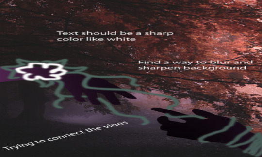
As for my progress on Project 3, I developed one of my poster ideas into a working concept. The first draft of this image showed me what I liked about the original sketch, but more importantly what I wanted out of the concept. Next, I took that idea into a second copy that sought to continue with a simple theme of connectedness. You can see in the first image that I included a high definition background with simplistic hands and detailing. The idea was to turn each detailed chunk into a much more simple but sharp object. The colors for the hands also convey a message. There is a splash of pink in them which came from an idea that I might use black as a blending agent between the more corrupted lower hand and a decorated upper hand.
The second image takes the same concept but applies it more effectively. Bright colors draw out the sharpness of my objects even more, especially when I contrast different shades of the same color. I also want to use real pictures as examples so that the shape seems believable. My current focus is finding out how to turn the picture I import into a solid, malleable shape. My images are stretched as a result of the files being .psd


0 notes
Text
Blog #2
This week's readings continue on the theme of interviews with the owners of design studios. I found that there was a lot of insight on partnerships and working together with other artists. This remains true with employees and workers, as most of the business owners stated that they look for enthusiasm and good attitudes in their applicants. Along with the personable requirement, young artists should contribute their own perspective.
The next chapter broke into interviews about type work and the intricacies of dispersion into each studio's theme. Each artist answered differently to questions about their typeface style or what motivates them, but what each of them have in common is their inspiration from personal visual satisfaction. In this way, their letter art becomes a vision only they can conceptualize.
For my work this week, I worked on our second project which involves abstract typeface art. For the first picture I actually started with a concept that resembled a modern symbol. Using parts of letters H's and J's, I turned them into a sort of forking symbol that converges to a single point. After receiving clarification about the abstract nature of my project however, I decided to remove the uniformity while still keeping that forked design present in the first sketch. Past that, there are two half circles to the right facing each other. They look sort of like an hourglass.
The second picture is meant to be a continuation of the first image's vertical lines. keeping in the same style, this photo has vertical lines with a lot of curving edges. The difference between the two photos is now in complexity and the addition of subtle skewed and varied patterns. It was meant to take the single vertical grouping of the first photo and extend that across the canvas, showing more positive contrast between the white and black space.
The last photo shows many diagonal lines, some terminating in spontaneous shapes while others extend off the page and into the middle picture. My reasoning behind this decision was honestly kind of weak because I hadn't had a plan at the time of creating it. I started stacking letter H's in lines that made them look like city streets until I noticed that the picture wouldn't be special unless it has something different from the previous two. Instead, I opted to rotate the entire artwork diagonally and then create some areas to draw your eyes away from the uniformity of some of the lines. The piece I'm proud of is called "eyes" in the original file. it was made from two lowercase "i" letters. It gives cartoonish charm to the entire creation which makes me smile so I kept it.


0 notes
Text
Blog#1
The reading for this week was a collection of transcripts that recount the thoughts and expressions of numerous graphic designers. Each of the artists listed comes from a different background and path to the career field, though they all share a single similarity: they all agree that inspiration was the key to art. The artist Stefan Sagmeister had a specific influence on how I view creativity, especially through the visual examples in his interview section. He believed in taking breaks from the labors of work in pursuit of personal motivators, stating "I had the insight that I could come up with different kinds of projects when given a different time frame to spend on them." The free spirited nature of his pursuit of art aligns itself with how I aspire to come by my own art style. I'm not much of a sculptor or painter but I've loved the idea of 3D modeling and fantasy design. With my passion, I find it really easy to drag real objects into my artwork and put my own twist on it, so long as I have the motivation to act. His type of mental therapy works well with people like me because it gives an artist time to think over their piece's thesis and get a clearer idea on where to start.
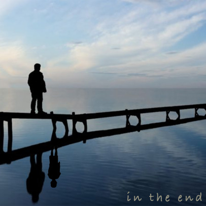
My first picture is titled "In The End". The idea came to me when I was driving home from class a couple days back. The snippet comes from a song that isn't often played on radio stations so it stood out to me. I recalled all the times I had heard the song from my childhood and what the lyrics meant to me. following that verse in the song, the line "it doesn't even matter". As an artist, I decided to spin the idea into something happier. The new continuation is "In the end you were always beside me". In practice, my art was extremely rushed. you can see with the silhouette asset I used that it has a sharper contrast than most of the picture. The text also doesn't blend well into the photo so it loses the intended effect. I wanted for it to be something like an old timey photo where someone had signed over the top.
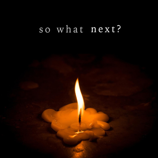
My next photo is titled "So What Next?" The idea also came to me through an audio snippet but this time it was something my sister was watching on TV. She just recently fell in love with a crime show about witness protection officers and how they solve mysteries with help from their witnesses. The show is called "In Plain Sight". During one of the episodes, the team gets stuck in the case. A character exclaims "So What Next?" in a defeated tone. I really liked this snippet because of the hopelessness in his voice. The pitch and frequency made his words much more believable. The art I chose hopefully captures that feeling of loneliness with the way a single candle flame draws the viewer's attention towards the center of the screen. The edges are faded to black so that only the table's surface is illuminated. I chose to put my text in the darkness above so that the words themselves also carried that feeling of loneliness, being spaced further apart and almost a dim shade of white. The word "Next" is purposefully brighter. I intended for the viewer to hang their eyes on that word as to help them feel what the characters in this show felt, hanging onto that last piece of information and hoping for some clues.


1 note
·
View note