
Statistics
We looked inside some of the posts by dxnaves-blog and here's what we found interesting.
Average Info
Notes Per Post
0
Likes Per Post
0
Reblog Per Post
0
Reply Per Post
0
Time Between Posts
5 days
Number of Posts By Type
Text
17
Last Seen Tumblr Blogs


Fun Fact
28.6 is the average number of monthly visits per US mobile user.
Text
[17] Evaluation
The context of this assignment asked us to consider how to use graphic arts & media to promote positivity in young people. I have explored themes such as music, fashion and fitness as all of these are well known industries and therefore this would appeal to my audience because all of these are popular In young people. I received work experience from Stanway villa fc, this was to create an end of season book to promote the team and the teams progress, i worked towards doing this rather than another topic because the Stanway villa project was closer to the brief that being positivity, i could take the stanway villa project to new levels to challenge myself, the area i worked towards was positivity in sport and layout design, which is area that I’ve never explored before but I was willing to give it a try because I wanted to challenge myself. The purpose of my project is fuel young kids with self confidence and positivity, thats the reason why I made a book with the kids included in it. One of the problems caused by a self-initiated project is people often do what they are interested i and they don’t think about a specific target audience, however I went off of football and sport for a while, so going back into this i felt confident as this project was set for me and i was in charge with the full making of it and it allowed me to get my passion and love for sport back.
My research started by exploring sports graphics to come up with a design idea for my final outcome. I would say the research information I used was very diverse as I researched the internet throughout the project coming across a variety of designs and designers, for primary research I went into JD and DW sports and went to see how different types of graphics were communicated to a specific audience. The artist that was inspirational to me was Emilio Sansolini because he works in sports graphics as a full time freelance designer and this was the area I was working on so it was perfect, these influenced my concepts because I based my page designs off of one of Emilio’s bechance projects for Fifa. I think I communicated my research relatively well because in my blog posts I explained why it influenced me and what I did in response. As the project went on my research grew fonder as I was coming across a lot of designers that make sports related graphics and I was using them as a examples and influences.
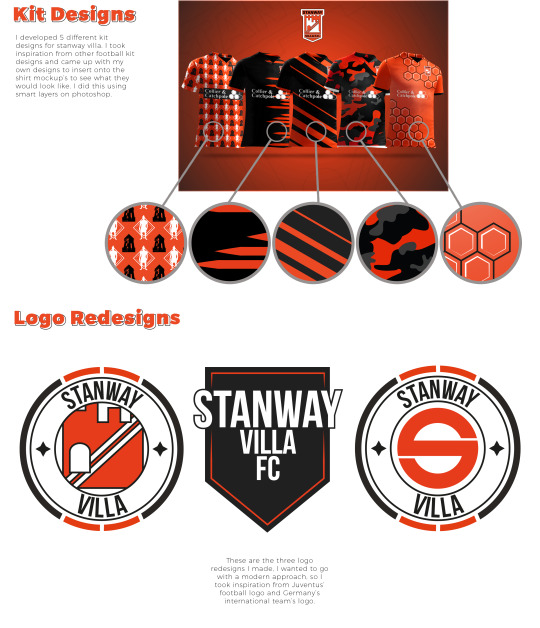
My experimentation was very varied because for 8+ weeks I was constantly developing new page designs and ideas, for example at the start it just started as mock ups then after that I got too the making straight away and had several meetings to show off what I had been doing over those 8 weeks and how I had developed what I did and why. Throughout the FMP my ideas mainly changed about 4 weeks in, this was because I had the Stanway villa book as work experience and I was also trying to make outcomes for my original FMP idea which was fashion, this changed because I was struggling to find time to do both and also I was finding it hard to come up with final outcomes for the fashion project, therefore it made sense to change project to the Stanway villa book and I’m happy I did so. I used my time very well when making the book because I planned out what I was going to do before the day started and set my self a to do list to complete for that current day, this worked very well because it kept my full focus on the book and I completed the work to a industry standard turnaround time. The strength of my creative decisions were based on team input, the processes that I have refined are layout design along with cutting out objects using the pen tool, i refined upon these because i was constantly using both of these. I developed different logo designs for Stanway villa these were inspired by different football badges such as Juventus and Germany. For this project I worked around digital processes as this was the area that I want to go into as a full time job.
I wanted my work to communicate positivity and confidence and i think i have achieved this as i have created a book where all players are presented in a positive way, Along the way the choices i have made i feel were good ones as everything went to plan other than a couple of slip ups, however i soon corrected these. I felt as if i worked to plan with the book and was on ask with all the writing but the writing side is what i fell behind on because i was so focused on the making of the book that i didn’t get a spare minute to do my blogs as i went along, this is something i wish i’d have changed about my project. I feel as if this project was perfect for me as the making was fully digital and it was a specialism i wanted to explore anyway. This project was as close to a job standard project as possible because it included communicating with a client and constantly thinking about what i was doing and letting the client know that also, I much preferred doing this as i want to progress and get straight into the work place as i feel like i will learn and achieve more if I’m learning as I work rather than in education.
-960 Words
0 notes


Text
[15] Stanway Villa Book
For one of my final outcomes I made a end of season book for the players and managers of Stanway Villa Under 14′s.
To make the book I used a selection of programmes such as Adobe Photoshop, Illustrator and InDesign. I used Photoshop to make the individual page designs, cut out the players and add the text that was needed. I used Illustrator to make the vector based assets and remake the logo, and finally I used InDesign to order the pages and create a high resolution pdf with crop and bleed marks ready to send to the printers.
Page Design
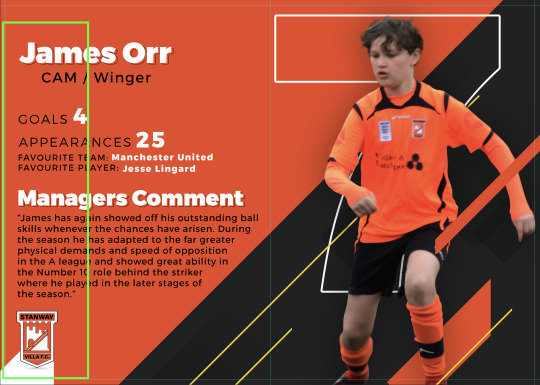
For the page designs I used a variety of designs, for the player pages I wanted to go with a Fifa styled theme as the players at the football club are mostly 13 and Fifa is a popular game for there age group, for the front and back cover they both had unique designs which I came up with to entice the audience into reading. The intro, thank you and all the other pages I tried to make the same page design with the same typeface and background.
When making the player page designs I wanted to create something that fits the stairway villa colour scheme which was dark grey (#212121), orange (#EB4824) and white (#000000), this keeps the book to a professional standard because it has been kept to 3 colours only and allows people to realise what the main colours are and would make people associate the club to those colour.
Text
For the text I used a neutral looking font called Trueno, I used this font because it has a modern feel to it and the type face is easy to read and understand. I would describe the font as formal because its not hand written or a type face thats hard to read and this gives it the edge on using a font like ‘Mark my words’ which is a hand written and calligraphy style font
Image
The images in this book have been taken by the photography students e.g. the player pictures and action shots. Which we then cut around and added to the individual player pages, I used a variety of portrait and action shots for the player pages, i did this because the age that the kids are at they are gonna want to see action shots of them selfs and it will give them a positive attitude, this is what i wanted to achieve within my work.
When using the images of the players, the colours, shadows and highlights were out a little bit therefore i used tools in photoshop to correct it, i did this because if i didn't do this it would look out of place on the page.
Process
1. First we started off by researching football related things such as Fifa football magazines etc. After we went into the making of the player pages, we decided to go with a Fifa inspired book and by creating a Fifa inspired book was because of the kids ages.
2. After this me, Jake and Jay took some mock up photos in the photography studio of us striking a football to cut out an then test on the player pages.
3. These worked really well so we decided to make an a3 sheet with all of our progress on and send to the manager of stanway villa to see how he liked it and the feedback we received was really good so we went with what he liked best.
4. After this we all decided that I would make this my main project and Jake and Jay would focus on theres.
5. From here all my focus was in this project, I knew I had a time frame to work to because of communication time and printing time. So I emailed the stanway villa manager to get information on the players such as their names, numbers, positions, appearances, goals or clean sheets, favourite players and favourite team, these would all be information that would later on be included within the pages of the book.
6. Next I got in contact with the photography department, who sent four students too attend two stanway villa matches and took a huge amount of photos for me to cutout and use to then put on the player pages and action shot pages.
7. Then I started with the making. First I started by making all of the player pages and inserting all of the assets into photoshop to make a template for the player cutouts to be on, then I cut round all the players that would be on their own player pages with help from Jay.
8. Then I started with the making of the front cover, intro page, action pages, thank you page and back page, the information that was required for these parts was given to me by the stanway villa manage at the start so I had it all ready for when it was needed.
9. After I had finished all of the pages I had it proofed by fellow teachers to make sure it was okay and I got back a list of amendments that needed changing these were some spelling mistakes, random characters that didn't need to be there and to make a bleed.
10. So I proceeded to make these changes, after all of these were done I then read over it and proofed it myself and also got my teachers to proof it with me.
11. After I got in contact with the printers to speak about sending it to them, so to send it I had to take the book into indesign and make it a high resolution pdf and I then uploaded that to google drive and sent the printers the link to download it.
12. Next I got an email back saying I needed to extend the bleed from 2.5mm to 3mm on every side, add bleed and crop marks to the pages and move the assets into the middle more as they would have been cut off during print.
13. So I spent 1 week doing these amendments, after I then reuploaded the corrected high resolution pdf to google drive and I resent the link to the printers and everything was perfect.
14. And one week later I received the final book which is going to be shown in my exhibition and be used as my final piece.

Original Plans
Originally this project was work experience for myself, Jay and Jake, we worked as a team to design the player pages, but further into the project we decided that it would be best to make this Stanway villa project my FMP as there was a lot of potential of where I could take this, it also made sense to make this my FMP as I was struggling to figure out what outcomes to create. From that point on me, Jake, Jay all decided that I would put all my focus onto this project to make this the best it can be by communicating positivity within football and team work. We also agreed that they would do there own projects.
My original plan was to make the book A5 Portrait but then after having a meeting with Nigel (SV Manager) we agreed it should be A4 landscape as more would fit onto the page and it would become more of a display book, rather than a small book which people struggle see.
youtube


Problems
We faced some problems along the way with this book, for starters when I was creating player page designs I created the document at 72 dpi by mistake which would then cause a problem after during the printing stage as 72 dpi is mainly the resolution for screen graphics, but because this was to print 300 dpi is the best resolution to print at.
Also towards the end of the making of the book, I got in contact with the printing company and they emailed me saying that I need to make some changes to the pages, this was to change the position of the logo and test on the left hand side of the page and to change the bleed size from 2.5mm to 3mm. If I wasn’t to make these changes part of the player pages and other pages with the logo and text would have been affected during the print process as the printer would have cut to close to them and when printed they would have been hidden by the spine of the book. After all of this the printers ran me through how to add bleed and crop marks onto a high resolution PDF so that the industrial printer could recognise what parts needed to be cut.
0 notes
Text
[14] Mid project review and Show and Tell
Mid-Project Review
For this project I will create an A4 Landscape book for Stanway Villa FC, this book will include the following. Intro page, manager, team line-up and player pages, action shot pages, fixtures and results page, league table, thanks you page and back page, this fits with the context of the brief because making a book for these kids at such a your age is a confidence booster which can be seen as a positive action and It also makes the kids feel positive about them selves because they are apart of a proper book which is mostly about them.
I will show I have good technical skills by creating concepts and ideas adnd comparing why one might work and the other may not. I will design to high standard also which will show I have good technical skills aswell because it shows I can work well with the programmes given. I will show I can use a broad range of processes by taking action and using many tool or processes within the digital programmes I have been using. I will show that I can keep to an industry standard by communicating with the customer in a friendly and formal manner, and I will also keep within time frames so that the book that I plan to create is printed on time and the customer is satisfied. I will present my work in a professional manner by showing it at the exhibition at college on the 14th of June.
The artist I looked at to inspire me was Emilio Sansolini because he creates sport graphic such as kit designs, player posters and many more, he has helped me develop kit designs for stanway villa as I tried to use him as an influence and he has inspired me to create a Fifa inspired page designs and graphics. Also Fifa inspired me because the kids are under 13 Fifa is a big game for there age group so to do a Fifa like design makes sense as they will think they are in a game.
Currently I have a potential outcome of what the book may look like but between now and the final project hand in thats likely to change because a persons idea is always changing, the potential outcome gives me an insight into what the book could look like and how its presented. I will create my final outcome by managing my time well and keeping a record of what I have done, how I have done it and what I did because this will allow to get the outcome produced by the hand in. I am getting the book professionally printing therefore you have to allow at least a week, so working to a time frame is important and critical to my success.
By the end of this project I need to have filled in my blog posts fully to a high standard, handed in my A1 springboard, handed in final outcome, filled and an organised production file, these will all be critical to my final grade because if none of these are done it will end up being a referred pass and I do not want that.
One thing that could disrupt my hand in is any printing problems with the book, anything could go wrong within the print process. Also if I miss a piece to hand in on deadline day it will corrupt my chance of getting an achievable grade, and I want to come out this year with a pass at least.
0 notes
Text
[13] Compare and Conclude

When looking at these 3 pieces of art I can see they all are very similar in that they have used the colour orange which communicates warmth and happiness because of what the colour is associated to such as fire and the sun and these can be seen as warming and happy.
Landor 2016
With this advert I can automatically see that the design of the boot is based off leopard or cheetah’s fur because of the iconic markings, this tells us that when nike were making this advert they wanted to communicate this as best as possible, thats why they chose to make it of a large scale. The leopard/cheetah print pattern communicates speed because a leopard and cheetah are both know for their speed and both are fast and agile animals and nike is basically saying that you will be the same if you buy these, therefore this advert is very effective in my opinion as it automatically draws you in from how complex it is and how it communicates the selling point of the boot which is speed.
‘Circular 19′ Typographic Circle Pentagram
This piece is interesting to me because its unorthodox, in the way that it has no structure which contrasts with the common association with contents pages being organised.
Made by Alphabet / ‘Wigan Little Theatre’ Project 2013
This piece is typography based, the artist has used 3 different type faces within one piece of art. The artwork says ‘WLT’ and each individual letter is a different type face, this suggests because all three letters are different there is no order and its borderline chaotic.
0 notes
Text
[12] Developments
At the start of the developing stage, I created several page designs and I sent all of these to the manager to see what he thought.
This was the overview that I sent him:
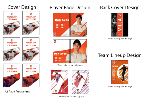
It included 6 different front cover designs, 2 player page designs, back cover design, team line-up page design and also 2 extra page designs.
Once I received the email back saying that he really like the top player page design and the top left front page design, I instantly started to make some mock up pages to take to a planned meeting with the manager, we agreed it would be best to meet up and discuss the book and that way I could take notes of possible places to take the book and what ideas to include.
At the meeting we agreed on a page design, orientation of the book, size, information to include and many more things, therefore I went away and started to make all these changes, the manager sent me a list of comments on each player, along with portrait and action shot images of each.
After I received these I started to make the first mock up pages using the images provided and the manager comments also.
These we’re the pages that I took to show him at the meeting.


First of all he liked the first 3 pages and thought we should go through with them, then he said he about possibly changing the manager page so there is less orange and the managers would be centred more, after thinking about it at the time I thought if were gonna centralise the managers why not make the whole book A4 landscape and I brought this idea up at the meeting and he was more than happy to do this, so this what I knew what my next destination was.

With these two he really liked the design, but after talking to him more about the A4 landscape idea I instantly knew I had to reorientate the page and scale it up to A4 and rearrange the graphic within the page also.
He gave me three amendments to fix within these two pages. He wanted a picture of their player of the season on the back cover instead of the current picture that was used, he also wanted me to change the U14 text to say U13 on both pages and finally the last amendment was on the front page design and this was to state underneath the title of the book that they are playing a year up e.g. they are a U13′s team but playing in U14′s.

And finally for the last amendment I had to move all the players names into number order e.g 1,4,7,8 etc. This then would require me to put the player pages Into number order.
0 notes
Text
[11] Repeater’ Workshop
A pattern is an underlying structure that organizes surfaces or structures in a consistent, regular manner. Pattern can be described as a repeating unit of shape or form.
When researching patterns I came across an extensive selection of pattern which took my eye, these were mainly geometric patterns which then lead me to make my first pattern which was the diamond one, i decided to do this because the shape of a diamond has inspired me for a long time.
Patterns can help set the rhythm of a piece of art. When we think of patterns, images of checkerboards, bricks, and floral wallpaper come to mind. But patterns go further than that and it doesn't always have to be a regular repetition of an object.
Patterns have been used since some of the first art was created. We see it on pottery from thousands of years ago and it has regularly adorned architecture throughout the ages. Many artists over the centuries added pattern embellishments to their work.
The task for this workshop was to create a pattern in Photoshop which was seamless and that would work well. The pattern which we create could be used to insert the pattern onto other pieces of work.


Tools:
Mac
Photoshop
Illustrator
Pen tool
Offset (Adjustments)
Define Pattern
Pattern layer
Process
1.First I placed one of my hand rendered previous peicie of work into illustrator, I did this was because I said I was going to use my hand rendered work more.

2. Next I used the image trace option within illustraor this would allow me to change it from a pixel image to a vector image and it would allow me to make a it a png without a background.

3. After I went into photoshop and set up a 2000 x 2000 document, then I clicked Cmd + R to enable the rulers and I dragged and dropped a vertical and horizontal guides until they made a centred crosshair.
I also added the quote to my pattern and centred it so it was in the middle of the 2000 x 2000 document.

4. Next I selected the quote and went to Filter > Other > Offset and I set the setting to half the document size, this quarters up the quote and will allow me to make it a recuring pattern.
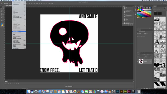
5. For this part I then copy and pasted my hand-rendered smiling skull onto the Photoshop document, then I centred it as much as possible. After this I then flattened the layers by going Layer > Flattern image then I defined it as a pattern I did this by going to Edit > Define a pattern and saved it.
6. Then I creates a new Photoshop document by going to File > New and made an a4 blank document, this is what I would then apply my pattern onto

7. After I went to Layer > New Fill Layer > Pattern then I selected the pattern which I had previously made and that would then fill the entire page with my pattern and you can then adjust the size percentage of the pattern.

8. Finally if you apply all of the above steps your outcome becomes a full functional pattern, that you can save or apply to any new piece of work or a singular piece of work.

I plan to use this pattern workshop to help me develop kit designs, when it comes to making the kits I will research and make some concepts and see if they fit and work well with the shirt.
If I had the chance to change something I would change the patterns that I created as they was not related to my project in anyway and this made it hard to apply to things in my project. I would make a football repeated pattern or something similar.
0 notes
Text
[10] Artist Research Related To Work
Emilio Sansolini

Emilio Sansolini is Argentinian/Italian, he has always loved to design, draw and create things. He is a full time freelance designer specifically working in sport graphics.
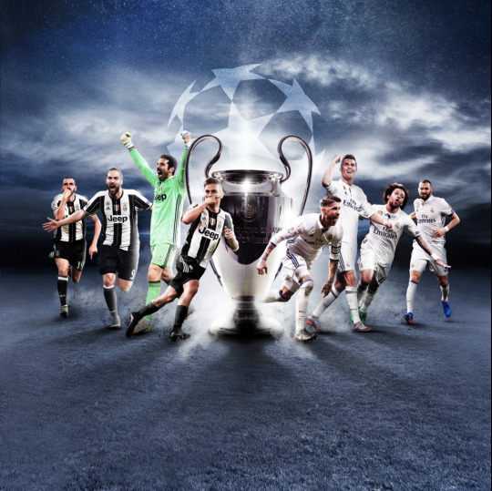
Emilio’s work is affective, for example in this image below, he has clearly shown the competitive side of both teams, he has placed images of the players with different facial expressions so you can clearly see they are passionate about the sport. The trophy in the middle suggests the two teams are battle to achieve the win and the trophy.
what I like and why and what inspired me and because.....
This piece of work most inspires me because with my project I would like to design some kits for stanway villa and present them in the style of Emilio, this would appeal to my audience in a better way because the design and when they see it applied to a clothing mock up they instantly picture them wearing the kit because its a 3D render and not a flat image.
The Colours work really well because they pop, and the colours also communicate happiness and positivity because of the colours used.
this piece of work is based on fifa’s team of the week, this is collection of players from different clubs that week that have had good games and scored goals, the difference in the colours represents the differences in the players and the vast amount of skills they bring to the table.
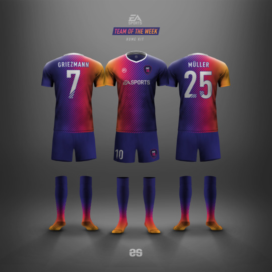
I could use this same concept in my work by presenting the the kits in the same way, and experimenting with colour and shape, I could test with patterns and use previous workshops and practices to help piece together my kits and future pieces of work.
0 notes
Text
[9] Saul Bass Workshop + Case Study
Saul Bass is a graphic designer who was known for his logo work mainly but did illustration also.
In this workshop we used his work as a case study because of how unique and everlasting they are still effective today.
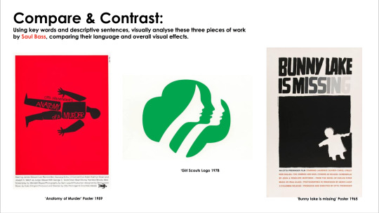
For the first task we all compared and contrasted all of these pieces of work from Saul Bass on the sheet, we then discussed as a class comparisons and differences between them and what they communicate, for example we spoke about visual language, effect and many more. The first thing that caught my eye was the Girl Scouts logo because logos are what interest me the most, so I instantly knew what to look for.
The Girl Scouts logo communicates that the Girl Scouts have unity from the use of the 3 stacked faces within the logo, this tells us that when Saul bass was designing he thought about how the scouts worked together as a team and communicated this within the logo, using positive space and negative space effectively. When we consider when the logo was made you would think it was made recently on high end and top spec programmes such as Adobe Illustrator or Photoshop, this just goes to show that Saul Bass’ work is everlasting and can be recognised even today for his modernised logo designs.
Next I analysed the anatomy of a murder poster, when looking at this I instantly saw that the storyline is communicated within the main image on the front of the poster, because the parts of the body aren’t connected this suggests some sort of murder or assassination could take place within the story. his acts as the films blurb to a certain degree and I think this works really well because when Saul Bass made this poster film trailers weren't very big and not everyone had a TV to view them on so the fact that Saul bass has essentially created a ‘film trailer’ within a static image, this is an example of good use of graphics.
Finally the last poster I looked at was bunny lake is missing this poster, this poster is really effective from the use of typography, for example on the word ‘missing’ from the letters I to G the opacity of the letters change gradually this give the effect of that something is missing or disappeared.
Tools:
Photoshop
Pen tool
Blend mode (Multiply)
Levels
Hue/Saturation
Clipping Mask
Response
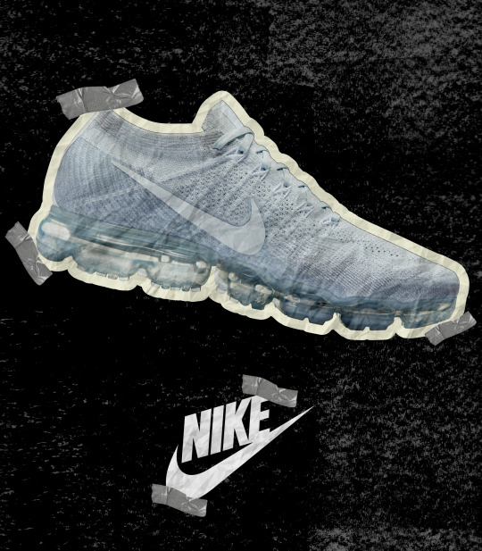
WORK I CREATED....
This was my response to the Saul Bass workshop, I created a shoe poster/advertisement in the style of what Saul Bass did.
I created it because I'm interested in fashion and I am interested in how things are represented in fashion to communicate to a specific audience.
the effect it has on the audience is it makes the audience feel as if it has been hand made and it gives the impression its temporary meaning the amount of shoes made is limited.
Process
1. First I started with a 2480 x 2835 Photoshop document.
2. Then I added a mono-print texture to the background and adjusted the levels and hue of the black.
3. I then used the pen tool to cut around the shoe then I went onto the path layer > I right clicked the path layer then clicked make selection, I then inverted the selection which allowed me to delete the background.
4. After I added white stroke around the shoe to give the effect that it was on paper.
5. Next I copy and pasted the nike logo onto the document, so people viewing it know what brand and make the shoe is.
6. After this I added a scrunched paper texture to the logo and shoe using clipping mask and then I set the blending mode to multiply to give the effect it has been hand made and that it was on paper.
7. Finally I added small pngs of tape to give the effect it had been stuck down onto paper.
Next Time
I think this piece of work could be improved because I would say it doesn't seem as if it has been inspired by S Bass, I think this is because I digitally made this and it wanted it to look hand rendered but this didn't go to plan, also I think there is too many colours within the poster mostly in the shoe, this is not how Saul Bass produced work, therefore next time I plan to make a hand-rendered piece more suited to the style of Bass.
0 notes
Text
[8] Where I am at? and whats next?
Where I am at?
At this point in the project I was already doing work experience for stanway villa, designing and making the end of season booklet, therefore I had to have a think about what area to take my project next, this mainly was because I liked the idea of steering my FMP towards just the football idea.
I was stuck on what to do for outcomes for the fashion project, so I finally made my mind up and changed my FMP from my original idea to the stanway villa idea this was because there was more oppotunity to show positivity within the football project because of the team work involved and how they motivate each other etc.
A potential with the football project is I could make more outcomes than I originally thought. I could create the main 24 page book, along with kit designs and logo redesigns for the club and also this would force me to use Photoshop, Illustrator and InDesign and widen my knowledge on all of these and to use them simultaneity. With InDesign I want to challenge myself as I have never used this programme because I have never made a book or leaflet before so I have never had a reason to use InDesign.
Whats Next?
Next I hope to get in contact with the stanway villa manager and finally make a start with this project, I also hope to do some more research into the football world but using resources such as Fifa, this is because I have visions of the book being a Fifa inspired design as the kids at the football team will enjoy this as its popular for there age range and this is also my target audience.
After this I hope to gain and maintain a fast response time replying to the managers emails as responding is a big thing when it comes to working for someone, if the person feels you are being too slow with the replies then they will find someone else and this is what I didn't want. I also hope to maintain a friendly and informal approach with the manager because the person you are working for should always feel comfortable speaking with you and asking any question they would like answered, also I hope to gain and maintain a quick production time for the book, so that it is handed over to the printers In time so that it is printed and placed into exhibition ready for hand in.
I will achieve all of these by staying on target and planning out what I am going to do next, this will ensure everything is done within the time frame and done to best standard it can be as I only want whats best for stanway villa and won't expect anything other than perfection.
0 notes

Text
[6] Zine Workshop
In this workshop the task was to create an A5 small portrait booklet with 8 unique pages, these pages include a small collection of work, they are commonly used to give the impression of what its like to be a publisher and they are commonly made using a photocopier, this is then binded and made into a Zine.
When making my Zine I wanted to create a something which best describes me as a person, so for the first page I created a abstract piece using the normal colour image, I then put abstract cut outs of the same image randomly on the page but lined up with the original, these parts had colour on, these were made with the photocopier and I used the colour overlay option. This page describes me as a person because as a whole I have a normal personality but there are random parts of me which bring out different sides to my personality and the colours represent these.
Another zine page which describes me is the back cover, this is because I feel like because of my personality I give out a lot of different moods and vibes and these are represented by the colours on the image coming out of the head. It can also be interpreted in a different way this being because the colours look as if they are ready to come out the head, and they look like they are about to come out at anytime, this represents my level of focus because I can loose focus at anytime and Its not something I can control. This is important because the nature of the zine connects the art and artist together due to its ‘do it yourself’ aspect.


0 notes
Text
[5] ‘Post Up’ Workshop
In this workshop we were asked to get inspiration from Anthony Burrills poster work and create a hand-rendered poster and a digitally made poster with a positive quote on, this was to directly fit within the context of the brief.
To start off with I wanted to create a hand-rendered poster because in my opinion when something is hand made it gives the effect its genuine and not just been put together without any care. I also wanted to do this because I wanted to challenege myself as analogue processes are’t my strong points.
“GO BIG OR GO HOME”
I decided to go with the quote “GO BIG OR GO HOME” which can be interprepted as either a gym quote or a quote for an activity. This quote speaks to people in such a way because of the hand-rendered quality people find it genuine and meaningful and it also speaks to people because it makes them realise that if there not trying hard whats the point in doing it, because I think we should try your best with anything we do in society because this is how you progress and learn new things, and this is what I wanted to acheive by making it hand-rendered and making it using the quote that i did.
With this poster I think it relates to Burrills poster work because its simple like all of his work, however it is monochrome and hand-rendered meaning it doesnt imply any certain meaning and can be seen as a quote for anything, this is different from what Burrill usally does, he usually makes posters digitially and uses colours, but i wanted to put my own twist onto my work, and just use him as inspiration.
To make this poster I...
1. Firstly I started by scanning and copying In a font on the photocopier I found from a book, then I proceeding to cut out the desired letters that I needed these were H,G,R,O,M,I and E..., to make the words I wanted to make I had to copy the font more than once on the printer.
2. After I then got a blank white sheet of paper and scrunched it up into a ball then unscrunched it to give me the background texture, I did this to create a more of a hand-rendered look and to create the message that if you dont go big then stuff is not gonna go your way and this is what the scrunching is for. Then I stuck the letters onto the poster and arranged them to make the desired words.
3. After this I scanned it in on the photocopier to esentially create a flattened version and this is the version you see here.
After this I got someone to give me a peer review, this is the peer review I recieved for this poster, Dallin in my class said...
“it’s a very easy type face to read, and the spacing between the letter also makes it easy to read”
From this I know that the letters and words are easily readable as they are spaced out and not squashed together, I also know from her statement that she finds it an easy type face to read like other fonts such as bebas, trueno, arial and many more. These are from a group of fonts I like to call neutral fonts, this means that you can imply any meaning through the type of font used and can be universal and used for anything.

“TRAIN YOUR MIND AND LET YOUR BODY FOLLOW”
With my next poster I wanted to do a more of a motivational quote, this is why I decided to go with “train your mind and let your body follow” this quote suggests that people should tackle things using your mind and doing so will allow you body to follow.
Because this poster has been digitally made it suggests to the audience that it isn't as authentic as a hand-rendered piece, but this is not always a bad thing because I think digitally made posters work better and speak more to an audience as it s better quality than a hand-rendered piece and our lives nowadays revolve around being ‘digital’ so think this is why doing digital work effective.
This difference with this poster compared to the other one is that its more like something Burrill would make and this is the effect i was going with, this is because it has been digitally made and laid out like his.
Hannah - “Contrast in font works well which catches your eye because the simple font used (Bebas Neue) is neutral and designed to be universal and to not have any emotion, the words “mind” and “body” in the different font draws you in because they are large and stand out first before the neutral letters”


My Peer Review - Jake
When reviewing jakes “JUST SEND IT” poster I realised that ours were quite similar in that we both used a large neutral type face to communicate to an audience. I would say that because the text is disappearing it shows that the person reading it is running out of time, and hints at the audience that they need to just do it.
The technicality of the type face has a hand rendered quality to, meaning that it is written from a genuine source.
Also I would say its empowering but also at the same time its full of confidence.
In contrast with my own work (Mind and Body) I would say that theres a rustic look to jakes and to mine there is a digital look, and they both communicate different things, mine communicates that the words “mind” and “body” are the most important and on jakes all of the words are important.

0 notes
Text
[4] Research
When I researched fashion as whole I found out that the fashion industry is worth $1.2 Trillion worldwide and $250 billion of that is just in USA, after knowing this I automatically knew that I wanted to do fashion as a topic for my FMP and communicate positivity through fashion and think about how fashion affects the lives of young people.
For me personally fashion is a way for me to escape all thoughts and buying clothes has become like a hobby for me. and seeing advertisements and marketing posters entices me in even more and makes me want to try that item of clothing on, therefore fashion for me is a really positive topic.
I think this is the same with others my age, older and younger because fashion unites us as a society. I think this because a couple years ago you had to got to fashion outlets like Sports Direct or JD and buy shoes but now we have social media platforms such as Depop which is a platform which allows users to resell or sell brand new hype or none hype clothing such as off-white or Gym kIng etc.

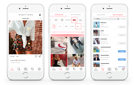
Also we have apps such as 21 buttons which is a platform where celebrities or normal people put up a picture of them wearing an outfit and they link where the item of clothing is from and how much it is, this gets young people into fashion because they want to look like there favourite celebrities and therefore creates more enthusiasm within fashion.
Primary Research
0 notes
Text
[3] Comfort Zone
For this task we filled in a sheet with things that were in and out of our comfort zones, the inner circle was full of areas we were comfortable and confident in and the outer circle was full of things we could improve on. Finally the things out of the circle was full of things I have no confidence In at all but could maybe improve on.
This task helped me realise what things I found useful and what I was good at, it then made me think how I could use this to my advantage during my FMP.

In my comfort zone I had stuff such as gym, digital art, driving, music, branding, advertising, fashion and many more, these aren't all graphic related but they are all things I find to be really close to me and that I find comfortable.
The stuff In the outta circle shows the things I'm 50/50 with such as analogue processes, research and the inability to control my focus, these are all things I can improve on and learn to manage with time.
Out of the circle represents stuff I have little or no confidence in at all, these include callisthenics, evidence of making, theory and blog posts.
Every since year 9 I have known what part of graphic design I have wanted to go into, this being branding and advertising. Because I set my heart on what I wanted to do from an early age I have stayed very well within my comfort zone, this has effected me now because at college you are required to leave your comfort zone in order to progress further. I have been so used to using digital processes in the past, it comes naturally to me this is why it is in my comfort zone. The stuff out side I will improve on for example with my inability to stay focused I plan to sit away from any drama or action that is taking place and find other ways to control it.
This is why I plan to mix and match the things I'm comfortable with and the things I'm not in order to learn new skills and progress to be the best I can be. Personally I think everyone should step out of there comfort zone at some point because if everyone was to stay within they're zone no one would make an progress in life and learn new skills.
-------------------------------------------------------------------------------------------

In comparison to Jakes comfort zone I can see automatically we are two different people, Jake finds drawing and hand rendered techniques to be his strong point as he finds he has more control over what he's doing and he produces better outcomes. whereas I can’t draw and I find it difficult and also with me I prefer to produce the majority of my work through digital processes as I think with the way technology is going there is no room for analogue processes anymore and its slowly dying within the graphics industry.
0 notes
Text
[2] Initial ideas and Comparing Positivity
Mind-map of initial ideas:
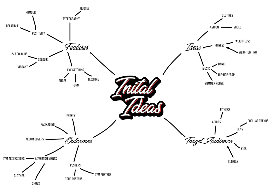
After writing out the brief I started to mind map my initial ideas and the main 4 points i wanted to look at, these were Ideas, Target Audeince, Feature, Outcomes.
The ideas I had was to either work with Fashion, Music, Fitness as these to me are up there in terms of the most popular interests in society, therefore being categories that could get a lot of attention.
After mapping out the brief I started to think about where I wanted to take my project. I plan to make a fashion brand/company, logos, advertisements, booklets and possibly a website design to go with it. I think these would be effective to do because these are the most used and recognised in terms of how to present a brand and would help gain attention and make my work iconic .
I have chose to do this in particular because to me fashion is a positive subject within my life, I use fashion as a way to express myself in a positive way from the colours, I wear and the type of clothing I wear. I can clearly see others use clothes to express themselves too. Also another positive thing to take away from fashion is the fact fashion can unite us as a society, for example currently the hype companies such as Off-white, Supreme, and Yeezy are the most talked about brands everyday because of the limited releases they have of the clothing items. Also people are constantly comparing themselfes and if they aren’t up to date with the latest shoes or clothes then thats when they go out and buy what they don't already have, In general the fashion industry is constantly being pushed into all sorts of directions meaning its a area you can't get bored of.
Compare And Contrast

0 notes
Text
[1] Reviewing the brief (19-3-18)
‘Popaganda’
For this final project ‘Popaganda’ I am required to develop and refine project outcomes ready for presentation within an agreed time frame based upon a specific issue or problem to solve.
Deadlines:
Proposal- 03/05/18
Practical work- 31/05/18
Any exhibitions- 09/06/18
Production files/ A5 sketchbook and blog- 15/06/18
The context of this assignment asks us to consider how to use graphic arts & media to promote positivity in young people. it states we need to plan and present a visual outcome or campaign that promotes something which we believe to be important to help the empowerment and development of young people, both socially and culturally. I will make my work and developments reflect positivity so people can get inspired by my work and take away something positive.
The main aim of the project is to promote positivity which is what I will do to a high standard in my work, I will not promote negativity as it doesn't help with societies confidence and mood. Especially children and others around them. This is the most important aspect of the project.
Keywords & Definitions:
Subjectivity - Based on your own opinion
Objectivity - Based on others opinions
Propaganda - Visual information, that lacks objectivity and is of a biased or misleading nature, used to promote a political cause or point of view.
Popular culture - Culture based on the tastes of ordinary people rather than an educated elite.
Requirements:
1. PROJECT PROPOSAL / TIME PLAN / SPRINGBOARD PRESENTATION / BIBLIOGRAPHY
2. A5 SKETCHBOOK(S). THESE SHOULD INCLUDE:
• PRIMARY INVESTIGATION, DRAWING, MARK MAKING & VISUAL RECORDING USING A VARIETY OF MEDIA, COLLAGE AND ASSEMBLAGE
3. PRODUCTION FILE THAT DOCUMENTS WHAT YOU ARE GIVEN, WHAT YOU LOOK AT AND WHAT YOU DO!
4. BLOG TO SUPPORT A NUMBER OF IDEAS & EXPLORATION PRESENTED IN SKETCHBOOKS/FILES
•ESTABLISHING CONTEXT USING THEORY AND THE PERSPECTIVES OF OTHERS (ESSAYS/CONCEPTS/QUOTES)
•CRITICAL ANALYSIS OF CONTEXTUAL RESEARCH, ARTISTS & DESIGNERS
•REFLECTION ON THE WORK YOU CREATE AT REGULAR INTERVALS
5. RELEVANT TEST PIECES AND EXPERIMENTS (PRESENTED IN PRODUCTION FILE)
6. A COLLECTION OF POSSIBLE FINAL OUTCOMES
7. EXHIBITION OF SELECTED OUTCOMES (IN DISCUSSION WITH TUTORS)
8. POSSIBLY MILESTONE AUDIO/VIDEO LOGS & FINAL EVALUATION
Potentially
I could potential pick 3 areas that are positive in my life and make a moodboard for each area, to show I have researched and evidenced that in my work which would then inspire me later on
0 notes