
Don't wanna be here? Send us removal request.
Statistics
We looked inside some of the posts by dylanilikeitwhatisit and here's what we found interesting.
Average Info
Notes Per Post
0
Likes Per Post
0
Reblog Per Post
0
Reply Per Post
0
Time Between Posts
3 days
Number of Posts By Type
Photo
11
Video
2
Text
2
Last Seen Tumblr Blogs


Fun Fact
The Tumblr office adopted Tommy, an 11-year-old Pomeranian.
Photo
Once I fixed the tags (as seen above) I took my posters into photoshop. The reason? I wanted to add a small amount of texture to the pieces to add something more to them for when they get printed and add some extra depth the the flat drawings. These textures may not be used for the animation but will be used when I print these posters in approximately size A2.
0 notes


Photo


After a discussion with my lecturer it was agreed that I should remove the titles but replace them with something that acts an homage to the comics while standing out as independent art pieces.
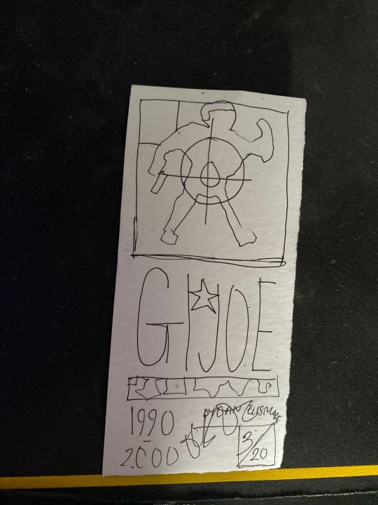
The conclusion, redesigning the price tags/issue number sections onto each poster while all being the same with little changes to fit the colour scheme, date of issue and so on to each piece.
the tag includes - illustration, title (nice to keep but small now) QR code (use my own generated one, date and copy number
As you see the tags are simple but work well with the pieces as they look like the comic tags and contain the necessary information to fit my timeline context.
You can also see I fixed the borders and equalised them now along with updated the first poster a lot to fir the new style while straightening out the 1990′s one.
After all of the tweaks and updates am near the end but now need to add more uniqueness to the tags by changing the characters in them while moving the tags from the borders slightly
0 notes
Photo


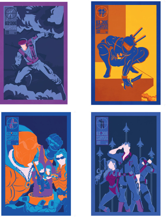
For the final 3 you can see I really improved from the first two pieces and came into my own style. I decided to remove curves and only have straight edges creating a subtle, new style for a cleaner look which I feel is cleaner and more unique. I continued to stick to the blues and oranges while also using purples too for a more mellow but noticeable contrast that works well with all colours. The choice to also keep the colours flat with no gradients or shading add to the cleanness of the images and make them pop more. They all took a very long to make but was made more efficiently than previously due to me finally getting comfortable with this detailed style of vector art I had been out of practice from for a while.
I felt that I had stayed faithful to most of these comics but changed them enough to be unique, new and fresh which I feel is quite a difficult balance but it paid off well in the end. I quite enjoy the subtle background details on some of the covers such as the cobra buildings or the jet planes being redone in a minimal, complementary style. Now these are made it’s time to go back and remaster the first two to fit the new style better and also see what I’m to do with the title font as I feel it was okay first but now seems more of a placeholder with a need to add something else.
I will revise and get some feedback and come back to finalise these for printing and animating
0 notes
Photo


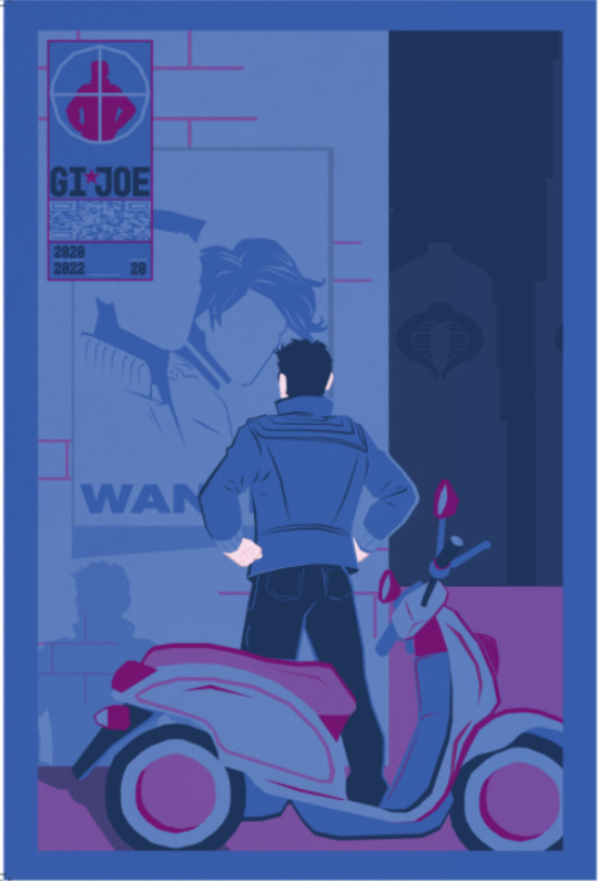
Moving onto the 1990′s I picked the special edition comic as I liked the focus of the one character with the minimal additional details of the ledge with perspective.
Using the same techniques I made the outline of Snake eyes after quite a while (completing each of these posters can take up to 4+ hours) then proceeded to add definitions, lines and shading using sharp, straight pen lines in pair with the width tool and also using the shape builder tools to add easy shade lines by duplicating and cutting the vector.
Once I had the figure made I put together the ledge and added another small, fiery cloud just for some extra details.
As you see in this piece I made completely contrasting colours and even added a 3rd, bright colour which I used very sparingly just for details that would be lost if used in another colour. This decision lead to some positive feedback but nothing too constructive so it’s up to me to analyse this and think what could improve this. I quite like the change of the text to fitting the piece more along with the spliced colours for more details which unfortunately can’t be replicated on every piece meaning it might have to change to fit a theme but time will tell.
Overall, this piece is good and may be revisited more in the future as I’m slowly getting more in the rhythm of this art style and is becoming slightly easier comparing to the struggle of making the first one.
0 notes
Photo


Here is my first, semi finished rendition of the 1980s comic cover. As you see it’s quite different to the original cover. The main reason I stripped so much detail was that I thought it was far too busy with all the characters firing along with the tank. So, I chose the foreground characters to focus on and enlarged him. I made this by recreating his silhouette in Illustrator and adding his crucial details like weapons and accessories to make his character still recognisable. I then added some simple shading using the pen tool and using fills but also strokes and width tool adjustments. I also wanted to make these pieces have a limited colour scheme to add to the unique style of the re designs. It is something that my inspired artists and I like to use in a lot of work as it stops the art being too busy and easier on the eyes for flat vectors. Once I made the figure i used image trace to add the iconic GI JOE Mobat tank as I thought it was a crucial detail to keep then finished it off with some explosion clouds and a bold and modern title font using termina.
Once this draft was done I sent it into the #wip section of the groups slack page for some feedback.
The main thing I got was to add more contrast to the colours instead of just using one colour with shades, which I agree with and will use on the upcoming posters and revisit this another time.
0 notes
Photo


Here Is a simple document of the covers I liked the look of to remake in one style varying in difficulty to give different outcomes. Each comic is from different decade in order for me to correctly fit my timeline theme.
0 notes
Photo


Once all my sketch booking was done It was a realisation to me that things like repackaging at a high level or animating will not be possible with the time I had left. From this, I still wanted to do something about GI. Joe since It’s something that had a big impact on me as a child since I used the toys a lot. So, at first I thought about making a comic but again, this could be too time consuming. So, I came to the conclusion of Redesigning a cover of the comics from the 1980s to now in a large poster format. This decision was to make an effort to celebrate the long running franchise and unite some of the covers over the decades under one style to make a suitable collection of art work for printing. My inspiration for the style was from a post GI Joe themselves made about some vector art they posted. My main inspiration is the work by Tom Whalen and Ollie Moss but also Russian artist Aleksey Rico as they all have elements to their vector art I like. Then I thought of doing something similar with existing covers to give them a makeover to modernise them and make them appealing to more people as the flat vector style is quite popular and also a favourite of mine which will help in the production phase as this is still no small task and will take many hours t make something worthy of remaking the great original comic art.
I also want to make a video with all the posters in with some sort of animation weather it be some elements like explosion clouds moving or gleams of light or rain, just something subtle to animate almost like a dynamic cover you for desktop screensavers. Doing this will even cover a couple of briefs by not only re publishing but reanimating also.
0 notes
Photo


For our first presentation of the project were tasked to present something we like from each topic : Package, editorial, animation, advertise.
Overall, my presentation was quite successful as I had a good amount to say for each thing and had a decent amount of backup knowledge for questions given due to me researching or just knowing the product well.
Unfortunately, from a design point it’s not appealing as on presentation day i had to remake the presentation very quickly but luckily it was more about the images themselves and me talking.
The only thing I’d say needs improvement on is the packaging I chose. As I could of picked something more contemporary but I only chose this as at the time I wanted to view something that I thought about redoing at the time -Toy packaging.
0 notes
Photo


This next mini task was quite interesting as were simply given an empty box of painkillers and had to measure out the net and redesign it in anyway we wanted as long as all the text was there but didn’t have to be legible.
To start off, I got out a ruler and measured the perimeters of the net for everyone to use and sketched it out. I then used my phones ability to copy text from the camera in order to gather all the information and posted it digitally so it was easy to get into what ever design software people were using.
From here I went onto illustrator and created the net correctly and scaled it up in order for me to easily design it. At first I wasn’t sure what to do as My initial intentions were to make something in a neat format but I knew I needed to break out of it and go further.
To start I used a standard purple to blue gradient and made some funky stretched text with a warped Tesco logo and some other small details it didn’t look too bad but I wasn’t completely pleased so I decided to get some feedback from others to see how I could improve as I was slightly stuck.
I was advised to break the rules of standard packaging and go wild with it a bit. From this feedback, I duplicated text, flipped, stretched and rotated it while keeping one type face for some consistency so it’s not 100% random and has thought behind it. I also removed the Tesco logo which gave me more space to add things. I then stretched the barcode over different dimensions which added some weirdness and overall looked quite interesting. I then changed the main colour to black to make the design look more contemporary and and modern to trends now. I did however, keep in the pill icons with colour for a nice contrast. I quite like the littered effect of the small print as It shows that most people for the most part don’t read this anyway so moving around the text in alternate ways is quite a freeing thing to do which is a nice change for me from what I'm used to.
Once all this once changed the only thing I had for feedback was to get rid of the 3D text- something I added for experimentation nut sadly didn’t work. In overall, this design worked quite well and is a complete flip on your standard design as it wouldn’t be repackage that could be sold commercially for an art piece it looks good.
0 notes
Photo


In this task we were asked to think of any show or film and gather a multitude of frames from it then add or replace a recurring factor that is recognisable with in these shows in order to make a strange result. However, we were only allowed to use the content aware tool in photoshop. This tool is used to remove part from the foreground and patch the missing part up automatically that blends with the background.
We were given example such have having scenes of the Simpsons with marge without her hair or star wars without lightsabres etc.
For my idea, I randomly had the thought of Wallace and Grommit and the wrong trousers. I then thought of using photoshop to just removing all trousers from the film and seeing what results would happen.
The idea ended up turning out quite well as the results were varying from people just floating or the Ai messing up and the filled areas were completely bugged out. In one situation multiple faces were pasted in the empty areas creating a very creepy image that wasn’t intended but cool. but even the ones which the Ai did better were still very odd.
The image qualities are awful as I first used google but then found a full film on vimeo in around 420p. However, this gave a cool effect as the low resolution added to the weirdness and as the film is old anyway it didn’t matter too much.
Once I got round to make the frames I had to make extra to fit the zine format and laid them out in a random way in varied sizes to match the oddness of the images and even messed with the title and sequences too to make a start and end which was a nice touch.
The feedback I got was quite positive while even getting some laughs as the concept was strange enough to be humorous and had enough content to have many examples. I have used the content aware tool before but not like this. It goes to show that when the Ai messes up it can make unintentional art that humans can’t replicate themselves.
0 notes
Video
tumblr
To finish off the animation I added a more prominent background sound that was a tap running in the background to further the gross factor. and softened the blows of the blocks hitting as it was a bit too sharp as it was uncomfortable in the wrong ways as the sound was almost painful.
Once the sound was done I changed the colouring and contrast of the video completely to a darkish red as I fell this really finalised the whole mood of this “meat Lego” animation quite well.
In overall this project was a lot of fun despite it being quite simple and short but the skills within are very valuable as every skill used, even the premiere pro use was new to me and I’m all about constantly expanding my skill set as being a jack of all trades designer is what I hope for.
0 notes
Video
tumblr
over a few lesson with our lecturer Manuel we were tasked with using old 16mm film used for a classic film projector to create a short animation of whatever we wanted. The catch was that we were given only a certain amount of film and as the frames were so small only simple animations could be made along with the looming factor of the limited amount of time we had.
Due to all these factors and the brief being create something that represents what you like I thought of a few ideas using a story board provided but ended up creating an animation of Lego brocks stacking. The reason? I simply always loved Lego as a child and still am quite fascinated now. Another reason is that the animation could be done quite simply by falling bricks stacking on one another until the screen is filled. The animation process wasn’t too easy however, as redrawing every frame from scratch without seeing a layer behind was more difficult than I predicted, causing the blocks to constantly morph and lose their hard, plastic properties and ended up being these jelly like pieces instead which gave an interesting effect but no longer looked like Lego as much. I also messed up the start slightly and had a redo as the animation process here is far longer winded as you need to stretch out movement along a lot of frames in order for it to be smooth so the first time around I made it too quick as I didn't spread out the animation enough, luckily I was informed soon enough to not be a hinderance.
Once the films were done they were pegged up to try until we came back to them a few days later as the ink on the pens have trouble staying on the film and can be easily rubbed off. From here, our lecturer turned the film into a digital file in order for us to cut out our part and begin playing with sound and edit it in.
This wasn’t just as simple as using existing sounds as I originally thought of just using the Lego games’ iconic building sound. Instead, we were given proper sound recording equipment and had to go out and create and record as many sounds as we could within the lesson time. I believe I was able to record around 50 varying sounds from sounds like cars out side to sounds I created like moving my tongue within my mouth as the recording device is so sensitive it can pick up things even we can’t hear.
From here I looked through all the sounds and picked a few to use.
Since the blocks were no longer Lego like I took a very different approach to change the perspective of what you see in the animation. Using sounds like water and various sounds of mouth and the sound of objects hitting the floor I piled them all into premiere pro and create what was once a pleasant video of some blocks stacking to wet like blocks slapping onto to each other.
The reactions from peers such as them being revolted or grossed out proved to me that my work was a success as the sound and animation worked well enough for them to imagine these meaty wet blocks hitting each other. It wasn’t my original intention but I turned what was a mistake at first into a whole new piece of work.
0 notes
Text
During the one of the first weeks of the new project we were introduced to rotor-scope animation. A technique of animation that involves you exporting a video file in after effects into a sequence of transferable PNGS that each represent one frame.
From here, we cut the video to around 2 or 3 seconds so the animated the number of frames isn’t so steep as even 2 seconds meant 60+ edits. Once all the frames were ready I gradually opened each frame one by one in photoshop and edited over them using the brush tool. My idea was to make a comical, simple cartoon that was easy to replicate and create quickly. So, I made a background to be replicated and only had to animate the character but gave myself extra work of a moving river.
The idea I had wasn’t just to retrace a person but remake everything and recreate the “mr frog” comedy sketch form the Tv show- Smiling friends. I chose this as the original video was comical and would match quite well with the animation I was going with. Instead of someone just jumping off the stairs I used the sounds as queues to decide where my character would go next. It was eventually decided the character would run along the river and when the jump happened the frog would leap at the screen in time with the dialogue.
Although this was done quickly with minimal detail the end result Al ended up being a success as the sound matched the actions well, improving everything as a whole along with the reference to Mr frog to make the video more entertaining. As a result I was quite pleased with the result to say it was only a short exercise and ended up being a new and Interesting skill.
0 notes
Text
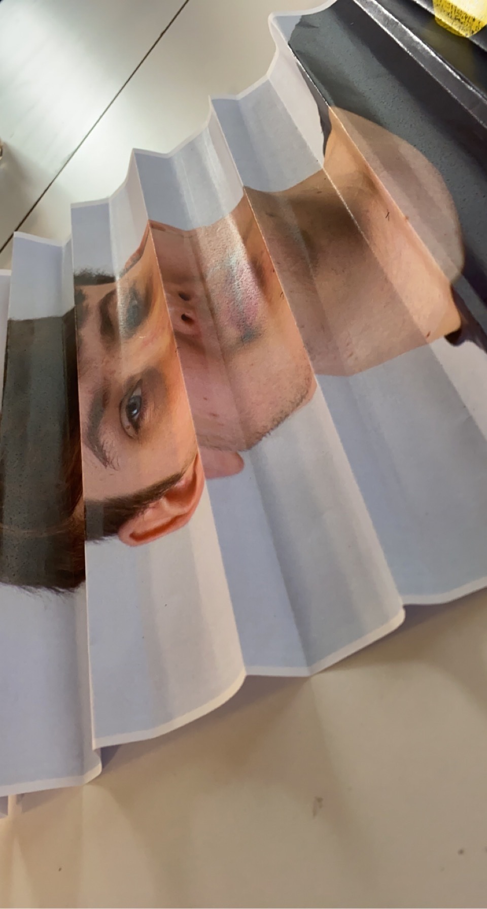


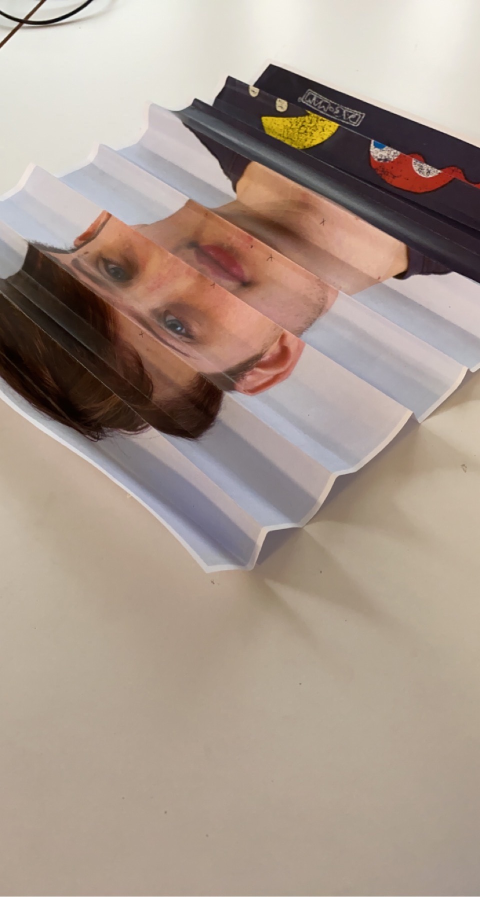

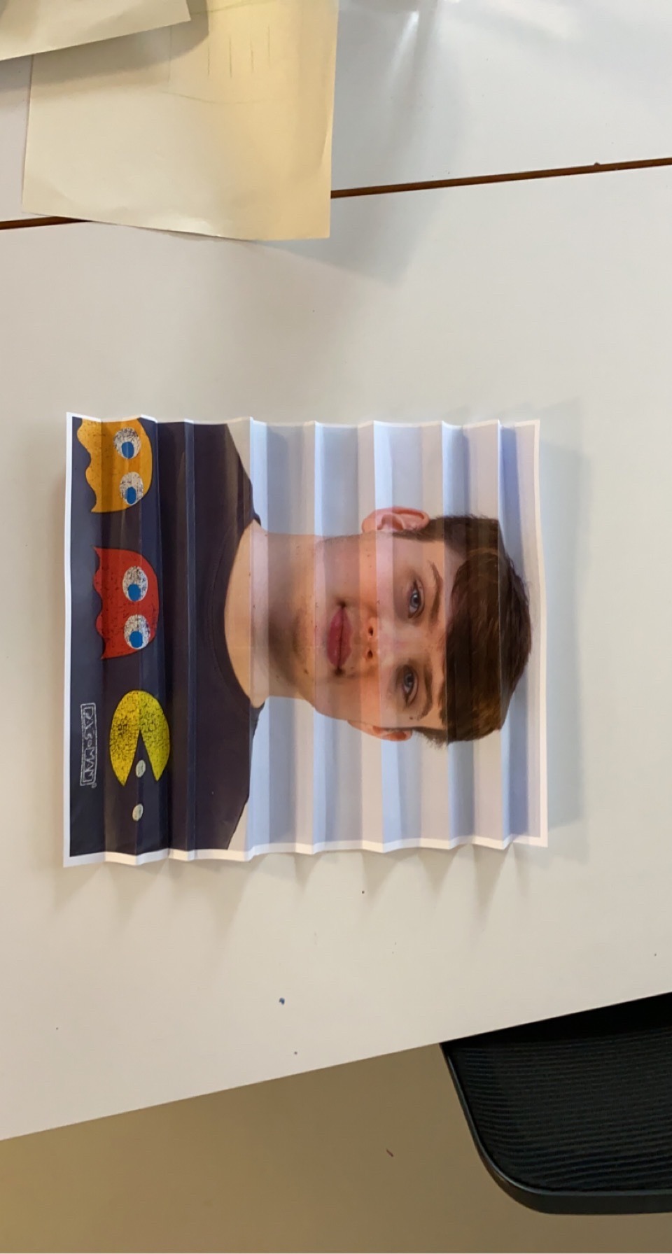
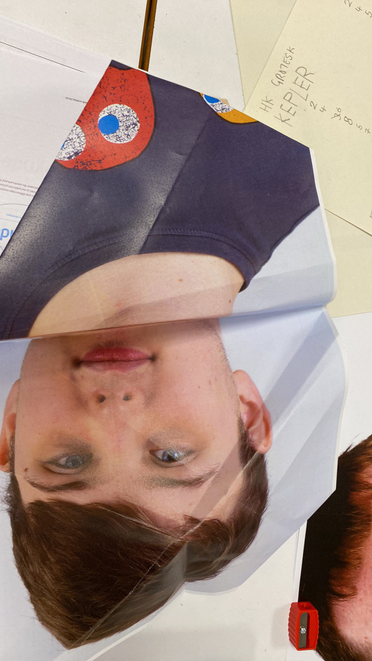
To start off our new project - “I like it, what is it?”. We had an experimental task that involved us taking A3 self portraits of ourselves and and folding them in interesting ways using guides from Paul Jackson’s folding techniques book.
I started off by choosing a fold that was too difficult for me and ended up giving up and moving to the next one. From here, I decided to walk before I could run and chose the most simple fold which ended up being mostly effective. It quickly highlighted how my skills in folding are lacking and could be improved on for future prints to have unique outcomes using these methods.
Once I was happy with one fold I took it to a blank canvas and took many angles that had a wide array of visual differences with a comedic aspect to it. Despite the hilarity to it, it’s winter sting to see what you get when you take photos at different angles to hide parts of an image to make another.
0 notes