
Statistics
We looked inside some of the posts by eamon-saunders and here's what we found interesting.
Average Info
Notes Per Post
11
Likes Per Post
10
Reblog Per Post
1
Reply Per Post
0
Time Between Posts
6 days
Number of Posts By Type
Text
2
Photo
12
Last Seen Tumblr Blogs


Fun Fact
12.7% of mobile users access Tumblr.
Text
Final Reflection
At the start of the semester, I wanted to learn more about working in different mediums and how to improve at them. I learnt a lot about the work that I do and what medium I can work in. Before this course I was probably a 90% digital artist, mainly working in vectors and with a mouse. However throughout this semester I have picked up many different mediums such as; charcoal, pencils, paint, papercraft and more. I have definitely improved in most of these mediums, even surprising myself with a bit of illustration skills I didn't realise I had, and have found some to be incredibly enjoyable and fulfilling. Overall I think I have achieved my goal of becoming better at the different mediums available, however there were obstacles. I had constant problems with self confidence in my work with newer mediums, I wasn't willing to show it to people and therefore would never get feedback and improve, however I worked on showing people my work, and begun to think more highly of my own work, making it easier to show and be proud of it. This year the cohort has been huge for my inspiration as well, the amount of amazing artists in our cohort is INCREDIBLE, anyone that posted jaw dropping work deserves a nice break. Good job everyone for semester one, hope we can all somewhat stand another semester.
1 note
·
View note
Text
ASK ME ANYTHING PART 3 - Final
This will basically be my only text post, it’s going to be the questions I asked my creative, my thoughts on them and his response to them.
What was your first made piece and what are your thoughts on it now?
Justin’s Response: It looks like what it is - something made by someone just starting out!
It definitely does! I wish people had more of this feeling for their first work, it doesn’t look like the most cohesive and understandble piece, but you can tell it’s art and it’s had work put into it, and isn’t that all that matters (maybe not but I hope it is).
This was one of my first chosen questions, I asked for this one as I know my first piece wasn’t that great, and probably no one’s is, but it makes an artist less intimidating when you see where they started off, just like you.
How is it being a freelance designer and creative director, what's your favourite parts/least favourite?
Justin’s Response: I'm actually now the CCO of deviantART, but have been freelancing for ten years. I loved the ability to build and shape my own career and manage my own time. The perpetual tlack of security was difficult to deal with.
I wasn’t actually aware that Justin had taken yet another very large step in his career and became the creative chief officer of DeviantART. I’ve been writing reports and trying to replicate his work since I first started desiging, so I’m surprised I missed this step, however I’m excited to see what this job oppurtunity will do for Justin’s work. The first time I ever really fully considered freelance design to be a real job was when I had done some real research on Justin Maller and how he grew his own brand. He started in Melbourne as well, working part time in a small convenience store, slowly growing his client base, he realised he didn’t have to struggle at his part time job to live, he could do what he wanted. After this he quit his part time job and put all his effort into his freelance work. Today he is well known for both is commercial and personal work, I hope after University I will be remotely like his story.
I chose this question as I wanted to know a little more about his thoughts on working as a creative, and I wanted to give a little insight into what Justin did as a living.
How often do you stuggle with self confidence issues in your work, how do you combat this?
Justin’s Response: I don't, honestly. Sorry I can't offer you more here.
I was so surprised to hear this. After talking to many of the creatives in my class, and even some of the teachers admitting that they have doubts about their work and have periods where they dislike what they’re desiging, I thought it was just common practise for designers to hate their own work and think negatively about them. It’s refreshing to here however that some people can be that confident in their work, it’s a lesson most should learn from Justin.
What's your favourite and least favourite software and why?
Justin’s Response: I love Photoshop and Cinema4D. They're my tools, I've learned to know and love them. I don't like Excel.
I can get the excel hate, I never got the love anyway. This is pretty non-surprising, as said in my earlier question, I’ve been following Jusin for about 5 or 6 years now, all of which his pieces have had 3D elements and defintely been retouched/edited in Photoshop.
I asked this question because I was curious as to whitch adobe programs Justin used, and what his favourite 3D tool was, learning about excel was just a bonus.
Do you do much original idea sketching, how important is it to you in your creative process?
Justin’s Response: I do not sketch and never have.
This was also super surprising. I get Justin’s work is pretty hard to sketch, but I’ve rarely come across a desinger/creative that has NEVER sketched their ideas. If only he told me this a couple years ago I might not have spent so much time trying to improve my illustrations.
What is your skill level now in the adobe programs compared to when you first seriously started working within the industry?
Justin’s Response: I'm better at Photoshop now in that I can do more, but I was already quite good when I began. I don't use other Adobe software much. I've improved significantly in 3D since I began in the industry.
Eventually there is a cutoff point to the ‘skill’ you gain through adobe and other design programs, however you have to learn what else you can ‘do’ in the programs, which is what I assume Justin is talking about here. Whether that be from learning the tools more or learning new tools.
Where do you do most of your client work?
Justin’s Response: In my home studio.
Not much to say here, I was hoping to get a photo of his workspace but he didn’t seem too keen to supply it, which isn’t a problem, but some of the questions weren’t really able to be put into the booklet if he didn’t provide it.
What is your setup like? (PC, tablets, books, stationary etc.)?
Justin’s Response: It's just an iMac with an extra monitor hooked up to it. Nothing fancy.
Again was hoping for a picture, but I ended up using a picture he put on his twitter of his new DeviantART office setup which pretty much fit the bill of the question.
I asked this question as I wanted a stretched image across my booklet, or across a couple of the squares anyway, I didn’t get that image but I was able to make it work anyway.
How would you say Depthcore has inspired or affected your work?
Justin’s Response: Hugely. I built Depthcore at the beginning of my journey as an artist, it's profoundly shaped my thinking and aesthetic.
I was really excited to ask this question, I wasn’t super sure what kind of interaction Justin Maller still had with Depthcore, as I remember reading about the art collective he built years ago but hadn’t heard anything new from him since, and expected him to have moved on, but it’s good to hear that it has very much been a large part of his journey towards becoming a creative. I hope that in similar fashion, the time I spend with my cohort in my higher education days will shape and mold how and why I design what I design.
This was a must ask question in my opinion, due to Justin’s huge influece towards Depthcore, I think it’s necessary to include so that people know what he is included in.
Is there any major artist you'd like to collaborate with and why?
Justin’s Response: Many! Beeple, KAWS, Gmunk. I just like the way their minds work. I think melding our styles would result in an interesting output.
I had never heard of any of these creatives but they all fit Justin’s style and would definitely result in an interesting piece. I’ve always loved the colours of Justin’s work, I’d describe them always as ‘eye-candy’, so I think combined with these artists it could really embrace their style.
What do you think all future designers should learn?
Justin’s Response: If they want to be freelance - how to manage and run a business from the ground up.
This is important advice, and that’s what I had hoped to get from this question. I think no matter what any graphic design or creative will do some kind freelance in their life, whether it be for a friend or for a professional client, however if you really want to BE a freelancer, you definitely need to learn to run a bussiness as that is what mainly being a freelance artist is.
What did you think your career would be before Digital Art?
Justin’s Response: I didn't have much of a plan to be honest. Figured I'd probably write or act as that's what I'd been doing the most of my life previously.
Don’t all of us. I can relate very much to this as before beginning my higher education I wasn’t sure of my plan at all, if it wasn’t design, it probably would have been writing, but I don’t think I have the same passion for writing as I do for my style of design, regardless of the quality of it, I don’t think I’d’ have as satisfying of a career or life if I didn’t follow some sort of creative outlet path.
This is the end of all my questions, I’m really happy I was able to snag Justin Maller, he’s always been a huge inspiration and I’ve loved his work for years, I’m only dissapointed I couldn’t make a booklet a little more centred around him and his life and a little more in depth. Oh well maybe next report!
1 note
·
View note
Photo


ASK ME ANYTHING - Part 2
Once my creative got back to me I quickly cut down the questions from the original 11 down to the 5 required. I’m not throwing my creative under the bus, but I was hoping for longer responses, therefore making a little more content filled booklet. However the responses were pretty small, and instead I decided to embrace the smallness and made a tiny 6cmx6cm booklet, that I titled in my head, “A VERY small look into Justin Mallers life”, however the title was a bit too large to fit onto the booklet. I also printed my zine from week 11′s workshop and wrote some annotations as to how to fix it. This would have been my backup if the booklet I had created didn’t pan out how I want. If I were to improve the zine I’d work on the type and image placement, except I’d make the type have a little more impact then it currently does. However I was really happy with how the booklet turned out, and decided I’d reprint it on an even thicker gsm and properly guillotine and fold it for submission. Unforunately I didn’t get any photos of my submitted booklet due to my own mistake.
1 note
·
View note
Photo


ASK ME ANYTHING - Part 1
When we were first handed this assignment I wasn’t sure what artist I wanted to interview, I loved a lot of big name artists, and knew the chances of them replying were quite slim, however there was one artist that I knew was quite well known and I had seen him be very open to answering questions on his twitter/email from university students. I wrote up an email and sent it to him, not having any questions yet but wanting to lock down my creative. He replied very quickly and enthusiastically to do my questions, I let him know I’d have them to him within the week and set off organising the rest of the project.
I began figuring out the layout by sketching up some different layouts of booklet like folds. I had a couple favourites, (1) was very similar to a style I have done before that worked out quite well, so I was fairly excited to see how I could get this booklet fold style to work with my creative. After sketching and figuring out which ideas were plausable/the best I began mocking them up within Illustrator. Indesign is often used for this process before mocking up the actual look, but I’ve always found it so easy to understand and use Illustrator over any of the other programs that I decided I would use my expertise to create the layout and edit as I got my questions answered.
I also, in class, made a small mockup zine. At this point I was still pretty clueless as to where and what direction I wanted to take my booklet, having no answers yet and my booklet not being able to be refined, I wasn’t sure if I was heading in the right direction, so I made this mockup zine on the off chance I couldn’t get my booklet to work, as I was confident enough in my layout ability to get a zine to look presentable for a submission.
1 note
·
View note
Photo


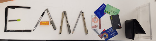
MY QUESTION IS - FINAL
After laying out my materials and getting a good photograph of them, I then went into photoshop to begin putting my final image together. I used a photo I had taken from over my balconey as a car was driving by, except I changed the values of the contrast and lighting through Photoshop to make it look a bit more serious and refined. After this I placed the image of my rope and extension and began masking, I used a wacom tablet for this process and it made it very simple. After finishing the masking I then added a slight shadow behind the materials and changed the hue and saturation as well to make them pop out just a little more.
Reflecting on this assignment, I was very unhappy with my final result, I thought it not only failed to meet what the poster requirements were, but I also thought it just looked fake and didn’t quite fit. However looking back at it now I see it as a starting piece of mine from this course, it’s not going to be my best work, but it will set a level for me to come look back at and compare how I’ve improved.
1 note
·
View note
Photo


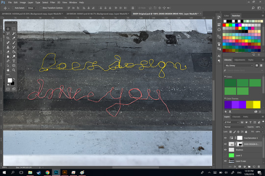
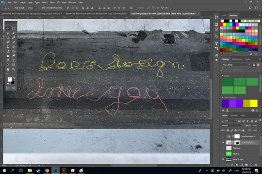
MY QUESTION IS - TRIAL 2
For my second trial I made sure to use some chords with colours that would be readable against the light grey concrete. The colours I chose were; a red bundle of rope about 25m long, and a yellow 30m extension chord. Luckily the rope and extension chord was much easier to work with and pose then the ethernet chord, this made the letter forming quicker and more efficient. The extension chord and rope also formed natural cursive curves within some of the letters, some of the letters I would just drape the shape of the letter and very smooth curves would form due to the preformed shape of the materials.
I was much happier overall with this trial, the colours actually came up against the concrete and the shape of the letters I was much happier with overall. Through this experiment I think I have gathered the elements I require to make my final poster.
1 note
·
View note
Photo


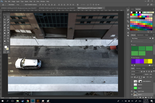
MY QUESTION IS - TRIAL 1
I began this project with the idea of creating the question “How does design drive you” in chord like materials. I first started with a 30m bundle of ethernet chord I had laying around my apartment, this almost immediately crashed and burned. From my balcony it was impossible to read as the colour of the chord seemed to blend into the asphalt, I then moved my photographer to a car park that was a little closer to the ground, however as you can see by the images it still blended in so well it was obviously not going to turn out well.
This was the end of my first trial, I ended on a pretty disheartened note as I had just expected it to work and look excellent, however I was left with something a lot less excellent and a little more unreadable.
1 note
·
View note
Photo

For our week 9 workshop we were tasked with experimenting with collage from a limited assortment of photos. This limitation made me think if it was possible to have a collage be made from a single image supplied, I decided to try with the gerald genta watch pages and created the letterforms of the watch “Gerald Genta” by cutting out shapes and forms of the watch itself. I also planned on creating the same sort of collage but with the other watch pages, however I vastly underestimated how long I would spend meticulously picking each letter form.
0 notes
Photo


For Week 7′s workshop we were tasked with finding letterforms in the RMIT buildings surrounding us. This was a really fun workshop that did help open my mind up to the different shapes and curves the buildings around us every day can form. I found the letters E, Z, F, Q, H and B
1 note
·
View note
Photo


In last week’s workshop we worked in a group of four to create the alphabet out of different shapes. My group (Alex, Charlotte, Jacob and I) were given semi-circles, triangles, and rectangles. At first it was hard to come up with the different letterforms out of one shape, but after playing around and combining the shapes in different ways, you begin to understand how much you needed to add to each shape. Our three colours really complemented eachother, and our letterforms had their own unique style. Overall the clss created some very interesting alphabets and it was very interesting to see how the other groups integrated other shapes into their previous alphabets.
0 notes
Photo


This week’s workshop had to be one of my favourite so far, we were tasked with creating a pop-up exhibit that had some level of interactivity to it. Our group decided to go with a slightly out there idea of hiding all of our designs around various places in the class room, and asking the question, “Where are the Designs?”. Unfortunately my work was extra hidden as it fell down as soon as the other group walked through the door, however everyone else chose expert hiding spots such as under the table, in the bag cupboards and underneath the projection screen. The other group came up with a more traditional exhibition that I found to be very aesthetically pleasing, they strung a string from one corner of the room to the other, following the random black stripe that runs through the whole clasroom. It was really interesting to see the stark differences between the two groups ideas, and seeing all of the other cohorts exhibits on tumblr as well has been an eyeopener to the different creative ideas we all have.
2 notes
·
View notes
Photo


Very late for week 3, and just a little late for week 4... For our fourth week workshop we participated in two activities, the first a time race. We were given the challenge of writing a panagram on a hot australian cement path, ours (Jacob, Hannah, Alex and I) being “The five boxing wizards jump quickly”. Without fail the sun quickly evaporated our letters, this began our tag team approach to the challenge. First having Jacob write the whole text, then the rest of us rewriting over his outline, after several practices we were able to get an awesome photo of our pangram.
For the second activity we then had to experiment with string like material and spelling out another pangram with making as little cut to the material as possible. Our group chose casette tape tape, which had to be the most finnicky material, but also very rewarding. After using tape to stick the letters down to our table and hand crafting each letter form we came out with the above image.
Both of these activities were a lot of fun and I definitely enjoyed doing both, I will be taking what I learnt from working with the cassette tape material, and applying it to my design question.
1 note
·
View note
Photo


Today’s blog, why YOU should convert to clay tabletism for all your social media! Read more below!!!
Today we learnt about communicating through different forms, ours being a lump of Playdough. We ‘texted’ our classmates on these tablets, essentially teaching us that with different media you have to understand what your limitations are and how to surpass them, or how to use them to your advantage.
0 notes
Photo


A little late on our first post, but for our first studio we were told to make our name, a phrase, and the alphabet out of the materials in our bags, which mainly consisted of pens, books and water bottles.
I haven’t had to rehearse the alphabet that many times since the 1st grade.
0 notes