
Don't wanna be here? Send us removal request.
Statistics
We looked inside some of the posts by eamonwebauthoring-blog and here's what we found interesting.
Average Info
Notes Per Post
0
Likes Per Post
0
Reblog Per Post
0
Reply Per Post
0
Time Between Posts
7 days
Number of Posts By Type
Photo
12
Last Seen Tumblr Blogs


Fun Fact
US Tumblr user growth rate is estimated to slow down to 4.1%.
Photo

Animations on websites have the ability to bring some flair to the design. These can be dramatic but often work best when they are subtle. An example of this could be the movement of text or a button when the cursor hovers over it. Animation can also be sued to imply direction, maybe leading the user further down the page to important information. Another important factor here is timing and speed. If too fast an animations can look jarring and unnatural and become a distraction.
0 notes
Photo

In website optimisation they are a few key areas that need to be tended to. One being designing for mobile first. This can include avoiding pop ups that cover the whole screen and scaling images with responsive design. Another area is SEO. This can be optimised by making sure your site is mobile friendly and making sure there are no issues such as broken links. A third area is link building. Google is very good at identifying and devaluing spam links. So in this case having high quality links is much more important than having many links.
0 notes
Photo
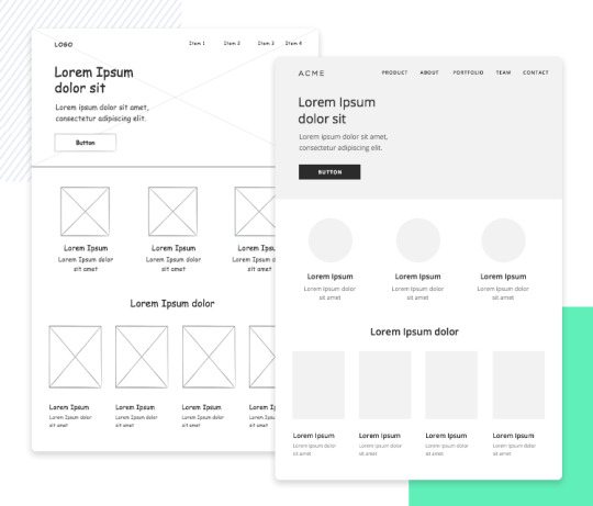
Wireframes are an essential part of the web design process. These allow us to predict any issues that we may run into in the future while also getting the programmers and designers on the same page. wire framing is primarily for the location and layout of elements, for this reason it is advised to work in greyscale to keep the focus on these elements. A great wireframe can be made with only a few elements, keeping it minimal allows for everyone including a client to understand the intentions of the design. More detail can always be added in the future. Showing wireframes to a client can give them a more clear vision of the design and they made decide to make changes at this stage. Something that will be much easier to do before work has begun on the website itself.
0 notes
Photo

Semantic HTML is the use of HTML to reinforce the meaning of content on a web page. CSS is then used to decide the design and layout of a page. Semantic HTML is much easier to read and understand. It correctly references all content on the page and gets rid of the need to add elements such as unnecessary divs. Semantic HTML also increases accessibility, allowing for better responsive design across all platforms as all elements are named correctly.
0 notes
Photo

When creating a website the goal is always to make it as accessible to as many users as possible. Excluding say 10% of your potential audience due to a design flaw is something that could easily happen without the proper checks. Disability can affect users ability to navigate websites in many ways. Some of these include site navigation, listening and watching content, Actions being too difficult to complete. Also websites being highly visual based can lead to a negative experience. A simple way to solve some of these problems is a clean and clear design, reduce the possibility for error and confusion. Colour and contrast within the page can also be very important increasing readability.
0 notes
Photo

adobe flash released in 1996 provided a way to display audio and video on browsers. This also allowed for the playing of light games. Flash was created in an era where all web browsing was done via a PC. This was fine at the time but when different ways of using the web came about such as mobile devices this created a few problems for flash. A couple of these being that flash was not suited to touch screen or efficient for battery life on mobile devices. In 2017 Adobe announced it would be no longer supporting flash by 2020. One replacement for flash is HTML5 . Some benefits to this are the integrated ability to play audio and video getting rid of the need for plugins. Another advantage is that HTML5 can keep web pages loaded in the cache. Allowing for faster page loading and less load on the server.
0 notes
Photo
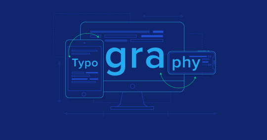
Typography style, placement and size is a crucial element when designing a website. Some websites are over 90% text which makes it very important to have a font that is readable and pleasing to the eye. When compared to traditional print media designing to websites can be a lot more challenging. This is due to the fluid nature of websites. Users will be viewing this media on screens of varying resolution, size and dimensions. Font size and line spacing will have to change depending on the screen. This can all be done through responsive web design.
0 notes
Photo

An open-source license grants its users access to the underlying source code of an application. This means you can typically change or extend its code to suit your needs and even redistribute it if you want. WordPress is maybe the best-known example of an open-source system.
Some benefits of open source are that it is much cheaper, apparently saving business’ 60 billion a year. Open source software can also be much more reliable as there is a huge number of users. However there can be some disadvantages to open source, One being that as all source code is available to users it can be used to expose vulnerabilities in the software.
0 notes
Photo

Mobile devices can be problematic for displaying complex tables and charts that would otherwise stretch the entire width of a laptop or desktop screen. Is it even worth showing tables to mobile and tablet visitors of your website.
But that doesn’t make sense. In many cases, a table isn’t some stylistic choice for displaying content on a website. Tables are critical elements for gathering, organising and sharing large quantities of complex and valuable data. Without them, your mobile visitors’ experience will be compromised.
You can’t afford to leave out the data. So, what do you do about it?
This means understanding what purpose the data serves and then designing the complex web table in a way that makes sense for mobile consumption.
Something like a WordPress table plugin called wpDataTables can make it easier to design both desktop and mobile compatible tables,
0 notes
Photo

Being fully responsive, WordPress supports all mobile platforms and screen sizes. Unlike custom-made HTML websites, you don’t have to create a separate version of your website for smartphones and tablets.
WordPress is a fully responsive content management system. Any user can run and update the website separately on different screens and reduce the hassle to check out the websites.
Themes of WordPress like Divi, Hestia, Astra, OceanWP, Tusant, etc. have the inbuilt responsive capability in the theme directory. They are pre-optimized for mobile screens, especially when you buy premium WordPress themes. Also, WordPress offers different plugins to develop a mobile version like WPTouch, Jetpack, WPTouch, etc.
0 notes
Photo

As HTML 5 does not support digital rights management most browsers currently use plug-ins for audio and video content. This is a highly debated topic as content providers such as streaming services want to provide their content under the restrictions of you being a paying subscriber. However their is a lot of criticism to these plans as implementation of DRM could create new restrictions for the user as it could hinder our ability to download, save and watch video online among other things.
0 notes
Photo

When researching and trying to understand CSS I came across some interesting facts. Firstly that CSS first got traction as it allowed can inherit and overwrite other styles and allowed for multiple stylesheets on the same page. The first browser with full CSS support wasn’t released until 2002. Until then “all presentational attributes of HTML documents were contained within the HTML markup. All font colors, background styles, element alignments, borders and sizes had to be explicitly described, often repeatedly, within the HTML”
0 notes