ebonyfashion6616
Fashion Student
Fashion illustration blog
31 posts
Don't wanna be here? Send us removal request.
Last Seen Blogs
piacereblog
piacereline
thechocolateoompaloompa
The Chocolate Oompa Loompa
yshonfire-blog
Live fast. Die pretty. ♥
applexscruff
Apple Scruff
b-r-oo-k-e-n
Sol
Text

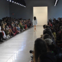
This is the first design I did in the first term. I had to take an inanimate object and make it in a a design for my I just I had a clock that looked like it was melting, so on my design i tried to make the effect of the clock melting on the women’s down her body as the dress however with the man I wanted to do a bit of a different design I put the clocks as shoulder pads but still had the melting aspect of the design as it looks like they are dripping down his blazer. I really enjoyed doing this task however I found it difficult to think of a way to make the inanimate object a full fashionable design that could go on a runway. I feel like both these looks go well together and match the same vibe, I think I did a good job to say it was my first every design project and can see the style and look I was going for.
4 notes
·
View notes
Text

This is an extra piece I did for a christmas card competition, where I had to design my out Christmas card but make it fashion, so the theme I chose to do was the grinch but make it fashionable. I made the grinch a women as I had the idea to but her in a Santa themed dress, holding a little candy cane bag. I really like how the design came out as it was the vision I had. To make it very grinch looking, as in the movie and the cartoon version the grinch is covered in fur i put a green fur border around the edge to emulate this aspect of the grinch. I made that part the border as I wanted the design to be high fashion and have a sleek look and the fur effect wouldn’t have gone well with the design but I still wanted the fur to be somewhere in this design.
0 notes
Text

This is an extra piece I did for a fairytale challenge, I basically had choose a character from a fairy tale and create a fashion piece from it. the fairy tale I decided to choose was princess and the frog however instead of going for one of the princesses or the character with gorgeous outfits I decided to challenge my self and did the villain, the voodoo man. In the movie he's alway in a suit with a top hat and cane and sometimes seen with a dec of card or his little voodoo doll so I wanted to include all of them in this design. I decided to do a women in staled of a man to change it up and give me more creative freedom and do a completely different look. I kept the hat and the cane but gave her a blazer dress with a deep v in the front and to compensate for trouser which he usually wears I gave her thigh high boot which I think look amazing with this look.
0 notes
Text


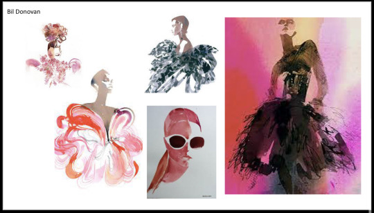
This is the Milan look from the fashion capital project, where I had to pick a look from each fashion capital and draw them using two illustrators style merge together. For the Milan look I picked a look from the Dolce and Gabbana runway show and chose Bill Donavan and Melique Street as they both really go well with the look I have chosen and the styles compliment each other and the runway look. I chose Bill Donovan for this look in particular as he uses water colour and I knew to achieve the effect I wanted for this look I need to use water colours. Once I had sketched these looks I first went in
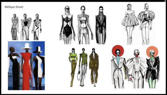

This is the research I did for the Milan fashion capital project, I started by gathering images of the two illustrators that I would be combining to create the new style out of the two merged illustrators. Having the references for these two illustrators work really help me grasp there style and this made it a lot easier to merge the two styles when drawing my own piece. I then looked for three runway looks from Milan spring/summer 2023 catwalk looks, I decided to go with the Dolce and Gabbana look as I thought it was the most interesting and a very edgy look which is different from all the other fashion capital look I had chosen.
youtube
0 notes
Text
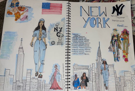
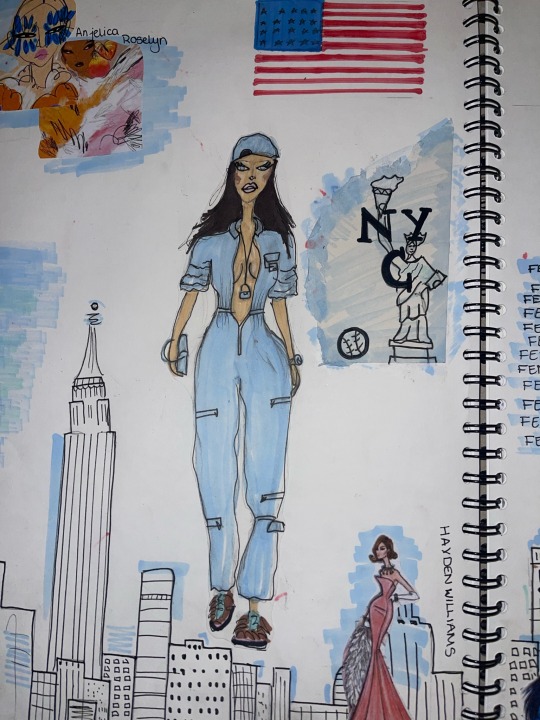
This is from a New York spring/summer 2023 catwalk, this is part of the fashion capital project where I had to pick a catwalk look from each fashion capital the sketch them by margin g the style of two illustrators I had chosen. For the New York catwalk I had chosen the Fendi catwalk as it was a bright and fun catwalk look, I then chose Hayden Williams and Anjelica Roselyn as my two illustrators to merge styles. I chose these two as I thought they worked beautifully together and with the catwalk look I had choses. I started by sketching the look out keeping the two illustrators in mind once I had the sketch done I went in with pro markers to create the seaplane effect that the look has. Although this only really had a couple of colours in the look I feel like the simplicity of it made the whole look so effective.


This is the research I did for this fashion capital, I gathered images of the illustrators work so that when merging the styles I had a reference of how the different style and a better indication of how to create a look using these two styles. I also picked three looks from the New York spring summer 2023 catwalks, I was very torn between the two Fendi look however went with the blue as I loved the colours and I hadn't come across a all in one look when doing my research for all the fashion capitals.
youtube
0 notes
Text
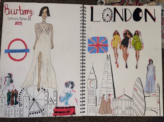

This piece is a look from the Burberry, London spring/summer 2023 catwalk. This also is from one of the fashion capital project where I had to choose a catwalk look and then choose to illustrators to merge their styles to create a new and unique illustrating style. For this Burberry look the two illustrators I choose was Maria Minina and Sara Sighn, I chose these two illustrators as I think there styles complimented each other and the effect I wanted to achieve when drawing the look from the London catwalk. To achieve the effect I used pro makers to create this look, there was a lot of details within this dress so taking my time to do this piece so that the details really would show in this dress. I really loved creating this piece with the style of the two illustrators although I did find it difficult to incorporate Sara Sighn so to do this I based the face off of her style so that the illustrators were still combined.
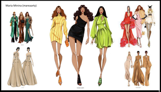
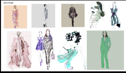
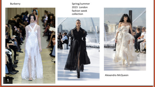
This is the research I did for my London ss23 looks, I gathered photo of the illustrators work so that when it come to merging the styles I knew how to and knew about their individual style. I then selected 3 catwalk looks from the London ss23 catwalk, so that when I came down to drawing one I had options to see what went best with the illustrators I had chosen.
youtube
1 note
·
View note
Text

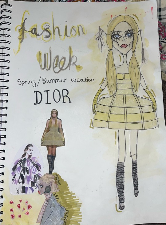
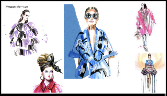
This I a piece is from a Dior 2023 spring/summer collection in Paris. for this task we had to find a runway collection from each major fashion city, then find two illustrators and and merge the styles together to create a new unique style for that particular runway. For the Paris runway I chose a gold Dior dress and picked Megan Morrison and Jamie Lee Reardin as my two artist. I chose these two artist as as I thought they complimented the model and the dress nicely, I really loved the style of Jamie Lee Reardin I feel like it very different to all the style I looked at when researching the illustrator, her style stood out a lot to me. Once I combined the two artist and created the dress onto the illustrations I used water colours to get the effect of the dress I wanted, I took a little bit of time to get the muted yellow colours in the dress, I used black and white pens to make the dress pop. To include the Megan Morrison style I created a drip effect on the eyelashes which I think really tied the whole look together.
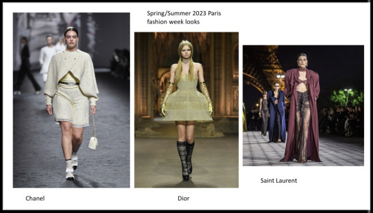

These images are the research I did for the runway and the illustrators, I gathered images to get an idea of their style so that when drawing the two styles combined I could easily do this style on my own illustrations. For the runway looks I picked three spring/summer 2023 looks from Paris, however I could only chose one and I found the Dior one to be the most interesting look.
youtube
0 notes
Text
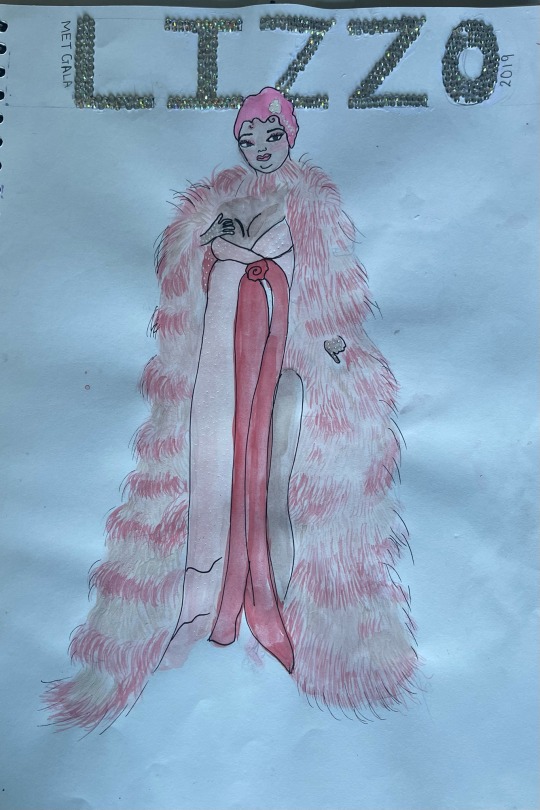
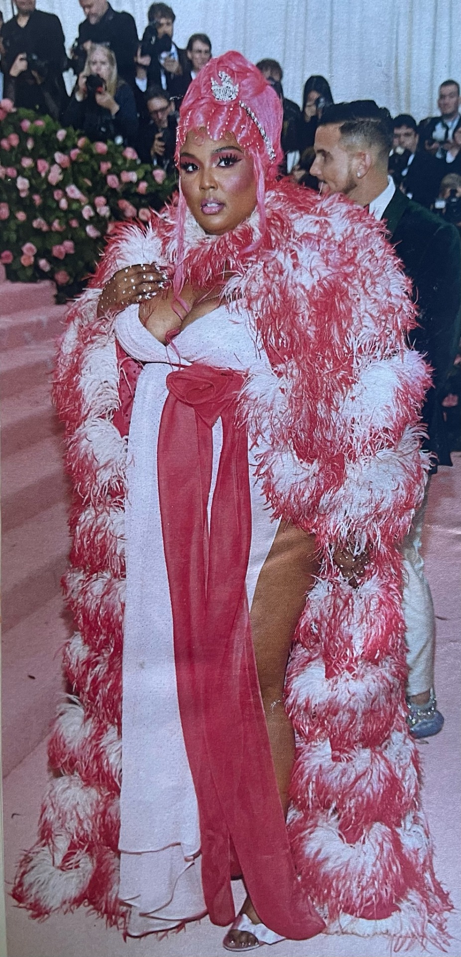
This is the other met gala piece I did with Lizzo. This piece had so much detail with the feathered jacket, I used water coloured paints with a very fine brush to create the thin brush strokes for the coat I had to practise the technique before putting on the sketch and took a lot of time to make the effect that I wanted on the painting. I feel like this piece came out exactly how I wanted it to and the strokes created textures and the effect that I wanted to create the look for Lizzo from the met gala.
1 note
·
View note
Text
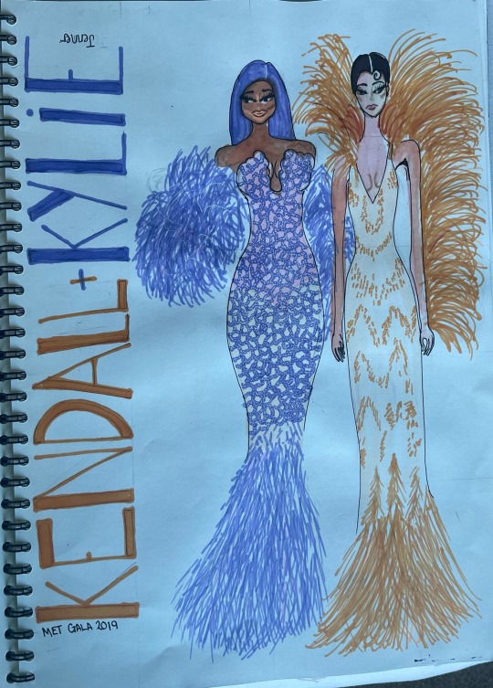

This is my Kendal and Kylie met gala piece, I love doing this piece this is one of my favourite looks from the met gala. I found it difficult to create texture of both of these dresses as they both had so many different details and texture on both of the dressing, if I was going to improve on this drawing I would go back in with a different media like coloured pencil to create more texture in the dresses. I really enjoyed trying to create the textures with the pro marker however I could not find the right shade for both of the skin tone with the pro markers as I didn't have the pro marker in that colours to create the right skin tones.
youtube
0 notes
Text

This is my collage piece I enjoyed do this one a lot, I search through many magazines to find the right colour pallets for this illustration once I found all the right colours I started layering tiny pieces of the magazines I found that for the dress layering tiny pieces gave a better affect and adds more textures, I did have to cut some pieces out to get the right shapes and textures for this particular dress.
0 notes
Text


Pro-markers are probably my favourite form of media, I love the look and effect they give to a drawing. These are the two drawing I did with pro-markers I think these two turn out extremely well and are two of my favourite illustration I did from this media task. the only thing I struggled doing with the pro-markers was trying to add highlights and finding the right shade to ad the highlights, the pro-markers are very easy to blend as the colours just seem to merge together when they are applied on top of each other, so when doing the highlights I found it easier if I applied to light colour under and blended to edges so it wasn't as blocky as if I just applied them next to each other.
0 notes
Text

This pencil colour drawing was probably the most difficult media as I found the pencils really hard to blend together so I had to keep going back into it so that the pencil crayons would blend together this was a more time consumer drawing. So after layering the crayons up I finally got it to my desired look where its blends seemlessly together. I should of done this illustration on brown paper as I think the final look would have look way better as on the reference image in the corner the image has a brown background, so I think that would have tied the illustration all together.
0 notes
Text

This illustrations media was water colours I found this very challenging as they smudge very easily and if I put too much water to the media it drips and could ruin it all, so when doing this piece I had to be careful when applying the media so by putting the right amount of water onto the paints made it very easy to blend and apply the paint.
0 notes
Text
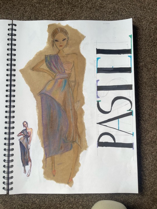

These are two of my sketches using pastel, the colourful piece is the one I did first, the pastel media took me a little while to figure out how to use this media to make it look good. The technique I figure worked well with the pastels was applying them then smudging until the merge together and create a blended piece, because I struggled with the fist sketch I decided to try again to develop my skills in the aspect of media so for the second sketch I used the same method of applying the pastels and blending them together with my finger to create the lovely blended affect after going back in with this method a few time until I got it to the desired colour and blend. once I had got this I went back in with the pastels applying more pressure to create some depth and dimension. Then to lock all the colours in I applied a layer of hairspray so nothing would budge or transfer.
0 notes
Text

This sketch was part of a media project to test and try out various different medias I can use on my illustrations, the first type of media I used was inks, were I took very watered down black ink and started to create a smokey effect on my illustration. I really enjoyed using the inks as it was very care free and the less I thought about were to apply the ink the better it was. However whilst using this technique the illustration can get lost behind the ink so the image must be inlined to make it pop, and get the details in the image back.
0 notes
Text
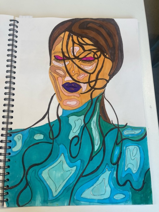

Facial interpretation face three I chose a face with lots of details with the hair and converted into the drawing with lots of different colours and details within the face. I started by sketching the face and drawing the details within the face which I wanted to add different colours to as it was confusing with all the hairs and different sections to add colour to before going in with the media I made marking to ensure I was adding the correct colours to the correct places I wanted them. for the face I went with skin stones that matched with the image, then for the neck and the chest to match with the reference photo which used many bright colours I decided to use different shades of blue to reference what image I was going. I found drawing this face a little bit difficult as the face was not looking face on and did not have her eyes open which the images so far I have drawn did have that but because I had don the stylised aliens piece it help me draw the different angles as I had already practiced that in them drawings, without that to develop my skills I feel I would of struggled to get the positioning of the face and features correct.
0 notes