
My blog for WR2310: Visual Rhetoric at WPI // Banner by @waneella_ on Twitter (twitter.com/waneella_/status/1448039480712171526) // Icon by my sister Adrienne Chau
Don't wanna be here? Send us removal request.
Statistics
We looked inside some of the posts by echau-wr2310 and here's what we found interesting.
Average Info
Notes Per Post
32
Likes Per Post
18
Reblog Per Post
12
Reply Per Post
2
Time Between Posts
4 days
Number of Posts By Type
Text
10
Last Seen Tumblr Blogs


Fun Fact
Tumblr has been banned in Indonesia for providing people with access to pornographic content.
Text
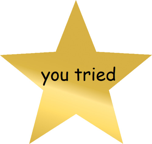
A Final Reflection: Blogging
With the final blog checkpoint coming up, I am 99.99% sure that this will be my last post on this blog. As such I would like to take this last space to reflect on blogging for this class.
I think our professor will agree that the blogging for this class did not exactly meet the expectations she was hoping for when beginning this course. Like many other students in the class, I had a lot of trouble keeping up with blogging. One reason was that it was so easily forgettable. Part of it could be because it was being facilitated on a platform way outside of Canvas. After all, I'm not exactly thinking about Tumblr when I'm thinking about my classes. Another part could just be a personal thing. Blogging for me was so low priority compared to the work in not just this class, but in all my other classes. I didn't think about blogging at all when I have three or four simultaneous projects on my plate. It just didn't seem worth my effort for most of the week, even if I'm able to write my posts fairly quickly. While most of my blog posts I made out of genuine passion and interest, some other posts I was scrapping for anything substantial to write down and submit as part of the blogging grade. I think for me it was difficult to reflect substantially on the readings and course concepts outside of what I want to express already in class discussions or in our visual designs.
Nevertheless, I saw clear improvement over time from the blog group. I think as we eased into the term, it became easier for us to spend time thinking about and then writing a meaningful blog post. I can definitely tell that as time passed, our peers put in a greater effort into maintaining a blog and created some wonderful posts that were worthy of discussion.
I'd like to thank Professor Riddick for being so accommodating with the course this term and for giving us so many chances and so much leeway to ease us into the flow of things. Like for many others in this class, I was simply not feeling it this term for various reasons.
To be honest, I can imagine myself blogging like this again. Like I said above, most of my posts were written out of genuine interest, so I had a great time writing those posts. In order to make the connections and explore these ideas that create a significant blog post, I need a subject matter that I care about. That ended up happening in this class. I don't think anywhere else I could have dropped a link to Linus Boman's YouTube channel just because I finally saw a chance to. The man has some excellent videos on typography and I've been enjoying his content well before knowing this course would cover typography. Thank you for exposing me to this medium of expressing myself that I had not considered before.
I like to keep my posts roughly between 200 to 400 words, but this is already well over 500.
So it's time to wrap up.
I believe that Professor Riddick tried her absolute best this term, and I'd like to believe that we all also tried our hardest (or at least intended to). You all did some amazing work in this class. Good luck on finals, and bless you all. I wish everyone a winter break where we lay in bed and do nothing.
And even if things didn't work out this term, just remember...
---------------------------------------
Image source:
Shiny gold star with “you tried” written in Comic Sans. Know Your Meme, 2012, https://knowyourmeme.com/memes/you-tried.
1 note
·
View note
Text
Our peer puts up an intriguing question for discussion in their post.
Do comic books really do a better job at teaching introductory information in a subject matter than textbooks?
It's complicated. At the core of this question is a more general question. What role do visuals play in the teaching and understanding of information?
Let's consider that textbooks also use images as part of the text. Why do textbooks use images? One reason could just be for decoration. Think about various mathematics textbooks we have used in our academic careers. Do any of them really tell us anything about the content of the book or math in general? Chances are, no, no they don't. They are just there to look pretty.

Let's consider, then, images that are part of the chapters. Why are they there? Chances are, especially in introductory science textbooks, the bulk of the images are diagrams that visualize the textual information being taught. Let's consider a biology textbook. I am sure almost all introductory biology textbooks would have a diagram similar to the one below.

Why are these diagrams helpful in an introductory textbook? After all, a cell does not look like this in real life, not even close. Simply put, visuals help to tell a story that text alone cannot. Just reading the textual information will not help us fully understand how all the parts of the cell are related to each other, or even how to clearly distinguish them. By visualizing the parts of a cell, the diagram helps students associate certain information with certain images. In this way, the information becomes distinct from each other, and thus becomes much more clear. The simple image of a single cell unit also gives a vague idea of how all the individual parts relate to each other to become one coherent unit.
But does it really work? A diagram like the one above works because it is a relationship between the text and the image. We can say that the brain can process information better if given another way to look at it. That is exactly what the image provides--a different perspective on the information. Hence, why comic books may be better than textbooks for introductory information. It constantly gives a different perspective on the information. The images act as the "in other words," a way to look at the information that may be easier to understand.
---------------------------------------------
Image sources:
Finney, Ross L., et al. Cover of Calculus: A Complete Course. 2nd edition, Pearson, 2000, https://www.pearson.com/us/higher-education/program/Finney-Calculus-A-Complete-Course-2nd-Edition/PGM277215.html.
Mokobi, Faith. Diagram of an animal cell’s structure. Animal Cell- Definition, Organelles, Structure, Parts, Functions, Labeled Diagram, Worksheet, Microbe Notes, 1 Dec. 2021, https://microbenotes.com/animal-cell-definition-structure-parts-functions-and-diagram/.
Are Textbooks or Comics Better to Learn From?
Before delving into the meat of this relatively short blog post, it's best to address the elephant in the room: learning styles. Some people might claim the answer to this question depends on whether someone is a visual learner, reading/writing learner, etc. This claim is based on the assumption that visual learners do exist. If this assumption is true, then the kind of claim previously mentioned is valid. However, according to Yale Poorvu Center for Teaching and Learning, "The overwhelming consensus among scholars is that no scientific evidence backs this “matching” hypothesis of learning styles (Kirschner 2017, Pashler 2008, Simmonds 2014). While all learners can develop subjective preferences for studying or digesting material, studies deny that students learn better through a self-reported learning style. Instead, scholars increasingly call for educators to replace ‘neuromyths’ with resources and strategies rooted in evidence from cognitive and adult learning theory" (Yale Poorvu Center for Teaching and Learning).

Image Credit: “7 Reasons Why Teachers Believe, Wrongly, in 'Learning Styles'.” 7 Reasons Why Teachers Believe, Wrongly, in 'Learning Styles', 8 Oct. 2016, https://donaldclarkplanb.blogspot.com/2016/10/7-reasons-why-teachers-believe-wrongly.html?spref=tw.
Now that the elephant has been settled, we'll briefly review some academic literature on the educational value of comics. Jay Hosler, a Professor of Biology at Juniata College, and KB Boomer, a professor of Mathematics at Bucknell University, conducted a study to determine whether comic books are an effective way to teach nonmajors about biology. The study used pre– and postinstruction instruments to measure students' knowledge about evolution before and after reading the comic. The results showed, "[o]n the preinstruction instrument, nonmajors reported the lowest scores on the content test and attitude surveys relative to the other groups. However, on the postinstruction instrument, nonmajors’ content scores and attitudes showed a statistically significant improvement after using the comic book, particularly among those with lower content knowledge at the start of the semester" (Hosler, Jay, and K. B. Boomer).
Let's briefly review one last academic journal on this topic. Jagannath M. Muzumdar, a Professor of Pharmacy Administration and Public Health at St. John's University, performed a study that focuses on the educational value of comic books for pharmacy. It was found from this study that "[c]omic books or graphic novels are a creative way to teach and learn about illness, patient experiences, and other related topics. They are a largely untapped source that may be uniquely suited to Generation Y and helpful in cultivating behaviors related to patient-centeredness, professionalism, altruism, and ethics. Comics have value as an innovative tool in pharmacy courses and require further investigation on beneficial uses" (Muzumdar).
What we can derive from these two studies is comic books do have potential to educate people about a topic. More specifically, comics have potential to educate people on basic concepts to help them obtain a vague familiarity with a field, as the first academic journal we reviewed strongly suggests. However, we should be hesitant about replacing textbooks with comic books. As the second academic journal we reviewed mentioned, further investigation into the educational value of comic books, especially for advanced subjects, must be conducted. I don't think comic books are capable of completely replacing the textbook. This is especially true when it comes to abstract concepts that can't be visualized but exist in a platonic realm. For example, if I wanted to write a comic educating my audience on the concept of truth, it is impossible for me to draw truth. I can only draw images which represent truth. My audience, which is new to the topic, may mistaken the images as being truth. Clearly, this example is very simple and it's unlikely you would think an image is truth. However, for an unfamiliar topic, you may also be fooled into thinking a visualization is the topic when it's not. For this reason, I think it's best for some fields to stick to words on paper to remain as general as possible. I doubt comics could have the same academic rigor as words on paper, but I'm always interested in hearing what others think.
Works Cited:
“7 Reasons Why Teachers Believe, Wrongly, in 'Learning Styles'.” 7 Reasons Why Teachers Believe, Wrongly, in 'Learning Styles', 8 Oct. 2016, https://donaldclarkplanb.blogspot.com/2016/10/7-reasons-why-teachers-believe-wrongly.html?spref=tw.
Hosler, Jay, and K. B. Boomer. “Are Comic Books an Effective Way to Engage Nonmajors in Learning and Appreciating Science?1.” CBE—Life Sciences Education, vol. 10, no. 3, 2011, pp. 309–317., https://doi.org/10.1187/cbe.10-07-0090.
“Learning Styles as a Myth: Poorvu Center for Teaching and Learning.” Learning Styles as a Myth | Poorvu Center for Teaching and Learning, https://poorvucenter.yale.edu/LearningStylesMyth#:~:text=Endless%20potential%20frameworks%20for%20categorizing,%2C%20auditory%2C%20and%20kinesthetic%20learners.
Muzumdar, Jagannath. “An Overview of Comic Books as an Educational Tool and Implications for Pharmacy.” INNOVATIONS in Pharmacy, vol. 7, no. 4, 2016, https://doi.org/10.24926/iip.v7i4.463.
3 notes
·
View notes
Text
I think our peer makes a great point here about the power of text and image together. She states that the "most effective and engaging mode of communication stems from having combined aspects of textual information and visual information" (svenkatesh 6).
Indeed, this rings true if we are to believe the old saying that a picture is worth a thousand words. The best combinations of text and image will have text that fits perfectly with its corresponding image, and an image that fits perfectly with its corresponding text. Not only is this a logical structure for clear reading of information, but it is the reason why the combination is so powerful. Combining the sheer informational power of images with actual written word brews up a storm of content and messages condensed into one neat (or messy, if that's the artist's style) package. Take, for instance, classic propaganda images that we see in history textbooks. An example we can look at is the iconic "I Want You" poster.

Imagine the poster as just the text.

Yes, it's clear from the bold text that someone desperately wants me to join the Army. And yes, it's clear from the visual emphasis on the "you" that I should feel a strong sense of individual importance. But who is the "I"? Why should I care that this person is so desperate for me to join the Army?
Now imagine the poster as just the image.

Yes, we recognize the figure as Uncle Sam, which we may also recognize as being representative of the United States. And yes, he is sternly pointing toward us so we recognize some sort of individual importance in the image. But why is Uncle Sam pointing at us? Why should we care that he is?
These lapses in context and information are filled in when the text and the image are combined. It is clear now that the "I" is Uncle Sam--the United States itself. We now recognize that our country wants us to join the Army in some sort of fight for our nation. It is clear now that Uncle Sam is pointing at us to single us out as individuals to join the Army. And now we care because our country is looking toward us for help. The full rhetoric of the image can only be understood and is only effective when text and image are coherent and rely on each other.
---------------------------
Image source: Flagg, James Montgomery. A World War I United States Army recruitment poster featuring a half-length portrait of Uncle Sam pointing at the viewer, with the legend "I want you for U.S. Army". Prints & Photographs Online Catalog, United States Library of Congress, circa 1917, http://loc.gov/pictures/resource/ppmsca.50554/.
Comics and the Spread of Information
“Words and pictures together are considered at best, a diversion for the masses, at worst a product of crass commercialism” (140).
McCloud, Scott. Understanding Comics, 1993.
The intertwinement of words and pictures is a common concept that has been discussed multiple times throughout this course. As mentioned in “The Semiotic Landscape: Language and Visual Communication,”
“Most texts now involve a complex interplay of written text, images and other graphic or sound elements, designed as coherent entities by means of layout” (17).
—. “The Semiotic Landscape: Language and Visual Communication. Reading Images: The Grammar of Visual Design. New York: Routledge, 1996. 16-44.
I believe that the most effective and engaging mode of communication stems from having combined aspects of textual information and visual information. Comics are the best example of this.
Comics allow for an audience to be enthralled by bold and illustrious images which are often, but not in every panel, accompanied by captions and subtitles. Having both of these elements allow the audience to capture the essence of the comic writer’s message and also to have a degree of freedom to which they can interpret the images in their own way. Crass commercialism, as mentioned in the above quotation, is something that simply would not arise if the interwoven beauty of words and pictures were of consideration by society.
While looking for some inspiration for our visual design draft, I came across a couple comics that caught my attention! The first, mainly for its color scheme, reminded me of Scott McCloud’s “Google Chrome” which described the technical background of the widely used browser. The second is very relevant to the life we are currently living, battling COVID-19. The title slide really pulled me in with its large and bold lettering.

https://www.theatlantic.com/entertainment/archive/2011/08/comic-books-as-journalism-10-masterpieces-of-graphic-nonfiction/243351/

https://www.graphicmedicine.org/covid-19-comics-educational/
2 notes
·
View notes
Text
A Reflection on Comics and Manga

In celebration of starting this unit. I wanted to write a short reflection on the place of comic books and manga within the arts and in culture.
McCloud makes a valid point in the "Show and Tell" chapter in his book Understanding Comics. As McCloud explains, "the general public's perceptions of 'great' art and 'great' writing hasn't changed much in 150 years. Any artist wishing to do great work in a medium using words and pictures will have to contend with this attitude" (McCloud 150). Indeed, even in 2021, almost two decades after Understanding Comics was published, even after the rise in popularity of multimedia franchises based on comic books and manga, the graphic novel as a literary and artistic genre still has not gained the respect of being "high" art or "high" literature for a frankly arbitrary reason. There is this perception that comic books and manga are not sophisticated storytelling or artistic mediums, that the graphic novel genre is made for children's entertainment. Why is that? Simply put, there are vivid illustrations. The perception that because a text has illustrations it is suddenly not a respected and complex text has permeated into the belief that comic books and manga aren't real books.
I think many traditionalists simply miss the point that a picture paints a thousand words. Through illustrations, a scene can show so many nuances of character or of setting that writing would struggle to get across in the reader's head. Traditionalists need to realize that by adding illustrations, it opens up a vast avenue for additional storytelling that the text alone can't easily and vividly convey.
The perception of the graphic novel may change with time, however. Comic books and manga have become engrained in our popular culture and the younger generation has fully embraced comic books and manga as legitimate forms of storytelling and entertainment. Merchandise branding comic book or manga iconography now are put in the front windows, from UNIQLO to Hot Topic. It helps that the Marvel Cinematic Universe is so successful of a franchise, bringing comic book stories to the limelight of the silver screen. I hope that as more time passes, the respect for the graphic novel as both a form of art and a form of writing will grow to the level that it deserves.
---------------------------------------------
Text citation: McCloud, Scott. "Show and Tell." Understanding Comics: The Invisible Art. Kitchen Sink P, 1993.
Image source: Character poster of Wenwu from the MCU movie Shang-Chi and the Legend of the Ten Rings. Shang-Chi and the Legend of the Ten Rings, Marvel, https://www.marvel.com/movies/shang-chi-and-the-legend-of-the-ten-rings.
1 note
·
View note
Text
I'd like to elaborate on the decision to use pictorial representations of humans in our infographic instead of more realistic images of humans or even photographs of real humans.
I noticed while we were creating this infographic that it visually felt very "modern". The main reason for this may be the rounded sans serif font that we decided to use that is reminiscent of Helvetica. As discussed in the Helvetica documentary, the rounded sans serif Helvetica font was made to be reflective of the cultural move toward modernism. It was made to be a modern font. We recognize sans serif fonts such as Helvetica to be "modern," partly because it was designed with this intent, partly because almost every font around us nowadays is sans serif, if not Helvetica itself. The flyers on the bulletin outside our classroom mainly use sans serif fonts. Microsoft Word's default font choice is a sans serif font. The font available on this word counter I am using so I don't crush your brain with an all too lengthy blog post uses a sans serif font.
Point is, our infographic took a very modern approach. We did the same for our pictorial representations of humans. I think we all recognize the ongoing move toward more and more abstract images in corporate visuals. Take, for instance, the evolution of the Mozilla Firefox logo:

We recognize that the image of the Firefox and the globe has become an abstract representation. The features of the fox have become heavily simplified, both in structure and in color with little shading detail. The globe has all but become a blue rubber ball, losing much of its geographical detail.
Although the move toward abstract logos is a contentious discussion to be had another day, we recognize that abstraction has become representative of modernity. As such, this affected our decision to use simple pictorial representations of humans, where specific details of the human anatomy are not present, but there is just enough shape and structure to recognize the image as being uniquely human.
This approach not only created consistency in our visual, but also contributed to our infographic rhetorically. We wanted the quotes to be relatable. By using abstract representations of humans, there is less of a sense that the speaker is one very specific person in the study, but rather could be anybody in a general group of people. In this way, it is easier to see one's self or one's peer or kin as a possible speaker of this quote.
---------------------------------------
Text reference: Helvetica. Dir. Gary Hustwit. 2007.
Photo citation: Hollister, Sean. Compilation of all Mozilla Firefox logos in chronological order. The Verge, 11 Jun. 2019, https://www.theverge.com/2019/6/11/18661931/mozilla-firefox-logo-new-design-more-fire-less-fox
Elaboration on Visual Design 2.2
As promised, I'd like to elaborate on one of the specific choices Ethan and I made when designing our infographic.
One concept we were debating was how many icons to include on the infographic. We didn't want viewers to be overwhelmed with data and charts, and wanted the graphic to be pleasing to look at, which would mean leaning more toward images and less toward including hard data. However, at the same time, we viewers to understand the results of the study, so we had to include clear, large charts.
In the end, we opted to only include a few simple pictures of people. Our choice was informed by Tufte, who introduced the concept of “chartjunk”, unnecessary icons that distract from the actual data and subsequent conclusions that the viewer may draw from it (48). We thought that adding extra elements to the charts themselves would contribute to “chartjunk” and make the data unclear and difficult to understand at a quick glance.
An image with "chartjunk" is shown below, where the small gun icons are unnecessary and do not convey much additional meaning at all to the viewer.

The few images of people that we included gave the infographic a more humanistic feel. This is related to the idea that Dragga and Voss described, which is that including icons with data can make the display more human and relatable. We didn't feel particularly guilty about not including images, since the data from the study didn't cover anything violent or deadly. However, by including pictures of people, particularly next to quotations, viewers of the infographic can feel more of a connection with those in the study.
As a side note, the images of people we used qualify as pictures, according to Arnheim, because they portray people in an inexact replica by using their most important qualities (138). In comparison, the quotation marks that we used to indicate direct quotes from participants are signs, particularly signs of human speech (138).
Sources:
Arnheim, Rudolf. “Pictures, Symbols, and Signs.” Visual Rhetoric in a Digital World: A Critical Sourcebook. Boston: Bedford/St. Martin’s P, 2004. 137-51.
Dragga, Sam & Dan Voss. “Cruel Pies: The Inhumanity of Technical Illustrations.” Technical Communication 48 (2001): 265-74.
Tufte, Edward. Envisioning Information. Cheshire, CT: Graphics P, 1990.
Images:
https://live.staticflickr.com/5046/5351196853_e75e8584f8_b.jpg, license: https://creativecommons.org/licenses/by/2.0/?ref=ccsearch&atype=rich
1 note
·
View note
Text
Our peer makes an interesting point in this post. I think people familiar with internet culture know about a certain image that jokes about causation vs. correlation on charts:

The meme is old at this point, but I remember this chart circulating social media to poke fun at other charts trying to show causation when it really is just some kind of correlation. We know that Nicolas Cage is not drowning people on set at his film productions (or at least we should hope not). The creator of this meme, Tyler Vigen, actually has a whole website dedicated to showing two charts that seemingly correlate with each other: http://tylervigen.com/spurious-correlations
I do think, though, that our peer may be misinterpreting Edward Tufte's purpose in writing Envisioning Information. Tufte wrote his essay to teach an approach to creating charts that is ethical. He emphasizes creating charts that show causality because that is what he considers an ethical approach to visualizing information (29). This does not necessarily mean that every chart will show causation. No, instead, he emphasizes that every ethical chart will show causation. We can definitely create charts that only show correlation, or have no pattern at all, but that would be an unethical approach to visualizing information, according to Tufte.
Of course, the ethical use of charts depends on the context. Dare I say that Tyler Vigen's charts are unethical? By Tufte's definition, yes they are, since they don't show causality and might be misrepresenting information. However, Vigen's charts are compiled on a website with the purpose of making fun of these charts for the sake of entertainment. It makes sense in this context that Vigen's charts are being used ethically even though they are unethical infographics since we recognize that they are being used in parody and for comedy.
-----------------------------------------------
Image source: Vigen, Tyler. Number of people drowned by falling into a pool correlates with Films Nicolas Cage appeared in. Spurious Correlations, http://tylervigen.com/spurious-correlations.
Text cited: Tufte, Edward. Envisioning Information. Cheshire, CT: Graphics P, 1990.
The Problem With Causality In Infographics
Let’s start off with a thought experiment. Imagine your house is on fire. What should you do? Call 911! A fire truck or two will then soon arrive at your house. Good. Now, let’s restart the thought experiment. Imagine your entire neighborhood is on fire! Naturally, everyone calls 911. This alerts the fire department that the fire is probably very large, making several fire trucks arrive at your neighborhood to put out the fire.
From this thought experiment, we realize that the larger the fire the more fire trucks will be at the scene. If we attempt to visualize this relationship on a cartesian coordinate system (xy-plane), the graph may look like the graph below.

The graph shows us the more fire trucks at a scene the more severe fire. Does this imply the presence of fire trucks causes fires? Of course not! This method of displaying data is best at presenting correlation, not causation. This applies to most other infographics as well, including infographics which have been revered.
For example, Edward Tufte, in his academic book Envisioning Information (1990), praises John Snow, a famous physician, for creating an infographic that displays the relationship between death from cholera and location of death. Some would claim Snow’s infographic clearly displays causation. However, the infographic Tufte created only displays causation if we assume the population was evenly distributed across the map. If it were the case that the population was focused on one region of the map, the graphic would fail to display causation, as of course deaths would occur where people reside, despite a disease.
It is very difficult to display causation through an infographic alone. Typically, experiments must be done to gather gather evidence that a cause may exist and doesn’t only appear to exist. For this reason, an infographic alone is not sufficient to display causation.
9 notes
·
View notes
Text
Gendered Shaving Products at Price Chopper
Over the weekend I stopped by Price Chopper to pick up some snacks when I remembered our class discussion on the gendered visual rhetoric of razors and Professor Riddick's note on checking out the layout of these products in an actual store.
So I took a look.

And surprise! Shaving products separated by gendered branding and marketing! I think we can all agree that we see this. There is a clear visual difference between the upper sections of the shelf and the lower sections of the shelf. The specifics of this difference also reflect what we discussed in class.
First, the color schemes. The masculine shaving products are dominated by dark colors, particularly a dark blue. There is a similar shade of dark blue being used by different brands on the shelf. Of course, blue is a color that we associate with the male sex. The specific shade of dark blue reminds me of navy, which in turn reminds me of navy color suits, an image reflective of masculine authority. The feminine products are dominated by bright colors, particularly pink. Pink, of course, is a color that we associate with the female sex. The pink is bright and stands out, which is a trend for products marketed toward women to make it seem more dainty or ladylike.
Second, the typography. Compare the fonts of the Barbasol can and the Pure Silk can:


The Barbasol can reflects the "masculine" theory of typography as discussed in our Benton reading, where there is very little embellishment and the font is very utilitarian. The letters are bold to reinforce the theme of authority in products marketed toward men. The Pure Silk can reflects the Benton reading's "feminine" theory of typography where the font is more stylized and embellished. Even the design on the cans reflect that, where the Pure Silk can has a complex but pretty design behind the text.
2 notes
·
View notes
Text
A Reflection on Sam Dragga and Dan Voss’s “Cruel Pies: The Inhumanity of Technical Illustrations”
Dragga and Voss make points on ethical visual communication practices that I emotionally agree with. I notice that with the conventional bleak approach to statistical graphics in technical writing, much of the humanity is lost. But I understand that the point of statistical graphics in technical writing is to provide data in the most clear, concise, and non-biased way. In respect to this purpose, the conventional techniques of creating statistical graphics works well, and I do appreciate data displayed as such.
Dragga and Voss do not want our humanity to be lost in our professionalism. I think their sentiment is a subconscious conflict that we all have sometimes--do we continue to put on a mask as a professional or as an academic? Or do we give way for our humanity, our character, our sense of self? While Dragga and Voss's humanistic approach is not the absolute "best" way to communicate statistics visually, the rhetoric they intend to push is fundamentally different from the rhetoric of conventional technical writing. As such, we must consider Dragga and Voss's assertion in respect to the medium or the context in which we create these statistical graphics. As Rudolf Arnheim consistently asserts in his essay "Pictures, Symbols, and Signs" the interpretation of our images is dependent on the context in which we put them. In the case of most technical writing, the context is completely practical and logical, and as such Dragga and Voss's emotional, humanistic approach may not fit, since this change in visual structure will affect our interpretation. In more emotionally lenient media that also rely on striking visuals, such as journalism, Dragga and Voss's approach fit right in, as they provide that emotional "punch" that a traditional chart or graph does not.
---------------------------------------------------
Dragga, Sam & Dan Voss. “Cruel Pies: The Inhumanity of Technical Illustrations.” Technical Communication 48 (2001): 265-74.
Arnheim, Rudolf. “Pictures, Symbols, and Signs.” Visual Rhetoric in a Digital World: A Critical Sourcebook. Boston: Bedford/St. Martin’s P, 2004. 137-51.
0 notes
Text
Sean and I had a lot of fun on this draft!
As mentioned in Sean's post, we had two images be our main inspiration for our font. We wanted to evoke the feeling of the early 20th century and a spooky train. Since we knew this font would be used in marketing materials, we wanted our font to be distinct, but bold and easily readable.
We noticed in our research that serif fonts with very bold lettering were popular for marketing materials in the early 20th century. Hence, why we decided to draw up a serif font with wide, bold strokes. To emphasize the harshness of the escape room's wintery spookiness, we took the idea of spikes as our serifs from the "Sparta Train Station" image.
Sean and I came up with specific rules for the "grammar" of our letters, down to the details of the negative space and the serifs, that we made sure we followed to create a consistent and unified font, adding to the legibility of the font. As I like to describe our font, it's "invisibility with personality".
I thought it'd be interesting to share my paper for sketches of some of the letters we worked on. Some of the letters went through multiple iterations before we agreed on a final design. (I ended up erasing some of them, so some iterations are now lost to time.) This is especially true for the letters we had the most trouble with, such as "c" and "i". However, we knew that many letters have common components, so once we figured out one letter, we could figure out at least part of the structure for other letters. This is easily seen with ascending or descending stems in letters such as "l" or "q" that directly came from our designs in "h" and "p" respectively.

BONUS: If anyone is genuinely interested in typography, I started watching Linus Boman's content on YouTube over the summer. I found this video on typography in Red Dead Redemption somewhat helpful for researching fonts for this assignment--
youtube
Visual Design 1.1 Update
Me and my partner have completed our visual design 1.1. The process took a while but we are happy with the result.
To start, we researched a variety of fonts related to the prompt. For example, we looked up fonts related to trains, 1915, cold weather, horror, etc. We then chose a few of the fonts that seemed to emanate the vibe that we were going for. Two of our most influential fonts are pictured below.

Source: http://images.squarespace-cdn.com/content/v1/58125128ff7c50ab8feb864a/1477680476810-VSV7EUY8EJQHL5NIH0SD/sparta-train-station-logo.png

Source: https://chicagothepolarexpressride.com/wp-content/uploads/2021/07/PEX_TitleTreatment_Chicago_1-1024x347.png
We then began experimenting with basic letters and came up with many different rules for our font. A few of the most basic rules are:
- the body of each letter (excluding ascenders and descenders) should fit in a 3 x 4 grid
- the vertical lines should be about one box thick, while the horizontal lines should be about half a box thick
- some corners will be curved or right, but the ones attached to long lines will have spikes attached to them
Based on these rules, and some others, we designed an entire lowercase alphabet. We decided we wanted the font to be thick and bold, since the situation is scary and also takes place in 1915. Furthermore, the spikes on the letters represent train tracks, and also feel cold like icicles.
Some of the most difficult letters to design were the e, i, and z, while the easier ones included n, l, m, b, d, q, and h. We noticed that we often only had to turn or flip a letter and we had the general form of a different letter, which was helpful.
Attached are some images of our work.


8 notes
·
View notes
Text
An Example on Regional Variation in Visual Communications

I want to expand on Kress and van Leeuwen's recognition that there is a "possibility of regional and social variation" when it comes to the unity of visual communication (4). Specifically, I want to take a look at an example of Western versus Eastern visual communication, which Kress and van Leeuwen briefly address (5).
The example we will be looking at today are the traditionally acceptable funeral garments in American culture versus Japanese culture.
The traditional wear for guests at a Japanese funeral is formal wear in the color black. The traditional wear for guests at an American funeral is also formal wear in the color black.
As we can see, both cultures emphasize the color black at funerals. This is because in both cultures the color black represents mourning and symbolizes death. Although the visual communication takes the same form and meaning in two different cultures, one did not influence the other in this regard. This color symbolism naturally formed in both cultures isolated from each other. In fact, there are drawings of Japanese funerals from 1867, still during Japan's Sakoku isolationist period, where the guests are predominantly wearing black.
The definition of "formal wear" does differ between the two cultures. Although Japanese men in the modern era almost always wear suits to funerals as is customary in Western cultures, the drawing does show the traditional Japanese formal wear that is much more Eastern influenced than Western influenced. It wasn't until the Sakoku period ended and Western nations began to interact with Japan that more and more Western influence began to take hold, leading to the norm of a Western style suit as formal wear in Japan. Kimonos are still considered acceptable formal wear at funerals in Japan, however, as the tradition and cultural significance of the kimono has remained well and alive today. As such, a black kimono worn by women at funerals are still common.
This traditional difference in the definition of "formal wear" in combination with the identical color symbolism despite isolationism not only is a real world example of a regional variation in visual communication, but it also emphasizes Kress and van Leeuwen's idea that "visual structures point to particular interpretations of experience and forms of social interaction" (2). It is through our life experiences in our own cultures that determine the meanings we interpret from the visuals around us.
-------------------------------------
Image citation: Silver, J.M.W. Photo of a cremation in Japan in "Sketches of Japanese Manner and Customs" illustrated by Native Drawings. Wikipedia, 1867, https://commons.wikimedia.org/wiki/File:Cremation_in_Japan-J._M._W._Silver.jpg.
Text cited: Kress, Gunther and Theo van Leeuwen. “Introduction: The Grammar of Visual Design.” Reading Images: The Grammar of Visual Design. New York: Routledge, 1996.
5 notes
·
View notes