
Don't wanna be here? Send us removal request.
Statistics
We looked inside some of the posts by efnmonster and here's what we found interesting.
Average Info
Notes Per Post
372K
Likes Per Post
175K
Reblog Per Post
197K
Reply Per Post
163
Time Between Posts
2 months
Number of Posts By Type
Text
11
Note
1
Photo
5
Last Seen Tumblr Blogs


Fun Fact
If you dial 1-866-584-6757, you can leave an audio post for your followers.
Text
People in the tags of my other diy bottle caps pins post pointed out there was a version without glue so I'm gonna explain it as well even if it's more well-known

you need
bottle caps (the ones made of metal obv)
pliers
safety pins
pull tabs (torn from drink cans)

pinch the edge of the cap and fold it towards the bottom side of the cap in one place, then do it again a second time on the opposite side

trap a safety pin under the pull tab but over the folded sides of the cap. make sure it's still possible to open and close the safety pin. you might have to slightly bend the tab in the middle to make room for the safety pin

pinch the edge of the cap and fold it towards the bottom side of the cap again in order to trap the pull tab under it

continue folding and flattening the cap until the pull tab holding the safety pin is completely trapped. unless you're very very lucky, the other side won't be perfectly round nor perfectly flat, but still! congrats! you made a diy button/pin with stuff you mostly found on the ground!


now paint the other side with whatever you like and varnish it and stuff. have fun be free
1K notes
·
View notes
Text


'Tomie' Manga Cover Artworks Illustrated By: Junji Ito (1998)
2K notes
·
View notes
Text

Twenty tropical shells, Johann Gustav Hoch, 18th century. Watercolour on paper.
84 notes
·
View notes
Text
Moleskines are Bad...
This post is doing the rounds again.
Everything in it remains true: Moleskine notebooks are overpriced for what they are, and even over-hyped; they’re not the original Moleskines referred to in the Bruce Chatwin (famous travel writer) anecdote which accompanies (or used to) each one. This is a typical example; here’s an extract:
Moleskine notebooks are synonymous with understated style and professionalism. They have been used by some of the greatest writers of our time, including Ernest Hemmingway and Oscar Wilde, whilst plain paper versions were popular with artists Picasso and Van Gogh.
Um. No, they weren’t.
Current Moleskines are a 1997 product which resurrected a long-defunct brand. If those Great Names used them there must have been a bit more resurrection going on, because by 1997 every single one - including Moleskine’s poster-boy Chatwin - was also defunct, most of them for quite a long time…
*****
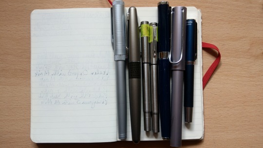
There are many other elastic-closure notebooks far more fit for purpose, especially if that purpose involves a fountain pen. My own current fave is Rhodia, with a Leuchtturm next in the queue, though I bought a few Moleskines some years ago when I still used gel pens a lot (Pilot G-2s are excellent).
Despite changing almost entirely to fountain pens, I’ve been working my way through the Moleskines because TBH they were too expensive just to chuck out. But they’re restricted almost entirely to gels again, because the wretched paper is so prone to bleed-through.
Here’s an example:
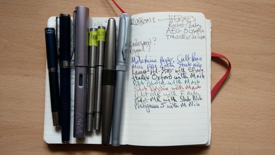
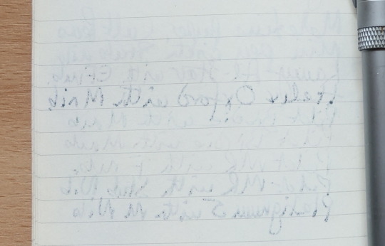
Here’s the other side. Every line is visible to some extent, and a couple of them have bled through. A broader nib, wetter ink or indeed both combined would leave marks so severe that a “120 page” notebook might have just 60 useable pages, and if the bleed-through was bad enough to mark the next page as well, maybe not even that.
There are several reasons for bleed-through: nib width (obviously a Broad nib <B> lays down more ink than an Extra-Fine <EF>), ink viscosity (“wet” flows faster than “dry”) and the way nibs vary between manufacturers, because widths don’t seem to have a standardised size.
It’s obvious that my Lamy Al-Star <EF> nib writes far broader than my Pilot MR <F>. With the same ink in both, the difference wouldn’t be as conspicuous, though I suspect it would still be there; Lamy nibs skew wide while Japanese nibs skew fine. Those variables apply to all the rest as well.
So why use broad nibs and wet ink if it’s so messy?
On heavy or just well-finished paper it isn’t, and the combination is (a) pleasant to write with, since the nib skims effortlessly along a lubricant of ink and (b) broader nibs with a bit of flexibility create more obvious line variation, and that makes for graceful handwriting…
…and fountain-pens in general, due to not needing pressure, can and probably will improve the sort of scrawl ingrained by years of using ballpoints. Voice of Experience.
The primary reason for bleed-through is low-grade paper, and Moleskine has that without a doubt. They should spend less on marketing and fancy associate-with-whatever’s-trendy-now covers and more on better materials, but they don’t need to, having settled into the comfortable “Lifestyle Accessory” slot where things sell by familiarity of brand-name, not quality of product.
IMO Mont Blanc fountain pens are there too, and have been since the early 1990s. @dduane‘s MB-146 was one of the last without the various authenticity marks that happen once a thing becomes desirable enough to be worth counterfeiting - as in China, which churns out a lot of fake MBs. (China is also where Moleskines are made…)
DD’s 146 may also be one of the last meant for use rather than possession. Nowadays (IMO again) a big MB is the fountain pen To Be Seen With. The equivalent big fountain pen To Write With is a Pelikan.
Just don’t try using either of them in a Moleskine…
*****
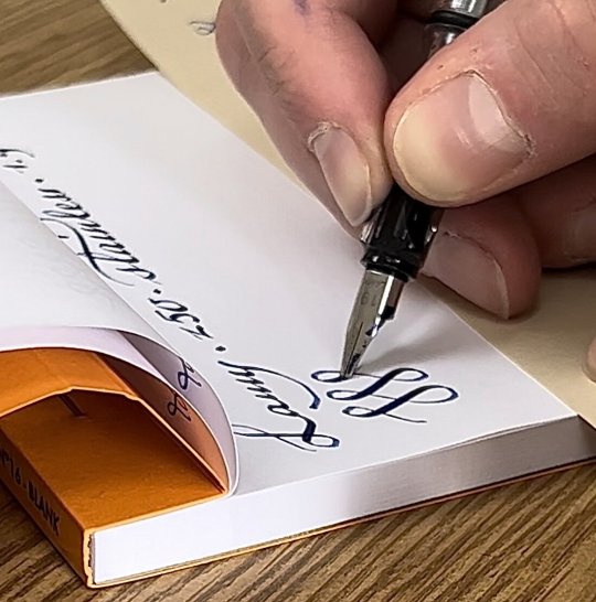
And yet, rummaging through old posts, I found something which amazed me as much now as when I first saw it 8 years ago. This was done with ballpoint pen on Moleskine, and embellished with real gold.
Wow…
6K notes
·
View notes


Text
windows down, wind in your hair, naruto theme songs blasting
14K notes
·
View notes

Text
this is just my unprofessional opinion but fuck all that shit
236K notes
·
View notes


Text
Gonchposters’ reading list:
If on a winter’s night a traveler (Calvino)
Tlön, Uqbar, Orbis Tertius (Borges)
Pierre Menard Author of the Quixote (Borges)
The Hydraulic Emperor (Martine)
The King in Yellow (Chambers)
(This list is incomplete. You can help by expanding it)
5K notes
·
View notes
Photo
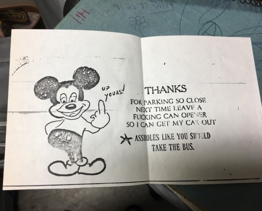
WE WERE GOING THROUGH STORAGE TO GET A STURDY BINDER FROM THE 80S FOR SCHOOL AND MULTIPLE COPIES OF THIS FELL OUT OF ONE OF MY MOMS JOURNALS IM SHITTING
59K notes
·
View notes
Text

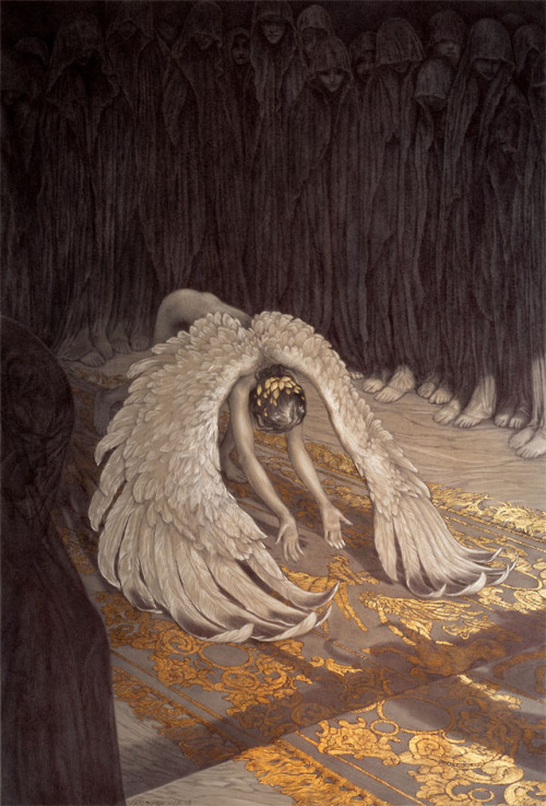
"Snow Angel"
Imagining what a new (50th anni please?) home media release of Goncharov might look like. Here's hoping.
typography from -> @beelzeebub
illust by me
10K notes
·
View notes

