
Don't wanna be here? Send us removal request.
Statistics
We looked inside some of the posts by ehkingofcards and here's what we found interesting.
Average Info
Notes Per Post
0
Likes Per Post
0
Reblog Per Post
0
Reply Per Post
0
Time Between Posts
3 days
Number of Posts By Type
Text
17
Last Seen Tumblr Blogs


Fun Fact
There are dozens of funny blogs to kill time on Tumblr.
Text
King of Cards evaluation
In this project I have learned a whole load of various skills and techniques which have definitely improved my graphic design skills. Some of these skills were the use of tilde key in illustrator which created some really interesting effects. I also learned how to create repeat patterns effectively and the small graphic processes in making various elements of the repeat pattern like using the shape builder tool. I have also never created a multi slide pdf presentation which was a first and I think that could really help me in future when presenting work to clients. I also learned how to do some non digital style work. I learned how to make op art and suminagashi which were both really fun and I was happy to have learned as the suminagashi was really effective in my final pieces.
Unlike most projects were I would usually take a lot of inspiration from one artist and create work very inspired by their style in this project I haven't done that at all. I couldn't say there was one particular artist which swayed me. I did a lot of Pinterest research of looking at other cards already made and I took small elements from different cards I liked. I can say looking at an artist called Austin Ho who designed a previous deck of cards for the same company under the multiverse theme helped me in the direction I was going in. His work was really cool and felt very illustrated and not too realistic which is something I kept in mind. Seeing work like that did boost my confidence as I could see what kind of work the client likes and how I could alter my work to be in more of that direction whilst still keeping it fresh and new.
If I had more time I think there would be a few things I would've like to have changed. I think I would've liked to given my box for the cards a bit more thought as that was very rushed although I would've kept the repeat pattern style as I thought that worked really well and especially as that was an aspect we did as workshop on earlier on in the project. I also would've created all 52 cards. and the main thing for me was the pips and font. I think I could've came up with some better pip designs as I think they weren't great and I would've worked on the colour scheme a bit better with that. As for the font I would've In Heinz sight looked at an old English font as I think that would've worked really well and created a juxtaposing style which would compliment the sci fi artwork nicely.
As a whole this project was definitely one unlike any other one I have done. Firstly I really like the concept and the fact that it was a commission and for a real client added on pressure and authenticity of it. It was a cool and scary feeling knowing someone would be judging my work from a financial standpoint to see if they though it would sell. Secondly the fact it was in a lockdown and almost all of it was remotely from home definitely had its impacts as well (good and bad). I like working at college and I find myself usually being more productive as I almost ‘have’ to work. However I surprised myself and was quite proud of my work ethic this project and that I came up with all my design with literally no input from my teachers like I usually would be getting at college. Things like that might seem small to some but for me that's actually quite a good achievement and gives me hope as this work setting will be a lot more like working at university which is where I plan to head post college. I also found it tough as I found it difficult at some points to know where I should be with the development of my final pieces. With weekly work I just knew to finish it by the end of the week but I wasn't great with time management regarding the final pieces so they were a bit of a squeeze to make in the last few days. Overall this project felt very very different for me and I suppose part of that is due to this only being the second project on this course. Nevertheless I thought this resinated a very positive ending for me and the project I was proud of the work I made and the concepts I created very individually and I am excited to move onto my fmp and put my all into it.
0 notes
Text
Final pieces
I thought I would dedicate a post to just my actual final pieces so I could portray the various versions I actually did which wasnt in the mockup I presented to the client. As as requirement I made all the suits with each different pip and a number with each different pip to show the various examples of the cards.


0 notes
Text
Production of my final pieces
For my final pieces I started from drawing them up. I first needed to find a concept and I stumbled across a sugar skull on Pinterest. After seeing that the idea of a sugar skull moon popped into my mind as that would be relative to the multiverse’s solar system theme. With that I began drawing my king, queen and jack.


I was quite pleased with the designs and I thought after some digital touch ups they would look really cool! Next in the drawing phase I drew my pips , the ace and I drew the number card. For the pips I found examples online that I liked and tweaked slightly to fit my criteria better. For the number card I just purely came up with the idea of dice as it feels very relative to multiverse. The ace was inspired by a moon cycle I saw on Pinterest and I think it is quite fitting as the suits all seem like a family and like characters whereas the ace culminates it all together.


Now I have everything drawn up I digitised everything onto illustrator using the pen tool and shapes where I could. This was a very very long process and after doing it I found out there was a much much quicker way which I should've used in Heinz sight.


I was very pleased with the suits so far and I was excited for them to develop even more. After I finished digitising everything I began to add in backgrounds. Very fortunately I made some excellent experiments using samanagashi and after some computer editing I had two edits which looked very sci fi related.


At this point I began to piece everything together as I was putting the backgrounds in. For the suits I put white circles with very light opacity on them behind the moons to try and both enforce the idea of it being a moon and for it to stand out more as the dark background wasn't making the illustration pop as much as I intended. I also had the same problem with the dice especially. However with the dice I wasn't able to just put a white background behind them I needed depth and texture. To do this I coloured areas of the dice with different tones of a very similar grey to try and make them look more 3d. From there I also added an effect called noise which really helped with the depth and texture and now the dice seemed a lot more ‘in the scene’ and realistic which is just what I wanted!.


At this point I was adding on my pips I digitised and any final touches I needed to add. I drew in the letter of the suits and I was almost finished! I also was saving multiple files of the suits with each different pip to show the example of the relative one. The only thing to do now was create the back of the card and the packaging to go with it. For the back I thought what better to do than a repeat pattern like I did earlier on in the project. For this I used the same processes that learned in that workshop and created a pattern from a mixture between inverted and non inverted jack moon faces. I thought this turned out well and it happened quite quickly in final steps of bringing this project all together.
Now I needed to complete the mockup in order to present the cards to the client. I used a pre made mockup file and just added in the appropriate cards from my suits to my number cards. I also needed to design a box for the mock up for my cards to go in. Admittedly this was very rushed as I forgot about it until actually doing the mockup. With that being said I created the box in the actually mock up piecing my monogram I made together matched with some type I placed onto the top. I also altered the background colour of the actual mockup as I thought it much better suited my dark tones.
Now everything was finished I did various steps to change it into a multi page pdf. This included merging pages, exporting it into layers and then other steps to turn it into a slide show style format for the client. This was a very long and difficult process for me as I have never done anything like that before and I am quite proud of myself for finishing it despite the few hiccups I had along the way. I will be talking in more detail about those mistakes and the things I thought I did particularly well in my final evaluation which will be the post after I upload all my actual final pieces onto my blog to show.
Overall this was a both stressful yet fun and rewarding process which I am very pleased with the outcome of.
0 notes
Text
90′s inspired monogram designs
In this task I created a monogram print which consisted of shaped I created using different illustrator based techniques. The style is very 90′s inspired and I found a picture of the internet which inspired the colour scheme of my work.

To start I created all the elements going into the repeat pattern. I began by making the trio triangle

I simply did this by creating a triangle with the pen tool and then copy and pasting them and putting them in this position/colour-way. Secondly I made the circle with a gradient going through it.

I made this by using the elipse tool and then adding a gradient over it. I wanted a nice blue however I didn't want the gradient to be massively prominent as I thought it would throw off the effect of the monogram so I kept it quite lowkey fading into a darker blue.

After that I made the sliced triangle. To do this I created a triangle using the pen tool. After that I drew on some rectangles with the rectangle tool. After that I selected them all and clicked the shape builder tool

After that I simply slide the black rectangles outward whilst holding option and this got rid of the rectangles leaving an interesting cut up triangle. Finally I made a triangle using the pen tool and put another simple gradient going through it intending on the same low-key effect as I previously did.


Now everything was ready I organised it into my 100mm x 100mm square. some areas I tried to keep symmetrical whilst others areas it was not possible so I tried to gather a general theme which I think worked nicely. Once I did that I put a black background behind it and it was ready to be made a pattern.

To make the pattern I highlighted everything and then went into object- pattern - make

From there I saved it as a copy which would save it into my swatches. This means I would able to create a shape and then fill my pattern in.


This is the finished print put into a couple shapes. Overall I really like the monogram and I think it really fits the 90′s style I intended it for. Im not entirely sure why some of the shapes became a lot more ‘absorbed’ and enlarged however nevertheless I think it still worked really well. in future I would attempt to sort of the distortion of certain shapes but I think It looks good enough to not be fixed with this experiment.
0 notes
Text
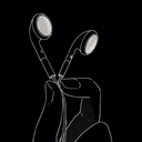
Tilde key illustrator experiment
For this workshop I used illustrator and the tilde key to create some very interesting concepts and experiments

Before doing anything I made sure to have my fill off, stroke black and 0.5p In size.


Above me were some of my first creations. I used the ellipse tool matched with the tide key to create some very interesting work. I slowly began to get the hang of it and began to try and form interesting artwork. After getting the hang of it I then ventured into changing colours and looking into gradient. However before I did this I made a quick experiment of using the option key with the tilde key and that created some very interesting effects as well


After the option + tilde key I went back and changed my last regular artwork into a nice tone of blue. From there I added a gradient called ‘fading sky’

I think this was really effective and made it feel similar to a very skilled drawing as the lighting is so prominent in one area. After this I decided to venture out more and change my tool. I changed it to the line tool and began to create from there.

Although this one isn't as visually interesting as the elipse tool I decided to use the option key on this one as well and I got some really cool results


I thought these two were very cool and the last one I thought looked like and actual figure. That interests me to see how far you could take this concept.
Overall I really enjoyed this experiment and I think I made some awesome work that I really liked. Although the process was quite simple I think it was still very interesting and effective. I get the feeling of like wormholes and different universes in this style of art and I think it goes really well with the aesthetic of the project and especially with the work I made at the beginning of this experiment.
0 notes
Text
Suit pip designs
Today I was trying to brainstorm some alternative ideas for what I could use as my pips for my playing cards. For my deck I think it would be important to be quite minimalistic with the pips as i’m going to have a lot going on in the background/ foreground of the cards themselves. With that being said I created a few ideas on simple designs I could potentially use


I am probably going to be using the last set however I would obviously need to clean them up and digitise them. I think they are both simple yet futuristic and that's something I definitely like the idea of to be on my cards.
0 notes
Text
Op art pip
Following on from my last experiment I decided to quickly do the same style experiment but using my op art I created.


I didn't think this was quite as effective as the pips with marbling however I still thought it was interesting and I liked how I was able to intertwine different elements of the project into more of unified set.
0 notes
Text
Digital experiments with the suits of playing cards.
To try and develop some ideas on how I could change the colours and background of the suits symbols themselves I created some experimental . To do this I digitised the suminagashi marbling work I had previously created in hand. After this I used pip templates on photoshop to add my marbling in (similar to a mockup). To do this I would just select my marbling and copy it. After that I would click on the thumbnail of the pip and press command and click. This then enabled me to ‘special paste’ it in so it was behind the pip. After that I was able to move it and resize the marbling until I wanted to lock it in and it become one.


This was my first one and I think it looks really effective. I love that I could adjust it so only the best areas of marbling were on show and I really liked the overall turn out. After completing this one I decided I would try to do more experimentation with the actual marbling before I put it behind the pip as a pose to me only adjusting the brightness and contrast.


I thought the original marbling for this one was generally one of my strongest I did however after simply adjusting brightness and contrast and then inverting the image I saw some really amazing results. It very coincidentally looks just like an image out of the moodpboard I did for the multiverse. I think it was so effective and it looks just like its own universe. Although I put this on a pip I can really see this being on a background to a card and I think this imagery would be almost a waste just to put on one of the suit symbols.


I went for the same effect with this one and I achieved similar results. I see this one as more of a night sky however the blues really help it reach more of a ‘galaxy’ with milky ways and other space related elements. I really like how much these are relating to space and sci fi.


For the spade I decided I would put the image in the pip both before and after I edited it for experimental reasons. I do think the inverted version was better and just more relevant however I would put that down to colour palette because I think the un edited version looks a lot more texturised.
Overall I think this experiment was both really fun and really effective and I was able to create some really interesting experiments which I will definitely use for other elements of the project.
0 notes
Text
Op art outcomes
We were tasked to create some op art following a tutorial online. I found it actually quite fun and therapeutic. It was relatively easy and I would call it more maths based than art based ironically but nevertheless I think the outcomes are really cool. Its quite time consuming however very rewarding and this style is something I would definitely consider in my card deck


I think the outcomes are really cool especially the second one. It works so well it looks like the paper is curved but it is actually a dead straight square.
0 notes
Text
Op art - Bridget Riley
Op art (short for optical art) is a style of visual art that uses optical illusions. Op art is typically black and white. It is an abstract art style and gives the viewer an impression of moving. Op art qualifies as a style of ‘kinetic art’ which is a term it is often referred to as. Op art has has been seen as early as 1908 by the artist Victor Vasarely. it was also seen around that time in Abstract expressionism which is a term applied to new forms of abstract art.
Riley was born at Norwood, London, the daughter of a businessman. Her childhood was spent in Cornwall and Lincolnshire. She studied at Goldsmiths' College from 1949 to 1952, and at the Royal College of Art from 1952 to 1955. She began painting figure subjects in a semi-impressionist manner, then changed to pointilism around 1958, mainly producing landscapes. In 1960 she evolved a style in which she explored the dynamic potentialities of optical phenomena.
Riley taught children for two years before joining the Loughborough School of Art, where she initiated a basic design course in 1959. She then taught at Hornsey School of Art, and from 1962 at Croydon School of Art. She worked for the J. Walter Thompson Group advertising agency from 1960, but gave up teaching and advertising agency work in 1963-4.
I personally think Bridget Rileys work is really interesting. I personally can't really find any direct meaning to her work however I find it really visually interesting to look at and I am intrigued as I have never really seen art like this. I have obviously seen optical illusions and relative art to that but I really like the length of abstractness Riley has achieved with her artwork.


0 notes
Text
First Sketch ideas
I drew a couple sketches of potential ideas from some of the research I have done. There was no direct inspirations for these I just overviewed all my research and tried to incorporated from certain elements I liked from what I have looked at so far.

For this sketch I drew some distorted smiley which looked like they were almost dripping away. In terms of the background it was hard to hand draw the effect I wanted to portray and will be much more efficient once I digitise it. I think its cool, it walks slightly away from the multiverse directly but I can still relate it amongst that aesthetic.

For this drawing I thought it would be interesting to dabble with the idea of dice. Dice gives you that feeling of uncertainty and idealises unknownness which highlights the multiverse various believers and theories well as there is no definite with it. The background will be a sky full of stars and various multiverse themed things like small galaxies and things like the milky way. This one is my favourite out of the two.
I aimed to try and incorporate a physical equal to the cards numerical value. As I chose the number 5 for both I had 5 dice and 5 smiley faces. Small details like that will be what I aim to bring throughout the whole deck so gain some constancy as I haven't t really developed a theme for them yet so they can relate in that way as a minimum.
0 notes
Text
Pinterest Playing card analysis
As part of furthering my knowledge and progression into the project I will be analysing some more playing card decks to try and begin to generate some ideas for my own deck.

I picked this deck because I like the contrast from style of art to what the actually artwork was! the characters are Harry Potter themed which is obviously based around present time witches and wizards. The actual artwork is very futuristic and geometrically ‘advanced’ so the contrast is very interesting. I feel like its more down to opinion on this one and I actually quite like it.

I picked this one because I really like the way the illustration is actually progressive I think its a really interesting concept and I think I would maybe like to have something like that in my deck but perhaps a bit more lowkey.

Although this isn't a whole set I thought id show this card as I really liked it. It is obviously in a traditional oriental style. What interested me was that this style would be the traditional style for various asian countries however they have the faces of kings and queens that would've been seen in other countries.

I picked this deck simply because I really liked it and is the first I have seen of this. simple design just different colours and tones. I can see this maybe being a problem in professional card tournaments like poker or various other games but as a pack of cards to keep in your home I think they are very cool.
0 notes
Text
The history of playing cards
The true history of playing cards is uncertain of the time and the use of them however there is many speculations pointing to many different theories. There is clear historical evidence of playing cards in the late 1300′s and the early 1400′s but the question is how did they get there? some people believe they we imported in by Gypsies, crusaders or traders. Educated guesses have made links to the cards, suits, and icons of 12th century and even older cards in China, India, Korea, Persia, or Egypt, which may have been introduced to Europe by Arabs. Some scholars believe that playing cards were invented in China during the Tang dynasty around the 9th century AD. There does seem to be evidence of some kinds of games involving playing cards from this time onward, including cards with icons representing coins, which also appear as icons on playing cards later in Western Europe. I like that the overall history is somewhat unknown it helps keep that curious aura surrounding playing cards and all of its different uses.


0 notes
Text
Suminagashi recreation
As a practical experiment I was tasked to re create some suminagashi work which I have just previously researched. To begin with I needed to get all the equipment i was to use. For that I got various food colourings, some vegetable oil, some pots to put the mixtures in and a tray for the main experiment.


After I got everything together I began to create my individual colours, I did this by mixing together the oil and colours in separate dishes. After that I filled up the main tray and began dripping the various colours into the tray


After that I just began dipping in paper and then changing the water to do different colour schemes and patterns etc. This was actually a suprissingly hard task to get effective results with due to it being a lot of trial and error. There was a good few variables which I had to figure out in the process of doing this. For example when I was first laying it in the solution I would pick it back up and it would drip down and become really smudged so I learnt to be really quick when I was picking it up and this helped it keep its shape a lot better. As well as this I found the consistency and ratio of the oil-food colouring pots really mattered. I found that using too little colour made the colours really weak and not really show. On the other hand too much colour gave a saturated ‘dotty’ texture where there was too much to mix in and looked really bad. if you had too little oil the food colouring is more water based and its not dense enough to act like the oil does so it disperses in the water as if you just dropped ink in water regularly. So finding a good ratio was very important and definitely reflected in my results and you can definitely see the progression from the beginning to the end. I attempted to swirl the water round with the ink in to see if I could get any swirly patterns like that. Unfortunately I neglected the idea of blowing into the ink with a straw like they do with authentic suminigashi so my work looks very different to the art already created.


I pasted in the designs I did in order of my first one to my last to see my progression. As you can see I did begin to get in more of the right direction towards the end however I was constantly struggling with the colours as they were either not enough colour, or too much of the same or the colour was too scattered. By the end of it I think I did like a couple of the prints but overall I think I could've done a better job. The prints also looked a lot better when they had dried (the pictures were from when they where wet). Regardless I still enjoyed the task and I can see how some of the potential art you could create could link in with the multiverse theme and I think you could generate some really cool original style backgrounds for some of the cards.
0 notes
Text
Suminagashi Research
The origin and development of marbling was practiced in Japan as early as the 12th century. The first forms of Japanese marbling were called Suminagashi, or “ink floating”. Delicate, swirled patterns were produced on paper when colors of ink were floated on the surface of the water. The artist would drop circles of black and indigo blue ink into the water, then blow gently on the surface of the water to produce smoke-like patterns. Marbling later became popular with members of the Japanese royal court. They used a slightly different technique to produce Suminagashi. They would decorate paper with sumi-ink then immerse the paper in water. As the inks floated to the surface, beautiful patterns would appear. I think Suminagashi is an awesome style of art and the extremely old history behind it makes it all that more meaningful. I especially like Sumingashi when the artist incorporates it as a secondary element or just incorporates it into the piece somehow. I am excited to re create some of this work in my own perception however I feel like I will get a lot less ‘streaminess’ due to the equipment I have at home.


0 notes
Text
Further Multiverse Research
In my Christmas holidays I decided to do some further research into more specific parts of the multiverse theory(s) that exist and I interestingly found out a lot.
The Multiverse is obviously an incredibly sophisticated deep concept. Within this concept different theories are made all gravitating to a different background influence. For instance there is a very philosophical theory known as ‘Modal Realism’ which is the theory of their being coexisting worlds which all are on equal realities. As well as this there is another theory developed which is more focused on physics and mathematics called the formal system which is looking at there being mathematical systems that are equally real. The most well-developed model of a multiverse and the one which makes sense the most to me is ‘proliferating space-times’ this is based on the idea of cosmological inflation. Inflation is a hypothetical process of the early universe in which space-time would have expanded exponentially at a much faster rate than at present. In most models, expansion would have been driven by an energy present in the vacuum that would generate a repulsive force. This kind of exponential expansion creates a region of space-time far larger than the observable universe and leads to a highly connected (albeit fairly pedestrian) multiverse composed of regions very similar to the observable universe.
I find the multiverse so fascinating in so many ways and one of which is the different theories that all have valuable reasoning but yet are all so different to each other. This research has helped me to recognise the diversity of the multiverse and for me to try and keep my work as diverse as possible creating artwork both centred to fiction and non fictional styles. I would really like to explore different concepts some of which I have thought of and some others that are inspired by the theories of scientists or various people.
0 notes
Text
‘Playing arts’ research
I am also researching into ‘playing arts’ which is another playing card company that designs some more art based cards. Each deck is called its own ‘edition’ in which each deck is designed by around 52 different artists. This is an awesome concept and it makes each card completely unrelated to each other. I also found that with these cards they typically have artwork relating to the number on the card which is a nice touch.

This card entails more of an Egyptian style which I think is really interesting and this is the first sort of card I have seen like this. I like the colour scheme and the use of line is very effective.

This was probably my favourite card I saw on the sight. It has such an awesome design and I really enjoy the multi media parts of it especially the watercolour. It is an interesting abstract piece and everything about it works so nicely.

This artwork is amazing. First of all I love the idea of it being in the Mexican day of the dead style art, as well as that its so cool how the artist has incorporated the regular jack illustration to create this cut up collage style art.

This Card is not one of my favourites but I thought it was important to show it as it demonstrates some minimalist continuous line art. A lot of the artist took very detailed approaches to their cards but I like how simple this is. Black on white. The artist almost anticipated all the very bright colourful work all the other artist would do and gained a interesting juxtaposing approach.

This art is another one which uses line very effectively. They are creating an illusion which sort of just disappears. I also noticed the lines being very sharp at the bottom which I could imagine it being due to it being in the diamond suit. I like the presence of there being three hooded characters and I also think its works well with the white background.
I have found that from this research the cards feel a lot more art orientated than the king of cards decks. I feel that is due to it being led by different artists delivering their own style on only one or two cards. With the king of cards they had to create a theme and then make the whole deck work around that which is why perhaps it feels less creative. Both companies do very interesting work and I think I can try and take certain elements I particularly enjoyed from both of them to incorporate in certain ways.
0 notes