
Don't wanna be here? Send us removal request.
Statistics
We looked inside some of the posts by eleanorbriarsterm2 and here's what we found interesting.
Average Info
Notes Per Post
0
Likes Per Post
0
Reblog Per Post
0
Reply Per Post
0
Time Between Posts
15 hours
Number of Posts By Type
Text
17
Last Seen Tumblr Blogs


Fun Fact
69% of Tumblr users are millennials.
Text
Week 9
Case Study Presentation
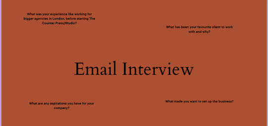
I did my presentation today, it went quite well but I felt a bit nervous and got lost in my script at one point. I am glad I did it as it wasn't as scary as I though it would be. I maybe could have been clearer, but this is something to work on. They liked that I had an actual interview despite having a blunt email back.
0 notes
Text
Week 8
Case Study
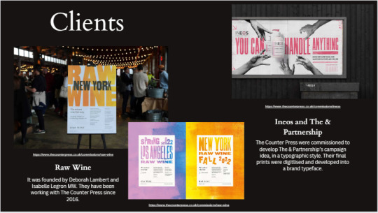
This is my final presentation, I just need to add my bibliography. I found this project to be really interesting because it let see so many agencies that I could imagine myself working at. I like the Counter Press because it uses physical and digital element which is something that I find fun. I made my presentation reflect the Counter Press, with the three colour palette and the straight lines as a pattern, I used a serif font to show the traditional ways The Counter Press make their pieces.


0 notes
Text
Week 8
Photos of boxes
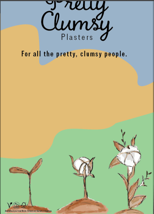
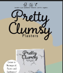
These are a few pictures I took of my boxes in the Photo Booth. I’m really happy with how they have turned out, they look professional and fun. Although I have changed them through the project, my core ideas are still clear which are easy access plasters that have a bit of a cottage core aesthetic and look feminine but are still for anyone.


0 notes
Text
Week 8
Bus stop poster
I was going to do it on Adobe Dimension but the poster wouldn't input into the document, so I did it on Photoshop instead, which worked just as well. I like it a lot more now that I can imagine it in real life. I think it catches people's attention with how bright and clear it is.


0 notes
Text
Week 8
Case Study
These are my slides in my presentation. I need to keep adding to them and can finish them once I have gotten the information from the company itself. I changed the colours to orange, black and white to reflect the Counter Press.


Above is my transcript for each slide so far. I will time it and practice, and then make any edits I need to.
0 notes
Text
Week 8
Case Study
I have started my presentation by copying all the research slides in, so that I can see what information I have to put in the presentation. I will then sort out the design to reflect my chosen company.
I made two mind maps of everything I need to put into my slides and what I have already researched, which was super helpful.


I then sorted what will go on each slide.

0 notes
Text
Week 8
Finishing my poster
Now my boxes were done, I put them onto my poster, but had to choose which one and remove the background on Photoshop. I then matched the background to the box colour. I then printed it, cut it down and stuck it together. Overall, I am happy with the outcome. It reflects my packaging and stands out with the bright colours.


0 notes
Text
Week 8
Assembling main boxes
I printed out my boxes on 180gsm card. At first one of them wasn't quite right as the printer had automatically scaled it down. I fixed the problem on normal paper first and finished printing them out. I then assembled them and added the little pulley bit on the side. I really like them. They are so cute and reflect my research and idea well. On the blue one, I realised it had an outline around the plaster but the others didn't so I had to quickly reprint it and re-assemble it. Also, on the green box, the flower slightly touches the text but I didn't realise that until they were put together. It is annoying but the writing is still eligible, and it would mean re printing both bits and I don't have enough card. Apart from that everything is how it should be, it looks like one collection and professional.


0 notes
Text
Week 8
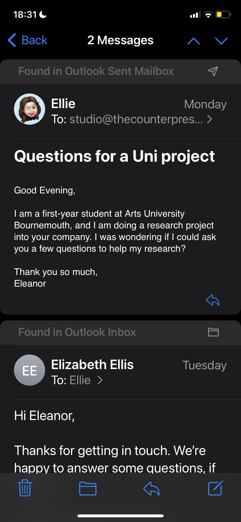
Emailing Counter Press
I emailed Counter Press to get some more information about their company that I couldn't find online. They got back to me really quickly which is so helpful, and adds an extra bit of detail to my research.

0 notes
Text
Week 8
Social Media Workshop
This was a quick workshop to look at how we can advertise on social media to our advantage. I designed these templates, with the idea of the 'bold' changing font on some of the words. For a three hour project I am happy with what I produced, it is bright and bold, perfect for the exhibition. I found the workshop super helpful, I can think about the posts in a more collective way instead of just one at a time.


0 notes
Text
Week 8
Poster Amendments
Following the tutorial, I made the adjustments so that my poster looks more finished and professional.
Make a few changes on my posters
take outline out of circle
make the animation longer
fade out the background
separate the sentences on the plants so one comes after another
Logos and small text move
I experimented with the logo placement, I settled on the left hand corner, as it is still noticeable when printed but doesn't take up too much space.
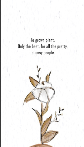
I then made adjustments on my moving poster, moved the logos to the corner. I then kept trying out different text placements on the growing plant until it was readable but still got my point across. I ended up taking out the 'for all the pretty, clumsy people' on the grown plant, as it was too long and it would be on the final poster anyway. I am happy with this final adjustment, I now need to add in the actual picture of my box and change the colours to match my boxes.


0 notes
Text
Week 8
Tutorial
In my tutorial today Briony suggested the following for my posters:
Make a few changes on my posters
take outline out of circle
make the animation longer
fade out the background
separate the sentences on the plants so one comes after another
Logos and small text move
For my main boxes, they are nearly done, I just need to print.I was going to do blue, green and orange as they are natural colours, making my boxes look more sustainable, but I really like the purple colour. We decided that my original colours would work best with my project, but if I don't like it I can always print on purple.

0 notes
Text
Week 7
Paper Research
For the prototype I made, the card was 160gsm, it was a good quality but I want it a bit thicker so 180-200gsm, so that it can fit in the normal printer. I had a look at Uni but there wasn't all the colours I wanted. I looked online and found some paper on Amazon that should be good, if it isn't I have a backup plan of using the Uni's paper but the orange colour may have to be pink or yellow. The paper doesn't arrive until Monday, so if it isn't right, I will look at some stationary shops (I already looked at UniPrint).
0 notes
Text
Week 7
Moving Poster Edits
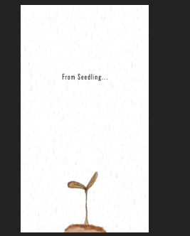
The first thing I did was have only one box on the end poster. I then added in all the text on the growing plant and faded it in and out. When I had done all my edits, I went back to make sure the text was smooth which took a long time as I had to make sure you had enough time to read it and that it didn't clash with the next text. I fixed the background by adding in a solid white fill on a separate layer, it also fixed a problem I had with an outline on the first plant, which I tried to fix by cropping it but didn't work. The plants are bigger at the end, which was annoying to fix as I had to redo moving the position up. I also added in the logos and store text at the top and the little circle of text so that it is my main poster. Overall, I made things smoother and look like it is one moving image.
(For the first bits of text I added in my slogan so that it ties in with my box, which I need to add to my main poster somewhere)
I really like how this has turned out, I found it pretty easy to use After Effects, some things were annoying but I found solutions quickly. I actually enjoyed making this.


https://liveaucbac-my.sharepoint.com/:v:/g/personal/2303715_my_aub_ac_uk/ETW0y6qRFAtIgsPMH64a__UBhpoY0OZ6KXBWokd3pXCLrQ?e=UMmwQm
Final moving image ^
0 notes
Text
Week 7
Poster editing
This is my main poster, I just started experimenting with it and if I can make any changes etc.
The main change is that I only have one box now, with a circle of text about the other projects, either Briony or Hannah had said about doing that in a previous tutorial, but I cant remember when that was. I also made the plants bigger, so that my moving poster looks better but they won't be as big as these. I still need to work on the text and after my next tutorial I can make any improvements. So far it's looking good, however, I have been looking at it too much so I am starting to be not sure about it. I need to remember that the box on here is just a placeholder, and it will be better quality once I have made and photographed my actual box.


0 notes
Text
Week 7
Adjustments after prototype
These are all the things I needed to edit:
moving text
Adding a tag on the side
Vectorising the logos on the back
making plasters bigger
Adding the pattern all the way around the box
Putting text on the growing seedling
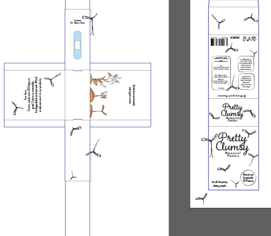
I did all of these things on my first box (waterproof) and then repeated it on the other two but in the style the box needs.
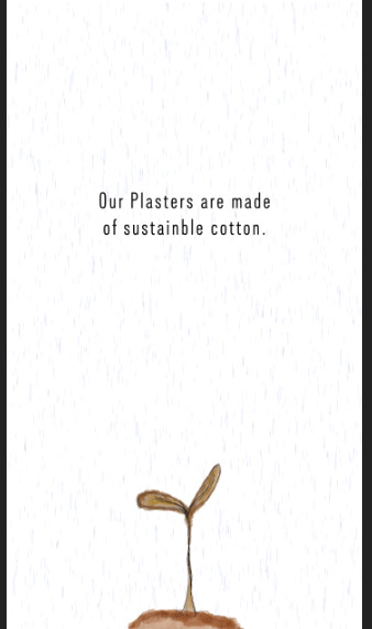
First off I moved the text on its own to the plaster side and added in the pattern to go around the whole package. I did it so that any plants that are cut off on the front, wraparound the sides. I then thought to move the cotton text on the side to the growing plants as it was an empty space, and on my animated poster I need text when the plant grows and so I can add in what it says here on package (made from sustainable and natural cotton). It groups everything together so that my brand is clear on our message.
I then made the little logos on the back clearer by using image trace then silhouette. I also moved them in slightly along with the slogan at the front. I also made the front waterproof plasters bigger.
I am really happy with these designs and I think they will be the final one, I just need to sort out paper and then I'm ready to print.


0 notes
Text
Week 7
Moving Poster Feedback
I got some good feedback from Briony and my peers, this is what I got, and I think with these changes it will look so much better. The last one I will experiment with, as I am not sure yet.
Fix rain
Add text to the growing plant
Make end plants bigger
Only need one box?
Make the word Plasters bigger on box
0 notes