
elianimationblog
Eli's Stop Frame Animation Blog 2020
51 posts
Don't wanna be here? Send us removal request.
Last Seen Blogs

midnight-rendez-vous-blog-blog
Midnight Rendez-vous, crazy clothes 4 crazy people
middiknight
Back On My Gay Shit

izahi-an
Deviant randomness

syzygyzip
Waking the Windfish

thegracefulphoenix-blog
The Graceful Phoenix
Video
youtube
With the shakiness gone I’m much happier with the result of my animation. There are a few strange movements (like a slight pan up in the first shot) but overall the result is much better. I think if I had more time, I would’ve gone back and tried to perfect the first two shots of my animation. But, overall, I’m happy with the result of my work!
--
My final design is inspired by the lightheartedness and playfulness of the song MOSCOW, with inspiration also being drawn from Russian culture, including architecture and constructivism. I wanted to keep most of the type within the piece similar to the style I found in Russian Constructivism - bold, unyielding letterforms. I think at some stages I could've leaned more into this - if I had more time I maybe would've made the "magic grew" a bit bigger and more demanding of attention, but nonetheless the type before the information slide adheres to this style.
I really wanted to play with the 'Moscow' element of the song and drew my colour inspiration from the colours of the city architecture. The light and eccentric colours of classical Moscow architecture are featured throughout my piece. I added the cityscape as a visual element to further connect with the city. For the colour grading, I've tried to boost these colours, while also adding a nostalgic warmth. I wanted the colours to seem reminiscent of days past, like the golden age of the Soviet Union as a Superpower, and also to connect with the nostalgic message of young, carefree love in the song.
Which leads me to a key theme in my animation being love! Autoheart have explicitly said the song is about love, and so I definitely wanted to incorporate this into the piece. A lot of their other media is also about the freedom to love who we choose, so I think it's definitely a core message of the band as a whole.
0 notes
Video
youtube
The footage in my second export is higher quality! However, I’m not entirely happy with how bouncy the footage is. After some googling, I found there’s a tool in Premiere which can help fix this, so I’ll try again.
0 notes
Video
youtube
I decided to eliminate the first section entirely from my animation, as I feel it was definitely the weakest part. I also feel like starting with “Head back to” is a nice and inviting for a concert teaser, and so is a nice opening line.
This is my first export with the colour corrections and everything. The quality is obviously very low, which means I need to redo this!
0 notes
Video
youtube
(I’ve had to start uploading videos to Youtube since Tumblr is giving me error messages when I try and upload directly)
Halfway through editting, I had the idea to redo the middle section of my video. I liked the idea of using glitter, so I built on this to have the text made entirely from glitter. I’ll definitely play this in reverse in my final.
0 notes
Text

At this stage I started editing my animation. I especially wanted to play around with the colours to make them more vibrant and pop more! I’m still playing around with my current clips and considering what I want to do with them
0 notes
Video
I’m happy with the movement in this shot, but I feel a bit off about the framing. I might want to redo this with the text more central in the frame - since especially when I crop the piece it might look a bit strange.
0 notes
Text


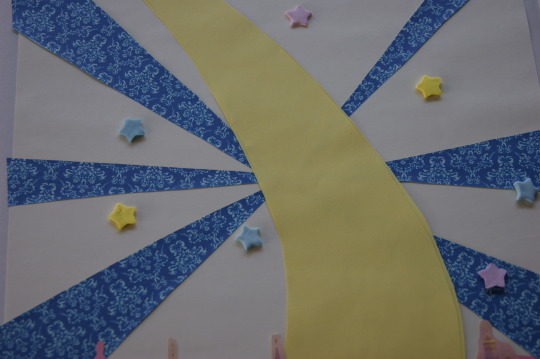
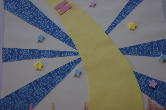
I tried the word MOSCOW on different coloured papers, as I was wondering if this might be an issue as well in my previous shot. I asked some of my family members and friends and they thought the off white looked nicest since it allowed the colours in the individual letters to shine, so I’ve decided to stick with it!
0 notes
Video
I tried this using a similar technique to the information shot, but I’m not sure about it. I feel like the word ‘magic’ needs a bit more fanfare than this gives it. I might move the words to a different shot entirely.
0 notes
Video
Continuing the animation. I’m happy with how this looks, but when I tried the plane across the cityscape, it didn’t really work for me. I deleted the photos before saving them, but I had issues with the scale of the plane compared to the city, and I also felt I could better utlitise techniques unique to stopmotion. I feel like with a plane flying by, I could easily recreate this in computer animation, so I want to try something else.
0 notes
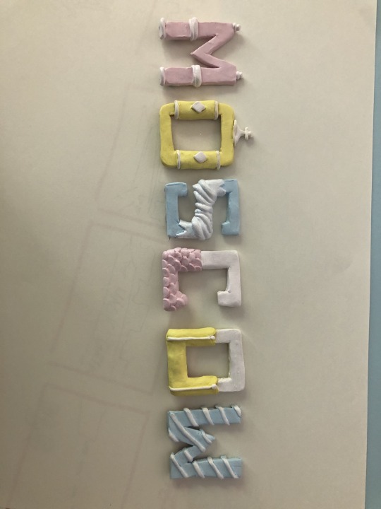
Photo
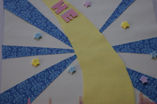
Initially, I was just going to have the letters appear one after the other. But as I was working, I thought it might be a nice idea to have each letter hold a bit, and then have the stars still spin in the background.
0 notes
Video
I really like how this turned out! Initially, I was going to leave the mounds of clay simply as that, but as I was filming I had the idea to turn them into hearts, which I think really works for the theme of the song and the band. For my final, I’ll reverse this footage so that it looks as though the words are forming out of the clay.
0 notes
Text
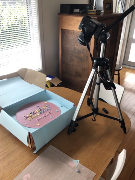
For reference this is my filming set up at my dining room table! I don’t have any lights, so I’m reliant on the natural light from the window. Luckily it’s quite sunny out so the lighting isn’t changing too much.
0 notes
Photo


I actually decided I preferred the look of the record on a flat surface as opposed to in the box, since the box cast a shadow over the top portion of the record.
0 notes
Video
I also tried the same animation from a different angle. This test jumps around a bit, which I’d need to fix in my final. Honestly, I’m not entirely convinced by the design of this section of the animation, I might go back and revise it later.
0 notes
Text

I remixed some colours of clay to form the letters for my information shot. While usually I’ve kept the colour scheme in a recurring order (pink, yellow, blue) for the information I used yellow first since I thought it would work best for the word Power (like electricity!)
0 notes
Video
This is the first actual filming I did. The footage seen here is played in reverse. I actually had an issue with the focus of the camera - I was using autofocus and when the letters were nearly offscreen the camera unfocused, and I hadn’t quite figured out manual focus yet so the letters start onscreee, which isn’t really what I wanted.
0 notes
Video
Another test video, I just wanted to try out the letters lifting up (which can be played in reverse to have them lie down). The letters shift around a bit because I added blutack to each one as it became the letter to move - in my next attempt I’ll definitely have the blu tack on in advance.
0 notes