
Don't wanna be here? Send us removal request.
Statistics
We looked inside some of the posts by ella-hazel-blog and here's what we found interesting.
Average Info
Notes Per Post
1
Likes Per Post
1
Reblog Per Post
0
Reply Per Post
0
Time Between Posts
15 hours
Number of Posts By Type
Text
8
Photo
8
Link
1
Last Seen Tumblr Blogs


Fun Fact
If you dial 1-866-584-6757, you can leave an audio post for your followers.
Text
More works, the final choices.


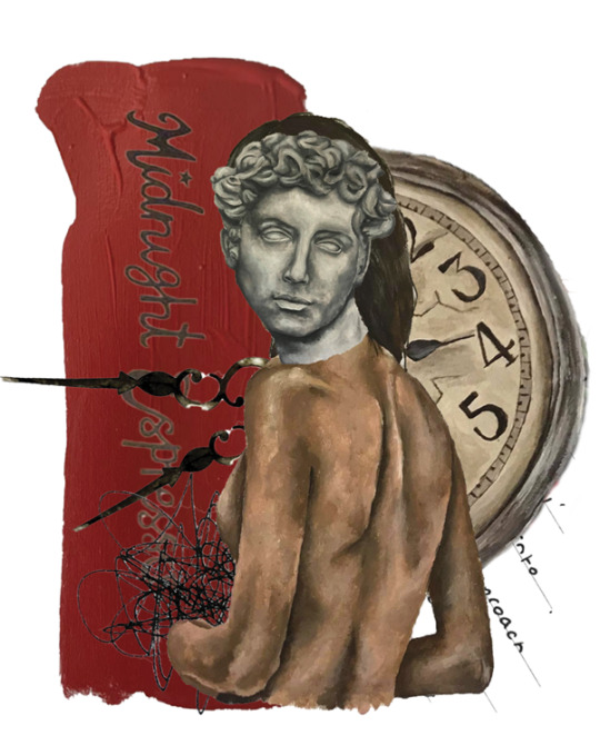
I edited the works some more and made my choice of finals by what each piece was saying. I wanted to represent all sides of midnight espresso and equally all sides of myself. The bright, colorful, warm, confident elements, as well as the more vulnerable, more grunge, chaotic aspects.
0 notes
Text
More Works


I created some more works, sticking with the nude forms. I painted some more figures and then tried to really create something new, as well as work with some elements i’d already painted.
0 notes
Photo


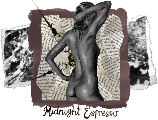
Edited this collage after feedback to try some of the suggestions. I cleaned up the collage and tinted the background as well as played around with different edgings and centering the clock hands. I tried adding color into, however decided that this piece wasn’t necessarily about the brightness of midnight espresso. More about the grunge. The sticky table tops referenced in the back ground. (the back layer is a cropped photo of midnight’s tables, the textured print of them) The confidence of the people. The midnight espresso night scene rather than the colourful day scene. I quite liked the tinted background, however decided that i agreed with Eugene in terms of the edging. I liked having the mix of soft and straight edges of the ripped page.
0 notes
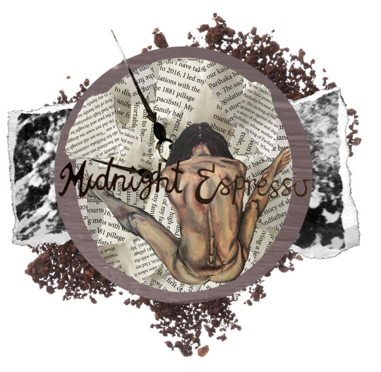
Photo
This was the piece of work that was critiqued for the second crit. The feedback was really useful.
0 notes
Text
Creating more work


In these works i tried to do what Eugene said in my critique by reusing pieces in different works. For example I used the other half of the statue face as well as the same female figure. I also painted some new bits to give myself more to work with as had been suggested. One work i based around color as my classmates had suggested.
I still am trying to keep similar elements within each work so they remain coherent. In ideas and looks.
0 notes
Text


Some more bits i painted to add in to my collages. Painting was really slow, as was actually creating the collages so i was beginning to find this pretty tricky. The colors i had actually created earlier when studying midnight espresso.
0 notes


Link
Found this article very useful and informative when looking into Martha Rossler.
0 notes
Text
Martha Rosler
Martha Rosler an American artist who worked across disciplines. Her collages often commented on political issues such as the Vietnam war. She’s also well known for her strongly positioned feminist art which was often played with sarcasm and irony. I like the way she uses female figures however, not in a sexualising way. She has a strong female voice which is emulated through her work - something i want to express in mine. Her collages themselves are also very interesting. They feel very deliberate and sharp.
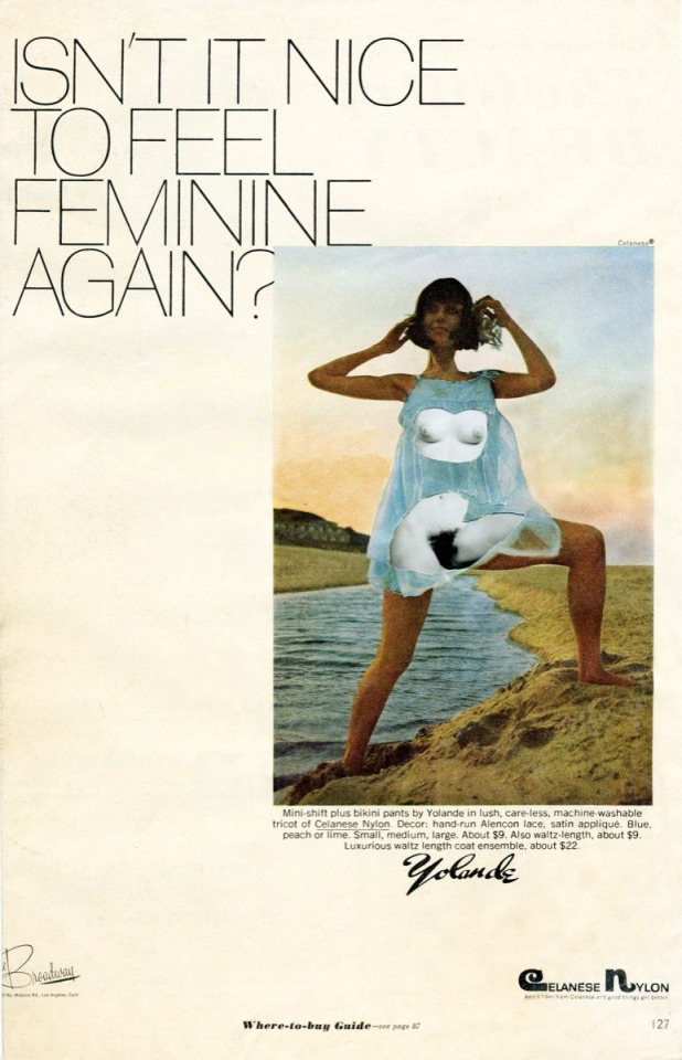
Martha Rosler, Isn’t it Nice..., or Baby Dolls, from the series Body Beautiful, or Beauty Knows No Pain, c. 1967-72.
1 note
·
View note
Text
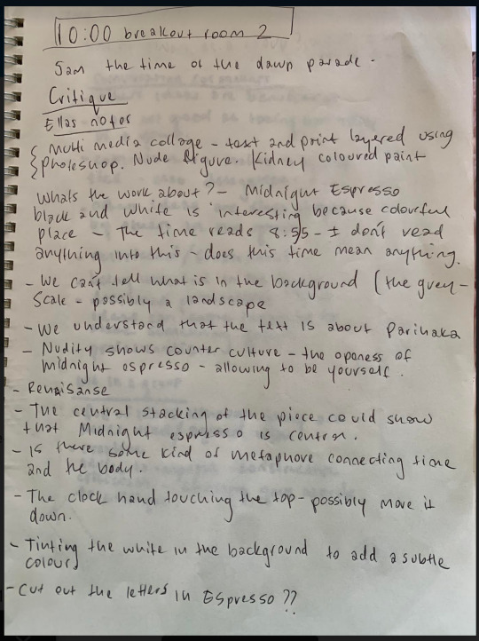
First Critique
Typed up notes from first critique...
Felix, Sally, Josh:
- Liked the mixed media - Make some more works that are different - Try do a work based around color because midnight espresso is a very bright place
Eugene: - make some works that are very very similar to each other and play around with that. Only changing very subtle elements. That’s the bonus of digital art, can re-use elements in a different way.
- Give yourself some more elements to play around with
- Look at the artist Martha Rossler, could be a useful reference in terms of feminist art
0 notes
Text

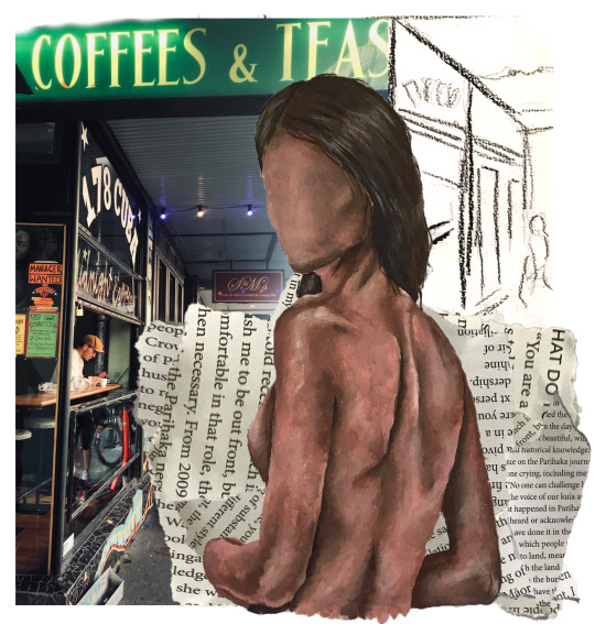
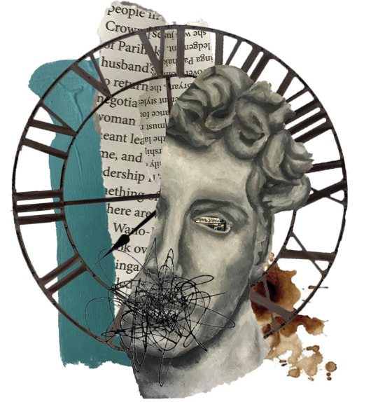
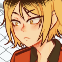
These were my first three works that i came up with. The first two i made with an idea in mind. The female forms nude represent counterculture and being proudly feminine. Midnight espresso is clearly referenced in conjunction. All the textures and paint colors are from midnight espresso. The writing is all about Parehaka referencing my NZ history.
The third one with the statue face was not planned. I knew i wanted to reference classics in my work as its an important part of who i am, growing up being told all the greek myths and studying it last year, but i wasn't sure of how i wanted the piece to go. I ended up just playing around referencing myself and midnight again with the paint, time and coffee. I liked the halo effect in Alex Contreras’ work so used that idea to inform this piece.
I’ve been trying to keep lots of the materials i’m using similar for example the writing and paint to keep the body of work coherent and flowing nicely.
0 notes
Photo


These are the paintings i used to create this piece. One great thing i discovered about Photoshop is that if you don’t like the color you've painted something you can adjust it. I ended up not liking the blue of the nude figure so could change it without having to repaint it.
0 notes


Photo

%u2022 CITY Imaginary Beings by www.johannagoodman.com | All images ©Johanna Goodman 2019
Johanna Goodman was an artist i found informative. I enjoyed the way she collaged pieces together that did not necessarily traditionally fit together as such. She is able to talk about a number of things within one work which is what i’m aiming to do in my work.
0 notes
Photo


One artist who’s techniques i have been studying is Alex Contreras. His works are untitled however he produced the two above in 2019. These two images i find particularly informative. I found the way he fractured the face to reveal something between of interest and effective. I also like the Use of circle within the first work creating almost a halo around the figure. The use of mixed media is effective.
0 notes


