
Don't wanna be here? Send us removal request.
Statistics
We looked inside some of the posts by ellarotteveelmandmthree and here's what we found interesting.
Average Info
Notes Per Post
0
Likes Per Post
0
Reblog Per Post
0
Reply Per Post
0
Time Between Posts
9 hours
Number of Posts By Type
Text
10
Video
4
Last Seen Tumblr Blogs


Fun Fact
Tumblr’s website traffic is steadily declining.
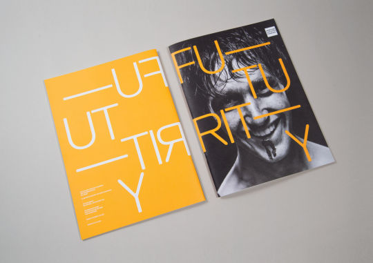
Text
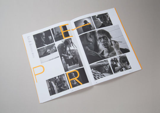
Brochure Layout Research
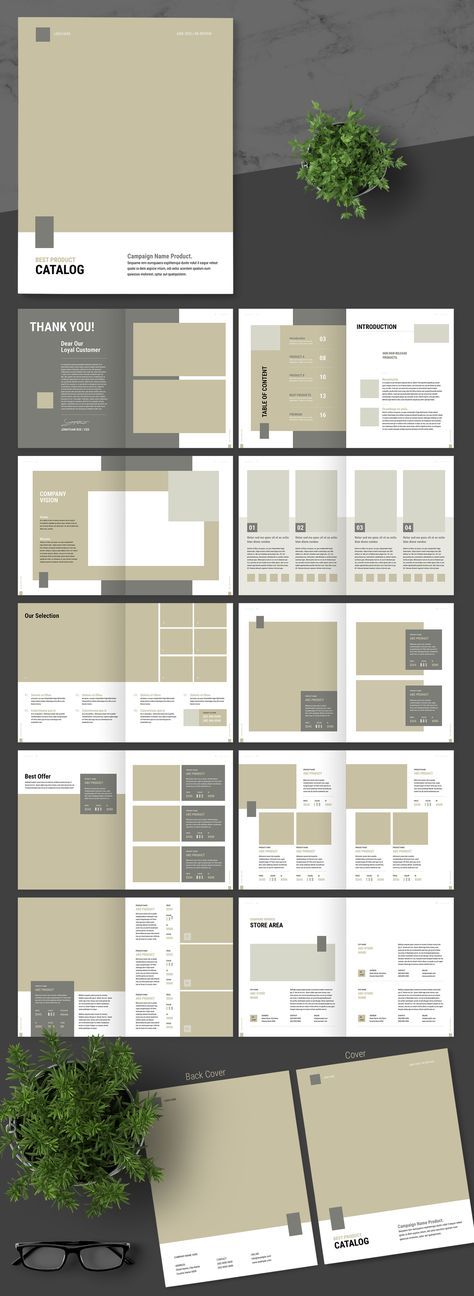
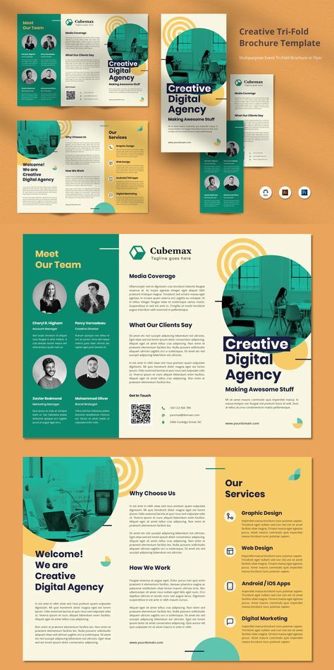
Source: https://pin.it/6c2Y10V
0 notes
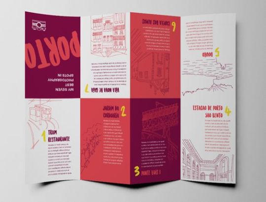
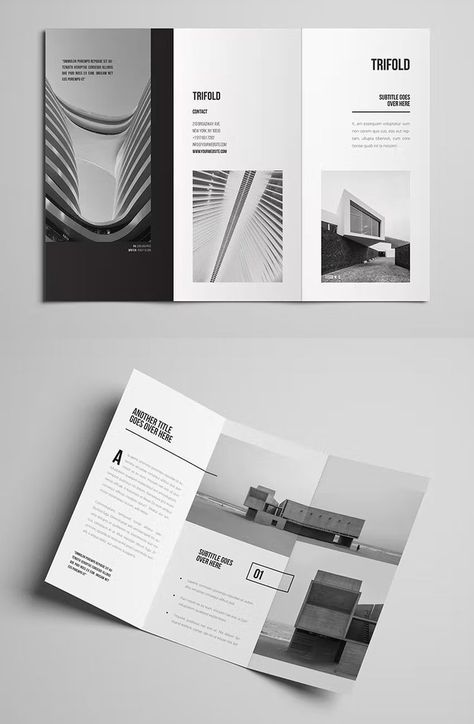
Text
Further Brochure Research on Layout & Visual Style
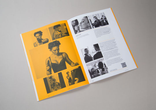
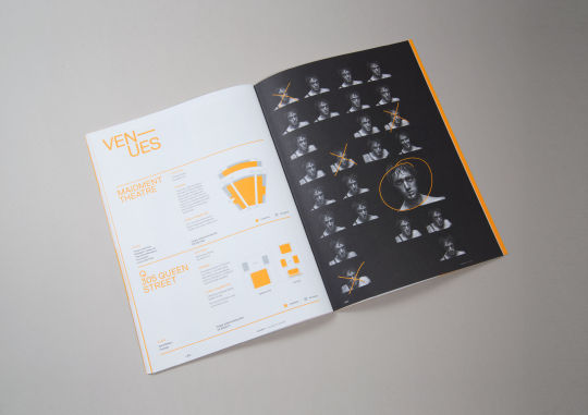
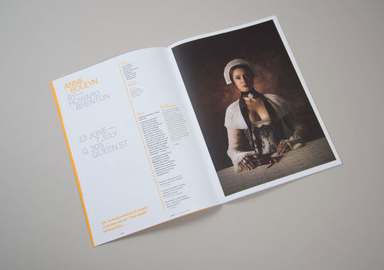
Source: https://bestawards.co.nz/graphic/editorial-and-books/saatchi-saatchi-design-worldwide-1/auckland-theatre-company-subscription-brochure/
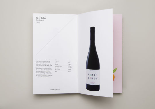
Source: https://bestawards.co.nz/graphic/design-communication/strategy-creative/mudgee-ridge-estate-brochure/
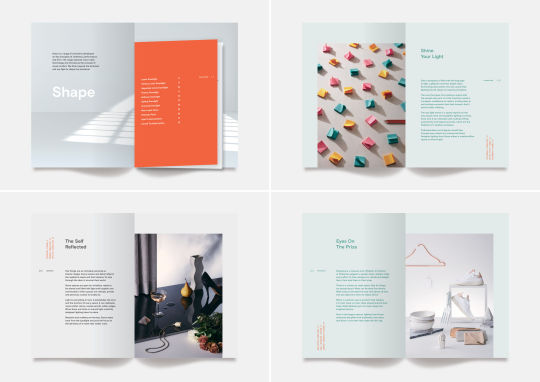
Source: https://bestawards.co.nz/graphic/design-communication/plantation/grace-brochure/

Source: https://www.behance.net/gallery/129247881/CLA
0 notes
Text
Typography Research
As the brochure is based on a typography convention I want to look at ways I can experiment with type. I went to the library to find books based on type:
Typography Essentials: Ina Saltz
0 notes
Text
Typography Research
As the brochure is based on a typography convention I want to look at ways I can experiment with type. I went to the library to find books based on type:
Typography Essentials: Ina Saltz
0 notes
Video
tumblr
Above is the fourth test I completed of the brochure folds. I trialled this one in two different ways, as to why there are multiple numbers on each page. This way proved to be the more efficient way to opening the brochure than the other one tested on the same page, as the other way had the first 8 sections placed at the bottom of the page and the last 8 at the top. The unfolding method shown in the video above is one of the more efficient trials I have done as it is logical to the viewer when unfolding, as tested on my classmates, however, the downside to this is that the first four pages are on the top left corner, the next four on the top right and then the final eight across the whole width of the bottom.
0 notes
Video
tumblr
Here is my third test of the brochure folding. I liked the way this one unfolded similar to a book and then opened up completely. The section designs also line up well when completely unfolded so this is a potential option for my final brochure.
0 notes
Video
tumblr
Here is my second test of the brochure folds. This example also didn’t work very well as when it was completely unfolded the sections didn’t follow one after the other very well and some of the design was upside down. It also folded open from the bottom rather than the side which would be slightly confusing for the reader.
0 notes
Text
Types of Brochure Folds
https://www.caseyprinting.com/blog/what-are-the-different-kinds-of-brochures
I then researched further and found this source that explains the different types of brochure folds and I began testing with different variations of these folds on my next prototypes.
0 notes
Video
tumblr
Here is the first test of how my brochure will be folded. This option doesn’t work very well, as when it is completely unfolded the front and back cover are in the middle of the page and the sections 2-7 are underneath it at the bottom of the page. I would prefer a design where the pages went in order from the top of the unfolded page.
0 notes
Text
Speakers Type

Source: https://www.fontshop.com/designers/verena-gerlach


Source: https://www.johnsonwitehira.studio/

Source: https://arabictype.com/portfolio/

Source: https://en.wikipedia.org/wiki/Carol_Twombly

Source: https://collections.tepapa.govt.nz/topic/973

Source: https://fonts.adobe.com/designers/veronika-burian


Source: https://jessicahische.is/


Source: https://frerejones.com/
0 notes
Text
Speaker Research
Verena Gerlach: Verena Gerlach was born in Berlin and studied Visual Communication at Kunsthochschule Berlin Weißensee.Shortly after finishing art school in 1998, she founded her own studio (fraugerlach) for graphic design, type design and typography. As well as all kinds of typographic print works and type design, Verena also art directed several video clips and worked on the typographic production for international contemporary artists.Verena gives lectures and workshops about type and graphic design all over the globe. She also works as a freelance book designer for different art book publishers.
Source: https://www.fontshop.com/designers/verena-gerlach
Source: https://www.oneclub.org/awards/adcawards/-judge/3273/verena-gerlach
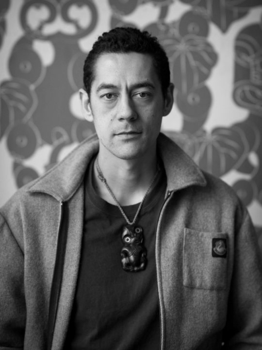
Johnson Witehira: Johnson Witehira is an artist, designer and academic of Tamahaki and Ngāi Tū-te-auru descent. He is the co-founder of both Indigenous Design and Innovation Aotearoa (IDIA) and Waahi Wairua. Since completing his doctorate in Māori Visual Art (2013), Johnson has been on a mission to bring Māori culture into all aspects of New Zealand life. He has led the development of Māori design for some of New Zealand's most prominent organisations: The Auckland City Council, TVNZ, The Auckland International Airport, and Waka Kotahi (The New Zealand Transport Authority). Other significant design projects include developing the first set of Māori alphabet blocks, co-designing the PAKU gardening tools for children and developing the first functional Māori-specific typeface.
Source: https://semipermanent.com/profiles/johnson-witehira
Source: https://semipermanent.com/profiles/johnson-witehira
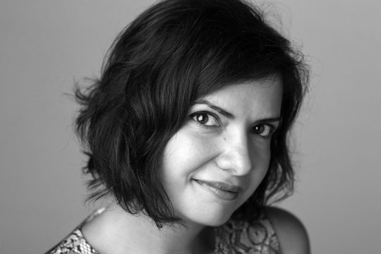
Nadine Chahine: Dr. Nadine Chahine is an award winning Lebanese type designer. She has an MA in Typeface Design from the University of Reading, UK, and a PhD from Leiden University, The Netherlands. Nadine’s research focus is on eye movement and legibility studies for the Arabic, Latin, and Chinese scripts. She has numerous awards including two Awards for Excellence in Type Design from the Type Directors Club in New York in 2008 and 2011. Her typefaces include: the best-selling Frutiger Arabic, Neue Helvetica Arabic, Univers Next Arabic, Palatino and Palatino Sans Arabic, and Koufiya.
Source: https://arabictype.com/about/
Source: https://arabictype.com/about/
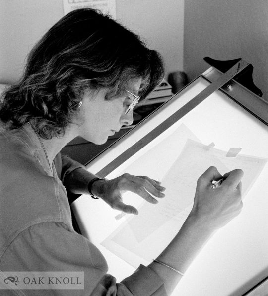
Carol Twombly: Carol Twombly – born 13. 6. 1959 in Concord, USA – type designer. Studied at the Rhode Island School of Design and at Stanford University. 1984: is awarded 1st prize in the Morisawa type competition in Japan for he Mirarae typeface. 1988: joins Adobe and designs Adobe’s first original display typefaces (Trajan, Charlemagne and Lithos). Fonts: Mirarae (1984), Charlemagne™ (1989), Lithos™ (1989), Adobe Trajan™ (1989), Caslon™ (1990), Myriad® (1992), Viva™ (1993), Nueva™ (1994) and Chaparral™ (2000).
Source: https://www.linotype.com/606/carol-twombly.html
Source: https://www.oakknoll.com/pages/books/125344/nancy-stock-allen/carol-twombly-her-brief-but-brilliant-career-in-type-design
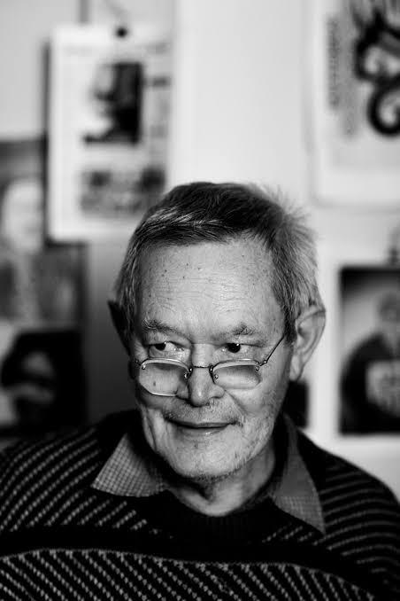
Joseph Churchward: Samoan-born graphic designer Joseph Churchward was an internationally renowned typeface designer whose work graced record covers, billboards, newspapers and popular literature such as posters and brochures around the world, both during his lifetime and beyond. He hand-created around 700 typefaces, drawing upon influences from his Pacific heritage and family. His work was well known to the international design community from the 1960s but was not prominent in New Zealand until Te Papa Tongarewa acquired his archive and held an exhibition of his work in 2009.
Source: https://teara.govt.nz/en/biographies/6c10/churchward-joseph
Source: https://www.the10sonsofmanu.com/joseph-churchward-qsm-1923-2013/
Veronika Burian: Veronika Burian studied Industrial Design in Munich and worked in that capacity in Vienna and Milan over a few years. Discovering her true passion for type, she graduated in 2003 with distinction from the MA in Typeface Design course in Reading, UK. Veronika then worked as a type designer at Dalton Maag in London for a few years, spent some time in Boulder, USA, and then her hometown, Prague, and is now enjoying life in sunny Cataluña, Spain.Veronika Burian is a type designer and the co-founder of the independent type foundry TypeTogether with José Scaglione, publishing award-winning typefaces and collaborating on tailored typefaces for a variety of clients. She is also involved with Alphabettes.org, a showcase for work and research on lettering, typography, and type design by women, and she continues to give lectures and workshops at international conferences and universities.
Source: https://fonts.adobe.com/designers/veronika-burian
Source: https://www.granshan.com/veronika-burian
Jessica Hische: Born in 1984, Jessica Nicole Hische is a renowned letterer and illustrator originally from South Carolina. After attaining a degree in graphic design and interactive design from Tyler School of Art, she worked with design firms like Headcase Design and Louise Fili.
Source: https://www.zilliondesigns.com/blog/designer-spotlight-jessica-hische-typography-illustration/
Source: https://en.wikipedia.org/wiki/Jessica_Hische
Tobias Frere-Jones: Over 25 years, Tobias Frere-Jones has established himself as one of the world’s leading typeface designers, creating some of the most widely used typefaces, including Interstate, Poynter Oldstyle, Whitney, Gotham, Surveyor, Tungsten and Retina.Tobias received a BFA in Graphic Design from the Rhode Island School of Design in 1992. He joined the faculty of the Yale University School of Art in 1996 and has lectured throughout the United States, Europe and Australia. His work is in the permanent collections of the Victoria & Albert Museum in London and the Museum of Modern Art in New York. He has received the Gerrit Noordzij Prijs, the AIGA Medal, and most recently Cooper Hewitt’s 2019 National Design Award for Communication Design, recognizing his contributions to typographic design, writing and education.
Source: https://frerejones.com/about
Source: https://www.cooperhewitt.org/2019/10/09/nda-20-yrs-qa-with-tobias-frere-jones/
0 notes
Text
Audience
The audience is any designers, typographers. people interested in learning about these topics or people that work with type in a professional or creative way.
0 notes
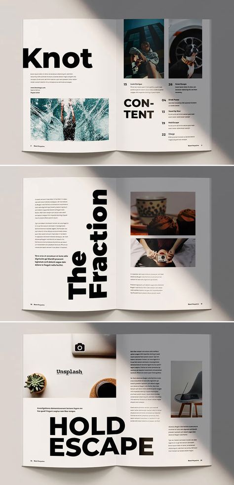
Text
Initial Research

Source: https://www.behance.net/collection/201976253/Typografika
Above are a collection of designs I found on Behance. The bottom right design of the cup inspires me to be creative about the style of typography I use in the designs, as the project is typography focused, I would like to experiment with a range of typographic techniques for the project. The typographic design with the pink background experiments with multiple typefaces which could be an interesting approach if done right.
I like the use of minimal colours such as the red black and white designs as the design system is cohesive and bold. These two designs also have interesting use of typography, highlighting different parts of the type, which I could take inspiration from.
The yellow design shows the use of treated imagery to match the design system. The photo has been made black and white and this could be translated throughout the rest of the design (potentially in monotone or duotone colour), for my own designs.
The blue and white design shows how contrast can be used well in the design. with similar features but contrasting/ opposite colours. The ‘EUREKA’ design next to it shows the way type can be made large, bold and overlap to create a unique experience for the viewer to read along.
The top left design shows use of symbols, which could be interesting to experiment with in a design about typography. The following three designs in the top row show other ways typography can be used in an interesting way, such as in the form of graphics or depth. I would like to explore the idea of cutouts, shadows, gradients, as well as type that has been cut, stretched, distorted. I would also like to take inspiration from the brochure at the bottom middle as the photographs and graphics are also treated and only a few different typefaces are used in a hierarchal way. Information is organised and the layout connects image and text that relate.
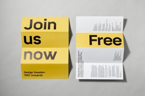
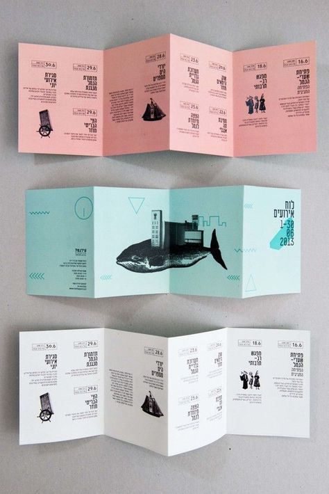
Source: https://www.pinterest.nz/pin/686447168224183050/
The brochure above shows clever use of bold type and folding. It is in both landscape and portrait forms and the more you unfold, the more you reveal the sentence. The other side links well with the poster side by involving the same bold type as part of the design system.
0 notes