
ellenillustrationnua-blog
Ellen Harling BA Illustration Year 1
Ellen Harling Illustration
Research and experimentation during year 1 at Norwich University of the Arts studying BA Illustration.
See below for project links.
193 posts
Don't wanna be here? Send us removal request.
Last Seen Blogs

oppein-kitchen-blog
OPPEIN Kitchen

shaon-ahammed
writer shaon ahammed

divertliving-blog
Divertliving
divertliving-blog
Divertliving

bariza-holidays
Bariza Events & Holidays Pvt. Ltd.


Photo


Collaboration Industry Report
0 notes


Photo


Off The Press Collective - ‘Paperback’ at Norwich Arts Center
Yesterday, Off The Press Collective took their exhibition ‘Paperback’ to Norwich Arts Center. I attended the opening of it that evening. It was interesting seeing the exhibition in a new location with a very different atmosphere. Having it in a more gallery-like location certainly made it feel more like a ‘proper’ exhibition. They had also created new signage for this location such as the two wooden panels in the top pictures which I thought worked really well as it gave much more information about the Collective and the project than the exhibition in Bury St Edmunds. They also showed some of the collective’s work outside of the theme of ‘Paperback’. My favorite was the screenprints based on the film Labyrinth by James Treadaway (bottom right).
It was also great going to the opening of the exhibition as it allowed me to talk to both the members of the collective and some of the contributors that were there such as James Treadaway and Toby Rampton.
1 note
·
View note
Photo


Publication 2 - Black and White
This is our second farming publication printed in black and white. With this, we wanted to keep the production similar to our last booklet, as we really liked how it turned out. We therefore used a similar off-white natural looking paper and spiral bound it. Although I think it’s quite effective in capturing the sort of natural/industrial aesthetic we’ve been looking at as part of farming, I don��t think the black and white works as well for this. Firstly, it doesn’t show the variation of marks as well as colour does and secondly, I don’t think the backgrounds of the images work as well. They just create like grey squares around the image - I think if we were to print in black and white again it would look better if we got rid of the backgrounds so that it looks like the image is sitting directly onto the paper.
0 notes
Photo


Publication 2 - Colour
After the Kaleidoscope event, we were left with a numerous amount of our printing sheets; both unused ones and the ones that the public worked on. We felt that we wanted to do more with these, as the results of the collaborations with the public produced some really interesting results. After all really liking the publication we made before, we decided to make another booklet documenting these works. Each of us took away and cut up and collaged elements of the images produced that we found the most visually interesting.

Myself and Helen then worked together to select the best out of these images and organise them into an order in a way similar to the way we worked creating the first publication, as we found this worked well. We paired some worked on images with a plain lino-print to create a balanced double page spread and paired some worked on images together that went well (for example two with lots of circles).

We then scanned in these images and create a 20 page booklet from them using InDesign, formatting the booklet to print in the printing studio. I was really pleased with this process, as we managed to put together a publication and print it without any help - something I’m quite proud of as I’ve only created a booklet once before!
The only thing that did go slightly wrong was that when we first printed the publication it printed on plain white paper instead of the off-white we intended. This ended up being helpful, as it showed us how pink the image backgrounds were - which we decided wouldn’t work with the cream paper and helped us make the decision to print in black and white for the final one. However, I do actually really like the way this colour print came out and so decided to make it into a booklet by staple binding the pages together. I think I actually prefer this to the black and white one in the end, as I think the bright green used in the printing is important to the overall image and this showcases it well. I also think the white paper and binding technique makes it feel more professional than the other one. Overall, I think it works really well as a study of random chance and collaboration between strangers of all age groups and walks of life. I’m pleased we decided to develop the results of our work further.
0 notes
Photo


Film Project - Early Woodcuts
During my film project, I was very inspired by early medieval/Tudor woodcuts. I love these woodcuts, as I have a real interest in early printing and medieval art. They proved a real stylistic inspiration for my rubber stamps. I wanted the prints to look as though they could be images that Julian would have seen in her time period and I thought that these early woodcuts would have been the type of thing she would have seen in special manuscripts and bibles. Like with the rest of my film, I wanted the stamps to look like they had come from the imagery that Julian saw around her. I therefore tried to mimic some stylistic features of these woodcuts in my stamps - using strong black lines and stylised, bold facial features.
0 notes
Photo


Film Project - Eric Gill
At the time of Project 1: Film, I did a lot of research which I never got around to putting on this blog, having stored it on my phone or on Pinterest instead. I will now post this research for project one, tagging it ‘filmproject’.
I knew I wanted to use stamps to make my film as I wanted to create a stop motion animation to create a stilted, surreal feeling with repeating imagery. However, I wasn’t sure how to approach the style of this as I didn’t want the stamps to look naive as they sometimes can. I also really wanted them to be very obviously prints of religious imagery to show the idea of Julian’s mind being saturated with the religious images she saw every day.
Whilst in the library, I found this book of the work of English sculptor/printmaker Eric Gill (1882-1940). Despite always feeling conflicted about liking Gill’s work due to his questionable personal life, I am a fan of his work; particularly his printmaking, as I am very into both the Arts and Crafts movement and wood engraving.
Much of Gill’s work was based around religion and the wood engravings shown in this book had exactly the aesthetic I didn’t know I’d been looking for for my own prints! They are simple in their style, not obviously being a wood engraving, but iconic in their imagery - immediately communicating an idea. This is what I wanted with my stamps, as they had to immediately convey strong imagery as they wouldn’t be on screen for long. I also really loved Gill’s genius use of negative and positive space in his prints to create bold, graphic, monochromatic illustrations and wanted to use a similar style in my own prints. Gill’s images of the crucifixion in particular were a massive stylistic inspiration to me when it came to creating my own prints of Christian iconography.
0 notes
Photo


KALEIDOSCOPE - Other Stands
I loved walking around looking at and interacting with the other stands at the festival. Here are a few of my favorites from the day (although there were a lot more I loved that I just forgot to take photos of!):
1. Anatomy - The heart center piece of the anatomy group’s stand was beautifully made and very intricate. You could see the amount of work that had been put into it and it was a great art instillation in its own right! The activity also worked really well as the collage pieces were very aesthetically pleasing.
2. Flight - The illustrations for the flight stand were amazing - you were instantly drawn to them from across the forum. The quality of drawing paired with the strong graphic design really worked to get the powerful subject matter across.
3. Housing - I loved the interactive activity of the housing group’s stand of building your own house. Like ours, the pleasure came from having fun with an almost childlike activity that you wouldn’t have the opportunity to do otherwise! I also loved the design of the blocks - whatever you made looked great!
4. Money - I loved these ‘money-saving’ fliers on the money stand. The humorous nature of them worked really well - especially when pained with the DIY 80′s/90′s zine aesthetic to create a ‘careless punk’ feeling.
5. Dance - The sticker activity on the dance stand was great - it reminded me of the dress up dolls that I used to love playing with as a child! This childlike enjoyment paired with an adult’s sense of humour created some interesting creations from everyone!
6. Chemistry - The chemistry stand was immediately visually engaging due to it’s wonderful use of colour! There was something very satisfying about finding the correct colour and using it to add your own mark the the patchwork of colour filling the table. I also felt like I really learned some facts from this stand!
1 note
·
View note
Photo


KALEIDOSCOPE Illustration Festival
Some images of the festival as a whole. The Forum had a very buzzing atmosphere with everyone walking around checking out each other’s stands and the public coming in and interacting. The difference in subject matter, style and interaction of the stands made for an interesting and engaging mix.
1 note
·
View note
Photo
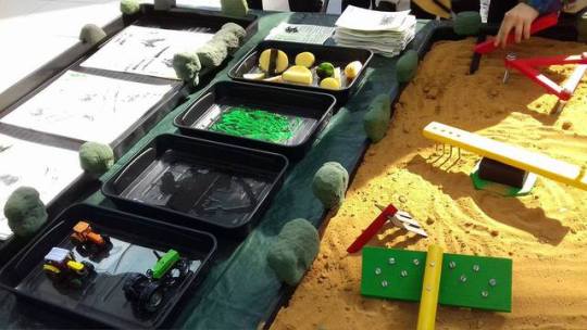


KALEIDOSCOPE Illustration Festival Stand
On Friday 5th was what we’ve been working towards - the Kaleidoscope Illustration Festival at The Forum! After carrying our stuff down there, we located our table and wall space and began to set up. We were really pleased with our positioning, as it was on the corner next to the main walkway, meaning there was a lot of space for people to walk around our table and it was closest to people as they walked through The Forum. We were also right next to our poster, meaning that it acted as a backdrop for our stand which looked great!
The setup went well - everything fitted onto the tables well and the last minute adjustments like putting acetate into the bottom of the seed trays to flatten them out were done effectively. Our stand instantly proved popular - people loved playing with the sand and printing with the potatoes and tractors - we received a lot of feedback from people saying they liked it as it was things they hadn’t done since childhood! However, people were slightly more reluctant to take things than we thought - especially the stones! Maybe this was due to the fact that people felt somewhat intimidated by us asking them to take something. However, the postcards in particular were very popular and so when people did take them they usually took 2 - meaning that we ran out of them quite a while before the end of the day! People seemed to really like the traditional, hand-printed nature of lino cuts both on the postcards and the template sheets and commented frequently on the artistry of them.
Although the stand went mostly as expected, we did have an unexpected problem with the printed sheets of paper. We had initially planned to put people’s finished pieces of work up around the edge of the table. However, we hadn’t factored in the fact that the paint took quite a long time to dry. This meant we couldn’t stick the finished pieces around the table as people would have got paint on their legs! We initially put the finished pieces under the table to dry, however this looked messy. We therefore then decided to use them to create a ‘changing poster’ - sticking them up over our poster to let them dry and displaying the work as part of our stand at the same time. In the end, I think this actually worked really well and made people even more engaged with the stand as it meant their work would be displayed as part of it. Once the pieces started drying, we did also put them up around the table as in our original idea which I think looked effective. I think one of the reasons putting other people’s work together in this way worked so well is because everyone approached it so differently. Some people made abstract marks as we had originally intended, but interestingly people also used the printing methods to make their own objects - for example using round potato prints to make a tree! Although this hadn’t been our original intention it worked really well having a mix of abstract images and more thought out ones.
Overall, I think our stand was very effective. People engaged with it in exactly the way we wanted them to and drew in people of all different age groups and interests. People seemed to have real fun using it but were also interested in the ideas behind it - questioning us as to why we were looking at fields and allowing us to explain our inspirations of ploughing and irrigation. It was also nice to see people being so pleased at being able to take away our work in the form of the postcards and stones!
0 notes

Photo

Painting the Tools
Today, we added the final touches to our stand ready for the show tomorrow. This included making more postcards, sorting out the trays, fitting the hedges and painting the tools.
I painted my own and Shauni’s tools (above) using acrylic paint. We decided to paint the tools as we thought it would make it more obvious that they’re based on industrial farm tools. We therefore decided to use the sort of bold, primary colours that can be found on tractors and harvesters. The colour scheme I chose was inspired by the tractors we are using for our printing section. I do think they look much better painted than plain wood, as (as well as contextualising them) it makes them much more eye-catching and engaging.
0 notes
Photo


Postcards
These are a few example postcards that we have made to give out at our stand. We decided to have a mix of cards with backgrounds and without, as we thought some prints worked really well by themselves and so it was nice to have some just showing them. I think the prints with backgrounds look great as well - the pale green colour and soft lines really compliments the sharp lines and blackness of the lino prints. I’m really pleased with how these postcards turned out. They look quite professional and I think we could even get away with charging for them if we wanted! The successful results of this has definitely inspired me to combine ink wash and printing and possibly creating my own personal postcards in this way in the future!
2 notes
·
View notes
Photo


Creating Postcards
We decided that we wanted to create postcards to go with our stand, as we were really pleased with how the lino-cuts turned out and felt that they would work really well as stand-alone prints in the form of postcards. We also wanted something else that people could take away from our stand, as many of the other groups have been creating things like stickers for people to take away.
We used a slightly off-white card cut into A5 sheets for the cards. We weren’t sure whether to have a background or to just have the lino prints, so we decided to experiment. We liked the idea of having backgrounds with the shapes and patterns that we had been looking at on. First, we tried with green paint (top left), but we felt this was too dark and looked too messy. We then tried green ink (top right) which worked much better as it didn’t clash as much with the print. We then mixed this ink with black ink and water to create a more subtly, earthy tone (middle left).
We created around 40 postcards today, however they seem to be very popular and we think they might run out quite quickly! We have therefore decided to make some more tomorrow.
1 note
·
View note
Photo


Printing the Templates
Today, we printed our templates using the lino-cut stamps each of us had made. We decided to use A3 paper, as we thought that this would be easy to handle and pin after people have completed their pictures. It also means that it’s easier for people to take home if they want to. We decided to get 80 sheets of paper to make sure we have enough to put up around the edge of the table and to last throughout the day.
To print the paper, we split the stack up between the 5 of us and set up around a table with the ink and stamps in the middle, meaning that we could all easily access each other’s stamps. We then used up to a maximum of 4 stamps on each piece of paper (to make sure the image didn’t get too busy) to create a unique image onto which someone could print their own tracks, with our stamps acting as obstacles. Working in this manner, we managed to quickly and effectively print all 80 pieces of paper.
I’m really pleased with how these templates have worked out; a lot of them are actually just really nice printed images in their own right! This has really added the illustrative aspect that I felt was somewhat missing from our stand. I feel like they will really help to draw people in, as the prints are attractive enough that people would want to contribute to the image and take them away for themselves. As we like the outcome of the prints so much, we have decided to also make some smaller postcards of individual ones to give away.
0 notes
Photo


Lino-cut Stamps
These are the lino-cut stamps I made for our printing templates. I decided to stick with quite traditional imagery associated with farms in order to make the theme obvious, especially to children. I also felt that more old-fashioned farm imagery such as scarecrows and farmhouses fit in well with the traditional aesthetic of block printing. I was inspired by folk-art woodcuts when creating these stamps as I felt the rustic, rural look of them fitted in well with out theme.
2 notes
·
View notes