
Don't wanna be here? Send us removal request.
Statistics
We looked inside some of the posts by elleywestbrookfarp and here's what we found interesting.
Average Info
Notes Per Post
1
Likes Per Post
0
Reblog Per Post
1
Reply Per Post
0
Time Between Posts
1 day
Number of Posts By Type
Text
17
Last Seen Tumblr Blogs


Fun Fact
In February 2021, Tumblr had 518.6 million blog accounts.
Text
54. Digital Portfolio is loaded onto Teams
C.V
2022 HCA Summer Degree Show
2022 Abstract Kab, Hereford College of Arts
2022 Common Ground, Da Koffie Pot Gallery, Hereford
2021 Market Arts Studio, Hereford. First Friday, guest artist
2021 Project Space, Hereford College of Arts
2021 Hereford Museum and Art Gallery
2021 Grayson Perry, Vanity of Small Differences
2021 Released, Maylords Centre. Hereford
2021 In the Frame, Online exhibition with the Guerrilla Girls
2019 Crafting the Cathedral, Hereford Cathedral
2019 h.Art, All Saints, Hereford
2018 End of Year show, Portfolio, HCA
Contact
Instagram @elleywestbrookartpractice
Email [email protected]
Artist statement:
I am a multi-disciplinary artist exploring different mediums in narrative-led works, collaborating directly or indirectly with people. Their shared experiences and their stories compel my practice.
Most recently I have been using found photographic imagery and projection in a variety of formats to illustrate past personal narratives to a contemporary audience.
The narrative aspect is always central to my work and I intend to continue seeking out new engaging possibilities in order to research these thoroughly, and to respond to them artistically in a mixed media context.
Sample slide

Bathtime 2020
digital photograph of family photography projected onto childhood home
text per slide is in a grey colour type face and 10 font size.
So that's me... over and out!
0 notes
Text
53. Evaluation
FARP Summative Evaluation Elley Westbrook
Shirley
In my initial project proposal (Armchair Travels), I felt that the work for this project would cover some key themes and concepts. These were: Aging, memory, mortality, narrative, post colonialism and colonialism, nostalgia for the past.
I hoped to achieve this by interviewing and recording Shirley’s memories and stories, using lens based technologies, audio recording and editing, possibly projection and mapping with the intention of making a mixed media installation that combined objects with imagery and sound.
I felt this related well to previous successful modules AP1 and AP,2 and also some key themes of my dissertation which centred around family photography and memories.
I cited influences as :
Erik Kessels – Dutch photographer
Cornelia Parker – for her evocative use of objects
Christian Boltanski – objects/imagery
Rosemarie Trockel – assemblage
Susan Hillier - installation, video, photography
Wolfgang Tillmans – possible installation techniques relating to photography
Amak Mahmoodian – Zanjir (Arnolfini)
Tony Oursler - mapping and projecting onto objects
Imogen Stidworthy - installation, audio (the whisper heard)
Phil Collins-free fotolab Nam June Paik (TV screens)
I also thought I might make some structures to interrupt the projection or use modified existing objects such as an armchair, which is where most of her life is now spent.
I listed some book titles in my APPENDIX Bibliography that I felt were relevant:
Barthes Camera lucida.
Batchen, Forget me not.
Hirsch, Family frames.
Kuhn, Family secrets.
Mindell, Evocative Objects
Mitchell, Remember me.
I did add to these titles and they were relevant, I was already familiar with the above named books for my dissertation research, so it was an easy transition from dissertation to final major project for me in that regard.
Progression and changes in thinking.
Primary research was very formative in the execution of this project, I was greatly influenced by a couple of exhibitions I went to see in Bristol, Polly Braden at the Arnolfini, and Liverpool, Suki Chan at the Bluecoat Gallery in Liverpool. These also started to feed into my curation ideas and how to realise the work.
I have pared down the project in its execution and exhibition. Finally using the install time to reflect, respond to and refine my ideas further.
I identified early on that I didn’t want to major on the Colonialism or post colonialism aspect for this work. Things became a little less defined for a while and it was looking like a biography piece about Shirley.
I was introduced to the work of Dragana Jurišić and it was whilst looking at some of her projects that I came across ‘L’Inconnue de la Seine’. This is the name given to a young woman whose body was recovered from the River Seine and whose death mask was cast in a bid to identify her. Looking at her immobile plaster cast face, with her features perfectly depicted I realised that others would indeed have been able to identify her in so much as to put a name to her face. I began to consider the differences between how we view someone’s identity and how the person identified would see themselves.
Shirley’s identity is in fact wrapped up in how others saw her when she was young. She values physical beauty and attractiveness, her upwardly mobile ticket on the social ladder was on the account of her good looks. I see that the way she communicates with me is via her photographs and memories of when she was young and beautiful and that is how she curates her life to any available audience, she is adding a value to herself that she fears one might miss if one were only introduced to the Shirley of today.
I have used a collection of Shirley’s own photographs to illustrate this point by projecting them onto an armchair. The armchair was chosen as a vehicle for this because that is where she spends most of her days, the armchair stands in for Shirley. The empty armchair stands in for her audience. The idea of projection mapping has been constant throughout this project. Other ideas have dropped away, making a film of Shirley now, and using the audio as a soundtrack seemed complete overkill when I got down to it, especially after seeing Polly Braden’s work at the Arnolfini. Right up to the point of hanging my work in the gallery space I had intended to add the text of her quotes, and also a piece that I was writing. I have 10 and a half hours of conversation that I have recorded, and this is the hardest thing I have let go of. I am not including the text at the time of writing this. I think the images and the projection do the job and give the viewer room to interpret. I might however use these in the future because I have also been talking to Shirley’s daughter, who has provided a completely different perspective on Shirley’s memories and stories giving this project a potential future development and legacy.
The photographs I have taken of Shirley and her objects are very much snapshot in essence rather than considered, staged or art photography. They were the initial shots and I thought to go back and re photograph them at some point. However, I really liked the casual nature of these images which echoed the ease that was growing between us as our friendship developed. This was lucky because she flushed her teeth down the toilet by accident and refused to be photographed again without them.
My initial project proposal has been realised but refined.
Point 4. EVALUATION How will you critically review and reflect upon your work as it develops? How will you identify directions for ongoing development?
I have been using my blog predominantly to make sense of my thinking around this project. I am also lucky in that my son has been very involved in feeding me relevant artists to look at and he has been a great sounding board for workshopping ideas. I feel that evaluation will be ongoing as I hope to extend this project, utilising the differing experiences of other family members.
The aspect that I have enjoyed most about this particular project has been the research.
A major realisation is that a narrative aspect should always be central to my work if I am to continue practising and to remain interested in finding, researching and making these narratives physical in some way in the future.
Blog : [email protected]
Instagram : @elleywestbrookartpractice
Digital portfolio is on teams
0 notes
Text
52. Installation

All gone to plan, I have left the printing and application of the texts until last. Does it need it...on one level I am finding it hard to drop them, I found the addition of text in the Polly Braden exhibition (Arnolfini) so affecting. It was definitely part of the work.
I'm trying to look at my work with critical eyes but its tricky because there are 10 and a half hours of taped conversations that will have no evidence. Liana has applied her lettering in vinyl...I like it and was thinking that's what I would do. But it will interrupt the narrative that the viewer takes away, be more directional...urgh! Conflicted!
I'd just like to take a moment to comment on the incredible support from the guys in the digital workshop. Nick, Joel, the two Carolines and Jason have been totally amazing and have enabled me to produce this piece. I only embarked on it because I knew I could rely on that department to facilitate my ideas and show me how to use the software that I needed. It really is one of the things that has made this course for me. (Actually all the tech dems are brilliant.)
here are some of the install and mapping shots:


so this is what it looks like...few technical hitches with the mapping at the install and so we are having to use a laptop and not the raspeberry thing (or some other fruit named mini mapper thing).
I have added a grey rug to deaden the shine from the wooden floor.
.
0 notes
Text
51. Texts
Firstly some quotes:
"My Mother was 99 when she died and my Grandmother 101. She lived to 101 like the Queen Mother. Scottish blood. Strong."

"He's half Spanish you know. Spanish blood. Gives him a little zip I think."

"With the pill you can organise things so well. My children arrived just before the pill."

"You do have rights if you are married, that you don't if you're not. And if you don't like it, you can always get out of it."

Dickie Fry, he was divine. He had that made into a little broach for me.

Sandy's wings and medals.
“My darling Sandy”


Separate text to inform the narrative? Maybe something like this:
"I don't know. They're all gone now. All of them, gone. It's very sad." June 2022.
I have known Shirley for a little over a year. Unlikely friends, she and I. There is an experiential gulf between us; attitudes, history, lifestyle, politics.
Shirley is a Colonial relic at odds with the current zeitgeist. She holds fast to her opinions and politics and I to mine. I try to steer away from contentious ground. I have found that her stories and memories form a bridge, a way to cross the divide that exists between us politically. I see Shirley as fully and wonderfully human. She wants me to see her as she was.
In her youth, Shirley was considered a great beauty, in her head that is who she is, it's what she holds fast to as identity.
I very much enjoy my time with Shirley. Differences aside, there is no baggage between us and I can laugh with her.
(pair this with a 5 x7 photo of her)

OR... I quite fancy writing a fictional piece of prose...? Or just pose a question? Or just leave it to the statement and a few (very few) quotes?
Also need to credit the artist that painted the portrait of Shirley in the 50's.
0 notes
Text
50. Install progress.
By Friday 20th I am on track, all images are printed, the frame has been made, collected (£60!) and installed around the viewing window.

Because the internal walls and ceiling of the room are dense matt black there is a real depth to the black that you can see when you step back and look at the frame. This will obviously change with the mapping onto the chairs, but I love the way it looks at the moment, eerie, it makes you want to step forward and investigate.
I finally found a console table that fits in with my idea of what it needed to be. I've taken that to the workshop and sanded and re-waxed it.
The chairs have been moved into place. I am considering whether to use a grey rug I have to quieten the wooden floor down a bit, but I don't think I will need it. It's in my studio if I change my mind.

All the chipboard panels have been filled and painted. Black in the 'room' and white in the 'gallery'.

I am booked in with Nick for Monday morning at 9.30 to finalise the mapping.
(update Mon 23rd...Nick has put his back out and isn't able to meet today...oh crap! I need to see if someone else can help me 'map' and cross everything that he's ok very soon. He thought he'd be back soon enough, so I just need to keep a lid on the panic and work out an emergency contingency plan. Meanwhile, there is plenty more to crack on with. Trimming the board to fit, hanging photographs, hanging the portrait, decide on font, print out texts and decide how I am going to attach them to the gallery wall, credit portrait artist, complete digital portfolio, I need final shots of install for that, make sense of my note books and read through these blog posts to make sure they are legible.)
After that I need to hang the images and portraits.
The last bit of the jigsaw is the text, which I am considering over the weekend.
I have my evaluation to write and my digital portfolio to complete (for which I need some of my final show images ... Then I am good to go for hand in on Friday 27th.
Then its done and I don't know how I feel about that!

0 notes
Text
49. Degree Show statement and promotional photo.

Degree Show Statement Elley Westbrook
I am a multi-disciplinary artist exploring different mediums in narrative led works, collaborating directly or indirectly with people, their shared experiences and stories compel my practice.
Shirley was initially going to be about memory, and to some extent Shirley’s biography. As I have got to know her better and, as a result of my research, my thinking has changed.
I came cross ‘L’Inconnue de la Seine’ whilst looking at the work of Dragana Jurišić. This is the name given to a young woman whose body was allegedly recovered from the River Seine and whose death mask was cast in a bid to identify her.
I started to wonder if Shirley would recognise herself from a mask cast today. A mask like that would help others identify her but it would bear no relation to where Shirley places her identity.
This work is an exploration of identity. How Shirley sees herself is rooted in how others perceived her when she was younger. Shirley curates the telling of her stories through evidential photographs and evocative objects from her past. She is not much enamoured of the present.
0 notes
Text
Show prep: printing, cutting, painting, building, tunes on… keeping panic at bay!


0 notes


Text
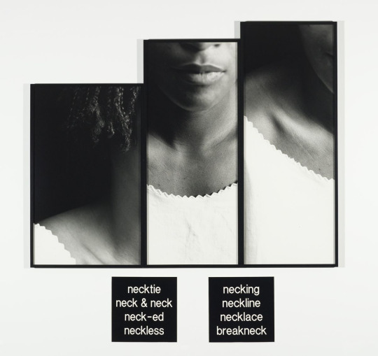
46. Lorna Simpson.
Born in Brooklyn, Lorna Simpson came to prominence in the 1980s with her pioneering approach to conceptual photography. Simpson’s early work – particularly her striking juxtapositions of text and staged images – raised questions about the nature of representation, identity, gender, race and history that continue to drive the artist’s expanding and multi-disciplinary practice today. She deftly explores the medium’s umbilical relation to memory and history, both central themes within her work.
Studying on the West Coast in the mid-1980s, Simpson was part of a generation of artists who utilized conceptual approaches to undermine the credibility and apparent neutrality of language and images. Her most iconic works from this period depict African-American figures as seen only from behind or in fragments. Photographed in a neutral studio space, the figures are tied neither to a specific place nor time. Drawing upon a long-standing interest in poetry and literature, the artist accompanies these images with her own fragmented text, which is at times infused with the suggestion of violence or trauma. The incredibly powerful works entangle viewers into an equivocal web of meaning, with what is unseen and left unsaid as important as that which the artist does disclose. Seemingly straightforward, these works are in fact near-enigmas, as complex as the subject matter they take on.
Lorna Simpson – Hauser & Wirth (hauserwirth.com)
0 notes
Text
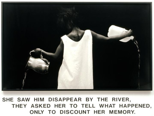
45. Carrie Mae Weems From Here I Saw What Happened and I Cried 1995-96

Carrie Mae Weems. From Here I Saw What Happened and I Cried. 1995-96 | MoMA
“When we’re looking at these images,” Weems said, “we’re looking at the ways in which Anglo America—white America—saw itself in relationship to the Black subject.” Among them are distressing pictures of enslaved African Americans taken by photographer Joseph T. Zealy in 1850. Commissioned by the Harvard scientist Louis Agassiz, they were meant to support racist theories about the inferiority of Black people. Many of the sitters are naked or half naked and depicted as anthropological specimens rather than individuals. The work is bookended by images of a royal Mangbetu woman witnessing the narrative.
Through her presentation, Weems asks us to question the intentions behind these pictures and their dissemination. She enlarged, cropped, and tinted the images, then placed the prints in circular mattes that suggest the camera’s lens, emphasizing the acts of framing and looking. Finally, she overlaid the images with her own texts that expose a long history of systemic injustice. “I wanted to intervene in that by giving a voice to a subject that historically has had no voice.”
Text is a very powerful tool in conjunction with photography. I really need to nail what it is I am going to say in the texts. Some will be relevant quotes but I think I need something more than just the quotes.
1 note
·
View note
Text
44. Duane Michals
"Duane Michals (b. 1932, McKeesport, PA) is one of the great photographic innovators of the last century, widely known for his work with series, multiple exposures, and text.
Michals first made significant, creative strides in the field of photography during the 1960s. In an era heavily influenced by photojournalism, Michals manipulated the medium to communicate narratives. The sequences, for which he is widely known, appropriate cinema’s frame-by-frame format. Michals has also incorporated text as a key component in his works. Rather than serving a didactic or explanatory function, his handwritten text adds another dimension to the images’ meaning and gives voice to Michals’ singular musings, which are poetic, tragic, and humorous, often all at once."
Duane Michals - Artists - DC Moore Gallery


I love these, but on this occasion the staged nature of the images and the hand written text is not how I envisage this project going. I do have another project booked in for June 'Caravan Glam' and this is a great idea to revisit for that.
Sequences
Things Are Queer 1973 Nine gelatin silver prints with hand-applied text 3 3/8 x 5 inches


Death Comes to the Old Lady 1969 Five gelatin silver prints with hand-applied text 3 3/8 x 5 inches (each image)
I REALLY like the sequenced works...

The Fallen Angel 1968 Eight gelatin silver prints with hand-applied text 5 x 7 inches (each image)
Some of his installation/curation ideas fit in with what I want to achieve I think.


0 notes
Text
43. Final image selection


The above wings need editing ... I've done that on photoshop but file too big to share without flattening.
0 notes
Text
42. Wolfgang Tillmans. Curation ideas.
Mark suggested a look at Tillmans again to inform curation choices. Adding in research somewhat out of chronological order.

‘Concorde Grid’, Wolfgang Tillmans, 1997 | Tate
Concorde Grid is a series of fifty-six colour photographs of equal dimensions arranged in a grid four rows high and fourteen columns wide. The series was created in an edition of ten plus one artist’s proof. Tate’s copy is number four. The photographs were taken as part of a commission for the Chisenhale Gallery, London on the occasion of I Didn’t Inhale, Tillmans’ solo exhibition there in 1997. An artist’s book consisting of sixty-two Concorde images was produced to accompany the exhibition. It was published by Walther König, Cologne. Fifty-four of the images in the photographic edition are reproduced in the book. The photographs were taken at a number of sites in and around London, including close to the perimeter fence at Heathrow airport.
Throughout the early 1990s, i-D magazine commissioned spreads from Tillmans, whose pictures of young people and the clubbing scene quickly extended to subversive fashion shoots. With the collaboration of his subjects he began setting up scenarios which reflected his personal lifestyle and fantasies. His styles encompass portraiture, documentary, still-life, landscape and more recently, a unique form of abstraction created by manipulating light on photographic paper. He has said of his photographs that ‘they are a representation of an unprivileged gaze or view ... In photography I like to assume exactly the unprivileged position, the position that everybody can take, that chooses to sit at an airplane window or chooses to climb a tower.’ (Quoted in Wolfgang Tillmans, p.136.) In accordance with this, Tillmans exhibits his work in installations combining photographs, ink-jet prints and pages taken from magazines arranged in rows and grids. Typically his images are taped or pinned directly to the wall, emphasising their physical qualities. The fifty-six glossy colour prints which make up Concorde Grid are, characteristically, exhibited taped to the wall. However, the artist has agreed that Tate’s copy may be mounted in abutting Perspex boxes in order to protect it.
Wolfgang Tillmans | MoMA
Imagine a group of photographs arranged with the deceivingly casual precision and emotional impact of a perfect pop song. That’s a decent approximation of what it feels like to take in a wall of photographs composed by Wolfgang Tillmans. Meticulously constructed with materials ranging from monumental inkjet prints to magazine spreads to photos that would fit in your pocket, Tillmans’s installations embrace a full range of photographic possibilities.
Tillmans’s tendency to ignore disciplinary boundaries was evident at the 1993 exhibition that announced his distinctive method of displaying photographs: In a small gallery in Cologne, carefully excised magazine pages featuring his work appeared in a dense array alongside unframed photographs meticulously affixed to the walls with Scotch tape. Tillmans placed portraits of friends and lovers alongside those of strangers and musicians, collapsing the distinctions between commissioned and impromptu sittings. Across one wall he stretched a horizontal band of small black-and-white closeups of club revelers glowing with perspiration in the photographer’s flash.

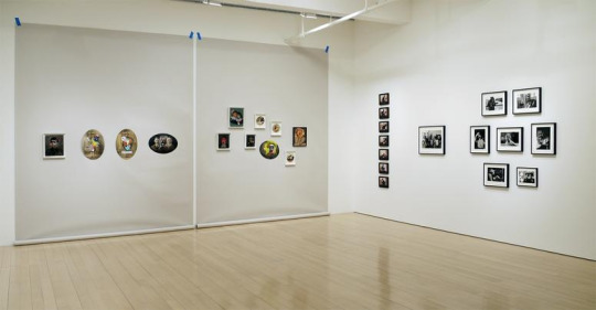
This shot of the Contemporary collection exhibition at MoMA is part of the inspiration I took when considering my own curational ideas for my piece in the degree show.
0 notes
Text
41. Photoshop mock ups of curation for degree show.

I have been working on several versions of curation for final show. Image selection, sizing and placement. Finally coming up with one that I like, I was able to figure out the sizing for printing. Printing is booked for tomorrow, Tuesday 17th May with Caroline.
Image selection and sizes (physical) as follows:
Shirley seated (to be placed opposite her portrait) 62.5 x 75.5 cm. (portrait) I have also cropped this image again so the the head and eye line within the two portraits will line up for the viewer. One picture sort of mirroring the other.
Sandy's Wings and Sandy's Medals (both square images) 26 x 26 cm.
Table of photos (landscape) 59.5 x 39.5 cm
Dickies Wings (landscape) 33 x 25 cm
Classic FM (landscape) 50 x 37.5 cm
Photobox (landscape) 59.5 x 39.5 cm
Sherry for me too (landscape) 27.5 x 23 cm
Michael Portillo (landscape) 53 x 37.5 cm
I still have the text to complete and artist statement to properly think about.
The image I am going to load onto teams for show catalogue is between two that I have taken.


I have also decided to take the portrait of Shirley that I have borrowed from her family to the picture framers and get him to make a frame to go around my aperture or 'viewing window' to view the projections through. Thus framing Shirley in a way that she would want...her curation of her life if you will. I'm hoping that I have left enough time for this to be realised.
(Edit, I have done this and the frame will be ready on Wednesday 18th about 3pm. £60 though!)
0 notes
Text
40. Text with photos.
Actioning points from my most recent feedback from Jonathan.
"Where there is still some thinking to be done is around the area of titling and decisions about what text you use with the photographic images. These areas are crucial in directing the viewer and to add another layer of narrative, or not. The piece works on many levels, so now these final decisions will highlight certain aspects of the piece, for example, memory, aging, an individual’s loss etc so do consider carefully what is most important for the viewer to know, and how much they need to know.
Look at artists whose work has used image and text such as Victor Burgin, Duane Michals, Carrie Mae Weems, Lorna Simpson, Glenn Ligon."
VICTOR BURGIN : UK76
4 December 2015 – 29 January 2016
Richard Saltoun Gallery, London
The year 2016 marks the 40th anniversary of Victor BURGIN’s seminal photo-conceptual series UK76. On the occasion Richard Saltoun Gallery will present the work in its entirety and as it was originally exhibited in 1976: printed on cheap commercial paper and pasted directly onto the gallery walls.
The work comprises eleven large photographic prints – each one metre high by one and a half metres in width – overlaid with text. The photographs were originally commissioned by the National Community Development Project and Coventry workshop. Burgin subsequently added short texts and captions 'reversed out' over the photographs in ironic reference to fashion magazine spreads. Much of the texts' language derives from such journals, British newspapers and advertisements of the day. Burgin's articulation of the style of 'socially concerned' documentary photography, together with graphic and rhetorical conventions from mass media, was anathema both to the social documentarists of the day and to the proponents of 'art photography'. In addition to its gesture to the street, his practice of postering his works for exhibition staged both the transitoriness of the world 'caught' in snapshots and a rejection of their repurposing as commodities.
Victor BURGIN: UK76 | 4 December 2015 - 5 February 2016 | Richard Saltoun

The caption reads:
Cut the cost of Living
He presents himself as the goods and values others to the extent
they are in demand. If his personal qualities aren’t selling well,
he changes them. Smart man.
He knows his value is not made up of qualities and abilities
he actually has, but by his success in a competitive market
with ever-changing conditions. Super man.
He knows that in our Super market society even his own powers
are taken from him to become hostages in the market-place.
Whose caprices are the final judges of his value.

I'm struck by the captioning on the supermarket photo. To my mind it echoes certain aspects of Shirley, although she possibly doesn't 'know' these things, or accept them, or even really think about them. Its just how she 'was' or is.
"He knows his value is not made up of qualities and abilities he actually has, but by his success in a competitive market with ever-changing conditions."
Shirley made a good marriage socially speaking. She was undoubtedly of middle class stock but she married 'up'. Her father was a banker, he never went to university, he worked his way up in his job by dint of being good at it, I think. He was also willing to travel with his work and they were posted all over the world.
They were always a part of the ex-pat community in whatever country they were living in. This facilitated lots of mixing with the armed forces that Britain had stationed there, but with the officer classes. Shirley has only ever been interested in men in uniform of good social standing. She was wonderfully aided in her prospects of a good marriage by her looks. She was considered a great beauty... her value was not made up of qualities and abilities she actually had, but by her success in a competitive market. (The rich husband netting market.)
Belinda, Shirley's daughter, says she is vacuous. I have found her to be very opinionated about many things, but she does her sex no favours at all. She doesn't particularly believe in rights for women for example, often saying - 'here we go again, rights for bloody women. What rights do they need?'
Belinda and her sister were left half the amount of money each, by their father when he died, that their brother was. This is because they were expected to make good marriages, their husbands were expected to provide for them. So I strongly suspect that Shirley's views are Sandy's views. (His in preference to her second husband George Bubb, who doesn't seem to count at all in her stories. Although he left her financially provided for.)
When Sandy died, Shirley fell apart and ended up in an asylum for a bit. She had to undergo electric shock treatment (she hasn't told me any of this, her daughter has). When she came out she set about the business of finding herself another husband, and as she was still a very attractive woman at 50 (with little in the way of challenging views) she didn't find it much of a problem.
Shirley sees her success and worth entirely due to her good looks, and that is what she values in others. Also she cannot understand, and actively pities a woman without a man.
" He presents himself as the goods and values others to the extent they are in demand." - this seems to me to sum Shirley up. How do I reflect this in my own text (sensitively - she is coming to see the show)?
Also... the tension I see between Shirley's reality and her view of herself is what has been pushing this for me. She completely down-plays her current physical state and living situation. She tries to boss Belinda about as if she were staff sometimes and becomes petulant when she is put in her place by her daughter. She cultivates me as an ally and embraces me because I show tremendous interest in her and her life. But only on her terms. She's not overly interested in chatting when 'Flog it' is on, or one of Michael Portillo's train journeys (I have seen them all). And I dare not turn up when she is having her hair done on a Wednesday.
So... this captioned text has prompted me to think about what I am trying to present and brings me back to Jonathan's question : "Should the text you choose support the images, or contradict them?"
Lots to think about at this late stage.
Burgin has captioned his images by placing the text onto the photographs, emulating a print advert. Great sense of slippage when you first view them.
He also has pasted the images straight onto the gallery wall, much like some of Polly Braden exhibition I went to see in the Arnolfini. I was thinking of this as a display option...still thinking on all of this.
0 notes
Text
To do and final crit feedback (that was quick Jonathan!)

Elley, you have made most of the decisions about how the install will look, the furniture, the projection, layout and so on. There is a clear sense as to why the projected images and why the actual photographs are being shown; the projections giving the viewer Shirley’s version as it were, the photographs documenting her lived reality now. The portrait operates as another version of herself that Shirley wants to be seen. This is all seems well thought through, though of course in the actual installation process ideas may shift as it comes together. Where there is still some thinking to be done is around the area of titling and decisions about what text you use with the photographic images. These areas are crucial in directing the viewer and to add another layer of narrative, or not. The piece works in on many levels, so now these final decisions will highlight certain aspects of the piece, for example, memory, aging, an individual’s loss etc so do consider carefully what is most important for the viewer to know, and how much they need to know.
Consider:
• If the title is Shirley’s name(s) it makes it about a very specific individual much might not leave much room for the viewer to bring their own ideas to the work as it could suggest a ‘truth’ or reality?
(We discussed ‘Framed’ or something like it)
• Should the text you choose supports the images, or contradict them?
(Or both?)
• Should we definitely know that the quotes are by the same woman as the images are of, is there room for slippage or doubt in the viewer’s mind?
(I think so)
• Think about how you edit the texts carefully.
(Good point … have started editing a couple down and they work better)
• Look at artists whose work has used image and text such as Victor Burgin, Duane Michals, Carrie Mae Weems, Lorna Simpson, Glenn Ligon.
(Will do- thankyou)
• Although I know you are not a Barthes fan he is eloquent on text image relationship. See Images and Text: The Rhetoric of the Image.
(Oh God, I thought I was finished with him)
Module Leaders Signature: Jonathan Whitehall
Date: May 2022
0 notes
Text
Sample of the conversations that I've recorded.
Having recorded over 10 and a half hours of conversations with Shirley I thought I would just drop a sample here for assessment purposes as I am not intending to use them for the final degree show.

0 notes