
Don't wanna be here? Send us removal request.
Statistics
We looked inside some of the posts by elliemaemoreing-blog and here's what we found interesting.
Average Info
Notes Per Post
1
Likes Per Post
1
Reblog Per Post
0
Reply Per Post
0
Time Between Posts
4 days
Number of Posts By Type
Text
17
Last Seen Tumblr Blogs


Fun Fact
The “We are the 99%” Tumblr blog became the slogan for the Occupy Wall Street movement.
Text
08-09.10.2019
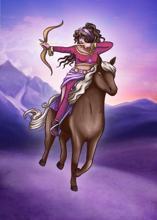
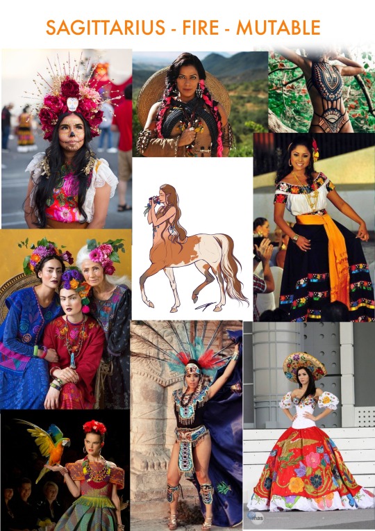
For the design of Sagittarius, I didn’t have a concept for the background in mind when I created the illustration which again resulted struggling an idea that would support the focal character, but also not clash too much with the amount of coloured already in use.
I decided to do more photo layering again to meditate this issue and rather than just leaving the photo as it was, I used a smudging brush that gave a painterly like texture to go over the photo and move the colours in ways to blend it better and make it look more like an illustration.
I feel I will be going back to edit this illustration more before final printing.
I was struggling with the colour initially so I decided to go back to a greyscale method and then pick out my colours afterwards so I didn’t waste too much time trying to pick colours before painting.

1 note
·
View note
Text
07.10.2019
The design for Cancer is probably my most favourite design as I was very happy with the deeper colour palette and use of transparency and light. My first sketch concept I had in mind for this card was to include an Aboriginal tribe as the sign of Cancer represent home life, family, heritage, the past and the mother. My reason for going for an alternative design was that I was unsure of any cultural implications that may have had and I decided not to take any chances and create a whole new design.
Instead, I used my mum as inspiration, as she is a Cancer Sun and is my ‘mother’ so it became a much more personalised representation which I will include in the guidebook I will create to go along with the cards.


0 notes
Text
04 - 05.10.2019
For the design go Gemini, I revisited the initial design I created early on in the design process in week 5 and continued with it. I did, however, print out the digital sketch, re-draw over it in ink and take a photo to reimport as I had more control over the shape and edit the details.
The most difficult aspect of this illustration was potentially the colouring aspect and finding the right palette.
Gemini being an Air sign landed with a similar palette to Aquarius (another air sign), and Libra ended up being quite different from those two designs.


0 notes
Text
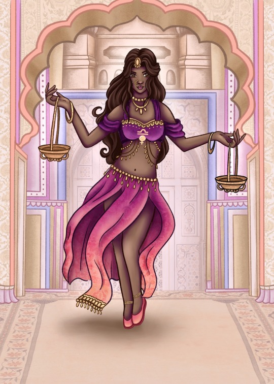
03-04.10.2019
This is the version for Libra I created which took much more trial and error when it came to choosing colours. Libra traditionally resembles as a set of scales so I liked the idea using a kind of belly-dancer who has a kind of balance using a set of scales.
I would like to go back and retouch this image to add something to each of the scales to add more symbolism to this character. I was also very happy with how the background turned out for this character and I again used photo playing of textures to add additional details and bring more life to the image so it didn’t appear overly flat.
I released in my first colouring attempt the character looked far too much like the Disney character Jasmin from Aladdin, hence why I recoloured it!

0 notes
Text
01 - 03.10.2019
The next illustration design I created was the card Leo. For this design, I asked my followers on Instagram to help me choose a hair colour for the character using a poll vote on my Instagram stories. This gave a kind of collaborative element to the design and also helped me reflect on what my followers liked.
I definitely wanted to have a more diverse range of ethnicities in my designs so for this piece I was inspired by Drag Queen RuPaul and also Ancient Egyptian aesthetics with an African woman as the focal queen. Again, I also used photo layering as a technique to give the illustration some additional detail without exhausting too much time in designing something from scratch.
I also found that switching to drawing on paper first and then drawing over them digitally as I felt i had much more control when it came to the grip on the paper as well as relieving strain from the light on my eyes.


0 notes
Text
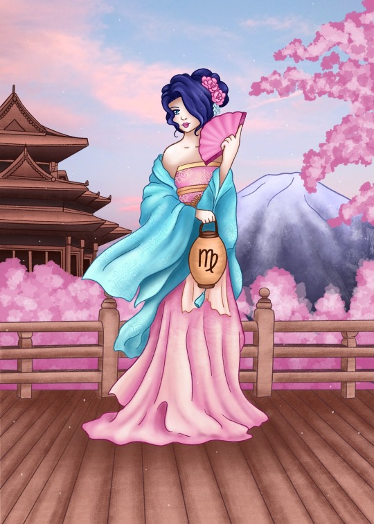
30 of Sept - 01 Oct 2019
These 2 days I created the card ‘Virgo’ and I also purchased some additional Procreate brushes from https://alicjaprints.com/
This included:
Sketchy Brush Set
https://alicjaprints.com/shop-page/sketch-brush-set/
Hair Brush Set for Procreate
https://alicjaprints.com/shop-page/hair-brush-set-procreate/
Paint Brush Set for Procreate
https://alicjaprints.com/shop-page/paint-brush-set-for-procreate/
These brushes significantly improved the quality and speed of my illustration process so I was able to create the artworks in a much shorter space of time.
I also became much more elaborate with my backgrounds to give the viewer more idea of the setting and to make sure my characters weren't floating in midair. Unfortunately, I did not record much of the process of creating the illustrations as I sped through it.

0 notes
Text
23-24.09.2019
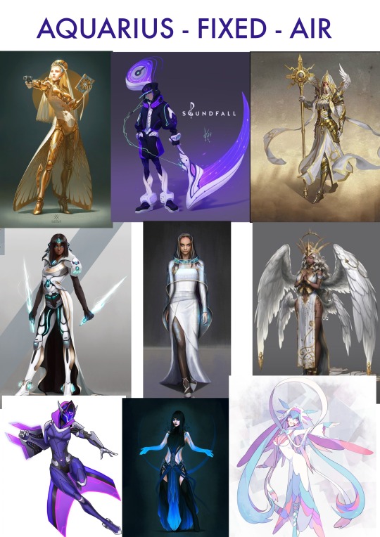
This week I had finished the Aquarius Card design which wasn’t as rich in imagery as I had hoped as I was previously visualising creating a background of a utopia like setting with Greek influence, however, the scene did not resonate with the card meaning, nor could I conceptualise what I wanted to create.
This week I was again going through a low state pf creativity where I wasn’t feeling inspired which made the drawing process much much harder. I’m happy with the outcome as it currently stands though I may go back and do some retouching of the image. I used photo collage in the background to save a lot more drawing time.

0 notes
Text
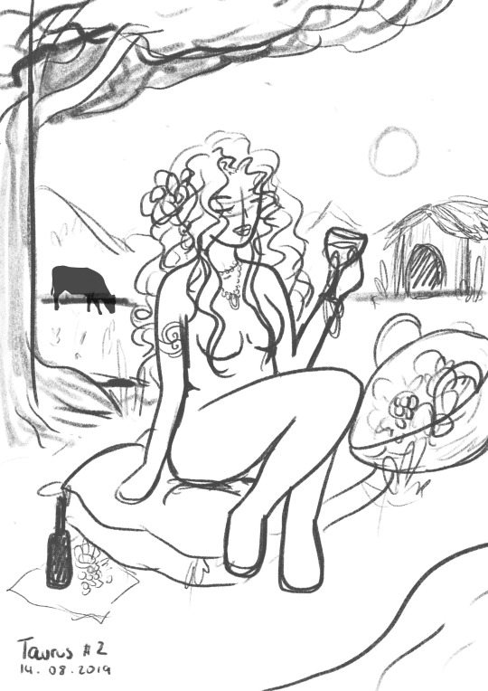
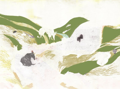
Aquarius 16.09 - 22.09 (ongoing)
For my Aquarius cars, I tried to do more research for ideas as to how I wanted to create this card. I sketched out more concepts and took a personal photo reference as drawing poses, and havent done as much process on this illustration this week though I have my base sketch and have laid my flat colours in greyscale and added shadow and depth.
(and yes, that is a bottle of cuddly)


0 notes
Text
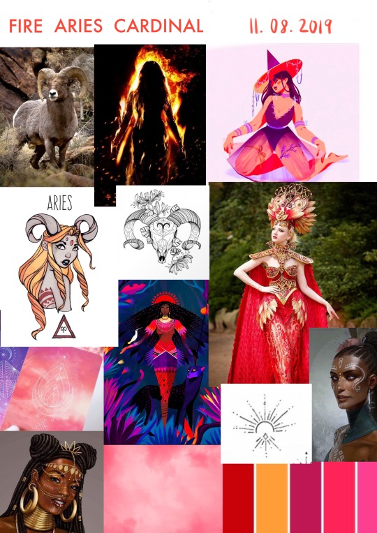
Aries 10.09 - 13.09
I was really struggling with the conceptualisation of my ‘Aries’ Zodiac card. I didn't have a clear concept of what I wanted to illustrate and so I dove in headfirst into drawing and I decided to go with the first sketch I created which made a whole lot of issues later on in my process.
The illustration was very out of alignment of the fantasy theme I had been creating my deck under, creating a more sporty character with a Katana which made no real sense for the keywords (aggressive, energetic, powerful, direct, dynamic).
Once I finished colouring it I was still incredibly unhappy with the process so far, and I knew it didn’t go with the rest of my theme so I decided to paint over what I had done and created a made-up character in a random location.
The key I took from this huge complication was to not go into a full colouring illustration without a solid plan for the concept, intention and outcome as this creates unnecessary extra work afterwards. I was also feeling tremendous art block and a strong lack in motivation to draw or paint.
I'm not sure I’ll be using this illustration eventually as I am not happy with the lack of direction, clarity or composition of this piece.

0 notes
Text
Pisces: 07.09 - 09.09

My process for this card illustration was much faster in my painting process and conceptualisation. I took inspiration from painting styles of Elentori, LuluSketches, and GDBee.
There was a lot of colour alterations and editing until I harmonised with a cool, crystal colour palette to emphasise the magical and fantastical nature of this sign.
I also incorporated matt painting style using photos to add texture, such as on the surface of the water, the wall in the background, the stars on the tail and the ground under the water.
0 notes
Text
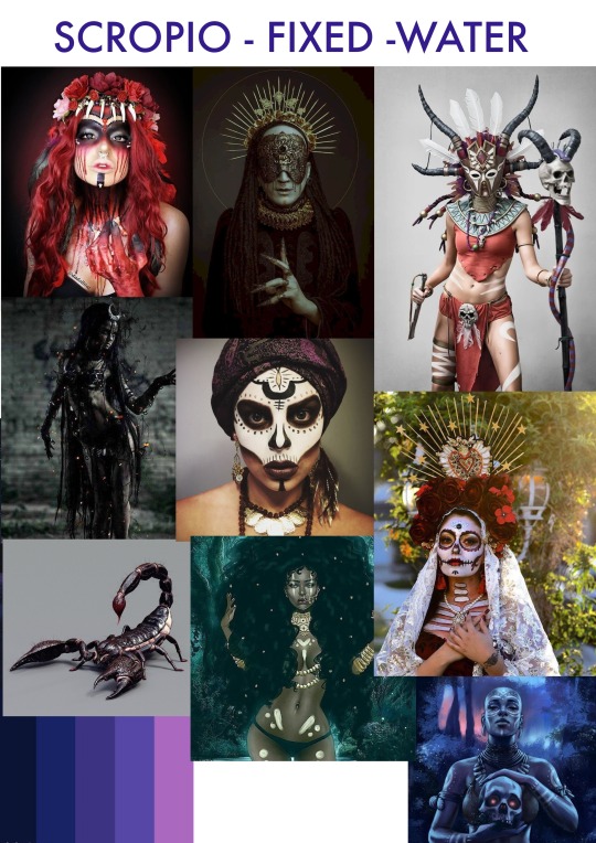
28.08 - 06.09: Scorpio Card
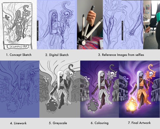
During the process of creating this card, I had purchased a new Procreate brush set which greatly contributed to my stylisation improving upon the first illustration of Taurus.
I have to keep in mind as I continue my painting process not to keep changing my stylisation too much, otherwise my collection of works will not be as cohesive which can throw off the reader.
I really enjoyed experimenting with colour with this piece, as I went for a complementary colour palette to give this illustration energy and vibrancy. My composition was purely intuitive though it works well as the fire draw the eye up to the character and up to the smoke.
The process for this illustration took longer to process than anticipated, however, I have further established my workflow and ability to produce concepts.
0 notes
Text
NEW PROCREATE BRUSHESSS
30.08.2019
Since it was my birthday recently, I was spoiled and received $100 from a family friend to spend on myself.
I like to aim to invest my money into either tools or resources that will eventually aim to help me make money, so I purchased a professional brush pack and texture pack from Tip Top brushes for Procreate which I’m absolutely over the moon with!
This will aid greatly in giving style and texture variation to my illustrations to experiment with!

480+ items (brushes, shaders, swatches)
33 different collections (listed below)

133 Textures
Speckled - 33 textures
Red and Purple - 27 textures
Floral plants - 20 textures
Confetti - 20 textures
Blue and Green - 14 textures
Plain - 10 textures
Construction - 9 textures
JPG Format
2536 x 2017 300 DPI Resolution
Brushes: https://tiptopbrushes.com/products/complete-bundle
Paper: https://tiptopbrushes.com/collections/all-textures/products/handmade-paper
0 notes
Text
When the intention isn’t enough...
On the 29th of August, on my Instagram, one of my favourite deck creators, Chris-Anne Donelly, had announced in a video she recalled one of the tarot cards she created in her newly released deck due to controversy around one of her designs.
Her illustration for the 10 of Swords triggered an upset to an African American woman did to the design and thus, Chris-Anne responded by recalling the card design and creating it.
This was a very pure and perfect example and representation for myself the consideration of how symbols and imagery can affect the viewer enough to demand a design recall and react harshly to a design.
Also due to the nature and context of a tarot deck, the target market is typically aimed at women interested in spirituality, tarot, healing, diving etc - The audience tends to be sensitive in nature and thus while it is understandable the design may have caused upset, the reaction of the viewers perception dictated the result of their emotional response to the work.
The viewer could have chosen to acknowledge the artist's intentions in regards to the design and subside their response to the design, or they could also choose to confront the artist to make a change.
This is an example of the studies and research I have currently been doing as well as taking into greater account of how my design can be perceived by others.

0 notes
Text
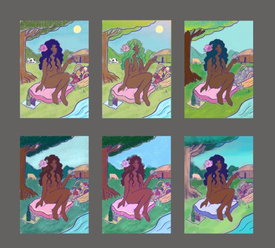
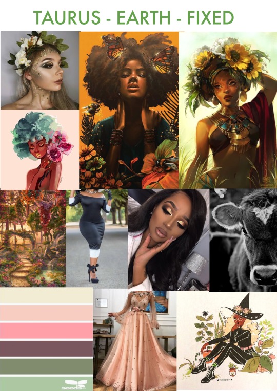
Card 1: Taurus
First card illustration: Taurus
I decided to go with concept 2 for my card illustration of the sign Taurus as I feel this encapsulated the most number of symbols into the card imagery.
From the completion of this illustration,
I now have a better idea of my design practice for creating cards and a clearer way to refine my process to speed up production.
For this card the process began as:
Sketching full size directly onto the iPad
Several stages of refinement for the sketch before I proceeded with inking and outlining the work
Adding my flat colour layers to each of the separate bases
Beginning to add colour, shading and texture
This became a tedious process as I worked off the bat rather than giving proper former planning to the illustration so I felt like I could have stylised the image in a better way by paying more attention to symbols I could have incorporated into the background.
The update of my process will now proceed as such:
Make reference to my keywords and list symbols I can utilise to represent that core meaning, including colours and body positions
PRE-PLAN the colour palette! This was the most frustrating aspect for the first card as I was using too many colours and they weren’t as harmonious as they could have been! I’ve now been using a colour palette creator called ‘Paletton’ to refine my colour choices so they are more limited and harmonious.
Sketch onto appear first! I find my ideas actually flow a lot better when I sketch onto paper.
Sketch smaller. I definitely need to do thumbnail size sketches which I then take a photo of using a scanner app on my iPad and then transfer the photo into Procreate where I then lower the photo opacity and re-sketch it digitally in a more refined way.
Additional changes to my process:
Create a greyscale later to check the contrast
Use the same or similar textures throughout a single card
I’ve also been watching more illustration tutorials on Skillshare and Udemy to help refine my painting practice.

0 notes
Text
Victo Ngai (Inspiration) 11.08.2019

This is a copy/paste of Interviews and inspiration from an artist that I found on Skillshare today. I fell in love with her work and so I wanted to collect some information about her and her process and save it here.
Victo Ngai is a Los Angeles based illustrator from Hong Kong, graduated from Rhode Island School of Design. Victo provides illustrations for newspaper and magazines such as the New York Times and the New Yorker; create storyboards and art for animations.
( http://victo-ngai.blogspot.com/2011/05/honolulu-mag-new-illo-and-first-process.html )
“I work half traditionally and half digitally. I enjoy this way of working as it allows me to create images with a wide range of media which are"incompatible" in nature. It also allows me to be really experimental with colours/texture and still able to deliver my work by the deadline safe and sound. Usually, after the sketch is approved, I go in and draw the line with pen and ink and the texture with various media like pencil, charcoal, crayon, pastel. etc”

*Approved Sketch Concept*

THE PROCESS - Starts with traditional medium


“After I am done with the drawing board, I have everything scanned, composed and coloured in Photoshop”.


FINAL

(Source: https://medium.com/design-manifestos/design-manifestos-victo-ngai-408af23e2c04)
“Illustration essentially is about using visuals to tell a story and creating a world that you’re able to bring people into and get lost in. I realized I could do drawing as living some time in high school. For a while, I thought of drawing as just a hobby”.
On where her illustration ideas come from “Everywhere. First of all, illustration is different than fine art, it’s different from gallery art. We usually don’t just sit there and dream up something we want to paint or something we want to express. Usually, you’re given a prompt. I am very interested in concepts with every project. I start with learning what my clients want me to communicate: what is the most important thing that I need to showcase in this piece? From then on I brainstorm and see what kind of visuals will be relevant and will be the best symbolism or metaphor to communicate this idea and tell this story.”
On her illustration process I get the assignment, I read it over a lot of times. I try to boil it down to the essence — usually a few phrases or short sentences. After understanding what the assignment is about I like to have some distance from it. I realize a lot of the time that the best idea comes when you’re not thinking too hard. When you think about it, the imagery that comes to mind becomes very literal. You’re almost boxed-in. I like to understand something and then forget about it for a while. Usually when it’s least expected something will pop into mind. It could be something abstract or not related, but somehow the feeling matches with the assignment and then I will start to explore how I can tie this back in. After the concept is done, I usually supply my clients with at least 3 sketches of options. When one is approved I take it to find out if any tweaks are needed for the sketches and then I will do the linework and all the texture on paper, with pen and ink or various mediums. Everything is brought into photoshop and coloured digitally.
On her unique illustrations The thing is that I draw the way I draw because I don’t know how to draw any other way. I don’t think it’s something for me to be very objective to say, but I have gotten feedback from past clients. They like my work because they think it solves the problem quite nicely without feeling like the piece is so editorial. They like that it fulfils the commission — the purpose of it — but they would still like the piece to hang in their living room to stand alone as an art object.
On her interpretation of a successful illustrator A great drawer doesn’t make a good illustrator. A great painter also doesn’t make a good illustrator. A great thinker doesn’t make a good illustrator. Being a great illustrator means you have to have the best of both worlds: you’re able to deliver an idea but you’re also able to execute it. If you have the concept, but you don’t have the skills then people won’t know what the concept is about. It’s almost like having a software without the hardware to deliver it. You have to be able to think in a critical way and also an imaginative way, and you have the skill set to represent that.
On advice she would give herself before starting
This is a phrase that has become my motto at the moment, which I didn’t know when I first started — “it’s not about how good you are, but about how good you want to be,” by Paul Arden. When you were a student you follow rules, you follow assignments which are necessary for the classroom environment. It also puts you in the mentality of being a follower or doing things that are required of you, instead of being self-generated. When I was in school and I had the chance of doing an internship, I would pick the internship that on paper says you will be more hands-on and will give you a lot of tasks to try on. As opposed to work that might give me better networking connections.


0 notes
Text
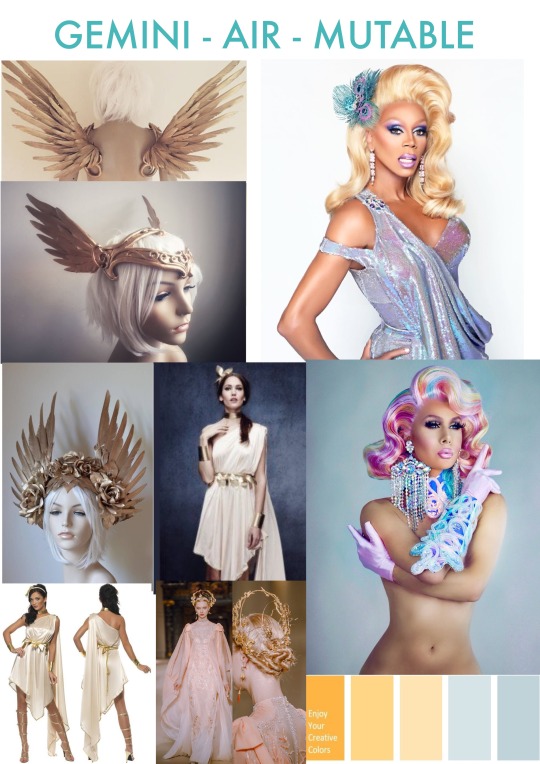
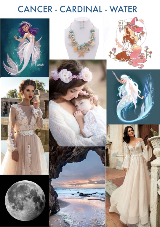
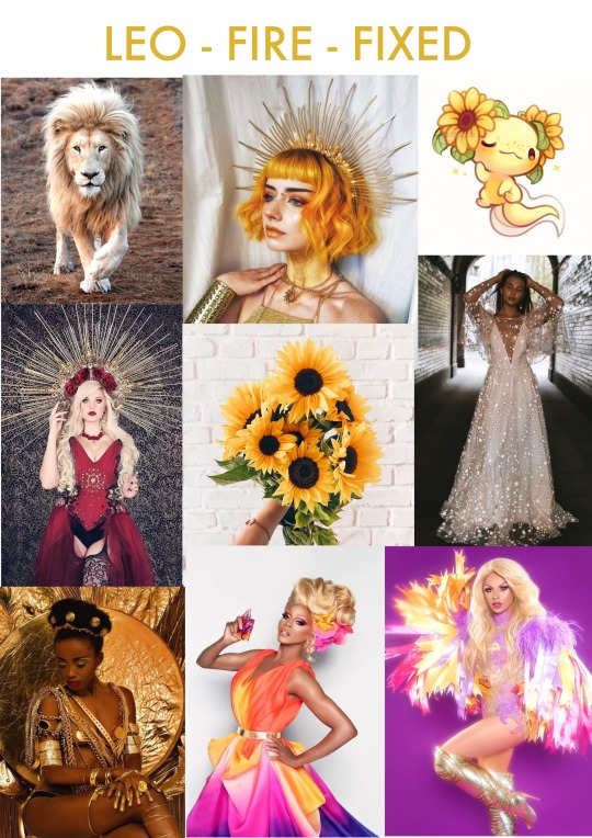
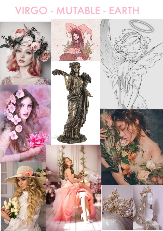
Zodiac Sign MoodBoards
Here are my mood boards for my zodiac oracle deck cards. 11.08.2019


0 notes
Text
11.08.2019
Today I started creating my mood boards for my illustration compositions. I initially started with the intention of creating figures for the Zodiac under the theme of a goddess, and a type of expression of that energy. The further I went in regards to my research of collecting images to create mood boards, I felt more inclined inspired to capture this concept but also bring into focus cultural aspects as an additional symbolism and influence and essence to bring in regards to the feel of the cards.
This is an idea I want to contemplate, but whether or not I can put this into practice will be something I will have to contemplate over again because there are the inclination is of potential perspectives about other cultures depending on the individual Rita, and also there are many choices that I can go with so I will have to figure out whether I want to go on a cultural practice basis or reduce them down to the essence of the culture and what I feel will resonate the strongest in a reading. I also want to maintain the essence of ancient implications That frame them as a modern take on an ancient concept that’s also captivated in a culture.
Zodiac Associations and cultures:
Aries: Spartan (Greece)
Taurus: Native Americans
Gemini: Saudi Arabia 🇸🇦
Cancer: Peru 🇵🇪
Leo: Mexico 🇲🇽 or India 🇮🇳
Virgo: England or Ireland (Celtic)
Libra: Japan 🇯🇵 or China 🇨🇳
Scorpio: Africa (Witch doctor)
Sagittarius: Jamaica 🇯🇲
Capricorn: Sweden 🇸🇪
Aquarius: Egypt
Pisces: Greece 🇬🇷
0 notes