
Statistics
We looked inside some of the posts by em2dplatformer and here's what we found interesting.
Average Info
Notes Per Post
1
Likes Per Post
1
Reblog Per Post
0
Reply Per Post
0
Time Between Posts
23 hours
Number of Posts By Type
Text
17
Last Seen Tumblr Blogs


Fun Fact
Hackers stole 65M passwords from Tumblr in 2013.
Text
Adding a Pickup Pop Up Message
I want the player to know what they've just picked up. To do this I need to add some text telling the player what item has just been picked up.
By entering the HUD, I can add a text box from the Palette and create a new binding for it.

This binding detects when the player picks up the cog and then displays 'Cog Acquired' when they do. This, however, means that the text will stay there for the rest of the level as the player never drops the cog. This also does not work for the valve.
To fix this, we need it so that the text does not rely on the cog directly. To replace the cog in the code, we can create a custom event in the player character (where the cog and valve Booleans are stored). This custom event needs a new string variable which we will call 'Display Text'. This variable will be ticked and unticked after a delay of 3 seconds.

This Display Text event then needs to be added to the Cog and Valve code with the correct text for each one.

Cog's code says 'Cog Acquired'.

Valve's code says 'Valve Acquired'.

The binding code can now be changed so that the text relies on our string variable and not the Boolean itself.
0 notes
Text
Designing a Win and Lose Screen
Both my win and lose screens are currently still the placeholder assets. This needs to be changed before the game is finished.
Game Over:
For my game over screen, I took inspiration from the Hi-Fi Rush game over screen that I researched previously. I really like the spotlight from it and want to use that in my own game. For this, I first looked at images similar to what I wanted to create for my screen.


I then began drawing the main spotlight in photoshop.

For the spotlight to have some sort of fade out effect, I copy and pasted a few layers of it, lowering the opacity on each one and erasing each one at certain points.

I then added my character as a puddle, showing the aftermath of her death animation.

When added to the game's widget, I can now add text including the score that the player got during their playthrough.

Win Screen:
For my win screen, I wanted it so that it showed the player character finding a civilization after leaving the sewers. I also wanted to add a sunrise as the first two levels took place at night.

I gave the sunrise a blockier look because its a pixel game.

I then added some ground that will have the houses on.


I created two houses, a small, round house and a larger building. Both of these are inspired by the Solarpunk houses I found and put on my Game Design Document at the start of this project.


I then placed two more of the smaller buildings around the other side and added a pathway and some farms.

Next was adding the player character. I wanted her to be looking over the area preferably with the pipe she came from being in shot.

Once this screen is added to the widget in Unreal, I can add text.

0 notes
Text
Upgrading the Enemy and Projectile
Currently, projectile destroys the enemy actor which, while it works, looks very boring and unfinished. I want to fix this by adding a death animation for the enemy.
First I need to create the death animation. For this I first thought of smoke but found out that smoke is very hard to animate in a way that would fit my games style, so I changed to a small explosion.

Now that I have the animation ready, I need to edit the code to both my enemy and my projectile.
Enemy Code:
For my enemy to be able to take damage and have a death state, it needs to have health. This integer works identically to the player's health, with a default value that can be decreased/increased. This then allows me to add a death state for the enemy.

The death state occurs when the enemy reaches 0 or negative health and it disables movement, its ability to kill and plays the death animation before destroying the actor.

This section of code now has a branch statement making sure that, when enemy health is 0 or below, the player will not die from touching it.
Projectile Code:
The projectile's code has been changed so that, instead of destroying the enemy actor when they overlap, it takes away 5 health from the enemy. This means that, instead of removing the actor entirely, it will allow the code in the enemy to play out once its health reaches 0.

0 notes
Text
Hints in Level Design
Trying to create a way to tell the player what to do/where to go without making the hint intrusive is difficult depending on the task. In my case, I want to hint to the player that, in level 2, the valve needed to proceed is in an area that isn't on camera. For this, I'm going to use a similar method to Astro Bot.
In Astro Bot, there are levels that use an armadillo as a form of transportation. In these mini-levels, there is a sign with a skull symbol on it. If the player doesn't know/remember how to do it and accidentally hits the armadillo, it is programmed to always hit the sign and bounce back to the player, indicating that it is required for the level.

I really like this method of hinting to the player as its extremely subtle and doesn't pause the gameplay for people who know what they're doing. I want to do something similar for my game.
My method of hinting to the player that there is something below the screen is by using a sign just like in Astro Bot. This sign points in two directions, the main route and the area below the screen where the valve is.

This should be subtle enough that it blends into the game and doesn't feel out of place, but also clear enough that the player understands what it is there for.
0 notes
Text
Puzzle Variations
Because my game has a couple of levels, I want to create a variation of the gearbox puzzle so that the game is a bit more interesting. This will still be the same 'find the key' type of puzzle but will use different sprites and animations.
Back when we were making pick up sprites, I created a valve. This gave me the idea to create a valve and pipe that would open an exit.

This led me to create an animation for the cog pickup item, and a pipe with an animation for when the valve is added and turned.


For the coding of this puzzle. I created new actors and added the code over from the gearbox and gateway to then edit.

For the pipe, the code needs to be heavily simplified. This is because the pipe doesn't need to have the same amount of animation as the gearbox as it doesn't open or close. I also need to change the flipbooks and sprites over. The pipe also needs the interact interface added in its 'Class Settings', this lets it use the 'W' key for interact.

Code before

Code after
The pipe (I've reused the pipe from the level beginning and created a new actor for it) that opens uses very similar code to the gateway, with changes such as the flipbooks and sprites being the only main changes.

Code before

Code after
These can now be added to the game.


0 notes
Text
Animation Pioneers Research
Eadweard Muybridge:
Muybridge is well known for his effort in pioneering chronophotography of animal movements. Chronophotography is the practice of using multiple photos, each capturing a different part of a motion, and showing them in order to create the illusion of movement. Muybridge used this to display animals such a horses and big cats.


Muybridge also created the Zoopraxiscope, a small scale projector that would display a simple animation as it was rotated.


Stephen E. Wilhite:
Wilhite is best known for being the inventor of the GIF as he was the engineering lead on the team. The GIF was a large step for digital animation as its format allows up to 8 bits per pixel, meaning it can use 256 colours. This made it the default way to display images on screens until the PNG was created 9 years later.


1 note
·
View note
Text
Win and Lose Screens
For game over screens, a lot of games use the typical black screen and writing or a text overlay on the normal screen. I don't want this to be the case in my game because I find it boring which is why I'm going to look at win and lose screens from some games that them in more interesting ways.
Cuphead:
Cuphead's lose screen consists of a slip of paper slid onto the screen with the enemy you lost to taunting you. This helps portray the enemies' personality while also making sense for a higher difficulty game. It also shows the progress bar along with where each stage of the boss fight is. This is very useful for players who die and want to know how much more of a boss fight they would need to survive. The theme of the lose screen also perfectly fits the hand drawn animation style of Cuphead.

Cuphead's level win screens consist of a tally up of the points the player got during the level. The player is then given a final grade on how well they did. I like the idea of keeping track of the player's stats like the score for a final grade as it gives the player a reason to replay a level and try new ability combinations.

Hi-Fi Rush:
Hi-Fi Rush's game over screen has the player character fall dramatically as a spotlight focuses on them. I like this for it being simple yet still unique.

The Results screen is also really fun and dynamic, with the player character escaping from an explosion. The level end screen also shows the grade for each stat with a final result given at the top in big bold writing. This screen fits with the lighthearted style of Hi-Fi Rush while still giving clear results to each objective.

0 notes
Text
Designing Enemies
To help me get a better idea on what I want my enemy(s) to look like, I'm going to look at some enemies from popular games.
Sonic the Hedgehog:
I really wanted to look at the enemies from Sonic the Hedgehog as I think their designs would fit really well into my game. Designs like the Moto Bug and Buzz Bomber were what first came to my mind when I was thinking about enemy designs. The combination of nature and machinery is exactly what I would use to explain the style of my game and the sonic enemy designs.


The bright colours of the enemies are also something I want to use as it both fits my style and makes them more clear to the player. Them also having different roles is something I like the idea of including with both a land and air variant.
Grounded:
Carrying on from the bug enemy idea, I wanted to look at the idea of using giant/mutated bugs. The first game that came to my mind for large insects was Grounded. Grounded's main enemies are larger insects such as spiders, ladybirds and beetles that are, compared to the player, massive. This helps to make enemies a lot scarier in Grounded, especially since the game is in third person.


With both of these ideas in mind, I started trying to design my first enemy. For this enemy, I wanted to focus on the mechanical bug idea from the sonic series and picked a mechanical bee to do. For this, I wanted to look at some pixel art bee for reference.


I didn't want my bees to be overly detailed because they would look out of place but I also struggled to keep them simplistic while still making it clear they're mechanical.

My first attempt was very simplistic with the body being pill shaped. I tried to make the mechanical aspect clear using a winder from wind up toys instead of wings. This attempt does work and I like the winder part, I just think that it doesn't feel enough like a hostile enemy.

For my second attempt, I relied a lot more on my reference images to create a more detailed version of the bee. I added different colours for the bees stripes so that the arms wouldn't be lost on his torso, I added a fur collar for the bee to look fluffier and more natural so that the biological side was more apparent. To balance this out, I added a section of the bee's face that has peeled away to reveal the robot underneath. I also added shading to the now larger winder so that it isn't made insignificant by the rest of the bee's design.

I added an animation to make it feel more alive and its ready to be put into the game.
0 notes
Text
Creating projectiles
First, I need an actor blueprint for the projectile.

The photo for the blueprint looks different. This is because the scene root has been changed from the default to the sphere itself.

Next is adding the projectile's movement so that the projectile isn't just staying still.

The 'ProjectileMovement' requires a few changes so that the projectile works correctly. First is changing the speed as both the initial and max speed have to be changed from the default 0.

Currently the initial and max speeds are the same as I want my projectile to stay a consistent speed for its duration.
Next is making the gravity scale 0 so that the projectile stays going the same direction for its duration instead of falling to the floor.

Now that the projectile is set up, it needs to be given the correct event graph. Before we create the event graph, however, I need to add an arrow to my character so that it can shoot the projectile.

This arrow must be outside of the character's hitbox as the projectile would be immediately destroyed otherwise.
For the actual code for the projectile we need to do two parts, one in the projectile and one in the character:

In the projectile is this as it decides the projectiles' life as well as how it is destroyed. This event graph basically just means that, when the projectile is spawned in, it will last 3 seconds before being destroyed unless it overlaps another actor which will destroy it immediately.
0 notes
Text
Creating an Enemy
Because my enemy needs to be able to move around, I need to use a character blueprint rather than an actor blueprint.
Once the blueprint is created, I need to add a placeholder for my enemy so that I can see the enemy in game. (this placeholder needs to be set to have no collision).
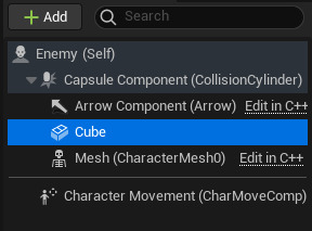
Now before we code the enemy's movement, a control point blueprint needs to be created. A control point is used as the boundaries of where the enemy will be allowed to go so that they don't fall off of ledges. This can be created using an actor blueprint. This only needs to be a sphere so we can see it in the editor and does not need collision.

Placing two of these means that the enemy will have to walk between them.
For the enemy's code, there are two main parts. The first is setting it so that the control points are what change the enemy's direction. This starts by making a Boolean called 'MoveRight'.

The full code for the first part is:
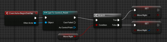
Event ActorBeginOverlap + Cast To Control_Point - The even begins when the enemy overlaps with the control point.
Branch + MoveRight condition + Set MoveRight - This means that, if the MoveRight Boolean is ticked, it will be unticked by the point and, if its not ticked, it will be ticked by the point.
The second part is the movement of the enemy itself. It requires another new Float variable called 'MovementSpeed'. Set the default number to '20'. This variable should be exposed so that each instance of an enemy can have a different movement speed if required.

The full code looks like this:
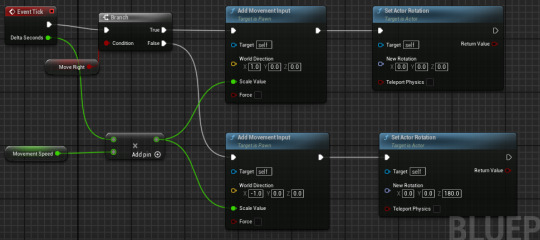
The branch and the condition work the same way as before but, instead of changing the Boolean, it changes the character's movement and rotation.
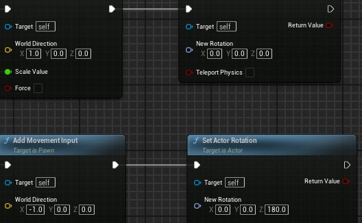
The movement and the rotation should be the opposite on the 'False' options to the 'True' options.
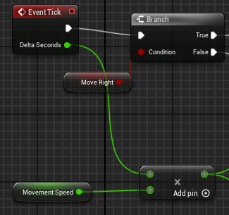
The event tick means that the character's movement will occur with each frame (Delta Second). This is added to a multiply event that's connected to the character movement variable which means that the movement speed is multiplied by the frames. This means that, if a frame is missed due to lag, the enemy will speed up to compensate. The outcome to the multiplication is then connected to the scale value of the movement input.
0 notes
Text
Creating a Background and Start Screen
Now that my game has levels, sprites, a HUD and a puzzle mechanic, its time to create some backgrounds for it. I first want to look at some inspiration for the backgrounds as, while I have a main idea, I want to look at how to frame the background the way I want to.


I like both of these backgrounds mainly for their layering of the nature. Both images have very clear layers that help make the background look more 3D. I personally prefer the first image as its a lot more similar to my game's style.
Now, because the background for my game is going to move with the character, having a lot of background scenery will make it look odd in areas that are a lot higher or lower. This meant that I decided to go for a plain sky rather than a proper backdrop.

This kind of background is now the type I'm going to focus on.

This first attempt felt too empty and not detailed enough for my liking so I tried again using the previous reference as a much bigger influence.

This version feels more 3D and uses the colours a lot better.
For my start screen, I've used assets from my tile map as well as new assets.

I've reused the background and I used the walls from the tile map to create a backing. I then created this pipe which I plan on adding to the beginning of each level so that my character has somewhere they came from instead of just appearing. I then created some flooring to add a bucket which holds what becomes my character.

I then added the image to a widget that will be implemented in my start screen level.
Now, I next created an actor that will become the pipe at the beginning of each level.

This pipe uses 3 layers, the actual metal pipe part that I've labelled the overlay, the black inside I've labelled the underlay and the animated bars that fit in between the two layers.


All of these are then added to the actor and place in the correct layer order.

Next is the basic code so that it shuts as the game begins so that the player character is forced to continue.

This is done by just making the animation of it closing play once the game begins. The animation then flips to the closed sprite.
0 notes
Text
Creating a Door Mechanism
For my puzzle to be of use in game, it needs to have a reason for it to be completed. My main idea for this is that it will open a door to the next level.
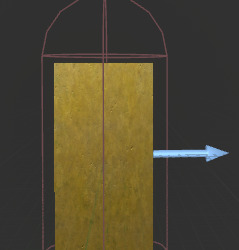
First is creating the sprites that I will need. This includes an opened version of the gateway, A closed and an open gate and the animation for the gate closing and opening.

I created both an opened and closed version so that I could see how big the gate itself would be. I need this so I can determine how long the animation will be. The left part of the gate's frame is on a separate layer so that I can move it further back in the sprite when its in Unreal, this is so that the player can walk inside the doorway without being in front of the whole door.
I then created the animation sheet for both an opening and closing animation. I'm not fully sure if I will use the closing animation but I have included it incase I want to use it in the future.

I then imported everything as sprites, created the necessary flipbooks and added them to a blueprint just like the gear box. For the actual coding, I first created a custom event in the gateway's event graph. I then connected that custom event to my code in the gear box so that, when the player interacts, it will cause the custom event to happen that is going to open the door.

The custom event I've created will set the gateway's animation to opening and then, after a delay that allows the opening animation to fully playthrough, it will set the flipbook to an invisible animation to keep it opened.

Now the issue with this is that it opens the door even when the player does not have the cog. This makes the puzzle pointless. To fix this, I added a branch statement that checks if the 'Cog' Boolean is checked. If the cog is not, the door won't open and the gearbox opens as normal and if it is the door will open alongside the box.

Now, because I don't want the door to open immediately after, I'm going to add a delay to it's custom event.

Next is to make it so that the door's collision is removed when the door is opened so that the player can actually walk through. For this, I have a collision that is set to 'BlockAllDynamic' as a preset. To change this after the animation is finished, all I need to add is 'Set Collision Enabled' at the end of the event graph with the door collision as the target and the new type as no collision.

This now means that I can add a second collision box behind the first that will take the player to the next level.

To make this asset reusable, I promoted the 'Level' in 'Open Level' to a variable so that each instance can be changed when it needs to be.

This now means that I have a working puzzle mechanic for my game. I do plan on making variations of this puzzle for the game to be more visually engaging.
0 notes
Text
Health Systems Research
Health systems are vital for most games as most games have some form of damage the player can take. This information can be displayed in many different ways, some more common than others. This research is to see how effective different displays are and which ones I personally prefer.
Owlboy:
Owlboy keeps its health system simple; a small bar at the top left of the screen above the coins collected. This bar can be made longer by finding food around to increase the total health. This method is very common but I still personally like using it, player's are used to the health bar and will not need it to be further explained like other, more complex health systems.

Hollow Knight:
Hollow Knight uses a similar system to the heart system, where each heart absorbs one attack from enemies. The most unique part of Hollow Knights health system is the collection of souls. This works similarly to a life steal mechanic, where the circle in the top left fills up as the player kills more enemies. This can then be used to refill the player character's health, using a portion of the souls in the circle to heal. I personally really like this method of healing as it gives more of an instinctive to get back into the fight after losing health rather than running away.

Kirby:
The Kirby games all use the one life mechanic, meaning that the player is given a set number of lives which, once they're gone, gives a game over. I personally think that this system only works for a specific type of game like the Mario games and it shouldn't be used for games with more of a story that would have to be repeated after a game over.

Nier: Automata:
Nier: Automata is another game that uses a health bar with one for the player character in the top left corner and ones for the enemies you're fighting above their heads.

I chose to talk about Nier: Automata not because of the health display on it's own, but because of how the game is affected when damage is taken. When the player has sustained a large amount of damage, the screen glitches and becomes black and white.

This is a good example of utilising the world building in a game as this makes sense with the player character being an android. The self destruct also makes the HUD glitch out as well as the main menu.
youtube
0 notes
Text
HUDs Research Pt2
This second part of HUD research is to look at more unique HUDs to see just how different HUDs can be while still showing the necessary information to the player.
Dead Space:
Dead Space is a great example of how a HUD can be implemented in a way that further emphasizes the type of game the player is playing. In Dead Space, the HUD is put into the game itself, with things such as health and ammo being displayed in game on the character rather than on screen. This helps to emphasize the horror aspects of Dead Space as it helps immerse the player.

Even menus such as the inventory and the objectives are implemented as holograms that the player character can interact with, keeping every aspect of the games UI inside of the world.

Persona 5:
Persona 5 is a very stylised game with an even more stylised UI. The strong limited colour palette of black, white, red and yellow for a majority of the menus helps to give the HUD a bold look while also keeping each menu screen cohesive.

A large portion of the menus also focus heavily on the characters in the current moment which links to Persona's emphasis on well-written, complex characters and its story.


Mirror's Edge:
Mirror's Edge is an example of a minimal UI. This means that there is close to nothing shown on the screen most if not all of the time. This type of HUD is another way to help make the game more immersive and/or more cinematic. For Mirror's Edge. both the immersion and the cinematic feel of the minimal HUD work very well especially combined with the games limited colour palette.

This lack of information, however, can be very annoying for players. Because games often have useful information such as health and stamina displayed, being unable to see either in a combat and parkour game can feel off for a lot of players who are used to having that information. This means that a lot of players might struggle to keep track of their health and get frustrated when they're unsure if they can risk another fight or not.
Cris Tales:
Cris Tales uses a very similar HUD to Persona 5, using the same bold shapes and dynamic positions for actions. The layout is pretty minimal, keeping most of the information in small areas of the screen like health and mana. Tutorials are kept out of the way and aren't invasive yet are still obvious enough due to the dark box on the light background. The top of the screen is used for the character's moves with their portraits indicating who is gong next. This method of showing turns is very common in games that use a turn system with games such as Baldur's Gate 3.

This top turns bar is very useful as it also shows what characters have what effects on them. These games often involve a form of strategy, meaning that the turn bar can help the player decide on a plan to help take down stronger enemies.


Dead Cells:
Dead Cells uses a very simple layout for its HUD, keeping everything clear and in a place that most players would be used to seeing in other games. Because of the game's emphasis on speed, all buttons are kept on screen so that players will never need to slow down to check or make a mistake during a battle.

A timer is also included above the minimap for the same reason.

The minimap itself works similarly to Terraria's with the map only showing areas the player has been before. This is normally done to hide any future fights/puzzles and to keep the player going one pathway at a time.
0 notes
Text
Creating HUD assets and implementing them
Because I want my game's HUD to be cohesive, I need to make all the assets. I'm going to start with the health icon/bar and the score icon.
Health Icon:
For my health icon, I wanted to use a simple heart motif as hearts are commonly used to indicated health. I wanted to keep my version more interesting however, so I created tree stump background for my heart icon to be placed on. This fits my nature theming and helps make the icon more visible.

Health Bar:
For my health bar, I used the progress bar from before but added a bar behind it as well as vines in front of it. I did this so that I could keep the coding from the old bar and so that I wouldn't have to draw each amount of damage taken as a separate entity.


This helps to make my health bar match the rest of the HUD.

Score Icon:
Because points are given by the gems collected, I think that having the gem as the score icon makes the most sense. I wanted it to match the health icon so I kept the same trunk backing behind the gemstone just with different vines.

Scoreboard:
I was initially planning on leaving the score number itself alone but, after adding everything else, it now feels out of place.

To fix this, I've added a board behind the score, vines over the top and changed the colour to show up better against the brown backing.

Inventory:

This inventory is a placeholder as it currently has no code added to it.
0 notes
Text
Importing Fonts
To import a font we first need a font file. Sites such as dafont.com. Now, its important that for projects that will be put on itch.io/projects that aren't classed as 'personal' need to use fonts that say '100% Free' and not just 'Free for personal use'. This is to comply with copyright laws.
First is downloading the font from the site.

Next is extracting the zip files so that the font can be imported correctly.

The newly extracted file can then be added to the content drawer by dragging it into the correct spot.

Now that the font is in the content drawer it can be selected as a font for text in the widget.

0 notes
Text
Creating a Game Over/Start/Win Screen
For our game to technically be classified as a game, it needs a win and a lose state. This means I need a game over screen nd a win screen. I will also add a starting screen during this process.
Game Over Screen:
To make a game over screen, we first need a new level for the screen to be in so that nothing else is being loaded while the screen is up.


Loading this level up, the first thing that we need to change is the player character because, as of right now, the player character spawns in falling forever. This is fixed by creating a new pawn in the content drawer. This pawn has no physical body and has one control: pressing any key will load the first level back up.

Now that we have a working pawn to replace the player character, we need to create a new game mode so that the player character is actually replaced.


In this blueprint, we want to change the 'defaultpawnclass' from default pawn to the newly created one.

This new game mode can now be added to this level by selecting 'World Settings' in 'Window' and putting the new game mode in 'Game Mode Override'.


Now we can create the game over screen as another widget.

For this widget to show up, instead of using the player character's event graph, I will add the code to the level's blueprint as this makes the most sense to be stored in the same level. It also means we can repurpose our pawn for other screens.


Start Screen:
The start screen is mostly the same process, with a new level being created followed by using the same game mode as the game over screen with the same pawn. The two main differences between the start screen and the game over screen are that the start screen uses a different widget for a different screen. The other, more important difference is that the project settings need to be changed for the start screen.

So that the start screen is actually the first screen that the player is shown, we need to change the 'Game Default Map' and not the 'Editor Startup Map'. This is so that the first level the player will see is the correct one while I, the dev in the editing software, won't have to each time I play test the game.

0 notes