
Don't wanna be here? Send us removal request.
Statistics
We looked inside some of the posts by em4dproject and here's what we found interesting.
Average Info
Notes Per Post
0
Likes Per Post
0
Reblog Per Post
0
Reply Per Post
0
Time Between Posts
1 day
Number of Posts By Type
Text
17
Last Seen Tumblr Blogs


Fun Fact
BuzzFeed published a report claiming that Tumblr was utilized as a distribution channel for Russian agents to influence American voting habits during the 2016 presidential election in Feb 2018.
Text
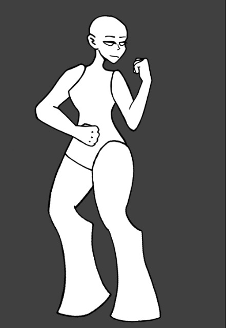
Game Banner
For my banner, I started with my game's name, United Fighterz. I then added a form of shadow to the text so that it would be easily read even with a more distracting background like the paint splatter I have used.
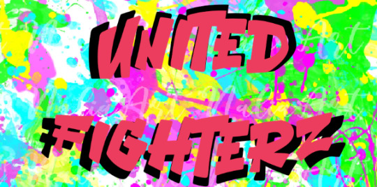
Next I wanted to add some framing, by adding black framing to the top and bottom, the shadows for the text feels less out of place.

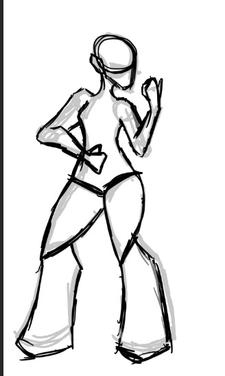
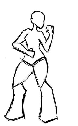
Next, I needed to add something that represents my game. I landed on adding the two characters in my game; the player and the test dummy. Having these characters in their fighting stance helps to convey what my game is about as well as taking up the lots of empty space around the outside.
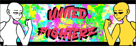
I then hid parts of the characters behind the framing to make them feel included in the image. However, I cannot decide whether I prefer this to them sticking out.
0 notes
Text
UI Design
For my game to feel more polished and unique, I need to design my UI so that it isn't the default Unreal UI pieces.
The first part of the UI I wanted to focus on was the health bars as they are the main bit of the UI that the player will be focused on. This is also the main part that I can be influenced by my UI design research from before.
My first idea focused on keeping the health bar simple as a more detailed design can be harder to read. I tried using a yellow similar to the score colour from before, I want to use yellow as it makes the important aspects of the UI stand out, making it easier for the player to understand what to look at without focusing on it too much and getting distracted from the gameplay.

The second design had a bit extra added to it to create a more interesting shape, but I think I prefer sticking to the basics with the health bar itself.

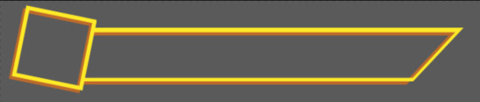
Since I like the basic bar design, I next decided to try out different portrait shapes. I tried a square portrait next as a square would allow me to show more of the character. I also tried a tilted version.
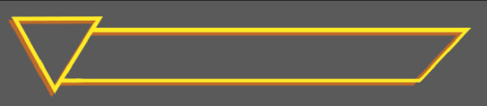
Next was trying out a triangle. Despite the triangle having less space o actually show off the character portrait, I do really like how it looks. I also tested out a different rotation to see which I would prefer. I quite like both version, but I feel like the second version is more dynamic. In regards to the lack of space in the portrait, I think that having the character poking out of the frame could be a fun way to show them off.

0 notes
Text
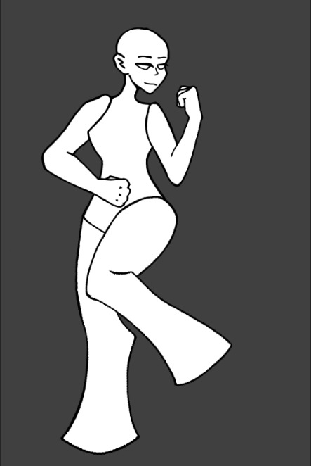
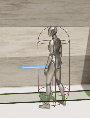
Creating Base Animations
Now that I have a base that has movable limbs, I can begin animating the required movements such as the attack animations, walking and jumping as well as the combination of each.
Punching:
I started with the punching animation as it was the one I felt would be easiest since it only focuses on one limb. The first issue I came across was how Photoshop saves certain changes throughout every frame. I tried to rotate parts of the arm to bring them into a straight armed punch. This did not work as it left the previous frames looking bizarre.
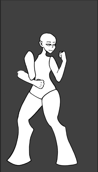
This meant that, for these new frames, I had to use duplicated groups. This, while working now, has caused a massive amounts of groups that I have thankfully been labeling as I go along. I will need to remember to name each layer and group if I do this for even bigger animations.
I created 3 main frames, the base, the punch and the in between. I used several frames of the punch with only one for the base and in between to create a slower pull back from the punch. This should hopefully fit the delay in the attack in Unreal.


My only issue with this animation is that there is a distinct lack of weight when the punch happens, I'm not sure how to fix this but it will be a focus the next time I do this.
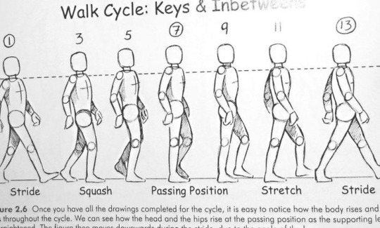
Walking:
The next animation I wanted to do was the walking animation as it is the most important one and the most use one compared to the attacks, jumps and combinations. This animation takes more frames than the punching animation as, without a clear continued movement, it can look very choppy and will not make sense to viewers. This meant that I had to know which frames were crucial before adding in betweens.
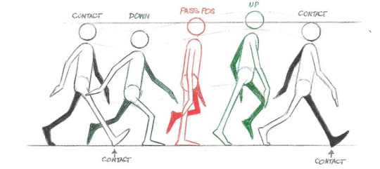
These Pinterest images show the segue frames used to imitate walking, the one on the right in particular. These are guidelines, but due to my character being turned away, will not be easy to follow.
These are the three main frames: stood, left leg up and right leg up. However, these three frames will not suffice on their own as the illusion of walking is not created. This is because the second and third frames look too similar and the human mind cannot imagine the amount of movement that would need to take place between those frames without help.
I then added 4 new frames for in between. This includes the first three that help to mimic the swing of the legs during walking and the fourth that helps to make the animation repeatable by blending the walking into the base stance.
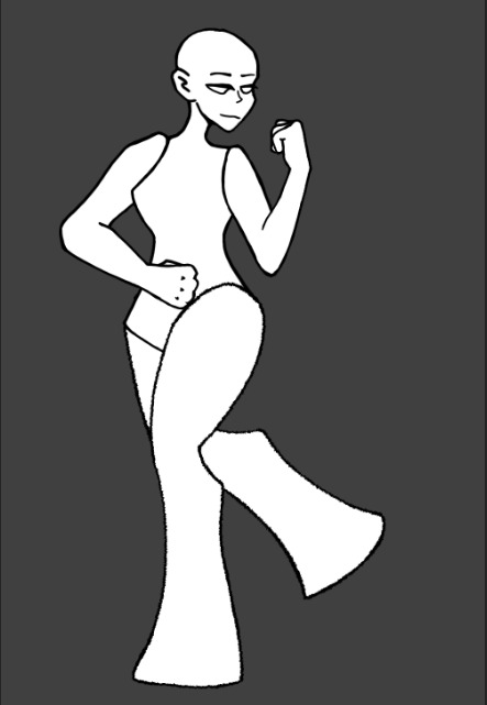
The animation we are left with is this:
The line art for the legs needs cleaning after being rotated and stretched so many times, but overall I am happy with this animation.
0 notes
Text
Minimum Viable Product
The MVP (Minimum Viable Product) is the version of the game that has the least amount of possible features while still meeting the requirements for the game to be played.
For me, my minimum viable product is having a fight that works between player and 'AI'. This needs at least one attack although I am aiming for two and all controls have to be able to be used on the arcade controller.
I also need sound including both music and melee sound effects. This then requires a credit screen so that I can credit the people who created the music and SFX for my game.
The game then needs a win and lose state, each with a method of restarting the fight. These states should give the player some information such as their score as well as the current highscore.
The game also requires a quit button to be functional.
All of these are what I need to make an MVP. Other features such as a main menu and character select screen would be nice bonuses but are not necessary.
0 notes
Text
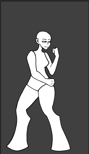
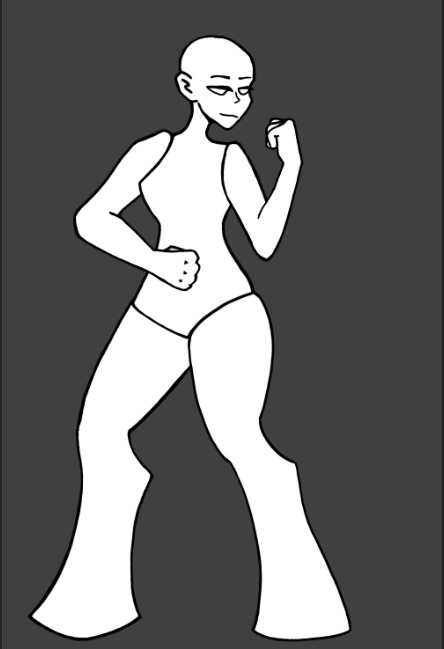
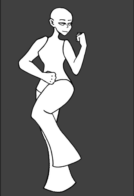
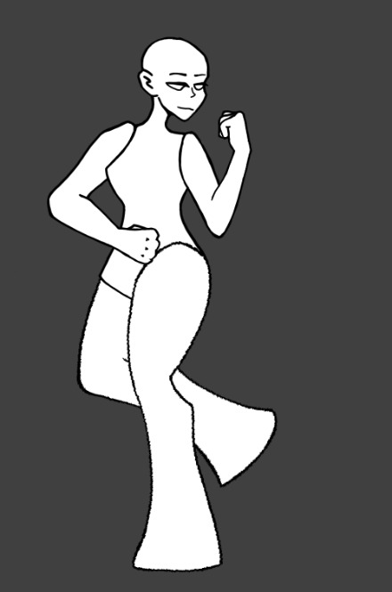
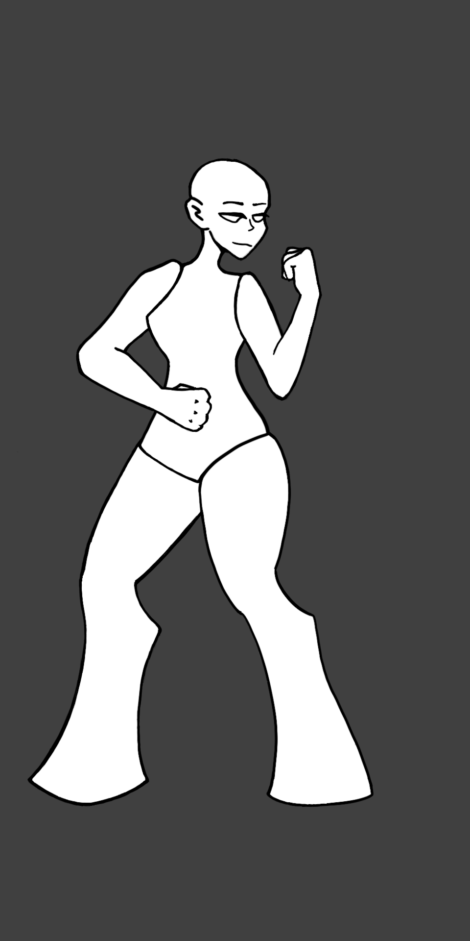
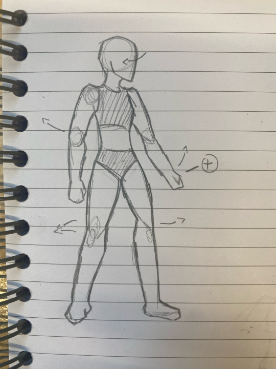
Creating a Character Base
Because I want to save time animating. I'm going to create a base that all of my characters can be built onto. This means that, instead of drawing each character separately and animating them, I can create a base, animate it, and use it multiple times, changing the character by the hair and clothes.
The first thing I want to do for this base is research the poses that I will need to draw and animate. This will help me get a better idea on the anatomy and the art style that I want to use.

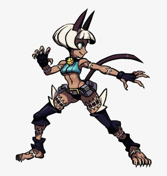

A lot of the references I am using are from Skull Girls 2nd Encore. This is because I want to try a similar art style to Skull Girls since my normal art style is too realistic to be easily animated.
Next was deciding on the anatomy of my base, I did this on paper because I find it easier to sketch traditionally.
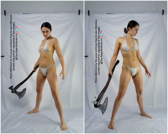

My first sketch was to get a feel for anatomy again as I don't often do full body drawings. It especially helped me get used to the way the body was going to face the camera. I then added some things that I wanted to try out in the next sketch such as moving limbs and scaling the hands bigger. The next sketch was based off of the Skull Girls posing. I wanted to focus on this specifically as most Skull Girls' characters use very dynamic poses, having the body face away from the head etc. I also used the top left body reference from the sheet as inspiration for larger legs, having a base focused on being bottom heavy. Bottom heavy characters often feel more stable as they look more connected to the floor, this gives them a sense of strength and endurance, perfect for a fighting game.

I then begin to recreate the drawing in Photoshop.
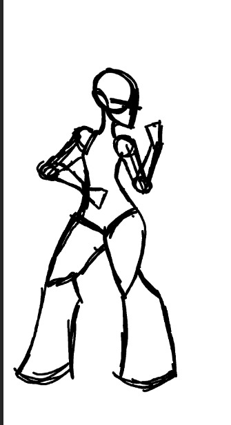

Next was creating the base that could actually be used, meaning each moving part needed to be drawn on a different layer for easier animation. I then added a base colour underneath each layer. Each body part's outline and base colour have been put into different groups.


0 notes
Text
Creating a CPU Pt. 2
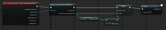
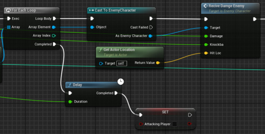
Receiving Damage Event:
So that the player's attacks can work properly, we need to make it so that the enemy receives damage differently to before. This uses another custom event that has pins for the amount of damage, the amount of knockback and the location of the other actor when hit. The first part takes the amount of damage done by the attack and subtracts it from the enemy's health so that it can be used for multiple attacks with different amounts of damage.
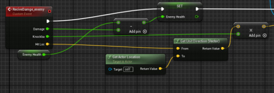
Next is the knockback which is done by adding an impulse that occurs using the knockback amount multiplied by both actors locations.

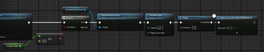
At the end of this event, we can add the death check. This means that the death check will no longer occur every tick, keeping costs down. This code just checks that, when the enemy's health reaches 0, they can no longer move or attack and will then open the win level once the delay for their death animation plays.
Main AI:
Now that all of these parts are finished, we can create the main code for the AI. This begins with the event tick as they need to be moving at a constant to keep player attention. Then we have it perform its events from before.
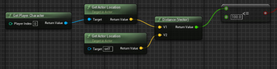
We then make sure that the enemy is always facing the player as it makes it easier for the AI to actually fight back when they're always facing the player. This uses both actor locations, the enemy's as the start and the player's as the target to look at.

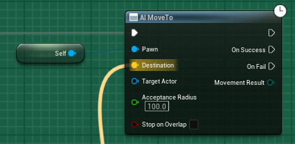
We then have the AI move to node back with itself as the pawn and a specific set of code for the destination. The acceptance radius is 100 so that it won't have to be on top of the player at a constant and will accept being within 100 of the player.
The code used to actually decide the AI's destination is complicated, using both the player's exact location as well as the distance between the player and enemy combined with the fidget amount to create a suitable location.

This is all of the code used to create a basic combat CPU for my game.
0 notes
Text
Health and Player UI
We start by adding a health variable to the player.

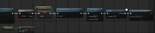
Next is making it so that, when the player's health reaches 0 or less, the player will be put into the game over screen.

Now I've added some code so that the player will lose health when the enemy overlaps with them.
We can now start the player UI, adding a progress bar for the health.

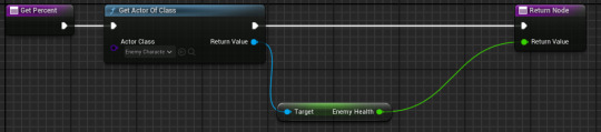
Now we add the code that links the bar to the player's health. The player's health is divided by 100 so that the result is a percentage rather than just an integer.

Next is repeating this using the enemy's health. This is done by using the same code but replacing the actor of class with the enemy's class and changing the variable to the enemy's health rather than the player's.

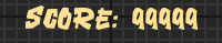
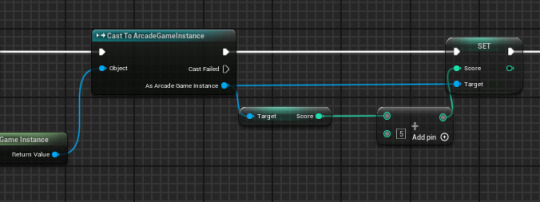
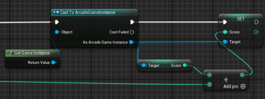
Next is adding a score tracker so that the player can see how many points they have. This is done by adding text to the canvas and binding it to code that looks like this:
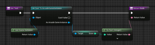
This code takes the score from the game instance and turns it into text that can be displayed.
However, I have now changed how the attacking system works and so need to update how the player's health works. The way the player receives damage now is by a custom event that triggers when the enemy successfully attacks the player. This event requires the health to become a float rather than an integer as it allows us to use a damage variable that can be changed depending on the attack.

Knockback has also been added, using the location of both actors to decide which direction the knockback needs to send the player.

We can then also add in the death check in this piece of code so that the check only occurs when damage is taken rather than each tick.
Because we have changed the health systems from integers to floats, we need to go change how the health bars work. This just requires removing the divided by 100 node.
With those being the main functional parts of the UI, its time to move onto making the UI cleaner. To start with, I have imported a few fonts to try on my text to help make the UI feel less generic.
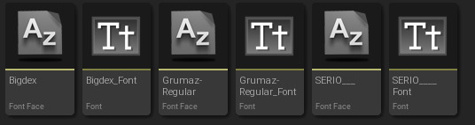
These are all exported, extracted and imported from DaFonts. All three of these are also 100% free use, meaning that I have permission to use them.
I have chosen option one: BigDex as it feels the most like a fighting game font to me. This is due to its strongly stylised writing.

I then changed the colour of the text, finding that a yellow was best in terms of sticking out and not being too harsh on the eyes.
Next, I changed the bars so that they were both a reddish pink (colour associated with health) and that the enemy's health bar goes from right to left rather than the default left to right to help with mirroring.


The next main aesthetic part for me to do is creating a portrait image for the corners as well as a backing for the health bars. Both of these help to hide the default health bar so that the game looks more unique. I also want to add a backing to the score so that its easier to read.
0 notes
Text
Melee Attacks
For this fighting game to actually work, I need to add a way for the player to attack the enemy.
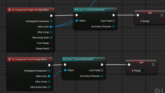
First we need to create a collision box for where the range of the attack will reach, this is done in the character viewport.
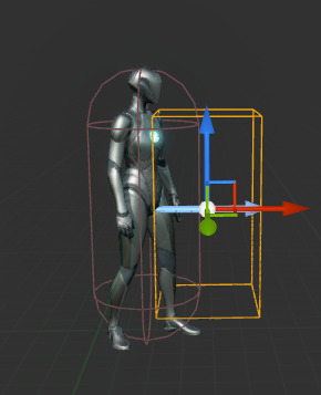
Now we need a variable for the range. This is a Boolean so that it can be checked if true or not.

Then we can two lines of code. The first line sets the InRange variable to true whenever the enemy overlaps the collision, telling us it is within range. The second unticks the InRange variable when the enemy leaves the player's range. This stops the player from being able to attack the enemy when they're not supposed to.
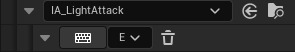
Next is adding an input action to the mapping for the light attack, this is done the same way as the quit button from before.
We can now make it so that, when the input action key is pressed, the code checks if the enemy is in range before removing some of its health.
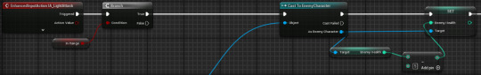
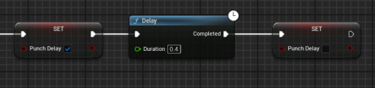
The issue with this code, however, is that there is no delay, meaning that, when the player presses the button, the attack happens several times. This is fixed by using another Boolean variable and branch that checks for PunchDelay.
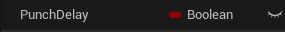
Then, by having the Boolean tick and untick at the end with a delay in the middle, we can stop the attack spam.
I can then also add the way to get points here as I want the player to get more points for using different attacks.
Using this code, I can create a heavy attack by using a different input action and adjusting the damage, score and delay time.
This code, however, is not very useful since I plan on making multiple attacks. If I want to then change how these attacks work in the future, I would have to change each attack manually. The code also won't work for the enemy character.
To optimise this, we need to create an attack event that can be used by the player. This event will have multiple pins that can be adjusted when the event is used. This allows us to reuse the attack event for different attacks because we can adjust certain aspects.
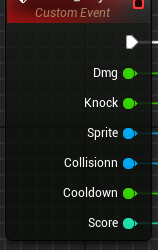
These are all the pins we will need:
Dmg allows us to change the amount of damage done depending on which attack is used.
Knock allows us to change the knockback that is inflicted on the enemy depending on the attack.
Sprite changes which sprite is used for the attack, whether its the punch animation or kick etc.
Collision lets us change with box is being used as the range of the attack, this lets us make longer ranged attack or attacks that hit higher/lower.
Cooldown lets us change how long the attack takes to replenish.
Score lets us change the amount of points the player gets for each attack.
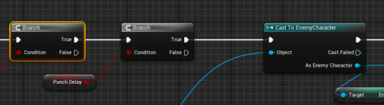
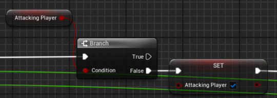
Now we need a way to determine if the player is attacking already, this is so that the attack cannot be spammed and everything is forced to play out correctly. This is done simply by adding a new variable and checking to see if its false. If it is false (player not attacking) it needs to be set to true.
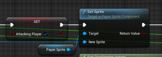
Then we have the part that decides on the animation. The target is the sprite that is in the viewport of the character as that is the sprite being changed. The new sprite pin is connected to that sprite pin in the event.
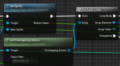
Next is checking that the enemy is within the range of the player character's attack. This is done by using the get overlapping actors node which is connected to the collision pin from the event. This checks for ALL actors that overlap this collision box. To make sure this only uses the enemy character, we connect the array to a loop that checks for a specific array element, in this case our enemy.
This check has two results. If the enemy is in the collision when the attack is pressed, it will cast to the enemy character and cause another event called 'Receive damage enemy" which will be explained in the enemy AI portion. This event uses the dmg and knockback pins from the event as well as the player's location. If the attack does not land, there will be a delay before the attack variable is set back to false so the player can try again (this bit is needed as else a failed attack will prevent the player from ever using the attack again).
The final section is what gives the player points for a successful attack.
0 notes
Text
Crouching
Because my game is using the up direction to jump, I want the down direction to make my character crouch which can then be used to help dodge. Because I wasn't sure where to start in terms of moving the hitbox, I searched for a video.
youtube
This video explained that there is actually a default crouch option that is just set to false on the character. By ticking this to be true in the character movement and adding it to an input action, I can have my character crouch and uncrouch easily.

There are two options for how crouching can work: holding or toggling.
For holding:

For toggling:

0 notes
Text
Creating a CPU Pt. 1
Because the arcade machines don't have a good setup for two players, I want to create a basic AI to fight the player.
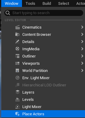
To start, I want to get an AI that moves around the fighting area. I can do this by going into the window tab, selecting place actors and adding a NavMeshBoundsVolume. This can then be stretched to the desired area that the AI can walk around. (Can use P to see where the AI can go).
Now a third person actor can be added.
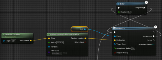
In the character blueprint, add an AI MoveTo node off of the EventBeginPlay. We can then add the option to randomise movements by using the GetRandomReachablePointInRadius (put actor location as origin so that the AI won't pick same spot again).

Add a self reference to the Pawn pin on the AI MoveTo node so that it knows what pawn is being controlled by the AI. Then add a delay so that the AI doesn't constantly move. This delay should loop around to the start again.
This now means that we have an AI that moves randomly about the map. Now, I want it so that the AI follows the player.
To do this we first get rid of the random point and actor location nodes.

Now we add a Get Player Character node and attach it to the Target Actor pin so that the AI knows that the player is the actor it should be targetting.
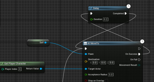
Now, in case the player is out of bounds, we need to connect the On Fail pin to the delay as well.
Now the AI follows the player at a constant.
For my game, I need a much more complicated AI. This required some help since a lot of this is much more complicated than what I have learned so far.
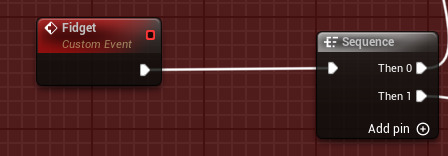
Fidget Event:
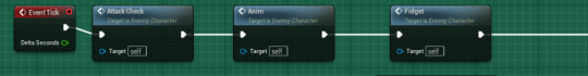
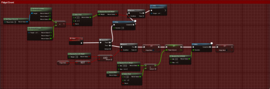
The first thing I need before building the main code is a way to make the AI move in a way that actually makes sense for a fighting game. This is done by creating an event that will occur on the event tick that I will call 'Fidget' as that best describes what we want the AI to do. This fidget needs to do two main things which will use a sequence.
The first bit that the fidget needs to do is to make the enemy character have a chance to jump. This starts with a delay (stops him from spam jumping) and a branch that will have a condition that needs to be met before the AI can jump.
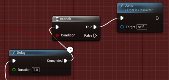
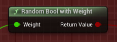
For this condition, we need to add a weighted bool, this allows us to change the chance that the character has of jumping depending on certain aspects
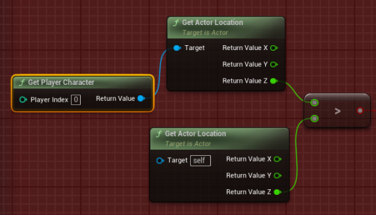
The aspect we are using to change the chance is whether the player is higher up than the AI. This will make it so the AI will have a much larger chance of following the player up when the player tries to jump out of the way. This code checks to see if the player character's Z location is greater than the AI's.
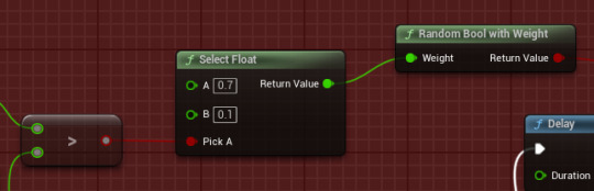
We then add what percentage we want for each result (player is higher and player is lower). This is done by using a select float node that has the 'Pick A' pin connected to our greater than condition. This means that, when the greater than node is true, it will pick A which is the larger percentage.
The next half of the fidget event decides how the enemy will move. We start with a branch that will decide whether the AI should move at any given time.
The condition for this branch consists of a 50% chance and if the fidget bool variable is not active. This makes it so that this condition cannot be met when the fidget bool is active and, even when it is, the chance for the condition to be met is only 50%, making it feel more decision based. This feeling of a decision is important as it makes the enemy feel like an actual AI rather than what is actually is.
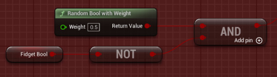
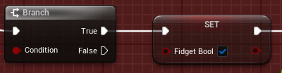
Once this condition is met, the fidget bool is set to true to prevent the event starting up again while the event is still playing.
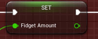
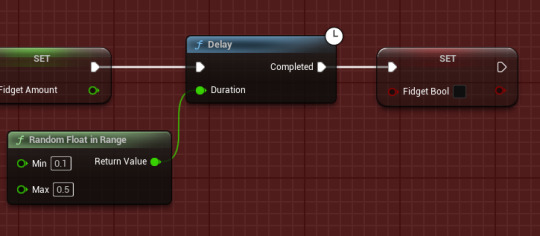
Next is giving the fidget a range, this makes it so that the enemy character can move differently each time as, if the enemy could only move the same amount each, it would get predictable and boring. This is done by having a range for the amount the character will move as well as a 50/50 chance of the enemy character switching which side of the player it is attacking from. These are multiplied together so that they can be given to the set fidget amount node in the main code.

Next is putting a range for the delay so that the movement also feels choice based rather than just on a timer. This range currently makes it so that the enemy character will move for at a minimum 0.1 seconds and at a maximum 0.5 seconds before ending their movement.
Whole event:
Animation Event:
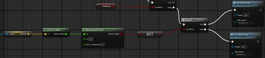
Next is setting up the statement machine so that different animations will occur depending on different conditions. This will also be done on a custom event that can be added to our main code later on. First is the death animation that will play when the Dead variable is ticked (occurs when enemy health is equal or less than 0).

Next is the falling animation that is triggered when the is falling condition met, this then leads on to the next branch that checks if the player is attacking mid air. All of the attacking animations are left blank as they are added in the attack event rather than in the statement machine.

The character's velocity is then checked to see if the character is moving, if yes the animation will be their walking and if not it will be their idle animation.
Attack Event:
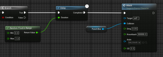
The attack event is what will cause the enemy to punch the player. This uses a custom event with several pins that can change different aspects of the attack so that, if I want to add more attacks I can reuse this piece of code.
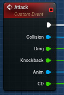
Collision is what box is being used which determines the attack's range.
Dmg is how much damage the attack will do.
Knockback is how far the player will be knocked back when attacked.
Anim is which animation will play during the attack.
CD is how long until the attack can be triggered again.
This small piece of code stops the attack from being able to be spammed by the AI.

This changes what animation is being played to signal which attack is being used.
This checks for the player inside the collision box, if they are the attack will cast to the player and if not the attack will end.
This makes the receive damage event occur in the player to make them take damage before ending the attack.
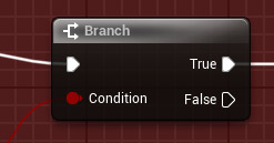
Attack Check Event:
Now we can create an event that checks for when an attack should be done. The attack check starts by using a condition to determine if the attack should occur.
This condition will use distance the enemy is from the player and will allow the enemy to attack when within 100 of the player. This makes it feel more realistic as the enemy can slip up and attack too son or too late.
We then add another range delay to prevent constant attacking while making the attacks look more random.
0 notes
Text
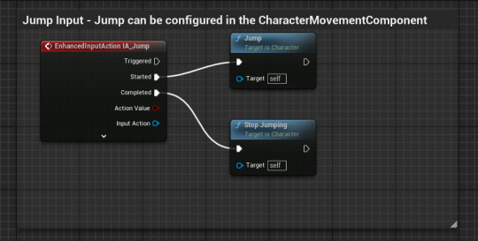
Prototyping: Controls and Camera
Because I want my controls to be different to what I have done in the workshop, I need to test how to adjust what I've learned to create what I need.
This has started with me recreating the 4 way movement that was created previously for the arcade test.
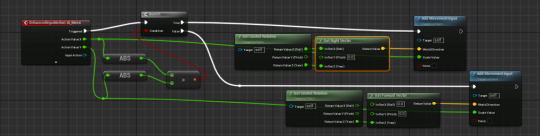
We now want to change the character's rotation rate so that, instead of turning slowly, they flick from one side to the other.
Next I want it so that moving up will make the player jump rather than move up. This is done by deleting the forward and backward movement (2D game so not needed) and replacing it with jump.
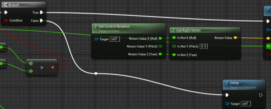
The main issue with this is that now both moving up and down cause the player to jump, to fix this I have added a branch that checks if the Y movement value is positive. If it is positive, the character will jump.
Now we can remove the default method of jumping.
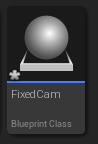
We can then also delete camera input as we want the camera fixed to where it is.
Now we can add the fixed cameras from before using a new actor.
0 notes
Text
Character Design Survey
To help pick out which character designs I should use, I created a survey with each character, the goal they were based off of, the designs and a little bit about what inspired those designs.
Goal 1 - No Poverty:

Both design 2 and design 3 came close to winning with design 1 being the least picked. Design 3, the bee design, won in the end with 1 extra vote.
Goal 3 - Good Health and Wellbeing:
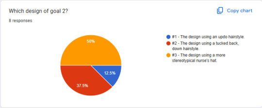
Goal 3 (ignore chart saying 2) had a similar chart to Goal 1 with designs 2 and 3 being the main contestants. Just like before, design 3, the nurse's hat, won by an extra vote.
Goal 4 - Quality Education:

Goal 4 had a lot more a unanimous decision with most people picking design 3, the modern, sci-fi robot design.
Goal 7 - Affordable and Clean Energy:

Again, Goal 7 as much more unanimous. Most people picked design 1, the wind turbine design, with design 3 not getting a single vote.
Goal 9 - Industry, Innovation and Infrastructure:
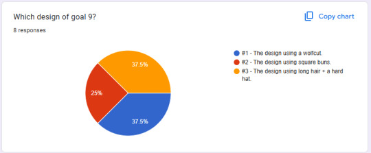
Goal 9 had our first and only tie between design 1 and 3. Because the two designs have tied, I plan on using a mixture of both. This will most likely be the wolf-cut hairstyle of design 1 being combined with the hard hat of design 3.
Goal 14 - Life Below Water:
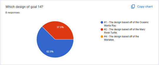
Goal 14 had another clear winner with design 1, the manta ray design, being the most popular choice and design 3, the manatee, getting none.
Goal 15 - Life on Land:
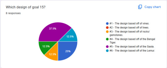
Goal 15 had 3 extra designs and so the chart is a lot more divided. Design 1, the vine design, came at a close second with design 5, the saola, winning the popularity vote.
Goal 16 - Peace, Justice and Strong Institutions:
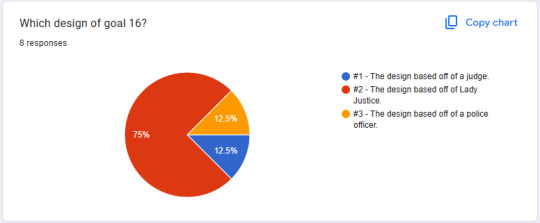
Goal 16 had another clear winner of design 2, the Lady Justice inspired design.
With all of these concepts being chosen, I can now start on getting a working base for them all. This is partly why all of the designs are female, as all of them can use the same base.
0 notes
Text
UI Research
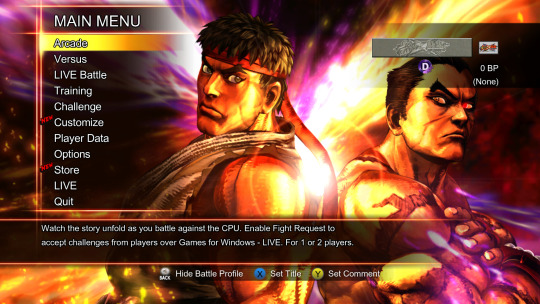
So that I can get a better idea of what type of UI I want in my game as well as what style I want my UI to be in, I am researching 5 different fighting games to see how their UIs differ, what they do similar and what I think looks best in each one. I will be focusing on both the character select screen and the mid fight UIs as they're what I will be focusing on myself in my game.
Street Fighter 6:
Street Fighter 6's UI is very clean, using a pink to blue gradient as its colour scheme. The buttons and menus themselves are very simple, having a slanted square shape along with glowing outlines to show which part of the menu is selected.
The character select screen has the same colours, using the same basic shapes for the character portraits. I personally dislike this simplicity as it feels too generic, I prefer when games create a more stylised select screen that feels more in line with the world of the game.
The UI during the match is also very simple. It also uses the same palette as everything else which helps to tie everything together. The health bars are slanted to give them more of a dynamic look that also fits in with the previously seen menus while the character portraits focus on their eyes. I like the use of just their eyes as it stops the portraits from being too distracting while also conveying the main aspects of each character.
Street Fighter X Tekken:
Street Fighter X Tekken's main menu style is very basic, using transparent black boxes with text. What I do like about the menus however is the use of dynamic character poses in the background. Having characters either interacting or just posing in the menus allows the player to see what type of character they are and who they like/dislike.
The character select screen in this Street Fighter game is much better than the last one in my opinion. This is because, despite using basic squares for the character portraits, the menu itself has a lot more personality partly because of the stone background as well as the use of having both characters in frame staring each other down.
I also prefer the mid fight UI in this game to the previous as it has much more uniqueness to it. The bar is curved, making it less plain compared to the basic rectangular shape. The character portraits are also placed in the middle, making them actually face off rather than having them hidden in the corners of the screen. This helps to emphasise the fight.
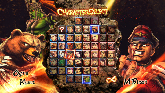
Skullgirls - 2nd Encore:

Skullgirls' menu is heavily inspired by old film and the Art Deco style, using the film reel for decoration and Art Deco motifs in each menu option.
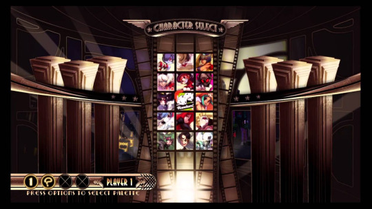
The character select screen keeps the old style film motif, using film reel to hold the character portraits. I love this style of menu as it both keeps a strong theme throughout the game and gives the game a sense of self. The strong shapes used from the Art Deco period are also used, this time as decorations in the background.
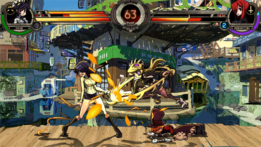
The UI in game is a lot simpler, using the same slanted health bars as Street Fighter 6. While I do prefer the curved bars from Street Fighter X Tekken, I do still like these bars as they feel clean and are easy to read while not being boring. What I want to focus on is the timer in the middle. I love the idea of having the timer front and centre as a way of pressuring the player during the fight and will probably be using the same placement for my timer.
BlazBlue - Central Fiction:
BlazBlue's menu is very reminiscent of most anime games such as Dragon Ball Xenoverse. The menu also uses a very blue colour palette, helping to make the characters in the corner stand out even more compared to the rest of the screen.

The character select screen also uses the blue colours but toned down to allow for the character to be the focus. The honeycomb structure of the character portraits is probably my favourite way to stack characters so far.

BlazBlue keeps its UI very simple, using the basic bar shape. This, however, is surrounded with detail so that it doesn't feel boring. The character portraits show a bust of each character, I prefer this to just the face as it feels more unique for each character. The timer is big and bold so that the player can see the time without having to take their attention off of the actual battle, this is important as a confusing and cluttered UI can distract and anger the player.
Mortal Kombat:
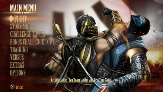
Mortal Kombat's menu heavily focuses on what the game consists of, having characters mid fight as the background. This is always a good use of empty space as it keeps with the tone of the game and lets the player see the characters interacting.
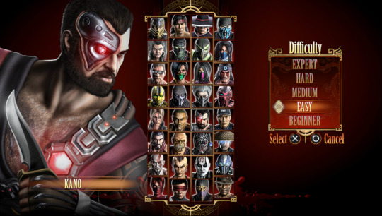
The character select screen is very basic with each character having the same pose and the background having no detail. While I prefer the more detailed character select screens, I can certainly see the appeal of not having to give each character a unique pose (especially with the size of the Mortal Kombat roster).

The in-game UI is also very basic, having just a base bar and timer with portraits that are just from the character select menu. On one hand, this style of UI is pretty boring and visually unappealing. however, its important to remember that this is a fighting game first, meaning most players don't care about UI visuals and just need the UI to have clarity. Overall, this game knows that it is a fighting game and has focused on getting that done over all else.
Out of these styles, I generally prefer the more unique and bold aesthetics. This is because they help to give the game a sense of identity among all of the 2D fighters that exist.
0 notes
Text
Attract Modes
An attract mode is a prerecorded section of gameplay that is displayed on screen when the game is not being played. This form of advertisement is used most commonly on arcade machines as a way to entice players into choosing that specific game over the other games that would typically be lined up together in an arcade.
This is important for any arcade game as, if the game doesn't attract players, the game won't be played. Arcade games are often in competition with the other games around them, meaning that they need to have a more appealing attract mode if they hope to win over players.
youtube
This Batman Arcade attract mode is a good example of an appealing video. The video contains many important aspects such as main gameplay to show the player what the game is like, cut scenes that show the starts to the story as well as giving players a chance to see the characters as well as small tutorial sections to help those who are unsure on where to begin.
0 notes
Text
Top Down Shooters
For this piece of research, I am going to pick 5 games from this video and explore their features and style.
youtube
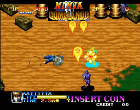
Ninja Commando:
Ninja Commando's graphics are pretty realistic given the year it came out (1992). The game gives the player the option of 3 characters each with different abilities allowing the game to both appeal to a larger audience and give players variety after playing the game for a while. Ninja Commando is a vertical scroller, meaning that, instead of going from left to right when progressing through the level, the player has to go up from the bottom. I personally prefer the horizontal scrollers to the vertical ones as I struggle with the depth, especially on older games with flatter graphics. I do, however, really like the use of multiple characters with differing moves.

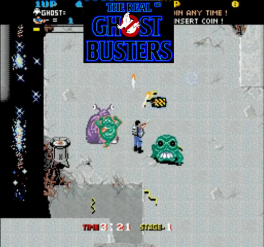
The Real Ghost Busters:
The Real Ghost Busters graphics are very simple, using basic outlines and shading with very few shades per sprite. The scene is especially simplistic, consisting of a white stone backdrop with a black background and small pathways between floors. I personally dislike this simplicity as, in terms of repetitive play, can get boring to look at very quickly. The game uses a mix of horizontal and vertical scrolling, having the player able to move freely around the map. I really like the sense of freedom this gives the player as they can chose where they think is best to be on the map.

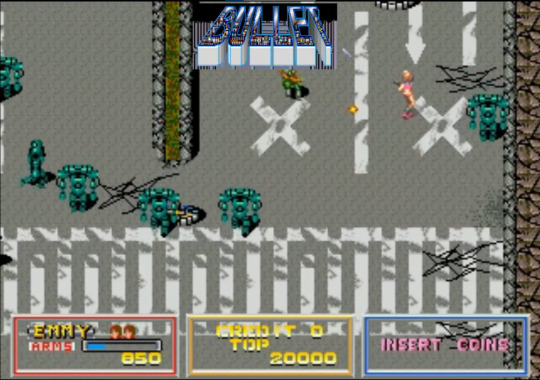
BULLET:
Bullet's graphics are semi-realistic, having shading and realistic proportions while still being simplified and stylised. I really like this style as it mixes both realism and simplicity really well. This game also uses free movement but to a lot less of an extreme, focusing on vertical movement with only a little bit of horizontal. This is well implemented as it helps to give the player more space while still giving them a specific correct way to follow.

Out Zone:
Out Zone's graphics are very well done, with the extreme top down perspective still being clear to the player. The scenery is also nice with details going into the tracks on the floor and certain parts of the terrain that are inaccessible being shown to the player by obvious but still natural looking rock formations.


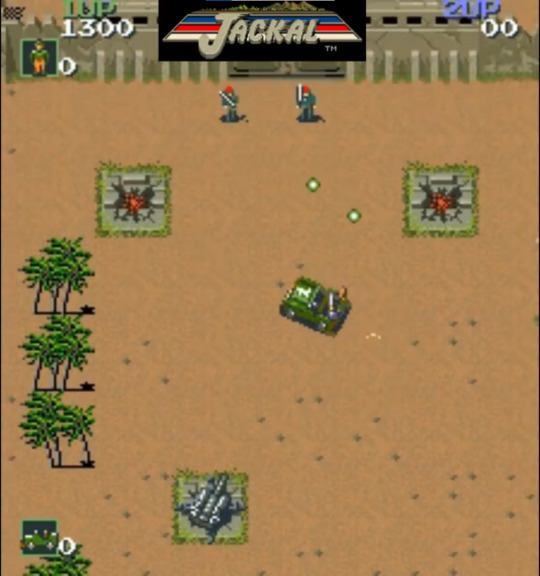
Jackal:
Jackal's graphics are very simplistic, however, unlike Ghost Busters, I like this form of simplicity. This is because of how zoomed out Jackal is compared to Ghost Busters. Because Jackal has the player controlling a car, the game is played in a much further out perspective, meaning that less detail should be put into sprites as they don't have many pixels to work with. This makes it feel more real while Ghost Busters just felt empty. The use of the car is also another unique aspect as most top down shooters have the player playing a character rather than controlling a vehicle. I like this change of pace, especially since the car still controls very well.

0 notes
Text
Concepts and Character Design Pt. 2
Due to the 30 photos per post limit the final designs have to be included here.
Goal 15 - Life on Land:
For goal 15, I wanted to do a similar thing to goal 14 by using different endangered animals to spread awareness. However, I also had a number of nature based ideas that could focus on the Earth side of life on land. Because I was struggling to pick three designs to focus on, I have instead done three designs for both main ideas, having three plant based designs and three endangered animal designs.
Design 1 is based on vines and flowers.
Design 2 is based on trees.
Design 3 is based on rocks and gems.
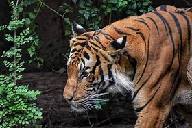
Design 4 is based off of a Bengal Tiger.
Design 5 is based off of a Saola.
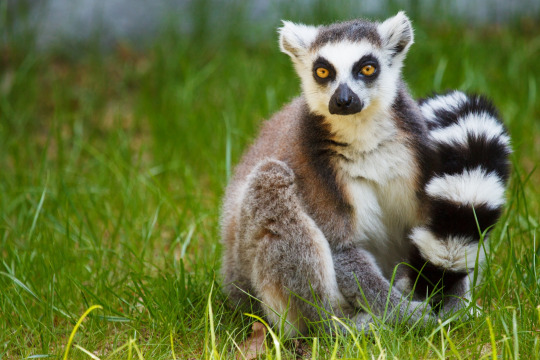
Design 6 is based off of a Lemur.


I have not designed weapons as there are too many different ways I could take these designs. I will decide on a weapon when I have the design that I will use.
Goal 16 - Peace, Justice and Strong Institutions:
For goal 16, I wanted to focus on parts of the justice system. This included physical parts of the system such as the Judge in the courtroom and a Police Officer as well as the symbols of justice such as the Lady Justice statue based from the Ancient Rome goddess of Justice, Justitia/Lustitia.
Design 1 is based off of a Judge.
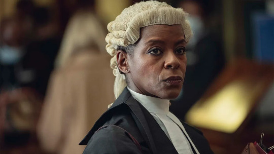
Design 2 is based off of Lady Justice.
Design 3 is based off of a Police Officer.


I have also included possible weapons for when the character is implemented.
Now that I have all of these concepts down on paper, I plan to use a questionnaire to have classmates and friends vote on the designs they like the most. This will help me decide on which designs to use and which characters should be done first.
0 notes
Text
Concepts and Character Design
Now that I have chosen which idea I want to base this project off of, its time to begin developing concepts into a more solid plan.
To begin, I have altered how this project will relate to the United Nations' 17 goals. Instead of using one goal as the overarching theme for my characters, I have decided to instead use different goals as a base for each character design. I have done this so that I can create more characters as well as give myself for freedom to explore more unique designs. Out of the 17 goals, I have managed to select 10 that have the grounds for a design. Some of these (goals 2 & 6) have been starred but not designed as, when attempting to create designs fore these, I struggled to make them stand out from other designs.

Next was planning out designs for the characters themselves. Because I want a decent roster of characters, I have tried to make several designs of each character so that I have at least one design that I want to include in the game.
Goal 1 - No Poverty:
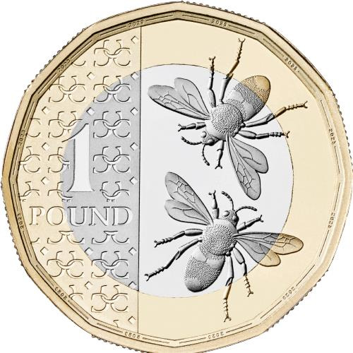
For goal 1, I wanted to use what came to my mind when I think of a lack of poverty. I started with the idea of money and expensive items in general. This was then focused down to expensive metals (gold/silver) and forms of currency (coins/bank notes). I wanted to use both of these concepts and so picked the £1 as a base for my design as it has both silver and gold and is a form of currency. Each design is based off of different £1 coins.
Design 1 is based off of the Queen's portrait on the £1.
Design 2 is based off of the Lion from the Coat of Arms on the £1.
Design 3 is based off of the rare King Charles' Bee £1.


I have also included possible weapons for when the character is implemented.
Goal 3 - Good Health and Well being:
For goal 2, I already had a more concrete idea of what I wanted to do. I wanted this character to be based off of a healthcare profession with either a doctor or nurse being my main two options. I did also consider a therapist based design, but that was scrapped due to a lack of a distinction, meaning that it would be too hard to understand what the character was meant to be. Because I already has a clear idea of the main design in my head, I used the alternate versions as a way to explore different hairstyles for this character. I tried to make sure that all 3 hairstyles were unique as well as somewhat reasonable for a doctor/nurse to have (hair must be up or back).


I have also included possible weapons for when the character is implemented.
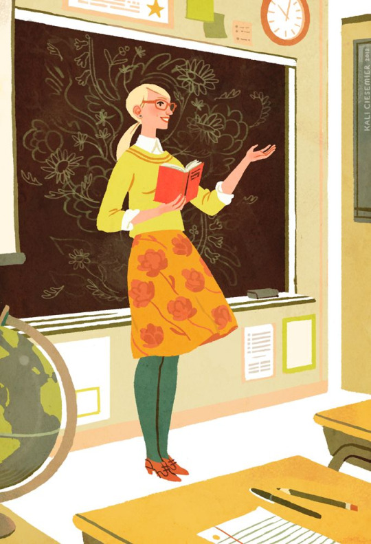
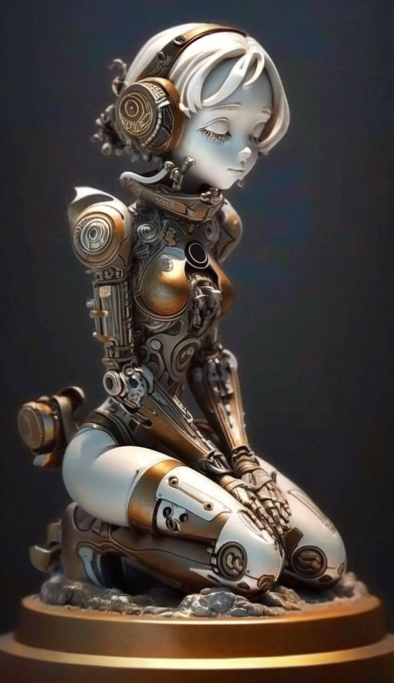
Goal 4 - Quality Education:
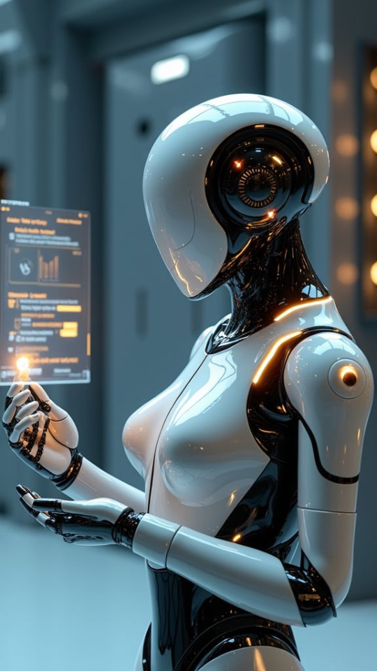
For goal 4, a few different ideas stuck out to me. This included a teacher, a nerd stereotype and a robot/AI design. I wanted to avoid using the nerd stereotype as it felt unnecessary and instead wanted to focus on the teacher and robot ideas. The robot design was where I was least sure as there are many different ways I could take the idea to, whether that's steampunk, sci-fi or something else entirely. I just had one rule and that was to keep it humanoid so that it could be applied to the base that I will be using for each character.
Design 1 is a human teacher.
Design 2 is an old-fashioned, steampunk robot.
Design 3 is a sci-fi, futuristic robot.

I have also included possible weapons for when the character is implemented.
Goal 7 - Affordable and Clean Energy:
For goal 7, I wanted to focus on the clean part of affordable and clean as its easier to show in character design. For the different designs, I decided to use different forms of sustainable energy, one for each design. To start, I listed a few different energy sources such as wind, solar and hydroelectric/hydroponics. I wanted to use a different source for each character to help get a good range of designs as I was relatively unsure on what I wanted this character to be.
Design 1 is based off of wind turbines.
Design 2 is based off of hydroponics.
Design 3 is based off of solar panels.


I have also included possible weapons for when the character is implemented.
Goal 9 - Industry, Innovation and Infrastructure:
For goal 9, I wanted to focus on the infrastructure part as it was easiest to base designs off of, however, I will be including parts of industry in my designs. My main concepts was to have the character be made of concrete, appearing as a statue. This then allowed me to add different eras of building designs on top such as Art Deco and Brutalist architecture. I haven't managed to include as much of the symbols from these eras in the designs as much as I would like and so I plan on adding them in future versions.
Design 1 has a wolf cut and has earrings based off of Art Deco symbolism.
Design 2 has square buns as a nod to brutalism.
Design 3 has long straight hair with a hard hat for industry.


I have also included possible weapons for when the character is implemented.
Goal 14 - Life Below Water:
For goal 14, I really wanted to explore creating characters out of unique animals. This led me down the idea of using different endangered sea animals, preferably lesser known ones, as a way to highlight the importance of this goal. I wanted to use lesser known animals specifically as a way to make people aware that more species are endangered than the few that are often discussed in these types of conversations.
Design 1 is based off of a Giant Oceanic Manta Ray.
Design 2 is based off of a Mary River Turtle.
Design 3 is based of of a Manatee.


I have also included possible weapons for when the character is implemented.
0 notes