
Don't wanna be here? Send us removal request.
Statistics
We looked inside some of the posts by emackenzie-03 and here's what we found interesting.
Average Info
Notes Per Post
1
Likes Per Post
1
Reblog Per Post
0
Reply Per Post
0
Time Between Posts
10 days
Number of Posts By Type
Text
8
Last Seen Tumblr Blogs


Fun Fact
Tumblr was attacked by a cross-site scripting worm deployed by the Internet troll group GNAA on Dec 3, 2012.
Text
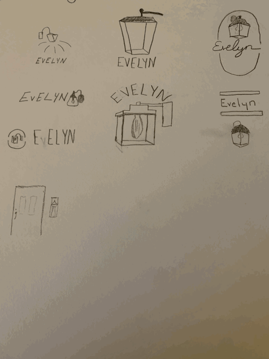
Here are some rough logo sketches that go with my process blog for project 3.
0 notes
Text
Project #4 Process Blog
I am happy that we ended up recreating an image for our fourth project, because that was the option that I had voted for. I also wanted another crack at using photoshop, because I had learned mostly how to manipulate an existing image from project 2, but wanted to create something this time. Immediately I had ideas in my head of an image that I wanted to recreate. Everytime that I see an image that has to do with nature that has been manipulated I find it intriguing. The process for gathering inspiration was generally easy for me. I gathered some images of manipulated landscapes, a woman who had been edited so that she was inside of a bottle floating in the ocean, and a lighter where water had been manipulated to look as though it was a flame. This was my favorite, mostly because it was so ironic and simple, yet well-done. It also meant that I would learn new skills on photoshop. I started by gathering an image of a lighter with a black background for my first layer to the image. Next, I had to search for an image of water being poured to manipulate into a flame. It is important that the water image also has a black background. Lighting plays a very big role in how the image would come together, so both of the images that I would use together needed to have the same lighting in the background. Puppet warp was the main tool that I used to achieve the flame look with the water. This was an incredibly useful tool. In addition to puppet warp, I also became a lot more comfortable with the magic wand tool and layer visibility to achieve the flame look that I was going for. It took some trial and error, but I was able to manipulate the water into a flame coming out of the lighter.
0 notes
Text
Project #3 Process Blog
The third project was probably my favorite that we have done. The process for this project felt the most in depth, and I felt as though I was able to work through that process of turning an idea and concept into a physical logo. When I was thinking about adjectives that described me the best, I constantly came up with adjectives such as dependable, consistent, etc. When we spent class time brainstorming how to turn adjectives into a physical object that could be used in a logo, I already knew that I wanted to do something with a porch light. To me, a porch light represents safety and dependability. Now that I had a general idea of what I wanted to do, it was time to translate that into a logo. Early in my decision process you suggested that I check out monoline logos, which focus on building an image or scene with lines of equal weight. I started out by sketching some little designs of what that might look like. Some of those sketches featured a little porch and tree scene per your suggestion. Other sketches that I made focused solely on the porch light itself. After some brainstorming with you, I landed on a design that would focus on the porch light figure in the middle, with some lines surrounding it in a radial pattern, almost like beams of light. The process of turning that I could see in my head into an actual design on Illustrator took a lot of time. It took a lot of trial and error to get myself used to some of the tools, and I had to watch a couple of Youtube tutorials to get some parts done. After I had the general image of my logo done, I had to find a way to incorporate typography. I knew that the general theme of my logo was clean and consistent lines, so I needed to choose a font that followed that. I ended up browsing a lot of different fonts until I landed on a simple one. I wanted it to be so that my first name and last name followed the circular shape of my logo. This process was difficult, and if I had to redo this project again, I would probably fidget with that part of the logo to make it look a bit more polished.
0 notes
Text
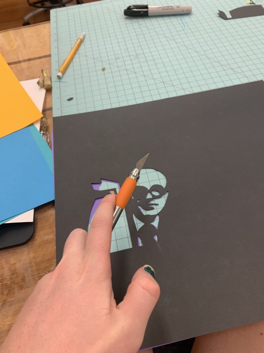
Here is an image that can be paired with my Project #2 Process Blog. Here, I am cutting the positive space out of the negative space to create a portrait.
0 notes
Text
Project #2 Process Blog
The second project was something completely new to me. It combined new forms of material with some that I had used previously. I have used a bit of photoshop in the past, but almost completely lost any skill set that I might have had, so the photoshop work did not come naturally to me. The person that I chose to use as my image is one of my favorite architects, Philip Johnson. I really like Glass House. I struggled starting out with separating my original image into the contrasting positive and negative. I ended up creating a gray background and making the positive and negative more separated. This was per your advice. Then, I went to the light table and messed around with deciding if I should cut out the positive or negative from the original. This took a lot of trail, error, and help. This project was difficult for me to conceptualize how to trace the image out so that the positive and negative space were separated. That was something that I needed help with, but once it was pointed out to me, I was able to see it going forwards. Using the X-acto blade was a new process for me. I liked this project because it had both a digital and physical aspect. The physical aspect was easiest for me to understand. Using photoshop was still something that I needed help and direction with during the project, because I didn’t feel very confident. After I had created a good template to use for my five squares other than the original, I began to cut out the paper. I used the light table for this, and cut out the positive space of the image so that the negative space was what I glued onto another piece of paper. I did this process for a low contrast one, high contrast one, classic black and white square, and a patterned paper related to my individual. Since Philip Johnson was an architect, I used a brick shaped pattern. After my six squares were done, I mounted them on a piece of black foam core. If I were to do this project again, I would probably make sure that my squares were exactly the same, because there was some variation as I cut them out.
0 notes
Text
Reading Reflection #2
I enjoyed the reading on the interview with Victore. Something that immediately grabbed my attention was the idea that it takes 10,000 hours to master a skill. I thought that was a cool quote and concept that he included pretty early on. He tied this in with his childhood. Overall, I think his upbringing was very interesting. It sounds like his parents were super supportive of his interest in art, which i'm sure helped him get into what he wanted. Throughout reading this article I could tell that Victore is incredibly dedicated to his work. His story about making posters and getting evicted due to not paying his rent was interesting. I liked how he called it the cost of his freedom, and brought up that every dream that you have is going to have some cost of freedom. One of the things that I like about Victore and the way he discusses his rise to fame is the starkness of it. The way that he talks does not seem incredibly formal, and the whole interview felt very personable. I liked how when he was talking about the work that he did with Chris and Laura he talked about how they all cam from different backgrounds, but used graphic design to convey their ideas to each other. Art is quite frequently talked about as a medium to convey important ideas, and Victore hit the nose on that one. I also liked in the interview that they talked about things other than simple just his career and where he is going forward. The little bit that was added about music at the end was cool, you can really tell that James and Laura get along super well. Overall, I really liked reading this interview. Victore talks about his career and talent in a way that feels super personable- as a reader I felt that he is friendly. Comapred to the other reading, Victore feels much more like your average guy that you could strike up a conversation with. Scattering pictures of his work throughout the interview was helpful, because I was able to actually see what his works look like. I like them. They get the message across, yet are simple and feel complete.
0 notes
Text
Reading Reflection 1
I found the reading on Bierut to be very interesting. I think it's pretty cool that he randomly stubbled upon what he wanted to do for the rest of his life just making something as simple as a poster. Seeing his works scattered throughout the article were very interesting to look at. it's not like traditional art, and I find it very cool and intruiging. I am not well versed with the world of graphic design, but after reading this I want to go look at some more of his works. I also liked how he could clearly identify his strengths and weaknesses, and they didn't seem like he was just saying them to have an answer. It was interesting hearing about his two different jobs, they seem like they have two very different envirnments. Finally, I liked how he wrapped up the article by defining design as something that still has the same objective as it did forty years ago: combining words and visuals to create a message. It seems like for as ground-breaking he is, he still knows what his main objective is in the most simple way.
0 notes
Text
Project 1 Process Blog
My process for this first project had many twists and turns. When I sat down to figure out my snippets, I initially only had one solid idea. My first snippet was based off of a painting that my best friend made for me when we both left for college. One part of it contains the quote "Call Me When You Get to Pluto". This stuck out to me, and I decided to incorporate it into my first snippet. The main feeling that I was trying to engulf with my snippet is the feeling of security within good friendships, and the knowledge that no matter how far away we are from each other, my best friend and I will always be like an anchor for one another. I started out drawing this very literally, but after I recieved some help to point me in a different direction, I finally sketched a front door/porch with a porch light on. This represents that feeling of security and comfortability, because even though we are far apart, we always look out for one another. My next snippet took a little bit longer to land on. I wanted to incorporate the phrase "Fix it Again Tony" into a work. This snippet has another personal connection to me, as a couple years back I purchased a project Fiat Spider with my Dad. True to the acronym, the car has been nothing but a constant struggle. It is jagged around the edges, but I could not be more proud of it. I wanted to try to represent that feeling of pride into a drawing. At first I took a very literal approach to it, and drew a wrench with the Fiat logo on it. After reflecting and recieving some help, I decided to draw a rough depiction of a run-down looking Fiat with a bow and balloon on it. I attempted to show that pride that I feel for my car through the balloon and bow, which are commonly put on a first car for teens.
1 note
·
View note