
Statistics
We looked inside some of the posts by emarsss-blog and here's what we found interesting.
Average Info
Notes Per Post
2
Likes Per Post
1
Reblog Per Post
1
Reply Per Post
0
Time Between Posts
1 day
Number of Posts By Type
Text
17
Last Seen Tumblr Blogs


Fun Fact
Tumblr.com rank in the US is 25.
Text
WEEK 11 - Inspo & Overview
My inspiration is heavily based on Disney and Pixar and the animators within. Everyone I have discovered, whose art I adore and admire dearly, have either done work for or have been an intern for Disney and/or Pixar. Some of these artists/animators include:
Tyler Bolyard (@tyrassic) – Did work on character development and animation for Zootopia, Ralph Breaks the Internet, and the upcoming production of Frozen 2.
Phil Shoe (@philshoe) – Lighting artist at Pixar who did work on Toy Story 4 and will be doing work on the new Pixar films to be released 2020; Onward and Soul.
Cory Loftis (@coryloftis) – artist for the new Disney film Raya And The Last Dragon.
Alex Pimwong (@itspimwong) – Intern at Pixar.
Yaou Chen (@yaouchenart) – Intern at Pixar.
Whenever a new poster is released for a film or Disney posts about a new intern, I go into stalker mode instantly so I can get an idea of what kind of work they do. Although I’m heavily interested in character design, there are so many more jobs and responsibilities I have discovered through the interns accounts and the different artists/designers who work on my favourite films of all time.
As for this unit ‘Professional Orientation’ overall, I have thouroughly enjoyed it. I have benefited from it so much and I have gained a solid understanding of what it is I want to achieve and build towards. Although I don’t know exactly what I want at the end of the road, at least now I know what paths I want to take and what pit stops I’d like to make on the way. Having Tom as our tutor made things even better for me as I could relate and respect his honesty. Just as I mentioned in the blog about Chris Do, I wont listen to someone I don’t feel is real and with Tom, I could easily take everything he was saying on board because I felt he was speaking with complete honesty and truth.
0 notes
Text
WEEK 10 - Q&A
This week we had the privilege of speaking with four industry professionals. Fortunately for me, two of them were graphic designers and I was able to learn so much from what they were saying. Questions that I didn’t even know I had were answered which was extremely helpful. Even though I asked very little, I was given all the answers I needed which I feel I can incorporate into not only my learning at my time here at uni but also incorporate it into my career path and plan.
They key piece of advice I took from the Q&A was about a portfolio and how to express yourself as an artist. To show your full potential in that one moment you get with an interviewee or company. It’s not about how GOOD you are, it’s about your showcasing your value and your skill set. To broadcast your worth and what YOU can bring to the industry. It’s about passion and involvement. Something to mention as well are your goals and what you’re driving towards. What skills you want to develop and what you personally want to get out of the job. Honesty is key.
The most important thing about your “portfolio” is to make an impression. Craft an idea on how to present YOURSELF and your talent rather than crafting the perfect portfolio.
0 notes
Text
WEEK 9 - Craft ACT
The excursion to Craft ACT was very informative and interesting, however, I can’t say I can benefit from it at this point in time in my design journey. We had Kate Nixon speak to us briefly about the exhibitions and the opportunities they give to the members of their community and it sounds like a wonderful experience to those who can put their ideas out on display and take the chance to showcase their work. Unfortunately for me, my area of expertise wouldn’t exactly be suitable for the set up and I don’t believe character design or illustration is what their looking for. Who knows, my passion and career path may change. But for now, Craft ACT doesn’t seem like something that can help me and assist me as a designer. I will definitely keep it in mind just in case, for what ever reason, I get the opportunity to display my work or to use the connections and networks within the staff and other local designers.
0 notes
Text
WEEK 8 - Keep Co.
I felt that Anna and Korske of Keep Co. were nothing but truthful. Ive said it over and over again but nothing, absolutely nothing grabs my attention more than honesty and truthfulness. These two are a great example of team work and cooperation, something I should be working towards and focusing my work experience on seeing how my goal requires a desk and multiple, multiple other designers working around me. Hearing about this work environment and how the workload is evenly distributed is one thing to take into account but if I’m wanting to work for a company like Disney, I’ve got to expect bigger and busier. I have always been a confident team player but what Anna and Korske have brought to my attention is the surroundings and environment I need to prepare for if I’m wanting to work for a company as big as Disney or Pixar. It’s absolutely frightening to think about considering my whole artistic career, I’ve been working by myself, doing commissions in my own time, at my own pace. That’s not going to cut it in the industry I hope to get into so thank you Anna and Korske for helping come to realisation and introducing me to a cooperative design atmosphere.
0 notes
Text
WEEK 7 - Design Thinking
To be completely honest, I didn’t take much out of this webinar because I just could not focus. There are so many times you rewind to re-listen before you give up and I think a vital reason for that is because I’m already covering this topic in another unit. There’s a whole unit for design thinking and everything that was being mentioned in the video, has been touched on in class. The failure, the fear of failure, the empathy, the relationships, the mind maps and design thinking techniques. Although I felt I couldn’t take much from this lecture, I did learn one thing. I don’t know if its been discussed in the tutorial yet but I assume it would have at some point because it seems like such an obvious step in the design thinking process. Research and data. Before you can successfully achieve your design, you must fully understand what it is you’re designing and who you’re designing it for. It’s something I definitely should take on board more than I do. It’s a bad habit, designing something I personally think is appropriate rather than what my client thinks which results in more time and impatience on the customers behalf. It’s a learning process and as it is drilled into our heads so often in this course, fail earlier to achieve sooner.
0 notes
Text
WEEK 6 - Design Entrepreneurship
“Design Entrepreneurship”. Before this week, I had zero idea that that word even existed but now I do and now I know what it means and quite frankly, it scares me. Of course I haven’t got anything to be afraid of as I’m only in the very first semester of uni but the fact that I didn’t realise how much there was to entrepreneurship is a little daunting. The area of design I want to go into doesn’t really require me to know all of this stuff like the back of my hand seeing how I want to work for a company rather than own it but its still important stuff to know as a designer and who knows where my head will be at in the next few years. I’m currently doing commission work for people (graphite portraits and tattoo designs) so maybe in a couple of years, I’ll be wanting my own ABN and starting up my own design business? It’s definitely something I have considered on multiple occasion so its not impossible for me to change my mind at some stage of my design career. Therefore, I should be looking into this topic more than just covering it in a couple of uni classes.
0 notes
Text
WEEK 5 - Chris Do
Chris Do is an extremely successful designer and UC had the privilege of conducting a Q&A with him to help reassure and guide the design students by answering any questions they may have had. Something that stood out to me was his comment about how polite the students were being and his request for them to be as brutal and honest as they need. This was something that had a massive influence on me. It was at that moment that he made me realise how I need to go about getting the things I want in life. Along with this comment, telling us to start yesterday was motivational and extremely powerful to me. I don’t take to motivational speakers and never get anything from talks with successful and supposedly motivational people and I think the reason I was so mesmerised by the discussion with him is because of how raw and truthful he was. I usually don’t see any honesty behind motivational speeches because I see it as a job opportunity or as someone trying to be an influencer and I don’t agree with taking the advice they give if they don’t believe it themselves, Chris Do on the other hand has taken my interested and I have been inspired. He is now someone I can admire in the design industry and who knows, maybe one day I’ll reach out to him. I just have to start yesterday.
0 notes
Text
WEEK 4 - Tom Skeehan
Listening to Tom speak about his journey through his business and experience in design has been extremely helpful in the sense of opening my mind to different design careers. He speaks about his work in furniture design and branching out to create other things like rugs and even sex toys; this has helped me realise how many other career paths I can take and other opportunities I can have from the one area I’m particularly interested in. I’ve been battling with my desired career and which path I truly want to take, however, after listening to Tom’s experience, I have been reassured that just because I choose to go into one type of design doesn’t mean that the only type of design I am stuck with for the rest of my career.
He speaks about the stuff he didn’t learn at uni and what areas of the industry aren’t included in the course and how that was somewhat of a struggle to get the hang of or can be troublesome if not taught. In order to full appreciate and understand where I am to go with the type of design I want to get into, I should probably look at joining some electives and expanding my skill set and knowledge of the niche industry I want to go into.
Site Visit: I made my way to the National Museum of Australia to assess all the different design techniques used within the building. My interest was mainly taken by the foyer as it is the introduction to the entire exhibit. The introduction is always the most important part; in essays, in reports, in films, TV shows, etc. It gives you a brief overview of what you’re about to encounter and what is to be expected. It’s what needs to grab the attention of the audience in order for them to keep reading and so I studied the foyer over all other areas of the NMA.
Although I’m more of a graphic designer, I thought the architecture was more appealing to me. I couldn’t get past the arched windows and the amount of natural light that is let into the building. The buildings walls are built on an inward diagonal, drawing attention to each of the centre pieces, all on display on a platform. The tiles in the floor have random facts printed on every second tile. Learning and talking about focus points in another tutorial the other week had me gain a better appreciation to the architecture of the NMA.
0 notes
Text
WEEK 3 - Networking
Networking is something I don’t believe is a priority at this stage in my career but that doesn’t mean I cant keep an eye out. Listening to the lecture and discussing the networking topic in class has opened my eyes to all the possible connections I may have, big or small. Putting my name out there and giving a little heads up may be the difference between someone never realising I was there and someone watching my growth overtime. Things like putting my name forward for future marketing positions at work or tattoo designing. Letting my friends who are in the marketing/design department at their jobs know that I’m here and this is what I do. Getting my parents to showcase me work at their work or just to their friends at the pub on the occasional Sunday night. At this stage in my career plan, I don’t believe I need to be focusing to much on making every effort to be noticed. Little hints that I exist is enough for me to grow an audience and have them watch me expand my skill set over the next few years. Who knows where everyone will be at that stage and who they might know. By that time I can start prioritising connections through the ones I have grown over time.
0 notes
Text
WEEK 2 - Eduardo Kranz
What I took from this lecture was the amount of career paths Kranz took before making it into the design industry and the amount of discomfort he had during his time at those jobs due to his dissatisfaction with where it was taking him and the level of passion he had for them. It wasn’t feeding his ambition and in order to give your ambition a good meal, you’ve got to feed it the right stuff. Kranz talks about faking it until you make it and although that’s a vital piece of advice, you can’t stay faking it forever and you’ve got to understand the difference between faking it, and loving it. I believe strongly in faking it until you make it but hearing his list of previous jobs before his design career was seriously reassuring for a 20 year old first year design student, not knowing specifically what area of design I want to go into. Knowing that, I dont have to stress so much about the niche industry I want to partake in because I have so much more to expect before then.
0 notes
Text
WEEK 1 - What is Design?
Design is an idea process that requires an initial problem in order to create a solution. Design is problem solving. From the way you sit most comfortably to designing the next Apple product, design is everywhere. Design is using the imagination and thinking techniques to form a solution, to assist another; whether that be yourself, your next door neighbour, or a client. No matter how creative or artistic you may be, design is more than just an art form. It’s functional, it’s practical, it looks beautiful, it smells fresh, it sounds sophisticated, and overall, it’s the solution to every day life.
0 notes
Text
WEEK 7 - Public Spaces
An ideal public space needs to accommodate for not only the people who will be utilising the area, but it also needs to accommodate for the environment and atmosphere it is located in. A successful public space should accommodate for the locations vibe and consider the locations surroundings in order to create an appropriate and functional space, specific to that area. For example, designing and building a Westfield shopping centre in the middle of Edgeroi, NSW; a tiny country town off the Newell Highway, would not be ideal nor would it be successful.
The Toowoomba Region has an open space strategy laid out on their website which demonstrates and explains their future plans for Toowoomba’s public spaces, old and new. In their plan you will find a structured layout with dot points of the five strategic goals; people, place, sustainability, prosperity, and performance. It is clear that they are thinking strategically for the location and trying to find what is appropriate and efficient for the citizens of Toowoomba and the suburbs in which they live.
While this is all good and well, considering the future generations and where our world is currently headed, I strongly believe the environment is what needs to be taken into account and considered more closely as these construction sites and road works are having a huge impact on our climate change.
Public spaces should accommodate for its specific location and the environment it resides in. After all, the success of the space is dependent of the usage and money it gets from the citizens that visit. This is how the space lives and thrives. Money and people is what the space feasts on. Why build a space for a town/city to use if the living space isn’t catered or cared for.
0 notes
Text
WEEK 6 - New Branded World
I found ‘New Branded World’ by Klein extremely interesting. It clearly depicted the comparison between advertising and branding which I personally benefited from. It was an area of design and visual communication that I had not yet thought of and now knowing what Klein has taught me in this chapter, I feel I can easily understand what my role is when branding. I can understand what is and isn’t my duty and responsibility as a designer. Branding and advertising take up two different aspects of the marketing world and both have their own worlds in which different yet similar people live; like a parallel universe.
Understanding branding and the keys to a brands success, designers can understand the worth and value of a brand and can judge their price and how much they should be paid by the value of the brand itself. As Klein says in the chapter, “The more you spend, the more your company is worth”.
As I am new to the industry, I’m at risk of under budgeting and being taken advantage of, financially. This would occur due to many personal reasons like lack of confidence or lack of knowledge. In order to avoid this as much as possible, I must expand my knowledge and attempt to gather every piece of information possible; this chapter has gotten me one step closer to understanding branding and brand identity.
(Klein (2019). New Branded World. Unknown: Unknown, pp.1-15.)
0 notes
Text
WEEK 5 - Bauhaus
This first piece is an oil painting by Paul Klee titled “Red Balloon”. Designed in 1922, Klee presents us with a beautifully rustic representation of the bauhaus movement. The image is a formation of geometric shapes to convey a city scape. We can see the red balloon as the focal point of the image and at first glance, the painting looks like a bunch of shapes. After paying closer attention it becomes clear that a city scape is incorporated in the picture. One would not notice that the arch in the top left hand corner is a tree and that is what I find so inspiring about this bauhaus piece; the subject matter isn’t obvious but at the same time, it isn’t a metaphor. All the information is there, you just have to dig for it.

2019 celebrates the 100th year of Bauhaus. What better way to show off and advertise this glorious occasion than with posters inspired by the bauhaus style. The poster in image 2 is a clear and extremely well thought out representation of bauhaus. The bold primary colours used to contrast one another and create form in the chair. The red back of the chair is what captures the attention of the audience first and draws their eye to other features in the poster with the positioning and angle of the shadows and figures. As you can see, ‘100’ has been incorporated into the image as the shadow of the chair. The font is bold and clear but uses curves to soften the blow and keep in tone with the style. Geometric shapes are a key element of the bauhaus style and this poster not only demonstrates that, the colour schemes and the fonts, it also includes another key design element of the bauhaus style. Furniture was another significant part of the bauhaus development and incorporating this into the poster gives the viewer even more information not the movement.

0 notes
Text
WEEK 4 - Arts and Crafts Movement
William Morris was many many things but his best and most recognisable work are his designs. He was both an influential typographer and designer and created products such as wallpapers, textiles, ceramics, furniture, and glass. His company Morris & Co. would sell his works in fabrics and curtains and although there were issues with expenses and marketing back in the 1800’s, Morris & Co. designs are still being sold today in the United Kingdom, Europe and the United States of America.
This particular design is called ‘Acanthus’ wallpaper and is part of the Archive IV collection. It was the first designed for the company by Morris in 1875. (Below)
Morris’ work was heavily detailed and inspired primarily by flora and funa. Every one of his designs has nature incorporated in the pattern. Although sometimes simplistic, a lot of Morris’ work was detailed enough to create a three dimensional effect. He did this by overlaying the patterns and subtly using slightly different colours and lines to shade the surroundings of the leaves and flowers. The colours often used include, but aren’t limited to, different shades of olive green, faded teals and blues, greys and browns, and peaches and yellows. The Acanthus design above is of leaves that almost appear as if they are wilting. Their shape and colour almost create a rhythmic effect with the fall and placement, almost as if they have just fallen onto the page. Although the leaves appear to be on the verge of dying, there is something peaceful and warm about the design. The colours used are a balance mix between cool teals and faded yellows and greens which imply a cooler environment but still conveys a sense of warmth and ironically enough, life.

0 notes
Text
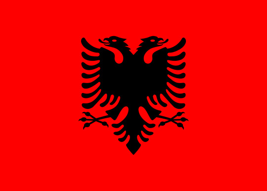
WEEK 3 - Flag
The Albanian flag is red with a black silhouette of a two headed eagle presented in the centre of the flag. In this design, the red signifies bravery, strength and valor, and the black represents dominance, power and determination.
The two headed eagle is a representation of the sovereign state of Albania and even after numerous changes in the nations flag, the double headed bird remains a key feature in most of the past designs. It’s a strong and powerful icon and is significant to Albanias history. Since the deterioration in communism back in 1912, the eagle’s heads no longer represent anything symbolic. However, other emblems such as stars, crosses, and crowns, have been symbolic for the different governments in Albania.
0 notes
Text
WEEK 2 - National Museum of Australia
After visiting the National Museum of Australia, I took quite a bit of interest in the design and development of fire tools. Starting and controlling fires was something that the indigenous mastered at with their lack of equipment. Joining common knowledge and pieces of nature together, they were able to design tools that would assist them greatly with catching their food and opening and expanding their hunting grounds.
The indigenous used fire frequently to hunt for food and to control their land. Controlling smaller fires would limit the risk of larger and more dangerous fires from occurring. In 1996, Rhys Jones named this action, Firestick Farming. Aboriginal people would use tools such as the fire saw to light these fires. The fire saw creates fire by using friction.
In comparison to the tools we use to create and control fire now days, the indigenous were extremely resourceful with designing fire tools and equipment to assist with food preparation and catching food in the first place. Controlled burning, fire stick farming, and back burning are all methods of fire control, influenced by the techniques the aborigines used before the first fleet.

2 notes
·
View notes