Don't wanna be here? Send us removal request.
Text
Physical Presentation: Torn Pages
The plan for my physical presentation is to be some form of torn up documents with the artwork of my characters and some writing about them. I want these pages to look as if they had been found after being subjected to light weathering including things such as tears, stains and maybe even some burnt edges.
Since I have already adjusted the environmental sketch to fit this idea, I now need to adjust the character art sheets. I won't be doing too much to them like I did to the room sketch but I do want to remove the writing and separated sections to use as smaller, close up photos on the pages. For example, this is what Amari's photos would be separated:


These will be printed out and stuck to worn pages to make them look like medical documents.
For this, I needed some card to make my work look more clean. I reused some old school folders to create a backing for the pages. I then used gouache to stain the pages to make them look older and worn down. I then printed out and added both the photos and the text for each patient. These are glued down, but I felt that using tape would be good aesthetically.
Amari's Page:

Lily and Calliope's Page (had to be combined due to lack of folders for backing):

Overall, I am very happy with how these turned out. The photos look as if they're being held on with tape just like I wanted and I managed to fit all of the important text onto the documents.

0 notes
Text
Digital Art: Room Footage
Since I am planning on making a physical page for the character and environment art I have done so far, I have decided that I want to make the artwork look more authentic to a booklet format. For my environmental art, this meant using the idea of camera footage. This idea came to me when I used the high angle photo as a reference and I am glad to try out Photoshop's filters.
This video was a huge help to me since I have never done this before.
youtube
First was distorting the image to give the fish eye camera lens look that most cameras have. This was done by using the lens correction filter, setting the distortion to -20 and adding a vignette with a lower midpoint to make it spread further inwards.


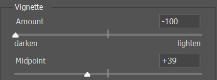

Next was adding noise to make it look more like an old camera. In the video this was done using a texture filter, however, my Photoshop is missing the texture option for some reason which I couldn't find a solution for. To mimic the effect, I took a noise PNG from Google and turned the opacity down to create a similar enough version. I also had to do this for the halftone lines since I am also missing the sketch filter option. The halftone should then be set to soft light. Both layers should be given a 1 pixel gaussian blur.


To create the black and white camera effect, I then used a solid colour adjustment layer. This layer should be set to a light green/blue since cameras often have a hazy cool tone to them.


For the final additions, I downloaded a pixelated text off of Dafont and added the date, time, camera location and the recording symbol along with the red recording light which was just a red ellipse. The text should have a one pixel gaussian blur and the light a three pixel blur.

This will look much more accurate for an in world piece of literature than if the concept art was left plain.
0 notes
Text
Digital Art: Creating Rooms
The next focus for my artwork is creating environment art. I have decided that I will start with the protagonist's room. Since I am making a room for someone in a psychiatric hospital, I need to look at examples of what an average room would look like. These videos are examples of lived in psychiatric ward rooms.
youtube
I then found this website called Planner 5D which I used to create a 2D and 3D reference for the protagonist's room inspired by the two videos from before.


I am unable to provide the file to this without paying so unrendered photos are what I will be presenting here.
Next was redrawing the environment using the photos as a reference. The third photo was specifically taken at a high angle so that I could draw the room as if it is being taken from a security camera. I started with a basic sketch of the main room with no furniture so that I could better understand the perspective before adding the furniture and erasing any hidden lines.
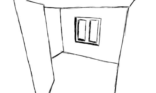


I then added some colour, using the floor from the original image before adding a simple window lighting to make the room feel more 3D.


0 notes
Text
Digital Art: The Empress
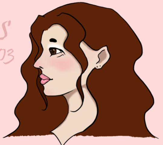
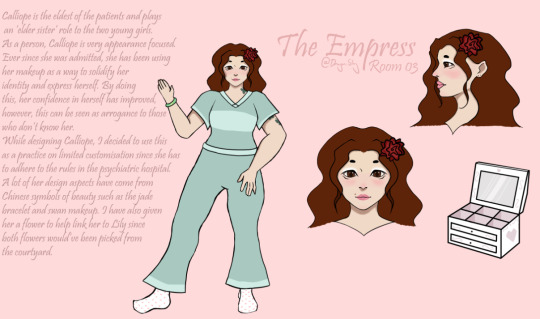
The third character I will be giving a full reference to is The Empress. I, again, started with a traditional sketch for the front and side profiles since I prefer this method of sketching to digital sketches.
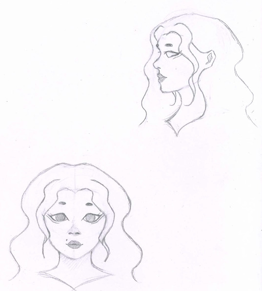
Her design did not change much from the original, I have just changed her eye shape since I want to adjust her ethnicity. Since the symbols of beauty I have chosen for her design are all very Chinese based, I felt that it was more fitting to create a Chinese character.


After the decision to make Calliope Chinese, I began to look at how monolids are drawn. Monolids are a form of eye shape that cover the inner eye without folds and are most commonly found in those with Asian decent. Since I have not drawn someone with these before, I wanted to make sure I would get the shape right by looking at examples. Unfortunately, the dark eye makeup I chose to do has covered the inner eye and made it harder to see but I have tried my best to keep the main shape correct.


Just like before, I then proceeded to do the block colours for the design. I had not actually planned colours ahead for this character like I had done for the other two and so I asked for some feedback from my friends. We eventually decided to use brown for both the hair and eyes for a sense of cohesion.
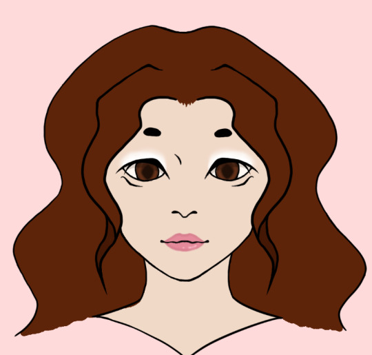

Next was adding the same YRB, shadows, blush and the additional skin detail of her beauty mark from before. I have used a pink blush for Calliope since both of my previous characters have used very warm orange/red colours for their blush and I wanted to explore different things on this design. I then added her rose from her base design as it helps show her relationship to Lily.


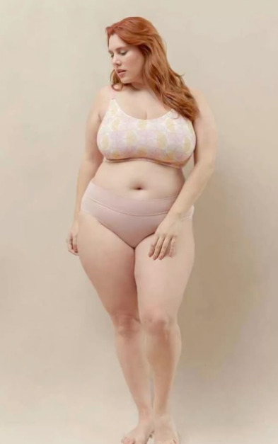
Her full body drawing used this as a reference since I wanted to make her more plus sized. Her original sketch was more midsized but I wanted to practice drawing more unique body types since its not something I often do. The sketch was very rough and did not include the head as I planned on copying the head over from the front profile to save time.
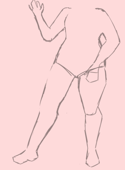
Her design included the trousers version of the uniform since I hadn't had the chance to use it yet. I've included her jade bracelet and butterfly tattoo as well as added some heart print socks to help add to the sweet persona I wanted her to have.

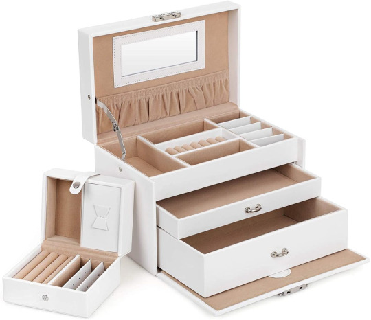
I then added an item of interest, Calliope's makeup and/or jewellery box. I wanted to add this item specifically since it is both heavily tied to the character's personality and could be used as an in game item of interest by holding a key item. It was based off of some makeup and jewellery boxes I found online.
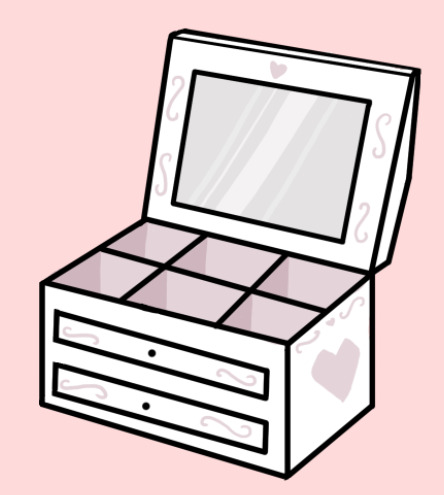


Finally was adding the the text about Calliope and her design.

The final reference sheet:
1 note
·
View note
Text
Digital Art: The Fool
Just like with Temperance, I began with a traditional sketch of The Fool's profiles in bust form. Since I am very new in drawing younger children (not used to different proportions), I have used a 3/4 profile rather than a side profile as I found this easier to keep the character's features consistent.

For this version, I have rounded out her hair to keep her shape language more obvious rather than the curved but straight hairstyle from her original design. Other than that The Fool has stayed relatively the same as I am overall happy with her design.


Since I need to speed these sheets up, I skipped past the digital sketching and headed straight to line art. This actually went surprisingly well and has given me the confidence that I might be able to create more than the minimal viable product I had previously outlined.

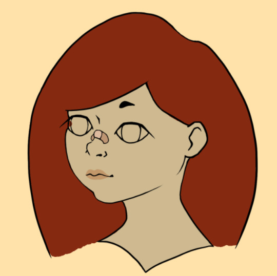
Next was the basic block colours such as skin tone, hair colour, lips and, for The Fool at least, her plaster. Since this character is meant to be a younger child who is a bit messier, I have left her lips as a block colour rather than adding a gloss-like highlight.

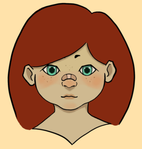
I then filled in her eyes which have a more hexagonal shape since I felt that a round pupil did not fit with her sharp eye shape and gave her the freckles from her original design. This will most likely be a theme in any future character designs. This was then followed with the same YRB, shadows and blush clipping masks to add variation to the character's face.


Next was the full body which was created with the help of a reference. I have given The Fool the short sleeved version of the uniform since this felt more fitting with her more outgoing nature. She has been given more plasters to help show how she often is a bit too adventurous and has kept her daisy chains which currently are only two bands on the right wrist.


I then did the same colouring as her profiles with the same block colours, clipping masks and shading plus the additional freckles and some dirt on her feet rather than socks. I then coloured in her uniform, giving her the same pattern as Temperance's. I added some grass stains to her uniform to again show that she doesn't think too much about the consequences of her exploring. Finally, I added daisies for her bracelets.

I plan on adding some writing about her as a character as well as an item of interest for her. I did switch the background colours as a friend mentioned how the orange makes her skin tone look more grey.

I added a teddy bear based on these doctor bears I found online. This felt fitting for the setting and also works well as a way to represent the medical staff's constant supervision over the patients.


Finally, I added some writing about Lily and her design just like for Amari. This paragraph includes details about what the girl is like and how aspects of her design shows this.


0 notes
Text
Minimum Viable Product
As we come up to the end of this project, I need to figure out what my MVP is. This needs to be done since I do not feel that I can achieve fully what I set out to do. This was decided between me and one of my teachers.
My initial plan was to create full character reference sheets for as many characters as possible. This will not be possible in the time we have and so I have reigned this objective in to be sketch references instead and only for some characters.
I have also decided that I will only be doing sketch concepts for the rooms since I do not usually draw scenery and will take a lot of time trying to perfect a proper drawing.
I will not be including the extra game play "screenshots" that I hoped to add as a bonus since this will require even more research into how to portray a game through screenshots as well as recapping UIs which will be a waste of time.
0 notes
Text
Weekly Work List + Reflection 7:
This week I have created the protagonist's character reference sheet which also includes the different uniform options I was considering since researching better uniforms for hospital patients. I also created a Google Form for my friends to help me decide on some aspects.
For my next week's work, I will be creating sketch references of a few characters as well as some room sketches. These will be less detailed and clean than the protagonist's sheet since I need to get them done a lot quicker.
0 notes
Text
Google Form: Uniform + Temperance
Since I couldn't decide on a uniform pattern, I have decided to ask some friends to see what they prefer and if they liked the idea of more customised uniforms. During this survey, I also let them decide on the name of my main character.

For the pattern of the uniform, striped won by a landslide with every person picking it.


For if uniforms should be allowed to have major changes, most said no. This makes sense since hospital attire tends to be not too customisable.
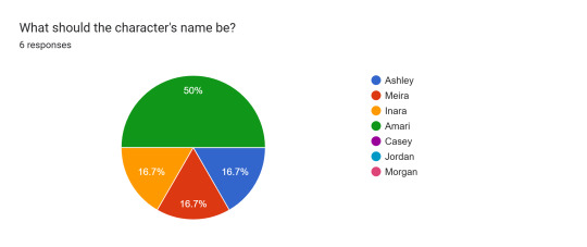
For the protagonist's name, the majority picked Amari. Amari is an African American name with an uncertain meaning but is often associated with stability, referring to the harmony meant to be portrayed by my Temperance character.
0 notes
Text
Digital Art: Temperance
To begin with the character sheet, I wanted to create close up of the protagonist's front and side profile to include alongside the full body art. This will allow me to zoom in on any details that I want to include/add.


My first version of this didn't feel right especially the front view. This drawing just felt too old to be the protagonist as she looked like an adult rather than a teen/pre-teen.

This 'off feeling' was the confirmed for me when I began the digital art.

My second version was much closer to my original vision for this character. Her hair and her jawline are much more squared compared to my first rendition. I have also changed the 3/4 profile to a side profile as a way to better highlight her features. Her design also now includes piercings scars like some of the other characters.


I then used the traditional sketches to create digital line art for the character reference sheet. During this process, I decided that the spirals in her eyes would look better if they had some different line weights throughout. I also changed the eye shape to be more bold and stylized.


I then added basic colour, followed by the lips and eyes.


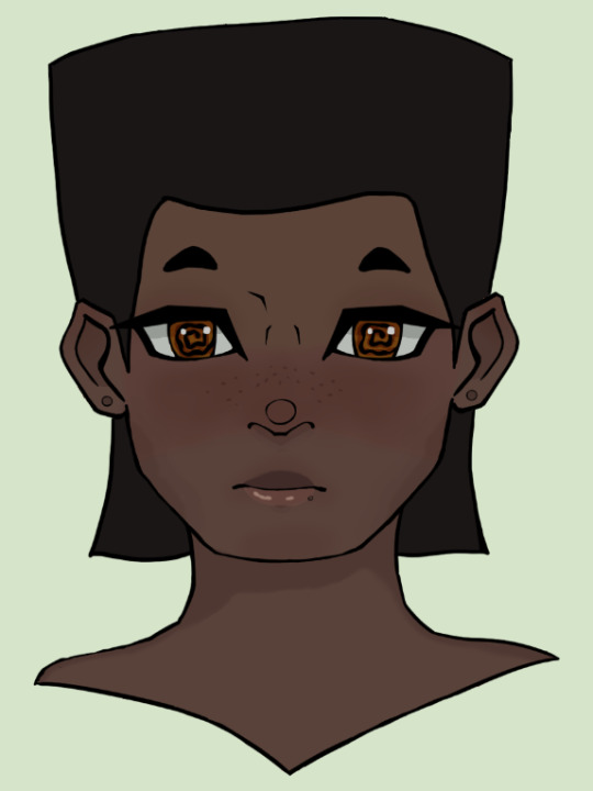
Since the skin was looking very basic, I then added several layers including a blush, shadows and the YRB colour shading to make her skin look more varied.

Next was the full body which I based off of this image with tweaks to the arm placement to better show of the character's tattoo.


The initial sketch was a little rough, however the line art gave me hope and the initial colouring proved me right.

This was then followed up by the colouring of the uniform, however, I felt that this was too plain and needed to have some variation. This led me to make two extra versions, each one adding a pattern to make the uniform more visually interesting. Since I cannot personally decide which one I prefer, I will be asking friends and peers to vote in a google form.

This is the main character sheet which has the full body of my character, including the three different uniform options as well as the front and side profile busts. I would also add an item of interest, however this character does not have one.
The final touch I added was after the Google Form for her name, Amari. I wanted to give some context behind her as a character and some design choices so I have provided some context in the form of a paragraph.

The final reference sheet:

0 notes
Text
Better Psychiatric Hospital Clothing
While the typical hospital gown is what most people first imagine for patients, there has been a recent increase in clothing that is better quality for patients. A good example of this is Strong Tex's anti ligature clothing.


The material used for the clothing is made to be soft, thick and tear-proof so that patients feel comfortable and keep their dignity. There is also a trouser version. I plan on using these as a base for my hospital's clothing.
0 notes
Text
Weekly Work List + Reflection 6:
Last week was spent starting and completing the recommended research for the Easter holiday. This research needed to be completed before I began my digital drawings since it included important tips for consistent and unique art styles.
This week will be spent starting my digital art for my characters, beginning with the protagonist, The Fool and The Empress.
0 notes
Text
Environment Art Research: Wards in Media
Because I am planning on creating a psychiatric ward, I want to look at how they're portrayed in media. By looking at how media designs psychiatric wards, I can see what creative liberties they take, what they do well and what I want to avoid.
Ratched:
Ratched is a Netflix series set after World War 2. The hospital's design is very strongly influenced by the time period with floral wallpaper and pastel colours (particularly the use of mint). The use of pastels does actually have a specific purpose since less saturated, lighter colours are associated with calm and relaxation.

The use of white is also very prevalent with it being the main colour for most rooms. White has both positive and negative connotations:
Positives: cleanliness, hygiene, purity, innocence, refreshing.
Negatives: emptiness, isolating, coldness, hard to hide.
In terms of being a hospital, both the positive and the negatives can apply. The association with cleanliness is the main reason white is often in hospitals since they're meant to be a sterile environment just like in the lobotomy scene in Ratched. The feeling of isolation and emptiness is the other main feeling that comes from a white room. This is something I want to avoid overusing since I want my environment to be more welcoming.

The final room I wanted to look at from Ratched is one of the "treatment" rooms. This room is specifically for hydrotherapy which was believed to cure mental illnesses at the time. This room is darker and dirtier, showing the darker aspects of psychiatry at the time. While I may use the darker colour idea for my hospital, I do not intend to create the same unappealing atmosphere.

American Horror Story: Asylum:
Since AHS: Asylum is a horror series, its environments are much darker and dirtier. The rooms aren't as well lit and almost resemble dungeons with grey/black brick walls and dark red chairs. This is the exact opposite use of colour psychology to Ratched where a dark colour palette is used to make the rooms feel less inviting.

Even lighter areas such as an examination room are still tainted with light coloured furniture being stained or having shadows cast over them to take away the clean and pure symbolism that white usually has.

In general, I would like to avoid creating a similar feeling with my hospital since I don't want to criminalise the institution I am creating. However, since I am interested in making a more corrupt vision that represents the protagonist's distrust, this is still useful for me in case I try making that twisted version.
Sources:
White Color Psychology and Meaning – Color Psychology
The Color Psychology Behind Pastels & How to Use Them in Your Home | Redesign
Ratched accuracy | Lobotomy and hydrotherapy explained | Radio Times
American Horror Story: Asylum by Ellen Brill - Set Decorator & Interior Designer | 1stDibs
0 notes
Text
Environment Art Research: Detroit: Become Human
Because I don't draw settings, I will be looking at the environment art for Detroit: Become Human. I felt that, since I had already used DBH's character art, it made sense to look at how they did setting art as well.
A lot of the art I have chosen to look at is for indoor spaces. This is because my concept takes place in a psychiatric ward which consists of very little outdoor areas. I have still included some outdoor artwork as psychiatric wards do still tend to have areas such as courtyards.
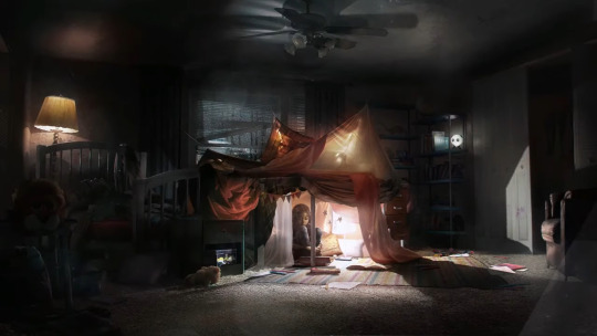
The first set of artworks consists of a kitchen and a bedroom in the same home. The kitchen has signs of the owner(s) with pages on the fridge and opened boxes, this makes the room feel lived in, giving it a sense of warmth. The bedroom has a much stronger version of this atmosphere with a makeshift tent in the centre. The idea of making small hideaways is one I want to try and include since they act as a way of gaining privacy, something that patients in psychiatric wards often want to get back.

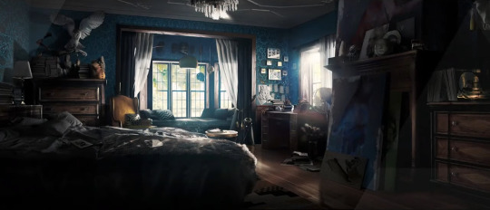
The next pair of pieces comes from a more luxurious setting which is shown in the rooms themselves. The bedroom is much larger than the previous, with lots of paintings and trinkets covering the walls and most surfaces. On one hand, I like the idea of including a lot of detail in different patients' rooms as a way to show more of their personalities, however, this is not very accurate to real psychiatric hospitals. I plan on finding a balance between detail and accuracy when planning the rooms. The dining room is similarly large and fancy. While I will still avoid adding too many details to my main rooms, I can take inspiration from main aspects such as the long, banquet-style table.

I have also included the exterior of this house. The reason being, while I am focusing on the inside of the psychiatric hospital, I do want to figure out the exterior as a part of keeping a consistent building layout/floorplan.

Another outdoor one I have decided to use is the artwork for Amanda's area. I wanted to look at this piece since the main feeling around it is relaxation. The reason this is something I wanted to look at is because I want the courtyard in the psychiatric hospital to have the same calming vibe as a way to help patients.

The next two images are from a motel room, meaning that they're much more cramped and basic. These two pieces are most accurate to what a patients' room would look like with plain walls and minimal decoration. The bedroom consists of two beds each with a single nightstand along with a desk and an armchair. The bathroom is also quite small with dirty walls and only the basic requirements. While I plan on making the psychiatric hospital more clean as well as only having one patient per room, these two images have given me a good idea of what my setting art could look like.


The next two artworks are also from a more luxurious home. I have chosen them for their large, open foyer/main rooms since I want the hospital to feel open and safe rather than tight and constricting. both have tall, twisting banister poles which, while fancy, are also much safer since its impossible to hang anything over them, something that is carefully considered in places such as psychiatric hospitals.


The next setting art is another home with this one having much more clutter. With places like wards encouraging patients to do things such as cleaning their rooms as a way to motivate them, having messy rooms is unlikely. Certain aspects, however, such as notes on the walls and books lying around, can be used as a more productive form of clutter to include in rooms especially for patients such as The Hermit.

The next artwork is a much more professional setting with a corporate lunch room. This type of setting is much more likely to be a staff room for nurses and doctors at the psychiatric hospital. The room is much more modern and is less of a main food area and more of a break room with vending machines for snacks.

The next piece I have mostly included for its focus on flowers. Since a big part of my characters' designs is that a lot of them include flowers, I want to put those flowers in the courtyard to justify how they got them. This concept art has several flowers in the forefront, providing me with an example of how to show flowers in a settings while still including other aspects.

The next few images are all from another home concept. This home is another welcoming, warm place which is what I want to invoke with some of the areas in the hospital since its meant to be a place of safety for the patients. The first image is of the living room includes a lot of soft furnishings such as sofas and rugs which make the place feel a lot safer and comforting. The second is the kitchen which, while less important, still helps me with how to create an inviting atmosphere with soft lighting, warm colour schemes and small details.


The third is of a laundry room which is again not too important in terms of room but is another example of creating barriers to help hide and gain privacy. The final image is of the upstairs hallway, I wanted to include this as an example of a more decorated hallway. Most halls are often left very plain which, while it makes sense for getting through quickly without tripping over anything, often means that they feel scary and restrictive. This can easily be changed with minimal details such as paintings and thin furniture which won't get in the way in case of emergency.


0 notes
Text
Project Presentation: Physical Forms
In terms of how to present my project, I was given the suggestion of making something physical such as a book. This was then developed into creating something that would fit into the concept's world such as a patient's diary or medical file. This method of presenting my project would be both fun to create and good for world building as I can include writing about development, the character and the world itself.
Because I have never done something like this for a project before, I wanted to look at how some other games have created their artbooks since some games have also gone down the route of presenting their art in unique ways.
Murdered: Soul Suspect:
Murdered: Soul Suspect's art book includes a few details that make it feel like it came from inside the game. The yellowed pages and writing help to convince that this journal was previously owned. There are also several ways the images in the book are implemented that make it feel like someone has been writing and adding to this book like a journal.
Some images are made to look like photos that have been stuck onto the pages even using fake tape to sell the illusion.


Other images have had their corners and edges scratched away to make them blend into the pages themselves, making them less disjointed. This effect is a good way to make the image look like its been drawn into the book rather than printed on. Smaller sketches also have this effect.


Small extras such as tiny doodles are found on some pages, making the book feel more like a personal journal.

The Evil Within:
The Evil Within's art book is much less immersive than Murdered: Soul Suspect's. However, this art book has a very good way of displaying character concepts. Character's all come with a chunk of writing, several previous designs and different angles all to give a clear but detailed explanation for who each character is and how the artists came up with them.
The first character art is of Sebastian Castellanos, the protagonist for the game. His first page is the main one I want to focus on since most of his focus on the 3D modeling. This page has a lot of information with several full body drawings (both final designs and concept designs) and a couple of paragraphs about the character.

Next is Julie Kidman, one of the main side characters. I am planning on looking at two of her pages since her first page is a bit more empty compared to Sebastian's. Her first page consists of a paragraph about her as a character as well as one full body artwork and two busts.

Her second page is full of design concepts showing the process of her design. This also has paragraphs on how her concept progressed, giving insight on how a character changes over development. My artwork will not change this much since the character's stories will not change anywhere near as drastically as Kidman's did.

0 notes
Text
Character Art Research: Detroit: Become Human
Since I am going to be creating character art for my game concept, I want to look at character art from other games in order to get a better idea of how actual game concepts are shown. This will allow my art to feel more professional.
The first game I wanted to look at was Detroit: Become Human since this game has a lot of different ways of presenting characters in each concept piece, allowing me to figure out which aspects I want to use and which aspects I feel wouldn't work for this project.
youtube
The first piece of concept art I wanted to look at focuses on different uniforms. The reason I wanted to look at this is because I want to explore different clothing for the patients that isn't the stereotypical medical robe since most modern psychiatric wards have retired these for more comfortable, pyjama-like outfits.

The uniforms that are shown in this art clearly indicate the wearer's purpose. This is an idea I would like to test with different clothing limitations for different patients.
Much like the last one, this concept art shows alternative outfits, however, this piece focuses on alternate outfits for the same person. This is a good way to explore a character's personality through their design while also giving multiple options for different occasions.

Once several designs are made, the final one/few are picked as the main design(s). Some designs will be merged into one in this process. This will be a good way for me to decide on which ward uniform will be used on which patient.
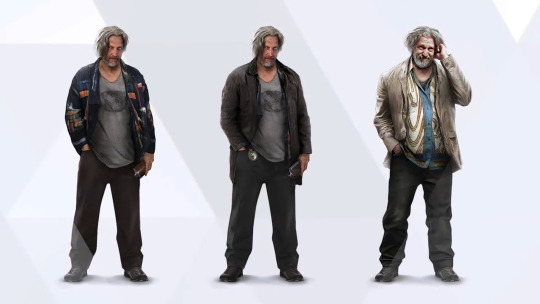
The next pieces of concept art delves into deciding colour palettes. Once a main design is chosen, the artist will often explore several colour palettes to see which ones best fit the character as well as the setting the character will be seen in the most.
The first concept shows a simple colour palette swap with minor outfit changes. This is something I can do for characters with less deliberate colour palettes who have more flexibility in which colours I can use.

The second couple of concepts have a more specific set of palette changes. This character in game changes outfit colours as the game progresses and her motives are made more clear. This is shown in her colour palettes even in the concept art with the second piece having much darker colours compared to the first. I can do something similar to this with character who have deliberate colour palettes.


The next pieces of concept art focus on showing scale and connections between sets of characters. By having characters of the same groups in the same artwork, the artist can see if the characters have any form of visual connection.

Having a group of characters together also gives a sense of scale which is particularly useful for other artists and 3D modelers in this case.

The next pieces have backgrounds included. This is a good final check to see if the characters' designs actually fit in with their settings and if their colours aren't too similar/muddy to the backgrounds they will be seen in.
The first piece includes all possible characters found in the one scene the background is from. This makes sure that all characters fit in with the location.

The second piece focuses on the two playable characters from the scene and has different designs shown. This is a way to test which design best fits the scene.

The final image is less character focused and instead has concepts for a possible item for a character. This is something I really wanted to look at since I plan on giving at least a couple of my characters items of interest as a way to portray who they are. A key detail for this concept art is that the character is still in the image as well since the item needs to have some visual connection to its character.

1 note
·
View note
Text
Research: Character Sheets
Since my first part of this project is going to be making character designs, I am going to look at how character sheets are made. This is so that my concept art feels professional and so that I can show of a proper amount of detail in each character.

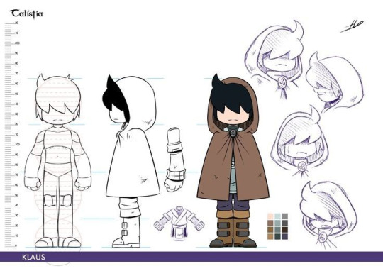


In general, character sheets include:
Character front profile
Character side/back profile
Items of interest
Additional facial expressions
Different outfits
Since I am going to be using a psychiatric hospital setting where patients are in standard hospital clothing, other outfits are not something I will be doing in my sheets. I would like to add items of interest to any characters that I feel would have some since this allows me to show their personalities, same with posing.

This example is a good base point that I want to reach. This reference sheet has the character in a somewhat unique pose (different to the A-pose most reference sheets have) which is a nice way to show a character's personality. It also has a back view of the main body which, while less necessary for my character since there won't be many outfit details, is nice to have for reference. The front and side facial profiles is also useful as it shows a character's features.
0 notes
Text
Character Art Research: Art Styles
Before I begin creating my digital character art, I want to solidify the type of art style that I will be using. I want to do this since using a consistent and deliberate art style gives the artwork a cleaner and more professional look.
I plan on researching different pieces of media with art styles I either think are similar to mine or have the art style I think would fit with my concept.
Coraline and BoxTrolls:
Coraline and Boxtrolls, along with a lot of Laika studio's projects, both have a very exaggerated style. Characters often have large heads, pointed features, stick-like bodies and emphasised poses all combined to make the characters feel more expressive and unique.
Coraline herself is an example of several of these traits with a wider head, thin body and pointed facial features. Other characters, such as Mr Bobinski, are styled with even more exaggerations to the point where he appears to look less human. This is good for me to look at since I want some of my characters to feel off in some way.


In Boxtrolls, the designs I want to focus on are the Boxtrolls themselves since they have very stylized designs and are also a good example of using limits in designs. In terms of design, the Boxtrolls have to be wearing boxes, meaning the designers could not distinguish them by clothing. This also made using different body types harder since you can't actually see their bodies, forcing the artists to use exaggeration to make the Boxtrolls distinguishable from one another.


Lost In Random:
Lost In Random is a game that uses a very similar art style to Laika Studio's films. The artwork for this game in particular is also displayed in a very appealing way with the main art front and centre with bonus sketches surrounding it.
In terms of style, Lost In Random has the same long, thin limbs and sharp facial features as Laika's work. This art style is meant to feel vaguely unsettling and is linked to Gothic stories such as Tim Burton's Nightmare Before Christmas. The use of expressions in the artworks helps to give the character's more feeling and personality.


Am I Nima:
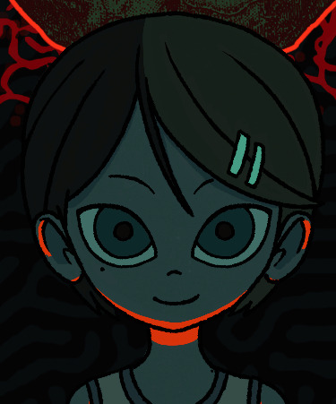
Am I Nima is a psychological horror game currently in development. Am I Nima has a very unique art style using dark, cold colours to set the game's tone. This game's style is further highlighted by the artist's use of light. By using a harsh red lighting, Am I Nima creates an unsettling atmosphere which emphasises the horror aspect of the game.

The way character's are drawn in Am I Nima is another thing I wanted to focus on. Nima herself has a very similar style to how I want my patient characters to look. Her large eyes lack highlights, making her appear soulless and the red highlights around her face illuminate her in an uncanny way. Eyes in general in Am I Nima's demo are very unsettling since both Nima and her mother are always staring directly into the camera.

3 notes
·
View notes