
Don't wanna be here? Send us removal request.
Statistics
We looked inside some of the posts by emiloart and here's what we found interesting.
Average Info
Notes Per Post
3
Likes Per Post
3
Reblog Per Post
0
Reply Per Post
0
Time Between Posts
15 days
Number of Posts By Type
Text
7
Last Seen Tumblr Blogs


Fun Fact
1,644 Tumblr posts in 1 second.
Text
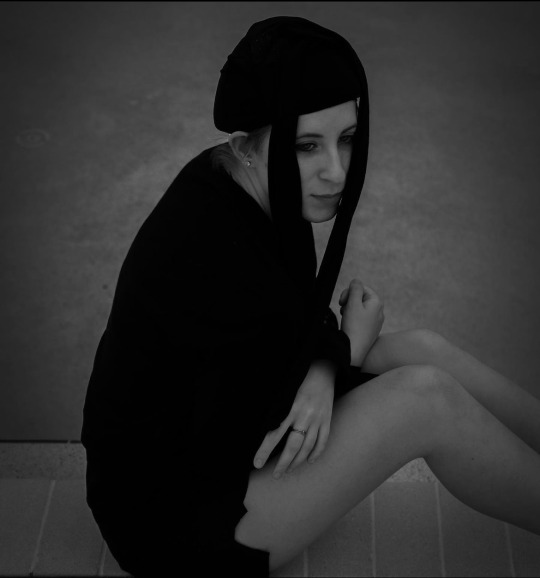
This project called A Rebel in the Dark is based on portraying my feelings the way I hide from myself in ways I can't describe. This video shows how I am an introvert, and someone who has dealt with trauma and how it has been affecting me as a person. That's what I love about art is that if you don't want to talk about it then make something out of it. Art is my only way of escaping from my own thoughts. Ways I don't know how to, no matter how hard I try to find ways to become true to myself and to others. I named this A rebel in the dark because it’s a rush of adrenaline, excitement, going against the norm and challenging authority or societal expectations. It can be exhilarating to stand up for what you believe in, but it may also come with consequences such as social isolation.
As you see this was me expressing my thoughts against a cold pavement, dressed all in black with no identity. I chose this style for my video because it is raw and clean and unique type of art. You can tell that I am doing all kinds of moving techniques to tell a story that not everyone can see.
Thanks for watching!
0 notes
Text


Virtual Sketchbook 4
Photo by Zhenna Milo
abstract/non-representational art
WRITING, THINKING AND LOOKING CRITICALLY!
Jackson Pollock's evolution from using abstract imagery to removing all imagery in his famous "drip" paintings was a result of his exploration of the subconscious mind and spontaneous creation. His study with Thomas Hart Benton provided him with a foundation in traditional techniques, but he later rejected this style and turned towards abstraction. He began experimenting with pouring and dripping paint onto canvases, allowing chance and intuition to guide his movements rather than a preconceived plan or image. This technique allowed for an immersive experience for the viewer, as they were able to get lost in the layers and textures of the painting. Pollock removed all recognizable imagery so that the viewer could focus solely on the act of painting itself, the physicality of it, its energy and movement.
0 notes
Text

Charles Demuth, I SAW THE FIGURE5 IN GOLD
Principles: Used by artist Demuth
Unity and Variety- Unity means that all elements should work together to create a sense of harmony and balance in the design.
Variety means that the elements should be placed in an interesting and balanced manner so that the design has visual interest and movement. Variety helps to create contrast and keep the design interesting.
Balance- when the elements in a design are arranged in a way that creates equal visual weight on both sides of an imaginary axis. Balance can be symmetrical, asymmetrical, or radial.
Emphasis and subordination- Emphasis can be achieved through contrast, size, color, placement, repetition, texture and other design elements.
helps create a visual hierarchy within a composition by assigning different levels of importance to the different elements. This helps viewers determine what is most important
and what is less important. Subordination can be achieved through scale, value, texture, color, line and shape.
Directional forces- used to draw attention to a certain area or element or to create a sense of flow. Directional forces can be created through the use of lines, shapes, colors, and textures. For example, a curved line can be used to create a sense of movement, while a sharp, angular line can be used to draw attention to a specific area.
Repetition and rhythm- involves the repeating of elements such as shapes, colors, and lines. This creates a sense of visual consistency and harmony.
Rhythm creates a sense of movement and flow, giving the piece a sense of balance and unity. It can also be used to create a sense of atmosphere and emotion.
Scale and proportion- Scale refers to the size of an object relative to other objects, while proportion refers to the ratio of one part of an object to another. For example, a large object placed in the foreground of a composition can give a sense of importance, while a small object placed in the background can give a sense of scale.
Both scale and proportion are important elements in creating a successful composition. They can be used to create a sense of balance, drama, and unity in a design.
Examples:
1. Balance: The symmetrical placement of furniture in a living room or the even distribution of trees in a park.
2. Proportion: The size of a window relative to the area of a wall or the size of a bowl relative to the size of a plate.
3. Contrast: The texture of the sidewalk relative to the texture of the grass in a park or the colors of a painting.
4. Rhythm: The repetition of shapes in a patterned wallpaper or the uniformity of a city skyline.
5. Direction: The arrows in a parking lot directing traffic or the path of a river on a map.
6. Unity: The cohesive look of a room with furniture and accessories in a unified style or the unified look of a city skyline.

By CILDO MEIRELES, CRUZEIRO DO SUL (SOUTHERN CROSS)
The artist uses his hand to make a different statement to viewers by using his body part, his hand to point out a unique illustration of the photo, he also uses two small wood blocks that are less than a half inch across. Cildo’s work is a challenging experience to viewers in a room sized illustration, distorting the scale of the object highlighting the focal point. The object on his finger tip is a piece of pine and a piece of oak glued together, which fits just right on top of his finger tip. The background is completely white and the foreground is equivalent to the artist's skin tone and the tiny wooden object.
(textbook 4.6 scale and proportion)
CONNECTING ART TO YOUR WORLD
As an artist, color can have a powerful effect on our work. Colors can change or take away certain emotions and feelings in viewers, so it’s important to choose the right colors for the right mood. For example, warmer tones can create a feeling of passion, while cooler tones can define feelings of calm and peace. Additionally, certain colors can be associated with certain concepts or ideas, such as blue representing trustworthiness or yellow representing happiness. As an artist, it’s important to be aware of how color can affect our work and the emotions it can change you as a person. In my own experience whenever I see a color on a wall or on a painting for example I'm obsessed with the colors gold and red and black as well as bright saturated and super vivid neon colors, because I see these colors and I feel happy and sad but when I see neon colors my eyes sparkle with happy emotions, because it’s bright and inspiring as well as powerful that brings so much joy to me. If I had to pick a color scheme it would be a burgundy red or purple, because they are warm but also give off some hip style and unique color that no one really uses.
ART PROJECT - ARTIST CHOICE

This is a painting I did a few years back when I was in art school. I did not have a plan on how I was going to paint. At that time I just felt completely lost and miserable and not being able to feel emotions and constantly feeling helpless, frustrated in myself. This painting started off with the red on top and just shaping the face. The blending that I did with the paint made the painting look more abstract and not making the face perfect was an interesting choice. The blue represents the tears and water, the black represents the darkness surrounding the face, The red represents anger and frustration and also demons. The technique I used to paint this portrait was using my fingers and also to blend out everything, making it more messy and destructible looking.
0 notes
Text


Portrait: This is a photo of a Jaguar yawing in nature or seems to be that the Jaguar is Rawring. Glancing at the background and the foreground the Jaguar is outside laying on a huge rock that is high up. I wanna say the Jaguar is in a jungle or a zoo because of the trees and flowers and how close up the photo is. In the background. The big cat has its eye opened halfway, but with those teeth you just can’t tell if the Jaguar is angry at something or if it’s just yawning.
Landscape: This is a photo of an Icelandic Rock which is shaped exactly like an Elephant, which is made out of Basalt rock which was formed by the volcano, Eldfell. The Island is called Himaey which is in the Westman Islands. You can also see that the nose goes right into the water, Which I think is super neat because that’s how Elephants drink water. Even the details are just as similar to an actual elephant around the head and the eyes are carved out so accurately.
Still Life: This is a still life of a person levitating who is jumping across two rocks that appear to be very high up, because if you look down at the picture the mountains and the horizon are below. The person that is jumping seems to be posing and running in the air like a superman flying. This picture even looks fake by how the person in the photo looks like they are ziplining but can’t tell if the photo has been edited, who in the world can jump that high and that far away. The message to this photo is to not be scared and to be brave and do crazy things, perhaps that’s on your bucket list to jump like a crazy monkey.
What motivates the choice of black and white vs. color? Is the choice effective (does it influence the way you are feeling or looking at the subjects?
The choice of black and white vs. color can be motivated by a variety of factors, including cost, stylistic preference, or the mood of the subject matter. Generally speaking, black and white photography can be used to create a timeless, classic, or nostalgic feel, whereas color can be used to create a more vibrant and modern feel. The choice of black and white or color can be effective in influencing how viewers feel or look at the subjects, as both have the potential to evoke different emotions.
0 notes
Text
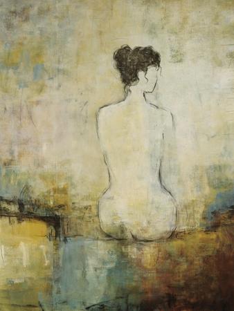
This is a painting that I absolutely adore, it’s currently hanging in my bathroom in my house. The painting was created by Lisa Ridgers, she works with professional grade quality artist materials for her original works. She also uses UV resistant acrylic paints and mediums. Lisa chooses to use watercolor papers and mat boards. The artist mentioned that when she paints on canvases she has the canvas pre-stretched professionally and doubled, triple primed with acid free gesso. Lisa Ridgers makes sure that her works are protected and has strong quality equipment and ready to be hung up with a heavy duty frame and wire. She finds that rich colors and dramatic scenery of the desert and the countryside influences her. The artist also enjoys using new techniques, technology, and mediums which is a great way to evolve and grow as an artist. When I take a glance at this painting of a woman sitting down naked outside a bedroom I see that the artist uses very faint lines in a simple way to add the subject in her painting. She also uses the foreground darker and more vivid but also she blends out her paint in a unique way. I think that this painting has its own beauty, yes I think it is a beautiful piece. Because for me I believe that it makes a statement to true beauty in a woman's body. Who cares if she’s naked? The woman is sitting looking at what I think is nature since the artist did describe that she likes to paint using nature in her work, also the subject looks peaceful.
Hello my name is Zhenna. People call me Zee a lot of times, because it’s just easier. Anyways I am 23 years old, female, she/her, I’m originally from Khabarovsk, Russia. I've actually been adopted since I was just turning six and then my parents welcomed me home in Fairfield CT at the time we were living. I am white caucasian, Russian, siberian, ukrainian. What I love to do for fun in my free time is hang out with friends, go to bars and sing karaoke. Also I love to practice my photography and videography skills, since I wanna make movies in the future. I am not a member of any group but I kinda wish I was to keep me more busy. I currently have a new job at Publix stocking shelves and unloading the trucks that come in so I work in the grocery department. What makes me uniquely myself is that I'm outgoing, fun, loving, caring, an artist, I love all sorts of music, food, I dance like a crazy person, and people say I have a unique eye for photography and art in general.
When I look at art, the baggage that brings me along are questions, and all sorts of thoughts that make it more complicated for me to see the actual beauty in the art piece. I ask myself what is the purpose of this? What happens if you turn this work of art a different way? Etc But instead of asking myself these and just enjoy when i'm glancing at an art piece. Sometimes I think art is boring but again there are so many ways to do art, it just depends how you get inspired by art. Is it a painting, art on a building, perhaps a dance move on tiktok is the way to go.
My daily life is by far fascinating, because as a growing artist I have always been learning to grow and new ways to make art more interesting. I've always been in love with Art overall. I think that being creative has saved me from my own thoughts. My work may sometimes seem dark and gloomy like a mystery, but sometimes I change my work into moving stills or a short movie that reflects on a self portrait. Just because I want the series to grow and since I love to do both photos and videos, why not make one picture into multiple or even a short video to make the whole thing into a visual moving piece. These four self portraits represent me on how I see the world and how I use different objects to make a photo grow into a story almost. My favorite is using black and white just because it’s cleaner and the subject is more bold. That’s how I represent myself as an artist. I use a simple background so it’s not overwhelming to look at. like I said I'm a mystery thinker dark and gloomy and maybe a rainbow on top.


2 notes
·
View notes

Text
Michelangelo 1499 Pieta
Michelangelo 1499 Pieta - Marble; 68.5" x 76.8".
1. Michelangelo chose to make Pieta with a single block of Carrara Marble from a Tuscan quarry.
2. This was the only artwork by Michelangelo that was signed by the artist himself
3. Michelangelos manipulation of proportion and draping, which allows Mary to hold her adult son. His portrayal of Mary as she is young. This pose shows purity of spirit. The faces of mother and son show tranquility and acceptance instead of pain and sorrow.
4. The face of Jesus in the sculpture does not show any signs of suffering which was Michelangelo intention. The work of Pieta shows the serene face and vision of abandonment in Jesus.
5. During the following years the Pieta by Michelangelo sustained severe damages. Mary's fingers on her left hand were broken, When the statue was relocated to the Basilica. However Giuseppe Lirioni restored his famous artwork. Then after the statue was restored it had been damaged again 1972. When a mentally ill geologist stormed into the chapel and he forcefully attacked the artwork.
When I had a first glance at this piece, at first I thought it was just a normal and random statue. The first thing that stood out to me was the background and how shiny the statue was, for a second I thought pieta was just wet clay. I had so many questions at first, like why is the girl holding a man who seems dead? why is she starring down at him like she's upset that he died. Then when I did my research on the Pieta, my answers were answered. I found out so much more about Michelangelo himself and this piece he made is just remarkable. My vision changed the background that stood out, it's perfectly in line with the statue and really makes the Pieta stand out. What changed the way I viewed more into detail and the meaning of the piece, was that it's all made about marble and the details that Michelangelo created to make this piece seem more realistic.
January 12, 2023
Zhenna Milo
SCF - ARH
1 note
·
View note