
⋆⭒˚。⋆ My ongoing blog, documenting the progress of my work at UCLan on the MA Animation course! ⋆⭒˚。⋆ Check out my various pages to find module specific posts DE4401 DE4402 DE4403 DE4404 DE4405 AX4406 Thoughts & Feelings Inspo
Don't wanna be here? Send us removal request.
Statistics
We looked inside some of the posts by emilydaisymasters and here's what we found interesting.
Average Info
Notes Per Post
0
Likes Per Post
0
Reblog Per Post
0
Reply Per Post
0
Time Between Posts
7 days
Number of Posts By Type
Text
17
Last Seen Tumblr Blogs


Fun Fact
Tumblr has been banned in Indonesia for providing people with access to pornographic content.
Text
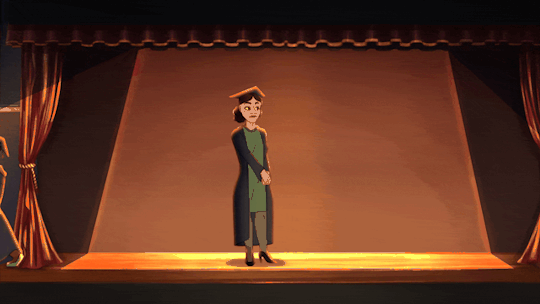
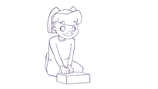
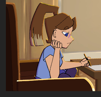
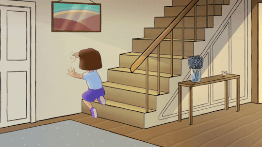
Scene 3 - The Process
I actually completed scene 3 some time ago, before even scene 4, though it seems I forgot to make a full post about the process, so I'll do it now. There really isn't much to say about scene 3 as it's so simple in comparison to every other scene I have completed thus far, however there were a few new techniques I tested out that I'll talk about.
The Sketch

As I was coming out of the depths of scene 10 at this point, I knew I would want an easy scene to work on to ease my nerves and to re acquaint myself with the rest of the project, and scene 3 was the perfect interlude. There is such little movement in this scene, so I knew I had to make it say a thousand different things. As such, I actually took to sketching this scene out prior to lining it, so that I could really fine tune the movements. This also benefited my lack of ribbon drawing skills, as I could tackle that later on. I had a lot of movement in Em's shoulders and face here, to emulate one big sigh.

One particular inclusion that I was so pleased with I decided to include in most future scenes, was the movement of the pupils, darting around as they assess the scene before Em. This subtlety really brought the character to life in a way I hadn't quite seen in my work before
Colouring

I coloured as I normally would, though I added a sheen onto the ribbon to make it stick out a little more. It was at this point that I also added a first place participant to fill out the space a little more. The scene really comes together with the background in place.
I applied my usual shading technique, which really works better with earlier scenes given their simpler style. Other than these inclusions, the scene largely presents as the others do, with a similar style and finish.
Regardless of how little work this scene took in comparison to the last one, I think I was able to include the necessary details to allow it to stand out and hold it's own amongst the bigger scenes, and I am really pleased with it. I will post the clip in full in a separate post.
0 notes
Text
Scene 13 - The Process
Scene 13 has genuinely given me a run for my money on what I consider personally achievable by myself at this moment in time. When I initially planned the scene, I anticipated animating in a more detailed style to be of course challenging, but a welcomed break from the simplicity of every other character design I had created thus far. In many, many, many ways, I was sorely mistaken.
Whilst I appreciate how this scene has turned out thus far, I have to say I am not wholly pleased with it, but I honestly do not have the time to go back and make improvements where I would like them to be. I am also missing a lot of clips from the process of making this scene, mostly because I was just begging the universe for it to be over and trying my best not to just move on with a half completed product. Let me start from the top and work my way down with the clips I do have.
Extras
I began by animating the extras worrying that I would be likely to half bake them if I animated them after the main attraction. In a lot of ways, this was a good call, as the animation really doesn't look awful here. However, it certainly drove me into a bit of a pit, realising after spending countless hours animating and colouring and positioning, 'I haven't even begun animating the main character yet!' Pushing through that feeling was pretty tough.
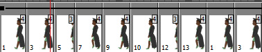
I did the extras walk cycle, and Em's by proxy, in a loop of eight individual frames, including all of the regular positions a walk cycle should, and yet it still didn't look or move right when put into the scene. I ended up fixing this with some keyframes to help the movement along, but this had the nasty side effect of creating the dreaded 'sliding walk' that indicates a pretty cheap animation. I really tried my best to avoid this, but in the end I simply didn't have the time to troubleshoot all of my issues, so it became a regrettable stay in the scene.
Animating the officiant also took a lot of personal grit to do, since she had some movements that I wasn't quite sure on in the beginning. I had no real clue how to animate her reaching into her robe and pulling out a second scroll whilst also making it believable, so I just did what I could. It turned out okay.
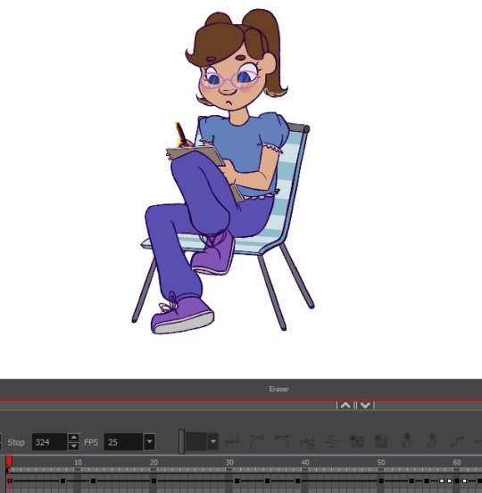
Animating Em
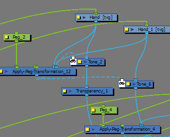
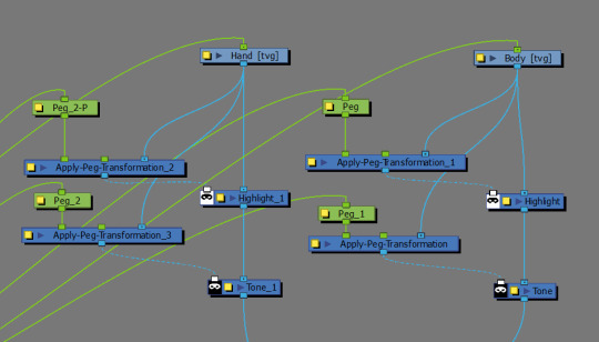
By this point, I thought I would get some relief having moved on to the main focus of the scene, and I did in some respects. The change of pace was nice, and I was back to some familiarity with the character design. What I didn't bank on was having such immense difficulty with the colouring, which just about drove me up the wall. Why did I include so many hair shades? I'll never know.
Getting the shading to sit functionally was also a pain, though I did manage to get the light to shift as she walks which looks quite nice in practice.
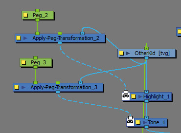
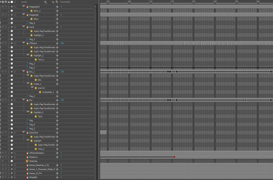
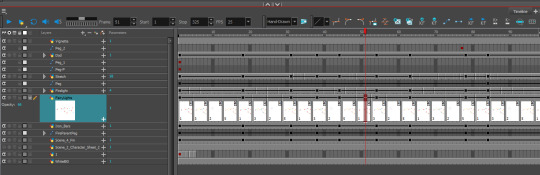
To give you a better idea of how intricate this process was, here are some screenshots of my timeline and node view.
Whilst this was essentially just repeating the shading process as in every other scene, it felt far more tedious here. Another tedious thing was managing to get the scroll to effectively transfer between hands and between layers, something I am going to have to attempt to repeat in a later scene.
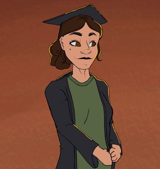
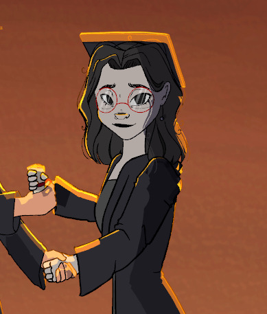
I really wish I could go into more detail about the issues and depth of this scene, I'm not sure what else I can say that I have evidence for. The camera movement remains the same as usual, the facial expressions don't differ out of the ordinary. I could point out that the colours are less saturated as I intended them to be, to the point that I coloured the character wholly in greyscale, but that can be seen in the image above. Essentially, I was very happy to move on from this scene. I don't think scene 14 will be nearly as trying on myself as this one has been, especially considering the decrease in movement, so in some way I am looking forward to redeeming my experience in animating in this style when I reach it, though that remains a fantasy for now. I will post the completed scene in full in the next post.
0 notes
Text
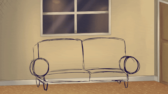
Scene 4 - The Process
Scene 4 was one I was sincerely looking forward to from the start of this project renewal, mainly for the atmosphere the scene presents. I haven't really ever tackled a themed scene such as christmas, so I was excited to be able to add all of the extra detailing to make the vibe of this one stick out. I would say this scene took me a little longer than usual, though I actually thoroughly enjoyed every minute. I don't have the entirety of the process exported for this scene, seeing as I am beginning to crank out the scenes at a faster pace now, though I will do my best to substitute missing clips with screenshots.
The Sketch
I began by drawing out the character and all of her movement, including the raising of the box and the dropping of the wrapping paper. My process as of recent has become more about me fine tuning the existing lines, rather than drawing over a pre-existing sketch a second time. This saves me a lot of hours for one, but also allows me more freedom, since I know I would be likely to stick 100% to the sketch if I was lining it over, even if I made mistakes the first time. This method allows me more freedom and I feel as if the lines are far more malleable.
The Colouring
There is a lot to unpack in this video since we took quite a big jump, so let me unravel it step by step
1- Em
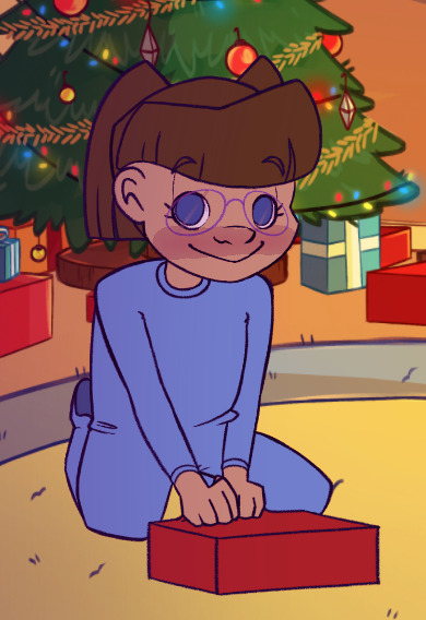
I went ahead and coloured Em as I normally would, and then shaded her with what has swiftly become my go-to method of tone and highlight nodes. I made sure to give the highlight an extra oomph of orange to emphasize the coziness of the scene with the bellowing fire.
2- Fire
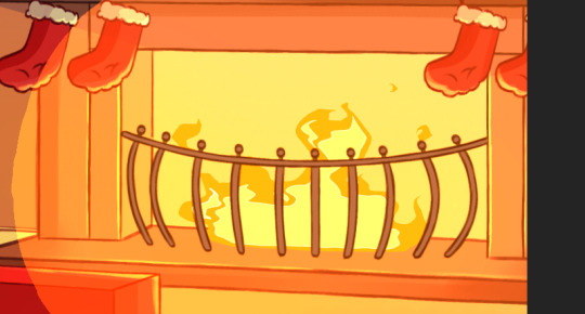
This is finally where the animation of the fire I completed about six months ago comes into place. In reality it's such a small background asset, barely noticeable past the character animation, but it absolutely brings this scene to life and I am so grateful to myself that I took the time to complete it.
3- Fairy Lights

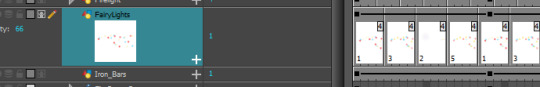
To complete the fairylights, I simply used an airbrush tool to add some soft circles of colour over some of the bulbs. I used an 8 frame cycle for all three colours, with differing starting and ending points to mesh the cycles together. After this, I added a glow node for some sparkle.
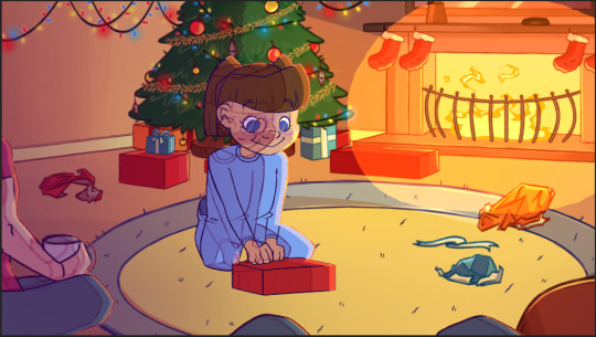
In the final rendition of the scene, some static people can be seen on the outer portions of the screen, those being Mum and Dad. They aren't animated as the zoom quickly renders them invisible, but they add a nice depth.
My timeline was considerably less busy this time around, which shocked me with the amount of detail I felt I had, but it was a happy sight, especially when I found I could navigate so much easier.
I will post the finished scene, complete with the wobbly camera movement on a separate post. I hope this post is as in depth as I wanted it to be as I sincerely put a lot of time into this scene, and I think it personally turned out wonderfully, a favourite of mine to be sure. It just brings that cozy, home-grown familiar vibe into the film that perhaps I was missing before.
0 notes

Text
Scene 10 - The Process
I'm finally getting around to documenting the rest of the process for producing scene 10, which admittedly took a lot longer than I initially anticipated. As such, this post will be a longer one, and I will try and be as technical as I can be when it comes to the techniques I used to achieve my end product.
Extra Furniture, TV Animation and Character Lineart

I unfortunately don't have the separate files for each of the specific parts of animation here, but all can be seen in this one clip and I will explain each portion individually with corresponding screenshots.
Character
I began the line art for Em shortly after finishing the furniture turnarounds, as with my previous work on character animation I felt I was stronger suited to adapting the character to the furniture than the other way around. The lines are sharp so as to reflect the style of the original concept art, and overall it was an interesting challenge to get the angles correct for each frame.
TV Animation

Drawing the TV animation was honestly a really nice break from the technicalities of the rest of the scene. Getting to work on something so simple in the midst of a particularly hard scene was so refreshing. I opted to keep the animation simple for several reasons, not least because it would only be in the background of the shot for a matter of seconds, and I needed the focus to remain on Em and the turnaround.
The animation makes use of a lot of gradient colours so as to save me as much time as I could find on shading and other elements.
Extra Furniture

As can be seen above, there is a shelf, potted plant and some books that exist outside the boundaries of the shot. I was adamant that I didn't simply want to cheap out and draw the visible parts in in case my choice of camera angle changed, and so the shelf exists as an extra asset and can be moved in future, should I want a fuller shot.
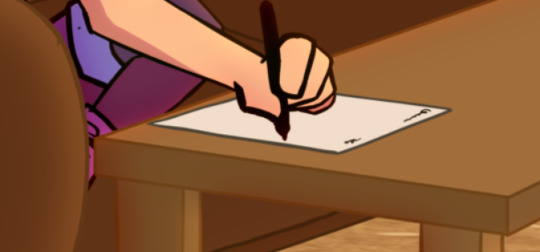
Colouring the Character
When it came to colouring and shading Em, I chose to use warmer swatches so as to help the character to meld in with the warm light in the room. I additionally went for some cell shading to begin with, as that's what the style initially called for. I did ponder the idea of including the pop art effects over Em here, but for time reasons I decided against it.
I also rigged the sofa arm as can be seen in this video, so that it moves alongside Em and gives a better idea on the perspective of the character. This video with the basic colouring in my opinion really starts to make the piece come to life, and helps it to seem like less of a mess of assets in one shot. Still to add yet were the papers on the table, a few lighting fixes, the glasses and the movement, but my timeline and node view were already getting quite busy, so I tried to stay organised.
The Finishing Details
I used the same node build as in most of my previous scenes here, mainly because the effect is so nice, but also definitely to save me some time as I was already overdue for this scene.
The transparency and tone nodes working over the top of my manually cell shaded character looked great in the end.
The glasses were a bit of a pain to add seeing as I had forgotten to animate them as I was animating the character, so their movement didn't and still doesn't quite match up to the character's movement, which bugs me a little. However, with the final effect, I am sure it won't be as noticeable. The glasses were done in a diamond style here to fit the character's sharp design.

The paper equally was a pain to add, not so much the rotation and resizing, but more so getting the writing to turn at the same pace. I managed it in the end, but I was quite stressed with the scene as a whole by the end.
I added a vignette and some extra light beams to add some more dimension to the room, especially as it is actively spinning. I thought it might need to have some more elements to it to retain the illusion.
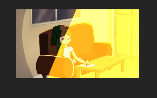
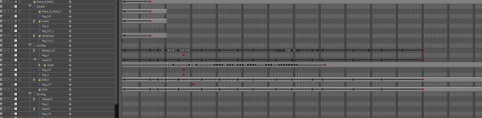
Here is my finished timeline after all of the movement had been animated, just to give a perspective of the scale of this scene.

I will post the final video seperately to this post, seeing as it is so large.
Thoughts
This scene admittedly was one I wasn't looking forward to from the start, and I quickly began to convince myself I was throwing myself in too deep. However, the more I worked at it and chipped away at little problems, the more it began to come together, and before I knew it I had made a scene that I never thought I'd be capable of so quickly. I do think this scene is one I'll be referring back to for motivation from time to time, to prove to myself that if I can do this, I can do anything. I am really impressed with the quality of this scene.
0 notes
Text
Scene 10 - The Process so far
This will be somewhat of a longer post, seeing as a lot has gone into creating this scene thus far, and it isn't quite finished. Scene 10 was one I had always somewhat dreaded coming to, so I opted to place it slap bang in the middle of my schedule so I wasn't tempted to delay it or replace it entirely.
Scene 10 has the concept of a room rotating in a 2D space, one I'm not sure why I decided to torture myself with but I did. The first hurdle was deciding how to go about creating the rotating effect in the first place.
The Rotation Paradox

I began with a very fast block rendition of walls rotating in correlation with one another. As the rotation would be just beyond 90 degrees, I knew I could get away with three walls, the middle wall being the most detailed as it gets the most screen time. I thus created simple backgrounds to use in place of these blocks:


After arranging the backgrounds in place of the blocks, this is what I was left with. The floor was particularly painful to try and arrange, as I still haven't quite gotten the hang of mesh transformations in toon boom, though this will soon be ignorable with the furniture atop.

The Furniture
In order to create a believable rotation, I needed to sketch the furniture in accordance with the angles of the walls, which really helped me to mentally map out where each piece should shift. I began with the main piece, the sofa, which I soon deduced would have to be in two separate pieces in order to properly sit the character. I key framed in an end pose, a beginning pose and a middle pose, and went from there, referencing the wall angle always.
Following from this was the table, which followed the same rules, though this was a lot easier as it was just straight lines. The trickier one to get was the TV, which is designed to be big and clunky and a full artifact of the 2000s. Achieving the angle I wanted was quite difficult, so I opted for a faster rotation with more exaggerated frames, so as to get the screen on screen quicker. This is how the sketch looked:

From here, I was able to work on the lining of the furniture, as well as the colouring. I wanted some kind of gradient shading using block colours to reflect the angle of the light, and this follows suit for all of the furniture pieces. Here is the result after colouring:

Character
Though I still had the shelf to complete, I decided to begin work on the character of Em, in order to get the rotation mapped out as best I could before it came time to line her. I am currently still in the process of doing this, but here is my progress so far, with more in betweens to come:

I also took the liberty of beginning the sketch of the animation on the TV, so that things would be easier to breeze through later. Here's a quick shot of my current timeline:

As I continue to work on this scene, I will keep the blog updated.
0 notes
Text
Scene 1 - The Process
I recently completed scene 1 of my short film, and though not particularly challenging, I thought it best to post a run down of the process and whatnot. This will be a shorter post, seeing as I didn't do anything new with the animating process, but will be cohesive nonetheless.
Sketch and Line art
I began by sketching out my character in accordance with the key frames from the animatic, each new pose got a key frame, from which I could in between animate and tinker with.

At this point, the character wasn't of the correct size, as I needed the extra scale on what I was working on. She is however, in the correct position, so a quick parent peg resize at the end wold do the trick.
I proceeded to line beyond the sketch to get a more solid piece of line work, though seeing as the sketch is so detailed, the differences are honestly quite negligible.
Colouring and Shading
From here, I utilised the same process as that of the previous few scenes, creating a colour layer from the line art, bucket filling the layers and then using nodes to create a shadow and highlight effect on either side of the character. The last things to do were to add the vignette, and to rig the camera movement.
Apologies for this being a much shorter post, in all honesty there wasn't much to distinguish this process from the last few, and going into the same depth once again felt redundant.
I will post the completed scene on a separate post.
0 notes
Text
Scene 8 - The Process
Here is the completed process for scene 8 in my short film. I admittedly didn't record my steps as thoroughly as I should have for this scene, so I will try and go into as much detail as I can.
Sketch/Lineart
I began by drawing out and animating the first and second appearances of Em in the scene. Similar to the previous scene, I didn't begin with a sketch for each frame but rather the line art as it was, since there really wasn't too much movement to be done save for the hands and the head.
Colouring was moderately easy as well, as I knew it would be arranging the nodes into a suitable form that would be the hard part, so I kept the basic shading simple. The particular progress for this animation segment can be seen in my previous post, should you want a closer look.
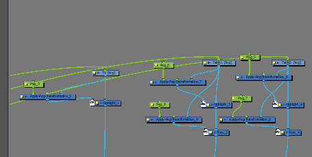
Nodes and Shading
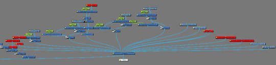
This is where it once again got a little tricky. I decided to reference my node set up from scene 2, as I really liked the shading and highlight effect and felt I could expand on it. My node layout ended up looking something like this:
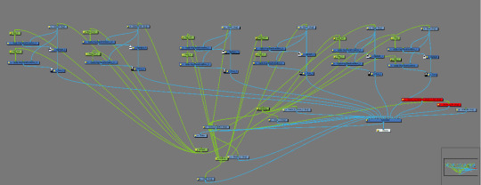
The highlight and shading are applied to different pegs, which actually made it far more difficult to move in the log run. I did this for each independent piece of animation, including separate hand layers, and made sure to set the colour, level of blur and alpha levels to the same on each individual peg. I decided to go for a softer look this time, as I didn't want the lines to be as harsh, seeing as they are all out in the sunshine. Here is what the character looked like with the shading effects applied:


Animating and Troubleshooting
Now came the trickier part. Everytime I tried to move or resize a character, the shading layer moved or re-sized at double the speed and would never move in coordination with the base layer. I spent hours trying to troubleshoot this, I looked up the question online, looked on forums and youtube videos, but even with the specific wording I couldn't find the fix I was after. I tried relocating the pivot point, assigning new parent pegs, changing the layering of the nodes but nothing worked and I couldn't figure it out. Here's how I at least partially fixed it:

Under layer properties for each individual peg, I found an option to ignore parent scaling, which I didn't think would help, as I WANTED the shading to correlate with the parent scaling. However I thought to try it anyway, as well as locking the scale and in tandem, this meant I was able to resize whilst retaining the placement of the tone and highlight. Moving the object still caused some skewing of the shadows, though it was so marginal now that I could simply readjust it by eye, which was a relief.
The only thing left to do was to import my extra characters from the other canvas and get to work. Here's how my timeline looked:

As can be seen, I utilised parent pegs very heavily in this to achieve the placement I was after. I also had to do some rethinking of how to get the smaller assets to move, as trying to move the hands and glasses was a pain seeing as they already had assigned key frames to the character. Ultimately I placed these assets under their own parent pegs and moved them that way. I found out that if I chose to move only the base layer drawings, rather than each and every transformation layer that they would just follow suit, and so I applied keyframe movements to a select few layers under each group and got to work. I additionally imported a PNG of the bush in the scene to cover the anti aliasing of the fence.
Thoughts
In complete honesty, this scene drove me up the wall a little as it had many hurdles, not the least being how I kept having to return and re export after fixing positioning issues, but I am glad to have it finished. This was my first real test run with importing an entirely different animation into a final scene and it was finnicky, but ultmately do-able. The camera wobble was quite routine by this point and wasn't too difficult. I will post the results in a separate post to be seen in full.
0 notes