emilyknightillustration
Emily Knight Paradox Module Blog
70 posts
Don't wanna be here? Send us removal request.
Last Seen Blogs


Text
Project Proposal
Illustration and Audience: The Paradox
Proposal
The subject of my dissertation was; how time and pace is shown in wordless children’s books. Moving forward and using my findings from this writing, I want to create a story based around the idea of a young baker that hates sweet things. I do not want it to be wordless as I would like to get comfortable with putting text into my illustrations and explore placement and typefaces. My Sequential Project was also wordless so I feel like I have explored this enough for the moment.
What I am excited to explore with help from my dissertation is the pacing of the story I create, and using techniques I have seen in the books I used as examples. Being playful with composition will be key, exploring a mix of vignettes, possibly panels and full page spreads. I am looking forward to seeing how much more comfortable I am with sequence after I have spent so much time exploring it in Research and Review.
I want this project to be full colour as I think the colour palette will be important in showing change in tone and pace of the story as well as that, bakeries are fun, colourful places and I want this story to be cheerful and energetic. I think colour will be a challenge as I want to be thoughtful about the palette and not just use colours I like for no real reason. I am going to start creating palettes that I think evoke certain emotions, this will also hopefully help me in creating characters and illustrate what kind of person I want them to be.
0 notes
Text
Age Group
Age Groups
I decided the age group that would best suit ‘Midnight Snacks’ are children aged between five and seven. I feel like the narrative is quite lighthearted, humorous and fun for everyone. However the vocabulary used has a few challenging words such as gorgonzola, Profiterole and savoury. Whilst researching reading levels, I found children aged between five and seven are starting to be able to read more common exception words (tricky words), as well as using phonics to decode words that they are not familiar with.
The artwork I have used is full of texture and mark making with lots of smaller details. Preschool children’s picturebooks often have bolder colours and more graphic shapes such as the popular classics Dear zoo or Where’s Spot?. Therefore I think my audience would be slightly older as I’m not sure my more muted, darker colour palette would keep a toddlers attention.
0 notes
Text


FINALLY DUMMY BOOK.
An A4 hardback book, full colour. With a finished cover, set of end papers and five complete double page spreads
0 notes
Text
FINAL DUMMY BOOK!
I had a few struggles making my hardback book but overall pleased I was able to produce a book.
In future I need to take into consideration the grain of the paper and which way it goes.
Trim the prints more carefully and the final art work came out a little darker than I wanted but the images in the post below show a true representation of what I wanted.
0 notes


Text


Workshop for text placement!
This was very helpful and showed me that you can convey different emotions between characters just by moving the text
0 notes
Text


Colour pallets and textures used for collaged characters.
Darker colours such as the navy blues are used for Bonnie and buildings. Lighter pinks are for the baking parents to distinguish the characters personality's and tastes.
I created textures by painting gouache, acrylic, glass and ceramic paints onto different papers.
I also used a roller to create a black texture
0 notes
Text
Paradox Sketchbook 4
Mostly used to document shops and People
0 notes
Photo


Sequence for final review (PART 2)
Feedback
good use of tone
some spreads too dark
work on gesture
text placement needs more consideration on some spreads
0 notes


Photo

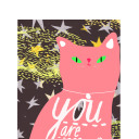
Cover Update!
So far I like the composition, I feel like it might need more objects around the title? Im pretty pleased by the tones and brightness created for the torch.
0 notes