
Statistics
We looked inside some of the posts by emmaaspris and here's what we found interesting.
Average Info
Notes Per Post
4
Likes Per Post
4
Reblog Per Post
0
Reply Per Post
0
Time Between Posts
8 days
Number of Posts By Type
Text
17
Last Seen Tumblr Blogs


Fun Fact
Premium Tumblr themes are available from anywhere between $9 to $49.
Text
Comic Book Confidential (Stage 1 - Research)
14 / 06 / 2020
The aims of this brief are to make panelled illustrations based on observations of real locations/objects and photographic references. •Create at least 5 a4 comic book pages made up of at least 3 panels •Build a narrative exploring the ideas of isolation and coming out of lockdown •Understanding how to create the passing of time in a sequenced visual narrative •Explore & discuss the basic comic book characteristics.

Our core text for this project is the book: ‘Understanding the Invisible art of Comics’ by Scott McCloud. At this point in time as I’m writing this, I have read up to page 60 and so far enjoyed what I have learnt from it. As an avid comic reader myself, I didn’t think there would be so much about this art form that I didn’t know and I’m surprised at the amount of information that I have learnt already, and I’m not even near halfway through the book yet.
Although this might be going a little off topic in terms of comic research, I wanted to talk about a theory in chapter two of ‘Understanding the Invisible Art of Comics.’ On page 53, he brings up a triangle with many different styles of faces drawn inside, the first thing I noticed being that the more ‘cartoony’ ones were o the bottom right and ones closer to realism on the left at the bottom.

This is called the picture plane! It’s a way of categorizing the very wide world of art styles. On page 57, he says ‘When an artist is drawn to one end of the chart or another, that artist may be revealing something about his or her strongest values and loyalties in art.’ Of course, it made me wonder where fit on the graph as well. I don’t feel like my style is realy where I want it to be at the moment, but maybe the way it is now will tell me something about what pulls it to a certain point in the triangle.

As of 2020, my art looks like this:
Most of my work is digital and drawn on my I-pad, although recently I have been looking to try out inks and traditional mediums. Stepping back and looking at my own style, I want to work out where on the triangle it would fit, and I think it would work at the bottom middle, leaning slightly to the left. I think this because although by looking at it, it is very cartoony in the unrealistically big eyes and small noses, I haven’t changed any of the anatomical placements of features. (such as the examples of the cartoon faces on the far left.) However, this is my ow art I’m looking at, so somebody else could see it in a complete different way and I may be wrong when compared to a fresh, outward perspective on it.

Actually now looking at it again, maybe it would lean more towards the right side of the triangle? I’ll have to get some feedback because now I’m not sure.
What I do know about myself is that I am very passionate in the art of storytelling! I think this has influenced my art away from an abstract style (which would be at the top of the diagram) and more towards being influenced directly from cartoons and Japanese animation. I know I like to draw pretty faces and characters (mostly characters of my own) and constantly play around with concepts for their designs and stories. This may show evidence of me leaning towards the ‘ideas and meanings’ side, because most of what I draw contributes to a character I have made up and mostly to serve the purpose of telling a narrative. This would also make sense, since on the most far right, the visuals are broken down into words. And I was a writer before I started practising art. I used to write my stories and ideas rather than draw them. In fact, if I hadn’t known about this course I would have done English literature and language a-levels instead in hopes of being able to publish my own books one day.
Back to Research:
We were asked to look at 3 very different artists. Kastushika Hokusai, Aiden Koch and Sam Elston. (be right back on a comparison between all 3)

(((( Can you define what a comic is in your own words? What are the characteristics of a non verbal comic? • What different forms of comic can you find? How are they different? • How do comics communicate their messages? • Can you list the similarities and differences between the three artists? ))))) *
0 notes
Text
♡ ‘Automatic Encounters’ - Workshop
31 / 03 / 2020
Materials:
Watercolour
Brushes
Fine-liners
What I used:
Digital Media called Procreate on the I-Pad.
This weeks aims and objective are to review basic principles of automatic practise in relation to a specific artist. To also experiment with working from abstract starting points. Also to generate experimental work that shows progression of learning and compare our work to the work of others.
What is experimentation? - The action or process of trying out new or revisiting ideas, method and activities.
But why is it so important? If you don’t experiment, where else can you expect to go other than staying in one place? It becomes increasingly difficult to progress if you don’t try new things.
Our subject of research this week was looking at the Dada and Surrealist movements. In order to show a good response to this, I needed to make sure that in the activity I wasn’t second guessing or deciding consciously what to draw over the watercolour paint. Rather, I needed to draw the first thing that appeared to me out of the shapes of the paint.
The Surrealist movement which started in the late 1800′s was a break outside of the comfort zone of traditional art. This movement celebrated the idea of dreamlike realities and what the unconscious mind is capable of, leading toward some very bizarre looking pieces of art.
Surrealist automatism is a method of art-making in which the artist suppresses conscious control over the making process, allowing the unconscious mind to have great sway. This is why today’s work shop is called ‘Automatic Encounters.’ Because we needed to learn how to let ourselves automatically run on auto-pilot and let our un-conscious minds take over.
An Artist we were encouraged to look at and take inspiration from is
Will Barras

So for the task, here is the watercolour I started out with. I chose these colours because I personally went for the default bright palette I like most. To help not to be a perfectionist about it, I scribbled some parts with my left hand, (my not dominant one.)

Here is the inked version. I used a simple default ink brush from the software and began rotating around the page and drew from the outside into the middle. I did my best to draw only the first things that came to my head while using the abstract background as a guide for shapes.


Time taken: 1 hour 55 minutes.
youtube
1 note
·
View note
Text
Artist Research - Rhettaro
Rhettaro is an amazing modern illustrator I've been following for as long as I can remember. His work is mostly digital and his style looks largely inspired by western animation, like Disney. What I like most in his work is the way all of his illustrations tell a story about his characters. The worlds he draws look classy and have that really cool black and white aesthetic. As I am considering creating an outcome with a monotone look, (to compliment the 1950's theme it's from), Rhettaro's work is a huge inspiration on how to achieve a high quality concept art without colour. Not that he doesn't use colour at all, but most of his work is focused on lighting and tonal values.
As digital medium is also my strongest point, I really hope to push it as far as I can and see where I can go with it. I personally like to make really bright digital drawings, so working with a limited palette will be new but fun to explore.


0 notes


Text
♡‘Post - it’ - Workshop
25 / 03 / 2020
Equipment:
Post it notes
Black 0.3 and 0.2 fine liner
Blue highlighter
Watercolour
Watercolour brush
The aims of this session was to make panelled illustrations based on observation and ideas based on general ideas and sketching. We also were to create at least 6 drawn and inked post it note panels, each one based on a different subject. Then, using these we had to build a non-sequential comic using these panels. Then we were to make a group comic using yours and somebody else’s post it notes. This was to help us think about how we make sense of the world and put non-sequential images together to make sense. When creating our panels, it’s important to keep thinking back to the Gestalt Theory, making sure we are showing an appropriate response.
Comic Definition:
Juxtaposed pictorial and other images in deliberate sequence, intended to convey information and/or to produce an aesthetic response in the viewer.
So what is the Gestalt Theory?
‘Gestalt’ is a psychological term that means ‘unified whole’ and it refers to the way we see or perceive things. This theory was formed by German psychologists in the late 1920′s. It’s based around the idea that everything we look at, we put into groups or unified according to their similarity or shape. For example, when I look at the picture below, specifically at Closure, I see the triangle the most, even though the shape isn’t really there. The black dots and the cuts in them are creating an illusion with the negative space and turning it into a closed off, simple triangle. This is the way that our brains fill in the blanks for us when things don’t seem to make sense upon first glance.

Back to the task, our first instruction was to react and sketch based on visual prompts. We were encouraged to use our imaginations, but don’t take something completely out of the blue. I wanted to make sure that I had a reason behind every post it note drawing and I will talk about that here. I began looking at the bullet point list that our tutor had given us and sketched ideas that first came to my mind. Amidst the corona virus situation, I went out for a walk and took pictures of daffodils I noticed growing around the place. I planned to incorporate them into my work somehow. Tis workshop felt like a good opportunity. After sketching out the daffodil I decided to give it an emotion to make it weird and wonderful. Almost surreal!
The list we were given were:
Objects & tools
Icons of Inspiration
Characters & Alter egos
Motivational words & Wisdom
Emotions & Expressions
Weird & Wonderful
The motivational words I didn’t think too hard about. ‘You’ve got this’ came to my mind straight away and I stuck with it.


The first drawing I did was of the view I see from my window. Although it didn’t fit into the bullet point list we were given, it was still different enough to the rest that I thought it would work anyway. After that I worked on ‘you got this’, for the motivational words bullet point. Those words came to my mind immediately. They’re like a quick believe in yourself motivation that I find really helpful for when you feel disheartened about something. The next one was referenced from daffodils I saw on my walk the other day. I took a picture of them because I thought they were really pretty. I decided to put it under the category of weird and wonderful, so I attempted a surreal idea of giving it can expression. With this, I chose to juxtapose the daffodil’s positive connotation of spring and sunshine with something dark with heavy eye-liner. I think this contrast worked well and I am pleased with the result.
For the inspirations, I spent a while trying to think of how to incorporate people I look up to into a small drawing. So then I decided to go for a different approach and worked on the idea of inspiration connotating with admiration and then infatuation? This is what led me to draw the eye with the light bulb in the middle, staring in amazement at the viewer but then tears of petals because they feel like they could never become someone like the person they’re admiring.
The paintbrush was the first thing that came to my mind under tools. Then the last one was the one I spent most time on, inspired by the mix of alter ego and expressions. I have a personal own character who deals with two identities. One where he’ s transformed into this inky vigilante and the other being a lonely guy with no friends other than Steve, the parasite-like monster that’s obsessed with ice cream and making Cipper’s like miserable. I won’t get into them too much, just enough to give some context. I wanted to create something really deep and I first started with a sketch of a sad expression, but in the end I went a bit further. Although drowning isn’t an emotion, I drew a desperate expression of terror. I wanted to make him look uncomfortable being smothered and doesn’t look like he can quite handle it.
As someone who doesn’t usually draw quite dramatically dark stuff, this was new for me. But I enjoyed it and liked the outcome.
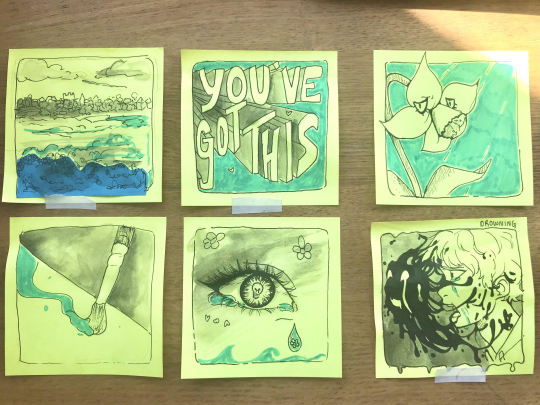
After that, our next task was to put them together and rearrange them into a sequence, then try to make sense of them. Here is my arrangement:

From where my mind tries to fill in the blanks, I interpret it this way. “You’ve got this” they said, but does she? Her tears were welling up quickly, grieving tears spilling over her cheeks as she mourned for the person she knew she could ever become. It was enough to form rivers, her tears suddenly pouring into the world and creating oceans in their wake. As the tears touched nature, flowers took their first breath of life. But from the deep of the ground came the monsters the tears had awoken. Hungry for more, they sought out the helpless to greedily feast on their worst nightmares.
I don’t know when my interpretations started becoming so dark but I promise quarantine isn’t making me crazy.
Group Sequence:

Despite that all the panels are so different, does it work as a comic? I think it does! To me, my interpretation of this is a struggle in seeing the positive side of things. Like an enthusiasm for something it great, but it’s only temporary. I think it’s possible to also interpret this as in someone is trying to make a change in their life but can’t. The eye with the heart in the beginning being a sudden love for something (in this instance, smoking) and then there’s this sort of nothing-ness and suddenly everything revolves around the next cigarette. A friend comes along and gives support to get them out of the addiction. But they re-lapse. Then 2020 is a new year. Suddenly they’re even more determined to make the change.
What this has taught me:
In conclusion, I definitely understand the Gestalt Theory, as it makes sense that our brains will fill in the blanks for us where it seems that nothing makes sense. This makes me think about how humans like the genre of mystery and detective work. Filling in the blanks an solving things as a narrative has been a highly successful theme in entertainment. This theory is something I definitely want to look further into, because of my planned mystery narrative. This has also helped me when thinking about the way I could set out my comic (which is one of the final outcomes that I want.) I should infer some of the clues and panels here and there, not completely spell out what is happening to the viewer.
0 notes
Text
♡ Thursday Electives - Darkroom
𝓦𝓮𝓮𝓴 2
12 / 03 / 20


1 note
·
View note
Text
♡‘Icons’ Workshop - Frida Kahlo
𝒰𝒩𝐼𝒯 𝟪: 𝒟𝑒𝓋𝑒𝓁𝑜𝓅𝒾𝓃𝑔 𝒶𝓃 𝒶𝓇𝓉 𝒶𝓃𝒹 𝒹𝑒𝓈𝒾𝑔𝓃 𝓅𝓇𝑜𝒿𝑒𝒸𝓉
02 / 03 / 20 - 09 / 03 / 20
The aims of this session was to begin to research artists given to us and start to analyse their work. This would help us in future research, giving us an example of how to go about doing this. I think this was also there to show how important Artist research is in preparation for our final project.

”Feet. What do I need you for when I have wings to fly?”
- Frida Kahlo
Frida was born in 1907 and died in 1954. Mostly known for her strong political and feminist views, she was admired by many as a well known female Mexican/European painter during her time. She used her publicity to criticise the art community directly, pointing society out for its flaws and making people aware of overlooked situations. Her paintings were made from oil paints on large scale canvases. Her work is mostly recognisable from the recurring self portraits she would always do, using the same thick monobrow as her trademark.
She quotes “I paint self-portraits because I am so often alone, because I am the person I know best.”
Personally, I don’t like her art work, as it doesn’t look particular aesthetic or pleasing to the eye. Although I can appreciate her painting, I wouldn’t buy it. Art to me is something created to look nice. To be pretty to look at. But her art, especially in the faces that she draws don't suit this style. The monobrow she paints herself with is a statement likely against what society says is beautiful and I can definitely understand why she used her name to promote this idea of beauty standards. She was known as a very political woman with strong views towards the art industry and governments.
I’m not a fan of some of the muddy looking colours she uses, but I can understand why some people do. There is an atmosphere of seriousness in her work, mostly perceived through her eyes as she stares coldly at the viewer. It is clear that what she paints isn't there to look ‘pretty’ but rather to convey her opinions.
As someone who focuses on the aesthetics of illustration rather than the messages behind them, this leads me to ask the question: Can I put a similar emphasis on message through art like Frida does?
I can learn a lot from her example of bold features in her work and important messages.

0 notes
Text
♡Contextual Research - Fables and Fairy tales
10 / 03 / 20
𝓣𝓱𝓮 𝓔𝓶𝓹𝓮𝓻𝓸𝓻’𝓼 𝓝𝓮𝔀 𝓒𝓵𝓸𝓽𝓱𝓮𝓼:

[Source: Illustrated by Virginia Lee Burton for Hans Christian Andersen’s book, The Emperor’s New Clothes.]
The Emperor’s New Clothes is a story about a tyrant king, tricked into believing something that isn’t there and in the end humiliates himself. This is the tricky work of two foreign merchants who claim that their clothes are tailored so well, that only the wise can see them. This leads to the king and his advisors to go along with it, in fear that anyone else ever thought of them as ‘unwise’.
What interested me in this fable was how the whole story was centred around ‘transparent’ clothes, lies and pride. The beginning of this well known story makes you hate the king, but by the end of it you feel half sympathy for the character and half justice and satisfaction that he got what he deserved. The merchants get away with what they have done, because as soon as the king and everyone realises, they are already gone with their gold, ready to head off and deceive someone else.
My favourite part that I want to look at in the story is where a little boy amongst the crowd (while the king is parading around the streets naked) shouts out that he looks ridiculous and is clearly not wearing anything. Only after a child, who is clearly unafraid of what others think of him, unlike the adults who don’t want to be thought of as unwise, points out the obvious that everyone else should have sooner. The use of this young boy in this tale likely shows how different age groups are manipulated by social pressures of this world. This would be an interesting theme to look into for a narrative.
The story also addresses the pressure that we put on ourselves with our appearance. Fashion and clothes in particular is a struggle to keep up with. In order to look fashionable, you have to be aware of what influencers are wearing and what brands are most in right now. I think this causes a lot of unnecessary pressure, especially on teenagers. With clothes that you wear also comes judgement from peers. The Emperor in the story clearly wanted to have the best robes put on him that anybody had ever seen. He wanted to be judged as an amazing looking ruler with a lot of wealth and the support of his country beneath him. By deciding to parade through the streets with his new ‘robes’ on also reveals his boastful nature. He wanted to have these clothes and he wanted everyone to know about his amazing clothes.
That, definitely, is a character trait most people would find annoying and feel negatively about them.
Linking this story back to the project, the trigger in The Emperor’s New Clothes story is the merchants coming to the country to meet the king. This encounter leads to much rising action as the tailors take their time making the robes and a surprise at the end where everything is revealed and turned back on the King. All of this causes much humiliation, but leads to a good message at the end of the story for the reader.
I think this is something that I would like to achieve at the end of my narrative for this project. The sort of story that makes you think at the end, using metaphorical visual language throughout concept art for idea.
0 notes
Text
♡ Brainstorming: Mind maps + Experimentation + Sketches
18 / 03 / 2020
Over the past two weeks we have done lots of varied different work shops and activities to help us in our research and idea development. Over the course of this time, I have come up with a couple of ideas for potential narratives. They are very vague at the moment, because they are just concepts, but hopefully once I am able to settle on one, I can flesh out the story and characters more.
I have three separate ideas for this FMP, but this does not mean that I might pick only one. I’m still open to newer ideas. Once I have gathered together my research and inspirations, I will begin to develop it and start to link it back to previous projects.
In this blog, I will go over the brief idea of each concept and then list out how it links to previous research and projects. I will also describe how each idea came to me.
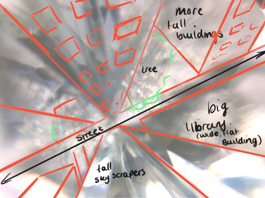
1 - Glass City
This was my first idea, inspired by the preparatory task at the beginning of the FMP. I took inspiration from a glass diamond. Upon closer inspection, I found that the shapes inside looked like the street of a city at a high perspective. This idea follows a main character trying to achieve some sort of goal in this universe. It was fun to think about if a city were made out of glass, what it would mean for the people living there, nature and the ruler. I came up with the concept of a mayor with some aspect of unstable obsessiveness with being able to see everything that’s going on in the city. No secrets. No privacy.
The pros of this idea is the aesthetics I think I can get with this. Especially when looking into how light interacts with transparent objects and surfaces. What colours can I use that will make it look dream-like enough? Another pro to this idea is the way I heavily want to link it back to surrealism. The civilians would most definitely have parts of their features and personalities disorientated and strange looking. Everything would be topsy-turvy, where fish can fly and birds swim.
Would this be an actual reality or would it be a good idea to make all the surreal aspects of this universe have a metaphorical meaning? None of it is actually real, rather from the mind of a young protagonist with a very big imagination?
I could explore surreal character design inspired by the work of Max Ernst and Lewis Carroll (Alice in Wonderland in particular.)
I could look further into light source and its relationship with transparency.
I could work towards an outcome of a highly detailed, large scale illustration that compliments this universe, along with a short comic.
I could also look back at Primitive worlds and perhaps think about trying to build a miniature scale version of this city. (An idea I would have to look into more about materials and how I could work this out.)
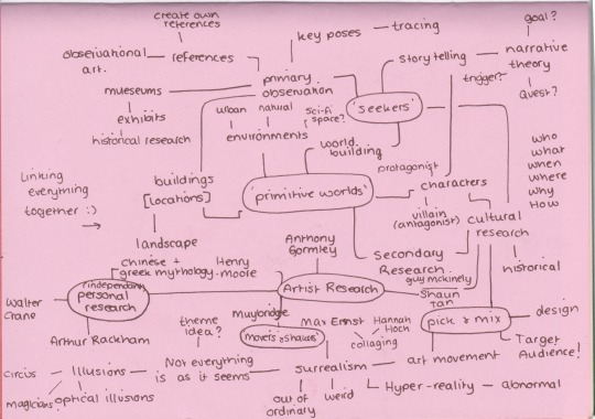
Projects this links back to:
‘Seekers’ - Narratives, Character Design
‘Primitive Worlds’ - Potential 3d diorama, Character Design, World building
‘Pick & Mx’ - Character design, Surrealist art movement.

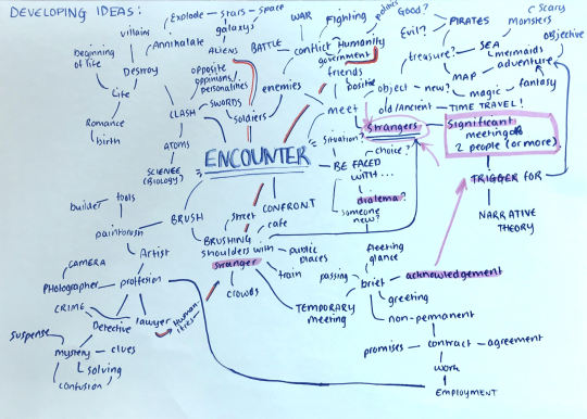
I stuck with this sort of idea for a while, but due to further research I did into Alice in wonderland, and then into the 1950′s, I began to have an idea of something a little different but still in a city setting. This idea also came to me after I interpreted the word ‘Encounters’ for myself using a mind map: A significant meeting of two unique strangers. They have to be extremely different and their meeting must trigger an adventure or ‘quest’.
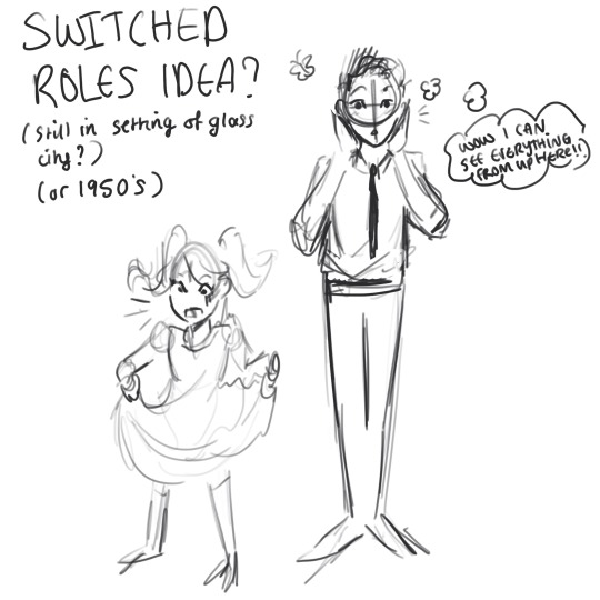
2 - Switched Bodies Idea
The main idea of this concept is quite a simple one but perhaps over-used? The main protagonist would likely be a young but talented detective who is trying to solve a mystery of (*something*) for someone. He’s very talented and one of the best, but as soon as he thinks he’s come close to solving it, he realises it’s a trap and that someone who employed him is actually trying to kill him. Despite the heavy, darker turn of events, while on the run he bumps into a young girl and they switch bodies because of (*something*). This somehow makes him lose the bad guys but now he’s in a 10 year old girl’s body. Then he has to try to solve the mystery with her help so that they can reveal the truth and switch back, thus forming an unlikely friendship.
I’m not sure what it is with me and unlikely friendships developing over a narrative (especially considering my ‘Seekers’ project theme), but I’m all for it.
The themes of this would be mostly comedic, with aesthetics from the 1950′ s detective tv shows and western comic book art. The plot would likely be very character development heavy, as both main protagonists are introduced to extremely different view-points. Their differences will be understood when they learn to live in each others shoes.
Out of the ideas I have come up with already, this is the one that I favour the most currently. But this may change depending what knew things inspire me or if another idea pops up that I like more. Some outcomes I could consider are:
A pose to pose walk cycle of the two main characters. Coloured and Shaded.
Research on western detective shows/animations. Also aesthetics of cartoons in the 1950′ s
Contextual research about the 1950′s aesthetics, influences and life style.
A comic book of about 10 pages illustrating the protagonist’s ‘Encounter.’
Projects this links back to:
‘Seekers’ - Narrative, pose to pose animation
‘Movers & Shakers’ - Muybridge cycles
‘Pick & Mix’ - Character Design, Character turn arounds


3 - Deep Sea Encounter
This idea was inspired by the Dark Room elective I had every week especially the second week of it where we looked at another form of creating photos using light sensitive materials. This process is called: Cyanotype printing.
As you can see in the blog were I write up that week’s elective, the effect of it is a deep blue background and a white outline. My favourite part of it was the way any white bits seemed to glow. It gave me an idea of a potential under water scene. The encounter would be between a mermaid and a diver. He drops his flare and in a panic to get it back, he gets himself tangled up in a net. A mermaid is drawn to the light of it and so she meets the diver, but she isn’t so keen to give it back because she thinks it’s pretty. This is the most vague idea out of the three because there are some big plot holes I would have to fix if I were to pick this. But if I were to create some illustrations based on an undersea world, I think the aesthetics would look really nice. Especially since I can still sort of keep that light source research in mind, seeing how light reacts through water.
The downfalls of this idea are that I think it’s too much like The Little Mermaid, a very well known story. Although I could link mermaids to surrealism, I think that claim would be weak as mermaids are well known fantasy creatures, frequently seen in books and other media. Surrealism is the strange and shocking, so despite that mermaids don’t resemble real life, I don’t think they are particularly mind boggling enough to truly feel like something out of the unconscious mind. However, some outcomes I could work towards with this idea are:
A rotoscoped animation
Character Turn Arounds
Research on certain types of fish and developing them into personified mer-people.
Contextual Research on mythology surrounding Mermaids such as Sirens. (Particularly Greek Mythology, but a little say from every culture would be interesting.)
Finalised illustration.
Projects this links back to:
‘Movers & Shakers’ - Rotoscoped Animation
‘Seekers’ - Narratives
‘Pick & Mix’ - Character design, Surrealist Movement

0 notes
Text
♡ Thursday Electives - Darkroom
𝓦𝓮𝓮𝓴 1
05 / 03 / 20
𝒰𝒩𝐼𝒯 𝟪: 𝒟𝑒𝓋𝑒𝓁𝑜𝓅𝒾𝓃𝑔 𝒶𝓃 𝒶𝓇𝓉 𝒶𝓃𝒹 𝒹𝑒𝓈𝒾𝑔𝓃 𝓅𝓇𝑜𝒿𝑒𝒸𝓉
Equipment:
Photographic Paper
A darkroom
A small light source for example an enlarger
Some objects (translucent objects and things that will make interesting shapes)
The aims of this session was to begin to grow an understanding of darkroom processes and create images that will help us link to our idea development of Encounters. Our tasks were to start out with some test strips and then move onto trying to make faces out of objects. This was a good opportunity for me to start thinking about character design.
I had never done Photograms before, nor was I sure what it was completely when I picked it. When we had to pick electives, I liked the aesthetic of the black and white pictures being shown to represent this workshop and that was what drew me to it. But I also knew I wanted to try something outside of my specialism, like photography.
What I thought was interesting was how these images were appearing without using a camera. In that lesson, I learnt about Photograms as a technique that photographers use to transfer an image onto photographic paper without the need of using a camera. It’s one of the simplest ways of creating an image and requires little equipment.

We had to set up out objects underneath a light and then set a timer for how long the paper should be exposed to light for. After that we put the photographic paper into solutions and soon the image starts to appear. Then, you wash it in water, dry it and then you have a picture!
This was a process I wasn’t used to at all before, especially that none of it gave me the opportunity to draw until the very end when we were given translucent paper. I feel like I rushed the drawing of the girl at the end, because of the amount of time we had left, but I tried to achieve a sort of crying character.
Overall, this elective really inspired me, especially with all the black and white images. It made me wonder if colour is really necessary sometimes to create an illustration. If I made project in black and white, what would be the effect? I think it would highlight the darker themes of the world more than the positive, but it might also look too monochromatic. I’m beginning to think about how splashes of colour like reds or a rainbow when light is split through a prism of glass could be effective in conveying certain emotions and feelings. I think a limited colour palette will definitely be something to look into and experiment with.


0 notes
Text
♡ Primary Observational Sketches - Coffee Shop
𝒰𝒩𝐼𝒯 𝟪: 𝒟𝑒𝓋𝑒𝓁𝑜𝓅𝒾𝓃𝑔 𝒶𝓃 𝒶𝓇𝓉 𝒶𝓃𝒹 𝒹𝑒𝓈𝒾𝑔𝓃 𝓅𝓇𝑜𝒿𝑒𝒸𝓉
03 / 03 / 2020
As part of my feedback from my past projects, the biggest critic I took away with me was using primary sources and how important it is to reference from real life. I have a habit of drawing what I imagine from my head, so to break this I need to be drawing what I see in front of me instead. Despite how this wasn’t so exciting to me at first at all, I soon think I got the hang of it and started to enjoy it.


I went to a local coffee shop and drew strangers that came and left. The reasons for this was so that I could start to understand primary observation. Here, I was giving myself the opportunity to experience an atmosphere that could inspire me with more ideas for this project. I began to wonder about having a narrative set around a coffee shop. Rather than a normal one though, would there be an aura of magic and wonder? What if they didn’t just sell coffee, but also had a secret menu you could order from that only select people know about? Would the cafe be set in a city or village?
I had an idea of a narrative from this experience. The main character is working in the cafe cleaning up and about to close up but maybe one of the paintings on the wall comes to life, where they suddenly are introduced to a side character (and potential love interest.)
I aimed to fill at least 10 pages of observational sketches. Although I have a habit of drawing too big and only got about three sketches on a page at a time. This activity helped me to see what I was capable of. As this isn’t something I used to do very often, I wasn’t sure if I would be able to get good results from primary observation. So I am surprised at myself, as I think I was able to get them in their proper proportions, though sketching a realistic face straight from a primary source could use some work, as I had a habit of focusing more on their stance, clothes and poses to think really about the details of the face that sets everyone apart properly a individuals.


I have learnt so much from this task, such as how important it is to draw from observation and why. This has made me see flaws in my own observational work, as I have a recurring habit to draw from my head rather than exactly following what I see. I struggle to pull my art away from being so stylized, because it’s what I’m so comfortable with. When I was first advised to put more emphasis on observational drawing, the only thing tat came to my mind was drawing strangers. People. But after my recent individual tutorial, I was encouraged to look at more buildings and architecture rather than just humans. This would help me to link my current ideas of a glass/transparent city to primary research.
Overall, this has taught me to not confine myself to only drawing humans. Draw buildings, objects and glass. Expand your visual library. Don’t limit yourself (something I was doing without realizing.)

0 notes
Text
♡ Preparatory Task
𝒰𝒩𝐼𝒯 𝟪: 𝒟𝑒𝓋𝑒𝓁𝑜𝓅𝒾𝓃𝑔 𝒶𝓃 𝒶𝓇𝓉 𝒶𝓃𝒹 𝒹𝑒𝓈𝒾𝑔𝓃 𝓅𝓇𝑜𝒿𝑒𝒸𝓉
28 / 02 / 2020
♡ Select an image of an artwork or design in a museum collection that you like.

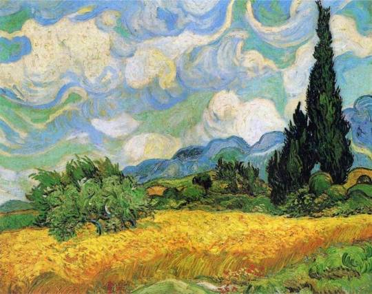
Vincent Van Gogh was always an artist I had heard about and seen a couple of times, but only until now when I was looking at the exhibits at the national art gallery online did I find that it caught my eye. A Wheatfield with Cypresses is my favorite work of his, as I love how his emphasis on shape gives an illusion of movement. Despite that this is very clearly a still painting, one of the first things that I notice is that he scene looks windy. Although it’s obvious that you cannot see wind, in this painting, we can see the effect it is having on nature as it passes. What I love most about this piece is how each stroke is curved in some way, following a pattern throughout the piece. Even though there is a lot of emphasis on circular lines, you can still effortlessly point out every different object and plant. They’re still recognizable.
The darkest point on the painting is the tall trees that span more than half of the height of the painting. When I look at this piece, I find that my eyes are always brought back towards the trees. The way they swirl with the shape of the clouds in the background gives the illusion of movement.
Connecting this back with the project though and the ideas that I have, I feel like it’s important of the illustration and concept art that I make will be able to tell a story in itself. Illustrations don’t have to have realistic silhouettes. Especially when I’m working with an idea of a man made, extremely built up scene, I can illustrate the unnatural way streets and corners are laid out. Planned out to perfection. Perfectly organised in rows. Straight lines and pointed corners will make the scene look sharper and somewhat unfriendly looking.
As part of our preparatory task, we also had to look at a quote that inspired us.
“Would you like an adventure now or shall we have tea first?”
- Lewis Carroll
This is a quote said by the Mad Hatter towards the main character, Alice. During her stumbling into this new world, she comes across the Hatter having tea with the hare and a mouse. She begins to question about why she is there and tries to get some answers from them, but their replies are very vague and don’t usually make much sense. What I love about Carroll’s universe is how everything feels so surreal and weird. The Wonderland that Alice is surrounded by feels almost dreamlike, because of all of the strange goings on such as using a flamingo as a crochet bat, playing cards come to life and a purple cat with a crescent moon smile.
This quote stuck out to me the most, as I like the lack of urgency in the tone of the sentence. The use of the question allows the character Alice to respond and make a decision whether to simply put off an adventure. Hatter’s character is illustrated here as insane and slightly too relaxed. We as the audience are immediately given the impression that due to his personality, he could easily be comfortable and content in a scene of chaos. This level of imaginative character writing from Lewis is so intriguing and interesting to me. How much more interesting is a slightly insane character to read about? Could I create a character with similar mad qualities? Does insanity on a character automatically make them a villain?
By comparing an adventure to something as mundane as having a cup of tea, Carroll is hinting to the reader that there is no rush to get Alice out of the dreamlike wonderland she’s in. This comparison is also very well thought out, as it easily helps an British audience to relate (as Lewis Carroll is an English Writer himself.) Within the narrative itself, Alice is following a white rabbit who is always muttering about being ‘late.’
“I’m late, I’m late! For a very important date! No time to say ‘hello, goodbye,’ I’m late, I’m late, I’m late!”
- Lewis Carroll

[Source: Disney’s 1951 Alice’s Adventures in Wonderland animated adaptation.]
This is why the earlier quote from the Mad Hatter intrigued me so much. It feels almost frustrating to the viewer that, as the main character is in a rush and time is clearly of the essence, that another character is paying no attention to urgency. This has made me think about the themes of my narrative that I could create. Maybe by making the viewer feel this level of frustration with my themes, but also enjoy the out of the ordinary world building I want to create.
Connecting back to some of our previous work, Carroll’s story could be considered to fall into the category of surrealism. Synonyms of surreal are: dreamlike, bizarre and out of the ordinary, all words that can easily describe the world down the rabbit hole that Alice had fallen into.
Artists part of the surrealism movement in the 18th century wanted to create art that went against all forms of rationalism. Their go was to free humans of the oppressive ordinary things and introduce them to what the irrational, unconscious mind is capable of seeing. Although Carroll was a writer, he was born close to the time of the surrealism movement and may also have seen a part of it. This makes me ask the question if Lewis Carroll was a surrealist himself, writing Alice’s Adventures in Wonderland as an escape for himself and his readers to enter a world different from our own.
The White Rabbit meeting Alice (triggering her adventure) = Encounter
Overall, this Preparatory Task has significantly helped me to form ideas and come up with new ones. Without this, I feel as though I wouldn’t have the ideas that I do now. I now feel more comfortable with the theme of the brief and definitely feel like I could tie down some ideas and form a narrative with them. But for now I am aiming to keep my mind open to future research, so that I can still allow other aspects of my research to influence my final project, not just Alice in Wonderland.
I’ve always admired Carroll’s Alice in Wonderland, so it felt good to analyse it slightly more in-depth. The world building of his wonderland is most definitely something I want to re-visit in future.
0 notes
Text
♡ Preparatory Task
𝒰𝒩𝐼𝒯 𝟪: 𝒟𝑒𝓋𝑒𝓁𝑜𝓅𝒾𝓃𝑔 𝒶𝓃 𝒶𝓇𝓉 𝒶𝓃𝒹 𝒹𝑒𝓈𝒾𝑔𝓃 𝓅𝓇𝑜𝒿𝑒𝒸𝓉
26 / 02 / 2020
♡ Select an image of an object that inspires you. This could be something in your home/garden/room/journal. Take a photo; tell us why you selected it?
In preparation for our final major project, we were required to undertake a research activity in order to help us generate ideas and themes for our project.
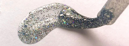
The first thing assigned for us to do was to find an object or image that inspired us. When I first saw this task, I was confused as to how I could find an ‘inspiring enough object, but once I had found something and experimented with angles and perspective, I began to understand why referencing from real objects in a 3d space like this was so useful. Why were we looking at inanimate objects with no obvious meaning to them? Especially if they had no expressions to work with or human-like features. Why would they be useful to producing a narrative, animation or character? Only after taking some pictures did I begin to understand the significance of this task. Using the glass diamond shape from my window sill and some glittery nail polish in my room I took pictures of them with my phone from different angles. I’m no photographer but I tried to look at close up angled and perspective where I could use the shapes, colours and detail to my advantage. I wanted to highlight each objects best qualities; such as the diamond’s glassy, clear material and the polish’s small detail and iridescent colours. I was drawn to these objects because I noticed the sunlight filtering through them from my window.
The way that light interacts with these inanimate objects intrigued me the most. In the dark, they look completely ordinary and lifeless almost, but when the sun hits them, colour springs out of them and then they become aesthetically pleasing to look at. The glow in the gif below reflecting off of the smoot glass surface is only possible when a light source is involved.
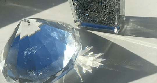
There are many things in this gif that inspire me, one of them being the way the light has filtered through the diamond and painted a shiny pattern on the surface on which the diamond sits. The shape of the pattern looks sharp, like real shards of glass with hard edges. The immediate thought that came to my mind was the pattern of a snowflake and a scene from an animated movie were a large, sharp looking, almost crystallised snowflake is under the feet of an ice queen.
There's a specific scene where during the characters music number, she stamps her foot on the ground and a icy, crystal snowflake forms from the middle outwards. I love the smooth way that the camera pans out to show off the rest of the snowflake forming under her feet. This sort of perspective and camera work is something I would like to achieve in an animation, if I decided to make one for this project.
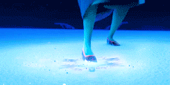
[Source: Disney’s 2013 Frozen Movie.]
Another thing I liked about this gif is the way a pinpoint of light is being reflected straight into the viewer's eyes. As I watch it, I realise I'm only concentrating on that beam, as it draws my eye the most. This has taught me how to influence where the viewer looks first. The way it shines reminds me of a common Japanese anime trope where weapons will glint menacingly in sun/moonlight when unsheathed. This is likely to get the point across how dangerous of an object it is and to emphasise its deadly sharp make.
This gives me lots of ideas for potential scenes where I can use this to my advantage, perhaps using it to draw the eye of the viewer somewhere else on the screen so that they can notice something before the character does. This leads me onto questions such as: what could the glint be coming from? Something like treasure? Or a knife hurtling out of a dark spot? Is there an attack? How would a character react in a situation like that, depending on their personality type?
Iridescent Definition:
- showing luminous colours that seem to change when seen from different angles.
‘Iris’ means rainbow in Latin. ‘Escent’ is an English word.
Synonyms:
Shimmering, glittery, sparky, gleaming, multi-coloured, kaleidoscope, opalescent, prismatic, colourful, rainbow-like, glowing, shining, dazzling, opaline, many-hued, lustrous.
Antonyms:
Colourless, dull, plain, faded, bleached, dark, bland.
What I really like about the diamond shaped object I chose was the different shapes I could get, my favourite perspective being the very zoomed in picture. At this angle, to me it looks like the dark lines of glass are tall skyscrapers and the glitter at the bottom are the details of people, cars and streets below. I personally really like the way it almost looks blurry, because it leaves the viewer’s brain to fill in the blanks. This is an effect that inspires me to use something similar like this in this project, leaving my illustrations up to the viewer’s interpretation.
The glassy effect that it has as well leads me to think about what a city would look like if it were entirely made out of glass. Fragile and delicate, what would that mean for the people living there? Can the world I set my story in have similar fragile qualities? Should I consider a city aesthetic?
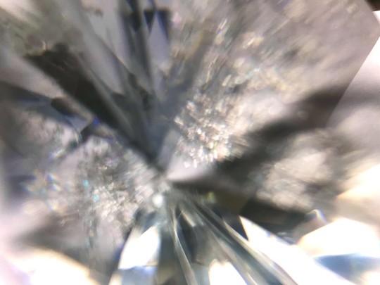
If I were to create a world based around a fragile material such as glass, light would be an extremely important aspect to research. Ways I could do this is study how professionals use it to convey a meaning or feeling in animation. I could also examine light and how it interacts with surfaces in real life, plus the absence of it. The way that shapes can also be twisted and changed through curved glass is something I would feel important too, as in a glass world idea inspired by these pictures, I wouldn’t want to use too many straight lines, as I would want to make the most of all of the properties that glass has.

As I filmed this gif on an open sketchbook page, the way that the end of the page seems to tilt and bend upwards was unintentional but interesting. If I were to animate this, most of my attention should be focussed on how lines and objects behind something like this.
Light Animation Test:
Using procreate, an app on the ipad pro I am very familiar with, I decided to test out a quick animation of a light moving along a surface, reflecting up to the viewer when it got to the middle as its brightest point. I used the gif at the beginning of this post as a reference for this. Although there is no object in this test, it made me think of how I might put this sort of animation on something shiny. Immediate ideas that come to my mind the glint of a sword/shiny barrel of a gun or sunlight traveling across the surface of a tall, glass building. I used 19 frames for this and the frame rate is at 12 per second. I feel like the light might be moving along the line a little too quickly, and it would look better if it were slowed down slightly, just s that the viewer can notice the effect for longer and for it too ave a slightly longer lasting effect.
Using a shine effect like this in an animation, depending on the context of which it is being used, could invoke different emotions.
After this preparatory task, I can really see the benefits of it. Whereas before I found it hard to imagine trying to take inspiration from an object, now I have far more ideas about what to do for the FMP than I did at the beginning. Although nothing is final yet, this research has helped me to see that inspiration and research does not just have to come from the work of other artists, and how important primary research is to development of ideas.
0 notes
Text
Creative Writing:
Most gardens have a song to sing. Usually a familiar symphony of rustling green leaves stroked by a cool spring breeze. An exciting buzz of wildlife and a splash of fresh dew dropping soundlessly from luscious leaves. But this place was different. Silent, as though even the wind himself knew to hush; in order not to awake what was slumbering here. Amongst the shrubbery, behind where the slug named Sid sat, stood something ancient with vines delicately curling around its wide waist. One hollow eye followed the newcomer’s movement, stretching towards the forbidden golden fruit.
Finally. A friend.
0 notes
Text
Electives - Ceramics Final Piece
Thursday 3rd February 2020
My aims for today was to identify and document what I have learnt in 3D problem solving in ceramics and communicate it through a final piece.
Materials:
Clay
Tools
At the beginning of this project, I had very little knowledge of working with 3d materials and how to turn them into somewhat aesthetic looking figures. I feel like this statue I had made really shows my progression over the weeks, from the first workshop until now.


1 note
·
View note
Text
Henry Moore - Artist Research
Friday 31st January 2020
Aims & Objectives:
To identify the possible influences of research
To identify methods of effective presentation
To use research to influence and support idea development
Henry Moore was an English artist, born on the 30th of July 1898 and died on the 31st of August 1986. Most of his work suggests the female body, using bumps on the chests of his sculptures and wide hips to infer femininity through his pieces. His semi-abstract style has led many to enjoy trying to interpret the meanings of each of his works. The materials he was most familiar with using is bronze and marble. Around the 1950’s, his work took on a family theme, usually depicting a mother and her children’s meaningful and deep relationship. When he became well known for his large scale marble sculptures, he was able to earn a lot of money from commissions. This made him exceptionally wealthy, but most of his money went to funding the Henry Moore foundation, which helps to support education and promotion of the arts.

What’s interesting about Moore’s work is how little colour and texture he uses to create emotions and impact on the viewer. All of his sculptures carry the same neutral colours, never covering over the bronze and marble in other colours not associated with the materials he had made from it. This was likely to make his work look far more natural and that something older or more ancient could have made these pieces.
In terms of texture and shape, all of his works are very smooth, with curved, soft lines and gradual arcs. This is likely to give a sense of calmness about his sculptures. All of his works have this recognisable, smooth theme. I think this must just be his signature style in sculpting arts. Though some wonder if the curves in his art was inspired by the rolling hills and valleys of Yorkshire, where he grew up.
“...if I spent a lot of time at the British Museum in those days, it was because so much of the primitive sculpture there was distinguished by complete cylindrical realisation.”
-Quote from Henry Moore
Tone is unimportant in his sculptures, as most of what he made was displayed outside, so lighting was not in his control.
1 note
·
View note