
Don't wanna be here? Send us removal request.
Statistics
We looked inside some of the posts by emmaillustration and here's what we found interesting.
Average Info
Notes Per Post
0
Likes Per Post
0
Reblog Per Post
0
Reply Per Post
0
Time Between Posts
16 hours
Number of Posts By Type
Text
17
Last Seen Tumblr Blogs


Fun Fact
Premium Tumblr themes are available from anywhere between $9 to $49.
Text
20th hand in reflection
i really enjoyed this class and the tutorials and time spent on video examples and group projects was amazing. i couldnt of done it without you. it does seem to work a whole different way from my previous electives. and i need to get better and layer work my file mamagement ended up pretty great. through chilli tasks etc. the shape idea through my final concept could have been tweeked to make a wow factor on my behalf.i do feel as you mentioned my artwork was based off a more organic sketch approach and my consistancy on that ended upa bit over the place. the part where the shine of water sunlight came in and saved me with the erasing for removal of white and colouring as the darker foam green around it i just wouldnt remeber how we got there. my final line accurancey tumbled get it tumblr. the font was okay to rely on but drew myself and turned over it so it interacted with the scene and water might of saved me from drowning. the videos during class really intrigued me and i took and tumblr worked on it so gracefully. the relationship between the body and the water right around her was very difficult although that was the whole task. the waves where she dips in the water was an okay challenge. This class taught me that story is key to others around the work without you there of what they might percieve. i. didnt seem to dig into the relisation of realism in my art work lol. i really enjoyed the mermaids line of action and composition through character rather than always font or image in other classes. i like my scarf idea and her props and enemy i thought of keeping that dres to tail option open. her kid like attitude is there. if we had more time i would of liked to learn of changeable light values and areas to the parts for layers and into imagery. because changing my mind went passed all that colour picking to value in areas. thanks for opening my eyes and hoping i get out of the water soon!.
0 notes
Text
20th june friday
extra study from the night before

tips for myself efore i got back to polytech rough phone screenshot to phone sketch on different points of action to take for 20th


worked with a more fimilar tail shape as my mum and dad suggested its not really mermaid like playing around with the made up font i was acting like it would be like shiny letters like metal . but used ut as if its dipping into the water showing the audience the last image stuck with as more pop like wanted to start going ahead with making the ater area more sunn yellow like the shadows at the end of it i went far to crazy and the finsihed product look like this this is the tail before the correct sunlight colour. the lettering is way more suttle and doesnt scratch acrooss the dappl like the first practiced one i did of the dapple shine. idk why im not as good as i should have been ii looked back on the reference of handpainted stylized textures but just didnt do right.

LIKE SHES being overexagerating squinting gagainst the light i made her eyes more human with red areas and white dot and the lietters are meant to act like the suns coming that way from the bottom left corner as her tail got more of it as a shiny surface. i dont think i spent enough time on the reversible sequin tail and should of really gone ahead and not just create outlines but fille the spaces or something. the face and body shape began far too washed out no shading nothing around her stomach expecially. i thin k the font worked out. qquite well as in any more and we wouldnt be able to read it. i made the mermaid far too green the sea around it the sunlight should of worked opacity wise towards the white opacity of the sunlight spot around her but it turned greeny and the tail kind of worked it looks so flattt. sorry
0 notes
Text
19th end of it. ahah almost.

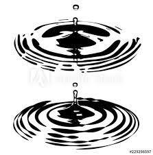
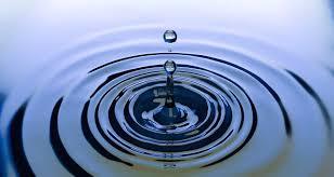
learnt about value study visual weight through grey tones. at the start i understood the through screengrabs and all getting too far forward i started colouring the pallets rather thatn using colour changing. using the command u but afterawhile i started loosing ability in futhur shading and tone areas of tail etc. i just started painting the detail . so it would be imposible through changing grey scale colour values which i am dissapointed in myself. the problem came about through lack of clarity and finsih work in the character line work. patchy sides happened etc through lamprey and waves the lecture from the cicle light it wouldnt really do that in relationship between water and person lying on it. found reference images of ripple effects and light greeney water more lake like. the light aim still needed worked on. shadow change was a bit light work. .


didnt end up doing a moodboard on her as my colour value practice sliped out of the way so fast and if id do it again another lesson through that and where the shading value layers come in is where it all spiralled.
0 notes
Text
colour value


adding korus in tree blanch and a sandal and colour valuing with pallets. REPEATING the sequins over in the section created made o the tail dress could have the sequin again too edge


the blue was changed. one viewer i showed said warp the tree maybe so i did that through. though i couldnt get it to move around her rippled area. the change of spotlight imagery was used to a water sunlight which works better the lamprey lower in water works better.
0 notes
Text
19TH JUNE thursday font type


font picking now he suggested it would be organic
the ripple effect dipping into her hip and tail needs to be edited


using marhey light typeface but drew my on flick style to work on moving type around quite like the way the font bumps up on the b before the l shos the natural wave art around the rest of mermaid and wave ripples and lamprey


old ripple and new the tail rippl works. just not the body referencing the blue lady floating as its straiht forward and she simks in areas i will think of on colour scheme later
colour value tip click command and tap icon and it will selct the coloured in area. and then make new layer and paint in other shade value
haha mix up i was toggeling colour picker with section of command click layer image meant to of cluck command u and that changes the value shade of grey
the colour rize effect is just change hue and saturation not lightness because the grey tones in art are already the lightness you want
where the jandal goes is difficult as it takes away from the s of the tree to mermaid to the water against head and then font title
0 notes
Text
19th june thursday.
next hour goal figure out ripples placement of tree as it should not follow the line of the mermiad add and positiol title and lamprey observe the line of action with against ripples.


first image ripples startin and they dont alwats just line as a circle around her body. 2nd image the tres line follows h girl which isnt suggrsted and looks likes shes apart of it nomatter how hard you try and not see it you do. the ripples been working on are quite hard but going based off an image i found through searh person floating on water animation image


went off reference lamprey through the finn a little bit and but still used same curve and lamprey shape from first rough sketch
tried another lamprey shape and it didnt really work the way this one does.
0 notes
Text
18th june colour pallet choosing
in the work so far i choose to do most detailed to start with as it helps get the preject on the way without hasstle. the good thing is the mermaid is already a proffer character and postions arre correct


getting a more understandable mermaid tail and body.
reshaping how i feel from futhur sketch


following the tulip shape with the line of action
The last one with the girl added an d twisteed her body section around the top. the lecture thought the hips on the new lower body worked as my progress through other ones worked the top left on looks like her tails rising off water. so used the tail that had been practicing with the soft edges rounded version to still have her old feel. the lecture suggested when you view a mermaid their shape is way different and you dont got. the bumps and all so practiced drawing and at the last minute it turned out the best on original but reformed based off other sketches

reflection experimental sketches worked. fimilar mermaid figure worked some of the arch of the bod worked as it acted like hips and position there . my shilohetes werent practiced futhur but they were applied through box practic eas my character in those positions but loved this one s shape i feel i maybe didnt use a recognisable shilohette at all or cartoon like. i did start with the triangular technique of each part bod and it didnt work as the tummy is not just a perfect circle.
0 notes
Text
18TH JUNE wed.
through the 16 boxes of artwork i went around the class with a a3 print out and asked peoples udeas and chosen options


tehse 3 were the choices of favourites
the first one i described that the mermiad has her line of action aswell the lamprey is looking back angriliy and she lys on the water with the trees reflection theres enough there on. the s focus that it drws you through the mermaid to the lamprey. the audience might question why shes lying against the water and why the lamprey is dissapointed and avoiding her space. A person in the class said if you were incorporating the nz accents the way i have in other two i could put suttle korus around the rripples around her body. the good thing about this also is the target point is till there but its meant to be based of her middle body it also targets the tree which is the goal through the character.
the 2nd one has the dunedin octogan clock in the back and the wanaka trees leading her through to the target of he treess reflection perspective has been used as i show off feedback sticky note pads of the kiwiana accent and the lamprey is hiding spying on her through the bucket. the target i expressed was in a odd place very odd and the title doset work with the picture above the trees. her journey through dunedin to wanaka works well and thats why it was the second option . the thid option was extremely quick thought of and the target is shown the tree dark side is the lamprey chasing her but shes also chassing the treeprotecting it before the powers take place. it shows her the evil to sweet side. the more i explained to people the less i became determined for the finished product as the mermaid is not shown well the lampreys on the side which is a different perspective aswell the trees just plonked there which theres no correct angle situation.
0 notes
Text
18TH june wed
colour values. the darker futhur away via mountains hills.
still thinking the dapple technique works
through the last few days of the box drawings the reflection of the tree bacame quite a common idea through the pallets
the target became more dominant as the tree is the target.
meanings in colours on the student hub my courses week 4 like blue for the sad guy off inside out red for chillies.
clients could say why you using the colour for their company got to be a client for ourselves through this project. because we will leave the art work for the viewers for curiousity or wanting more out of the poster based off the colours aswell.
monochromatic colour pallet using the coloue with different hues and opaicities. refer back to this if you have too many colours overwhelming you. can base art off a hue range of green so you can see if the dominant areas will be the right one.


like the example posters the red shoes and the blue midnight one. these are almost a muted colour scheme which is another tactic. leaving a few colours around image bright like the lamps in scene.
the red shoes - this one inspired me to. dod some work based off my mermaid one looking up through the ocean to the surface which is lightest
oposite of the colour wheel tactic yellow, purple for pansies it happens. green and red orange and blue. different effect if you put around other colours illusion based off purple and pinkimage
tip accent of the oposite colours on wheel is great idea last image.


Be on adobe colour colour.adobe.com colour create colour
saw a Poster downstairs using monochrome effect
0 notes
Text
highlight and shade 17th june tuesday
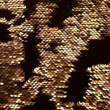
m y outfut for the reversible sequins. might need the light effected against it during night maybe. strong highlight is needed the shinier the item is. very shiny per sequn in areas of reversed like gold will be the shiny ones on the black


group work task the shadows arnt correct on middle image as its rather a circle and goes more plump so i made more use of a circle light source not so sketchy patch.


using the title as the powers which i turned not to do .
0 notes
Text
16TH JUNE MONDAY LAST WEEK


based this off my mermaid for the third concept poster
kept the tail but rotated for the Moving mermaid
if there holding something they will have a relationship with their accesorries.


with the second one i can use perspective warp from down in water from tail


expressions are a big part of the character and these would work for the lamprey and all through the boxing work i also worked with copying asting rotating already set in stone features such as the tail for the next poster and the trees expecially.
refletion during these sketching perspectives and more were thought the accents of nz features were added and the use of line of action.


saw this down the hall way.
describing 1st image box - down view 2- movie, book. 3- drama?. 4- storytelling poster. 5- moviettitle. 6. not sure use of angle thought of. 7- cartoon. 8- book movie. 9 -shadow use 10 target. 11- movie cover. 12- post card. 13- showscene anime. 14kids relax. 15. book. 16- action movie.
0 notes
Text
12th thurs the mermaids motives and reason on sihloette
composition donts dont cut a object off the edge on right or left. dont do it in the corner because it doesnt drw you to the main object.
dont do the antlers tecnique wheres theres a tree bhind the house.
can do the centered fugure technique like poster of lord of the rings and the silence fo the lambs
like a red jelly bean on the yellow lot gives the character visual plump and can make it a stronger feature and the n a stronger character all together


leading lines is good. 127 hours eg


rule of 3rds area on intrest on one of the points of the 3 by 3 or all


in here i represent the blend of the finn to the legs as a finny trick then the reversible sequins and the snood scarf knitted. the tail is needing reshapig but is quite a character when in a shilohette form i suggest that behind her arm the magic is sizzling in the right bottom corner and her tummy is exposed maybe. rounded tummy not sure as the tummy should be more skinnier for the fit type.. the shilohette ive shrunk the tails edge will work on.
0 notes
Text
12 THURS JUNE


trid that image shape analysis where using triangles but as this is a 13 mermaid girl child friendly she is so i wouldnt use triangles. so i tried the last one of all circles. quite princess like which is the mood she is a good girl to her parents. and doesnt like to go wrong.


ffcc01 yellow for the otago 0000ff blue for the otago colour pallet options her main colour will probably be a mint turquoise colour now looking at the 3rd image of the darker colours now i was thinking maybe not its too moody. the 3nd last image needs working on i still want otago and mintgreen of the first two images. pink and nice pinky purple might do well last image is editing.
adding that nice teen girl purple added the otago colours between the darker turqouise might be scrapped unless i enhance or darken the mintgreen the 2nd last image is the darker tones of turquoise mint green choose sea foam green which could go in many directions unlike the 2nd image beside otago colours. i checked out the shade variatios of the purple and it got too similar to the deep blues darker shades.
Reflection = the tip - lasso tool around drawing then v then rotate and move and resize has been really helpful excpecially in the sense of character positions and more deeper poster practice
0 notes
Text
11th of june wed
Doing the mermaid one from the references setting narative backdrop
use the main shape as the characters illustration then lightily sketch over a shiloette keep refereing back to the main shapes triangle head etc..
VIDEO watched was good as we can use the same shaoes for each section of design shape motifes
only 4 colour pallet good aswell think minecraft stretch square shape exagerate length of lube to different part of body.
keep the clothing accents simple dont do a massive fancy swirly rug that goes with the clashing hair. keep the two subjects different area so background wall against character looks like hes leaning on it which is wrong dont lay characters side by side with same colour variations. such as girls shoulders to hair being both lilacs. opacity change will be based off problems in long run. checking out the mermiad line of action bbut i still really like the bottom middle one of mine shes hiding against something through the poster.


first few mermaaid shilohetes i did based off my chosen story line. the last two were one of my favourite line of action ones. thinking she should be pretty fit as a mermaid aswell when shes human because it will show her demand towards going to lake wanaka the more and fit and all. going through these i think that could work thinking of adding a scaf as apart of her mermaid outfit as dunedins cold even wanaka. that adds deep story like the rules behind her are even on her wearing a scarf
0 notes
Text
10th june tueday
3rd option


the to dos are below based off the idea off lecture.
0 notes
Text
Chilli narative observations

to do based off my own character now. this hangs together to create the visual character and background design. Internal characteristics and challenges can be seen on the outside. External challenges may be what they carry or motion or physical things around them. like bright lights or paint on floor.
own option based off second fav animal lol


the lecture suggested me to go based off the external factors not just a choice such as the two roads the examples character vs fate char vs tech char vs gghost or unnormal thing char vs social issue char vs char. link viewed and reviewed https://www.indeed.com/career-advice/career-development/types-of-external-conflict
reflection remeber to relate the character devoloopment to the conflict such as stunned position if bosses shop on fire.
0 notes
Text
9th june monday
create the characters scene based off their talent where could they stand
https://www.instagram.com/p/CoYmoXmNkNF/?utm_source=ig_embed&ig_rid=aa06639c-fb18-4e9e-8f12-c0e5c108917c. found a really cool poster design relating back to the heeler as a dog for Australia. its making the breed aware of insighting the global awareness of the programme Australian icon issues

review on this poster for me is ---- this is cool twist around the icon you see on screen but shying away and is obvious still is the chilli from bluey its good shading loneliness and character effectiveness. for thickening shiloette and line of motion and position
the deep message saying she has her moment in the sun is cool because it means shes not the greatest in this stance and she is in the sun for it still as for the audience understands byline.
0 notes