
*Please note that these projects are part of my Fine Art A-level rather than a Photography Course*
Don't wanna be here? Send us removal request.
Statistics
We looked inside some of the posts by emmarustrick3-blog and here's what we found interesting.
Average Info
Notes Per Post
0
Likes Per Post
0
Reblog Per Post
0
Reply Per Post
0
Time Between Posts
50 seconds
Number of Posts By Type
Quote
6
Photo
9
Text
1
Last Seen Tumblr Blogs


Fun Fact
28.6 is the average number of monthly visits per US mobile user.
Quote
Texture
Within the project title of ‘Texture’ I wanted to explore the different textures within nature, I predominantly started with artist research and found Olivia Parker and Adrienne Adam, both female photographers focusing on texture and pattern in macro photography. I started analyzing and applying their techniques to my own photos.
0 notes


Photo


1. Delicately Wild- Using a shallow depth of field, I was able to focus solely on the wing texture contrasted against the green background, I wanted the tones of the image to be earthy colours- greens, browns with only the hint of blue in the moth’s body to make sure it is the focal point. In order to create a more dynamic composition, I had to bend the grass stalk (in the left hand side) so that it entered the frame and leads your eye down to the moth immediately.
2. Nature’s Curves- Focusing on the shapes and lines made by the tree I wanted to give a sense of movement. In order to make the composition more interesting and emphasize the texture of the bark, I have chosen to use an angle that means the perspective of the image almost runs parallel tree itself. This gives more of a sense of macro photography within the left hand side of the frame inspired by Olivia Parker. The depth of the field of the image ensures the viewer sees the full extent of the shape of the tree but also only focuses on the the texture of the bark in the first third of the tree.
3. Framed Bluebells- Continuing to experiment with depth of field, I wanted to highlight how the colours emphasize the textures of the bluebell. To give more of a sense of depth to the photo, I have focused on the bluebell in the back of the frame as it is surrounded by leaves, therefore the difference in textures of the flower and leaves is more evident. Due to the focal point being in the middle of the frame, it does not follow the rule of thirds therefore I feel the image lacks a strong impact on the viewer. If I were to re-shoot this image, I would position myself so that the flower is off centre, and emphasized by only one out-of-focus bluebell so that it does not detract from the whole point of the image- the difference in textures.
4. Blossom in white- Using contrasting colours of white and black in the background, I wanted to give an overall sense of texture. By ensuring the image consisted of mainly the same tones of white, brown and blacks it created an image that obviously showed the distinction between different elements of the composition- the flowers vs the branches as well as making a patchwork quilt feel to the image- highlighting how different textures were working together. By using a shallow depth of field it enabled me to show the difference in texture between the background and foreground whilst also emphasizing the delicacy and complicated design of the flower. It is successful in the aspect that it shows different textures, however the flower tends to get lost due to the overwhelming amount of different textures and colours of the background. To improve, I would isolate the flowers and use a solid colour background to highlight the textures that were within the flower itself.
5. Growing Tree- In the style of Olivia Parker, to emphasize the texture of bark I have edited the photo to black and white using Lightroom. I feel that B&W is effective due to the fact that it draws out the colour and leaves the different tones of blacks and whites therefore creating a more striking view of the texture. In order to make full use of the frame, I have shot in portrait in order to enable your eye to be drawn from the bottom to the top of the frame and around due to the root and surrounding texture.
0 notes
Quote
I wanted to explore the relationship between both nature and man,which is a huge topic within today’s society. I wanted to emphasize the natural side and the textures within nature to show my own views that nature is important and should be looked after.
0 notes


Photo


1. Ivy vs Metal - The frame is taken up by mainly ivy, with only the suggestion of a man-made material with a harsh line. This is trying to symbolize my personal view of the importance of natural materials, that we should be trying to preserve them, rather than allowing man to waste them. This is strengthened by the fact I have tried to use green hues and tones that are only interrupted by the harsh, cold grey metal. The composition is set up so that there is a physical representation of the metal intersecting the nature but interestingly this harsh line is what continues to bring your eye back to the focal point- the ivy. In order to really see the different structures and textures I would try and include more wire, set out in a uniform fashion if I were to re-shoot the image to contrast both shapes and textures of the different elements.
2. Growing roots - Inspired by Olivia Parker and my previous B&W photo, I wanted to emphasize the texture again using the different tones of black and white. There is the sense of the roots growing around the roots and breaking up the different shapes within the frame which I prefer (compared to ‘Ivy vs Metal’) and this also leads your eye right round the image. The lighter tones of the rocks act as a highlight against the darker shadows creating a stronger contrast and gives the effect of making the image seem more serious- much like the issue of the use of natural resources when they are running out.
3. Circular Nature - Following on from my previous image, I wanted to create more of a dynamic between nature and man-made materials using unusual lines.The contrasting colours of green and the colder grey show the differences in texture, but because I have intertwined both elements the viewer has to focus more to unravel where each element starts and finishes. This easily confuses the brain however it reinforces my aim of the image- to show that both man and nature depend on each other and have an incredibly close relationship.
4. Forgotten Flowers - Working with both the idea of unusual lines and the technique of B&W editing, I wanted to show the relationship between how the flowers have been placed by man (using the zip tie) on top of the natural lines of the tree branches. Learning from ‘Blossom in White’ I have chosen a subject that has a solid background (the wall) in order to be able to see the lines of the tree better. This creates a three component piece- the smooth background, the strong straight branches and then the delicacy of the flowers all tied together with the harsh zip tie. Rather than focusing on the individuality of the textures, I have tried to stand back and look at the overall image as a representation of texture- the main focus being the tree branches creating a striped effect against the background, only broken up by the flowers. This creates a more figurative idea and so would be harder to understand if presented without any context. Therefore it would be more effective if I focus on the tree bark texture as well.
0 notes
Quote
In order to encapsulate the true interactions between man and nature, I experimented with the use of double exposure, as inspired by Andreas Lie and Dan Mountford
0 notes

Photo


The Trees are Alive (PHOTOS SHOWING MY FINE ART DEVELOPMENT) - Working with the relationship between nature and man, I tried to create a single image representing both elements whilst still making sense as a individual image by itself. The use of double exposure is perfect for highlighting the strength and closeness of the relationship between man and nature, how they both rely on each other but also how man is who he is today because of nature (hence why it is the portrait that is made of nature). Primarily I started shooting self-portraits (please see bottom right corner) with strong lines (e.g hair, body posture) that could then be extended into a natural image. For example, with my hair down, then layered with a landscape of trees that followed the lines created by my hair to give a sense of unity within the whole image. However I still wanted the natural element to overwhelm the portrait, therefore I shot during late evening to ensure I had a vibrant blue background and tree silhouettes. I feel that concept as a whole works well and the variety of the tree silhouettes create the feeling of texture and contrast within the portrait
0 notes
Quote
Human Interactions
Photography is the perfect opportunity to capture moments that are not necessarily paid attention to whilst they are happening. I am looking to explore how humans interact- through facial expressions and body language. To begin with I wanted to shoot a variety of expressions and interactions displayed by different people in the same situation. I wanted to start off shooting with a photo-journalistic approach in the style of Flip Schulke, who captured a moment of social interaction without interfering with the scene before him.
0 notes
Photo


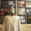
1. Side Glance- Primarily shooting the side profile with a shallow depth of field, I focused on capturing solely the portrait with limited interactions from the background, in this respect the image is effective. By having the side profile, the viewer has to focus to explore the interaction which in turn allows the viewer to interact with the portrait. However I feel that this image does not entirely explore the true essence of interaction, in order to make the image more stimulating it needs an element of truly showing the emotion- by moving from shooting the side profile to face on or from an angle that shows you the face.
2.Concentration - To go more in-depth into the project, I wanted to explore the relationship between people through body language. By using two figures instead of one, I can capture the difference in expressions to the same situation as well as their body language towards each other. By using a photo-journalism approach I wanted to shoot more candid photography like Henri Cartier-Bresson in order to get a true reflection of human nature. With a shallow depth of field and placing both figures slightly off centre, it highlights not only the figures but also the situation they are in to give more context to the image.
3. Moodiness - Whilst experimenting with Lightroom, I have edited the image to contain slightly more red-pink hues (to mirror the use of symbolism of the colour of red for anger/ negative connotations) as well as increasing the warmth of the photo. It is not as effective as my previous experimentation as it lacks contrast between the environment and the figures themselves and the body placement. To improve, I would ensure the temperature is slightly colder and the figures appear more isolated from the background. I wanted to show more of a divide between the two figures therefore I have shot from an angle that allowed the gap between the figures to be more central therefore more of a focal point in the composition.
4. Contemplation - I prefer this edited photo compared to the previous because of the physical contact between the subjects which highlights the interaction between them. The cooler temperature allows the body to stand out against the background as it contrasts well against the green. By shooting a photo where the figures are connected it shows more unity as well as your eye being led from the first figure to the next more clearly. This is a stronger representation of human interactions due to the bodies being tilted more towards each other, however I still feel it lacks a personal connection- there is no eye contact or acknowledgement within the two figures which I feel would give the image more depth.
5. Intensity - I like the juxtaposition of the two figures, the intense gaze captures the viewer and creates more of a connection to the photo whereas the bored posture of the second figure seems to isolate the viewer. I chose to shoot an image including eye contact after studying Flip Schulke’s photos where emotional connections are so evident due to the fact that he really captures the eyes of the subject. This is my most successful image in the fact that not only does it show more emotion but it also creates a human interaction between the viewer and the subject, which is what my project is all about.
6. Inner Happiness- Following on with the same idea of editing, I wanted to experiment with decreasing the shadows within the image- contrasting my previous image. This lightens the mood and atmosphere shown within the image and portrays an entirely different emotion- happiness. Reviewing my photographs, having the solitary figure does not seem to be as effective as having the two figures, as it creates a scene with a lack of connection shown within the portrait. Here the happiness seems almost internal and private, the viewer does not really understand the cause of the happiness and so this automatically creates a barrier between the subject and viewer. I have tried to add a slight bit of context without detracting from the main focal point (the portrait) with the addition of the cards in the bottom left corner. I have tried to compose the image so that the cards seem to be a minimal addition whilst the figure is in control of the overall frame.
0 notes
Quote
Rather than just focusing on expressions, I want to explore body placement and language, to do this I have tried to photograph the relationship between the body and its environment.
0 notes
Photo


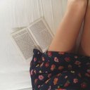
1. Breath - Using a fast shutter speed I wanted to capture the expression as well as the movement of the model. It was very important to me to capture both the rippled effect and the droplets to show the dynamics and movement in the photo but also to highlight that the body’s effect on the environment it is in. The focal point is the face and then the eye is led down his neck to his body and then out in the water due to the rippled effect. By placing the body central within the frame it allows the full effect of the water around him and you get a true sense of the interaction with the water.
2. Splash - The focal point is the water droplets, a contradiction to the project but highlighting the movement and relationship with the environment. By experimenting more with the environment rather than the model I feel that this picture loses some of the effect of the ‘human’ interaction with the water as the droplets seem to confuse the body shape. However this forces the viewer to try to make out the body shape themself, creating a human interaction between the viewer and the photo. I feel that the first photo ‘Breath’ is more effective in displaying the purpose of ‘human interaction’ within the photo.
3. Water Action - An amalgamation of action, expression and editing to show interactions of the model inspired by Blair Bunting. Going back to the first idea of focusing on the body rather than the droplets, I still wanted to ensure the movement is captured with the droplets. To do this I had to time my photo to ensure the splash was not covering the whole face, rather it was cocooning the body. This technique I discovered after researching Blair Bunting, who captures sports events with a similar technique. In order to display the body without interference from the background and to show the relationship between the body and water, I have decided to edit the photo to B&W to make the transition from water to body seem almost as though they are intertwined.
0 notes
Quote
Continuing with the B&W effect I wanted to focus on the human interaction between viewer and model through eye contact and body placement
0 notes
Photo


1. Frozen Intensity - Continuing with B&W, I wanted to combine the motion of the previous photos with the human expression in the first series. I wanted to add in the element of the viewer trying to interpret the expression themself, therefore I photographed the model with his face covered partially by shadow so the viewer has to actively seek the expression, and therefore interact with the model in the photo. I also wanted to include the interaction with the environment around him and so positioned the body so that the water would form ripples that seem to extend from him. By positioning his arms fairly wide apart and partially in shadow, it causes the eye to follow the lines of the arm and shadows around the frame as well as giving the effect of the body completely filling the frame.
2. Static Seriousness - Experimenting with shadows and lighting to create a more interesting piece with the intense gaze and suggestion of movement seen previously. As seen in my first series with ‘Intensity’ I wanted to use the concept of eye contact to create the personal connection between the viewer and model and create human interaction between them. I have done that through the central positioning within the composition and the shallow depth of field causing the viewer to immediately focus on the body and face. The use of black and white creates a more serious, moody feel to the image, creating a more intense photo for the viewer to focus on. It also mirrors the features of the face and creates a more striking image with the dark eyes, hair and range of shadows across the body.
0 notes
Text
Critical Essay on Steve McCurry
Steve McCurry has been one of my inspirations in the photography world ever since I saw his photo of the ‘Afghan Girl’ on the cover of the National Geographic magazine. I have read and marvelled at the photographs in the National Geographic magazines for years but this particular portrait caught my attention. The intense gaze of the haunting aqua eyes told the story of the turmoil of Afghanistan and her childhood. The distrust, vigilant, yet powerful innocence of her expression contrasts perfectly within a single image, and showed me how a photograph isn’t simply an image- it is a portrayal of a personal story told through the lens. From his projects in Washington State Park to the monsoons throughout the world, McCurry is undoubtedly is one of the modern day masters of visual storytelling.
Born in February 1950 in Pennsylvania, McCurry began by taking photos for Penn State University’s newspaper; this undoubtedly shaped his style of photojournalism. He seems to focus on how humans are shaped by war, with the main body of his work comprising of portraits from a multitude of wars from the Lebanon Civil War to the Gulf War. He works mainly with colour photography, progressing from colour slide film photography to digital in 2005. However recently in 2016 he has been accused of digital manipulation within his images, which leads me to question the honesty of his photos, if he is a photojournalist then surely he is under an obligation to present us with true images to inform and educate us?
McCurry’s work is influenced by Henri Cartier-Bresson, the inspirational master of candid photography. McCurry seems intent on capturing the quick and ‘decisive moment’ in time using a very simplistic approach with the use of natural light and only one or two lenses as we have seen within Cartier-Bresson’s street photography.
One of his effective photos is ‘Boy in Mid Flight’ shot in Jodhpur India, 2007.

The subject matter is the boy framed by walls all around him- giving a sense of being squeezed and trapped. The scale of the walls compared to the boy’s slight frame creates a sense of vulnerability and immediately the viewer is thrown into a story- what is the boy running from? Where is he running to? The use of a fast shutter speed has frozen him in mid-step highlighting the energy and movement of the boy. McCurry has set up a scene that pushes you to interact and think about the scene, making it impossible for you to simply be a passive viewer. The majority of the photo is taken up by the wall on the left, covered in red handprints which seem oddly out of place next to the innocent boy. This is a clever photograph; the warm colours of the red handprints strongly contrast against the cold colours of the blue walls. This sets up a disturbing image, usually red has connotations of anger and blood, this symbolism is also encouraged by the fact that the handprints are disembodied and not set out in a particular pattern, giving a chilling feeling to the image. The eye is easily led around the photo, first to the boy then on to the wall on the left, then it is led around the furthest wall through the slight curve of the handprint wall and then onto the wall on the right. The photo embodies the rule of thirds, the three sections of wall cut the image into rough thirds whilst still creating a sense of perspective with the path disappearing slightly off centre. However, I feel the wall on the right gives the image a more unbalanced feeling. The contrast of the more yellow hue against the blue makes it seem out of place within the scene and lessens the aesthetic feel of the contrast of the red and blue. Also, it is a very similar colour to the boy’s clothes and I feel that if it was removed it would mean that the boy stood out even more and he would therefore be an even stronger focal point. I want to try and use this style of contrasting tones within my own work to create a visually more appealing piece of work.

A second photo which I feel perfectly encapsulates McCurry’s style of photography is ‘The World’s Ride’ in West Bengal, India. He has captured a moment in time, uninterrupted and illustrative of how the world is in that particular area. Like Cartier-Bresson, in this composition he has focused on the geometry of the image. There is the use of natural framing with the train windows contrasting with the circular bike wheels. There is more of a sense of balance within the image due to the fact the bikes seem central with equal sizes and amounts of windows in the train. Personally I feel that this makes the photo particularly effective as it allows your eyes to take in the portraits of the people rather than being distracted by the composition. Immediately your focus is drawn to the bikes and then to the people above them. The neutral tones of the clothes and skin tones contrast very well against the train and there is a sense of personal connection to the people due to the intense gaze of the majority of the people leaning out of the windows. The different texture of the train’s body leads your eye around the image and allows you to examine each face. The individual expressions seem to be the feature that conveys the story within this image. There are a variety of poses that create the layers of the story, the women on the far left are unaware that the photo is being taken; the faces in the middle show a sense of wary curiosity whilst those in the last window vary from amusement to distrust. The human portrayal is what makes this photo so strong and is what draws me to it. However there a few distractions around the scene- there is a body just out of frame in the right and the top of the train is not completely even. These imperfections detract from the balanced composition, however that being said, they also highlight how this is a moment captured in time- so it won’t be perfect. With this in mind, when taking my own photos I want to try and think what would be more effective. If I want to depict the ‘bigger picture’ does it have to be perfect or should it be more realistic and show all aspects of the scene?

My third and final image is from McCurry’s Monsoon collection, it depicts woman shielding themselves from a dust storm in Rajasthan in India in 1983. This is a colour slide film and immediately the vivid colours of the clothing are very striking against the dust background. This is also a well balanced composition, the focal point of the woman are placed in the centre, however the irregular pattern of the trees and the vases in the bottom right hand corner contradict the symmetry of the image, which I feel gives the image more impact and power. The different textures of the clothes and dust ensure the women stand out. The background of the dust storm gives the impression of softness around the woman which makes them the focal point but contrasts sharply with the harshness of its reality. Although no facial features are visible you still get an overwhelming sense of humanity within the figures, they are huddled together in a show of unity and solidarity against the storm which I feel is more effective than showing the portraits of the women. The red and orange clothing is the only colour within the landscape, emphasising the sense of isolation around them and really creating the story of being stuck within this storm. There is an interesting perspective within this photo with the addition of the vases. Personally if I was within that moment I would not have thought to include the vases, however after examining the image I feel they are a useful addition as primarily it gives a context to the image, perhaps they were collecting water together with the vases, but also with the angle the photo is shot from, it gives the feeling of a circular composition. The women are in a circle, the sand around their feet is in a pattern that seems to protrude from the figures themselves as well, and the vases are not upright which also adds to this interesting perspective. I will try and experiment with different perspectives and angles to make an overall more balanced image, or an image that seems more unusual because of the different angles.
It is evident within all of McCurry’s images that colour, composition and light is very important, but what seems to make his photos so special are the stories that he tells within them. It isn’t just a singular isolated photo that is technically sound, it captures emotion and as well as being an enthralling image, it communicates a comment about the subject matter to its viewer. This is something that I really admire about his work and aspire to work towards.
0 notes