
Statistics
We looked inside some of the posts by emt555 and here's what we found interesting.
Average Info
Notes Per Post
0
Likes Per Post
0
Reblog Per Post
0
Reply Per Post
0
Time Between Posts
16 days
Number of Posts By Type
Text
2
Last Seen Tumblr Blogs


Fun Fact
70% of Tumblr users say the Dashboard is their favorite place to spend time online.
Text
DRMatEUR Reddit Rundown 2014
Now that the online participation assignments are over it's time for a little breakdown of our subreddit.
We have 31 subscriptions, making our subreddit rank 68,185 out of 509,573 according to: http://redditmetrics.com/r/subreddit_stats
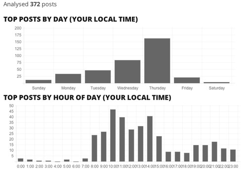
Our traffic stats show the big impact of the online participation due date with weekly spikes, and declining total page views as the term went on.
The day of the week and hour of the day for posting to our subreddit (from: http://www.redditlater.com/analysis/) seem to be about what I'd expected:
I scraped the data from our reddit with import.io. In total we have 567 posts with 1.185 comments. The following is just based on posts, not comments.
Post with the most up votes: "Visualizations of my FB network & an easy guide how to create your own" by _lizlemon_ Tied for second place: "Data visualization new style: The age of buildings" by NienkeJ, "New interesting Ted Talk on Big Data <3" by josinebakkes and "Engaging my Facebook Friends to add me on ELLO" by npenchev
Users whose posts were most up-voted (in total):
412753ibeur
Vally_W
_lizlemon_
Users whose posts were most up-voted on average:
MonikaHlub
fanchuly1
iana_p
Most comments: "Is Facebook a good venue for political discussions?" by Esther1604 is tied with "Free Brownie Points or 'a Reddit questionnaire'" by NienkeJ
Users with the posts that had the most comments (total):
Vally_W
_lizlemon_
katyanagibina
Users with posts that had the most comments on average:
deankoend
Esther1604
gabrielagarcia
Here is a wordle made from your post titles.
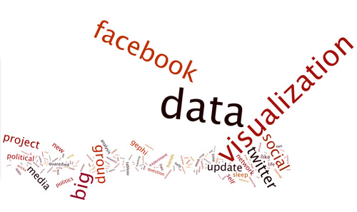
Great job everyone!
0 notes
Text
Tableau Visualization Ideas
Here are a few visualization ideas for your Twitter data in Tableau.
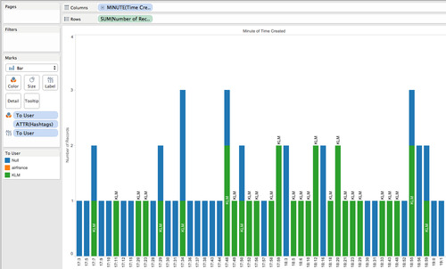
Above is a screen shot of a minute-by-minute view of the total tweets with colors and labels to show "to user" (generally @klm or none). We see no obvious time pattern associated with @klm vs no to-user tweets.
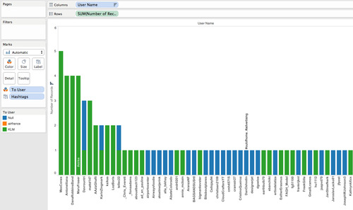
This chart is total number of tweets per user, where we see a "long tail" shape typical of social media data. The colors here are the same as above regarding "to user" and we see more of the frequent contributors in this dataset were tweeting to @klm. I added hashtags as labels, but we don't see a clear pattern regarding hashtags.
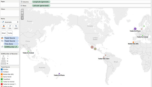
Here we are looking a geography using the field that worked best for my data, time zone. The colors and labels are about the Twitter client, but the main take away from the map is the large geographic spread. There are 27 missing values, so this is incomplete but it was the best option without doing manual data cleaning.
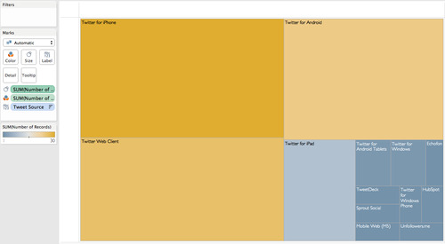
Here we see the Twitter client data by itself, where standard phone, browser and tablet sources dominate with various more specialized clients at the bottom right.
As I posted to the Reddit before, here is the tableau file itself for download: https://dl.dropboxusercontent.com/u/3755456/DRM/twitterExample.twb
0 notes