
Statistics
We looked inside some of the posts by enbys-art-blog and here's what we found interesting.
Average Info
Notes Per Post
739K
Likes Per Post
427K
Reblog Per Post
311K
Reply Per Post
547
Time Between Posts
22 days
Number of Posts By Type
Text
17
Last Seen Tumblr Blogs


Fun Fact
In Q3 of 2020, 31% of US users access the Tumblr app daily.
Text
hot artists don't gatekeep
I've been resource gathering for YEARS so now I am going to share my dragons hoard
Floorplanner. Design and furnish a house for you to use for having a consistent background in your comic or anything! Free, you need an account, easy to use, and you can save multiple houses.
Comparing Heights. Input the heights of characters to see what the different is between them. Great for keeping consistency. Free.
Magma. Draw online with friends in real time. Great for practice or hanging out. Free, paid plan available, account preferred.
Smithsonian Open Access. Loads of free images. Free.
SketchDaily. Lots of pose references, massive library, is set on a timer so you can practice quick figure drawing. Free.
SculptGL. A sculpting tool which I am yet to master, but you should be able to make whatever 3d object you like with it. free.
Pexels. Free stock images. And the search engine is actually pretty good at pulling up what you want.
Figurosity. Great pose references, diverse body types, lots of "how to draw" videos directly on the site, the models are 3d and you can rotate the angle, but you can't make custom poses or edit body proportions. Free, account option, paid plans available.
Line of Action. More drawing references, this one also has a focus on expressions, hands/feet, animals, landscapes. Free.
Animal Photo. You pose a 3d skull model and select an animal species, and they give you a bunch of photo references for that animal at that angle. Super handy. Free.
Height Weight Chart. You ever see an OC listed as having a certain weight but then they look Wildly different than the number suggests? Well here's a site to avoid that! It shows real people at different weights and heights to give you a better idea of what these abstract numbers all look like. Free to use.
331K notes
·
View notes
Text


I turned it into a five person art base for ya :]
Tag me if you use it! I wanna see :D
My Original under the cut

36 notes
·
View notes
Text


Ohh, so I was looking at my storage and found these! I originally shared them on twitter before yeeting the platform. Anyway, feel free to use! Art memes for your oc :D
69K notes
·
View notes
Text


tutorial for drawing characters with Down syndrome!
DISCLAIMER... please keep in mind that this is an introductory drawing tutorial and has some generalizations in it, so not every “X is Z” statement will be true for Actual People. it's more of an overview of features that are common in people with Down syndrome, not meaning to imply that every person with DS has all of them 👍👍 thanks
if you draw any characters using this feel free to tag me!!
35K notes
·
View notes
Text

btw. i made this quick guide of some of the natural size and proportion reference points in the human body. of course this all varies even irl, and you can stylize however you want, so ymmv but thought it might be helpful for some folks.
10K notes
·
View notes
Text
Collection of images and memes for anyone who doesn’t know what to draw


59K notes
·
View notes
Text

i know we joke about cis artists having the weirdest sense of anatomy, but also even when the anatomy is fine, no one seems to want to draw women doing normal things
171K notes
·
View notes
Text
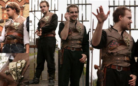
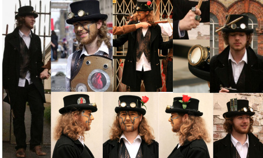
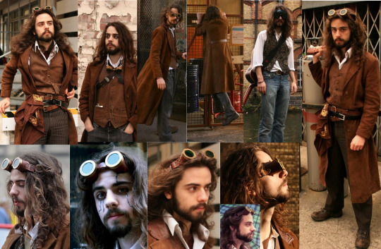
MECHANISMS REF IMAGE MASTERPOST
Okay, so I put together refs for each of the mechs as best I can. I tried to avoid anything in a show lighting, but sometimes it can't be helped. Notes will be underneath each section
Whole cast
Ivy is the only character leaning on the wall in the second image, but is roughly as tall as Ashes
Jonny D'Ville
Jonny in earlier shows like TTBT wears a black shirt underneath instead of the white. He occasionally has red or black painted nails and his goggles are either black or bronze. He has a black 7 of diamonds. He often holds a mic - which is a Shure Super 55
Drumbot Brian
He usually has just the flower in his hat, but sometimes it's replaced with RAM or his drumsticks. His goggle has a very small crack at the base. The rings seem to be a bit of a motherboard and screws? The visible heart is something I can only find in one picture, but it's cool
Gunpowder Tim
Sometimes wears jeans instead of dark brown trousers. His eye scars are more geometric than Jonny's, and he has dark eye shadow around the eyes where Jonny uses just eyeliner
Raphaella la Cognizi
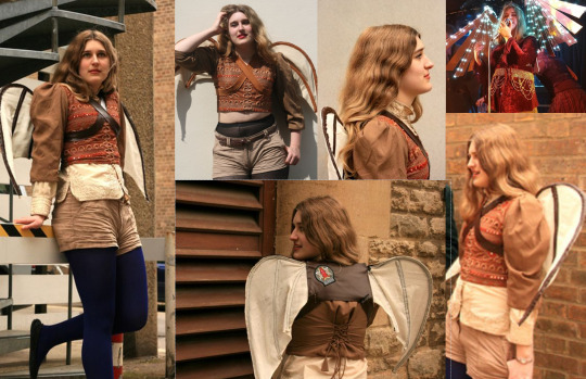
The top is three layers: a white/cream shirt, a brown puffy shirt and a a top layer which has a halter neck. Occasionally one or both of the undershirts won't be worn (see HNOC liveshow). Tights can be blue or black. Light up wings from DTTM
The leggings/tights are sometimes black and sometimes deep blue
Ivy Alexandria
A few different outfits, in liveshows they're also wearing some outfits not shown here - but always black and red with a waistcoat of some kind.
Nastya Rasputina
The necklace is a little cat :3
Marius von Raum
Kneepads in DTTM. The cards are a jack and ace of hearts. Necktie either has a white or gold pattern on it, but they don't always wear it. The green jacket has a tailcoat
The Toy Soldier
Hair varies a lot. Sometimes it's worn down, in a ponytail or hidden under the hat. Sometimes nails are painted red or black
Ashes O'Reilly
In live shows they often wear this eyeliner which has thick bars that go behind the ears - but I couldn't find any clear pictures of this. Though their outfits changes, always mostly black with some red in the hair
Dr Carmilla post can be found here
I hope this was in some way helpful to anyone who wants to draw the mechanisms. If you have questions feel free to ask me in the ask box and I will do my best to answer them and provide some photos <3 have a great day
2K notes
·
View notes
Text
RESOURCES FOR FONTS
KernClub

FREEFACES
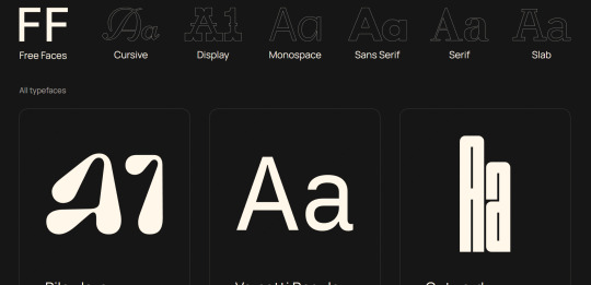
FontShare
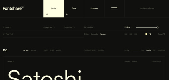
DirtyLineStudio
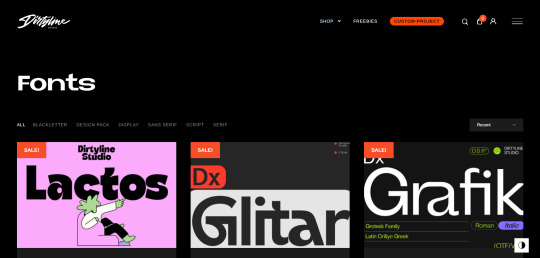
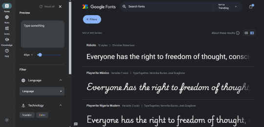
FontsGoogle
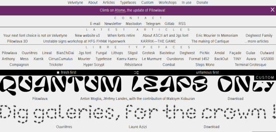
Velvetyne.FR
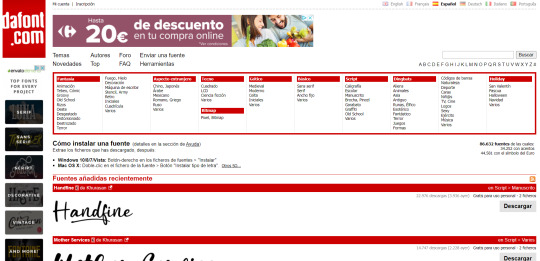
Dafont
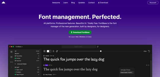
FONTBA.SE
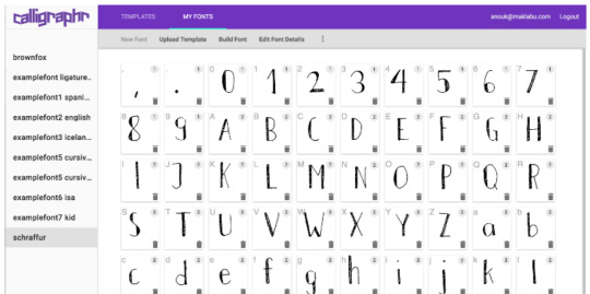
CALLIGRAPHR (to create your own fonts)
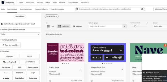
ADOBE FONTS
4K notes
·
View notes
Text
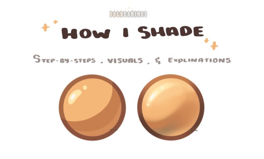
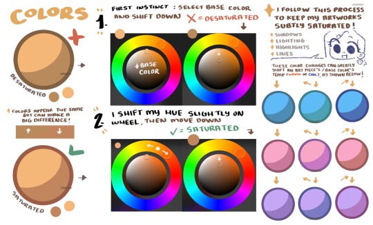
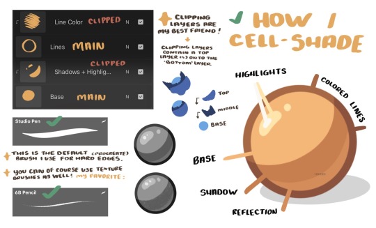
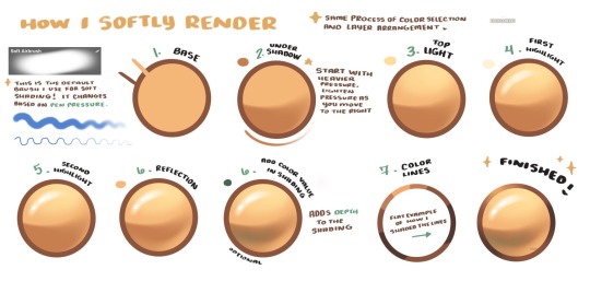
GoldCanines: “I had lots of questions on how I go about my shading ! ✨
Here is how I pick my colors, determine my layers, and lay out my shading !”
Source: GoldCanines on Twitter
2K notes
·
View notes


Text
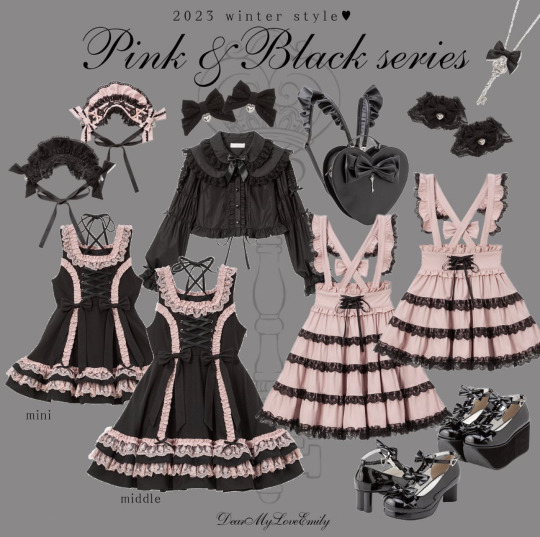
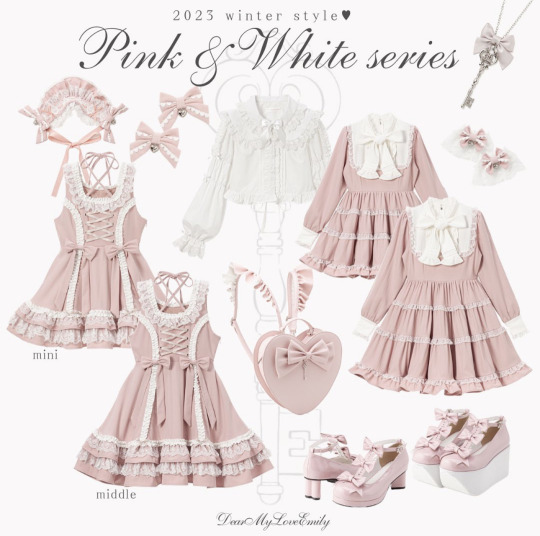
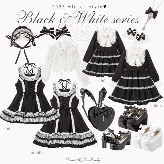
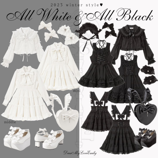
Items from Dear My Love Emily’s debut collection!
Cr: Dear My Love Emily Instagram
179 notes
·
View notes
Text
MY DIGITAL DARLING INTEREST CHECK

My Digital Darling is an original character zine about lesbian androids in an underground gay club. It will feature comics, illustrations, and stories with NSFW themes!
We are looking for a potential audience, artists, writers, and moderators to help us work on this project.
-> Interest Check
Open until July 31st!
Dates to note!
Moderator Applications -> June 15, 2024 - July 31, 2024
Contributor Applications -> July 15, 2024 - August 31, 2024
★彡 Join our Discord! 彡★
301 notes
·
View notes
Text

This article was written by Phil Straub back in 2005, and it is as fresh and vital today as it was then. Phil’s tips and trick are timeless, and can help you make your images pop!
Composition is everything! No amount of detail in an illustration or Concept Painting will be successful without a strong composition foundation.
Composition in Environment Concept painting can be quite difficult since your focal point usually isn’t as obvious as in a character piece. In this introduction to Composition we will explore the fundamentals used to create exciting and functional compositions along with a variety of composition techniques. Initially I will show some successful examples of iconic composition, formal composition, the rule of 3rds, the golden rule, etc. There will be a discussion on what makes each piece successful and an explanation on why the artist chose to describe the scene using a particular form of composition.

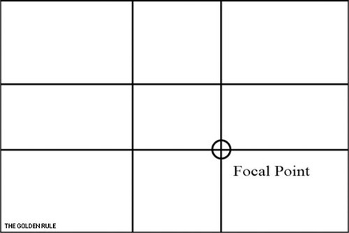
When you take the canvas area and divide it into ‘thirds’ Horizontally and Vertically, where the lines cross in the picture area is a ‘Golden Mean’, or the best spot in which to place your Main Subject or Object of Interest as it is the Focal Point of your picture. The golden rule originates from the Ancient Greeks, since they were great mathematicians as well as artisans, they came to the conclusion that there needed to be a certain balance in composition for it to be pleasing to the eye. They further developed this theory and defined what they called “power points,” Power points are located at the point where the lines used in the golden rule intersect. By placing a main subject on a power point, it further defined that subject as the focal point.
The golden rule can and usually is applied to a paintings canvas proportions. As you read through the following text you’ll notice that most of the imagery presented utilizes similar dimensions and almost all of them fall into the “golden rectangle.” Today you can find the Golden Rectangle almost everywhere: from credit cards to phone cards to book covers, all are shaped with its proportions. The Golden Ratio (the ratio of the longer and shorter sides of the Golden Rectangle) also appears in many natural phenomena. The ratio between the length of your nose and the distance from the bottom of the chin to the bottom of the nose is the golden ratio. The spiral growth of crustaceans follows the golden spiral. The divine proportions are an in-built (or in-grained) aesthetic parameter we judge beauty by.
The imagery [above] represents the division of space when the “golden rule” is applied to a blank canvas. Basically it is the division of a line in two sections, where the ratio between the smallest section and the largest section is identical to the ratio between the largest section and the entire length of the line. In other words A/B = B/(A+B). The ratio is about 1/1.618. Honestly, I’m still not exactly sure what that all means? but, I do know that I used this grid layout a-lot when I first started painting and found it helpful. I still do.
In the beginning you may find it useful to use this as an overlay for every concept piece you do. Having this grid float over your imagery as a reminder of where to place the objects of importance in the scene may help you as your develop your composition.
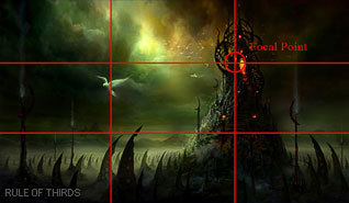
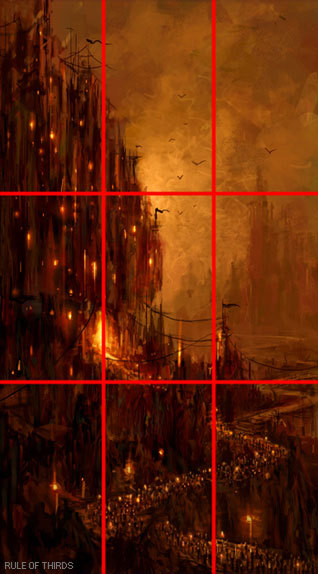
From the golden rule came the “rule of thirds” which is virtually the same concept but slightly altered to fit photographic proportions.I find it a bit easier to follow since it’s very simple in its origin.Here we have a look at the rule of thirds in action.
Notice that the main focal point sits right almost directly over one of the “golden means.” Additionally, other objects are placed near the other converging lines (the bird, for example) but, not directly on them, since that would create competition for the focal point.
There are Four Spots where these lines cross the Upper Left the Lower Left, the Upper Right and the Lower Right. Please note that all the “hotspots” are away from the center position in the picture frame.
The two best “power points” are the Upper Right and the Lower Right because the eye enters the picture frame at the lower left hand corner of the picture frame, travels to the center of the picture area and then reaches the right hand ‘Golden Mean’ position where it stops to look at the ‘Center Of Interest’.
The reason the eye enters a picture at the lower left side is because we are taught to read from Left to Right. This is a psychological fact that has been proven over the years. Next time you’re in an art gallery or art museum that shows the Old Masters paintings, notice how many have the Center Of Interest in the “Golden Rule” positions.

‘Implied Forms’ are a combination of ‘Implied Lines’ and they help to hold a painting together. The eye enjoys these interesting forms and will stay in the picture area to examine each one of them, if they are present. The following text and sample imagery will demonstrate a variety of implied forms and composition approaches.

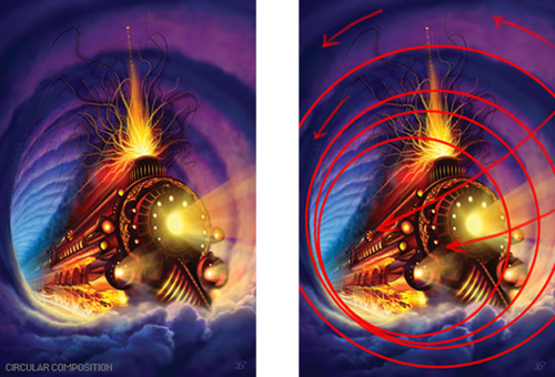
The Circle is made up of a continuous ‘Curve’ and it’s circular movement keeps the eye in the picture frame. There are many circles in nature and man made objects. You can use the circle in a very obvious way in your composition or simply suggest it.
The image [below] is a very obvious and deliberate usage of circular composition. Notice how the circular shapes created by the dragons also follow a path that leads your eye towards the focal point.
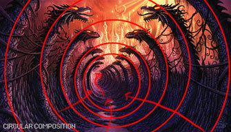
Another example of circular composition! Again, I chose this type of composition to enhance the feeling of motion in the piece. You can see how the eye follows the circular shapes across the picture plane to the focal point. Something interesting to note with this image, it actually uses two composition approaches at one time; circular composition and iconic composition.

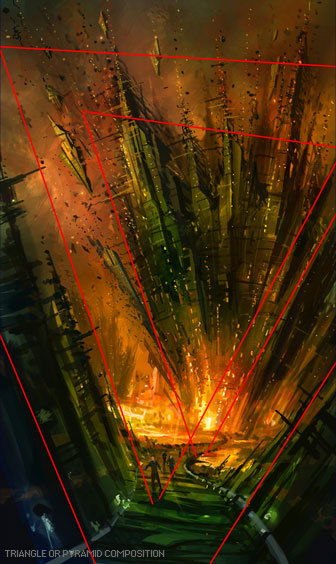
This has a ‘solid base’ and will show Stability. It also has Height and Strength. The Pyramids of Egypt have survived for thousands of years while other types of solid buildings have crumbled in to dust in less time. With the image below I was very deliberate with my arrangement of shapes so the triangle or pyramid composition is obvious. When I began this piece I simply started with a triangle shape as my starting point…nothing more than an abstract composition. I just let everything flow from there….and very quickly the painting began to take shape.

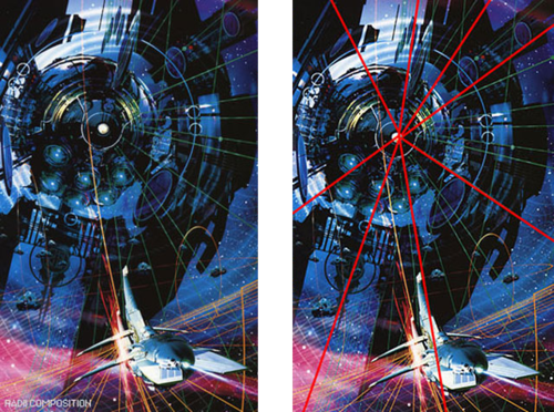
Is a connection of ‘Lines’ meeting in the Center and an expansion of ‘Lines’ leaving the Center. The Radii is usually found in Nature Subjects. The best example of the man made Radii is the spokes of a wheel.
The eye has two ways to go when it comes upon the Radii. It can either be drawn in to the picture area or it can be led out of the picture area. You must be careful how you used the Radii and try to have the eye led into the picture.

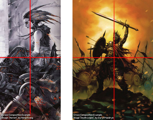
A showing of ‘Opposing Force’ that will give the picture a feeling of Cohesion and Relationship. The horizontal bar of the Cross will act as a “stopper’ while the vertical pole can act as a leading line. The windows in a large skyscraper will form crosses and will keep your interest in the building. The Cross also has religious meaning and the subtle use of the Cross can give hidden significance to an image.
In the painting below Hong Kuang uses the cross composition subtly. One could argue this piece is also using an “L Composition.” The strong line across the horizontal center that’s being formed by the characters body suggests “The Cross.” The somber facial expression and subject matter demonstrate an experienced artist’s ability to use symbolic composition to help tell a narrative.
To the right of that is Daryl Mandryk’s work which successfully combines a Cross composition with iconic composition. This is common composition choice for themes of heroism or comics. Fantasy artists like Brom and Frazetta use this type of composition in their work regularly.

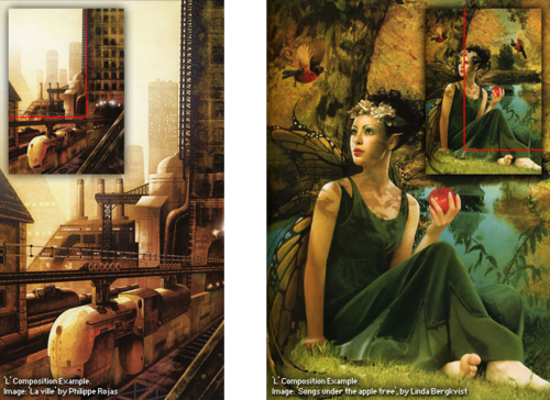
This makes an attractive ‘frame’. It can be used to accentuate important subjects. Many times it is a ‘frame’ within a ‘frame’.
A tree with an overhanging branch at the ‘right’ side of the picture area will form a ‘Rectangle’ and help frame the Main Subject in the picture. By doing this you will make the Center of Interest stand out and be noticed clearly.

Some Art theorists contend that the most important information in the image should be placed near the center of the picture plane. This may seem confusing to some students since this contradicts many of the major principles of the “golden rule.” In general iconic composition should and can be used to describe a subject in a certain way. Iconic Composition or “Formal Subdivision” applies best to subjects of a dignified or religious nature. This style of composition was the approach of choice in earlier times and many excellent compositions have been made with it. Usually Iconic composition is used to describe symbolic subjects, heroic subjects, or religious subjects.
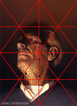
I’ve taken the liberty of drawing over this imagery to demonstrate the division of space in iconic composition. This is a technique used by many illustrators to help define the division of space and focal point when creating an iconic illustration. Well know and renowned illustrator Andrew Loomis used this technique extremely well and his book “Creative Illustration” to demonstrate this further.
Notice, that while the focal point is slightly off center, all the converging lines lead to the center point of interest. Additionally, notice how the figures head sits directly in the diamond shape of the overlay lines I’ve created. It should also be noted that I chose this composition to further enhance the regal and heroic appearance of the character.
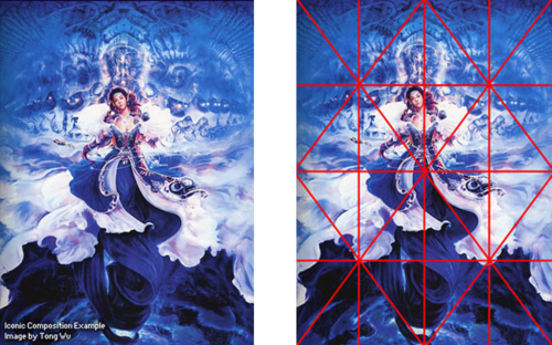
Tong Wu uses Iconic composition perfectly here! Notice how the character again falls nearly at center of the canvas. I’ve taken the division of space a bit further on this imagery and have broken down the image into smaller segments so you can so how the artist balances everything in the piece.
Notice how the top right corner is almost a mirror image of the top left corner. In fact, look at almost any opposing segment in the painting, they are very similar! When creating iconic composition, it’s not necessary to duplicate each side exactly, but there should be a feeling of complete equalization of the units or masses, the line and spaces of one side with the other.

So, there you have it, a variety of ways to deal with division of space when you first begin visualizing a painting or drawing. At the end of the day, theses approaches to composition are guides and simply a place to start. Once you become more comfortable with composing a scene you can begin to push the boundaries of formal composition.
Since most Environment Concept Artists work in the entertainment industries, its expected you will be asked to create cinematic moments or “memorable moments” utilizing the environment as a stage.
You’ll want to use your mastery of composition to lead the viewer’s eye and really make the viewer feel like they’re in the scene. The single most important thing you simply must have in any Environment Concept Painting is a clear and dynamic focal point.
Without a place for the viewer’s eye to rest, the painting will lack impact and won’t hold the attention of your audience. It’s the job of the Concept Artist to visualize what can’t be visualized in reality. Concept Artists are the first step in every production and therefore must create dynamic imagery that the rest of the team will be excited to build. There are a few cinematic tricks that you can use as a Concept Artist to make things appear more dynamic.

Sometimes all it takes to add an extra bit of drama to your composition is a simple tilt of the camera. In the image to the right the viewer really feels like they are part of the action, simply by slanting the camera a bit. This approach is especially useful when you are trying to depict action in your environment.

Many Concept Artists today, myself included, use perspective as a tool to create dynamic compositions that appear to have motion and lead the eye to the focal point clearly and concisely.
In the painting below you will notice I’ve used many of the objects that appear in the painting as opportunities to further guide the viewer to the “payoff.” Additionally, I tilted the camera a bit to add to the action.
http://www.cgsociety.org/index.php/CGSFeatures/CGSFeatureSpecial/phil_straub_composition_tutorial
15K notes
·
View notes
Text
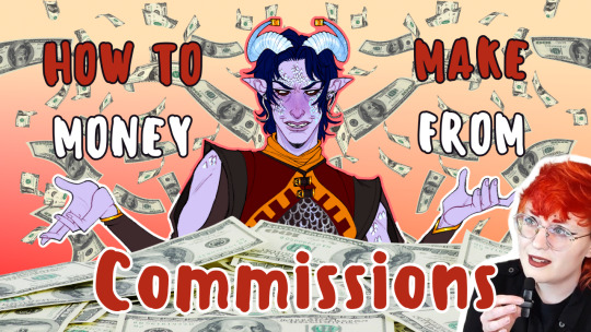
Wanna get help with commissions? I have a slightly comprehensive guide that's at least served me well the last five years! You can find it in the link below 😌
youtube
234 notes
·
View notes
Text
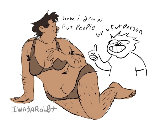
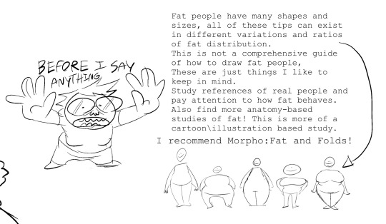

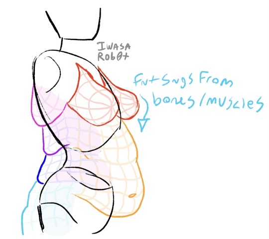
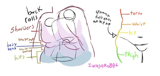
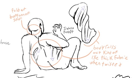
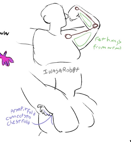


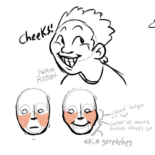
hey these are some tips for some of the little details in drawing fat folks that some people might not know!
everyone has fat on their bodies so its a worthwhile skill to have, but most art tutorials leave it out. heres some other good tips from artists!!
38K notes
·
View notes