
Statistics
We looked inside some of the posts by enoblesarts102-03 and here's what we found interesting.
Average Info
Notes Per Post
1
Likes Per Post
1
Reblog Per Post
0
Reply Per Post
0
Time Between Posts
16 days
Number of Posts By Type
Text
6
Last Seen Tumblr Blogs


Fun Fact
In 2020, 44% of users from Denmark used Tumblr daily.
Text
Final Project and class reflection I’m really going to miss ARTS102. Even though I had to walk 30 minutes to class every Tuesday and Thursday morning at 8:00AM, even though I was always freezing cold or drenched in sweat by the time I got to class, it was worth it. Even when I dreaded my day when I woke up, this class made me feel better. And I’m proud of what I have done, I got to put it all in a book. It is far from perfect, but I’m proud of myself and all the things I have learned this semester.
Process Journal The accumulation of all the work I did this semester in one book! At first, it thought formatting this book was going to be really easy and I would finish it in no time! No… wow, it was hard.
I started by making a layout. I had random sentences and grey shapes to work with and my book looked great! But, I soon realized this wouldn’t work. Having actual pictures and things I wrote changed a lot of the layout. I was expecting a lot of writing, but I forgot in my process that this isn’t a magazine, it’s a book to showcase my work. So, I did use some of my original layout but a lot of things were moved around and I had to improvise along the way.
As I was designing the cover, it all really happened because of my math class. I get so bored and I take notes on my iPad. I use the files app to write in and there is a water color feature, I love picking different colors and mixing them together! So, I just zone out and don’t listen to my professor as I play with colors… probably not the best thing. But it’s really fun. That’s how I got my inspiration for all the water colors. And I am ready for summer and sunshine, I just want school to be over and not feel stressed. Summer reminds me of snow cones and those are usually yellow, red and blue. That’s how I picked the colors!
The water color was a difficult choice, I feel like if I did a solid color it would be a lot easier to incorporate, but it was a fun challenge. I’d like to learn how to make backgrounds with a lot of color more readable or clean in the future. I also need to learn more about the computers themselves. A lot of my images turned up blurry and I really want to learn how to fix that. I wish I had more time on this project! Gosh, it was really fun. I know there is a lot to fix, but that’s ok. I’ll make another portfolio in the future, I can’t wait to see how much I learn and compare the two!
THE TEXT! Picking what typeface I was going to use was harder than I thought. At first I picked ‘Skia’ it is a funky and squared text that I really liked. It felt green to me, and I love green. Then I went to work on a different computer and had to pick a different type because it didn’t have ‘Skia’, so I picked ‘Comic Sans’. I liked it because it was bubbly and interesting, looking back, it wasn’t my favorite. When I received critique on my paper a lot of people said ‘Comic Sans’ has a bad connotation and looks a little unprofessional… I didn’t know that! That’s crazy that different types have different connotations! So, I changed it because I want people to think I’m a little professional at least. My professor suggested that I use a different clean, round type. I tried that and it just felt too… well, clean. To proper, to nice. I know on the outside I am quiet and shy, I have anxiety sometimes and I’m emotional. But I’m also weird and funky, loud and funny. I love animals and sunshine, I love swing-sets and rollercoasters. Triple chocolate ice cream, marching band, stuffed animals… I’m still a kid. I play with mud and walk barefoot as much as I can. Clean and round just didn’t look like me. So, I searched, around and eventually settled on ‘American Typewriter’. I think it’s a happy medium between professional and quirky. Looking back, I wish I made my cover name and project titles bolder. It’s too thin for me, but I’ll find the type that really represents me some day.
Reflection
As I walked out of the computer lab today, I felt genuinely sad. And as I’m typing about being done with this class, I’m genuinely upset. The people in my class were so freaking cool and interesting! I wish I talked to them more or tried to get to know them. Their art was meaningful and creative. Things that never even crossed my mind showed up in their work and it inspired me so much. Getting critique and hearing people say that they liked my style was… It brought me so much joy. It made me happy and it made me feel like I can do anything. I would call my mom after every class and tell her about my day in this class and I would always be so proud to tell her. I would send pictures of the stuff I did to my parents or show my partner and I felt so proud of all of it. I learned so much this semester, and man, if I could take this class over, I really would. Professor Machado, thank you for being one of the best professors I have ever had. You played the best music (even that one time you played a cringy remix) and you were always excited about everyone’s work. Thanks for helping me realize that this is what I want to do. I need this job in my life. And I know it’s not going to be all rainbows and kittens, it’s going to be hard. But, I really think this is it. It’s the kind of fun that makes time fly by, it makes me really think outside the box. For the first time in a long time, I’m interested in something.
Thank you,
Makena Nobles
Final Process Book:
https://issuu.com/arts102_nobles/docs/nobles_process_book
Below:
1. Different texts I thought of using
2. Video of Process Journal in the beginning

0 notes
Text
Project 4 wrap-up! In the last 2 days to work on our projects, I was very happy with where I was. I had the Liger Egg pretty solid and the Rainbow Camera with the text was done (I just needed to pick which color variant I wanted).
The Liger Egg was pretty good but my professor told me to try something with the whiskers so I made ovals and semi-ovals to fill in the shape. I hated the ovals, they just didn’t look good and the semi ovals were pretty nice, not too much dark.
Then I had to figure out how to add color!
In the project brief, it explains that we needed to use monochromatic, split-complementary or analogous color sets. I learned that monochromatic colors are varieties of a single hue. Split-complementary colors are the colors on either side of a complementary color. And analogous colors are colors that are grouped next to each other on a color wheel. For Deb’s logo, I wanted a lot of pink because that is the color she wears the most. I used a little bit of monochromatic color (pink) and the yellow and blue are just other colors she wears in the movie. For Napoleon, I really wanted the egg yolk to be yellow so the viewer knew for sure that the Liger was an egg. I tried to put blue in too but it didn’t fit the color requirements and it didn’t pop. I tried a golden color and the analogous color set and thought, “this looks like Napoleon somehow”. The red is bold and the green is funky just like him.
To wrap-up Napoleon’s logo, I needed the perfect text. At first I found a nice bold font that looked movie-like to me. I tried a lot of different placements and experimented with letter size. I wanted ‘Dynamite’ to be bigger than ‘Napoleon” because the last name is just so iconic. By this time class ended and I had to work on a different computer later… which didn’t have the old font. So, I searched for something similar and WOW! I found the perfect lettering! The ‘i’ is funky and the letters look like a movie title!
So that led me to my two final logos!
Pictures:
1. Before Napoleon logo
2. Before Deb logo
3. After Napoleon logo (I tried the lettering on the egg, which I loved bit didn’t have time to experiment with. The black and white would have not read well)
4. After Deb logo (I tried the logo without lines, it wasn’t visible enough so I didn’t love it)
5. Final product!! (Notice the whiskers in the black and white Napoleon logo)


0 notes
Text
For project 4, the class has been tasked with taking two characters from (preferably) a live action film and making logos for those characters.
At first I wanted to do “Howl’s Moving Castle” and use Sophie and Howl as my characters. I was really excited and had a bunch of ideas popping into my head all weekend before we started anything in class. First day on the project and our professor said he wanted us to try live action if we could… Ok, if it’s what the project asks for, why not try it, it’ll probably be interesting. So I brainstormed the minimal live action movies or TV shows I knew; “Hot Rod”, “Monty Python And The Holy Grail”. I also considered “Surfs Up” my favorite movie of all time if live action didn’t work out. I needed a solid movie with two characters that have solid traits I could work with to put into this thing called a concept matrix (see images below). So, I came up with “Napoleon Dynamite” and picked Napoleon and Deb as my characters.
First day with these characters and I got really frustrated. All my ideas were not very good, Napoleon’s logos seemed to have too much detail and were not minimal enough to me. I couldn’t think of anything for Deb and I almost gave up on using her character. I decided to stick it out and sleep on it.
Day 2 of the project and it never occurred to me till I looked at other projects to do character traits! I was doing objects that the characters used, like glasses, drawing or tots for Napoleon and I think that was the reason I couldn’t come up with anything I liked. I started thinking of words like ‘funky’, ‘shy’, ‘girly’ (Deb) and it allowed me to be freer with the objects I was drawing:
- ‘Shy’ made me think of hiding or disappearing. You disappear when people can't see you, their eyes are closed. So a lot of the logos in the ‘shy’ column are closed eyes.
- ‘Funky’ I think of wavy shapes
- ‘Pink’ = strawberry milk! Or strawberries in general
- ‘Sensitive’… I’m a pretty sensitive person and sometimes I’m more prone to cry than others. So I tried to incorporate tear drops
- ‘Girly’ made me think of the female logo. I actually like a lot of the ones with the female symbol somehow attached. One day I went to the library to work a little on this project and I actually tried to incorporate one of these in Illustrator… I liked the look of it, but now that I think about it, that logo was pretty boring compared to the current ones I have. Our professor said, when people make logos they’re constantly zooming in and out to make sure the picture is clear even if it’s small. I zoomed out and it looked like a uterus… nothing wrong with that, it’s actually kind of cool that the female logo (and a closed eye) make that shape but I was just playing around with Illustrator so I trashed the idea.
So, now I have a bunch of ideas for my logo, I’m starting to think “I can make something awesome with these”. We had small group critique in class and my group members had some great ideas! They told me which ones they like, and I actually didn’t take any of their advice... I felt the ones they picked were too minimal or there was too much going on. Plus, I didn’t fill up Deb’s thumbnail chart all the way (the hand was as far as I had gotten. See pictures below). I spent some of class finishing Deb’s chart to see if I could find anything else.
Our first steps into putting these logos on a screen is actually doing them in black and white. Trying not to use lines (use full shapes) and tracing a couple of the logos we liked on tracing paper. I used the Lyger egg, the Funky tether ball and the Music tape for Napoleon and the Funky eye, Funky strawberry, Sensitive Shy hand and the Rainbow camera for Deb.
The Lyger egg and the Rainbow camera are what I picked for my logos. The Lyger egg is just cute and I figured I could make something simple yet detailed at the same time.
The Rainbow camera came out of nowhere. My boyfriend is in media arts and he said he liked the camera on my concept matrix. It was originally just a camera with some sap flowing out. I thought it was just a dead end idea and I disagreed with him that I should try to use it for quite a while. but suddenly in class a rainbow popped in my head and took the saps place. RAINBOW!! Perfect, and I loved it! It fits deb really well since she’s so girly.
I took these images and we were supposed to put them on Illustrator, turn down the opacity and map out the image from the tracing paper. I thought we had to scan the images, I’ve never done that before and I didn’t feel like asking how to do that at the time, so I just made all the shapes and figured out how to use Illustrator. It was a lot of fun, I like the program a lot! There’s so much to do and I probably only know how to do less than 1% of everything in Illustrator at this point in time. So, I played around with both images.
The Lyger egg is still a work in progress, I tried a bunch of Lyger head shapes, added little stripes on the bottom of the face. I’m still figuring out the whiskers, where do I want the head in the egg, should I add little fangs? I also worked on making the egg white part look more… egg-y. I think it looks pretty good, but I still want to try more out.
The Rainbow camera was not what I wanted at first. I should have gone with my sketch because I like the curves better than the straight lines. They make the image look more like a rainbow! And I experimented with the cloud at the bottom, I like the small one, it just looks better to me. As for the colors, I wanted to see how they would look so I picked light pink, blue and yellow and a dark pink. These are all colors Deb wears in the movie and I knew I needed to make the main color light pink because she wears that color the most.
I’ve had a lot of fun and frustration with this project and its still not over but I’m really looking forward to see what’ll come out at the end!
Pictures:
1. Deb matrix chart
2. Napoleon matrix chart
3. Deb liked logos
4. Napoleon liked logos
5. Tracing!
6. Deb tracing
7. Napoleon tracing
8. Lyger egg 1st day
9. Rainbow camera 1st day
10. Lyger egg 2nd day


0 notes
Text
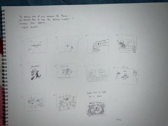
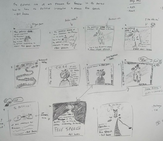
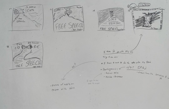
Project 3’s goal was to create a voting poster. We had to pick an inspiring quote from a list to base the idea of the poster on. I picked “The political core of any movement for freedom in the society has to have the political imperative to protect free speech.” —Bell Hooks.
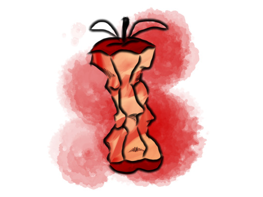
I didn’t know where to begin for this quote, and I honestly don’t know why I picked it since I didn’t know what to do. I just felt like… it wasn’t generic? I didn’t want to pick a quote that I already had of bunch of ideas for, because the ideas were basic and related to posters I’ve seen before. So, I just went with Bell Hooks and dissected every word I could. In my original sketches, I thought “core” was an interesting word, and what has cores? Apples! And jokingly I drew an apple thinking it would never make it past the sketch stage. We later did small group critique in class and both my partners really liked the apple, and I’m glad they did. I had a lot of fun brainstorming a ton of ideas.
Surprisingly, I didn’t think about an eaten apple till the 11th sketch. My professor mentioned something about it being more melancholic, and that just stood out to me. So I kept drawing eaten apples instead of the full ones. I liked the angles, the different colors, it just pops nicely to me. But I also don’t enjoy politics myself, I think the reality we live in today is really melancholic. Sometimes as a voter, we may feel meaningless due to the small portion we contribute. Sometimes there are people in power that don’t care about the people but their own party’s agendas (both sides). So, politics to me are not something that always creates positivity, I wanted to keep the eaten apple. So, now I have my main apple (the one on the top of the line, see pictures below). I tried drawing from scratch but I couldn’t get it just right. I eventually just took a picture of a sketch I loved and traced it. I just tried stuff out and didn’t overthink this process. I knew I wanted the lines as shadows though, I just felt, it fit and I liked it. So, I ended up with a cartoonish apple in my own style.
THE BACKGROUND. Gosh, this took the most amount of time. First I wanted a sideways paint slash but the app I use on my iPad didn’t have anything tactile enough. I wanted the paint to look real, with shadows and you could tell the paint was thick on the flat paper. Then I tried Adobe illustrator, no luck. Adobe Photoshop, no luck. Nothing looked 3D! So I went to the store over the weekend, got some cheap paint, canvas and brushes… did not work. I have absolutely no experience in paint, I really should have researched before I got anything, haha! But hey, I spent an hour messing around with paint and got it all over my hands and even on my wall! I did this on my bed by the way, with the plastic bag under everything, surprisingly no paint on my sheets. After washing my hands multiple times, I noticed the soap was like the shiny-ness I wanted, so I added soap to my paint and put it on a canvas, it did change a little, but it was a fun little experiment. The paint was still too flat! I started worrying wether I would be able to think of something else before the deadline for the project. So, I slept on it…
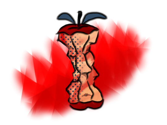
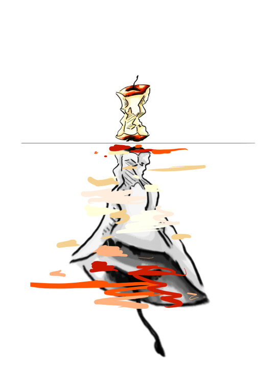
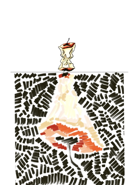
Last class to come up with an idea, and it just popped in my brain “reflection”. Ok, what reflects? Water! I drew a line across the middle so I could make that as the top of the water. I copied my apple, flipped it and I wanted to try taking the color out of it. I started smearing the greyscale apple but it just didn’t look anything like water. I decided to move on and thought, what if I put colors over the apple? Like abstract art? And I liked it. It was really cool, abstract dots and lines over a colorless apple. In the back of my mind I wanted to see what else I could discover, so I kept going. I must have been unconsciously conscious for this part cause I just found a brush and started loosely filling the bottom apple. Now I had the finished product, but I needed contrast, so I tried black lines on a whim. Worked out pretty well, cause I love it!
For a while, I knew I wanted the text to border the outside and highlight some words in red (especially core). A project someone else had from project one (six word memoirs) had text around the border and I really wanted to try it. Plus the bordered text takes up space without taking away from the picture. I did try placing the text in the bottom apple but it was too busy (see picture below). The best part of the text I chose is the name of it, ‘apple myungjo’. It has the word ‘apple’ in it!! And I love the way it looks in my poster as well.
For the critique stage I got a lot of good feedback and it made me feel really good about my poster. I got asked the question “why do you have the line in the middle?” And I didn’t have an answer! I never thought about the significance of it. Or “did you line up the line, ‘n’ and ‘l’ (in the quote) together on purpose?”… no, I never thought of it. It’s amazing how much there is to think about, not just in the way you compose a picture, but the words that are in it. I learned a lot this project and I had a lot of fun. I would definitely do this again to see what else I could come up with.
Pictures:
1. Process sketches, get the ideas out of my mind and onto paper
2. Apple ideas
3. Apple ideas continued
4. first idea try
5. Second idea try
6. Trace of sketch I loved, tried different colors too
7. Apple, mirror, try text in apple
8. Apple, mirror, abstract
9. Finished picture
10. finished poster


0 notes
Text
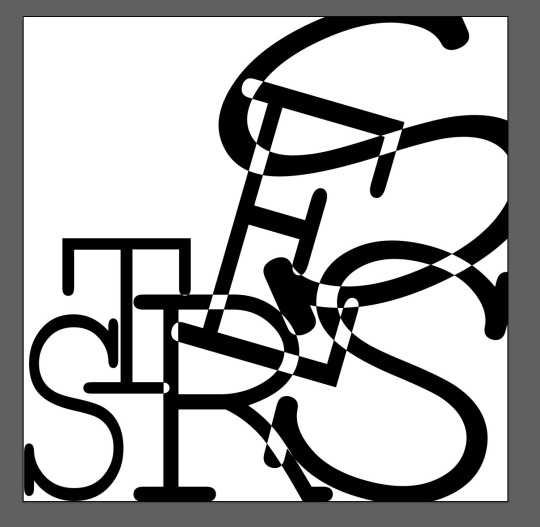
Week 3 and 4 of ARTS102 and every day has been such a great learning experience! In week 3, we were tasked with making three 5inx5in Typographic Abstraction pieces in Adobe illustrator. The words needed to be solid black and each piece had to have a different font. I noodled around for a bit and tossed around a bunch of different ideas, but I’m proud of the end results!
My first major inspiration was a word I experienced quite a lot last semester, ‘stress’.I wanted to pick a font that was very straight and slightly formal looking, maybe even a little unapproachable. Then, I wanted to create a picture that had meaning. The left starts off smaller and orderly and as it goes to the right the letters become larger and more chaotic. I also asked how to make the areas where the letters intersect disappear (I saw this in past projects and thought it was interesting). So that was the process for the ‘stress’ image you can see below. I liked the look of this image. You could read the word ‘stress’ very clearly and it has a deeper meaning behind it, but unfortunately, I had to eventually scrap the idea. My professor mentioned something like ‘how do we know where the line for abstraction is’ when I made the intersecting parts disappear. This made me re-think my whole approach as the image is very clear and too easy to read. I left it for a while because sometimes the best medicine is to sleep on an idea.
My next piece and one I kept till the end was my ‘cheese’ picture, I absolutely love cheese! Choosing the font for this happened fairly quick, it’s curved, thick and if the font did have color it looks orange (physically it’s black but in my head the font looks orange) just like cheese. I didn’t want to do anything special with this piece either, I just wanted a simple, generic looking piece since I was re-evaluating my whole thinking process towards abstraction. But, for all the pieces, I still really wanted the viewer to be able to read the words, so that was a constant lingering thought for my process from here on out. In summary, this piece was just an experiment to see what abstraction is like to make.
In my next piece, I used the word ‘frog’. They are one of my favorite animals! So, when choosing a font, I wanted it to look like hand writing or messy. There wasn’t anything too messy but I found a font that was round and scrappy enough. Then, I wanted to play around with the ‘O’ and ‘G’ because they are both round and I tried to fit everything in the ‘O’. After playing around with different options, trying to do a kaleidoscope effect, I just didn’t think it was abstract enough. The circles were too formal and I didn’t like how “put together” it looked. Just like the ‘stress’ piece, I decided to sleep on it.
…
The ‘stress’ piece was giving me such a hard time, I kept trying things but I didn’t want a piece anything like the others. So, ‘onomatopoeia’ popped into my head. Lots of letters and lots of ‘O’s to play around with. I chose the font just because it looked fun, and I wanted the text to take up space without taking up space. I think the lines in the letters do that quite well. I tried a lot of different things; making the letters touch, separating them, etc. Eventually, I found a corner and tried to bunch everything up, like the letters were blooming out of one corner. I arranged some things and found a good pattern, then I rotated the whole image unti I liked the orientation. For some reason… this picture reminds me of tacos, haha. Anyways, I liked this one the most.
My final piece ‘frog’, I really wanted to use the word frog, but I needed more letters, so I added a ‘S’ to make ‘frogs. I then had S,O and G to use, all round, I fit them inside each other and just randomly but G and F in the mix. At first the whole thing was sideways (corner to corner) but rotating and experimenting, I liked the blank space on the sides. It looked unique from many of the other previous examples I’ve seen that take up most of the space.
So then, I liked all my pieces and I was ready for the next step.
On the final day we had our 3 pieces printed and we cut them out with Exacto knives and as a class, made a whole composition together. At first, we put up our own pieces individually, but on the 3rd piece, everyone put their work up and we all talked together about where the pieces should go. This was a lot of fun! We ended up with a composition that has the denser pieces in the middle and the less-clustered pieces on the outside. We even explored moving some pieces out of the normal grid (see on the left of the final composition picture).
Overall, I really enjoyed this project and it really got me to use my brain differently! I had to stop thinking about what I wanted and start thinking what the project wanted (just like a client I guess) but still include creativity. I really enjoy this class!
We started our next project this past week, but I'll save all the details for next time!
Pictures:
1. STRESS composition (didn’t end up in final)
2. CHEESE composition
3. FROG composition (Later added S)
4. Cheese/onomatopoeia
5. Exacto knife
6. End result of class composition


0 notes
Text
My first art assignment, ever, and I didn’t even get to draw. Our first Project in ART102 was to make a 6 word memoir. We were tasked with picking six words that relate to our lives or an important memory. Then use AI to create a picture relating to the six words and format the words into the picture.
I started by writing down as many ideas as I could and all I could think about at first was what it was like being a middle schooler. Back then (and even a little now) I was really anxious and extremely shy, so most of the six words related to that; “People scare me, it’s too loud”, “I can’t speak, I can’t move”, etc. At this stage in the process I had about ten Ideas and I knew exactly what I wanted the pictures to look like, I even drew out what I wanted. I searched in the AI generator over and over but it was just not giving me anything that I saw in my head. AI can create some really beautiful pictures, but through this process I learned that AI can’t read my mind.
After hours of disappointment, I decided to brainstorm newer memories that I could generate less specific pictures with. I came up with “Run, Upon Mother Earth’s Beautiful Natures” (I didn’t notice till later, but “Earth” and “Nature” are interchangeable in the memoir!) and “I Play My Songs To Speak”. I’ve always loved being outside and nature reminds me of when I was a child. I typed something like “Little girl in a dress in the middle of a field, arms outstretched, wind blowing, clouds in the sky, old art” into the AI generator. What I asked for was specific, but not as abstract as what I first wanted. So, I got something I could finally work with! I have also been a musician since I was seven years old. Music has been a major part of my life and helped me grow to be social and not be afraid to meet new people. For the next picture, it was pretty simple what I wanted “mouse holding a bassoon”. The mouse is me, representing how quiet I was and the instrument it’s holding isn’t really a bassoon (my main instrument), but as someone in class said “it’s like what I would expect a mouse instrument to look like”. Interesting how things work out in ways you couldn’t imagine.
When I moved the pictures into photoshop, they were very blurry and I got to play around with photoshop quite a bit! It was pretty fun. I learned you can use filters, so for the mouse picture, I used sharpening and the oil paint filter. The oil paint really helped the mouse look cartoonish, and not grainy. And for the picture with the little girl, I just used the sharpening filters (and a de-noise filter, I think). When implanting the letters, I wanted to convey some sort of message. The mouse picture’s words progressively get larger as they get closer to “speak”. “Speak” is the biggest word to show that the word is loud (even though there is no sound). And in the little girl picture, she is almost holding the words “Beautiful Natures”. I wanted her to be connected with the words, like how I am connected with nature.
In the end, I was very proud of what I did and got a lot of positive critique in class. My favorite comments I got were, “they look like the covers of picture books”, “It looks like a story that I would want to read”. This made me feel proud of myself, and everyone in my class had amazing projects too! They showed me perspectives I didn’t even think of. This project was definitely a unique experience that I learned a lot from!
Pictures: (1)Little Girl Project memoir final (2)Mouse Project memoir final (3)Ideas for 6 word memoir (4)AI can have fascinating art (5-7)Ideas for AI picture (I later learned later that AI can’t give me exactly what I want).


1 note
·
View note