
Statistics
We looked inside some of the posts by enyaweber-blog and here's what we found interesting.
Average Info
Notes Per Post
5K
Likes Per Post
3K
Reblog Per Post
2K
Reply Per Post
22
Time Between Posts
1 day
Number of Posts By Type
Text
2
Photo
14
Video
1
Last Seen Tumblr Blogs


Fun Fact
Tumblr has been banned in Indonesia for providing people with access to pornographic content.
Text
Reflection and Summary!
What I loved so much about this unit was that each topic we discussed or workshop we did was done in such an abstract way. It enabled us to think outside the box and really stretch our mind and thoughts as far as we were willing to take them. I think this was such a useful skill that I will take away from this course - to always keep pushing the possibilities and my ideas further and further.
The biggest lessons I have taken from this is about allowing enough time to process ideas and experiment with them. I think a key element of being a designer is doing mock-ups, throwing around different ideas and having enough time to reflect on them so when it comes time to do your final, it can be to the highest standard possible. This was definitely something I need to work on and hope to improve for all of my future projects.
Karen and Andy are both such amazing designers and teachers, I have learnt so much from the workshops and lectures. Not only have they helped me to improve what I already know about design, but inspired me to go beyond what I know and delve into things which I never even considered - like coding, HTML and Java Script. This is something I hope to learn more about.
8 notes
·
View notes
Photo


AMA: EMILY LEUNG >> RATIONALE
PLAN: For this assignment I interviewed Emily Leung with a series of questions and presented this through the form of a zine. When I was applying for Communication Design at RMIT I was interested in seeing past alumni work. I found Leungs work by chance and was very interested in what she had been working on since she finished her degree. She has worked for numerous companies including ‘Thankyou’ and is now working as a freelance designer. I was very excited to receive a response from her. I had a number of other creatives that I also contacted but was unfortunately rejected or not replied to. I received my answers from Emily very promptly. This project began early in April and I received my answers on the 27th of April. I then planned out my goals for each week and what I wanted to achieve. Although I was sometimes interrupted by deadlines for other classes and work, I mostly followed my plan and have completed my zine to a standard I am satisfactory with.
RESEARCH: Leungs style is very current and simple, and I wanted my zine to reflect that. To research the style I looked at Leungs work online and in store at local supermarkets. I also looked at other designers with similar styles and how they present their work. It was very interesting to hear her answers to my questions as I then got to research who her inspiration is. I had never heard of Joy Cho before but I have now researched her work and explored her social media and I completely adore her artistic style and direction.
CREATE: I think I was mostly drawn to Leung because I have a similar style and hope to work in similar areas to her. From her work there is a reoccurring element of texture that makes her work stand out. I experimented with texture in my zine trialling different papers, alternate shapes/patterns and adding a tactile sensation through stitching the pages together. To present the interview I chose to make the design very simple with mostly black ink. I utilised tracing paper for the images to create a transparency between the two paper types.
It is not realistic to hand sew each zine, so for the purposes of mass distribution I have photocopied the original and created a flat A3 zine that easily folds together. In the images you will see the copied version at the top and the original zine at the bottom. If you scroll through my tumblr you will see a video that demonstrates the difference between the two. The final photocopied version is very accessible as it doesn’t require a lot of effort to be made, 1000s could be printed off and folded together in a couple of hours. Printed on copier paper it is very flat and folds up easier than the original.
COMMUNICATE: I am really happy that my creative enjoyed my zine. I believe that the zine I have submitted does reflect my interview with Leung and her creative world. I have included images of her work as well as small stylised elements that are both a piece of my style and hers. I have attempted to utilise different elements and principles of design in my work in similar ways to her, without blurring a line between what is mine and what is hers.
I have enjoyed this task.
CREDIT: photos taken by myself. Images used within zine utilised with the permission of Emily Leung.
12 notes
·
View notes
Photo

Task 3: Ask Me Anything
Interview w/ Jess Ruby James
“In Confidence”
17 notes
·
View notes
Photo

Ask Me Anything - Assignment 3 DONE!
For this Assignment, I decided to present my interview in the form of a Zine. My artist was @Screen14 who Is a UK based screen printer I’ve followed for quite some time now. Jon’s been a great influence on the way I’ve ventured into printmaking, and also into design by trying a different approach which is to create posters through silkscreens instead of digital design.
I had a love-hate relationship with this assignment, but overall it was challenging in a fun way. It was a good challenge :) Thanks again to Jon (a.k.a @screen14) for taking the time to answer my questions and allowing me to share your work.
55 notes
·
View notes
Photo


Assessment Three: Final Design
For this brief I chose to interview Bradley Pinkerton, a Melbourne based graphic designer who predominantly works with musicians and record labels in a collaborative approach designing album artwork, posters etc. The concept for this project was to create a monthly publication that showcased and celebrated Melbourne musicians, artists and designers who are involved in and support local underground music. The publication is called Modern Collective. With a subscription you would receive the small publication containing an interview and work by the individual as well as a cassette tape containing the recorded interview and a ‘mixtape’ of songs chosen by the artist, musician, designer etc.
The zine contains artwork courtesy of Bradley Pinkerton and was printed on recycled paper, with three copies made. This project helped to develop skills in layout, print and typography, sparking a keen interest in publication work. Prototyping a number of different designs helped to hone my end design and was an invaluable approach assisting with print and layout. Each of the questions asked were chosen to develop an understanding of Bradley and his career in design providing insight into the world of a freelance graphic designer.
12 notes
·
View notes
Photo

The last project “Ask me anything” for Communication Design Studies grap2199 completed and submitted. Zine around A5 size, cover made with a thick plastic sheet and a flyscreen on the back. Was a joyful process as that was my first experience of making a zine and something that I’m going to continue with.
39 notes
·
View notes
Text
Awesome final, congrats!
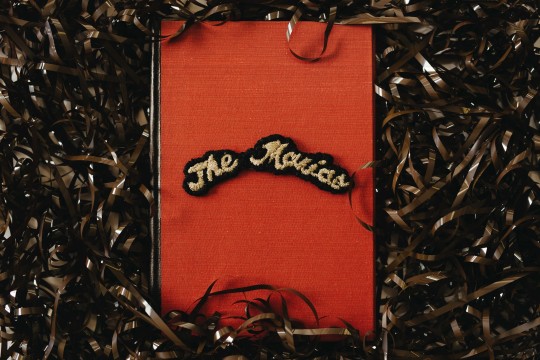
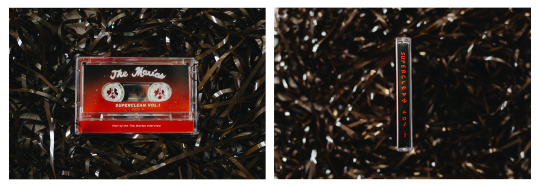
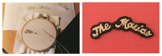
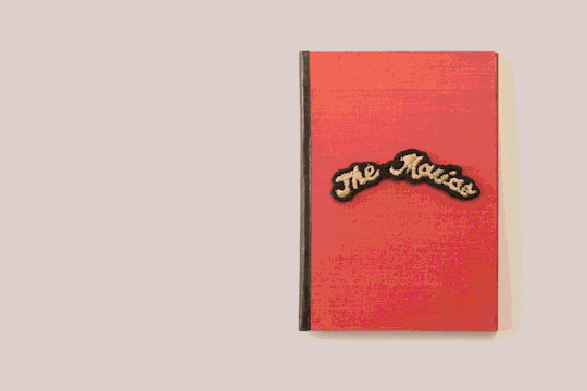
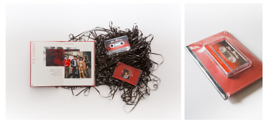
The Marías
ASK ME ANYTHING // CONCLUDE
Oh how this assignment has been so much fun yet stressful at the same time. BEFORE i get into the GUTS of how i used my hands to make things, i’d just like to congratulate everyone for making it through these 12 weeks and how amazing everyone’s ask me anythings look. Im really blown away by how our cohort can produce so much creative work. M I N D B L O W N
ALRIGHT!
So the The Marías are a band who formed in LA late 2016. The members include Maria, Josh, Carter, Jesse and Edward. Their unique style of music fits under the genre psychedelic-soul. I was introduced to them last year by a friend and fell inlove with their dreamy like composition. The reason why i decided to do a band instead of a Graphic Designer or Illustrator was because i realized that music plays a major part in my everyday life. The amount of music i consume some would say is unhealthy but i just find so much inspiration through what i listen. So when we were given the assignment of Ask me anything, The Marías was immediately on my list.
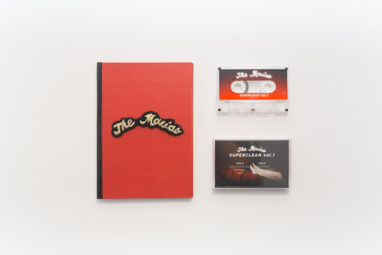
The creation of this small publication was probably the most fun ive had designing something. Since this task was driven on more interest in your artist rather then criteria, i knew this would be a great way to explore and really experiment with various medias. I started of searching my local thrift stores for items that could be of use. I happen to come across a few old books which had wonderful hard covers. I was lucky enough to find one that was red! This started the ideas flowing on how i could construct everything.
I had also found myself very interested in cassettes and cassette players. Growing up i never got to really experience the period where cassettes were booming. I found the concept of having physical music to be fascinating and oddly satisfying. Also i had no idea how tape worked so im pretty sure it was magic. Since The Marías had only one album out, (Superclean vol.1), I was determined to record it onto a cassette and find out how to do it. (with their permission ofcourse). After some research on how to record onto cassettes, i borrowed a old stereo player from a friend which enabled me to experiment with recording ontop of old cassettes from spotify. I experimented with different recording settings and Type 1 & 2 cassettes. After some frustration, i recorded the album onto a cassette and sliced the tape so it would only be the duration of their album. With 6 songs in their album, i split 3 and 3 and recorded them onto both side A & B. mmm quick math
The second medium i tried for the first time was Embroidery!!! After having difficulty finding a method to create a foil on my hardcover, i decided to give embroidery a try. With the help of a few youtube tutorials and Matilda’s wisdom, i recreated The Marías logo (which was already an embroidery but on a larger scale). and stuck it onto the front of my cover. Embroidery was alot of fun but it was definitely a risky pathway as it was my first and anything could have gone wrong. It also took a long time so a few ghibli films passed the time :’)
Designing the content within the booklet ran pretty smoothly. I knew i wanted to implement this psychedelic theme into the design aswell as their signature red. What was slightly stressful was the replies coming in 2 days before the deadline. It was another very risky gamble however it was all worth it. Since i had designed everything else, all i had to do was plonk the answers into the slots and rush to dinkums. Note to self, if ever creating another booklet, set up your documents as individual half pages instead of two pages on one piece of paper. Deciphering the correct order on what goes where is a nightmare.
The whole concept of my project was that while you listened to the music, you would read through the booklet and create a connection between the two. I found that the experience of sitting infront of a stereo and having to listen through each song and then flip the cassette, a very warming and meaningful experience. I guess you cant really skip a song forcing you to listen to what the artist has to express. I shrink rapped everything together at the end to give the user (Andy and Karen lol) a real experience of something you would purchase from an artist.
Overall it was SO MUCH FUN creating this and learnt so many new things from it. Id like to thank everyone who helped me with feedback and advice on making this and ofcourse, The Marías for giving me this opportunity and answering my questions.
If you were curious on what they sound like: https://soundcloud.com/themarias/sets/superclean-vol-i
Much much love
-Jam
78 notes
·
View notes
Photo


Assessment 3: Ask Me Anything
Some pages from the Interview with Andy Leaf Project Final.
Reflecting back on the very start of this project with so many ideas rolling through my brain about which artist to do and how to present it, I’m so happy that I chose Andy to interview. He was one of the first people that came to mind when we received this project and was so cooperative when I asked him to be a part of this project. It sure was a roller coaster of ideas and organisation though. From figuring out the best way to present his work, to what questions will best show who he is, to how I can best represent him.
I already knew Andy’s work was a very personal thing for him as he explored very personal experiences that only himself could possibly understand. Upon interviewing him (and meeting him), I realised how personal it actually is for him. He was so friendly and wanted to be able to express his work in words but I could see how hard this was for him. In fact, he admitted he never actually had to put it into words. His life, and his experiences, were represented through his illustrations. So, needless to say having to try and explain so much detail and difficult topics was a struggle. So the interview was treated more so as a casual conversation over coffee rather than a formal interview. I took notes while we were speaking but I made sure it was all kept very informal and that the questions I asked were in his comfort zone. I did have to contact him a few times after the interview to clarify or confirm what it was he was saying to make sure it was all worded correctly.
I left a lot of negative space/white space/blank pages because that’s sort of what it felt like interviewing him - there was a lot of pauses mid conversation to gather thoughts or for him to try and get the words to express himself. This is also why there are a lot of smaller pages or little booklets within the zine with the answers because they are so personal that they should be hidden. I made sure you could see an artwork on every page because it is really his illustrations that speak louder than his words. I wanted people to be able to read his answers and see his work at the same time so they have a proper idea of what he is trying to say.
Honestly I wish I dedicated more time to this project because it took a while for me to actually get started. I would of loved to be able to put more energy into it because it is probably my favourite assignment so far. However, there were many lessons and skills learnt from this - such as organising my time better.. but also crafting skills! It was interesting to have to make something, and to have to submit it in person, rather than online like most other assignments. I now know the basics of binding, and zine printing. Next time I know I will be able to take this even further.
Thank you Karen and Andy for this super fun project!
0 notes
Photo
WEEK 11 LECTURE:
This week we discussed the future of design and what our role is as designers. Erik Kessel’s ‘24 Hrs in Photos’ demonstrates how the internet and its users are bombarded with countless images everyday. This provokes the question of whether or not your imagery is going to have a lasting impression or if it’s just going to get quickly lost and consumed unless it’s done for the greater community.
16 notes
·
View notes
Photo
Whaaaaaaatttt this is amazing


WHAT THE ‘F’
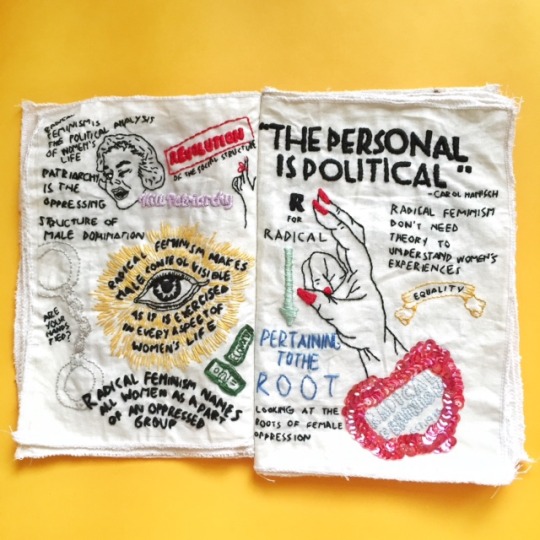
Crafts, illustration, and textile design piece by graphic designer Claudia Aksha of Jakarta, Indonesia
“The name Girls Gone Wild is chosen for this zine because it resembles how radical feminists were in the past, which is out of the norm and have no fear. And this zine will fully talk about radical feminism and the impact of radical feminism in the 21st century. Girls Gone Wild Zine is a little bit different from other feminism zine because GGW Zine criticize feminism (not in a bad way). GGW Zine criticize what feminism or feminist today often to forget and missed in today’s context. GGW Zine is straightforward, sarcastic and out of the feminist norm. GGW Zine is still a feminist zine, just in a different way.
The materials chosen for this zine is very unconventional, it’s not like how zine is normally produced. The reason behind it is because I wanted to discusses radical feminism in a radical way which is going outside the norm of how a zine should be.”
5K notes
·
View notes
Photo

This is so clearly Bauhaus inspired, and only made last year! It’s like a modern digital moving poster that could of easily have been designed decades ago by a Bauhaus member.
Source: http://www.brummellmagazine.co.uk/
2 notes
·
View notes
Video
tumblr
Week 12
Zine Trial #2
I created this zine from an A3 paper. Firstly I folded it in half horizontally and then folded the two ends to meet each other in the middle before then folding the middle in as well. From there I had created an 8 page A5 sized zine. To add more pages I cut slits into the bottom of each page, this meant I then had a 14 page zine with the double spread in the middle. I thought it would be cool to have the middle spread even bigger so I attached the same sized piece of paper to the bottom so it could fold out to make an A4 sized spread - sort of like a fold out poster. I then played around with page sizes and cut four of them so they formed a smaller booklet inside.
Andy’s illustrations are quite small so I’m pretty sure one of his artworks would fit on this A4 fold meaning I can accurately present his work in full! I wanted to experiment with creating a zine which folds out and has many layers, I guess sort of like a brochure and a zine combined. I think this concept works well with Andy’s work because his work is very personal to himself. Having some of the content in the zine hidden underneath the folds means people will have more of a journey through the zine (and through Andy’s life).
#AndyLeaf #AskMeAnything #ZineTrial #grap2199
1 note
·
View note
Photo
These pieces are really awesome! I just love how something so boring such as ‘data’ can be interpreted and be turned into something so interesting and beautiful.
I guess that’s another good point on where design is heading now. Artist’s and designers are taking the ‘ordinary’ and turning it into a piece of art.
Complicating the simplistic and simplifying the complicated?


Lecture Week 11: Parametic Design, Art through Data
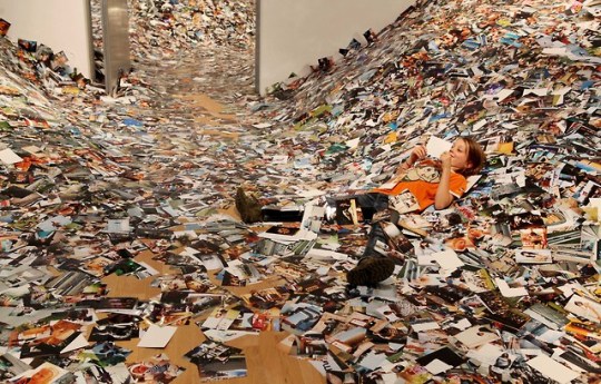
Todays lecture was an interesting insight into where we have come to with design and design/art’s role in society. Especially in showing the ways that all of this information that we are flooded with can be reinterpreted and used. Which brought me to Nathalie Miebach (Pictured), a sculptor using meteorological and oceanic data to create sculptures and installations. Each element of these pieces being related to a different set of data and each organised to be representative of a different reading. She mentions that none of the elements in her work are added for aesthetic reasons rather each aspect’s role is to visualise the data (refer to source). I found that really interesting and especially after being confronted by the flickr image mound today in class. In a society with so much “stuff” it seems like the perfect use of art and design and especially as the amount of data is only going to increase dramatically.
To start with I found it difficult to see what could be beautiful or aesthetically pleasing with interpreted data but after seeing Karen and Andy’s work and Nathalie’s work pictured I am well and truly wrong. It’s easy to be scared and confronted by all the information taken from us and constantly being used against us in social algorithms. However these are perfect examples where the question is asked of “If its out there, why don’t we use it?”
Sources:http://www.thisiscolossal.com/2016/03/nathalie-miebach-weather-sculptures/
Work 1: “The Andrea Gail” 2011
Work 2: “Hurricane Noel” 2011
4 notes
·
View notes
Photo


Lecture Week 11
What’s Next for Design?
Today’s lecture was really interesting because it got use thinking where we are today with design, and where it’s heading. What I noticed in the lecture today and looking at the contemporary art/design we saw is that there is a common theme of it all being quite interactive and involving more people than just the designer.
If we take a look at Metapolator we can see that they have literally designed a program, or a system, which anyone is free to use - a design which is only activated once it is used by the public. Similarly, the eyewriter, designed for Tempt1 but is also open for the public to buy and use at a very low cost follows the same concept. The installation piece which was displayed at the Tate Modern in London towards the end of last year was also a free exhibition which I was lucky enough to attend. It might just look like swings from this image but the metal beams joining the swings actually went around the whole building (which is a very large building) and went inside and outside, through the walls, roofs, windows. There was a a puzzle, or a game that accompanied this piece, forcing people to follow the beams around the whole building.
I think an important note to take from this is that design is being opened up to everyone. The initiative is now to involve the public in the design, get them to interact and think about it, rather than making a ‘thing’ and selling it. It is less about the money or selling price, but more about the meaning and involving communities. There is much more interaction and movement in the art and design world which probably stems from artificial intelligence being on the rise, meaning there is much more a play between human and machine.
#grap2199
source 1: https://www.designernews.co/stories/77640-metapolator--parametric-type-design
source 2: http://fffff.at/tempt1-eyewriter-art-by-eyes-kickstarter/
work - tempt1 colaboration with openFrameworks
source 3: http://www.tate.org.uk/whats-on/tate-modern/exhibition/hyundai-commission-superflex
work - Hyundai Comission: Superflex One Two Three Swing!
1 note
·
View note
Photo

Workshop Week 11
Indesign Zine Template
Today's workshop Karen talked us through the template for a zine in indesign. For someone like me who has never used indesign until I'd begun this course this was extremely helpful being shown the basics! We were also able to create a zine using the template (I just used random images from online) and then were shown how to print it on both sides correctly so when we fold it it all comes together. I also learnt how to print on different paper by watching other students who had brought in their own. This was useful as I was able to see how to put my own paper in the printer but also to see what the images look like when printed on different paper. Super helpful class!! #grap2199
0 notes
Photo

The M/M (Paris) Alphabet
On Week 9′s tut Andy showed us this amazing work by M/M Paris. I absolutely loved it! It was the perfect introduction for the collage activity that followed.
The resulting female typography is both clever and captivating – a striking homage to the feminine form (even where it lacks a face).
—Daisy Woodward
The people from M/M Paris expressed their love for the alphabet by creating a typeface, named “A – Z of beauty", made up of model cutouts. They took pictures of each of the models in different poses, printed them, and then cut away at the photographs with scissors to create the letterform. For the base of the shape, they used the existing lines and shadows in the photograph.
Full article: http://www.anothermag.com/art-photography/1604/the-m-m-paris-alphabet
Image: the alphabet (generic) http://shop.mmparis.com/products/the-alphabet-%5Bgeneric%5D.html
2 notes
·
View notes
Photo

Week 11
Zine Trials
Ask Me Anything Far left: 8 page zine from single A3 page Middle: 8 page A5 zine Far right: 16 page A5 zine Trying to figure out what size and how many pages I want to make my zine. I've done my interview with my Artist and am currently putting together all the information I got when I interviewed him. I'm still waiting for him to send me scans/photos of his work so I can figure out what content I want to include on the pages. I think I want to include quite a lot of examples of his work so that people can really get an idea of what his work is about while reading his responses to my questions. I'm yet to see any of the work in person but Andy has told me that his illustrations are quite small, some maybe even small enough to fit onto the zine example on the far left.. something to consider! #grap2199
0 notes