
Don't wanna be here? Send us removal request.
Statistics
We looked inside some of the posts by epadityamapog and here's what we found interesting.
Average Info
Notes Per Post
7
Likes Per Post
4
Reblog Per Post
0
Reply Per Post
3
Time Between Posts
5 days
Number of Posts By Type
Text
5
Last Seen Tumblr Blogs


Fun Fact
Tumblr has been banned in Indonesia for providing people with access to pornographic content.
Text
Mapping Waste Disposal Sites: Visualizing Sanitation Infrastructure for Cleaner Cities
Effective waste management is not simply about collecting garbage—it's critical for public health, environmental sustainability, and urban livability. As Indian cities continue to expand, clearly understanding where waste disposal facilities are and how effectively they're managed is essential. Traditional data formats such as lists and tables provide useful information, but they fail to convey the geographic nuances necessary for targeted improvements. Spatial mapping bridges this gap, offering vital visual insights into waste management infrastructure.

Why Spatial Mapping of Waste Matters
Spatial mapping transforms waste management data into visual, geographic insights. By utilizing Geographic Information Systems (GIS) platforms such as MAPOG, urban planners, policymakers, and communities can precisely visualize locations and conditions of facilities including landfills, recycling units, refuse transfer stations, and public waste bins. This approach reveals patterns, highlights effective practices, and clearly identifies areas that require immediate attention.
Limitations of Traditional Reporting
While conventional reporting methods offer valuable statistics, they often miss critical geographic details. Static reports cannot illustrate the spatial relationships between waste facilities and surrounding neighborhoods, nor can they easily communicate the impact of regional factors on waste management outcomes. Spatial maps effectively communicate these geographic stories, translating data into understandable and actionable visuals.
Key Benefits of Spatial Mapping for Waste Infrastructure
Spatial mapping provides essential benefits for diverse stakeholders:
Urban Planners and Policymakers: Quickly identify gaps in waste infrastructure and optimize resource allocation and collection routes.
Public Health Professionals: Visualize potential health risks associated with waste management, such as proximity to residential or environmentally sensitive areas.
Environmental NGOs: Showcase successful waste management strategies, promoting sustainability and knowledge-sharing.
Local Communities: Engage with their city's sanitation data, advocating effectively for improvements and accountability.
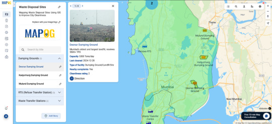
From Visualization to Real-World Improvements
Mapping waste disposal infrastructure isn't merely informative—it's transformative. Clearly visualizing waste management performance helps stakeholders prioritize critical areas, shape informed policies, and foster meaningful community engagement.Whether you’re an urban planner, government official, public health expert, researcher, NGO representative, or engaged citizen, MAPOG empowers you to turn complex waste management data into meaningful, impactful action. Because true progress in urban cleanliness begins with understanding the spatial stories behind the infrastructure.
0 notes
Text
Mapping Stories That Matter: Exploring Culture with Interactive Story Maps
Stories aren’t just found in books—they unfold around us every day. In the rhythms of daily life, in the spaces we move through, meaning is constantly created. Interactive story maps help capture that depth—not just showing where things happen, but why they matter.

Beyond Pins and Text: Why Story Maps Make a Difference
Interactive story maps created on platforms like MAPOG blend spatial data with visual storytelling. Whether it’s showcasing monuments, documenting community spaces, or mapping cultural festivals, story maps provide dynamic, multimedia-rich experiences. Each point on the map becomes a micro-story, complete with descriptions, images, and meaningful context.
Instead of a static document or a plain PDF, a story map lets users explore data intuitively—zooming into areas, reading histories, and drawing connections between places and their cultural significance.
The Challenge with Traditional Methods
Spreadsheets, reports, and slide decks may convey facts, but they rarely spark curiosity. They miss the visual relationships between locations, and they’re hard to interact with. By contrast, story maps let you see clusters, patterns, and trends. For example: Where are India’s Buddhist sites concentrated? What colonial buildings align with old trade routes? You can't spot that in a list—but you can on a map.
Who Benefits from Story Mapping?
Creating a story map using MAPOG isn’t just a tech activity—it’s a cultural tool that serves:
Educators & Students: Bringing history and geography to life in classrooms through visual journeys.
Tourism Boards: Highlighting cultural circuits and local heritage trails to inspire travelers.
NGOs & Researchers: Mapping social initiatives or heritage restoration projects spatially and clearly.
Content Creators: Building engaging blogs, portfolios, or exhibits with embedded interactive narratives.

A New Way to Connect with Culture
By turning data into narrative and maps into experiences, story maps do more than display—they communicate. They help us see patterns we hadn’t noticed before. And more importantly, they make heritage, culture, and community stories more approachable, discoverable, and memorable.
In an era where visual storytelling is more impactful than ever, story maps empower us to map what truly matters—from ancient ruins to modern social movements. With tools like MAPOG, it’s never been easier to create and share stories that are grounded in place and rich in meaning.
Your story deserves a map—and the world deserves to see it.
4 notes
·
View notes
Text
Mapping India's Heritage: Visualizing Monuments with Interactive Story Maps
India’s heritage isn't just about monuments—it's about the stories they hold, the cultures they represent, and the histories they embody. While traditional lists or brochures provide basic information, they often lack the depth and context that bring monuments truly to life. This is where interactive story maps come into play, transforming how we explore and understand cultural heritage.

Why Interactive Monument Mapping Matters
Interactive monument maps created through platforms like MAPOG visually communicate heritage data, turning static points into vibrant narratives. By plotting monuments geographically and enriching each site with images, histories, and architectural details, stakeholders—from travelers to historians—can easily explore regional patterns and cultural insights. These maps reveal not just where monuments are located, but why they matter.
The Limitations of Traditional Heritage Documentation
Standard methods like text-based documents or simple listings miss critical geographic and contextual details. They fail to capture how monuments relate to their surroundings, historical eras, or architectural styles. Interactive mapping bridges this gap, offering dynamic insights that traditional documents simply can’t deliver.
Benefits Across Different Stakeholders
Story maps of monuments offer significant advantages:
Tourism Professionals: Visualize heritage routes and plan engaging travel itineraries.
Educators and Students: Create immersive, interactive learning experiences that contextualize history.
Conservationists and Researchers: Highlight at-risk monuments and prioritize preservation efforts.
Content Creators and Bloggers: Embed rich, interactive maps to enhance storytelling and user engagement.
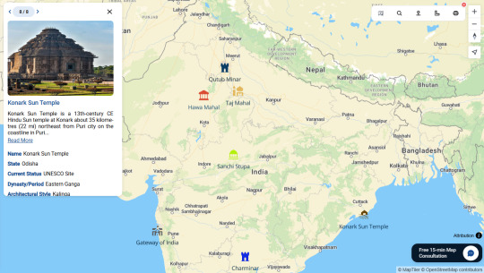
From Visual Narratives to Cultural Action
Interactive monument mapping doesn’t just visualize data—it inspires action. Clear, accessible maps help communities, tourists, educators, and policymakers better appreciate and advocate for cultural heritage.
True appreciation and conservation of India's monuments start by understanding their stories in context—and there's no better storyteller than a well-crafted interactive map.
1 note
·
View note
Text

Mapping India's Cleanest Cities: Visualizing Sanitation Success Across Regions
Cleanliness in Indian cities goes beyond rankings and awards—it directly impacts residents' health, quality of life, and environmental sustainability. Given the diversity of urban areas, understanding sanitation performance requires more than just lists or tables—it demands spatial mapping.
Why Spatial Mapping of Cleanliness Matters
Spatial mapping translates sanitation rankings, like those from the Swachh Survekshan survey, into clear visual stories. By plotting cleanliness data geographically, stakeholders can uncover patterns, recognize regional strengths, and identify areas requiring urgent attention. Using intuitive mapping platforms such as MAPOG, urban planners, policymakers, and communities gain a clearer understanding of sanitation success stories. These maps highlight not just who ranks highest, but precisely where and why certain cities are excelling or struggling.
Limitations of Traditional Rankings
While standard cleanliness rankings provide useful information, they often miss geographic nuances. They don't reveal why certain cities outperform others or how regional factors impact sanitation outcomes. Spatial maps bridge this gap, offering dynamic insights and helping stakeholders see the bigger picture.
Transforming Data into Action with MAPOG
Platforms like MAPOG simplify spatial mapping:
Quick Visualization: Easily upload cleanliness rankings and geographic data.
Clear Representation: Utilize color-coding—green for top cities, yellow and orange for moderate performers, and red for cities needing significant improvement.
Interactive Storytelling: Incorporate stories, images, or videos about standout cities like Indore or Surat, enhancing public engagement and understanding.
Moving from Visualization to Real Change
Mapping sanitation isn't just informative—it's actionable. Clearly visualizing sanitation performance helps stakeholders prioritize resources, design targeted policies, and foster community engagement.
Whether you're a city official, public health expert, researcher, NGO representative, or an active citizen, spatial mapping tools like MAPOG empower you to turn sanitation data into meaningful improvements.
Because true progress in urban cleanliness begins with understanding the spatial story behind the rankings.
1 note
·
View note
Text

How to Identify Healthcare Access Gaps Using Time-Based Mapping
In many regions of India, the availability of healthcare infrastructure doesn’t always translate into accessibility. Some villages lie within 20 minutes of a health facility, while others may require over an hour to reach the nearest hospital. This disparity in access often leads to delays in emergency treatment, lower preventive care usage, and, ultimately, poorer health outcomes.
But how can we visualize and plan for such access gaps?
That’s where time-based spatial mapping comes in—offering a new lens through which to evaluate healthcare equity at scale.
What Is a Healthcare Desert?
A healthcare desert refers to areas where residents cannot access basic health services—like primary health centers or hospitals—within a standard travel time, typically 60 minutes. This threshold is especially critical in rural and semi-urban regions where road quality, transport availability, and terrain impact mobility.
These access gaps may not always be visible in infrastructure lists or spreadsheets—but they become clear when viewed spatially.
Mapping Time-Based Access Zones
To identify underserved regions:
Drive-time zones (also called isochrones) are created around healthcare facilities.
These zones often include 30-, 45-, and 60-minute buffers based on average travel speeds.
Villages and towns located outside the 60-minute zone are classified as being in healthcare deserts.
Tools like MAPOG allow users to build these drive-time zones visually and layer them with village, road, and facility data—making analysis faster, clearer, and more actionable.
This method allows planners to go beyond just “how many hospitals exist” and focus on who can actually reach them in time.
Conclusion: Bridging the Gap with Spatial Insight
Time-based healthcare mapping offers a clear, practical approach to identifying areas in need. It turns spreadsheets into stories—showing not just where services exist, but who they truly reach.
If you're working with demographic, health, or service delivery data, consider integrating time-based mapping into your workflow. Tools like MAPOG make the process intuitive, visual, and powerful—bringing health equity one step closer to reality.
1 note
·
View note