
Statistics
We looked inside some of the posts by ericajohnsondoll and here's what we found interesting.
Average Info
Notes Per Post
23K
Likes Per Post
18K
Reblog Per Post
5K
Reply Per Post
25
Time Between Posts
5 days
Number of Posts By Type
Text
14
Photo
3
Last Seen Tumblr Blogs


Fun Fact
130K people were victims of a chain letter scam that affected Tumblr in May 2011.

Text
Grimes + Claire Boucher = Visions' ferociously playful head spaces

Grimes: Visions [Jan/2012] — CLAIRE BOUCHER SAYS she wanted the cover of her 3rd full-length Grimes recording to be “something very beautiful, and also very assaulting and violent, like the music.” She wanted the image to be zoomable — “like a Bosch painting” — and very movement-oriented. More than anything else, though, both the songs and their packaging had to be absolutely sincere.
Boucher can certainly be candid about what she was going for musically. “I wanted to make something that reads like a symphony,” she explains. “It arches — it begins in a sort of meek but inspired way, becomes very powerful, and then becomes very sad and lonely. I want people to enjoy themselves when they listen to it, but in the end feel very distant.”
And the drawing she made for the cover definitely mines one of her main creative veins: an affinity for Mesoamerican style. “When I went to Mexico, I was actually really inspired by a lot of Aztec art. I went to the museum of anthropology and Teotihuacan. It was all so horrifying and elaborate. More similar to my own art than a lot of stuff I’ve seen, even just structurally, because they use lots of little images of screaming faces and strange patterns to make big elaborate pieces.”

At the same time, Boucher says that “generally when I draw there is no concept, it’s just free form, I always improvise in whatever way feels best and that’s what I get.” Which sounds sort of like how she makes music too, having described a locked-in-her-bedroom recording process for Visions that involved tinkering and experimenting her way into the depths of sleep and natural-light depravation, self-isolating through the foggy and euphoric layers of her own songs.
Boucher says she usually draws during movie marathons, and that the Visions cover image was hatched with India ink, watercolour paper and “Ghost in the Shell II night, so I was thinking a lot about death and shit,” she says. “I do visual art in the same manner as music in that it’s intensive, but it’s not private at all. The album cover image took about 16 hours, I did it over two days. But it’s weird because I was sitting in my friend’s living room the whole time, so it was a much more social experience and there was a lot of feedback from my friends, and it was a bit different in that regard. At this point there is way less pressure for me to make visual art, so I only really do it out of love, whereas music has deadlines and pressures and stuff, so it’s not as free anymore. It used to be the opposite.”
This is probably why the prevailing influence on the Visions pieces is very personal — “my symbols,” Boucher calls them: the penetrating eyes (or lack thereof), the writhing textures, a weeping alien, the slanted hearts, flush roses and cushy bows, which apparently she’s been drawing since high school. “The eyeball was my first symbol and I use it in lots of ways all the time, but I also really like faces without eyes — which is why I’m attracted to skulls a lot. The alien head is my newest symbol. I have a tattoo of it now on my hand. It’s crying cuz, I dunno, I was sad at the time.”

Whatever mindset sparked the details, Boucher’s visuals are spiked with the same playful streak as her songwriting. The horizontal line of script atop Grimes on the cover says “I love” in Russian, and the two vertical lines are written in a conjured foreign tongue. “I’ve always been into fake writing on my art, particularly things that look kind of Japanese, because I love manga and anime poster art a lot,” she says.
Jasper Baydala, who helped Boucher produce the packaging layout, added a few more hints of mischief. The pink block on the right side is actually the word Grimes “jokingly” copied and pasted over and over and over again — “We both thought that it looked good so we left it,” explains Baydala. (He also alludes, also jokingly, to the roots of that particular idea, apparently inspired by sharing a living space with Arbutus Records’ honcho Sebastian Cowan: “I hear the word ‘Grimes’ hundreds of times per day.”)
Just as he did while producing the layouts for all of the Arbutus’ 2011 releases, Baydala hid a very small Ninja Turtle on the Visions packaging. And then there’s the giant pink alien head. Boucher had wanted to base her design on “another album cover that she liked, and we arranged the elements of her album cover to roughly match it.” For one of her departure points from aping this unnamed record (Baydala’s lips are sealed), Boucher suggested an alien head. A large-filter Google search quickly brought up the original alien head image, created by a then-anonymous artist, “who turned out to be a middle-aged man in Mississauga named Mark Khair, who makes alien heads in his spare time,” explains Baydala. “He was excited that we used it. It is a good alien head. I especially like that when we inflated it to put it on the back of the record, it became pixelated — that is the modern version of grain.”
Baydala says his favourite part of the Visions artwork is the fact that Khair’s alien head is so big on the back of the vinyl. “That is fantastic. It is hard to get away with something like that, and in the future Claire will not be able to get away with anything like that.” No matter how Boucher’s aesthetic ends up being affected by her popularity, Baydala puts her DIY sensibility nicely into context when he mentions the green bevelled lines he added to the packaging design. “I like the bevel because it is just like Photoshop. Maybe Grimes is distinctly Garageband.”

That said, Boucher’s Visions illustrations also show her visual art arsenal shifting to much the same trajectory as her music — embracing more risk, trusting her instincts, filling out the space of her canvases with idiosyncratic tangents. When she painted the piece that became the cover of 2009’s excellent Geidi Primes record, Boucher was just getting warmed up. “That was the first painting I ever really made, and one of my first 'eyeball’ pieces, so it was sort of a revelatory experience,” she says. “Like, 'Oh shit, art is way better if you use something besides a mechanical pencil!’ Plus, I realized that drawing on big paper is way more enjoyable and less tedious, and it looks better in real life.”
Even as her implements and materials evolve, thankfully it sounds like Boucher can’t help but maintain a mind-gripping art practice: “I remember not doing a lot of other important things in favour of doing that painting.”

Images by Claire Boucher. Story by Eric Rumble. Buy Visions from Arbutus Records.
141 notes
·
View notes


Text
Mabel: I wonder if grunkle Stan is dressed up for summerween
Dipper: Mabel, I don't think grunkle Stan is THAT festive
Mabel: oh come on! No one's too old to dress up!
Grunkle Stan: kids. We're gonna start selling fried chicken.

21 notes
·
View notes


Photo


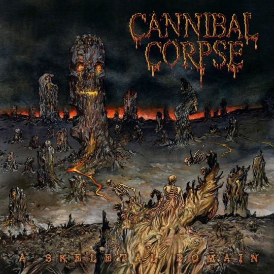

Pride flags colour picked from Cannibal Corpse albums 🖤💀
577 notes
·
View notes

Photo


Cannibal Corpse – Monolith Of Death (1997)
Originally released by Metal Blade Records on VHS-Tape.
207 notes
·
View notes
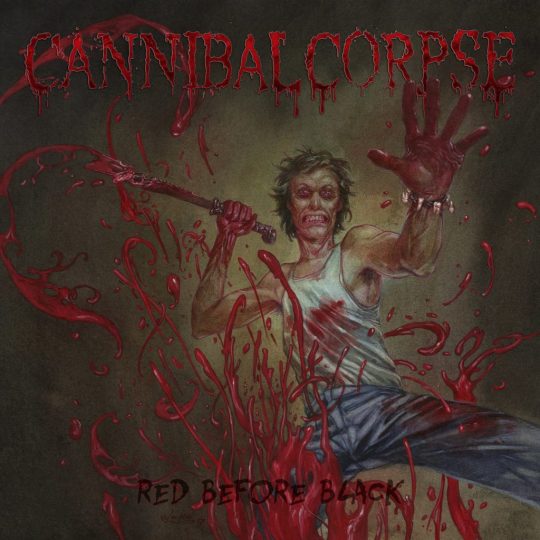
Text
💕CUTE ASKS ABOUT YOUR FAV CHARACTER!! ✨

��� What is their first waking thought?
KILL
🎮What is their favorite pastime?
TORTURE
🌹What is their favorite color?
RED BEFORE BLACK
🎄How will they celebrate Christmas this year?
VIOLENCE UNIMAGINED
👪How is their relationship with their parents?
BUTCHERED AT BIRTH
🧒🏻Do they have kids? What would they call their first-born?
THE WRETCHED SPAWN
Gosh💦. This last one is rather raunchy💦. What do they call your ‘downstairs area’?
TOMB OF THE MUTILATED
61 notes
·
View notes


Text

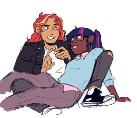
Most of the fallout 4 companions as my little ponies :3
145 notes
·
View notes

