
Don't wanna be here? Send us removal request.
Statistics
We looked inside some of the posts by erika-visual-design-blog and here's what we found interesting.
Average Info
Notes Per Post
0
Likes Per Post
0
Reblog Per Post
0
Reply Per Post
0
Time Between Posts
15 days
Number of Posts By Type
Text
6
Photo
11
Last Seen Tumblr Blogs


Fun Fact
The Tumblr app for Google Glass was released on May 16, 2013.
Text


As you can see this is where our app was up until week three. Very different to what it is now as lot of development has going on to better the functionality of the app and the aesthetic of it.
0 notes
Text


Images show the work Jessie and I had done in weeks one, two and three as we were working mainly from pen and paper at this point. These images displaying both research in relation to the Great Lake walk and that’s did it I wanted the app to hold. We were constantly changes our app for the better both making minor and major ones through the development.
0 notes
Text
Week6.2 reflection + rationale
Rationale
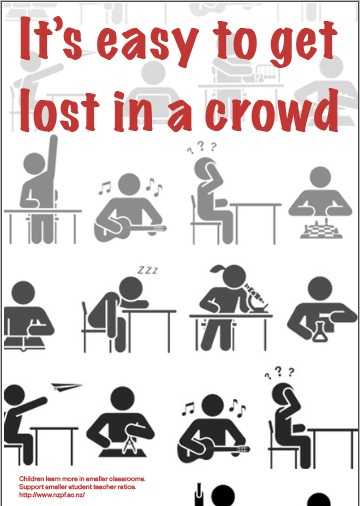
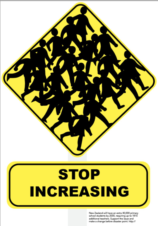
The inequality issue that I have chosen to explore for Ihi Wehi is overcrowded classrooms in New Zealand specifically in primary schools. My concept for this assignment was to design a pair of persuasive posters conveying the idea that crowds generate invisibility, this being a logical/literal representation of what students are currently experiencing in school. The rhetorical approaches I have implicated into my visual design are logos and pathos to engage the viewer, which are combined with the poster forms of subversion and juxtaposition this making both posters individually having their own style and effect, yet achieving the same thing, which is communicating the issue of overcrowded classrooms. My first poster’s ihi is the combination of text in the speech bubble and the presence of a child, which in turn influences sympathy in terms of wehi for the audience. My second poster’s ihi is the main header combined with the complementary subtle imagery in the background. In turn, I hoped this would influence guilt and sympathy in terms of wehi for the audience.
Erika Scholtens
Reflection
This assignment Ihi Wehi I found it different in a good way compared to the previous assignment by it taking me out of my confit zone and trying different software that I haven’t tried before such as illustrator. By the end of week 6, I feel like I learned how to create different forms from the same concept which I’m very happy with. If I was to do this again the thing I would do differently is to locking my idea earlier because I felt like I wasted valuable time on topics I wasn’t going to base my posters on
0 notes

Photo
Week6.1
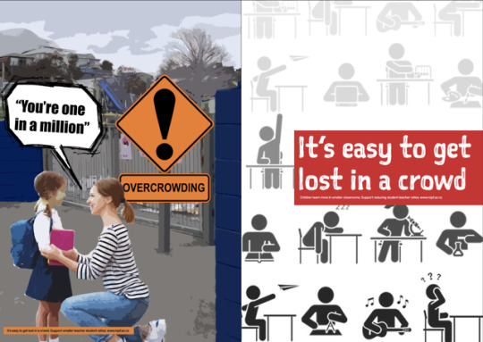
Final two posters talking about inequality in education and within that overcrowded classrooms
0 notes
Photo


Week6.1
I feel like the white text has a stronger contrast to the red and grabs the eye more. Will change the people in the background so there is no double ups.
0 notes
Photo


Week6.1
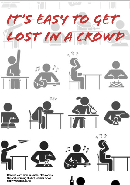
At the moment i am not like the positioning of all the element making it have an awkward flow through the poster.
0 notes
Photo


Week6.1
Image reference
Dejan Jovanovic, Adobe stock, https://stock.adobe.com/nz/images/collection-of-icons-presenting-education-and-different-school-subjects-science-art-history-geography-chemistry-maths-music-sports-student-in-school-attending-classes-pictogram-icon-set/218782154
0 notes
Photo


Week6.1
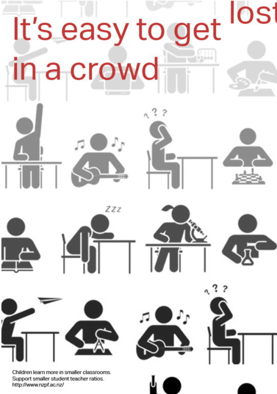
The feedback I receive was to try zoom in on the students making in fill the page better making it more visually grabbing. I like the gradient change as it goes with my concept of crowds make people invisible. Still want to play around with the font
0 notes
Photo


Week6.1
Have been trying several different ways to place the different elements on the page and opacity of the single students. Unsure if this is working overal so I’m going to go back to the leatures for some more feedback before finalising my second poster.
0 notes
Text
Week6.1 - Reflection
The feedback I receive was that my poster of the school sign isn’t very strong and is too similar to the other poster of “you’re one in a million” which now looking at it I agree. So I’m going to go back to the poster I did of the student icons and the one teacher and develop that more to full into the concept idea of crowd make individuals invisible.
0 notes
Photo


Week5.2
To create this poster I have used three different images.
- The background image I took myself at Newtown Primary School and used a filter over it which is called cut out.
- The road sign image of flooding I found online because I was unable to find this exact one in Wellington. changed the sign to saying overcrowding since it is a caution to relate to my topic and I also put the same filter on called cut out. (New Zealand flooding sign, https://www.nzta.govt.nz/resources/roadcode/about-signs/main-types/)
- For the image of the child and mother, I got this of online because I was unable a picture like this with it working so well with the layout of my composition making it more effective. I cropped the two figures out of the photo and put the same filter and I did on the rest of the elements of the posters. (mother and child outside school, https://www.google.com/search?q=4FBC5DC100000578-0-image-a-23_1536156642704.jpg&rlz=1C5CHFA_enNZ848NZ848&source=lnms&tbm=isch&sa=X&ved=0ahUKEwi52KKP9YvkAhWm_XMBHaCrBckQ_AUIESgB&biw=1440&bih=789&dpr=2#imgrc=11vBtiIbYvVXAM:)
0 notes
Text
Week5.2 - Brainstorm
Phrases to put in the sign
- stop cramming
- crammed school ahead
- stop too many kids
- high volume
- high volume ahead
- crammed school ahead
- Too many kids
0 notes
Photo


Week5.2
At the moment I’m trying to find the best font for design, what would work the best. Still might change the big text. Will brain storm some ideas
0 notes
Text
Week5.2 - Refection
Currently the two poster are looking too similar with the style used so I’ve decided to change the poster with the black and white background because I feel like that is the weaker design compared to the poster which says “You’re one in a million”. I am going to try use illustration for my new design, this will be my first time using illustrator so it will be good learning.
0 notes
Photo


Week5.2
Try to figure what my call to action will be, where to put it, what font and what colour contrasts the best.
0 notes
Photo


Week5.2
Try out different fonts to see what will work the best with the whole composition. I feel like at the moment impact font is working the best by resembling a comic form, also gooddog new font looks quite good. Will ask teachers and pairs what they think
Need to change the blue in the tree
0 notes