
Statistics
We looked inside some of the posts by eternalsunshine101-blog and here's what we found interesting.
Average Info
Notes Per Post
3
Likes Per Post
3
Reblog Per Post
0
Reply Per Post
0
Time Between Posts
3 hours
Number of Posts By Type
Photo
16
Text
1
Last Seen Tumblr Blogs


Fun Fact
BuzzFeed published a report claiming that Tumblr was utilized as a distribution channel for Russian agents to influence American voting habits during the 2016 presidential election in Feb 2018.


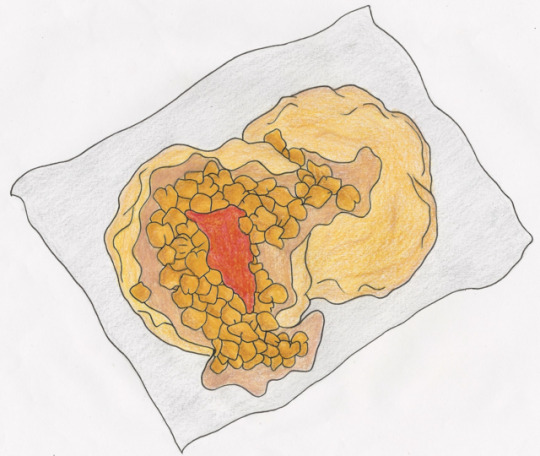
Photo


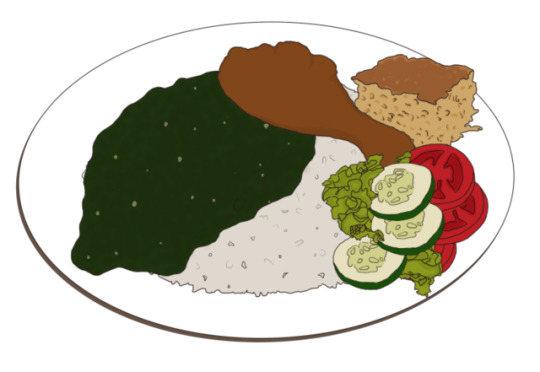
Rice, Callaloo, Stewed Chicken, Macaroni Pie & Fresh Salad
0 notes


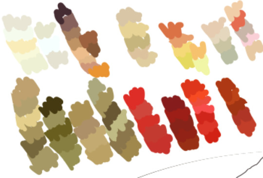

Photo
Testing Out Coloured Pencils
While using coloured pencils added much needed texture, I really disliked how scratchy the end result looked, I prefer a more solid finish. Also, it was extremely difficult to blend the coloured pencils and so it was a frustrating process trying to get it to the desired colour.
0 notes
Photo


Rough Sketches
Did some quick sketches of doubles & bake and shark. When I asked for feedback, someone said my doubles looked like pizza and another said it looked like a bouquet of flowers. Hoping it looks better when I add colour. *crosses fingers*
1 note
·
View note

Text
List Of Potential Illustrations
Breakfast Food 1. Buljol 2. Smoked Herring 3. Fried Plantain 4. Aloo Choka/ Fried Aloo 5.Baigan/ Tomato Choka
Meals 1. Callaloo 2. Pelau 3. Macaroni Pie 4. Curried Chicken 5. Fish Broth
Street Food 1. Doubles 2. Bake and Shark 3. Corn Soup 4. Crab and Dumpling 5. Pholourie
Snacks/ Dessert 1. Chow 2. Sweet Bread 3. Snow Cone 4. Fudge, Sugar Cake, Toolum, Etc. 5. Indian Delicacies
Beverages 1. Solo 2. Shandy 3. Malta 4. Sorrel 5. Punch
Natural 1. Chenette 2. Five Finger 3. Pommerac 4. Plum 5. Mangoes IDEAS Instead of illustrating dishes by themselves, illustrate them as an entire meal. Eg. Instead of callaloo, illustrate rice, callaloo and stewed chicken. For beverages such as sorrel and punch, where there is no label, illustrate the major ingredient next to the glass. Eg. For peanut punch, illustrate a glass filled with it as well as peanuts on the side.
0 notes
Photo


Tanya Cooper
Personally, I dislike her style where illustrating food is concerned. I understand that it may have been intentional but her work seems sort of stiff yet distorted, a combo that is unpleasing to my eye. Also, a lot of her colors are too bold and it seems like they’re competing with each other as opposed to complementing each other. These are some things I'd really like to avoid with my illustrations. What really caught my eye was the fact that her food was plated. I’m considering illustrating meals as opposed to separate dishes to really give a feel of what the food is like here.
0 notes
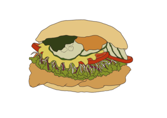
Photo


Katena Studios Kathrin and Lena
Their work has an emoji like, cartoony feel to it. The junk food illustration has no harsh lines and all colours are solid and perfectly blended. It looked very much like the emojis I’d find in the keyboard on my phone. However, if I actually do decide to give my illustrations an emoji feel, I prefer it to be more like the illustrations of sushi and ramen, etc. Using thick, precise black lines with very solid colors.
0 notes
Photo


Adam Larkum
While I’m not a fan of the style of his artwork, I really enjoy that his outlines are a brownish tone as opposed to traditional black. It gives his work a softer feel while still giving definition. I'm considering using a lighter tone to outline my work as well.
0 notes
Photo


Michael Frith
His work is extremely realistic at first glimpse, however, the more you study it, the less realistic it becomes. To me, his lack of harsh outlines are the only thing that really makes his work seem realistic. If you look closely, each piece is given at least one unrealistic characteristic. For the pineapple illustration, he uses watercolor and pays little attention to keeping his brush work precise, also there are noticeable paint splatters of a vibrant red colour. For the pumpkin, his work has all the potential of being a realistic piece, however, the colours he used were extremely dull in comparison to real life. For the burger, he used white highlights which was not well blended and therefore seemed very harsh, also, the overall texture seemed stippled without much blending.
0 notes
Photo


Matthew Hollings
I was very intrigued by his illustrations. His work has a semi realistic yet playful feel to it. He achieves this by using light thin outlines, relying on very thin, almost unnoticeable pencil lines to add depth to his work. Looking closely, I noticed that there wasn't much blending done. The paint splatters he used are what really makes his work unique and fun to look at.
0 notes