Last Seen Blogs
doublematch
Hear me rant

dc9spot
dc9spot
hey-stinky
what's that smell?

darkfireballz
Girls and large girls

justfortheac
Terror Mountain
Text
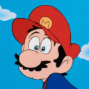
Alice Dellal
Artist Research
Alice Dellal was originally a model for various high-end labels, now she’s taken on a career in photography, documenting Britain and its underground music/graffiti culture through an updated style in which I can see resemblance of those like Anders Petersen and those in the first original wave of Japanese photography. These ideas show relevance to work of my own in terms of the style and subjects I plan to shoot. I love the way that her work truly reflects a lifestyle through unplanned imagery, rather than setting up a scene or directing her subjects. Another point to look at, is the way that none of the imagery is shot with the intention of being perfectly exposed, focused, or composed within a frame, a majority of the night time based work features a really harsh flash shown through the reflection of a surface or the blown out whites within a figure. Personally, I believe this effect really benefits the whole aesthetic and style behind the work and acts perfectly in documenting the characters in use. As mentioned previously, I also like how she’s utilised this traditional Japanese style but posed it against a modern society, commonly documented nowadays in such a different way with the influx of digital photography and phone cameras. The combination between the two has worked out well and gives the impression of todays featured artists regaining that reckless lifestyle of musicians back in the 70’s, over the typical censored style portrayed over the rest of the media currently.


0 notes
Text
Weekly Reflection
The course of this college week has significantly been affected by the outbreak of Covid-19, causing college to close from Thursday onwards, and most likely remaining closed past the original due date for our FMP. On Monday i managed to complete my first shoot, however due to the lack of ideal resources, I wasn't fully pleased with the results. The images have been developed and scanned but due to not currently having access to a computer which takes a regular USB port, I'm unable to see the images at home to evaluate until an adapter arrives next week. Due to the circumstances, I have spent the remaining period of the week preparing and gathering resources to ensure I can get as much done as possible towards the project, through the rest of the isolation. Going forward with next weeks work, I'll primarily be focusing on aspects I can complete at home i.e. research/planning.
0 notes
Text
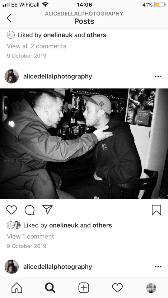
Research and Experimentation for Printing with Wood
As part of my project, I’d like a final piece to be a set of skateboard decks printed with an image of mine across them. Through research I’ve looked at multiple methods for printing with wood and before I begin my final piece, I’ll be completing experiments with each to see which method is the most successful.
The first technique I looked at was the ‘laser printed transfer’ using mod podge. This consists of printing out the chosen image onto standard paper with a printer which uses toner and laser printing, then applying the print side with mod podge and placing this side down against your surface. Leave the transfer to set for at least 4 hours for the best results, then using water, wet the back of the paper and gently rub until the paper is removed, leaving the print. Other alternatives to the mod podge include polycrylic and acetone along with a few others. From what I can see between the three, acetone would offer a much quicker and easier method, sacrificing the quality, where it will only need to set for a matter of minutes and the paper will peel off in one with ease. On the other hand, Mod podge and polycrylic offer much better quality and detail but require a lot more time and effort finalizing. At the time of experimenting myself, I only had mod podge available to hand and I’d come to a similar conclusion for what I had seen online. The print quality was good but the paper at the end became quite difficult to remove and after a lot of effort, there were still remains and some of the print had peeled away as well. Supposedly the polycrylic is meant to be a lot easier in this sense compared to the mod podge. Another aspect I also wasn’t too pleased about was the fact that the white areas within the image wouldn’t come through in the print and these areas were left with the grain of the wood.
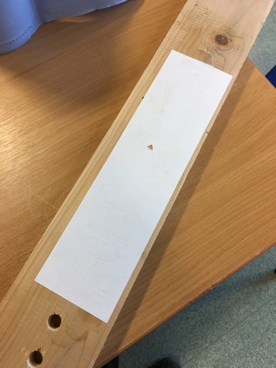
To combat this, I repeated the experiment, but in this case I coated the wood with an initial few layers of white undercoat and emulsion in the hope that when the image was printed on top, the originally blank areas would come through as white. Instead of this happening, the layer of paint stopped any of the print coming through at all and therefore was unsuccessful.
As I’m still not completely satisfied with the outcome from the original transfer, I’ll be looking into other alternative methods of printmaking. The first will be using cyanotype, the cyanotype method is most often used on paper or fabric, however I’ve seen pictures online where the technique is used on wood and I’ve really grown towards this more natural looking effect, which I feel compliments the aesthetic of woodwork. Instead of giving an accurate coloured or black and white print, the image is converted into a tonal range of blue and despite it also leaving the whites as blank, I feel this benefits the outcome in this style.
To carry out the procedure you start by mixing 100ml of warm water with 25g of ferric ammonium citrate, and in another container, mix the same quantity of water with 10g of potassium ferricyanide. Once both mixtures have diluted, add the two together and paint onto the chosen surface where the image will be applied to. This step must be done in a dark room or one with no natural light as the solution is sensitive to UV light. Allow the solution to dry in a dark place and then place the printed negative over the desired area, fixed down with tape or a weight, enabling it to stay in place. Once this is done and the negative is secure, either leave the subject under a lightbox for around 16 minutes, or if there isn’t one available, leave out in daylight for a full day. Finally, remove the negative and thoroughly wash in water until the image has clearly appeared. As this method was designed for paper, I’ve looked at examples online and some have first coated the wood with a layer of gelatine/water solution before applying the cyanotype. I’ll once again be attempting the technique until I’ve achieved the look I’m after and this may call for adjusting the method to suit the situation in hand with the availability of the resources around me.
Notes/process analysis

(Image on the right shows paper peeled off after 3 hours. Some of the print peeled off with the paper and was durable enough)


(Image on left shows remaining 3 prints where the paper was left to set over the weekend, print was still erased in areas but was much more successful then the first which was only left for 3 hours. Image on the right shows half a print with an overcoat of mod podge and half a print without. The half with, brought out the stronger blacks and will make the print more resistant)
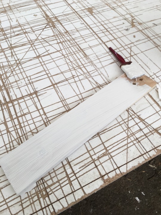
(Left image shows first layer of undercoat, and right image shows first layer of emulsion, another layer of emulsion was used on top of this)

(Paper was left to set for 2 days and when removed there was no print left on the wood. Printing onto emulsion with this method was unsuccessful)
0 notes
Text
Weekly Reflection
Unfortunately, due to matters out of my own hands I was unable to complete the first shoot. The Nikon f4 I'd ordered was lost by the delivery company, the hoodies which were being shot, arrived late. and by the end of the week I couldn't even shoot with my Mamiya due to the weather. Despite this, I was able to complete the written work preceeding the shoot as well as further working on experimentation for printing on wood.
0 notes
Text
Shoot 1 Plan
For this first shoot I’ll be attempting to complete it in the style of Atiba Jefferson and other relating skate photographers. I’ll be taking on board the research I’ve made over the previous weeks, including how I’ll be using the equipment and how I’ll direct what’s being shot. The final outcomes are needed for various different styles of product and therefore the outcomes will be made differently to suit. Throughout the shoot, I’ll be using my DSLR Canon for test shots whilst switching between my Mamiya rb67 and Nikon f4 for the final images. As well as this I’ll be using a Vivitar 285 flash on a tripod positioned around the figure to suit the shot at the time, accurately placed to achieve the fill in effect I’ve talked about before. The Mamiya will also be set up at a low angle on a tripod, with a shutter release cable to reduce camera shake. In terms of the available film at this point, the Mamiya will be shooting ektar 100, which is meant to pair well with flash, and the Nikon f4 will be shooting tri-x 400. The reason I’ve decided to use both is due to the fact that it’ll allow me to experiment with the different variables within skate photography. For example, the Mamiya uses a leaf shutter allowing me to sync at higher shutter speeds with flash whilst the Nikon gives the opportunity for trying different lenses I own and is much easier to use, enabling me to switch up my angle of approach with ease. As I try to capture the skating, I’ll also be looking to expose the clothing as the primary reason for the shoot stands as the promotion of the pieces being released. Due to this I’ll also take time out for portraiture and casual shots around the park with the clothes being worn.
0 notes
Text
Atiba Jefferson
Skate Photographer
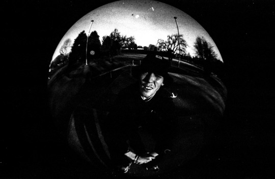
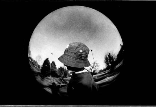
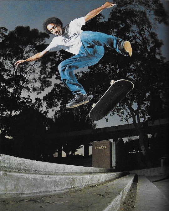
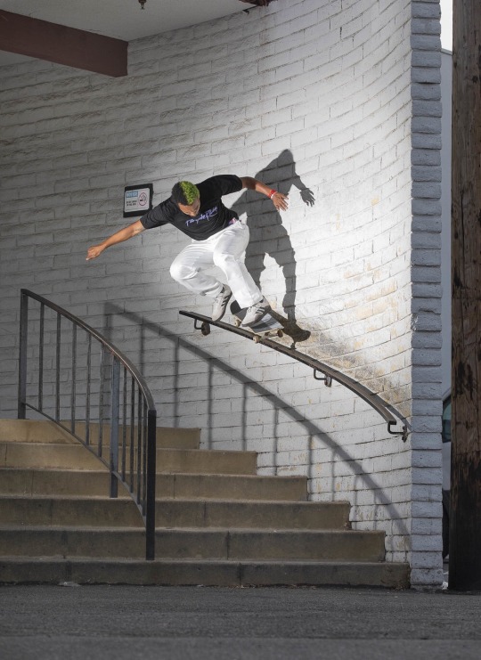
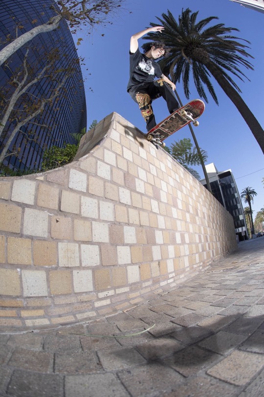
Jefferson primarily works within fashion, skate and sport photography, a lot of which I can take inspiration from for my current project. For the benefit of my own work, it’s worth looking into the equipment/techniques used by himself as well as the composition of his imagery. The majority of his skate work is shot using either a Canon DSLR (flash sync 1/250th) or a Hasselblad, which uses a leaf shutter meaning it will sync to the quickest shutter possible for the lens (1/800th in this case). In skate photography, having the fastest possible shutter is one of the most important variables as it allows you to capture the figure without blur. To compensate for the fast shutter, Atiba will also use a selection of off camera flash sources placed around the subject, often with the idea of exposing solely the subject leaving the backdrop behind slightly underexposed. This technique separating the two, emphasises the sharpness of the figure and brings them away from the setting to highlight the action in place. When shooting in film with the accuracy needed for capturing fast action with flash, he stresses that it’s important to also have the DSLR for test shot purposes due to their ease for experimentation. In terms of lenses, he’ll switch between fish eye’s, which force you to get closer to the subject, and longer distance lenses allowing him to stay clear of the path of the skater. The effect of using a fish eye works best in a setting which will emphasize the warp, and when the subject is closest, it’ll once again do the same. In order to do this, photographers like Jefferson will commonly use low to high angles, which in skating will make the skater seem higher and gaps seem larger.
The pieces of work below were selected for how they display these techniques and traits.
The first, embodies a few of the previously talked about points, as shown, the low angle really exaggerates on the height of the skater and paired with the slight fish eye effect, this is further enhanced. By shooting at night, the fill in technique using the flash is also clearly displayed. Against the black silhouette of the trees, the figure distinctly stands out within the shot as a key focal point, attracting the viewer towards the skater rather than the surrounding.
The next shot takes a completely different approach in the way that its focused towards the setting rather than the skater. Within this I was drawn to the composition in the way that aperture is used to focus in on areas, which cover such a vast distance. The image could be cropped down into certain sections creating a frame of their own, inspiring my idea previously spoken about for my boards.


0 notes
Text
Weekly Reflection
Over the course of the week, I’ve gathered a sufficient understanding of where I want to take my project, with a good selection of ideas for final outcomes. On top of this I’ve completed my proposal, after revised and improved attempts and I’m now at the point of preparing for my first shoot, practicing with equipment and researching the style/approach I’ll take. Looking towards the printmaking aspect to the unit, I’ve sanded down and prepared my first board as well as practicing the transfer onto a scrap piece of wood. From here forward, I’ll need to research further into printing and repeat mock up versions until I’m completely happy with the outcome. I’m pleased with the work I’ve so far completed and feel in a good position for the coming weeks for the project.
0 notes
Text
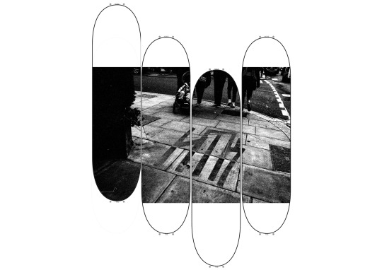
Initial Product Ideas
For the skateboard related idea, I’ve decided I’d like to display a series of boards side by side on a wall with a landscape image printed to be split over the set. Rather than covering the whole back of the deck, ill designate a section of each board to print, with the surrounding painted with a white boarder. Each board/section to the print will feature a point of interest to the image. This means I’ll need to consider the layout of the shot whilst shooting, positioning subjects to create separate frames that work by themselves and as a set. As well as this I’d like to play around with the alignment of the boards and how they’re presented on the wall.


0 notes
Text
Notes on using a Flashgun
For the experiment I was using a vivitar 285 flashgun on a digital camera. The vivitar flashgun offers more control over the outcome compared to my Pentax AF100S, with a simpler method for gaging the distance of the subject through colour coding. Starting out with a digital camera allowed me to experiment with ease, enabling me to evaluate the outcome as i altered settings, giving myself a better understanding as I move forward with film.
My main aim is to create a fill in effect with an exposed figure contrasting to a heavily underexposed background. This works best shooting outside on a more overcast day, giving depth behind for nothing to reflect the light from the flashgun. Underneath the bulb, the flash has a receptor, which picks up the light as it rebounds from the subject, at this point the light source will cut off. To meter the scene correctly, you must take a reading without the flash and set the camera to be underexposed. As the shutter speed can't be anything less than its flash sync (often 1/200th or 1/250th), this will have to be done through ISO or aperture. Saying this, it's also important to have a low aperture, to separate the figure from its background. This means in most cases its wise to use the lowest ISO possible ,whether this be through slow speed film or the lowest setting on your digital camera.
When setting up your flash, the dial must be set to the ASA used (100), and this will indicate the colour mode needed through the distance scale and also the advised aperture you'll need. Once setting the flash to the desired colour mode, you're ready to shoot.
0 notes


Text
Proposed Research Sources and Bibliography
Instagram.com. (2020). Atiba Jefferson (@atibaphoto) • Instagram photos and videos. [online] Available at: https://www.instagram.com/atibaphoto/ [Accessed 2 Mar. 2020]. - Skate/Sport Photographer
Instagram. (2020). corrupted on Instagram: “photos i took 4 @nikesb !!!”. [online] Available at: https://www.instagram.com/p/B84WAijB9hz/ [Accessed 2 Mar. 2020].
-Skate/Fashion Photography capsule to promote footwear
Anon, (2020). [Blog] aboveground.
-Hip-Hop/Graffiti Photographer
Instagram.com. (2020). Alice Dellal (@alicedellalphotography) • Instagram photos and videos. [online] Available at: https://www.instagram.com/alicedellalphotography/?hl=en [Accessed 2 Mar. 2020].
-Hip-Hop/Graffiti Photographer
Instagram.com. (2020). Nah Eeto (@naheeto) • Instagram photos and videos. [online] Available at: https://www.instagram.com/naheeto/?hl=en [Accessed 2 Mar. 2020]. -Artist/Hip-Hop photographer and filmmaker
Fritsch, L. (n.d.). ravens & red lipstick. Thames & Hudson.
-Japanese Photography Book
Lee Scott (2020). Ice Burn. [video].
-Hip-Hop music video, use of lighting
Theartofdoingstuff.com. (2020). [online] Available at: https://www.theartofdoingstuff.com/print-on-wood/ [Accessed 2 Mar. 2020].
-Method for printing on wood
VinylArt Co. (2020). VinylArt Co - Custom Picture Disc Vinyl. [online] Available at: https://vinylart.co/?v=79cba1185463 [Accessed 2 Mar. 2020].
-Vinyl printing/making business
youtube. (2020). [online] Available at: https://www.youtube.com/watch?v=6InhOF7nleg [Accessed 2 Mar. 2020].
-Printing with vinyls
James Watts -Co-worker for brand
Rudi Schofield -Co-worker for brand
Anon, (2020). [online] Available at: https://www.youtube.com/watch?v=uaUr2V2dXlI [Accessed 2 Mar. 2020]. -Tutorial for making vinyl stickers
Anon, (2020). [online] Available at: https://m.youtube.com/watch?feature=youtu.be&v=79t5e-CTAaU [Accessed 2 Mar. 2020]. -Hip-Hop music video
Blah Records. (2020). Blah Records | Rap/Hip Hop/Alt Independent Cult Label - UK. [online] Available at: https://blahrecords.com [Accessed 2 Mar. 2020].
-Record label with clothing line
Cult of The Damned (2020). Civilized. [video].
-Music Video Insporation
Stussy Europe. (2020). Stüssy | UK & EU. [online] Available at: https://stussy.co.uk [Accessed 2 Mar. 2020]. -Clothing brand, promote their brand through surfing and skating imagery
mid 90's. (2018). [film] Directed by J. Hill.
-Film based around 90’s skate scene
Anon, (2020). Thrasher Magazine. [online] Available at: https://www.thrashermagazine.com [Accessed 2 Mar. 2020].
-Skate Magazine
Instagram.com. (2020). uk hiphop vinyl&cd (@uk_hiphop_discogs) • Instagram photos and videos. [online] Available at: https://www.instagram.com/uk_hiphop_discogs/?hl=en [Accessed 2 Mar. 2020].
-UK Hip-Hop vinyl collector
Instagram.com. (2020). Grant Brittain (@jgrantbrittain) • Instagram photos and videos. [online] Available at: https://www.instagram.com/jgrantbrittain/?hl=en [Accessed 2 Mar. 2020]. -Skate Photographer
Joe Brook -Film Photographer for Thrasher
youtube. (2020). [online] Available at: https://www.youtube.com/watch?v=xHOWUR8vTvo [Accessed 5 Mar. 2020].
-Printing on wood
Peters, J. (2020). [online] YouTube. Available at: https://www.youtube.com/watch?v=wHTSMWcoBlw [Accessed 5 Mar. 2020].
-Printing on skateboards
F.E.A.R. (2007). [video] Directed by I. Brown.
-Music Video, plays with concept of time
Unfinished Symphony. (1990). [video] Directed by M. Attack.
-Music Video, shot in one take
Chris Cunningham -Videographer
0 notes
Text
Evaluation
In terms of the evaluation which will be made throughout the project, I’ll be doing what over previous units, I’ve felt has been necessary and what’s actually helped me get from one idea to the next. After every week I’ll be making a weekly reflection on where I’m at currently, with what needs to be done, and how I’ve felt about the methods I’ve used. Each shoot will also be annotated to learn for the next, and midway through the project I’ll briefly reflect on where I am to see how realistically I can fit to the overall schedule. Throughout, I’ll also be recording the meetings I’ve had with the other collaborating members, noting down the conversations made and conclusions we have come to. At the end of the project, I’ll complete a final evaluation, which will look back on how the project went as well as where I’ll take my work from then going forward.
0 notes
Text
Project Concept
I will immerse myself within cultural styles ranging from skate photography to film making for music videos to better understand the relationship between my work and its audience. In order to do this, I’ll be heavily researching into the pre-existing photographers within these disciplines. I’ll be looking into methods of advertising and promotion through all types of medium, as a way to give my work purpose. By the end of the project I will have created a series of products and materials which will display my imagery in a unique way. To do this, I’ll also be exploring new methods of print making onto different materials. These could include skateboard decks, vinyl and CD’s, with covers for both, posters, stickers and bags.
I need to learn more about film making, it’s a valuable asset to the label, it will be presented next to the other work in the show and I’m interested in how the moving image will over-lap with the other pieces of art. I need to improve both on camera handling technique and the finalizing touches editing my footage. More importantly in my case, the filming techniques as a plan to shoot the entirety of the video in one take.
Rudi specializes within animation which we plan to merge as part of the music video, projected to blend between two walls the corner of a room. James, the other artist, has previously painted a collection of skateboards to be exhibited. Together we plan on either working on a singular board together, or building a collection to
be presented side by side. I plan on creating a mock up store within the college show, featuring the products along with a rail for the hoodies to be showcased.
0 notes
Text
Rationale
Over the previous 12 units I’ve learnt skills enabling me to vary my photographic style to such a wide range of applications. After trying these variations I’ve now merged into a chiaroscurist style, which I’ve allowed time in projects to work on, trying to gain more of a knowledge and understanding on the techniques used. Alongside this I’ve currently been in and out of college working collaboratively on a clothing brand with two other artists. The brand, named High Top Killa, was made with the idea of three friends being able to use their art to get by for a living, without hating our work. The culture we’re growing up around is something we wanted to push through the clothing and along the way we’ll be showcasing and supporting other local creatives. Within the past two units I’ve used my work to produce the clothing and now it’s being made, the opportunity for promotion-based work is needed.
0 notes