
evancespedes
Evan Cespedes' Digital Fab Lab
Here you'll find my projects for Art 363 Fall 2022.
7 posts
Don't wanna be here? Send us removal request.
Last Seen Blogs

cartoonsilvia
We finish each other's—

sukablatnahui
Mikudayo 2.0

thebohemianvegan
The Bohemian Vegan

nytelights
nyte

typeknight
Sucker for a good story.
Text
Museum Assignment
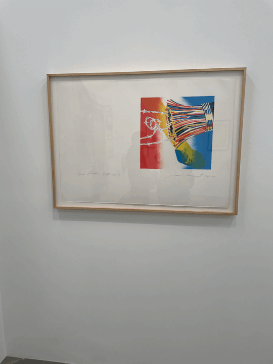
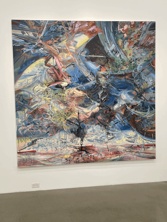
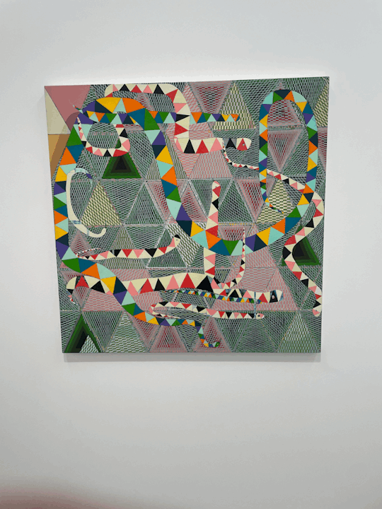
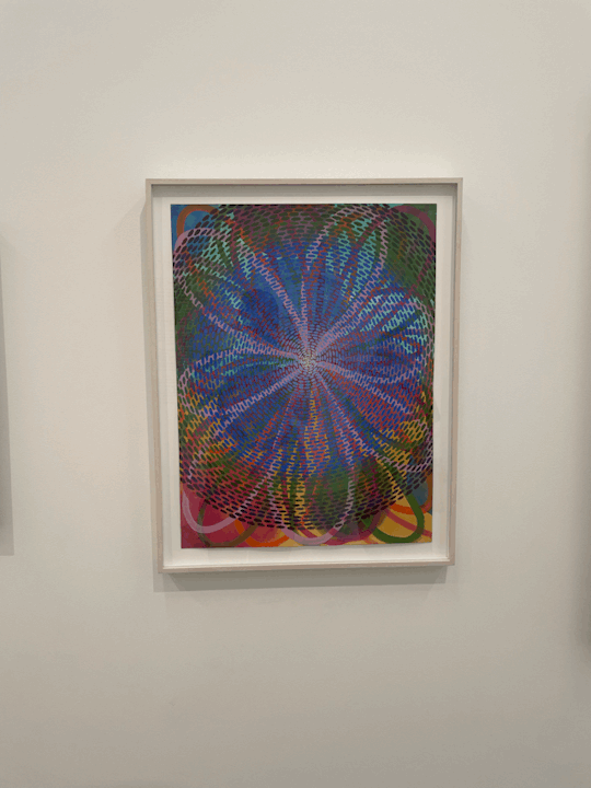
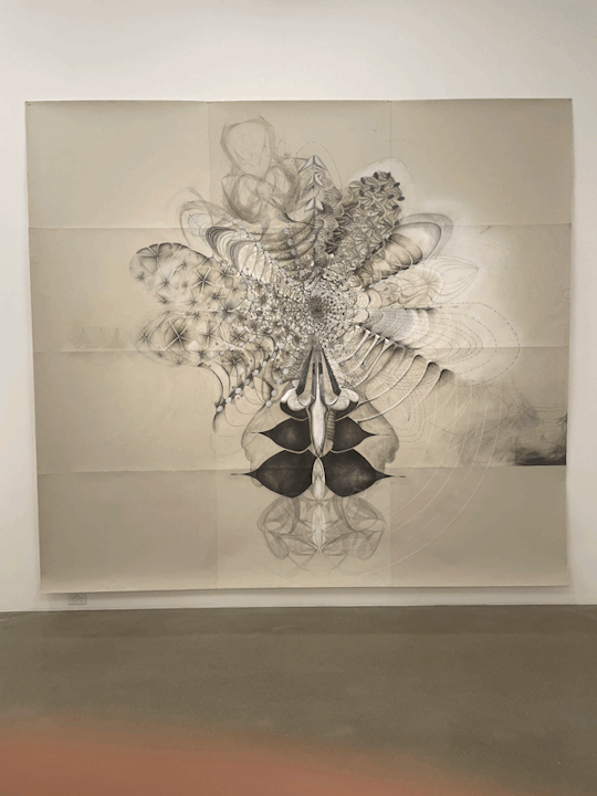
I attended the Hurry Slowly exhibition at the Kleefeld Museum for my offsite assignment. The exhibition is a summary, or recap, of the last fifty years of the organization’s collections. There was a great variety, as one can imagine, of works that ranged from photography to sculpture to painting. The exhibition provoked many interesting if disjointed thoughts in me, as well as a great deal of awe at the scale and detail of many of the artworks.
I was drawn to the more abstract, colorful drawings and paintings. One radiating painting by Robin Mitchell stopped me in my tracks when I entered the first room. The piece, called Boutonniere, displays every major color on the color spectrum, but manages to be highly cohesive and beautiful. An artwork by Amy Myers immediately provoked my imagination. Even in black and white, their piece shined with imaginative possibility, probably because it seemed to have been taken straight from the artist’s imagination.
0 notes
Text


Assignment #3B
This project began by testing the limits of my ability to do rough sketches that looked 3-Dimensional. I wanted to take a sketch of an abstract person and turn it into a large scale sculpture piece. I landed on a design that I liked (waist up sketch of a person with noodle hair and hands of hips) and I got to work in Fusion 360. I intentionally made all of its parts geometric so that I could do it all from scratch. In the process, I used the Revolve, Loft, Tube, Extrude, Offset Plane, Split Body, Move/Copy, and Combine tools. This was the most involved project I undertook in this class, simply because there were so many unique parts to it. At the end, I played around with appearances and scene lighting to get a green glass sculpture sitting in a white-walled room. If I were to really make this a public art piece, I might not make the material glass, instead a translucent plastic material, and I would scale it up to the height of a person. I am happy with the outcome and this has given me more confidence to take on more ambitious pieces in the future.
0 notes
Text


Exercise #3A
I sketched out some simple but compelling shapes that I thought could interlock or touch in a patterned way. I decided on a funky shape that looked like an apostrophe. Using six of the same extruded shape, I wove them together intuitively until I was satisfied with the final product. Most of the work involved using the Move/Copy function, which I became more comfortable with as a result.
0 notes
Text


Assignment #2
The concept for this assignment was based on stacking different objects in a way that was interesting and dynamic. I started drawing simple boxes and moved toward skewed shapes. On top of that, I cut out most of the insides of the 3 stacked objects in order for the viewer to be able to look at the internal geometry. One problem I ran into was finding out how to orient and sketch out the shapes I wanted to extrude. I ended up drawing ellipses, cutting them into quarters, and extruding them. I made sure to make each bottom the same dimension rectangle so that I could connect them together at the end. I think the outcome was successful even if it was a bit simple. I learned to use essential features of Fusion 360 like sketching and moving/connecting bodies.
0 notes
Text


Exercise #2
I used an iPad app to scan my face, sent the file to Blender to smooth out and remesh, and further simplified the mesh in Fusion 360. I wanted my face to be the main attraction, so I added a neutral-colored stand connected to the purple metal face. I rendered the final images using the appearance window, and this added a great shiny element to it. It was difficult at first to clean up the very large 3d scan file, but I was able to watch Blender tutorials to figure out how to get rid of many unneeded vertices. This made Fusion 360 handle the file better. When changing the appearance of the objects, I learned to use the Display Settings dropdown menu to select ‘Shaded’ in Visual Style so that I could see the metallic surface without it being covered by vertices.
0 notes
Text


For assignment 1, I wanted to capture a 3-dimensional environment and fill that environment with an emotion. I initially started with some abstract shapes for the background scene, and I tried to make them as interesting as possible so that they would juxtapose the more simplified, endearing foreground shapes. I landed on a design that attempts to capture a negative mind state, where one is feeling separated from the desaturated world they perceive around them. The focus of that person would be on their own shadow, and the problematic dynamic within themselves. Thus I chose to literally project their shadow selves into the space.
Some challenges with this project were making sure the background images were one singular connected shape and that they didn't break apart at the thin attachment points. Converting my drawings to vector was relatively straightforward; I used trace, simplify, and the blob brush for most of it. I used black poster-board as my material and added pink tape to the central figure to mark them as different from what they are feeling.
If I could redo any part of the project, I would project the shadows deeper into the space and make them bigger and taller. This would have an effect of demanding more attention, which is what the pink person in the scene is also paying attention to. Everything is from their perspective.
I think this project turned out mostly successful, but I would have changed the scaling of some things.
0 notes
Text
Exercise 1


This design was based on an abstract drawing I did of an orc-like creature. I made sure to incorporate organic shapes with lots of curves and movement, a design motif that runs strong throughout most of my work. I cut most of these shapes out of the material to create strong negatives and engraved the rest in a way that I thought would create a nice balance. As a decorative cherry on top, I filled some shapes in with 45 degree straight lines. I thought this juxtaposition with all the organic lines would create more visual interest.
0 notes